If someone asked you, “Where do you go on the internet to look something up?” you likely would answer with “Google.” Before Google, though, Yahoo was the search engine go-to. Often outshined by its competitor, Google, Yahoo still exists today in much of the same capacity as its competitor.

What Yahoo has struggled with, though, is maintaining its market share in this industry.
Even when the company wasn’t performing well, Yahoo’s logo has remained a universally recognized one. Even if you never use a Yahoo application, the Yahoo logo is likely one you’ve encountered once, twice, or many times before.
If you’re interested in learning more about Yahoo’s evolution as a brand and its evolution with its logo design, you came to the right blog post. Throughout the rest of this article, we’ll take a closer look at this company that paved the way for other tech companies to follow.
Meet Yahoo
Even if Yahoo may have started as a search engine, the Yahoo we use and know today encompasses so much more than that. Founded in 1994 by Jerry Yang and David Filo, Yahoo was founded to search for different websites in one place.
Founded in Stanford, Yahoo’s headquarters weren’t set up far from where it was founded. With headquarters in Sunnyvale, California, Yahoo evolved and grew right in the heart of Silicon Valley. We might even dare to say that Yahoo was one of the companies that helped establish Silicon Valley as a tech and start-up capital in the United States.
Today, Yahoo is a global internet services company with services spanning from email to search engines to news to so much more. Its peak happened in 2007 when the website received 3.4 billion views, and since this peak, Yahoo has tried to maintain its status as a reputable and noteworthy internet conglomerate.
The Evolution of Yahoo
1994-1997: Yahoo is born

Before there was Google, Yahoo was the go-to internet domain. Born out of a Stanford University dorm room, Jerry Yang and David Filo founded the company. Before Yahoo grew into a full-fledged online operation, Yahoo started much smaller, with a web directory.
In just one year, Yahoo reached one million views. Next up for the brand were two rounds of series funding, which propelled Yahoo to go public in 1996.
After building out its web directory, Yahoo began to circulate news, sports, and finance updates to those using its online directory.
1997-1999: Yahoo focuses on growing its services
In a quick effort to expand its services, Yahoo acquired Four11, which owned Rocketmail, in 1997.
The next year, in 1998, Yahoo expanded this directory even more. This time, Yahoo expanded to include email (which was formally Rocketmail), shopping, online games, travel tools, weather tracking, maps, and so much more.
These expanded services were born out of additional acquisitions from ClassGames.com, GeoCities, eGroups, and other tech companies. Yahoo was an early adapter in advancing alongside the internet and paved the way for many competing companies.
2000-2005: Yahoo navigates the dot-com boom
After Y2K, the internet experienced a boom, and Yahoo benefited from this. In 2000, Yahoo closed its stock at its highest price ever, $118.75. While Yahoo experienced a high at the start of 2000, the company also experienced an all-time low stock price in 2001.
To combat this decline, Yahoo began to frantically acquire more companies, primarily existing search engines, email providers, and Web 2.0 services that could help Yahoo rival competitors. Despite Yahoo’s attempts to combat this crash, the brand struggled to recover and never ended up back on top again.
2006-2017: Yahoo goes through a series of different CEOs

As Yahoo tried to recover, the company brought on a series of new CEOs. Each CEO, though, had a different vision and failed to build on the work of the past CEO before them.
For instance, Marissa Mayer, Yahoo’s’ CEO that reigned from 2012-2017, had hopes of transforming Yahoo into a mobile technology company but ultimately wasn’t able to see this plan through.
It’s important to note that this is only a high-level overview of Yahoo’s history as a brand, and much more took place beyond what we’ve highlighted in this article.
Roadblocks Along the Way
If you asked various tech analysts, they probably would tell you that Yahoo experienced a series of roadblocks that stemmed from being a little too late to the acquisition game and from a series of poor strategic decisions.
The most crucial strategic missed opportunity was failing to be an early adapter to other services that could have been offered under the Yahoo umbrella. Coupled with Yahoo’s failed attempts at acquiring companies like Google, eBay, and YouTube, Yahoo struggled to keep its stock price and revenue as high as it was during the dot-com boom.
It also didn’t help that the companies that Yahoo did successfully purchase (like GeoCities and Broadcast.com), Yahoo purchased at a high buying price. Those companies, unfortunately, weren’t revenue generators, and the amount of money Yahoo spent to acquire these tech companies never really helped Yahoo in the long run.
The Meaning of Yahoo’s Logo and Yahoo’s Logo History
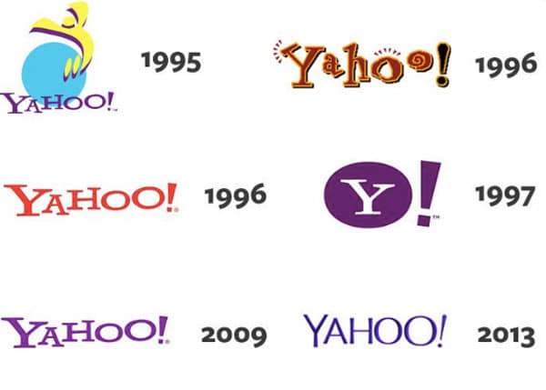
It’s common for tech logos to go through regular updates. As tech evolves, so do the logos of the companies in this industry. In this section, we’ll walk you through the seven different versions of the Yahoo logo to date.
1994-1995: The first version of the Yahoo logo
The first logo iteration was debuted when the brand was founded. This logo is as simple as a logo can get, making this logo design feel like an afterthought. This design only includes the Yahoo wordmark in a simple black font that was written in Times New Roman, a common default font.

1995: The second version of the Yahoo logo
It wasn’t long before Yahoo’s founders realized that having a well-designed logo was important. Logos became a brand’s identity, and Yahoo didn’t want to be known as the “Times New Roman” company. This logo design conveyed a sense of playfulness to the brand. An exclamation point was added after the wordmark (which would stay with the brand moving forward), quotation mark type lines were added before the “Y” and above the first “o,” and the font choice was a youthful, whimsical choice, drastically different than the first logo design. This design also ditched the black lettering and instead incorporated red and yellow.
1995-1996: The third version of the Yahoo logo
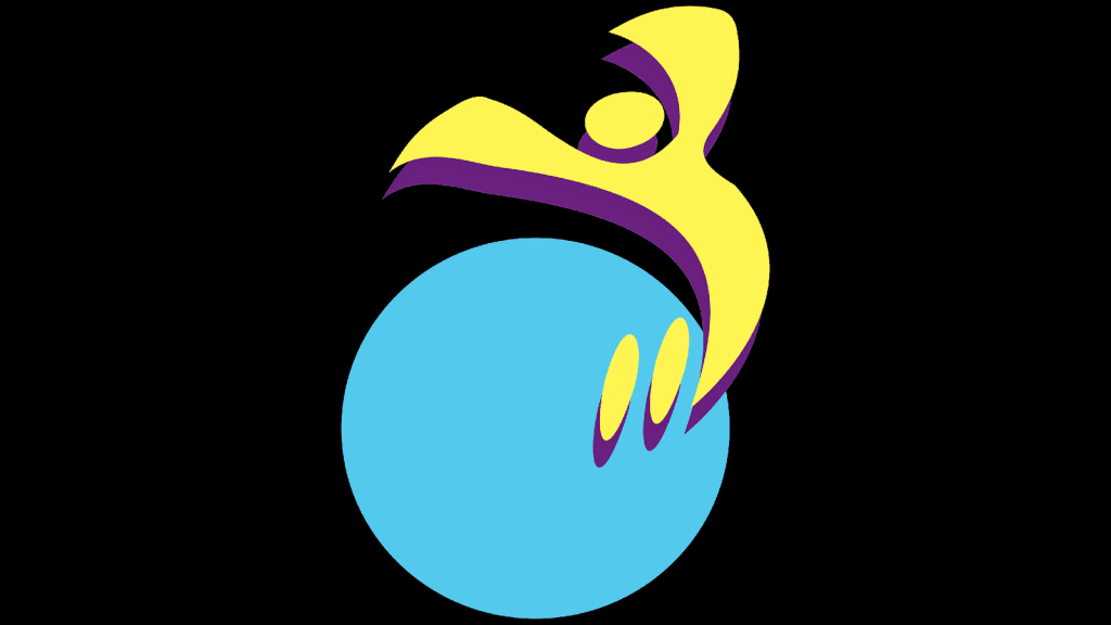
The second version may have been too playful for the company because it only lasted a few months. That same year, the logo was updated again, this time removing the wordmark altogether. This third version included an abstract picture of a yellow person jumping on a blue circle. The person jumping forms a “Y” with their body, symbolizing the Yahoo brand. Beyond yellow and blue, purple was also incorporated into the design, serving as a shadow to the yellow. For this logo design, Yahoo turned to its employees, and David Shen, an early employee of Yahoo, is the one credited with this logo design.

After this third design was unveiled, this logo was finetuned a little more. The brand name was added back to the bottom of the design in a cleaner, stylized font.

1996-2009: The fourth version of the Yahoo logo
From afar, it may look like Yahoo spent a lot of time on its third version when it only lasted a year, and if you think that, you are right. What that third version led us to, though, was this fourth iteration. For this version, the circle and jumping person was removed, only leaving the Yahoo wordmark. The Yahoo name was written in red this time.

2009-2013: The fifth version of the Yahoo logo
In 2009, Yahoo decided to update its logo. Rather than go through a large redesign, the brand decided to simply update the color of the logo to a purple hue. Yahoo felt this color was a color that better suited the brand.
2013-2019: The sixth version of the Yahoo logo
Sticking with the purple color scheme still, Yahoo decided to redesign other features of its logo in 2013. This design stands out because it was designed by the CEO of Yahoo, Marissa Mayer, rather than an ad agency. After partnering with her in-house design team, this logo was born. The purple color scheme was still used. However, there was a slight outline that was added to each letter. She also updated the wordmark to this thinner sans-serif typeface. The final update to this logo was with the exclamation point. Previously the logo formed a straight horizontal line. For this sixth version, the exclamation point was slanted ever so slightly.
2019-Today: The seventh (and current) version of the Yahoo logo
After Marissa Mayer left Yahoo, the brand was able to update its logo again. This version is what you’ll find across the Yahoo applications today. Designed externally by Pentagram, this design includes bold, lowercase purple letters with a slanted exclamation point. While not drastically different from past versions, this logo design stands out and captures your attention no matter where you see it.
Yahoo’s logo font:
Over the years, Yahoo played around with different fonts. Some were more playful, some were thinner, and some were bolder. The current font features thick block lettering that is a unique sans-serif font. Rather than earlier fonts that were used, this font is easily scalable and legible whether it is online or printed on a physical medium.
Yahoo’s logo color:
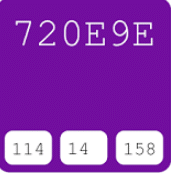
The color that is tied to the Yahoo brand is purple. Purple often represents ambition, creativity, mystery, and power.
These are all components of the Yahoo brand and all components that Yahoo was hopeful this color could convey through its logo design.
Yahoo’s logo symbols:
The one symbol featured on Yahoo’s logo is an exclamation mark—the exclamation mark symbolizes energy, intensity, and major significance.
The exclamation point shows Yahoo’s early adaption into the internet space and how the brand has strived to maintain significance over the years.
Yahoo Today
If you looked at Yahoo today, you would still find a company focused on the wide range of services it once offered.
The only difference is that while Yahoo was once the standard and go-to internet spot, it now is an internet afterthought. Some people, though, have remained loyal to Yahoo and still regularly use it today. That and the fact that Yahoo left its imprint all over Silicon Valley has helped the business coexist alongside large competitors like Google.
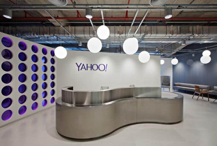
In 2016, Yahoo’s core businesses were purchased by Verizon. The divisions that weren’t purchased were later dissolved. In 2021, Apollo Global Management set out to purchase and acquire 90% of Yahoo, leaving Verizon with 10%.
Today, Yahoo’s headquarters can still be found in Sunnyvale, and as of 2020, Yahoo generated $7.4 billion. While Yahoo went through a string of CEOs who struggled to execute a strategic path forward, Yahoo’s current CEO is Jim Lanzone.
Many former Yahoo employees have gone on to both start and work at several other tech companies across Silicon Valley, from WhatsApp to NextDoor to Facebook to Google itself.
Lessons Learned from Yahoo
If Yahoo had a motto today, that motto would be one focused on never giving up. The brand saw its peak and lowest point all in one year. For a company that experienced this volatile market performance, it’s impressive Yahoo was able to somehow find a way to stay relevant and stay on people’s minds. How Yahoo seemed to do this was through its logo design.
The Yahoo logo is bold, simple, and stands out. At the same time, the color choice directly ties to the spirit of the brand, and the font choice is highly legible no matter the size of the logo design.
Over the years, Yahoo never altered its logo much, opting to stick to the same type of wordmark and color scheme. This helped the brand build recognition with users (and nonusers) even when the company wasn’t performing well.
When you have a logo that resonates with people, that logo will stick in their heads even if your company experiences a tumultuous time, like Yahoo.
Are you looking to design a logo for your business? If so, you might want to incorporate some of these lessons learned from Yahoo. The good news is that you don’t have to tackle this alone, though. When you’re ready to design a logo, head over to Hatchwise.
Hatchwise can partner with you on your logo wish list and turn those logo dreams into a reality.
Check out these awesome Logo Contests run on Hatchwise:


