
When you think of the color white, one very specific shade probably stands out in your mind: one that is pure and crisp, with no other hues or colors sneaking their way in. In reality, there are just as many shades of white as there are other colors. Though some of these seem closer to yellow, brown, or even orange, they’re categorized as white, at least for graphics and web design.
This list of white color names, Hex, RGB, and CMYK codes will help get you started, but these shades are really just the tip of the iceberg. The world is filled with different colors, and it’s truly fascinating. So sit back, buckle up, and enjoy them all!
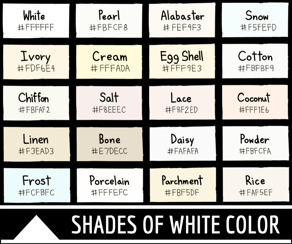
White
This is your standard, run of the mill white. Known to be crisp and pure, this color is often thought of when winter is about to roll around. White flakes of snow, pure crystals of sugar, and bright white paint for mixing are all things represented by this hue. Another great example is your standard sheet of printer paper or white sketchbook page.
White
Hex #FFFFFF
RGB 255, 255, 255
CMYK 0, 0, 0, 0
Ghost White
This slightly off-white hue has subtle hues of gray and blue, creating a ghoulish look. This hue is just like a ghost, subtle and almost transparent and can be seen in some costumes. This color is very similar to pure white but differs because of the gray, slightly sick tinge to it.
Ghost white
Hex #F8F8FF
RGB 248, 248, 255
CMYK 3, 3, 0, 0
White Smoke
This color is less blue than ghost white, with silvery gray tones mingling in with the white. It is like a soft cloud of clean-burning smoke, maybe from a simple log fire or other clean-burning fuel source. This may be seen coming from a chimney if the wood burns clean and is of the right tree species.
White smoke
Hex #F5F5F5
RGB 245, 245, 245
CMYK 0, 0, 0, 4
Baby Powder
Baby powder is a shade of white with soft tones of yellow, looking very similar to actual baby or talc powder. This color was released as a Crayola crayon as part of a scented crayon line, bringing it into popularity. Many people can easily imagine this color when they smell baby powder, or vice versa.
Baby powder
Hex #FEFEFA
RGB 254, 254, 250
CMYK 0, 0, 2, 0
Snow
This stunning shade of white snow is almost as pure as the original color itself. First used as a reference to a color in the year 1000, this shade conjures up images of frosty winter mornings with a fresh blanket of snow covering the ground. Snowmen, snow angels, and snowball fights, followed by steaming mugs of hot cocoa, are all images this color brings to mind.
Snow
Hex #F5FEFD
RGB 245, 254, 253
CMYK 4, 0, 0, 0
Ivory
Ivory has been in use as a color name for more than half a millennia. Named after the substance that animal teeth and tusks are composed from, this just slightly yellowed white is a simple yet beautiful shade of white that can give a work of art stunning color contrast that turns heads. It is often considered a pure color, great for creating the mirage of natural light.
Ivory
Hex #FFFFF0
RGB 255, 255, 240
CMYK 0, 0, 6, 0
Floral White
Floral white is almost a very pale yellow, though its lightness makes it classify as a white shade. This color is simple yet fanciful, perfect for wedding gowns. It also makes a common but always visually pleasing wall paint. The color is common and one of the most used off-whites in real world applications.
Floral white
Hex #FFFAF0
RGB 255, 250, 240
CMYK 0, 2, 6, 0
Seashell
Seashell is a pale off-white color that resembles seashells found at the beach or ocean. This shade of white has a pinkish hue and naturally looks very feminine and elegant, making it a great evening gown color. It’s a great summertime color, making one think of parties and lazy evenings spent laying in the sand, listening to the crash of waves on the beach.
Seashell
Hex #FFF5EE
RGB 255, 245, 238
CMYK 0, 4, 7, 0
Cornsilk
This color is a yellowish white, the color of cornsilks on a chill autumn day, waving their soft tendrils in the wind. This color has been officially in use for nearly a century and is almost creamy in appearance, creating a muted softness in tone.
Cornsilk
Hex #FFF8DC
RGB 255, 248, 220
CMYK 0, 3, 14, 0
Old Lace
Old lace is a shade of white with tones of yellow and orange gently mixed in. This is a classic color, well known in lace blankets, tablecloths, and doilies, as well as ladies lace clothing, such as gloves. It’s also used by many as an approximate skin tone for those of the Caucasian race, creating a standard for digitally created works of art.
Old Lace
Hex #FDF5E6
RGB 253, 245, 230
CMYK 0, 3, 9, 1
Cream
This color is a white shade with a good amount of yellow thrown in the mix. It is said to represent the color of fresh cream from cattle, a rich, buttery color that looks appetizing. This color has been in use for centuries, both within painting and other forms of art, and, more recently, on the web and in digital art.
Cream
Hex #FFFDD0
RGB 255, 253, 208
CMYK 0, 1, 18, 0
Beige
Though beige is technically a shade of white, it often appears to be more brown in hue and shade. It was originally a color that referred to the natural, undyed color of beige cloth, a cotton material that was commonly used in the past. This color is closer to a creamy white with yellow and brown pigments, instead of straight brown.
Beige
Hex #F5F5DC
RGB 245, 245, 220
CMYK 0, 0, 10, 4
Parchment
Parchment is a shade of white that is often thought of when discussing old school writing. Think old, textured parchment being written on with an old pot of ink and a feathered quill. Parchment paper is an almost tan off-white and the web color is as well.
Parchment
Hex #F1E9D2
RGB 241, 233, 210
CMYK 0, 3, 13, 5
Antique White
Antique white is mostly a color created just for the world wide web. When the creators of this color thought this up, they were likely thinking of thrift stores, old china dishes and pottery, or even an old antique sewing machine. This color is less pure than regular white, having an aged, slightly yellow look to it with just a hint of gray that almost resembles dust.
Antique white
Hex #FAEBD7
RGB 250, 235, 215
CMYK 0, 6, 14, 2
Champagne
Champagne is a unique, beautiful color with a natural elegance. Derived from the sparkling, bubbly drink, this color is a pale, almost straw colored yellow. It’s shimmery and almost translucent, just like a tall glass of the bubbly stuff. This color was commonly used in the early days of the internet.
Champagne
Hex #F7E7CE
RGB 247, 231, 206
CMYK 0, 6, 17, 3
Eggshell
This is a shade commonly seen while strolling through the chilly fridge aisles of the grocery store. Slightly tan in color, but still primarily a white, this shade closely resembles the color of eggshells on farm fresh eggs. A pale, almost ghost-like color that is familiar to both farmers and consumers.
Eggshell
Hex #F0EAD6
RGB 240, 234, 214
CMYK 0, 3, 11, 6
Dutch White
This shade of white is very similar to that of eggshell. It is creamy and pale, a tannish yellow hue tinting the white. The color is more popular overseas but can often be spotted in public via siding on quaint homes. The hue has notable differences from that of plain white.
Dutch white
Hex #EFDFBB
RGB 239, 223, 187
CMYK 0, 7, 22, 6
Bone
Bone is a shade of white that we are all familiar with. This color is a shade of white with both gray and yellow undertones. The color looks almost old in itself, the color of death and decay. It can be seen in skeletons, both human and animal, and tools and furniture crafted out of bone, like those from the far distant past.
Bone
Hex #E3DAC9
RGB 227, 218, 201
CMYK 0, 4, 11, 11
Vanilla
Vanilla is a rich shade of off-white that has been in use as a reference to color since the 1920’s. This color is meant to represent many things, from the color of vanilla ice cream to the color of vanilla cake or other tasty treats. The color is creamy and almost yellow. You can see it in the wild in vanilla orchids, a beautiful white flower that’s great for landscaping.
Vanilla
Hex #F3E5AB
RGB 243, 229, 171
CMYK 0, 6, 30, 5
Flax
Like vanilla, flax has also been in use as a color since the early 1900’s. This off-white color is almost golden in hue, shimmering in the sun as the light glints off it. The color is based off the flax plant, a pale golden crop that grows in fields and waves in the wind. The color is subtle but striking, the gold almost reminding one of a crown fit for royalty.
Flax
Hex #EEDC82
RGB 238, 220, 130
CMYK 0, 8, 45, 7
Navajo White
This color, used on the web since the 80’s, is a unique and stunning shade of white. Though classified as white, the color is very close to orange, just softer and more muted. Almost like the beginning of a sunrise, Navajo white is based on the background of the Navajo Nation ethnic flag. This flag showcases this shade of white in a beautiful and unique way.
Navajo white
Hex #FFDEAD
RGB 255, 222, 173
CMYK 0, 13, 32, 0
Alabaster
This shade of white is a really unique color. It has a base of white with cooler tones of yellows, greens, and grays mingling together. The web color is based off the mineral alabaster, a soft rock that is often used in sculpting. It is also used to produce plaster, making the color familiar to most people. It was first used in reference to color in a Shakespeare play, The Rape of Lucrece.
Alabaster
Hex #EDEAE0
RGB 237, 234, 224
CMYK 0, 1, 5, 7
Chiffon
While many popular shades of white have cool undertones, Chiffon has a warm hint of peach. It’s an ideal choice if you’re looking for a wall color but want something different than your typical blue- or gray-hued white. It also brings a warm energy to any website backdrop.
Chiffon
Hex #FFFACD
RGB 255, 250, 205
CMYK 0, 2, 20, 0
Unresolved Problem
Much like its namesake, this memorable shade of white has a background that’s just slightly stormy. As you can see by its CMYK values, Unresolved Problem has more black than yellow, which helps create its distinctive undertones.
Unresolved Problem
Hex #F3F2ED
RGB 243, 242, 237
CMYK 0, 0, 2, 5
Old Wood
This color name might seem strange for a shade of white or gray. But it does look a little like the silvery sheen you typically see on old fenceposts. Since it has nearly equal proportions of red and green, Old Wood has the unique quality of appearing somewhat warm and somewhat cool at the same time.
Old Wood
Hex #F0EEE4
RGB 240, 238, 228
CMYK 0, 1, 5, 6
Rose White
This soft, lovely shade of white is approximately the color of a white rose. It has a slight hint of cream, and it makes a dignified color for stationery or cards. As you can see from its CMYK values, it has a small amount of magenta that gives it some level of warmth.
Rose White
Hex #FFFAFA
RGB 255, 250, 250
CMYK 0, 2, 2, 0
Vista White
This misty color is a very slight gray. It’s ideal for those who are looking for a shade of gray that is especially close to white. As you can see in its CMYK values, it only has a very slight hint of other colors.
Vista White
Hex #FDFCFA
RGB 253, 252, 250
CMYK 0, 0, 1, 1
Link White
One of the beautiful things about the many white colors out there is the fact that you can find shades with undertones of almost any color. Link White has a slight hint of blue. It would make the ideal wall color for a workspace or office, as blue has been linked to productivity, and Link White offers the perfect compromise between white and blue.
Link White
Hex #ECF3F9
RGB 236, 243, 249
CMYK 5, 2, 0, 2
Spring
Spring is a shade of white that is effectively a soft gray. It’s reminiscent of some of the rain clouds you often see in the spring months. Spring’s soft color makes it a great text backdrop, and it also looks nice with pastel versions of various colors.
Spring
Hex #F3F0E8
RGB 243, 240, 232
CMYK 0, 1, 5, 5
Snow Drift
True to its name, Snow Drift is a snowy white shade that’s just slightly tinged with blue and gray. You can see that in its CMYK values. It has hints of both black and cyan. This bluish color is ideal if you’re looking for a quiet, soothing shade of white.
Snow Drift
Hex #F8FBF8
RGB 248, 251, 248
CMYK 1, 0, 1, 2
Peppermint
Many of us associate the word “peppermint” with the red and white peppermint candies. But this shade of white is modeled after the plant itself. Peppermint is a pale mint-green white shade. It’s perfect if you’re looking for a shade of white with a pleasant, springlike touch.
Peppermint
Hex #F1F9EC
RGB 241, 249, 236
CMYK 3, 0, 5, 2
Merino
This shade of white, named after the prized wool of merino sheep, looks a lot like a very faint taupe. It’s ideal if you’re looking for a shade that has a neutral undertone other than gray. Its brownish undertone has a warmth to it thanks to a relatively high proportion of yellow.
Merino
Hex #F2EBDD
RGB 242, 235, 221
CMYK 0, 3, 9, 5
Half and Half
This creamy white shade, named after the popular coffee additive, is one of the warmest white shades on the list. Notably, if you look at its CMYK values, all colors except for yellow have a value of zero. Despite its relative paleness, it’s among the higher-energy shades listed here.
Half and Half
Hex #FFFFE4
RGB 255, 255, 228
CMYK 0, 0, 11, 0
Island Spice
This exotically-named white is another color that seems to have both warm and cool undertones. Though its value for black is zero, a relatively large presence of blue helps make it somewhat cool.
Island Spice
Hex #FFFCEC
RGB 255, 252, 236
CMYK 0, 1, 7, 0
Soft Peach
Despite the name, Soft Peach actually isn’t one of the warmest shades on the list. As you can see from both its RGB and CMYK values, it has a moderately high proportion of blue and black.
Soft Peach
Hex #F6F1F4
RGB 246, 241, 244
CMYK 0, 2, 1, 4
Harp
This soothing, angelic shade of white is an example of a bluish green shade. As you can see, it has equal proportions of cyan and black. That helps make it look both blue-green and gray at the same time. It’s a good option if you need a shade of white with especially cool undertones.
Harp
Hex #EBF5F0
RGB 235, 245, 240
CMYK 4, 0, 2, 4
Titan White
This lovely shade of white is somewhat unusual in that it has equal amounts of cyan and magenta. Despite the magenta, though, it primarily looks like it has very slight blue undertones. It makes a very soothing, subtle wall color.
Titan White
Hex #EEEEFF
RGB 238, 238, 255
CMYK 7, 7, 0, 0
Audience Anger
Despite the name, Audience Anger really isn’t an angry shade of white at all. Instead, it’s one of the versions of white with prominent blue undertones. You can see that in both the RGB and CMYK values. Audience Anger has more blue than red or green, and it also has more cyan than magenta, yellow, or black.
Audience Anger
Hex #EAF4FC
RGB 234, 244, 252
CMYK 7, 3, 0, 1
Orange White
Though it looks almost like pure white at first glance, Orange White does appear to have a slight hint of orange that comes from its red and yellow values.
Orange White
Hex #F8F9F5
RGB 248, 249, 245
CMYK 0, 0, 2, 2
Cough Mixture
Despite its odd name, Cough Mixture is a very pretty shade of white. It has a decidedly gray look about it, as explained by its high proportion of black relative to magenta, yellow, and cyan. It also has relatively even amounts of red, green, and blue.
Cough Mixture
Hex #F6F4F1
RGB 246, 244, 241
CMYK 0, 1, 2, 4
Albescent White
“Albescent” means turning into white, and this color does resemble a reddish color fading into white. It has a slightly ruddier look than most of the shades on the list, and as you can see in its RGB values, that is likely explained by its large proportion of red compared to blue or green. Thanks to its rosy glow, Albescent White is also one of the more energetic shades on the list.
Albescent White
Hex #F3DECA
RGB 243, 222, 202
CMYK 0, 9, 17, 5
Coconut
This warmish white shade looks a lot like a slightly more diluted version of Albescent White. It has a little more yellow than the typical stark white of a coconut’s flesh. It’s a good choice if you need a shade of white but would prefer something with a bit of a reddish undertone.
Coconut
Hex #FFF1E6
RGB 255, 241, 230
CMYK 0, 5, 10, 0
Pink Salt
This very slightly red shade of white is roughly the color of pink Himalayan salt. As you can see from its CMYK values, it has a decent presence of magenta, yellow, and black. That makes it a balanced shade that is neither too warm nor too cool, although it leans toward the warm side.
Pink Salt
Hex #F8EEEC
RGB 248, 238, 236
CMYK 0, 4, 5, 3
Frost
Frost is a pretty shade of white that just has the barest hint of black. Its CMYK values are empty except for a very small amount of black. It also has roughly equal amounts of red, green, and blue. Frost is a good choice if you want a fairly bright white that has a very slight cool undertone.
Frost
Hex #FCFBFC
RGB 252, 251, 252
CMYK 0, 0, 0, 1
Linen
This warm, vintage-inspired white has a parchment-like quality that makes it especially good for use in stationery or brochures. It also has a relatively large amount of yellow compared to cyan, magenta, and black.
Linen
Hex #F3EAD3
RGB 243, 234, 211
CMYK 0, 4, 13, 5
Rice
Since rice is one of nature’s relatively few edible white things, it’s not surprising that it has its own shade of white. This color is a very slight off-white with a warm undertone. It’s a nice wall color if you’re looking for a shade of white with some elements of both peach and gray.
Rice
Hex #FAF5EF
RGB 250, 245, 239
CMYK 0, 2, 4, 2
Daisy
When you look at its different color components, Daisy just might be the most balanced on the list. As you can see, it has exactly equal amounts of red, green, and blue. And when it comes to CMYK values, it only has a small amount of black.
Daisy
Hex #FAFAFA
RGB 250, 250, 250
CMYK 0, 0, 0, 2
Powder
Not to be confused with Baby Powder, Powder is a pleasant shade of white that’s one of the lightest on the list. It has a bit of yellow and a bit of black, so it manages to avoid being both overly warm and overly shadowy. Powder is a great choice if you want something that’s slightly cooler than pure white.
Powder
Hex #FBFCFA
RGB 251, 252, 250
CMYK 0, 0, 1, 1
Pearl
This soft, snowy shade does almost have the luster of a new white pearl. Pearl contains more yellow than it does black and more red than it does blue, so it has a more cheerful glow than many other versions of white.
Pearl
Hex #FBFCF8
RGB 251, 252, 248
CMYK 0, 0, 2, 1
Paris White
This classy, cool white is one of the bluer shades on the list. You can see that reflected in the CMYK values. Paris White has more cyan and more black than most types of white. If you’d prefer a white shade that is effectively a cross between powder blue and true white, this one is a good choice.
Paris White
Hex #C2D8D3
RGB 194, 216, 211
CMYK 10, 0, 2, 15
Cup Cake
Like Paris Blue, Cup Cake is a shade of white that has noticeable hints of blue. As you can see in the CMYK values, this color has more cyan than it does magenta, yellow, or black. It also has more blue than either red or green. Despite that fact, Cup Cake is still a definite shade of white.
Cup Cake
Hex #EBF6F7
RGB 235, 246, 247
CMYK 5, 0, 0, 3
White Dove
This calming shade of white is one of the colors sold by Benjamin Moore. Just like its namesake, it creates a sense of peace wherever it is. White Dove is a versatile neutral that works especially well as a wall color in a variety of decoration schemes.
White Dove
Hex #F0EFE7
RGB 240, 239, 231
CMYK 0, 0, 4, 6
White Whisper
Though the blueish cool whites certainly have their appeal, warm whites like Warm Whisper evoke a subtle sense of home. They are effective in projects where you need to create a sense of calm, safety, and home. White Whisper is especially nice. While it’s still a warmer white, it manages to not be overly brown or yellow.
White Whisper
Hex #EAE8E1
RGB 234, 232, 225
CMYK 0, 1, 4, 8
Lexicon
This sleek, modern white’s cool undertones and hint of blue make it a shade that exudes authority and confidence. It works especially well as a background for projects incorporating bursts of bright color.
Lexicon
Hex #E7EAEA
RGB 231, 234, 234
CMYK 1, 0, 0, 8
Greek Villa
This highly evocative white just might make you think of summer getaways by the sea. Greek Villa has an impressive presence and energy. As you can see through its CMYK values, it has some amount of magenta, yellow, and black. It also contains more red than blue or green, giving it a decidedly warm look.
Greek Villa
Hex #F0EBE3
RGB 240, 235, 227
CMYK 0, 2, 5, 6
White Diamond
Nothing says elegance like the gleam of a white diamond, and this color gets close to capturing that sophisticated energy. White Diamond is a gray-leaning shade that has three times as much black as it does yellow.
White Diamond
Hex #E7E8E2
RGB 231, 232, 226
CMYK 0, 0, 3, 9
Decorator’s White
True to its name, Decorator’s White is a shade that works nicely in a range of design schemes. It’s a very middle-of-the-road white in a good way. It’s not too gray, too blue, or too yellow. This color is an understated one that still manages to be elegant.
Decorator’s White
Hex #ECEFEC
RGB 236, 239, 236
CMYK 1, 0, 1, 6
Winter White
This lovely, soft white is reminiscent of snow-colored hillsides on overcast days. Though it’s a simple shade of white, it’s calming and dignified, too. Interestingly enough, it has identical proportions of red and green, and it also contains more black than most white shades on the list.
Winter White
Hex #DFDFD5
RGB 223, 223, 213
CMYK 0, 0, 4, 13
Spatial White
This sophisticated shade is a grayish white with just a hint of warmth. It has a higher K value (proportion of black) than most shades on the list, and it also has almost as much blue as it does red. Spatial White makes a businesslike wall color, and it’s also a good color choice for desks and filing cabinets.
Spatial White
Hex #DEDDDB
RGB 222, 221, 219
CMYK 0, 0, 1, 13
Hog Bristle Quarter
Though its name may not be all that appealing, Hog Bristle Quarter is an inviting shade of warm white. You can see that in its CMYK values. It has just as much yellow as it does black, and it also has a touch of red. This color can really open up a room, and you can even dilute it even more if you want just the barest hint of warmth in a white color.
Hog Bristle Quarter
Hex #EBE4D8
RGB 235, 228, 216
CMYK 0, 3, 8, 8
Simply White
Simply White is a dynamic, energetic shade that’s perfect for a range of projects. It has a bit of a rosy undertone, and it’s a great choice for text backgrounds. Simply White works well as a wall color, especially with baseboards painted a paler shade of white. It is also ideal as a furniture color in more modern living spaces.
Simply White
Hex #EFEDE3
RGB 239, 237, 227
CMYK 0, 1, 5, 6
Oyster White
This white shade is particularly true to its namesake. It’s about the color of the shell of a healthy oyster. And thanks to the presence of yellow and of slightly less red, it does have a touch of warmth. The fact that it has more red than green or blue is unsurprising, and it’s a versatile alternative to the many whites with blue undertones.
Oyster White
Hex #E3DFD2
RGB 227, 223, 210
CMYK 0, 2, 7, 11
White on White
This unusually-named shade does look a bit like a bluish white with a plain white overlay. Unlike many of the white shades on the list, it contains a hint of cyan with no yellow or magenta. It does, however, have a medium amount of black. Its relatively high amounts of blue and green give it a pleasant, water-like look. It’s ideal if you’re looking for an especially refreshing shade of white.
White on White
Hex #EDEFEF
RGB 237, 239, 239
CMYK 1, 0, 0, 6
Lexicon Quarter
As you may have guessed, Lexicon Quarter is a fainter shade of Lexicon. As you can see in its CMYK values, it has a little black with no cyan, magenta, or yellow. It contains a relatively even amount of red, blue, and green, so it’s well-balanced and good for projects that need a subtle shade of white.
Lexicon Quarter
Hex #F2F2F1
RGB 242, 242, 241
CMYK 0, 0, 0, 5
Alice Blue
Though it has “blue” in the name, Alice Blue is pale enough to be considered a shade of white. It looks a bit like a very dilute robin’s egg blue. It’s somewhat unusual in that it contains no black. Most shades on the list have at least a somewhat gray undertone. Alice Blue is perfect if you need a calming yet inviting white shade with just a touch of blue.
Alice Blue
Hex #F0F8FF
RGB 240, 248, 255
CMYK 6, 3, 0, 0
Honeydew
Honeydew continues the trend of whites without gray undertones. This pleasant, springlike color is essentially the color of a honeydew melon, but it’s a bit paler than its namesake. It has equal amounts of cyan and yellow, which makes it a very well-balanced greenish white.
Honeydew
Hex #F0FFF0
RGB 240, 255, 240
CMYK 6, 0, 6, 0
Mint Cream
Like its namesake, Mint Cream is a refreshing color that’s well-suited to summer. It is similar to Honeydew in that it’s a white shade with faint green undertones, but it has a higher proportion of cyan than yellow. This feature gives it a slightly cooler, blue-hued feel. It’s a great color for rooms with a lot of natural light.
Mint Cream
Hex #F5FFFA
RGB 245, 255, 250
CMYK 4, 0, 2, 0
Milk
Although it is slightly less bright than its namesake, Milk is an excellent choice of white if you want an option with more subtle undertones than most on the list. This one has a bit of warm yellow (as evidenced by its CMYK values), but it’s tempered by the barest hint of cyan. It’s a good choice if you’re looking for a warmish shade of off-white.
Milk
Hex #FDFFF5
RGB 253, 255, 245
CMYK 1, 0, 4, 0
Pomelo White
This yellowish shade of white looks like a diluted version of the blooms of its namesake, the pomelo plant. The pomelo, which is the large fruit of the pomelo plant, is widely considered to be the ancestor of the grapefruit, and it is still used in southeast Asia. Interestingly enough, its scientific name means “biggest citrus.”
Pomelo White
Hex #F9FFE3
RGB 249, 255, 227
CMYK 2, 0, 11, 0
Anti-Flash White
This is one of the whites on the list that has great historical significance. Anti-Flash White has historically been used on nuclear bomb-dropping aircraft. This particular shade helps reflect the radiation that happens after a nuclear blast. Thermal radiation has the potential to severely damage aircraft and harm the people inside, and Anti-Flash White is meant to help prevent some of that damage.
Anti-Flash White
Hex #F2F3F4
RGB 242, 243, 244
CMYK 1, 0, 0, 4
Magnolia
This white shade isn’t quite as bright as the blooms of the magnolia flower. In fact, it’s decidedly more blue-gray in color. Nonetheless, Magnolia is still a pretty shade of white that is a good choice if you’re looking for a subdued wall color or even a color for accent pieces in a room.
Magnolia
Hex #F8F4FF
RGB 248, 244, 255
CMYK 3, 4, 0, 0
Azure
You probably think of azure as being a bright blue. But just like many colors on the list, Azure is a shade of white with just a hint of azure blue. Not surprisingly, it contains cyan but no magenta, black, or yellow. It does have equal amounts of green and blue. This helps create its lovely, soft blue-green look.
Azure
Hex #F0FFFF
RGB 240, 255, 255
CMYK 6, 0, 0, 0
Huntington White
This somewhat unusual white shade is similar to the color of a rose gray horse. Huntington White has hints of both red and gray. You can see that it contains slightly more red than green or blue, and it also contains equal amounts of yellow and black. That combination helps it strike a delicate balance between warm white and cool white.
Huntington White
Hex #F1F0E5
RGB 241, 240, 229
CMYK 0, 0, 5, 5
Acadia White
This pleasant, grayish-brown white is a great choice if you’d prefer a warmer white for a wall color or backdrop. You can see its unusual shade explained in its CMYK values. It has decent proportions of both yellow and black. Acadia White also makes a good color choice for stationery.
Acadia White
Hex #F4EFE3
RGB 244, 239, 227
CMYK 0, 2, 7, 4
Gainsboro
This pleasant white shade may look slightly bluish in color. However, you might be surprised to see that Gainsboro has equal proportions of red, green, and blue. Its gray tone can be explained by its high proportion of black. As you can see in its CMYK values, it has a high proportion of black and no cyan, magenta, or yellow.
Gainsboro
Hex #DCDCDC
RGB 220, 220, 220
CMYK 0, 0, 0, 14
Mercury
This cool, grayish white is a very well-balanced shade. It has equal amounts of red, green, and blue. It’s one of the paler shades on the list, making it a good choice if you just want a very subtly shaded form of white for your project.
Mercury
Hex #E7E7E7
RGB 231, 231, 231
CMYK 0, 0, 0, 9
Lavender Blush
So far, most of the shades listed have been grayish or bluish in color. Lavender Blush is a good choice if you’d prefer a soft pinkish white but don’t need the full saturation of a true pink. As you can see, it has a higher proportion of red than blue or green, and it also has a higher proportion of magenta than cyan, yellow, or black.
Lavender Blush
Hex #FFF0F5
RGB 255, 240, 245
CMYK 0, 6, 4, 0
Isabelline
Isabelline is a great white shade to pick if you would prefer a soft yellowish white as opposed to white with a pink, blue, or green tint. As you can see in its CMYK values, its balance of magenta, yellow, and black makes it a pleasant color with just enough warmth.
Isabelline
Hex #F4F0EC
RGB 244, 240, 236
CMYK 0, 2, 3, 4
Bubbles
True to its name, Bubbles is roughly the color of a very soft seafoam green. It stands out on the list because it has a higher proportion of cyan than magenta, yellow, or black. It also has more blue than green or red. It’s a great choice if you want a cooler shade that’s more cheerful than most.
Bubbles
Hex #E7FEFF
RGB 231, 254, 255
CMYK 9, 0, 0, 0
Glitter
Though its name suggests a loud, in-your-face shade, Glitter is actually a cool, relaxing shade of blue-white. Like Bubbles, it has more cyan than magenta, yellow, or black. It also has far more blue than red or green. Glitter can bring a real calming energy to any design or room, whether as a wall color or an accent color.
Glitter
Hex #E6E8FA
RGB 230, 232, 250
CMYK 8, 7, 0, 2
Platinum
This quiet, metallic white shade looks a lot like a cross between true white and pale gray. As you can see from its CMYK values, it does have a slight touch of yellow for added warmth. But the high proportion of black gives it a cool, soothing energy that still manages to be businesslike.
Platinum
Hex #E5E4E2
RGB 229, 228, 226
CMYK 0, 0, 1, 10
Cosmic Latte
This creatively-named white shade is one that leans toward being creamy and yellow. It’s not quite peach in color, but its warmth makes it a beautiful choice if you’re looking for a rich white for your project. As you’d expect, Cosmic Latte has a higher proportion of yellow than cyan, magenta, and black.
Cosmic Latte
Hex #FFF8E7
RGB 255, 248, 231
CMYK 0, 3, 9, 0
Blanched Almond
True to its name, Blanched Almond is roughly the color of an almond post-blanching. It has a very high proportion of yellow, but the addition of magenta creates some additional warmth. It’s a great choice if you want a color that’s a little like peach with some added reddish undertones.
Blanched Almond
Hex #FFEBCD
RGB 255, 235, 205
CMYK 0, 8, 20, 0
Light Yellow
Though the name of this white shade is “Light Yellow,” it’s also closer to being true white than many shades on our list. This color is a lot like the very pale yellow of a newly-hatched baby chick. As you can see in its CMYK values, it contains yellow but no cyan, magenta, or black.
Light Yellow
Hex #FFFFE0
RGB 255, 255, 224
CMYK 0, 0, 12, 0
Natural White
Natural White is a beautiful choice of color if you want a warm white that is not especially saturated. It has brownish-red undertones. As you can see in its CMYK values, it has just a touch of magenta with slightly more yellow.
Natural White
Hex #EEECE6
RGB 238, 236, 230
CMYK 0, 1, 3, 7
Vivid White
If you want a soft white color, Vivid White is your answer. Vivid White is fairly close to being true white, but it has a barely-there icy undertone that gives it just a hint of blue. Still, even the cool blue of it is balanced out by a considerable presence of red compared to blue and green.
Vivid White
Hex #F8F8F4
RGB 248, 248, 244
CMYK 0, 0, 2, 3
White Wisp
White Wisp is a popular paint color made by Benjamin Moore, but it also makes a beautiful backdrop for a variety of projects. This color is a quiet grayish white that is paler than many shades on the list. It’s ideal if you’re looking for a shade that is still fairly close to true white.
White Wisp
Hex #E9E9E4
RGB 233, 233, 228
CMYK 0, 0, 2, 9
Azureish White
If you liked the color Azure mentioned earlier but need something closer to blue, Azureish White might be the right color for you. This color is essentially a very pale blue. You can see that in the CMYK values. It has a much higher proportion of cyan than magenta, yellow, and black. The slight proportion of black ensures that it looks different from most shades of grayish white.
Azureish White
Hex #DBE9F4
RGB 219, 233, 244
CMYK 10, 5, 0, 4
Timberwolf
This pleasant, calm grayish-white is much warmer than many shades on the list. It’s effectively in the middle of gray and white. As you can see from its CMYK values, it has a very high amount of black. But a touch of yellow gives it the slight bit of warmth that sets it apart.
Timberwolf
Hex #DBD7D2
RGB 219, 215, 210
CMYK 0, 2, 4, 14
Papaya Whip
This appetizingly-named color looks a lot like a shade of pale peach. As you can see in its CMYK values, Papaya Whip has a very large amount of yellow and a fairly large amount of magenta. It’s an ideal choice if you’re looking for a slightly tinted shade of white that’s also slightly peachy in nature.
Papaya Whip
Hex #FFEFD5
RGB 255, 239, 213
CMYK 0, 6, 16, 0
Antique White USA
Antique White USA is a variant of Antique White sold as a paint color by Dulux. It’s a bit warmer than other whites, and its proportions of magenta and yellow give it a bit of a taupe-like undertone.
Antique White USA
Hex #EEEAE1
RGB 238, 234, 225
CMYK 0, 2, 5, 7
Cola
Cola might seem like a strange name for a shade of white. But the color code listed below is a very pale version of the more saturated color of Cola. It looks a lot like soda that has been whitened in a float or very watered down. Unlike many colors on the list, Cola has red-brown undertones.
Cola
Hex #F9EDEB
RGB 249, 237, 235
CMYK 0, 5, 6, 2
Atrium White
As its name suggests, Atrium White does make an excellent color for a building’s atrium. It has equal proportions of yellow and black, and it offers a fair amount of warmth. Atrium White is a versatile neutral that goes well with a range of decoration schemes.
Atrium White
Hex #F1EEE4
RGB 241, 238, 228
CMYK 0, 1, 5, 5
Cascading White
This gentle white, appropriately enough, is just about the color of the white water falling down a waterfall. This color is an excellent wall or background color if you’re looking for an almost true white with just a touch of shadowy gray.
Cascading White
Hex #F7F5F6
RGB 247, 245, 246
CMYK 0, 1, 0, 3
Cotton Ball
Though it’s more blue in color than its namesake, Cotton Ball is nonetheless a subtle, pleasant bluish white that looks especially nice as a wall color with bright white baseboards. It’s about the color of the sky on a lightly overcast day.
Cotton Ball
Hex #F2F7FD
RGB 242, 247, 253
CMYK 4, 2, 0, 1
Photon White
This interestingly-named white shade has just the barest silvery look about it. As you can see by the relatively high amount of yellow, it is one of the warmer types of white on the list. Photon White is an especially nice color for cardstock and signage.
Photon White
Hex #F8F8E8
RGB 248, 248, 232
CMYK 0, 0, 6, 3
White Heat
White Heat is reminiscent of the overcast days of summer. Its cloudy look is tempered by a burst of yellow energy. It’s a warm white that’s a lot less saturated than many on the list, and it’s a good choice if you want something that’s a little different from most shades of white.
White Heat
Hex #FDF9EF
RGB 253, 249, 239
CMYK 0, 2, 6, 1
Whitewash
This pretty, quiet white does look a lot like the thin white paint often used for whitewashing. And of all the shades on the list, this is one of the closest to true white. You can see that reflected in its low CMYK values. Everything but yellow is at zero, and yellow is only at a one.
Whitewash
Hex #FEFFFC
RGB 254, 255, 252
CMYK 0, 0, 1, 0
Shadow White
Sometimes you just need a pale white with just a hint of shadow. Shadow White is a faintly gray-white shade that incorporates both blue and yellow to strike a good balance between warmth and coolness. As you can see from its CMYK values, it has a small amount of cyan, a little more yellow, and a greater amount of black.
Shadow White
Hex #EEF1EA
RGB 238, 241, 234
CMYK 1, 0, 3, 5
Abbey White
This dignified shade is a great example of a subtle warm white. With a pale taupe-like undertone, Abbey White has a vintage appeal that makes it a good choice for projects that need to have a classic vibe. As you can see from its CMYK value, it has a high proportion of yellow that helps create its substantial warmth.
Abbey White
Hex #EBE5D0
RGB 235, 229, 208
CMYK 0, 3, 11, 8
Acoustic White
This dignified, pale shade of white has an interesting undertone. It falls somewhere between light gray and sandy brown. Interestingly enough, it has the same proportion of yellow and black. It also has more red than green or blue, and that can help explain its relatively high energy.
Acoustic White
Hex #EFECE1
RGB 239, 236, 225
CMYK 0, 1, 6, 6
Aircraft White
Though it is slightly more blue than most, Aircraft White is a pleasant pale white. Since white helps reflect sunlight off the body of the aircraft, it makes it easier to reduce the amount of heat in the aircraft cabin. As you can see from the CMYK values, Aircraft White also has a higher proportion of cyan than it does magenta, yellow, or black.
Aircraft White
Hex #EDF2F8
RGB 237, 242, 248
CMYK 4, 2, 0, 3
Ceramic
You may have guessed it from the name, but Ceramic is a very pale white color. It’s ideal if you’ve found most colors on the list to be too far away from pure white. The small amount of cyan and yellow present give it a faintly blue-green glow.
Ceramic
Hex #FCFFF9
RGB 252, 255, 249
CMYK 1, 0, 2, 0
Coconut Butter
This is another warm, buttery white shade with sandy brown undertones. The relatively equal proportions of red and green help create its brownish hue, and its high proportion of yellow makes it look relatively warm.
Coconut Butter
Hex #F2EFE1
RGB 242, 239, 225
CMYK 0, 1, 7, 5
Abstract White
Abstract White is a well-balanced shade that looks like an energetic pale gray. Part of that quality can be explained by its equal proportions of yellow and black. A slight bit of magenta helps give it a little burst of further energy.
Abstract White
Hex #EDE9DD
RGB 237, 233, 221
CMYK 0, 2, 7, 7
Bright White
It’s been said that adding an extra touch of blue or green to white can make it look even brighter, and that seems to be the case with Bright White. This color looks a little like a very dilute powder blue, and it’s especially soothing to have as a wall color.
Bright White
Hex #F4F5F0
RGB 244, 245, 240
CMYK 0, 0, 2, 4
Broken White
This somber, misty-looking white is a great choice if you’re looking for a shade of white that’s closer to a pale gray. Like some other shades on the list, it has a decent amount of both yellow and black. That combination makes it a decently warm shade that’s great for a wide variety of applications.
Broken White
Hex #EEEBE3
RGB 238, 235, 227
CMYK 0, 1, 5, 7
Brilliant White
This shade of white has an undertone of bright robin’s egg blue. Unlike many shades of white, this one has a sizable amount of cyan. It also has a higher proportion of blue than it does red or green. It looks especially refreshing in a room with white furniture.
Brilliant White
Hex #EDF1FE
RGB 237, 241, 254
CMYK 7, 5, 0, 0
Commercial White
True to its name, Commercial White is well-suited to business spaces and signage. It has a serious, stoic look with just a touch of warmth thanks to its portion of yellow. It also has more red than green or blue, so it does seem to have just enough energy.
Commercial White
Hex #EDECE6
RGB 237, 236, 230
CMYK 0, 0, 3, 7
Feather White
Feathers are likely one of the first things most of us think of when we imagine white things. Feather White is a bit more gray than white. It has a much higher value for black than it does for cyan, magenta, or yellow. It also has a slight hint of cyan which adds just enough cool energy.
Feather White
Hex #E7EAE5
RGB 231, 234, 229
CMYK 1, 0, 2, 8
Swan White
This aptly-named white is just slightly off-white. You can see that reflected in the CMYK values. Its value for black is only one, and the values for cyan, magenta, and yellow are all zero. Swan White has equal amounts of red, green, and blue, so it’s an unusually well-balanced shade.
Swan White
Hex #FCFCFC
RGB 252, 252, 252
CMYK 0, 0, 0, 1
Polar Bear
Though it’s named after the sparkling white Arctic bear, Polar Bear is a somewhat grayish shade of white. It might best be described as the color of a wet polar bear, as it’s slightly darker than pure white. You can see that reflected in the CMYK values. The value for black is eight, but a value of four for yellow makes it just bright enough.
Polar Bear
Hex #EAE9E0
RGB 234, 233, 224
CMYK 0, 0, 4, 8
Paper White
Paper White isn’t exactly true to its name. Most paper is a very bright, stark white. Or at most, it’s a creamy off-white. Paper White is somewhat unusual in that it doesn’t have any yellow or black present, but it does have some level of cyan and magenta. It’s an ideal option if you like some of the bluish shades on the list but need something even more dilute.
Paper White
Hex #F7FCFE
RGB 247, 252, 254
CMYK 3, 1, 0, 0
Pacific Pearl
Pearls come in all kinds of different colors, and Pacific Pearl is roughly the color of a silver-gray pearl. It’s somewhat interesting in that it has cyan, yellow, and black present, but no magenta.
Pacific Pearl
Hex #E8EAE6
RGB 232, 234, 230
CMYK 1, 0, 2, 8
Night White
As its name suggests, Night White looks a lot like the color white does under the cover of night. Its grayish tinge still manages to be fairly energetic thanks to its small burst of yellow.
Night White
Hex #E1E1DD
RGB 225, 225, 221
CMYK 0, 0, 2, 12
Delicate White
Delicate White is a very well-named shade. It’s close to being true white with just a bit of wispy gray. It also has a decent balance of red, green, and blue, and it’s a highly versatile shade.
Delicate White
Hex #F1F2EE
RGB 241, 242, 238
CMYK 0, 0, 2, 5
Coconut White
Not to be confused with Coconut, Coconut White is a refreshing shade with a great balance of cyan and magenta. This combination gives it cool undertones with a hint of pink-red energy.
Coconut White
Hex #E9EDF6
RGB 233, 237, 246
CMYK 5, 4, 0, 4
Cake Batter
This shade looks a good bit like its namesake. It has a bit of a golden-brown undertone, but it’s still pale enough to be considered a shade of white. It’s an excellent choice if you’d like a slightly tinted white that’s brownish instead of grayish.
Cake Batter
Hex #F0EDDB
RGB 240, 237, 219
CMYK 0, 1, 9, 6
White Sand
White sand is one of the most common white things in nature. And like the actual sand, White Sand isn’t exactly pure white in color. It has a tint of very slight brownish gray.
White Sand
Hex #ECE9E4
RGB 236, 233, 228
CMYK 0, 1, 3, 7
Stone White
Appropriately, Stone White is just about the color of white quartz or very pale sandstone. If you prefer a very pale neutral that still has some element of warmth, it’s a great choice.
Stone White
Hex #FBF6F0
RGB 251, 246, 240
CMYK 0, 2, 4, 2
White Chocolate
Actual white chocolate is usually a creamy white in color, but this color looks more like a combination of milk chocolate and white chocolate. Still, it’s a great choice if you want a lovely, pale cocoa white.
White Chocolate
Hex #EDE6D6
RGB 237, 230, 214
CMYK 0, 3, 10, 7
Retro White
Many colors on the list look like vintage-inspired shades, and Retro White is a great one to select if you like one that strikes a good balance between warm and cool.
Retro White
Hex #EDEAE2
RGB 237, 234, 226
CMYK 0, 1, 5, 7
White Colors
As you now know, the color white isn’t quite as simple as you might have believed. There are many shades of each and every color on the wheel, even white. From the soft color of cream to the familiar almost brown of beige, you’ve probably seen many shades of white in the real world.
Now that you know some of the most common variations of white, you can begin using them in your art, or simply start looking for them in your daily life. The details you’ll notice if you only look are fascinating.
These colors can also be found in nature. Here’s a visual list of things that are white.


