Script Fonts: Most Popular Typefaces, Best for Webfonts
Script typefaces are derived from the fluid, and varied strokes that are representative of handwriting. Script in penmanship is a general term that includes calligraphy, cursive writing and print writing. In terms of typography, script typefaces mimic the look and qualities of modern and historical styles in faux-written style.
A common theme with script fonts is that they are adjoined or nearly adjoined and often flow from one letter to the other, creating slanted or rounded characters. Script typefaces can also be organized as formal scripts and casual scripts.
The formal script
The letterforms of the 1600’s and 1700’s serve as the influence for most formal script typefaces. Notable influences include masters such as George Snell, George Shelley and George Bickham. These fonts have been written using the quill or the use of a pen with a metal nib end. Both tools allow the writer to create varying modulations of thick and think strokes. During the 18th and 19th centuries, typefaces that depict script fonts started to appear.
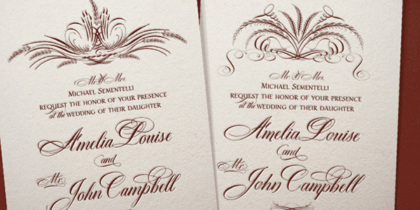
The modern revivals of formal scripts can be associated with the Snell Roundhand by Matthew Carter as well as the Kuenstler Script. The most common usage of the formal script would be on invitations as well as graduation diplomas. The formal script fonts depict a very formal, austere, elegant and elevated look.
The words are meant to be read once but are more ideal as memorabilia, and give the document a more official, intellectual or sober appeal.
The Casual Script
These types of script fonts tend to be less about form and more about movement. If formal scripts are austere and disciplined, the looseness of casual scripts make them dynamic. The strokes could vary considerably and the result could be similar to that of a wet brush being used than a controlled pen nib.
With Postcards Email Builder you can create and edit email templates online without any coding skills! Includes more than 100 components to help you create custom emails templates faster than ever before.
Free Email BuilderFree Email TemplatesThese script typefaces have appeared in the 20th century and with the popularity of photo-composition, the number of casual script forms has increased. These fonts reveal more personality than formal scripts and that is why they are popular for advertising across the Atlantic, including North America and Europe, especially during the 1970s. Popular variations of casual scripts include the Mistral, Kaufmann, and the Brush Script.
Most Usable Script Fonts
Thirsty Rough
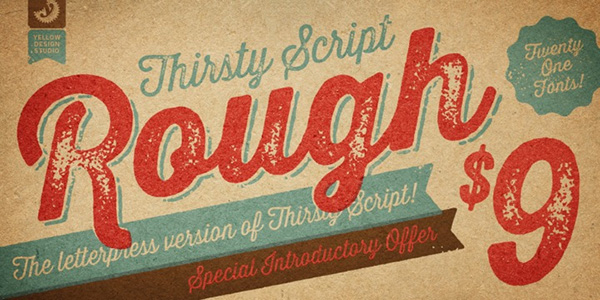
The characteristic trait of the product is indicated on the nameplate: the font is increasingly rough and robust due to grunge spots and touch of textures. However, smooth letterforms help it maintain an elegant and charming look. It comes with stylistic alternates, ligatures, old style numerals, four alternate versions, and multiple language support. Note, for a better result, set anti-aliasing to ‘smooth’ mode.
Thirsty Script
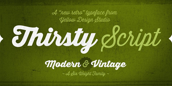
The designer is managed to marry vintage kind of look with modern details resulting in an outstanding typeface with dual nature that is applicable for various types of projects. It is delivered with six weights(including Light and Black), old style figures, ligatures, stylistic alternates, a ton of symbols so that you can write in numerous languages.
If you need a more classic appeal, then you should use contextual alternates. Although by default the spacing between characters is optimized and well-thought-out, the font allows you to manipulate with this aspect through the Photoshop or Illustrator.
Quarzo
Quarzo is a spectacular calligraphy typeface that gives off delicacy and subtle charm. It is marked by consistency on the spacing and letterforms. The beautiful curvy and sprawling touches of uppercase letters reinforce the artistic look. What’s more, the author has prepared an enormous variety of swashes and matching ornaments that assist in yielding the most significant outcome.
With Startup App and Slides App you can build unlimited websites using the online website editor which includes ready-made designed and coded elements, templates and themes.
Try Startup App Try Slides AppOther ProductsPopulaire
Populaire does an excellent job of imitating handwritten lettering. Although at first sight it looks a bit rough and insipid, however after reconsideration it becomes apparent that the typeface has its flair. It boasts of a proper kerning, optimized spacing, and nifty letterforms. The key feature is that each letter has four glyphs that help to add visual variety to the design. It is available with all the essential stuff including a basic set of symbols, punctuation marks, alternates and others.
Jacques & Gilles
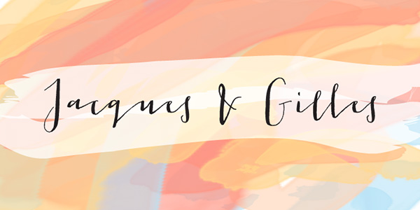
The typeface is an original fusion of two personalities that reveal themselves in uppercase and lowercase modes. It has a lovely human feeling with a whimsical note. Among three hundred glyphs you will find:
- terminal letters;
- alternates;
- ordinals;
- Roman numerals;
- two packs of ornamental stuff made in a line and solid styles.
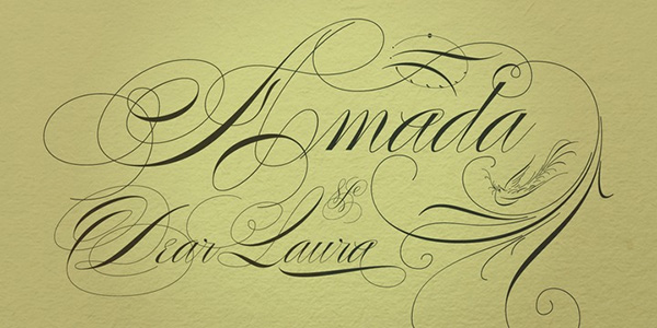
Dom Loves Mary
The font is saturated with romantics and love. Elegant letterforms in tandem with decorative swashes and powerful charisma make this product an ideal tool for displaying texts in wedding invitations or St. Valentine’s cards. Not only does it come with a ton of glyphs and standard OpenType features to support numerous languages, but it also has an extra set of flourish ornaments for finishing off designs.
Chalk Hand Lettering
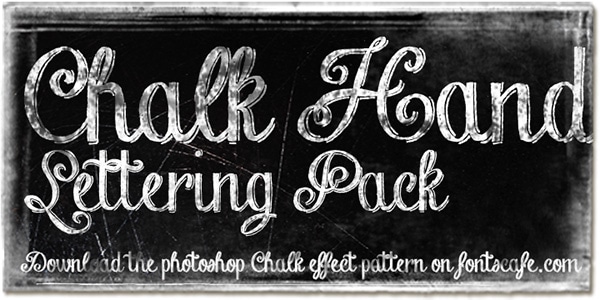
It is here where vintage meets the brutality. The typeface easily stands out from the crowd with its bulky and at the same time exquisite outward. There are two versions of the product: regular and shaded, and an additional pack of hand-drawn elements that plays wonderfully with classic chalkboard textures and dark grunge surfaces.
Platinus Script Pro
This is an admirable hand-style font that is elegant, playful and a bit off-kilter. Both uppercase and lowercase letters look just fine: they are legible, visually-appealing and artistic. The majority of core characters are made in one stroke that gives them a particular charm. Although the typeface is slightly overloaded with loops and swashes, however, this fact does not overwhelm viewers. There are more than five hundred glyphs that allow writing in Latin-based languages.
Aphrodite Pro
Much like the previous example, the product also gets its beauty from lovely loops, swashes, and fluidity inherent to letterforms. It is presented in four options that are appropriate for displaying short text and headlines. Each one has alternates, numerals and ligatures thereby letting owners feel comfortable with Roman writing systems.
Reklame Script
Reklame Script is able to quickly separate the text from the content flow and background with its relatively bold letterforms. It is spiced up with traits inherent to fonts that were used in posters and advertisements of the 50s. This beautiful brush typeface with a handwritten nature possesses loads of typographic features including numerals, ligatures, a core set of glyphs, extended set of characters to speak in CE languages and much more.
Samantha Script
The type boasts of a measured rhythm, optimal kerning, and proper spacing. It has letters with a slightly condensed look that goes perfectly well with its delicate old-timey nature. It is feminine, decorative and legible. You may use
- upright and italic variants;
- regular and bold weights;
- more than one thousand alternates;
- sixty ornaments and forty-five catchwords;
- swash characters that vary in size.
PF Champion Script Pro
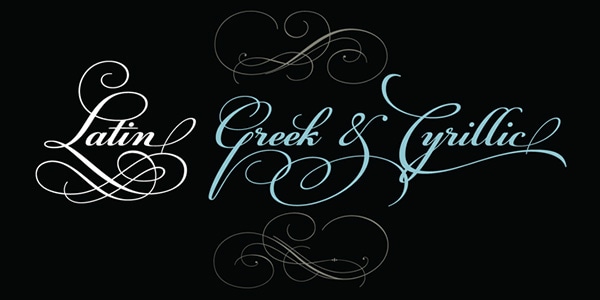
While the previous product looks moderate and discreet, this one is lavish, fancy and ornamental. It is rich in swashes and curly finishing strokes. However, despite its fragile decorative nature, it sustains harsh printing conditions and looks simply outstanding in any graphic design. It lets you speak in different languages including Latin and Cyrillic-based alphabets. Having received several prestigious awards, it is certainly worthy of your attention.
Poem Script Pro
This is another calligraphy script in our collection that is pretty wild, extremely fancy and imaginative. It owes its beauty to 19th-century American pen script style that was enhanced with a spirit of old French fonts. It comprises a ton of calligraphic ornaments, two options (Basic and Pro), and a bulk of glyphs to support CE languages.
Gioviale
The typeface is aimed to work as a tool for displaying both content and titles. It combines letterforms that from one side are florid and fancy, and from another side are casual and even formal. So that it is highly flexible and versatile. It consists of
- more than one thousand glyphs;
- alternate set of swash caps;
- twenty ornaments;
- twenty discretionary ligatures;
- three hundred swashes;
- a standard set of uppercase and alternative letters.
Salamander
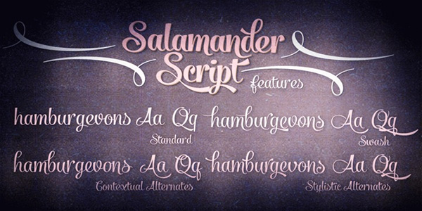
Salamander helps to avoid visual clutter in your design and deliver a message with ease. It is bold and elegant with a playful note and agile letterforms. As befits majority of such type of fonts, the product not only has several variants (Regular and Bold) but it also has an extra set of complementary graphical material that is also presented in normal and large weight. It works great with OpenType-savvy applications.
Metroscript
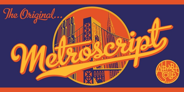
This elegant cursive script with a retro appeal strengthens any old-time atmosphere, leaving its undeniable imprint. It also has a sports vibe that makes it suitable for numerous projects. Thanks to tails that laconically connect symbols with each other, any word set in this type looks complete and harmonious. It comes with
- ligatures;
- swashes;
- alternates;
- foreign accented symbols;
- numerals;
- basic set of characters and much more.
There is also an additional pack of ornaments.
Paris Serif
Paris Serif is an ultra-narrow, delicate and sleek typeface that came from the avant-garde era. Although it is an all-caps font, that makes it fit to showcase headlines rather than copy, yet if you need to add some charm, artistry, and retro allure to short text, it can also do the trick. Thanks to an extended set it supports different languages.
Hummingbird
The author tries to mimic old-fashioned cursive penmanship. As a result, you can get a splendid retro handwritten typeface with a disciplined uniformity, handcrafted kerning and sophisticated look. Contextual alternates are its main weapon that separates it from the others and provides owners with lots of room for creation. As usual, it consists of contextual alternates, swashes, digits and OpenType features.
Belinda
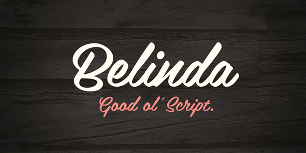
Belinda is a casual brush cursive font script that gives designs a sense of refinement and subtlety. It is skillfully balanced and optimized and well-suited to projects with retro air. It is presented just in one style and one weight so that you get what you see on the screenshot. As the author states, the product is applicable for both titles and short copy.
Insolente
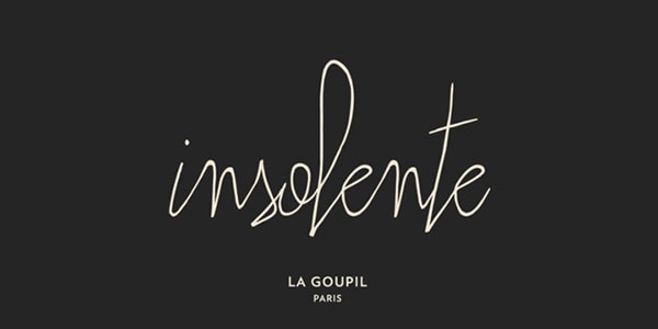
Insolente is a super slim, fragile and sleek typeface with inviting nature and a dose of fun and personality. While the regular version of this original human-like script is highly versatile, another one lets your imagination run wild. Ligatures, double-ligatures, uppercase and lowercase letters, numerals, punctuation marks, ornaments and alternate letters for starting and finishing words are all included in the family package.
Bello
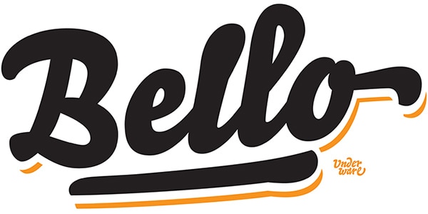
Bello is a bulky, weighty and slightly overwhelming. It is a classic brush script that is composed of soft shapes and smooth lines. It is also a cross-platform OpenType font with an enormous potential. It is available in two styles: Script and Caps that in tandem produces an impressive general effect. A ton of glyphs from various categories enables it to enrich the aesthetics of any design.
Adios Script Pro
Being technically refined, handcrafted and polished, this calligraphy script is a real diamond. It is elegant, fancy, flourished and charismatic. Its ultra-thin letterforms and lovely swashes equip any lettering with a subtle decorative allure. Its glyph coverage is quite impressive: including all sorts of glyphs, it speaks in numerous languages as well as works on various platforms.
Sut
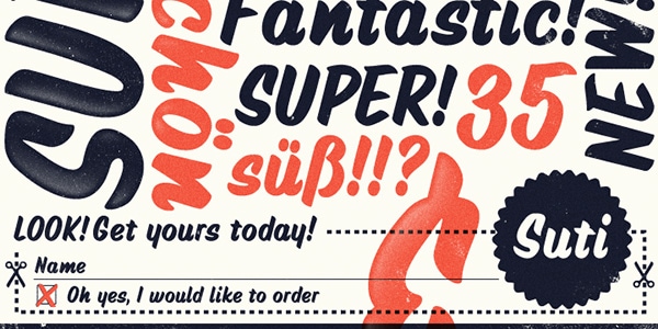
Suti is a classy rounded brush script with a friendly note that naturally adds visual weight to headline. It is an ideal instrument to enrich content in invitations, greeting and business cards. Although it is quite impressive and eye-catching, however, it comes just in one style and with a limited amount of glyphs, so that it is compatible only with Latin-based languages.
Signalist
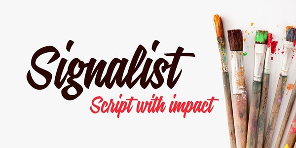
Compared to the previous example, this brush calligraphy font looks sharper and more robust, yet it still has some soft shapes and smoothed angles. It is reinforced by an artistic temperament with a dynamic nature and freestyle traits that give lettering an eye-catching appearance. It fits both contemporary and retro designs. The only drawback is that it can be used only for Roman languages; the extended set allows writing in French, German, Dutch, etc. Unfortunately, Asian languages are overlooked.
Saissant
Saissant is slightly quirky and bizarre; however it is also sleek, slim and neat. This exquisite manuscript typeface has a friendly nature and is saturated with a range of emotions that assists in imitating authentic penmanship. Although it is available only in one style and two license options (one for Desktop and one for web projects), yet its typographic features equip owners with contextual alternates, discretionary ligatures, numerals, and an extra set of symbols to speak in multiple languages.
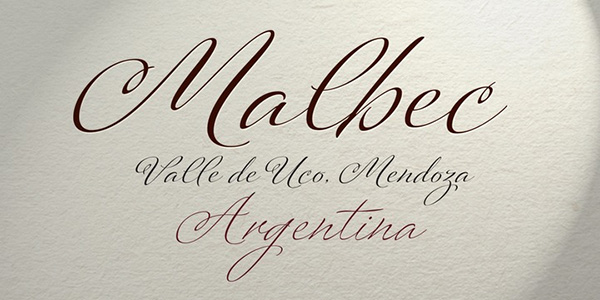
Candy Script
Candy Script bursts with an unflagging energy of Argentinean soul. It is bold, massive, spirited and juicy. It will win you over with its thick brush letterforms that are able to liven up any title and headline, as well as put a particular emphasis on a conveyed message. Including more than six hundred characters it covers stylistic alternates, numerals, punctuation marks, ligatures and some other integral features that are accessible in OpenType-supporting software applications. This splendid display font fits various needs.
Utilizing script fonts
- Always check the point sizes for the script font. The size can add to the readability or legibility of the font. Does the font read well? Make a test print of several types of script fonts and experiment on the right size. More than their aesthetic appeal or legibility, the script font should still be able to deliver the message effectively. Indeed, some script fonts can look crowded when in smaller sizes but can look more alluring and detailed in larger sizes.
- Test the letter spacing when selecting fonts, especially when setting the fonts on curved lines. The flow of the script could get disrupted since it alters the natural movement of the lines. Test if the script will flow naturally even in uneven lines. Script fonts are more ideal for straight lines since the movement of the lines already create a unique harmony on paper. Script has been designed for decorative purposes and so should be used in effective and more beneficial results.
- Script fonts are appealing on their own and they have their own character. Since they are designed to create presence on paper or on screen, it has to be used sparingly to create the desired effect. It is ideal to mix the elegant or dynamic movement of script fonts with more neutral fonts to achieve balance.
- If you took your script handwriting class by heart, you would know that writing Script in all-caps can result to clashing since the capital letters are not designed to flow with other capital letters. If the fonts tend to flow to each other, do not set them apart as that would break the line and cause an ugly mess on the screen or print.
- When using script especially those with swashes and curves, make sure that they are used in shorter lines of texts. The script fonts are used in diplomas and invitations for a reason: they do not contain too long sentences, they can be set apart and the layout emphasizes the font to create a more solid flow. It would be advisable to avoid using script for extended texts or when writing multi-paginated content.
- Scripts have unique qualities and so when used with other scripts; it is like a cat fight. Never mix two scripts on a page or the entire document. This causes the flow of line to be disrupted, eliminating the elegance or dampening the overall effect of using script to help the eyes glide through the words.
Follow these helpful tips and the use of any script font will be a pleasant experience for any amateur or professional graphic designer or layout artist.