
- Home
- Learn
- Design inspiration
- 49 of the most beautiful X/Twitter banners we've seen
49 of the most beautiful X/Twitter banners we've seen

Do you like free stuff? I think the better question is, who doesn’t like free stuff?
The next question: do you realize you have a plethora of free advertisements right at your fingertips? Social media gives you the option to plaster your brand all over your page and completely customize your look. You have profile pictures, headers, and banners galore, but are you utilizing them to their full potential?
Let’s talk designing for X (formerly Twitter)(opens in a new tab or window), and how you can create an X (Twitter) header(opens in a new tab or window) and personalize it to best suit your brand and get the most bang for your (free) buck.
01. Display your work

If you’re an artist you want to get your work out there. Why not use your social media to promote it as much as possible? Here the illustrator Nate Kitch showcases his work in his X (Twitter) banner. You could custom make a banner just for X (Twitter) or use one of your existing pieces. Using work you’ve created adds an element of personalization as well as showing your skills and specialization.
02. Use perspective

Use perspective to excite the eye and draw it forward. The more visually stimulating your banner is, the more likely people will be to visit your page time and time again. Here Andy Hau uses his architecture skills to create an interesting design to pull the viewer forward. It’s abstract enough that you can determine what the image is for yourself, yet it still contains consistent movement.
03. Be consistent

Translate your banner into your profile picture. In Eurico’s X (Twitter) banner, he uses the same color and style as his profile picture, which adds consistency and an overall feeling of unity to the page.
04. Show what you do

Sometimes people may not be familiar with your brand or what you do, so why not use your banner to show them? Headspace, which deals with youth mental health, draws attention to their subject matter in their banner. They show two different young people who both have difficulties and encourage them to talk it out.
05. Use patterns

Repetition pleases the eye and is easy to understand. Seeing repeats of colors and visuals creates interest, and is something that can be evolved over time in your banners. Steve Simpson uses a floral and skeleton pattern with a unified color scheme. The skeleton and select colors are also repeated in his profile picture, which adds to the repetition.
06. Try a limited color palette

Pushing yourself to use a limited color palette can give a retro, unique feel. Throw in some texture and you can have something really special. Computer Arts limited themselves to three colors, but you don’t feel as though anything is lacking. They use the colors in a way that doesn’t feel repetitive, and using the colors as texture as well ties it all together nicely.
07. Don’t be afraid of negative space

Simplicity can be an excellent thing to utilize in your banner. Keeping things clean and simple allows for easy understanding for viewers, and can evoke a feeling of professionalism and a certain chicness. Maurizio Marinelli uses negative space expertly in his banner. A solid, flat color makes up the bulk of it, but the subtle hint of the ‘M.’ in the upper right corner gives just enough of a flair to add character to the banner.
08. Stand for something
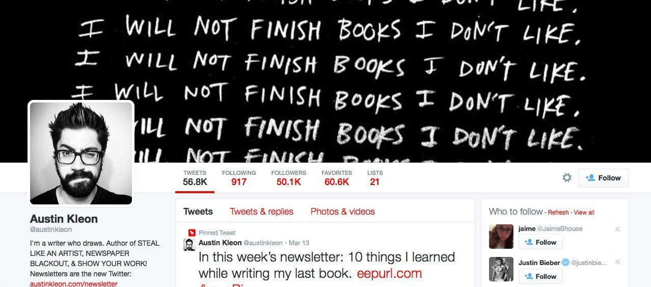
Feel free to express yourself in your banner, no matter what it is. If you show you can take a stand, it shows you have a backbone. While Austin Kleon doesn’t exactly stand for something ‘serious’, he still takes a stand on what he likes and doesn’t like. The text also has a personal feel because it looks handwritten and shifts a little on each line.
09. Use shapes

Don’t be afraid to break up space with shapes. You can treat the shapes as little windows to house different bits of information, like the popular magazine Communication Arts. Triangles break up the plane nicely. Some of the triangles are just black with different colored text, while others show color washed images of work featured in the magazine.
10. Be linear

Use lines to break up areas and create different depths of field. Here Niklas Lundberg uses lines to break up the composition and make the hand feel as though it is reaching forward. It gives a two dimensional space a three dimensional feel.
11. Create a scene

Tell a story with your banner. That’s what banners are for, telling stories visually. Erwin Kho shows a story of a futuristic environment that he created. It’s more interesting to look at something you can interpret, like a scene, than it is to look at a flat piece of work with no meaning.
12. Be proud

Show what you’ve been doing. Be proud of what you do and show it off, plus it makes for regular updates once you’ve finished something up. Am I Collective, an illustration studio, updates their banner whenever they finish a big project, like the one you see here.
13. Show process

If your work involves a type of process, show it. Showing how you work gives a deeper glimpse into who you are, and shows your entire range of skills. Eunike Nugroho created a banner that shows her work from start to finish. You can see where it began and where it ended, and get a feel for her working style.
14. Create a personal connection

Make your brand more personable by showing individuals with a connection to it. Designboom shows employees and people featured in their magazine holding ‘boom’ pins, signifying their support of the brand. It gives a face to those behind the magazine and makes it feel much more personal.
15. Arrange a space

Set up a little area that feels cozy and matches your brand. It makes your page feel a lot more personable when you can see someone’s environment. Lindsey Riel did a great job of showing a space. It is clean, simple, and organized, yet still feels comfortable.
16. Show your unique style

If you have a unique style, showcase it on your banner. In Dominic Wilcox’s banner, he showcases his unique illustration style along with an accomplishment of his – his published book. Feel free to show your unique traits and accomplishments in your banner. It adds to your credibility as a brand and makes you look more reputable.
17. Use subtle texture

Adding in subtle textures to your graphics and photographs can bring them out of the flat, two dimensional space. Dana Fox uses textures in her banner illustrations to give them more character and a more organic, natural feel.
18. Give a face to the name

Seeing a brand online is impersonal. A lot of the time it feels like you’re interacting with just a screen. Use your banner to show who’s behind that screen, it’ll encourage people to interact more with your brand. Knotch shows some of their employees on their banner, and you can see the different types of people and personalities that make their company up.
19. Have a theme

Whether you choose a color, a design, or a pattern, having a theme creates a feeling of unity. Behance, an online portfolio website, chose to stick with the theme of the color blue, matching their branding. They also have a pattern of users’ work in the background, adding to the theme.
20. Use a background texture

Using a texture in the background of your banner can add a little something extra to push it over the edge. AIGA could have had the announcement of their awards gala on a simple black background, but adding in the sparkling star effect gives it an extra feel of elegance. Different textures can evoke different feelings, all depending on what your brand is going for.
21. Play with scale
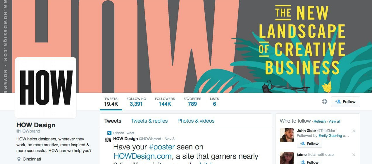
Don’t be afraid to push the limits of your typography in your banner. Play with different sized text pairings and colors to create a unique design in its own right. HOW Design uses large scaled type alongside smaller type to create a dominance in their banner. You know the brand, HOW, is most important, and then you see the message to the right, explaining what they’re all about.
22. Have a message
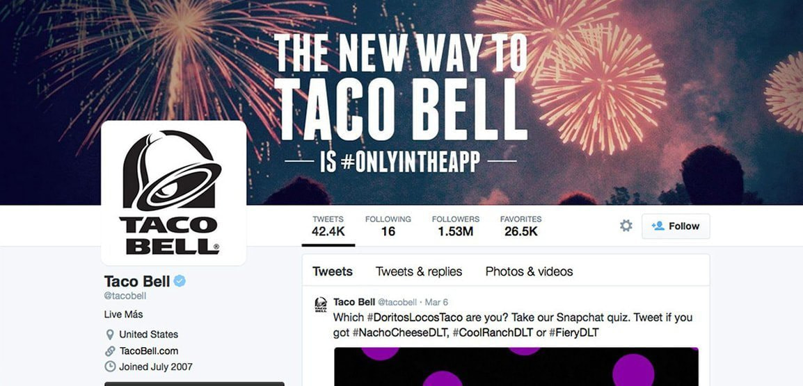
Use your banner to showcase a message you don’t want to tweet out all the time.Your banner can change as your messages change, just be sure to update and don’t leave an old promotion up. Taco Bell uses their X (Twitter) banner to promote their new app, and they even include a hashtag that should be used, killing two birds with one stone.
23. Pair design elements with photography
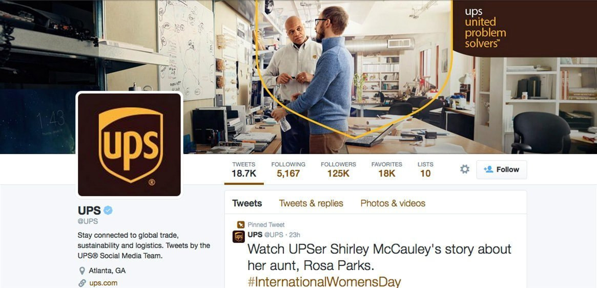
Incorporate design elements and graphics into your photographs to add another layer of depth. UPS uses their logo shield shape to encompass two workers, showing their employees are invested in the brand, as well as showing their clever acronym of united problem solvers.
24. Show your work environment
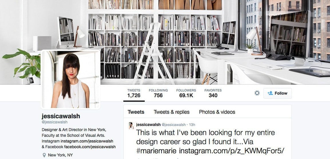
If your work environment influences the work you produce, don’t be afraid to show it. Sharing your private space with viewers gives them a glimpse into your world, and you seem more approachable. Jessica Walsh shows her office area in her banner. You can learn a lot about a person by the environment they surround themselves with, and by seeing her environment, you feel like you know Jessica better.
25. Be creative
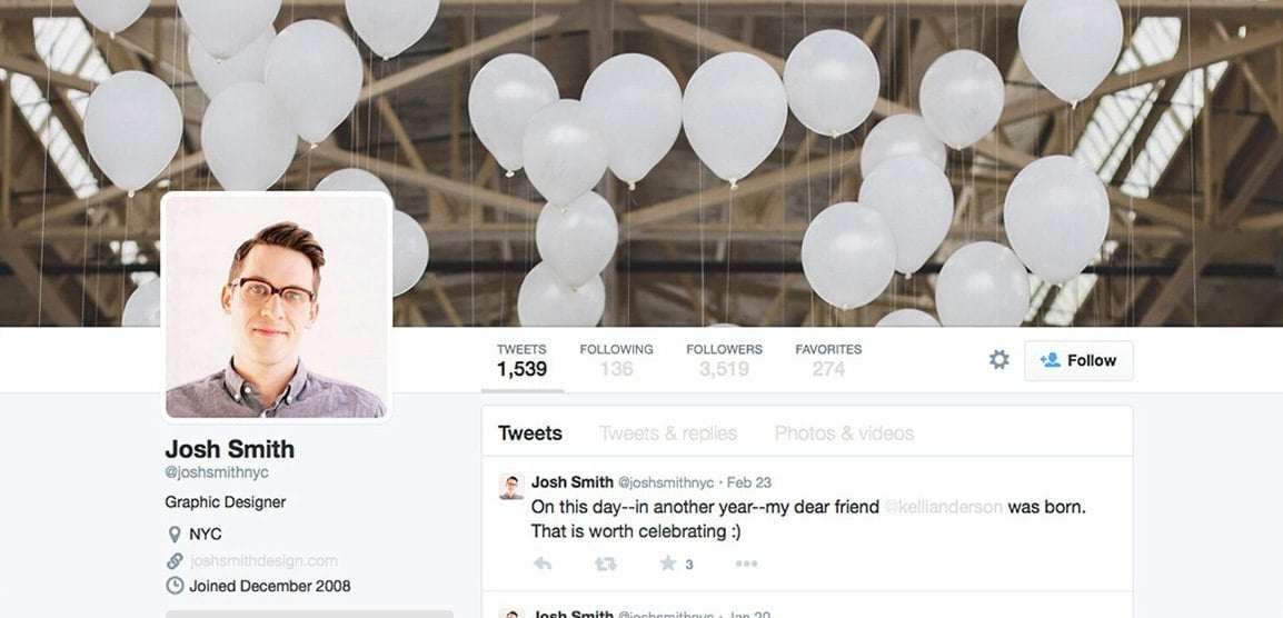
Try to think of visuals that may not be expected in your X (Twitter) banner and get creative shooting some interesting photos. Josh Smith uses white balloons in his banner. While they may have a significant meaning to Josh, the viewer just sees an artsy shot of balloons (people love artsy looking things).
26. Don’t be straightforward
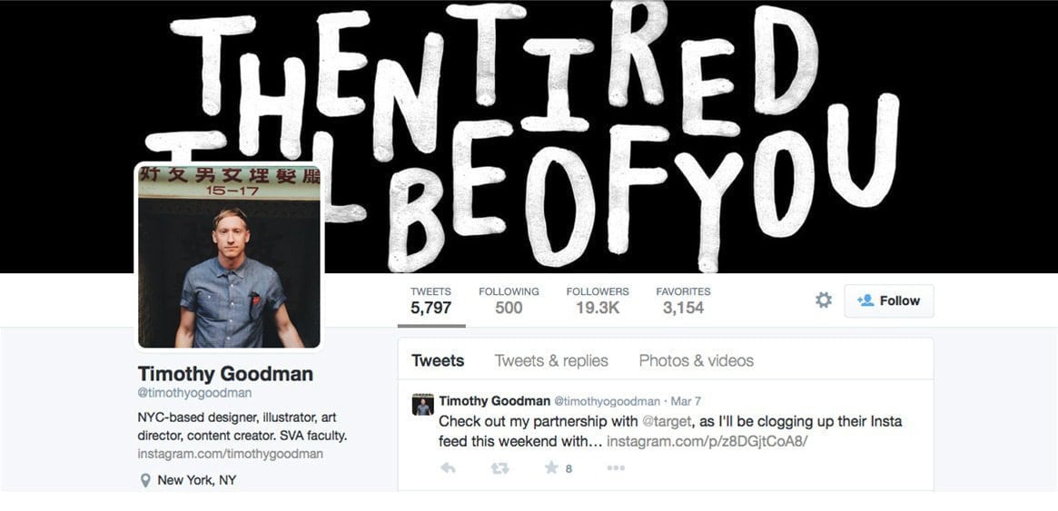
Make the viewer work a bit to understand your message. Everything laid out simply isn’t challenging, and can get a bit boring. Timothy Goodman uses an illustrated quote in his banner. The quote isn’t just straight from left to right and easy to read, it’s a bit skewed and jumbled, making it a little challenging to read right away. Arranging the letters in this way gives them their own design, and pulls them away from just being a quote on a solid background.
27. Glimpse into your life
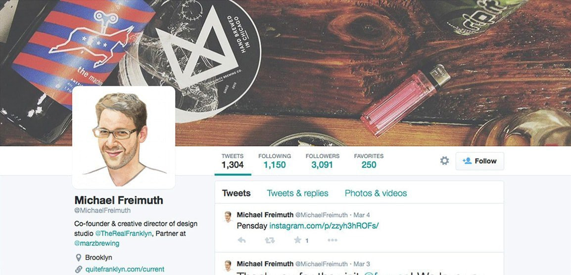
Sometimes stepping outside your workspace and offering a glimpse into your personal life can reveal a lot of information. It shows who you are as a person, and not just as a professional. Michael Freimuth has a set up of things he uses in his daily life. By seeing these items, you get more of a feel of his character, and not just his design work.
28. Break the plane
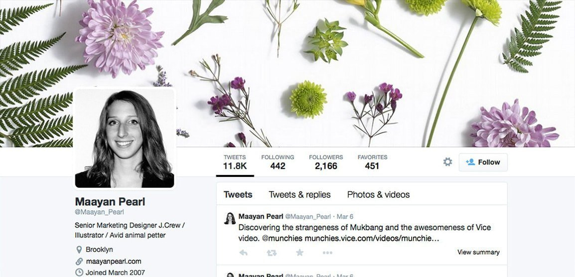
Don’t feel constrained to the dimensions your banner has. Break up the space by allowing things to run off the edges. Maayan Pearl uses flowers and other plants to create her banner, but she didn’t arrange them so perfectly they all fit in the space. It feels more natural and not so formulaic to allow for a bit of ‘error’ when you’re working with photographs.
29. Consider different mediums

If you specialize in something unique, utilize your talents in your banner. If you can make awesome butter sculptures, use an awesome butter sculpture on your page. If you’re like Owen Gildersleeve and you do awesome things with cut paper, show what you can do with cut paper. The subtle hint of the Exacto blade also lends to the image, making sure you understand these shapes were cut out and aren’t just digitally done.
30. Use blocks of color
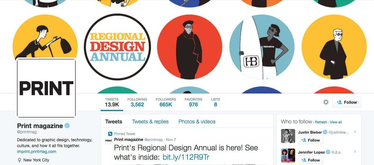
Bright, eye catching color grabs attention. Grab attention with your banner by using bright pops of color like Print Magazine does in their banner. The individual pops of color alongside the white balances nicely, and the simple black and white illustrations inside the color pops provide a break for the eye.
31. Show the world through your eyes
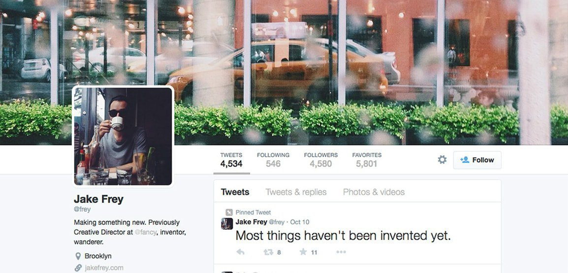
Everyone sees things differently, so why not show others how you perceive what’s around you? Here Jake Frey shows how sees Brooklyn. You’re looking at a beautiful set of windows surrounded by green shrubbery, yet you can see the hustle and bustle of the city in the reflection. It offers two different takes on life in the city, and creates a beautiful image.
32. Make a collage
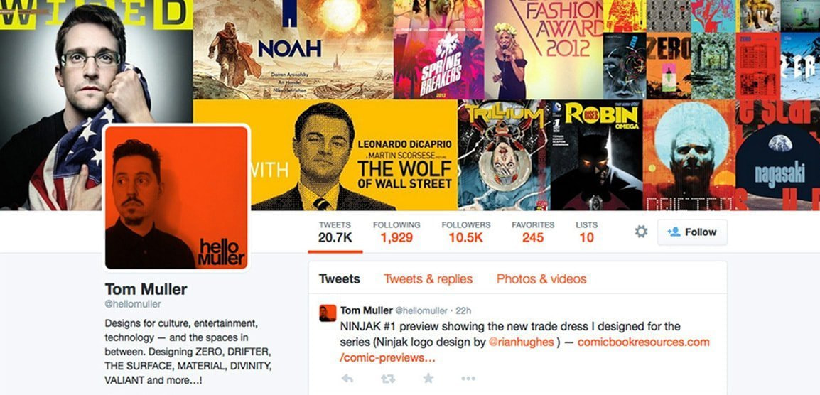
If you do tons of awesome stuff and you want to show it all, go right ahead. Create collages of your work and arrange them so they all fit neatly in the space. Tom Muller has done a lot of great things for the entertainment industry, and to show his wide range of clients he made a collaged banner. Think of this kind of banner as a mini portfolio sample that could prompt people to inquire more about your work.
33. Have character

Everyone is unique in their own way, and feel free to express your uniqueness in your X (Twitter) space. Whether it be your profession, your hobbies, your appearance, or anything else, show what makes you stand out from the rest. In Esymai’s banner, she shows the very top of her head, bun clad (if you look at her logo, there’s the bun again). If you have a distinctive style, like always wearing a bun, use it in your branding and carry it over to your social media.
34. Have fun with icons

Icons are simple and fun. Use them in your banner to give an interesting effect. The icons could range from things you enjoy to random items and knick knacks (really they could be whatever you want). Lotta Nieminen uses icons of nature and outdoor activities. By seeing these images, you assume she likes being active outdoors, which gives you a glimpse into her life.
35. Don’t complicate things
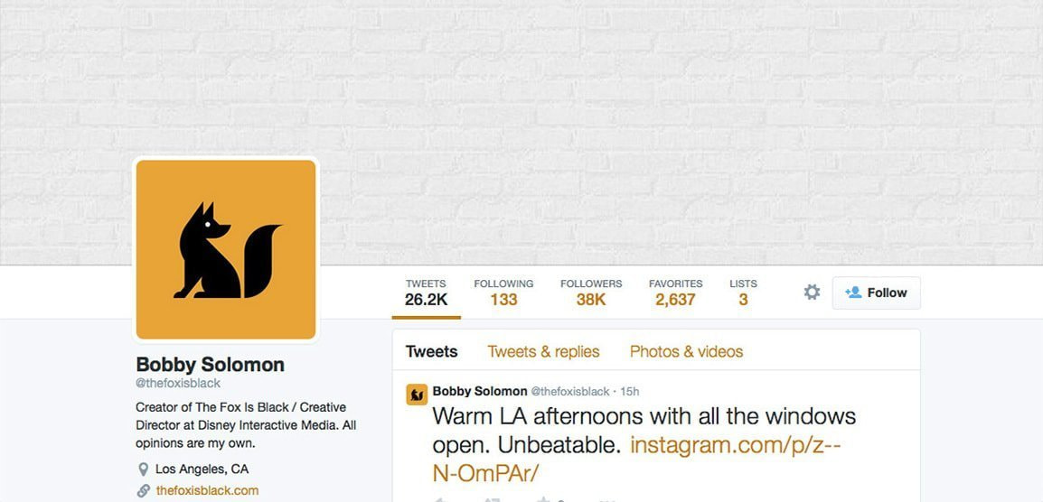
Sometimes simplicity is the best solution. It’s not always necessary to crowd your space with tons of information when a clean image will do. Bobby Solomon uses an incredibly simple banner. At first glance, it appears to just be an off-white box, but upon further inspection you see it’s a painted brick wall. The subtlety of the image pairs incredibly well with the bright yellow of the profile image.
36. Use contrast
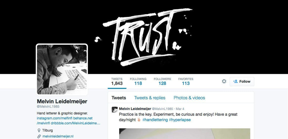
Contrast is interesting in imagery. Using a high contrast like black against white gives simple illustrations a bit of a boost. Melvin Leidelmeijer uses a high contrast to give his hand lettered banner more oomph.
37. Crop it
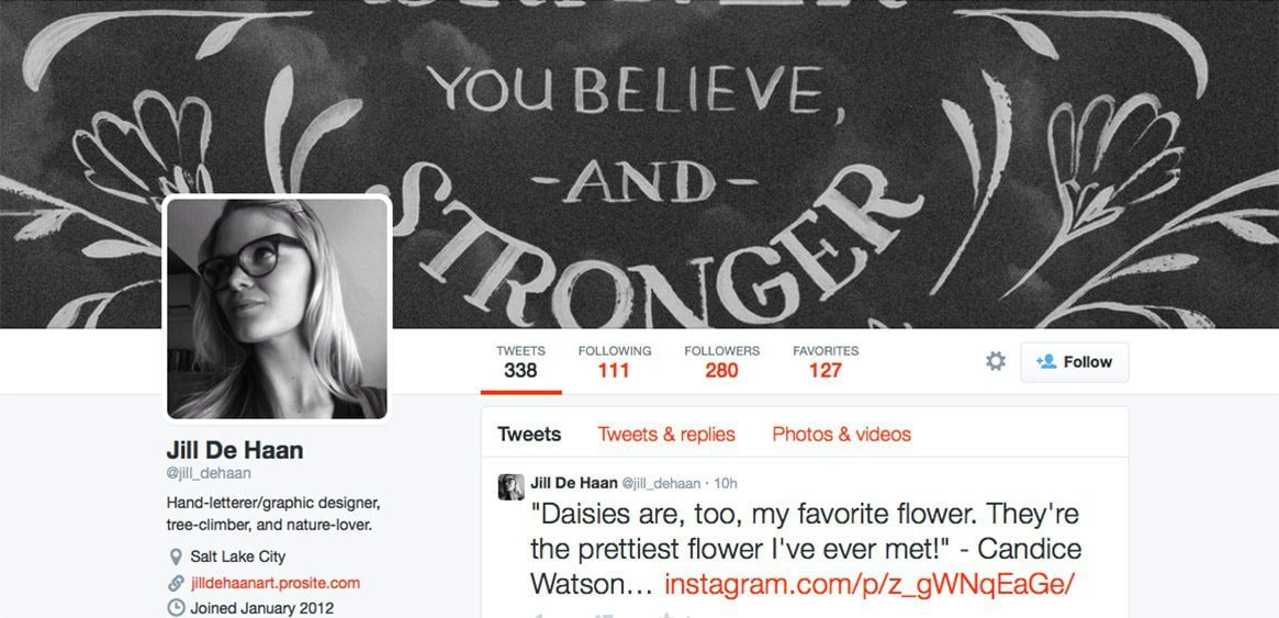
Don’t be afraid to cut off parts of your work or an image. It entices the viewer to find the image to see it in its entirety. Jill De Haan cropped one of her hand lettered illustrations in her banner. You can see the overall gist of what’s going on, but you’re left with the desire for more, which encourages you to visit her other pages or search through her feed to see if she posted the whole image.
38. Combine elements
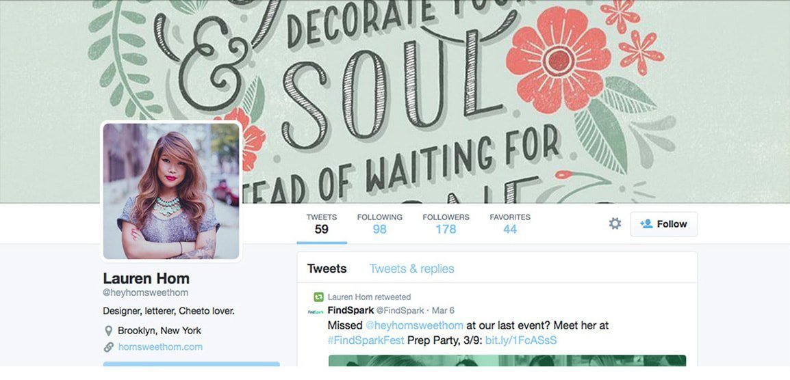
If you’re a multifaceted brand, show everything you can do. Here Lauren Hom shows her hand lettering skills paired with design and illustration. You see what all she can do and it makes her seem just that much more talented. Don’t be afraid to ‘show off’ (but be humble) and showcase all of your talents.
39. Know when enough is enough

Sometimes showing everything you’ve ever done can be a bit overwhelming. Limiting yourself and only showing the best of the best can set you apart from the rest. Here Brooke Shaden only shows a few of her photographs. It’s similar to the collage, but much more toned down. Since each photograph is so powerful and has so much going on, they benefit from not being overcrowded.
40. Get crafty
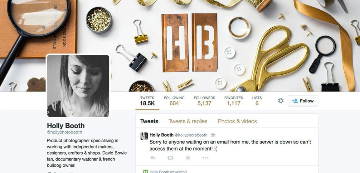
Get your hands dirty and make something for your banner. It could be as simple as arranging flowers and taking a photograph, or as cool as what Holly Booth did, cutting out your initials in pieces of metal. It creates a little scene and works well with the surrounding elements. Whatever you create should connect with what you do.
41. Think outside the box
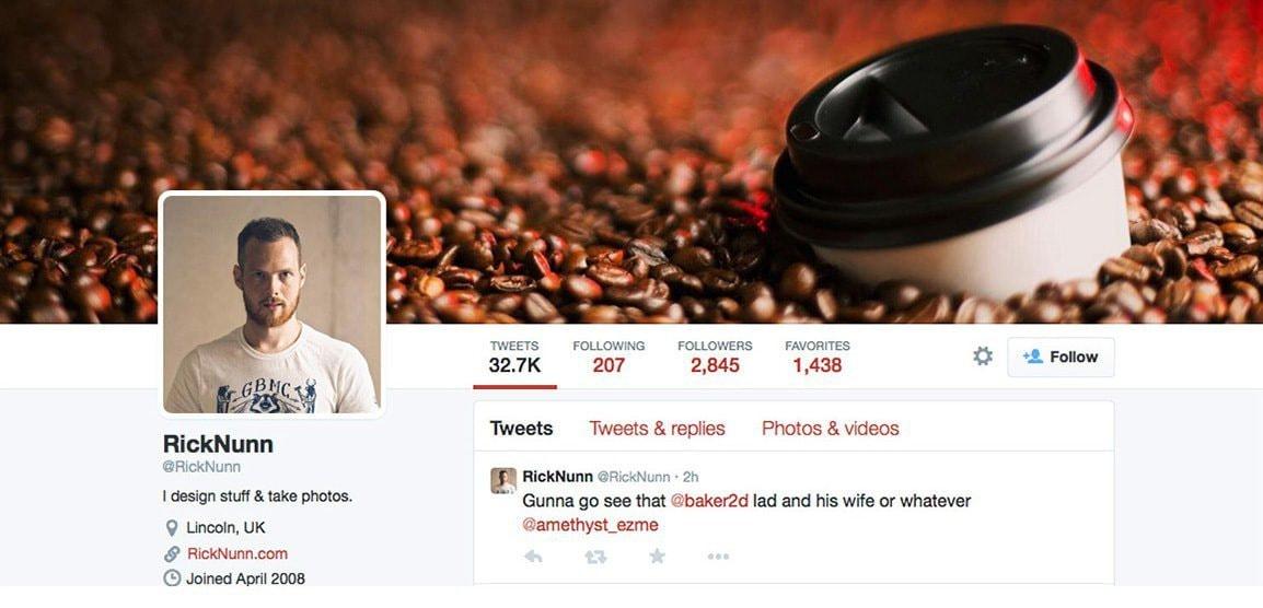
Instead of showing stuff that you do, you can show things that you like. Maybe you’re really into a certain breed of dog, or maybe you really like mountain climbing, maybe you love to cook. Show something you’re passionate about. Rick Nunn has a high quality photo of coffee on his banner. You get the idea that Rick really likes coffee, as well as photography.
42. Color outside the lines

We’ve been told since we were toddlers that you’re supposed to color between the lines. Now that we’re older, we can color wherever we want. In this banner, Happy Cog moves their color just outside the lines, leaving interesting gaps and overlaps that really lends to the images. Don’t be afraid to break conventions and go against the grain.
43. Show achievements
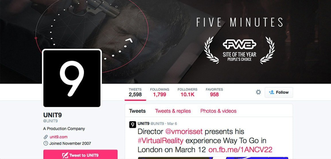
If you’ve received prestigious awards or recognition, let people know. Achievements show that you know what you’re doing and are ready for business. Unit 9 won an award for site of the year from People’s Choice and they incorporated that into their banner. Even if you have no idea who Unit 9 is, you automatically think they are of a certain caliber due to their award.
44. Have a sense of humor

Try to be funny in your X (Twitter) banner. Quick wit and funny images can go a long way and brighten up a viewer’s day. If it’s funny enough, they may even share your page on their social media. The Partners banner is a good example of wit with a purpose. They show the image of a chalk outline with the text inside, and you understand that brands who aren’t willing to take chances die out. It takes an issue many in the industry understand and puts a humorous spin on it.
45. Be dimensional

The banner on AKQA’s X (Twitter) is incredibly simple, yet still stands out. The three dimensional letters help bring more focus and attention to the banner, and creates more depth within the simple, white background and letters.
46. Use movement
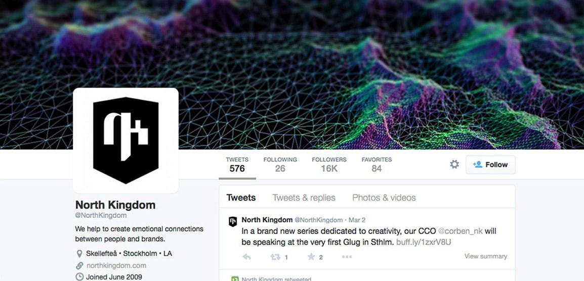
Having movement within your banner will make it more visually appealing. Your eye will travel across the page easier and be more interested in what’s going on. North Kingdom has a lot of movement in their banner. The movement is achieved through transitions of color and shape. The areas that are spread out flow into the areas that are more condensed and create a dynamic look.
47. Feature something
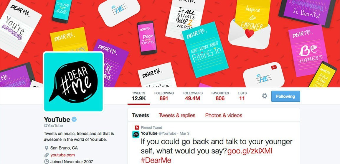
If your brand features different things, whether it be a series, new products, weekly articles, etc. show it on your page. YouTube is currently showing a trend they’re seeing online, the Dear Me series many people are creating videos about (what they’d say to their younger selves). Stay current and keep things moving. The more up to date your images are, the more likely people will look at it.
48. Create a story
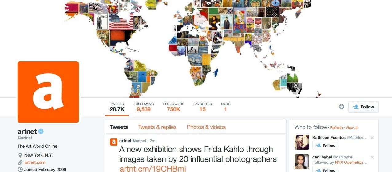
Tell a story with your banner in whatever way you believe is best for your brand. In Artnet’s banner, you get the feel of what they’re all about just by the imagery they’ve chosen. They show the world and different types of art all throughout, which is exactly what they’re company does.
49. Relate to your brand
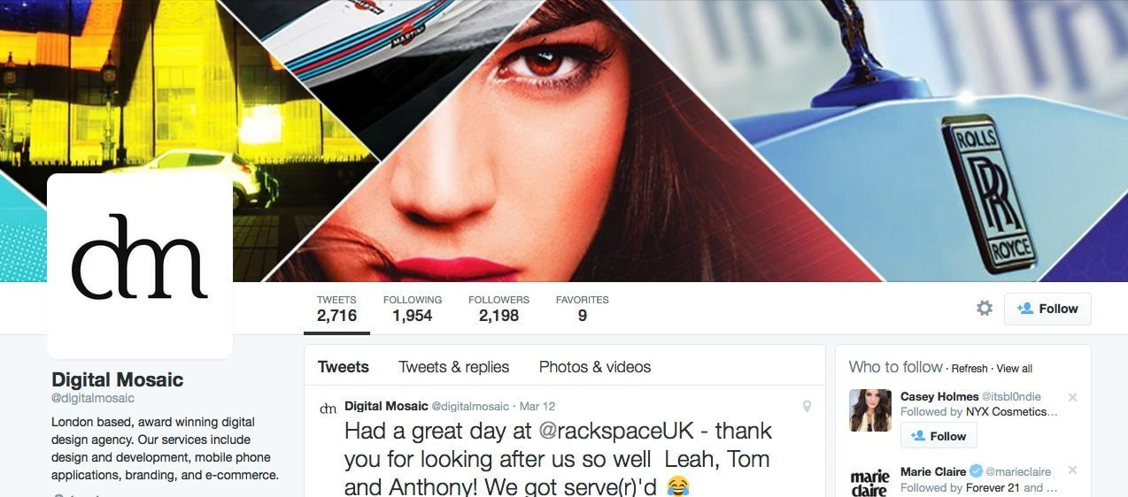
If you can somehow visually represent your brand, do it. Here Digital Mosaic, a digital design agency, showcases what they do in a mosaic style format. Not only does it help break up space and show what they do in their company, but it does it in a bit of a tongue-in-cheek way.
Now that you’ve seen a ton of awesome X (Twitter) header designs(opens in a new tab or window), how could you not feel inspired? When you’re creating your own, just be sure to remember the dimensions you’re working within (1500px x 500px) so you know exactly what your image will look like without having to upload it over and over.
Follow any of these tips and you’ll be sure to have one awesome banner. It may even end up on a list just like this.
Inspired? You might also be interested in these awesome articles:

Written by
Caitlin Jordan


