This page only shows primary logo variants. For other related logos and images, see:
|
1938[]
On April 18, 1938, Superman made his debut in Action Comics #1 (cover dated June) with this logo on his chest. This logo was designed by Joe Shuster and it was shaped like a yellow heraldic crest or a police badge with a red "S" inside.
It only made a really short appearance in the cover of the first Action Comics and it was never used inside of the issue itself. However, it can be seen in some early sketches of 1934 and 1936.[1][2]
1938–1939[]
When Action Comics #1 was published, the artwork inside the comic was completely different from the cover, including the logo of the character. It was designed as a red triangle with a yellow background. The "S" also was changed. This logo was featured in several comics, it was often colored entirely yellow, likely by colorists trying to save time.[2]
Logo used in Action Comics #7
1939–1940[]
| Designer:
|
Joe Shuster
Leo O'Mealia
|
|
|
|
In Superman #1 there weren't many changes in the logo, except that the triangle became thicker, the outline was removed, and the "S" was designed with a stylized look. Like the previous logo, it was often colored entirely yellow.[2]
February 1940–1946[]
|
|
|
| Launched:
|
February 15, 1940
|
|
In Superman #4 the logo had a drastic redesign - the red triangle was replaced with a white shield-like emblem with a black background and the "S" developed serifs.[2][3] This logo later appeared in the upper corner of Action Comics covers until 1946.
This logo resembles the one used in the costume of Ray Middleton, who played Superman at the New York World's Fair in 1939.
July 1940[]
| Designer:
|
Joe Shuster
Paul Cassidy
|
|
|
|
In Superman #6 the logo once again became a triangle, but this time it was yellow and bigger; also the "S" became a little more robust and the serifs are now more highlighted.[3] This design was also seen in the original Hugh J. Ward painting.
1940–1941[]
In Action Comics #26, artist Wayne Boring designed the shield wider and pentagon-shaped. This was also the first time the logo became five-sided, although some artists still drew it with three sides.[2]
Logo used in Action Comics #26
1941–1943[]
|
|
|
| Launched:
|
January 3, 1941
|
|
In Superman #9 the shield was redesigned to have a large, sharp upper serif. Like the 1938 logo, this one was sometimes colored yellow.[2]
1942[]
| Designer:
|
H. J. Ward (original)
Stanley Kaye/Joe Szokoli (redesign)
|
|
|
|
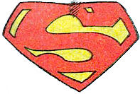
The logo as seen in the retouched H. J. Ward painting.[3] The original painting actually had the logo from Superman #6 but when it was repainted by artists Stanley Kaye and Joe Szokoli in 1942 (as result of a lawsuit by Harry Donenfeld) it was changed to a design that resembles the logo from Superman #9.[4] However, this logo shows some differences from the one in the aforementioned comic: the "S" looks cleaner and more stylized and the shield is six-sided instead of five.
1943[]
1943–1944, 1947[]
|
|
|
| Launched:
|
October 30, 1943
|
|
In Superman #26 the logo was designed like a diamond-shaped shield with a rounded bottom.[3] It later re-appeared in Action Comics #111.[5]
1944–1955[]
|
|
|
| Launched:
|
August 26, 1944
|
|
In that same year, DC Comics wanted to trademark Superman's symbol (just like how Disney did it with Mickey Mouse during that time), so Wayne Boring, who was then the primary penciller of Superman, changed the design of the "S" to the one we all know and love today, having a vertical upper serif with a diagonal left edge and a rounded bottom serif. First appearing in Superman #31, the trademark applied to the basic design and all variations and it was used during the rest of the Golden Age era.[1]
1955–1986[]
When Curt Swan became the primary penciler of Superman, he slightly modified Boring's design, making the "S" thicker and larger than before. This logo was used during the Silver Age and Bronze Age eras of DC Comics until the end of the comic book series Crisis on Infinite Earths. The last time this logo was seen was in the comic book Superman: Whatever Happened to the Man of Tomorrow? (Superman #423), which was Swan's last work as regular artist on the character.[1]
1958–1985[]
Another shield design made by Kurt Schaffenberger (who made his debut as a penciler in Superman Vol 1, #121) was used in tandem with Swan's during the Silver Age and Bronze Age. Compared to the one below, Schaffenberger's design shows that the space on the top of the "S" was reduced and the bottom of the shield seems asymmetrical.[6] The shield design was also used as both Superboy and Supergirl's chest symbols in both the Silver Age and Bronze Age comics.
1967–1978, 2016–2018[]

|
SVG NEEDED
|
The shield seen in most comic book covers made by Neal Adams (first debuting in Action Comics #356), as well as in the comics illustrated by the same artist, like Superman vs. Muhammad Ali. Addams would return working in Superman comics wit the release of Superman: Coming of the Supermen. In 2018, he also draw five-page story titled "The Game" for the Action Comics: 80 Years of Superman hardcover collection.
1968–present[]
|
|
|
| Launched:
|
September 17, 1968
|
|
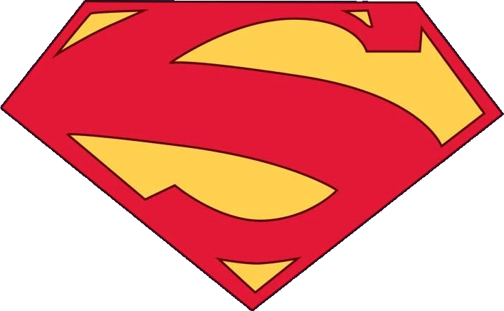
Superman's most-well known logo originally appeared at the right-bottom corner of the cover art from Superman (Vol 1) #211 which was also drawn by Curt Swan.[7] The shield resembles Boring's design only that the bottom was made triangular instead of rounded (probably by accident due to the low space where the logo was placed). For over 20 years, the logo wouldn't be seen in the comics again until the release of the comic-book series Adventures of Superman (specifically in the cover of issue #437).[8] Since the 1970's, however, it has been used for merchandise purposes, mainly in T-shirts[9] (it also made an appearance in the opening of the 1978 movie).[10] Throughout the years, the shield underwent several minor modifications to its appearance, depending on the style of the artist who is drawing it, but the main design was always kept the same. The design was also used as Supergirl's current chest symbol.
1986–1988[]
After the events of Infinite Crisis, the continuity of the DC Universe was rebooted, included Superman's, initiating the Post-Crisis/Modern Age era of DC. As a result, the storyline of the franchise was retold in The Man of Steel #1, introducing this logo designed by John Byrne.[1] In contrast with Swan's logo, most of its features were over-exaggerated - for example the "S" looks more robust and the bottom serif is highlighted. Also the shield itself is now shaped like an upside-down pentagon instead of a diamond. This logo was used until Bryne departed the Superman comics titles in 1988 (although he briefly returned as a guest inker in Adventures of Superman Annual #2 and Superman #50).[11]
1986–1999[]
|
|
|
| Launched:
|
September 23, 1986
|
|
In 1987, DC Comics launched the Adventures of Superman series, which continued the numbering of the cancelled main Superman series from issue #424. Jerry Ordway, who was one of the creators and main pencilers of the series (until issue #455), refreshed Byrne's emblem, putting more focus on the middle of the "S" and making the bottom serif less highlighted. Ordway worked on the main Superman titles as a penciler until 1999.[12]
1989–1995[]
Dan Jurgen's design was more faithful to the original shield than the other examples shown before, although his logo seems more shrinked and cartoonish. While the artist had already been collaborating on the character since Adventures of Superman #452, his works became much more recognized in Amargeddon 2001 and the Death of Superman storyline (he was also responsible of the creation of Cygborg Superman in Reign of Supermen). Jurgen later continued working as penciler in Superman Vol. 2 until 1995 and as a writer till 1999.[13]
1993–present[]
After Superman's death in the Funeral of a Friend storyilne, DC began using the shield as part of an advertising campaign - where it was seen at the top corner of comic covers and in the polybags that contained Superman (Vol. 2) #75 and Adventures of Superman #500. Designed by Tom Grummet (who also worked on Death of Superman and is responsible for creating the most famous version of Superboy) harkens back to the original 1968 shield with some changes that are not so noticable at first glance, like in the left edge and the bottom serif of the "S". This the default design that you would mostly see in the comics in different art-styles. It was also used as Supergirl's chest symbol.
In 2011, with the reboot of New 52, this logo was replaced in the main comic titles with a much more modern design made by Jim lee, although it was still used in other spin-off/non-canonical comics and other type of media. It was later brought back when Rebirth was released in 2016.
1998–2009[]
Following the success of the spin-off mini-series Kingdom Come in 1996, Alex Ross became one of the many regular Superman artists, starting with the comic book Superman Forever (cover only). Ross respects the traditional design while taking some liberties with it, like making the "S" more rounded and tweaking the lower point of the shield. Ross would later work on other Superman and DC titles during the 2000's, with JSA Kingdom Come Special: Superman being his most recent work.[14]
Trivia[]
- In most of the illustrations, the shield appears to be bigger, covering more the chest of the character than in other incarnations.
- Despite this logo is no longer being seen in the comics, it is currently used in some merchandise, like LEGO minifigures.
2001–2002[]
|
|
|
| Launched:
|
October 10, 2001
|
|
In Superman (Vol. 2) #175, the yellow background of Superman's shield turned "black", as a symbol of mourning due to sad events that made him change it. This appearance lasted for a period of time, and it later returned to the original color scheme.[2][3]
This version of the logo was formerly used by another member of the Superman Family: Superboy.
2004–2005[]
|
|
SVG NEEDED
|
This logo was used in the conntrovesial For Tomorrow storyline (Superman (Vol. 2) #204–215) illustrated by Jim Lee. Compared to other iterations, Lee made the "S" squery and the lower serif was missing in most cases. This would probably served as basis for his New 52 design (see below).
1997–1998[]
In Superman (Vol. 2) #123, Superman was given electrical powers included a completely new outfit with a reimagined shield designed by artist Ron Krentz. The logo, instead of being red and yellow/gold, was designed white and blue with stylized lightning bolt "S".[1][2]
One year later, when the character was split in two entities (blue and red) a red variation of the logo was revealed; this only lasted for a few issues, when Superman went back to his "classic-look."
2011–2016[]
After the events of Flashpoint, the DC Universe was once again rebooted, and the continuity of Superman's franchise was changed completely.
2011[]
|
|
|
| Launched:
|
September 7, 2011
|
|
In Action Comics (Vol. 2) #1 a new version of Superman debuted and instead of wearing his classic suit, he wears a T-shirt with this shield on his chest, as well as jeans, boots and a small cape attached to his back.
Designed by artist Rags Morales, this logo is similar to the 1968 shield, but with the difference that the center of the "S" looks thicker and the red tone is darker and the yellow tone its more pale. This logo only appeared in the first four issues of Action Comics (Vol. 2) until it was replaced by the one below.
2011–2012, 2015[]
|
|
SVG NEEDED
|
|
|
|
| Launched:
|
August 31, 2011
|
|
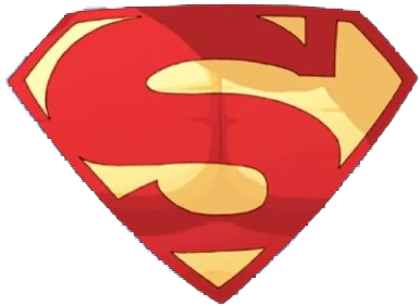
On Justice League (Vol. 2) #1, Superman started to wear a "Kryptonian Armor" with this shield on his chest, made by Jim Lee, which is a complete modernization of the classic logo. The "S" was given a more futuristic look and the lower serif has been removed (though some artists continued drawing it regardless).[2] This logo was used in Justice League (Vol. 2) until issue 12, though Lee would go back to work on the series from issue 38 to 47.
2012–2016[]
|
|
|
| Launched:
|
August 29, 2012
|
|
In Superman Annual (Vol. 3) #1, Kenneth Rocartof revised Morales' design, making it straighter and more symmetrical with the lower serif being removed. This logo was used during the New 52 Era of DC Comics, until it was concluded in 2016.
References[]
|
|
| Predecessors
WarnerMedia | Discovery, Inc.
(National Cleaning Contractors | Kinney Parking System | Warner Communications | Time Inc. | Turner Broadcasting System | Discovery Holding Company | Scripps Networks Interactive)
Warner Bros. Entertainment
WB Motion Picture Group:
Warner Bros. Pictures | Warner Bros. Pictures Animation | DC Studios | DC Kids Movies | Cartoon Network Movies | Castle Rock Entertainment | CNN Films | Flagship Entertainment Group | New Line Cinema | Spyglass Media Group1 | Wang Film Productions
WB Television Group:
Domestic units: Warner Bros. Television Studios | Warner Horizon Unscripted Television | Alloy Entertainment | Blue Ribbon Content | Telepictures | A Very Good Production | Cartoon Network Studios (Williams Street) | Warner Bros. Animation (Classic Animation) | The CW3 (Originals | Plus | Sports) | Cartoon Network Productions | Max Originals
International units: Cartoon Network Latin America Original Productions | Warner Bros. International Television Production (Australia | Belgium (Eyeworks | Savage Film) | Germany | Netherlands (Blazhoffski | Hollands Licht) | Spain | UK (Renegade Pictures | Ricochet | Twenty Twenty | Wall to Wall | Hanna-Barbera Studios Europe)
Other assets:
Fandango Media (assets)11 | The Wolper Organization | Turner Entertainment Co. | Warner Bros. Theatre Ventures | WaterTower Music
Warner Bros. Discovery Global Streaming & Interactive Entertainment
General streaming:
Max (Netherlands and Belgium) | Discovery+ (India | UK & Ireland) | Discovery GO (United States | Canada) | Player.pl (Poland) | BluTV | ThreeNow
Specialty streaming:
Discovery VR | Motor Trend On Demand | Food Network Kitchen
WB Interactive Entertainment:
Warner Bros. Games | Warner Play | WB Games Boston | WB Games Montréal | WB Games New York | WB Games San Diego | WB Games San Francisco | Avalanche Software | Cartoon Network Games | DC Kids Interactive | Adult Swim Games | Monolith Productions | NetherRealm Studios | Portkey Games | Rocksteady Studios | TT Games (Traveller's Tales | TT Games Publishing | TT Fusion | TT Odyssey)
Other assets:
Warner Bros. Digital Networks (OneFifty | Stage 13 | Uninterrupted | IStreamPlanet) | Food.com | Discovery Digital Studios
CNN Worldwide
U.S. domestic networks
CNN
International channels:
CNN International | CNN en Español (US and Latin America, Spanish) | CNN Brasil18 (Brazilian Portuguese) | CNN Chile (Spanish) | CNN Indonesia19 (Indonesian) | CNN-News1820 (India, English) | CNN Portugal31 (Portuguese) | CNN Prima News22 (Czech) | Antena 3 CNN33 (Romanian) | CNN Türk (Turkish) | CNNj23 (Japanese)
Former channels
CNN-D (Germany) | CNN Philippines (English) | CNN+ (TV channel)32 (Spanish) | CNN Airport
Warner Bros. Discovery Networks US
Factual and lifestyle networks:
Discovery Channel (en Español) | American Heroes Channel | Animal Planet | Cooking Channel 5 | Discovery Life | Food Network 5 | HGTV (Hogar de HGTV) | Magnolia Network6 | Science | TLC
Entertainment networks:
TNT | TBS | TruTV | Turner Classic Movies | Investigation Discovery | HLN | Oprah Winfrey Network | Destination America | Travel Channel
Cartoon Network Group:
Cartoon Network (Cartoonito | Adult Swim (Toonami | Checkered Past)) | Boomerang | Discovery Family7 | Discovery Familia
Home Box Office, Inc.
Television channels:
HBO (On Demand) | HBO 2 | HBO Comedy | HBO Family | HBO Latino | HBO Signature | HBO Zone
Cinemax | Go | 5StarMax | ActionMax | Cinemáx | MoreMax | MovieMax | OuterMax | ThrillerMax
Production studios:
HBO Films | HBO Documentary Films | HBO Entertainment | HBO Enterprises | HBO Kids
Warner Bros. Discovery International
Animal Planet | Boomerang | Cartoon Network | Cartoonito | Discovery Channel | Discovery Kids | DMAX | Discovery Science | Investigation Discovery | TLC
Americas networks:
Canada:
Adult Swim8 | Boomerang8 | Cartoon Network8 | Turner Classic Movies | Cooking Channel8 | Discovery9 | Discovery Science9 | Discovery Velocity9 | Magnolia Network8 | Food Network8 | HGTV8 | Investigation Discovery9 | Oprah Winfrey Network8
Latin America, the Carribean and Brazil:
Animal Planet | Cartoon Network | Cartoonito | Cinemax | Discovery Channel | Discovery Science | Discovery Turbo | Food Network | HBO Pack (HBO | HBO 2 | Family | Signature | Mundi | Xtreme | Pop | HBO+) | HGTV | Investigation Discovery | TLC | TNT (Series | Novelas) | Adult Swim | TCM | Warner Channel | HTV | Space | Tooncast | Discovery Home & Health | Discovery Kids (HD) | Discovery Theater HD | Discovery World HD | Golf Channel11
Europe, Middle East and Africa networks:
Western Europe:
UK and Ireland: Adult Swim12 | Boomerang | Cartoon Network (+1) | Cartoonito | Discovery Channel | DMAX | Food Network | Discovery History | Discovery Turbo | DMAX | HGTV | Quest | Quest Red | Really | TLC | TCM Movies
France: Boomerang | Cartoon Network | Cartoonito | Investigation Discovery | TCM Cinéma | TLC | Warner TV (Next)
Benelux: Discovery Channel | Cartoon Network | TLC (NL | BE)
Central Europe:
Germany, Austria and Switzerland: Cartoon Network (Germany | Switzerland) | DMAX | Discovery Channel | HGTV | Tele 5 | TLC | Warner TV (Comedy | Film | Serie)
Hungary: Animal Planet | Cartoon Network | Discovery Channel | Cinemax (HD | 2 | 2 HD) | HBO (HD | 2 | 3)
Other: Cartoonito
Nordics:
Sweden: Kanal 5 | Kanal 9 | Kanal 11
Norway: FEM | REX | VOX | TVNorge
Finland: Frii | Kutonen | TV5
Denmark: 6'eren | Canal 9 | Kanal 4 | Kanal 5 | Investigation Discovery
Other: Cartoon Network | Cartoonito
Southern Europe:
Italy: Animal Planet | Boing (Plus)29| Boomerang | Cartoon Network | Cartoonito29 | Discovery Channel | Investigation Discovery | DMAX | Food Network | Frisbee | Giallo | HGTV | K2 | Motor Trend | Nove | Real Time | Warner TV
Spain: Boing30 | DMAX | DKISS | TCM | Warner TV
Portugal: Invesitagtion Discovery | Cartoon Network | Cartoonito
CIS:
Animal Planet | Cartoonito | Cartoon Network | Discovery (Science | Ultra) | Golf TV | HGTV | Motor Trend | TLC
Southeastern Europe:
Romania: Cartoonito | Cartoon Network | Investigation Discovery | Warner TV
Turkey: DMAX | Cartoon Network | Cartoonito | TLC
Greece: Cartoonito | Cartoon Network | TCM
Czech Republic: Cartoon Network | Warner TV
Bulgaria: Cartoon Network | TLC
Other: Cartoonito | Cinemax (HD | 2 | 2 HD) | HBO (HD | 2 | 3)
Middle East & Africa:
Asharq Discovery34 | Boing | Cartoonito | Cartoon Network (Africa | Middle East (Arabic | Hindi | English)) | Discovery Family (Middle East) | DMAX | Fatafeat | TNT (Africa) | Toonami (Africa) | TCM (Middle East)
Polish networks:
TVN | TVN7 | Metro | TVN24 | TVN24 BiS | TVN Style | TVN Turbo | TVN Fabuła | TTV | Animal Planet | Discovery Channel | TLC | Discovery Life | Discovery Science | DTX | Discovery Historia | Cartoon Network | Cartoonito | iTVN | iTVN Extra | HBO (2 | 3) | Cinemax (2) | HGTV | Food Network | Investigation Discovery | Travel Channel | Warner TV
Asia-Pacific networks:
India and Pakistan:
Animal Planet | Cartoonito | Cartoon Network (India | Pakistan) | Discovery Channel (Tamil) | Discovery Kids | Discovery Science | Discovery Turbo | Investigation Discovery | TLC | Pogo
East Asia:
Japan: Discovery | Animal Planet | Motor Trend | Cartoon Network | Mondo TV | TABI Channel
South Korea: Boomerang | Cartoon Network
Taiwan: Boomerang | Cartoon Network
Southeast Asia:
Asian Food Network | Boomerang | Cartoon Network (Philippines | Thailand) | Cartoonito | Cinemax | Discovery Asia | DMAX | Food Network | HBO (Hits | Signature | Family) | TLC | Warner TV
Australasia:
Australia: Boomerang | Discovery Channel | Cartoon Network | TLC | 9Rush15
New Zealand: Discovery Channel | Cartoon Network | Three | Bravo11 | eden | Rush | HGTV
TNT Sports
U.S. television networks:
NBA TV | MLB Network (16.67%)16 | Motor Trend
International networks:
TNT Sports:
Argentina | Brazil | Chile (Basic, Premium) | Mexico
UK & Ireland28 (1 | 2 | 3 | 4 | 5 | 6 | 7 | 8 | 9 | 10 | Ultimate | Box Office | Box Office 2 | Films)
Eurosport
Eurosport 1 (UK and Ireland) | Eurosport 2 (Denmark) | Eurosport 3 | Eurosport 4 | Eurosport 5 | Eurosport 4K | Eurosport Norge (Norway) | Eurosport Asia | Eurosport India | Eurosport 360
Other assets:
Bleacher Report | Turner Sports | Play Sports Network | Eurosport Mobile | Eurosport.com | Eurosport Player | Discovery Sports Events | Eurosport Arabiya | Estadio TNT Sports | GOLFTV | Golf Digest (Golf World) | Motor Trend Group
Warner Bros. Discovery Global Brands and Experiences
Global consumer products:
Discovery Adventures | Discovery Expedition | Discovery Mindblown | Discovery Store | Wizarding World | Warner Bros. Studio Store
Global themed entertainment:
Discovery Adventures Moganshan Park | Discovery Destinations | Discovery at Sea | Warner Bros. World Abu Dhabi | Warner Bros. Movie World | The Wizarding World of Harry Potter | Parque Warner Madrid
Content sales & distribution:
Warner Bros. Domestic Television Distribution | Warner Bros. Discovery Home Entertainment (Studio Distribution Services27)
DC Entertainment:
DC Comics (Others | Logo Variations) | DC All Access | DC Black Label | DC Collectibles | DC Ink | DC Kids | DC Kids Interactive | DC Kids Movies | DC Universe Infinite | DC Vertigo (DC Vertigo/Other) | DC Zoom | Mad
Other assets:
Discovery Game Studios | Discovery Private Networks | Discovery Program Sales | Discovery Access | InJaus | Discovery Studios | Media Alliance25 | Platforma Canal+ (32%)26 | Cartoon Network Books | Momlogic | TCM Classic Film Festival | Petfinder | Warner Bros. Digital Distribution | Warner Bros. Post Production Creative Services | Warner Bros. Sound | Warner Bros. Studios | Warner Bros. Technology | WB2B | CartoonNetwork.com | Vox Media | Philo | Ole Distribution (50%)34 | Redknot (50%)
Former/defunct assets
Adult Swim Video | All3Media (50%)2 | AOL | AT&T SportsNet (Pittsburgh | Rocky Mountain | Southwest | Utah) | Atari | Atlanta Braves | Atlanta Hawks | Atlanta Thrashers | Bamzu | Bel Air Entertainment33 | Boing (France) | Boing (Turkey) | Boomerang (EMEA) | Boomerang (Germany) | Boomerang (Asia) | Boomerang (Southeast Asia) | Boomerang (Japan) | Boomerang (Turkey) | Brut Productions | The Burbank Studios13 | Cable Music Channel | Canais Esporte Interativo (1 | 2 | BR) | DTX | Eurosport (6 | 7 | 8 | 9 | Gold | Pluss) | Cartoon Cartoons | Cartoon Network (Spain) | Cartoon Network Too | Cartoon Network Video | Cartoon Orbit | Cartoonito (Romanian block) | Cartoonito (Spain) | Castle Rock Entertainment Television | Charter Entertainment | Cheddar U | CN Real | CNN+ | CNNfn | CNN Sports Illustrated | Comedy Central | CW Seed | DC Ink | DC Vertigo | DC Zoom | Death Row Records | DePatie-Freleng Enterprises | Dplay | Discovery Kids (Asia) | Discovery Kids Plus (Block | Website) | E! | Hanna-Barbera Australia | Essanay Film Manufacturing Company | Eyeworks | Festival | FilmStruck | Fine Line Features | Game Show Network14 | Geffen Pictures | Geffen Television | Glitz | Gunpowder & Sky | Hanna-Barbera | Hanna-Barbera Home Video | Hanna-Barbera Poland | Har Har Tharsdays | HBO (application) | HBO GO (US Only) | HBO Now | HBO/Cannon Video | HBO Defined (India) | HBO Downtown Productions | HBO en Español | HBO Netherlands (HBO 2 | HBO 3) | HBO South Asia | HBO Hits (India) | HBO Home Entertainment (Others) | HBO Independent Productions | HBO NYC Productions | HBO Savoy Video | HLN HD | WarnerFilms (Canada) | HOOQ15 | HubBub | Huboom! | Huboom! Nights | Hulu | I-Sat | Infinifilm | Joyn24 | Kideo Video | KOL (AOL Kids) | The Ladd Company | LazyTown Entertainment | Lorimar Home Video | Lorimar Television | Machinima | Midway Games | MTV | Much (Latin America) | Nelson Entertainment | New @ 7 | New Line Home Entertainment | New Line Television | New Line Television Distribution | New Line Television Pay Per View | New York Cosmos | Nickelodeon | Orion Pictures | Panavision | Picturehouse | Prime Time Entertainment Network | Rankin Bass Animated Entertainment | Raw Feed | Red by HBO13 | Ruby-Spears Productions | Seven Arts Productions | Seven Arts Associated Corporation | Seven Arts Television | Showtime Networks | Silver Screen Partners | Snowblind Studios | Studio T | Summer @ Seven | Super Deluxe | T.M. Productions, C.A. | TBS Productions | TMZ | TNT Productions | TNT (Asia) | Ted Turner Pictures | Thorn EMI/HBO Video | Time-Telepictures Television | Time Warner Cable | Toonzai | Toonami (Asia) | Toonami (India) | TriStar Pictures (Others) | Turner Classic Movies 2 | Turner Classic Movies (Asia) | Turner Classic Movies (Europe) | Turner Classic Movies (Hungary) | Turner Classic Movies (Nordic) | Turner Entertainment Networks | Turner Home Entertainment | TW Telecom | Upwave | VH1 | Warner-Amex Satellite Entertainment | Warner Bros. Studio 2.0 | Warner China Film HG | Warner Independent Pictures | Warner Max | Warner Music Group | Warner-Nest Animation | WB Channel (India) | WB Toy | World Championship Wrestling | WPCH-TV | 3net | 7'eren | 7food network30 | BBC America | Curiosity.com | Discovery Civilization | Discovery Digital Networks | Discovery Education | Discovery Family (France) | Discovery Films | Discovery Geschichte | Discovery Health | Discovery Home & Health | Discovery Home & Health (UK and Ireland) | Discovery Kids (Canada)7 | Discovery Kids (UK) | Discovery News | Discovery People | Discovery Pictures | Discovery Real Time | Discovery Shed | Discovery Showcase HD | Discovery Travel (Channel) | Discovery Travel & Living | DKids (Middle East) | DLife | DMAX (Middle East) | Eurosport News | ETC10 | Fine Living | Fine Living (Italy) | Focus | Food2.com | Good Food16 | GXT | HGTV Remodels | HGTV FrontDoor | HowStuffWorks | Particular Crowd | Quest Arabiya | Ready Set Learn | Rooster Teeth Productions | Revision3 | SBS Discovery Media | Spoon University | Switchover Media | ThreeLife | UKTV (50%) | Vivolta | The Voice (TV Channel) | Great American Country | Chilevisión | Crunchyroll | Fullscreen | TNT (Benelux) | TNT (UK & Ireland | Nordic | France) | Turner Program Services | Group Nine Media | DKids | Food Network (New Zealand) | HBO GO (Latin America) | HBO Max | HBO Nordic | HBO Portugal | HBO España | Mega (Chile)10 | Mega Go10 | Mega Internacional10 | Mega Plus10 | Mega Media (27,5%)10 | Warner Bros. International Theatres (Warner Village Cinemas | Warner Lusomundo Sogecable Cines | Warner MyCal Cinemas) | Oh!K14 | Otter Media | Warner Bros. Studio Store | WB Kids, Young Adults and Classics | Williams Street East | Williams Street West | Xandr | Mondo Mah-jong TV | Tabi Tele | TruTV Latin America | NonStop Television (Showtime | Silver | Star!) | TuDiscovery.com/DiscoveryBrasil.com
1Minority stake, co-owned by Lantern Entertainment and Lionsgate Entertainment Corporation.
2Joint venture with Liberty Global.
312.5% stake co-owned with Paramount, the remaining 75% stake is owned by Nexstar Media Group.
4Joint venture with Harpo Studios.
5Majority stake, co-owned by Nexstar Media Group.
6Joint venture with Chip and Joanna Gaines.
7Joint venture with Hasbro.
8Co-owned by Corus Entertainment
9Co-owned by Bell Media.
10Minority stake. Co-owned with Holding Bethia.
11Co-owned/under license by NBCUniversal (Comcast).
12Co-owned by Channel Four Television Corporation.
13Joint venture with Mei Ah Entertainment.
14Joint venture with Munhwa Broadcasting Corporation.
15Joint venture with Nine Entertainment Co..
16Minority stake, co-owned by Major League Baseball, NBCUniversal (Comcast), Charter Communications and Cox Communications.
17Co-owned by Novus Mídia.
18Co-owned by Trans Media (CT Corp).
19Co-owned by TV18 (Reliance Industries Limited).
20Co-owned by Nine Media Corporation.
21Co-owned by FTV Prima.
22Co-owned by TV Asahi Holdings Corporation.
23Joint venture with ProSiebenSat.1 Media.
24Joint venture with National Media Group.
25Minority stake, co-owned by Canal+ Group (Vivendi) and Liberty Global.
26Joint venture with Universal Pictures Home Entertainment.
27Joint venture with BT.
28Co-owned by Mediaset.
29Co-owned by Seven West Media.
30Joint venture with Media Capital.
31Joint venture with PRISA.
32Joint venture with Intact Media Group.
33Joint venture with SRMG.
34Joint venture with Ole Communications.
35Joint venture with Nelvana.
|


")

")


.svg "Superman (1940 Black).svg (6 KB)")
")
")


.svg "Superman (Electric Blue).svg (3 KB)")
.svg "Superman (Electric Red).svg (3 KB)")