#TBT Jumping Into 2022 With An Awkward Yema Digital

When I was putting together my #TBT publishing plan a few months ago, I thought about what watch would pay a nice farewell to 2021. When I laid my eyes on the Yema Digital, I knew I found my “jumper” watch in 2022.
The watch seems familiar, you just aren‘t sure about the Yema branding, right? Well, I bet there isn’t a single collector out there that hasn‘t seen this brick-like watch design, home to the best of the 1970s. I think we would need three stand-alone articles to list all the B-class brands (pardon my French) that featured a design identical or similar to that of today’s hero.
Yema trigger
I have never been particularly fond of this design, as it had so little in common with what I think a proper vintage watch should look like. It always looked like a chopped piece of wannabe steel with no dial. I guess it was its oddity, astonishing prevalence, and my own curiosity that put it on my wish list in the end. I had seen tons of them but had never felt anything. All that changed when I saw this knife-sharp piece branded by my beloved Yema. I honestly didn’t know that Yema had made these watches too. But then again, who didn’t make them, right? Surprised and amused with my discovery, I searched for a leading bid. The shameful €70 price tag stung my eyes so much that I was determined to make things right by bidding properly. However, not many people were up for the fight apparently, so I ended up winning the Yema Digital for €90. Outrageous!
Hidden gems
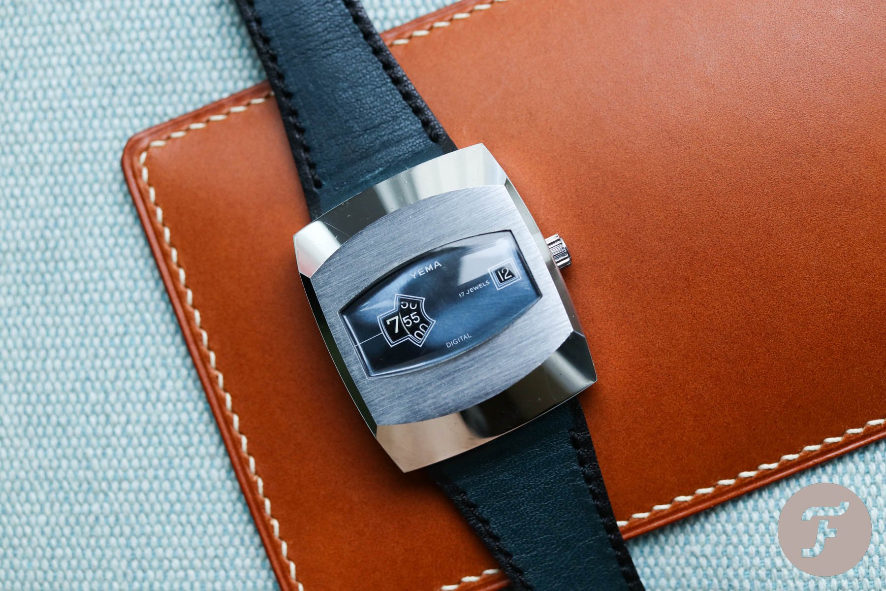
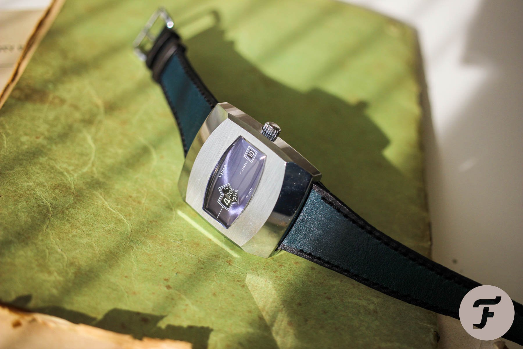
I felt I was quite lucky to make such an undervalued purchase. My feeling was confirmed within seconds of unboxing it. My Yema Digital came in divine newborn condition with almost no scratches on its shiny skin. All of the case’s edges have such perfect factory polishing, I need to handle the watch with care to prevent setting my flat on fire with the sun’s reflections. And just look at that horizontal brushing! Of course, we have all seen this type of finishing on other watches. But on this massive case with its minimalist crystal, the extra square centimeters it gets make the brushing the real deal. On this piece, you can really enjoy and feel the structure of it.
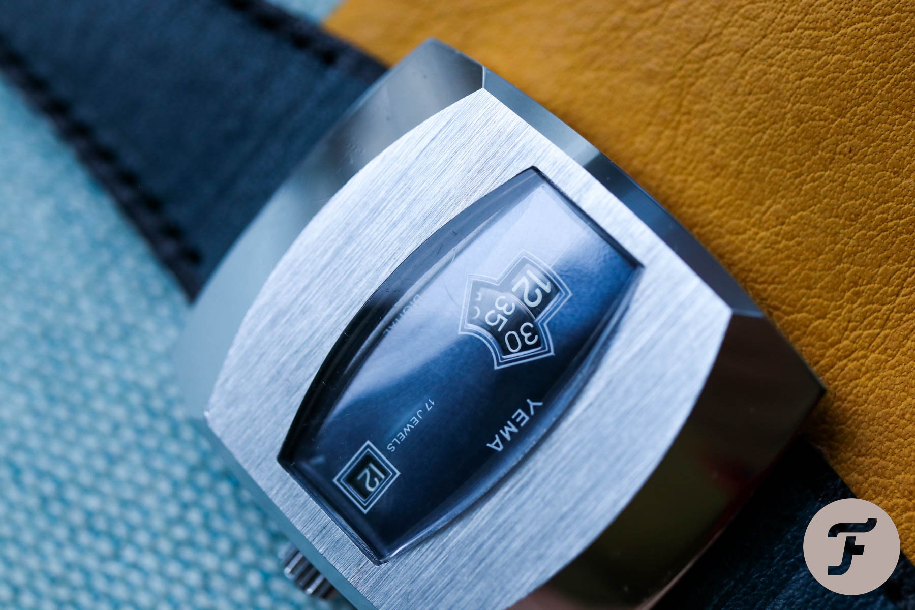
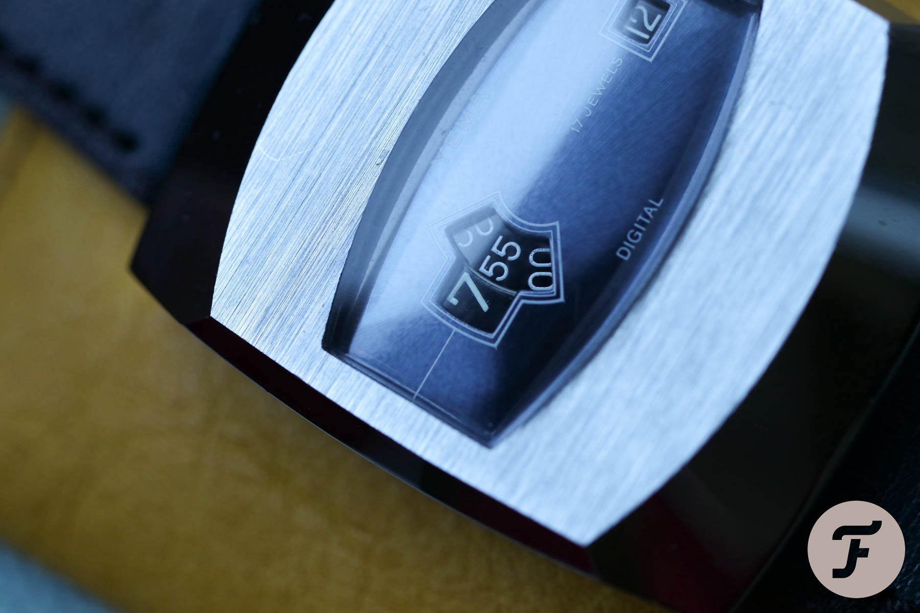
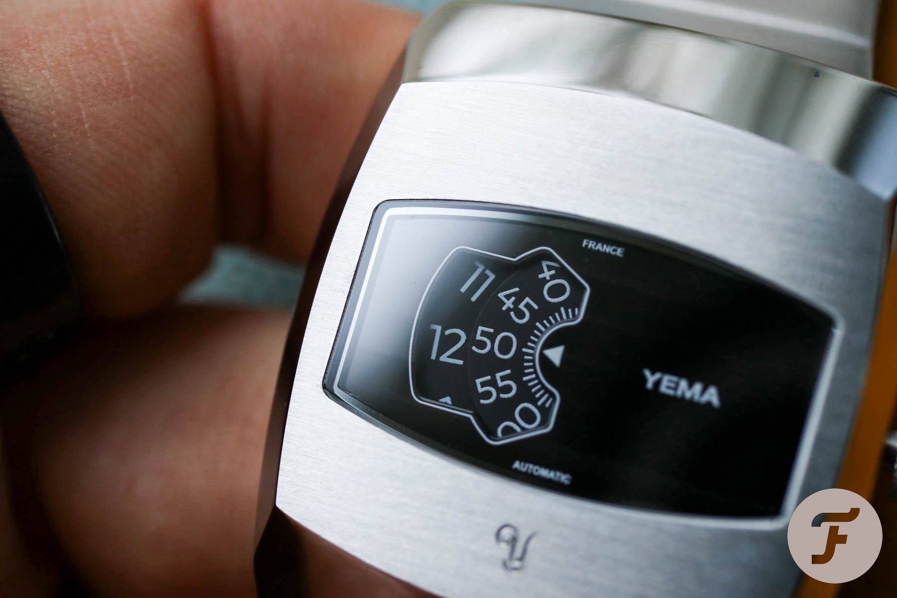
The dial
I have to admit, I really struggle to call it a dial. To me, it’s more of a dashboard or an instrument panel. There is not much design per se, but that’s precisely what makes it well designed. The pure minimalism is set in a seducing dark blue and black gradient. A thin white sector line draws your eye to the large jumping hour, followed by the minute disc in a slightly bigger aperture. The smaller date window on the right side near the crown perfectly balances the time display.
I like that the date disc got the same color treatment as the time discs. It makes the overall design pretty decent, in my opinion. And that’s what separates this piece from most other endeavors in this watch category. If you recollect any of them, you have to see all the crazy colors, cutouts, font sizes, and markings. Yema decided to keep it on the low. In my eyes, they managed to maintain the dignity and true idea of the overall design.
What actually is the idea behind the design?
Sorry, I have no academic view to offer. I just had a moment of fascination you can only get when you stare too long at something you didn’t bother to look at previously. And that‘s exactly the problem that faces this watch. There are so many similar ones out there that we all think we know them. I dare say we don’t. I am sure you have seen one, but have you held one? Have you tried one on, or experienced it fully? Once you do, you will see it differently. Let me share my learnings.


Most of our watches have a case to protect the dial and movement. The case is not the “case” normally, it’s a necessity. Wearing the Yema Digital, however, feels like wearing a case only, with the small benefit of it actually telling the time. If it wasn‘t a purely chromed case, but solid gold, for example, I would believe the case itself is the trophy. The dials of other similar jumping hour watches are often so crazy they eat all of the attention. But not the Yema Digital. I would call the dial almost boring, but for a good cause. The simplicity of it allows the case to be the real showman. It’s also that very same plain dial that lets you enjoy the plasticity of the unusual crystal.
The movement is not that important
From what I’ve read, there should be a simple Lorsa movement hiding between the thick case walls. This time, I even didn’t bother opening the case to check. A high-class movement is not going to be the reason you buy this watch anyway. All you need to know is that although it has a cheap metal jingle, it works reliably enough. I can’t say it will hold up well if you make it your daily beater, but I can’t see that happening. It’s interesting, refreshing, and it has a novel wrist feel, but most likely, a few days a year is enough.
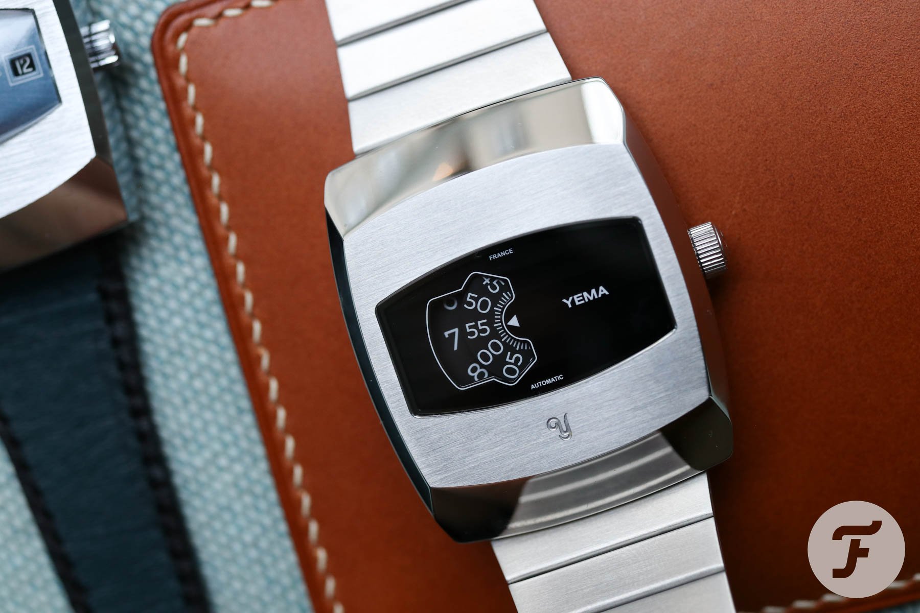
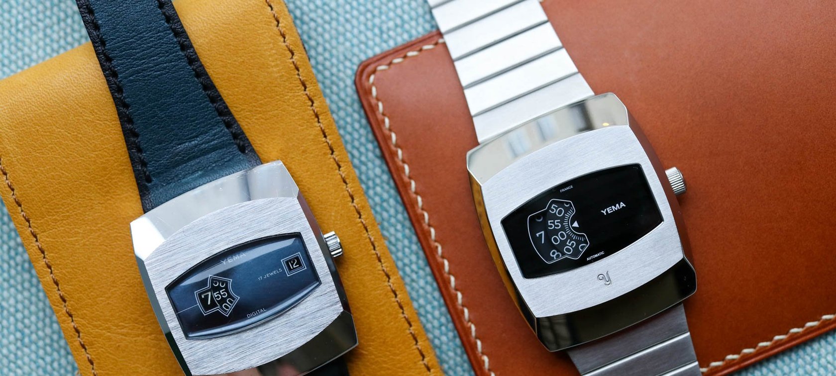
Yema revival
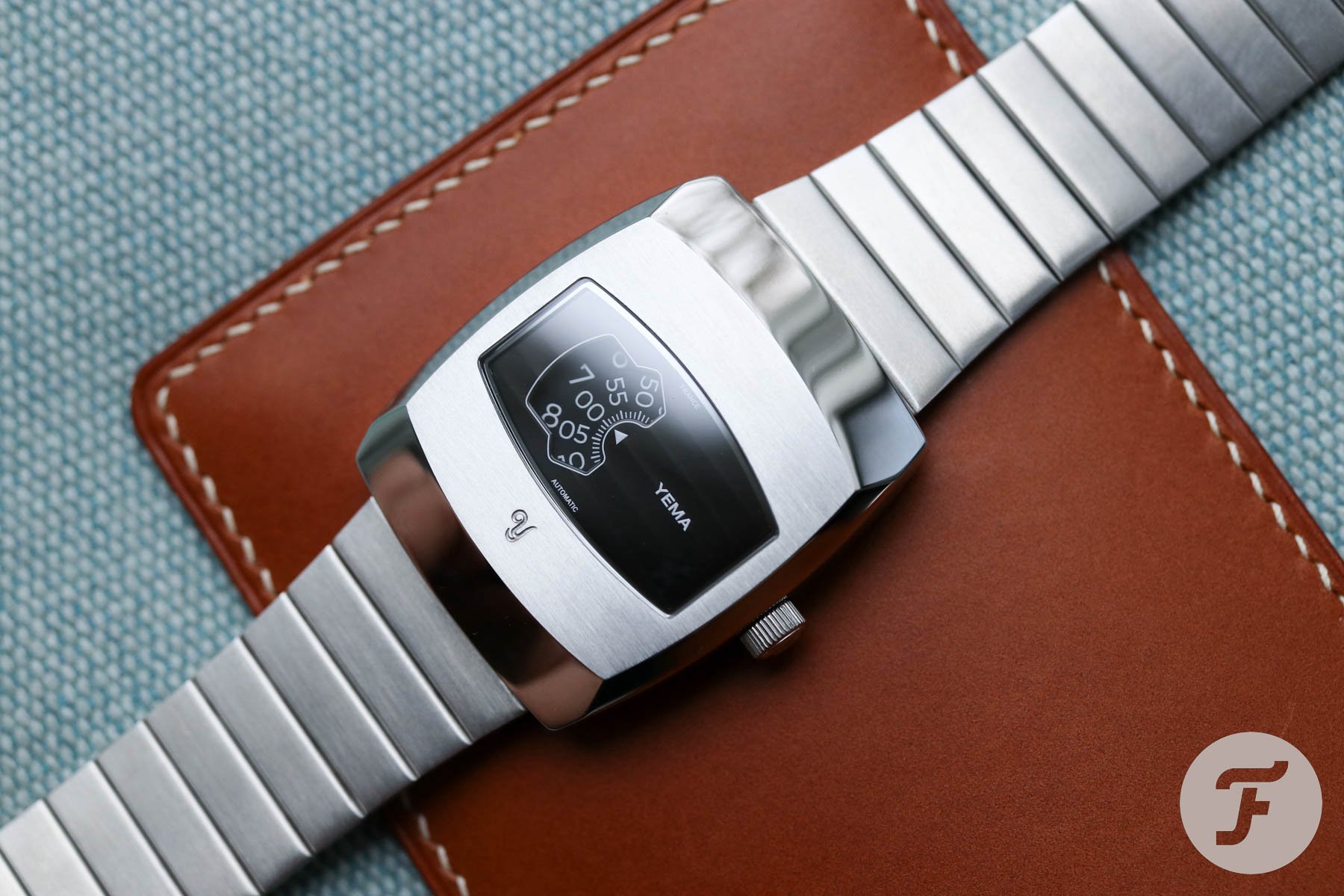
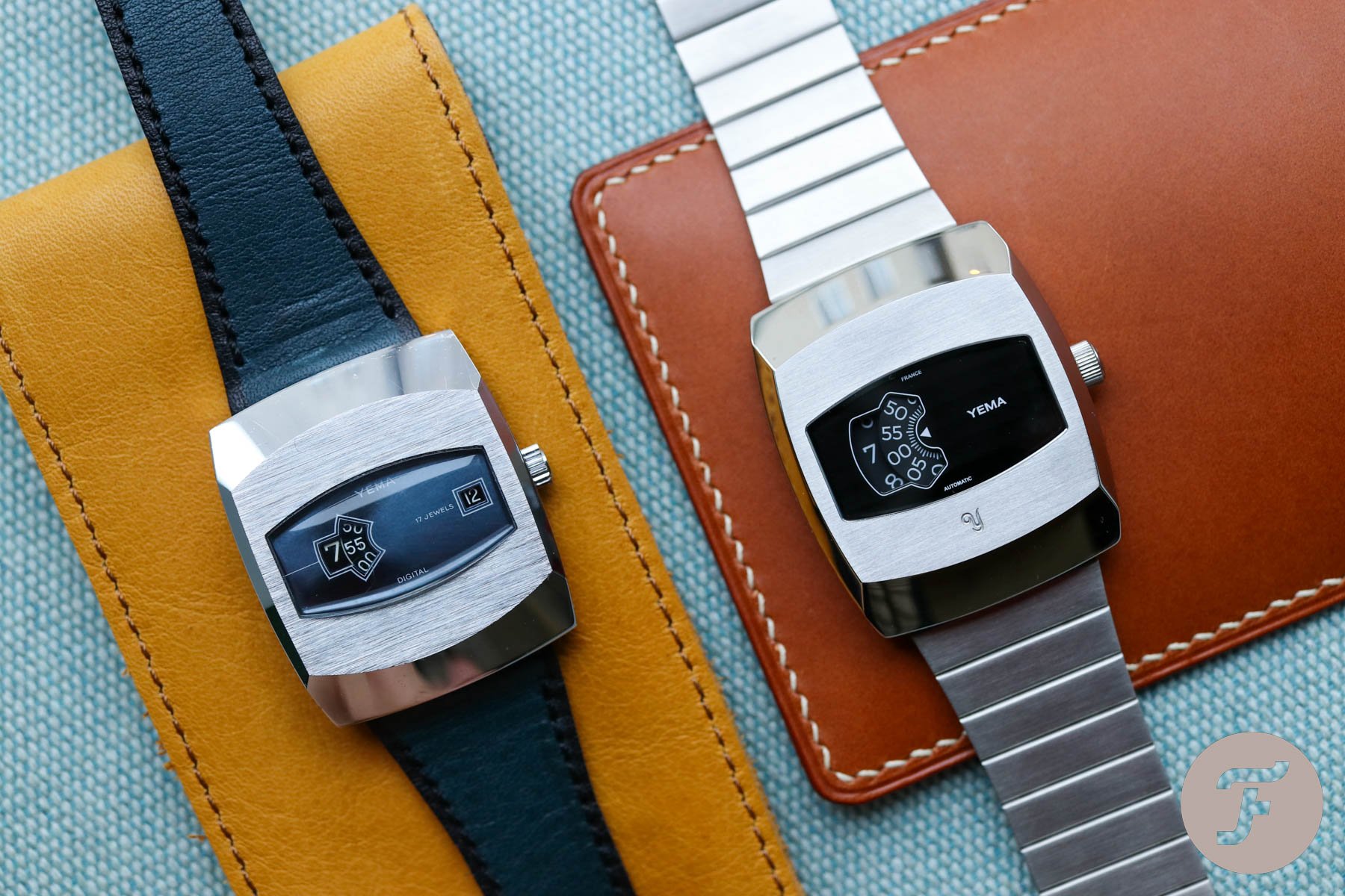
I was pretty surprised Yema brought this design back to life recently and I had to see it side by side with my 1970s Yema Digital. The Yema Digidisc has a nearly identical shape, it just feels beefier and less sharp. I was really excited to see the in-house movement at work. But there was one real showstopper for me.
Yema Digital defeats Yema Digidisc
In the first video, you can see how the hours jump in the 1970s Yema Digital. All works as you would expect. The hour switch starts engaging at the 55-minute mark and causes no time legibility issues. But that’s a bit of uncertainty when it comes to the modern Yema Digidisc. If you read the Yema website carefully, it points out that it displays the time by using discs that rotate instead of jumping. I warn you, the hour disc leaves its position too early. Reading the time between minutes 30-59 can be confusing, and you might find yourself one hour ahead of the actual time. Well, it’s nothing you can‘t get used to, but if you know the original jumped perfectly, you might be a bit disappointed in the modern re-issue.
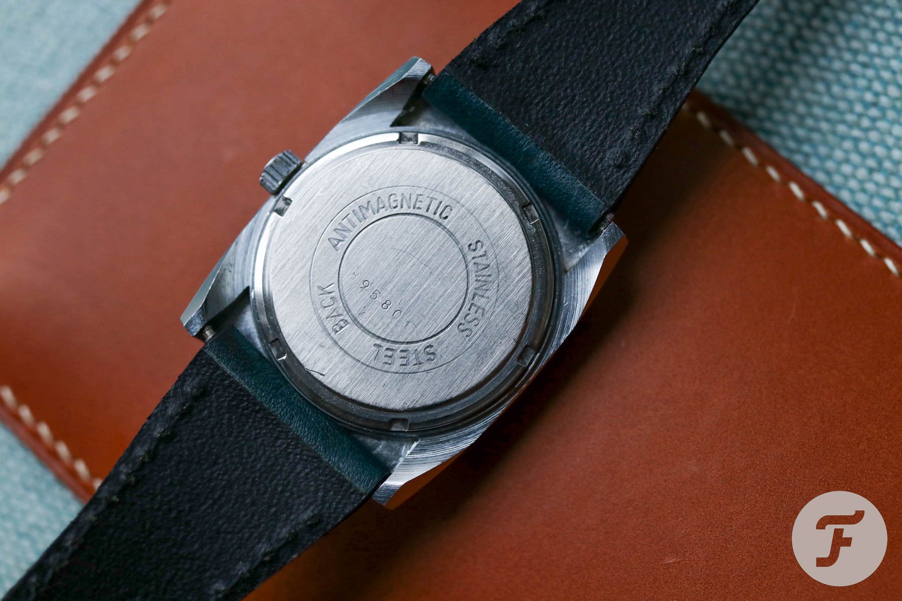
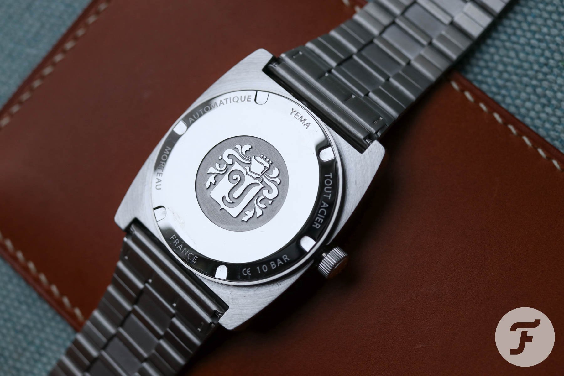
Strap and case back
There’s no majestic Yema emblem on the case back of the Digital. Nor is there any Yema logo on the crown. I look forward to reading the soon-to-be-released Yema book. Maybe we will find some more insights about Yema Digital watches in there. We might also learn whether the dark blue leather strap with black framing around the edges is original to the watch. I’m guessing that it is, but I would not put my money on it.
Final thoughts
I don’t wear the Yema Digital as often as I wear my other Yema watches, but I like it. Compared to the time that I first tried it out, I feel I understand it much more these days. There are some watches I have liked, but after acquiring them, they’ve either left me feeling nothing, or even worse, disappointed. The Yema Digital is not such a watch. It’s a sui generis watch and for such a small price tag, it leaves a bigger impression than many watches priced 30 times more do. If you have ever considered picking up a Yema Digital, go for it. It offers waters worth exploring and a new experience guaranteed. Happy hunting!
-

- 11:50 on Yema Digidisc.
-
- 7:55 on Yema Digital.