New Look for POF
- Monday, September 30 2019 @ 09:35 am
- Contributed by: Editor
- Views: 5,631
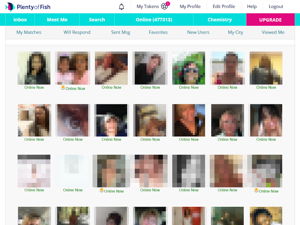
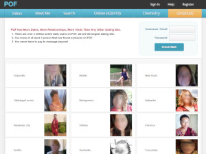
A few weeks ago POF banned face filters and it appears soon after on Sept 17 the Plenty of Fish website, blog and dating apps received a facelift. The dating service has moved from an all light blue fish logo and theme to a layered multi color almost neon look. The light blue color is still there but the brightness has been turned up along with the addition of pink and dark blue. The interface itself has changed to reflect these colors with a few tweaks here and there to the layout. As far as we can tell no new features have been added and none removed.
You can also see the new look reflected in the Google Play and Apple App stores POF app install pages. One thing I notice on the App store is that POF is pushing a new statistic of 17 million conversations are exchanged everyday on the service. They still list the same stat of 4 million visitors everyday from 2017 (among others like 150 million registered users and 57 million new connections every week) so it looks like the dating service POF growth has stagnated. This is in part probably the result of Tinder becoming so popular and is also probably responsible in part of the updated design (which I am still getting use to).
Other interesting POF facts include that the service is now available in 11 languages (2 more added in the past year) and available in more than 20 countries.
The look and feel of POF has remained relatively constant over the last 10 years with the last major change happening in 2015 when their website became compatible with both desktop and mobile browsers. To find out more information on this dating service you can read our recently updated POF review.


