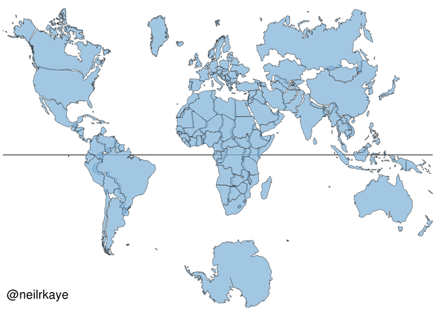
Think about a map of the world. The image you're picturing will most likely resemble the Mercator projection—a 2D representation of the globe created in the 1500s which most maps you commonly come across are based on.
But despite its ubiquity, the Mercator projection does not accurately reflect the true size of countries given the impossibility of representing a 3D object on a 2D surface. In fact, the projection distorts the size of objects as the latitude increases from the equator to the poles, where the scale becomes infinite.
Animating the Mercator projection to the true size of each country in relation to all the others.
— Neil Kaye (@neilrkaye) October 12, 2018
Focusing on a single country helps to see effect best.#dataviz #maps #GIS #projectionmapping #mapping pic.twitter.com/clpCiluS1z
In order to more accurately depict the size of the countries, Neil Kaye, a climate scientist from the U.K. Met Office, has created a visualization of the Mercator projection in which countries morph into their true size.
"Each country is projected to the spherical projection and placed at the center of where it appears in the Natural Earth projection," Kaye wrote in a Reddit post in reference to his creation. "There was then some manual tweaking of countries that are closer to the poles. This demonstrates you can't fit shapes on a sphere back together again once you put them on the flat."
The visualization clearly reveals how landmasses near the poles in the Mercator projection appear much larger than they actually are, relative to those nearer the equator.
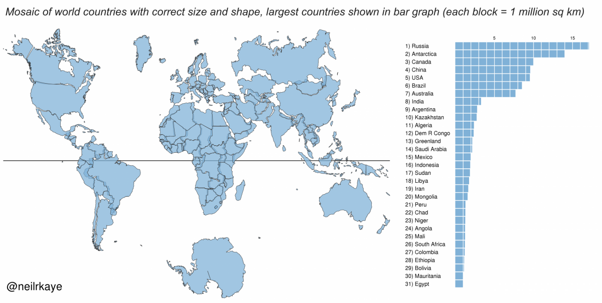
For example: Antarctica appears as the biggest continent, despite it being the fifth largest in area; Alaska takes up as much area on the map as Brazil when, in reality, the South American nation's area is almost five times that of the U.S. state; Greenland appears larger than Africa, when Africa is actually 14 times greater in size; and Africa also appears to be about the same size as Europe when it is almost three times larger.
The Mercator projection was first introduced by the Flemish cartographer Gerardus Mercator in 1569. Despite its drawbacks, the projection became the standard map for nautical navigation because it enables navigators to plot a straight-line course and is still widely used for this purpose.
The projection has long faced criticism because of its alleged Eurocentrism with both Europe and North America appearing much larger than they actually are in comparison to Africa and South America. According to critics, this reinforces the myth of white exceptionalism and depicts a view of the world rooted in the history of colonialism.
Because of this and the distortions present in the Mercator projection, some people favor other representations, such as the Gall-Peters projection, although each of these has their own set of flaws. For example, the Gall-Peters projection—which is widely used in educational and business circles—shows the correct size of countries and continents in relation to each other but it's stretched out at the equator and squashed towards the poles.
Uncommon Knowledge
Newsweek is committed to challenging conventional wisdom and finding connections in the search for common ground.
Newsweek is committed to challenging conventional wisdom and finding connections in the search for common ground.
About the writer
Aristos is a Newsweek science reporter with the London, U.K., bureau. He reports on science and health topics, including; animal, ... Read more
To read how Newsweek uses AI as a newsroom tool, Click here.