IHC Logo History
The following is reprinted in its entirety with no changes in text from B. Mitchell Carlson’s “Triple Diamond Treatise” as it appeared in the August 2011 issue of Vintage Truck Magazine. He did a wonderful job of providing the history of the International Harvester logos as they developed through the years and I felt it would be well worth preserving that information here for enthusiasts.
A Brief History of International Truck Logos
by B. Mitchell Carlson
The recent merger of the company I work for and the subsequent changes of corporate logos got me to thinking about the history of the trademarks International has used on its trucks. Throughout the years, International Harvester used a number of different logos on the trucks it built, and they sometimes were vastly different from the corporate logo.
The following is a brief look at the corporate identifying marks used on International trucks. As a reminder, all of them are the copyrighted intellectual property of either Navistar or CNH and are shown solely as an illustrative historical reference.
IHC – Old Logos
After a merger of several companies that created International Harvester in 1902, the logo on the left was adopted as the core corporate logo. It had the letters “I” and “H” inside the letter “C,” and all three letters were capitalized and had serifs. The words “International” and “Harvester” were printed inside their respective letters.
Highwheeler production started in 1907, and this corporate logo was used on the model. Models that had a radiator, including the short-lived cars from 1910 and 1911, generally had a brass logo affixed to the middle of the radiator or had the emblem embossed on the front of the shell. By the ’30s, International Harvester was using a streamlined logo without the names spelled out.
IHC Script Logo
In 1914, shortly before the Highwheelers were discontinued and the slope-nose trucks were introduced (1915), the company started a new trend for International truck logos. It was at this time that the word “International” was first used as the official name for trucks built by International Harvester Corp. Up to this point IHC, IHC Auto Buggy, or IHC Auto Wagons were the official nomenclatures for vehicles. This script was specifically designed for exclusive use on the trucks to differentiate the truck division from the rest of the corporation. However, after production of the slope-nose models ceased in the early ’20s, the script all but disappeared, and primarily block lettering in several fonts was used. Also, the corporate logo wasn’t entirely banished from trucks. The logo with “I” and “H” inside the “C” was embossed on some smaller parts, and it appeared intermittently in publications, such as sales brochures and manuals.
IHC Red Triple Diamond Logo
The first Triple Diamond logo that we’ve all come to know and love first appeared in 1923. Initially, only the S-series trucks bore this logo, but by the end of the decade, it was universally used. As time progressed, the relative size of the diamonds to the horizontal pointed banner reading “International” would grow and shrink as the angles of the points on the banner became progressively more blunt. In varying degrees, it was used until the late ’40s. For example, the original owner’s manual for my 1947 KB-1 carries this early logo on the back cover.
IHC Blue Triple Diamond Logo
First conceived in 1938, the stylized Triple Diamond logo actually went into use with the introduction of the K-series trucks in late 1940. At this time, both early and later styles of the Triple Diamond logo were used, seemingly interchangeably. However, the stylized logo was used for fixed trim on the trucks, such as the grille bar and horn button, while the earlier logo was found on hubcaps and in documents. By the time the L-series was introduced, the stylized image above had become the fully standardized truck logo. It was put to rest with the introduction of the R-series trucks in 1953.
This logo is significant because it is the first one in which the Triple Diamond image had a specific color scheme—blue center diamond, white outer diamonds, and black lettering on a banner with a white background. This color combination was also used on the earlier Triple Diamond logo, but it appeared along with several other combinations with no less than four solid colors on the center diamond.
IHC Man on Tractor Logo
Part of the reason that the multiple Triple Diamond logos continued into the ’50s was that in 1945 International Harvester adopted the now famous “man on tractor” logo. The company didn’t have to search too far for an inspiration for the design, which is essentially a simplified version of the original corporate logo. The new logo superimposes a large lowercase “i” on a large upper case “H” in block letters and eliminates the “C.” Initially intended for corporate use and for the agricultural division, the logo had limited use in the truck division. Almost exclusively this logo was used when referring to the overall corporation, such as on the back of a sales brochure if it referred to International Harvester Corp. In those instances the wording likely was followed by a small version of the “man on tractor.” With the introduction of the L-series, this generally continued to be the case, although the “man on tractor” logo started appearing more often and larger in truck publications. Still, the stylized Triple Diamond was on the hood badge and steering wheel horn button.
With the introduction of the R-series trucks, the “man on tractor” logo appeared tall and proud everywhere. Part and parcel was an about-face change in the corporate mindset immediately following World War II. At this time, the thrust was a unified corporate image—from tractors to trucks to home appliances—while still having the six separate corporate divisions. During the ’50s, all International Harvester consumer products carried this logo.
IHC Stylized Man on Tractor Logo
The “man on tractor” in its basic form lasted until the end of International Harvester in 1986 and even beyond. The only official redo of it by International Harvester occurred in 1973. Essentially the new logo was a slightly stylized version of the 1945 basic design. The modern design was more compact with the lower left and upper right comers on the center bar of the “H” curving instead of forming a 90-degree angle to make the logo look more dynamic and less blocky and simplistic.
Similar to the variations on the Triple Diamond theme, both styles saw some concurrent usage; however, the conversion was almost universal to the 1973 edition in a shorter timeframe.
When Tenneco bought International’s agricultural line in 1984, part of the purchase was the rights to both versions of the “man on tractor” logo. Case-IH (and subsequently CNH) continued to use the logos, more often than not leaning forward.
IHC 1986 Logo
With the rebirth of International as Navistar in 1986, the reorganized company gave a nod to its past. Not only did it go back to separate logos for the corporation and the International truck line, but the truck logo also saw the return of the diamond motif. In 2002, this was further changed—and more retro—with the adoption of the current International logo that enhances the diamond theme and reintroduces the International banner design dating back to 1938.
“Cornelius”
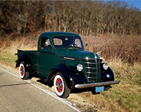
Cornelius Specifications:
- Make: IHC
- Model: D-2
- Type: Pickup
- Capacity: 1/2 Ton
- Wheelbase: 113"
- Year Built: 1939
- Engine: HD 213