In this blog post, Arlo Digital Services Team shares three optimization tips that you can implement to convert more of your website visitors into course sign-ups. Read on to learn how to get the most our of your training company website.
Course sign-ups are the lifeblood of a training business, but often, a poor website experience can prevent a training provider from attracting as many registrants to their courses as they could.
This “poor experience” is often a result of potential customers not being able to find the courses they are looking for, not being convinced that a provider is their best option, and not being sufficiently compelled to sign up for a course.
Arlo’s Digital Services Team has built and optimized hundreds of training provider websites over the years and knows what it takes to convert more website visitors into paying customers. In this blog post, they share their top three tips.
Three optimization tips for training company websites
Tip 1: Make it easy for visitors to find the courses they are looking for
When someone lands on your website, you want to make it easy for them to find your course offerings. The best way to do this is to have clear call-to-action buttons on your homepage that lead visitors to your course pages.
Arlo customer Myopain Seminars has accomplished this on their homepage in the example below. As soon as a visitor lands on their homepage they can quickly see how they can navigate to their upcoming courses.

After clicking the ‘Browse Upcoming Courses’ they are brought to an overview screen showing the provider’s upcoming courses. The visitor can then easily utilize the available dropdown menus to explore various courses of interest and filter the listings by a specific location.
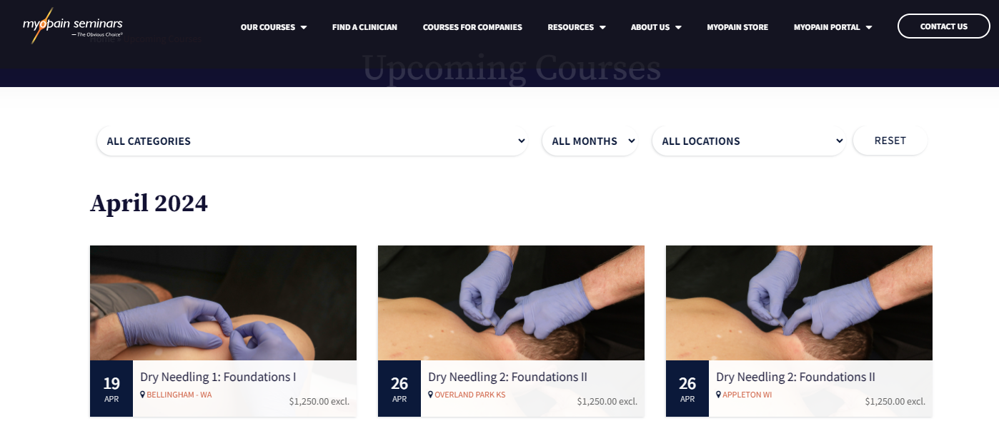
From there, it’s very easy for a visitor to hover over an individual course, get a quick overview of the course content, and choose to learn more about it, or register.

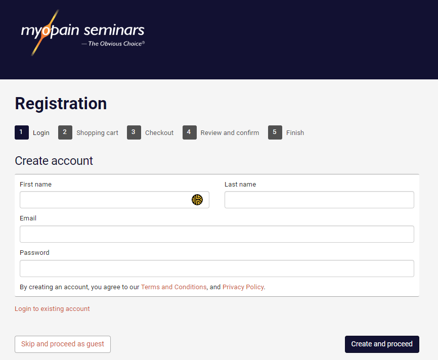
The end result is that a visitor can move from landing on the website, viewing courses of interest to initiating the registration process in under five clicks – quite impressive!
Ideally, your training company website should be able to do the same. As a rule of thumb, try to keep the number of clicks it takes for a visitor to navigate from your homepage to the registration process under five, for a seamless and efficient user experience.
Read More: The Ultimate Guide: How to Create & Optimize a Training Provider Website
Tip 2: Show customers why they should choose you
It’s likely that multiple providers offer courses similar to the ones you offer, so you must be able to articulate to potential customers what sets you apart and why they should choose you. One of the most powerful methods to do this is by leveraging social proof on your course pages.
To do this, prominently display customer reviews and testimonials from happy customers who’ve taken the course in question. Ideally, these should be easily visible on your individual course pages, providing immediate credibility and trust to prospective students.
You can do this with a simple ‘What others are saying’ section, as shown below on the website of Arlo customer Frank Capability:

Other strong forms of social proof you could share are:
- Case studies or success stories of past students who have benefited from the courses you offer. These case studies or stories can be particularly compelling if they include specific achievements like career advancements, salary increases, or unique projects completed as a result of the training.
- Endorsements from industry experts or institutions – if your courses are endorsed or accredited by well-known industry experts or institutions, prominently display these endorsements on your course pages. Endorsements can add an extra layer of authority and credibility to your offerings.
Another way of showing potential customers why they should choose your company is by displaying your unique selling proposition (USP). A USP is a clear element that describes or shows the distinct benefit or advantage your company offers, which sets it apart from the other options your customers have.
Some examples of your USP could be:
- Competitive pricing
- Your company’s reputation
- The quality of the training you offer.
For example, if you want to demonstrate that your courses are taught by world-class instructors, you should clearly highlight who is teaching each course on the relevant overview page. Additionally, provide a link to an instructor bio page so your customers can learn more about the instructor’s qualifications and experience. You can see a great example of this on one of Kāpuhipuhi Wellington Uni-Professional’s course overview pages:

Tip 3: Use scarcity and urgency to encourage course sign-ups
When potential customers find the course they are looking for and decide that you are the right provider for them, they are often ready to take action, but can sometimes need an extra nudge.
The key to giving them this ‘nudge’ is to incentivize them to enroll immediately, rather than delaying.
Two effective ways to achieve this are by tactfully using scarcity and urgency. These two strategies work well because people naturally assign greater value to products or services perceived as scarce or in limited supply.
A simple way of combining the two together on your course pages is to display how many places a course has remaining. You can see an example of this below on one of Humentum’s course overview pages:
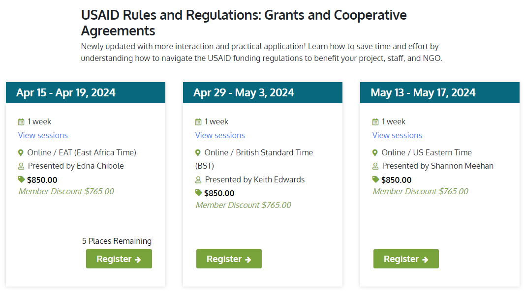
To encourage an even greater sense of scarcity, you can use phrases such as ‘Only 3 spots left’ or ‘Only 3 spots remaining.’ These phrases imply that the spots were initially available but have now been filled, and a visitor needs to act with a sense of urgency to secure their spot in the course.
There are plenty of other ways you can use urgency and scarcity on your course pages, such as:
- Displaying a registration close date for a course.
- Offering limited-time discounts, such as an early bird offer that visitors can take advantage of.
- Offering exclusive content for early sign-ups.

Websites built for training
Create awesome looking websites that help you sell more courses.
Get the Ultimate Guide to Websites for Training Providers.
Ready to drive more course sign-ups? We can help!
Now that you know some top tips on how to optimize your training company website, you can go ahead and implement them yourself, or save yourself the hard work and use Arlo’s pre-built website templates – designed specifically for training providers!
Our designers and developers have created a comprehensive library of ready-to-use page templates that can be easily integrated into your website.
Every template has been crafted to encompass all of the principles we’ve discussed in this blog, and the many more that we’ve drawn from our years of experience building and optimizing hundreds of training provider websites.
Arlo’s Professional Services team can work with you to get your website up and running, with custom solutions and packages designed to cater to your business, expertise, and budget. To find out more, book a free consultation.
Ready to talk?
Book a FREE consultation with the Arlo professional services team to discuss how we can help with your website optimization. No obligation.