How to Design a Logo for Beginners (With a Free Worksheet!)
By Cassandra• 16 min read, Mar 16, 2023
Creating a perfect logo for your company involves a lot of decisions, namely: colors, layouts, fonts, and symbols. But learning how to design a logo doesn’t have to be hard – and you don’t need to be a designer!
To help you capture the essence of your brand identity and business in one iconic design, we’ve created this logo design guide: so you can confidently create the best logo for your business, side hustle, or passion project.
We’ve broken down how to design a logo in five beginner-friendly steps:
- Research your brand
- Learn about logo design
- Get color, font, and symbol ideas
- Make a logo
- Test and finalize
If you want to play around with a new logo design right away, you can jump into our logo maker at any time — it’s free to try! But if you want a bit more guidance and preparation, you’ve come to the right place.
We spoke to expert branding and logo design agencies to give you the best logo design tips as you begin making your own logo.
Follow along with our FREE WORKSHEET! Find all of the market research and competitive analysis questions ready to go, along with resources and prompts for logo design inspiration.
What is a logo?
The term “logo” is often used as a catchall to define any emblem a company uses to visually represent its brand. Your logo isn’t your brand, visual identity, or an indicator of success. It’s simply the first step to creating your visual identity!
How to design a logo in 5 simple steps
![]()
Get a pen and paper ready, we’re diving into how to design a logo for your business!
Step 1: Research your brand identity
Most of us dislike doing research — why can’t I just get started already?! — but it’s an important step in any major project. To make your logo successful and long-lasting, you’ll need to set a solid foundation. And to set a solid foundation, you need to do your research.
Creating a strong brand identity helps your company gain credibility and become recognizable as you grow. Before you dive into your logo design, take some time to think through these questions:
Who’s my ideal customer? What brands do they like?
Figuring out your ideal customer and target market will help you better understand your messaging and logo vision.
Start here:
- What age range is my ideal customer in?
- Which social platforms do they use the most?
- What hobbies do they have?
- What impacts their buying decisions? (price, quality, sustainability, etc.)
- Which pain points do they experience?
Jump into our logo design Google doc and start answering the questions above! Envision your ideal customer as you go.
If you’ve already got a few customers (or friends who fit the persona you’re targeting), don’t be afraid to pick up the phone and talk to them about their lifestyle, buying decisions, favorite brands, and insights related to your product or service.
What’s my competition doing?
An excellent way to get logo design ideas for your business is to divide up a few of your competitors’ logos and websites into styles you like and styles you don’t like.
Start here:
Research your competitors and create a moodboard of all their logos to familiarize yourself with the colors, symbols, fonts, and layouts they use. This will help you understand how to stand out visually, while still associating with your industry.
Jump into your logo design worksheet and fill out the information below:
- What font type is dominant in your industry?
- Which colors are most common?
- What symbols are currently being used?
- Which layout is most popular?
This will help you understand what direction you want to go in as you learn how to design a logo.
What are 3-5 adjectives that describe my brand?

The next step on your journey is to create a list of your brand’s persona attributes. This list can also include specific features, values, and benefits you want your business to be known for. Here are a few examples:
- Innovative, friendly, easy-to-use
- Compassionate with superior customer service
- Witty/clever marketing and #killingit on social
Write these down in your logo design worksheet and use them to help bring your brand to life.
What’s my company name? Will I use a slogan?
If you haven’t already, it’s time to finalize your company name and decide if you want a slogan, which can be a description of what your business does (e.g. gluten-free cookies) or a catchy phrase (e.g. cookies for health nuts).
Using a business name generator is a fun and easy way to come up with company name ideas. Looka’s Business Name Generator helps you find a spot-on brand name while checking domain availability and generating logo designs!
Once you’ve come up with a few good business name options jot all of your ideas into your logo design worksheet, and ask yourself these five questions:
- Is it original?
- Is it future-proof? (a.k.a. Will it evolve with your business?)
- How user-friendly and easy to spell is it?
- Is it available (domain, social channels, etc.)?
- Do I love it?
If the answer to each of these questions is “YES!”, then you’re one step closer to starting your logo design journey!
Where will I be using my logo most?
Where you plan to display your logo will have a direct effect on your design. Maybe you own a construction company and plan to use your logo on T-shirts, truck decals, and signs.
Or perhaps you’re a consulting business that’ll be using your logo mostly online — your website, landing pages, and social media channels. Think about the applications that matter most and what type of logo will stand out.
In almost all cases, keeping your logo design simple with a clean layout will help ensure it looks great everywhere. Here are a few common places to use a logo:
- Online: Website headers and favicons, email signatures, invoices, and receipts
- Social media: Profile photos, cover photos, image posts, ads
- Print: Business cards, brochures, posters, car decals, clothing, brand packaging
You may need multiple logo variations to adapt to different mediums — but more on that later.
Step 2: Learn about logo design
Contrary to popular belief, designing a company logo on your own is totally doable! You don’t need fancy editing software or years of design experience. You can make a logo by yourself in five minutes with an online logo maker!
But before you start your logo design journey, here’s what you need to know to feel confident about the process.
What makes a good logo?
Though the quality of a logo is subjective, there are certain elements that make a logo either good or bad.
A good logo is:
- Simple
- Memorable
- Unique
- Versatile
- Appropriate for the industry
- Relevant to your target market
They should also be easily recognizable and clearly represent the brand!
In comparison, bad logos are trend-focused (or copy other famous logos), complicated, and confusing, which leads to poor brand recognition and versatility. They can also be boring or generic (not to be confused with simple).
Looking at the examples below, the one on the left clearly communicates what the company is and is easy to read and remember.
The one on the right is creative and fun, but it’s extremely hard to figure out what the company even does!
The three main types of logos
Logo design can be broadly put into two categories: logos that only consist of text (denoting the name or initials of a company) and those containing both text and a symbol.
Here’s a breakdown of the three most common types of logos — there are a few more, but we want to keep it simple!
1. Wordmark logo
The most classic form of a logo is the wordmark, sometimes referred to by designers as a “logotype”.
Wordmarks use only your business name — no symbols or monograms — in an existing or custom typeface. This type of logo works best if you have a short, distinctive business name and no slogan.


2. Monogram logo
A monogram is a logo that contains one to three letters, usually a company’s initials or first letter. The monogram can act as the symbol in the logo, with the company name below.
In the cases of well-known brands, the wordmark is dropped: for example, P&G for Procter and Gamble, VW for Volkswagen, or LV for Louis Vuitton. But most new businesses would keep the business name under or beside the monogram to build name recognition!
3. Combination logo
Combination logos are exactly what they sound like: a combination of a wordmark and a symbol.
This type of logo allows your brand to be easily recognizable because it uses two design elements that represent your brand, together (and they can be used separately when needed). It’s no surprise that this is the most common type of logo.

If these options don’t feel right, check out some other popular logo design styles:
- Emblem logos
- Mascot logos
- Brandmark logos
Design a custom logo for free. Only pay if you’re 100% happy!
Logo shapes and layout options
Shape plays an important role in your logo aesthetic because they hold particular associations in the human brain. This allows brands to use shapes to help convey a message or feeling to a target audience.
Shapes can be used as both containers and symbols in logo design.
What’s a container?
A container will keep your logo confined to a space and neatly packaged for visual consumption. It’s important to note that while containers add visual interest to your logo, they can sometimes provide challenges with scalability as the logo lives in a smaller space.
Make sure your company name is still legible in the container when scaled to different sizes.
Here are a few values associated with some of the most well common logo shapes, as well as design considerations for each:
- Circles: Represent unity, security, and protection. They work best for shorter names or monograms and should be used with a strong typeface to ensure legibility when scaled up and down.
- Squares + Rectangles: Translate to feelings of stability and balance in the human mind. This more traditional shape is good for longer names and is popular with large corporations.
- Triangles: Viewed as a more aggressive shape associated with strength, conflict, and speed. They can be used to represent direction and movement, or as substitutes for the letters ‘A’ and ‘V.’
- Vertical/Horizontal Orientation: Vertical lines and shapes are associated with aggression, strength, courage, and dominance, whereas horizontal shapes take on a more calm and tranquil feel.
- Organic Shapes: These shapes have a natural feel to them and exert warmth and comfort, which you can’t fully achieve in the other shapes!
Other logo layout options
There are a few other ways to think about arranging your logo that don’t relate to shapes. These include:
Stacked text
One way to add intrigue to a more classic logo is to use stacked text. Words can be stacked vertically to catch your eye, though sometimes this layout is paired with horizontal text to create more styling possibilities. Note that it’s best to use stacked text when the words in your logo are close to the same length.
Symbol placement
The placement of a symbol can change the whole look and feel of a logo. Is it in the center? To the side? On top of the wordmark? Incorporated into the wordmark? If you’re using a symbol in your logo, make sure to consider all options and see which placement feels the best for your brand and logo usage.
Slogan placement
If your logo has a slogan, it will almost always appear below your company name. But will it be centered or left-justified? In a different typeface than your wordmark? Depending on the length of your slogan, you can test different options to see what looks best.
Step 3: Get color, font, and symbol ideas
It’s finally time to dive into creating your logo!
With all of the logo research and ideas in your logo design worksheet, you should have a solid idea of your target market and brand attributes, as well as the style and layout of the logo you want. Let’s get into colors, fonts, and symbols!
Logo colors
Choosing a color for your logo design isn’t just about picking what looks good to you. Think about how your audience will perceive it and where it will be displayed. Your logo colors will be your brand colors, so imagine how they’ll look on all of your business assets.
As you can see below, your logo colors have the power to convey if your brand is sophisticated and luxurious, or quirky and fun. Use color to set the mood for how you want your brand to be perceived.
Different colors evoke different feelings and emotions, so choose them wisely. Do you see your brand represented by cool tones like blue, green, and purple, or warm tones like red, orange, and yellow? Or perhaps you lean more toward black, white, and grey to match your brand identity design.
Pay attention to the colors your competitors use, you’ll want to stay with colors familiar to your industry but differentiate from the competition at the same time.


To help you decide, here are a few emotions and descriptors associated with some of the most well-known colors:
- Black: Power and sophistication. It can also demonstrate elegance, formality, or mystery.
- Blue: Professionalism and success. Commonly used in corporate logos, but works in many industries.
- Orange: Joy and optimism. Results in an enthusiastic and excited cognitive association, and is also great at grabbing attention.
- Green: Balance and serenity. Commonly used when brands want to emphasize a connection with the environment, well-being, health, and calmness.
- Pink: Feminine and nurturing. Depending on the shade, it can have a gentle and calming effect, causing cognitive association with safety and nurturing. Other shades, however, are more likely to generate associations with love, flirting, and femininity.
- Purple: Royal and spiritual. Throughout history, purple has been considered a regal color. The connection with royalty has led to a cognitive association of purple with wealth, nobility, and luxury.
- Red: Confidence and ambition. Frequently used to represent masculine energy, and found to stimulate appetite and energy.
- Yellow: Happiness and positivity. Often very bright and frequently captures the eye. Meant to improve self-esteem, and, like the color red, is also believed to stimulate appetite and increase energy.
- White: Pure and simple. Traditionally associated with purity, cleanliness, innocence, and simplicity.
- Grey: Classic and serious. Becoming a more popular style, grey is a great color to use if you want to achieve a mature look.
When you finalize your new logo, you should also have a black-and-white version for times when the use of a full-color logo is not applicable (such as when you’re putting it on top of an image). As such, you want a version of your logo that accommodates black within its design — so test this before finalizing yours!
How many colors should I use in my logo?
The majority of brands use between 2-3 colors, with one of those colors being either black or white. Of course, there are some companies (like Google, eHarmony, and Slack) that have an array of colors in their logos.
Feel free to test out more colors, but again, make sure your logo looks good in all black or all white, too!
Logo fonts
With thousands of fonts to choose from, picking one for your logo isn’t an easy task. Each font conveys something different and should fit with your brand attributes and identity.
Let’s take a look at different types of fonts, and what their visual differences mean for branding and communication.
1. Serif fonts
Fonts that have little “feet” on the edges are referred to as serif fonts. They’re timeless, high-end, classic fonts associated with tradition and propriety. The most well-known serif font is Times New Roman. Because of its timelessness, it’s often used to attract a more mature demographic.
2. Sans-serif fonts
These fonts don’t have the little feet like serif fonts do, so they tend to have a more clean and modern look. They’re easy to read and work well across mediums.
3. Script fonts
Handwritten and script fonts add tons of personality to a logo, and tend to look formal, elegant, and feminine. This is one of the harder styles to pull off because script fonts are harder to read at a glance — but when done right, they can make your logo distinctive and iconic.
4. Modern fonts
Modern fonts are sans-serif fonts that hold a certain sophistication and starkness. This makes them most effective with younger demographics — and popular among app and tech companies.
5. Display fonts
Lastly, display fonts tend to be a broad category of out-of-the-ordinary fonts that add major visual impact. They can be bubbly and fun, or edgy and futuristic — but beware of using ones that are super trendy or that don’t match your brand personality.
You can also have custom fonts created just for your company, making your logo 100% unique. Custom fonts are usually an additional cost when working with a designer to create your logo.
Logo symbols
Symbols are another design element you can add to your logo to help people recognize your brand.
Symbols can be pictorial and literal (like animals or lightbulbs) or geometric and abstract logo marks (like a hexagon or overlapping circles). Just make sure that whatever symbol you choose doesn’t confuse or mislead your audience. Below, you’ll see two examples of how powerful a logo symbol can be in communicating your business and products.
If you’re a fitness coach, it doesn’t make sense to use a grocery cart symbol in your logo — something like a heart rate line could more clearly communicate your services.
You also want your symbol to match the style of your font — so if you’re using a modern, sans-serif font, you probably don’t want to pair it with a hand-drawn, vintage-looking symbol.
And, as discussed in the layout section, you’ll want to experiment with the positioning of your symbol to see what looks best. Try putting it to the left, right, top, or bottom of your company name — you can even try it in the middle of a word.
Step 4: Design a logo
“You’re telling me I can finally start designing my logo?”
Yes, yes we are. Unsure how to get yours designed? Here are three DIY options:
Option #1: Design your own logo from scratch
If you’ve already got some design experience, and have access to software like Adobe Illustrator or Photoshop, then designing your own logo from scratch is an option
Hiring a designer to create your logo from scratch can become pricey, quickly! Using your own tools and expertise gives you total freedom in what your design looks like, while also saving you money.
Option #2: Buy a logo template and customize it
Another option is to go with a template. There are a few companies and sites that offer free or paid logo templates that you can customize by making edits to the company name, colors, and more.
Two potential issues with this method:
1) These templates may not be very customizable
2) There could be hundreds, (maybe even thousands), of other companies with an almost identical logo design to yours.
Just like people, logos are meant to be unique. Every business should be recognizable and memorable.
If you still want to test this method, we encourage you to also try using an online logo maker, as these can be very similar in price, but logo makers give you much more flexibility with your design.
Option #3: Use an online logo maker
If you want a unique custom logo, but don’t have the design experience or time to do it yourself, using an online logo maker is probably your best bet!
Instead of working with a template, these tools allow you to create your own designs with a much more intuitive and smart design platform.
Looka uses artificial intelligence (AI) to help understand your design preferences, and create personalized logos that you can then edit in the app until you’re happy with the design.
Step 5: Test and finalize
Once you’ve designed your own logo (or a few!), it’s time to do some stress testing. Here are a few questions you should address before finalizing your business’ new logo design:
Is my logo scalable?
Having a scalable logo means you can display it anywhere and everywhere your heart desires (well, pretty much anywhere). Want to put it on a huge billboard? How about on your business cards?
When you’ve got a scalable logo, wherever you decide to put it, it will look clean and crisp (not pixelated) and will remain easy to read and identify. Check that your logo works at both large and small sizes and remains readable.
Another must-have for a scalable logo: a vector file.
Vector files are necessary, as they act as master files you can infinitely scale, edit, or send to a designer or printer. They’re created in programs like Adobe Illustrator, and can then be converted to any other file format that you need, such as a PNG or JPG. Examples of vector files are SVG, EPS, and PDF.
Does my logo look good in all black or all white?
Having an all-black and all-white version of your logo with a transparent background is essential. Why? Because it allows your logo to be more versatile and work in various visual environments.
When the background of your logo is transparent, it gives you the power to place your logo over any colored background, including images and videos!

If your logo doesn’t translate well when changed to all-black or all-white, consider making some tweaks to it. Does it need a bolder font? , or a simpler symbol? Would a different layout make your logo more adaptable?
![]()
Does my logo look good on the applications I’ll be using most?
Depending on your company, and where you’ll be interacting and engaging with your customers the most, this may have an influence on your logo design.
Alternatively, you could be planning on showcasing your logo mostly on prints, like car decals, business cards, and posters. Does your logo look good scaled down on a card, or scaled up on a big print? Does it have complex elements that need to be made more simple?
Think about how your logo will look in all of your core applications, and make changes accordingly to ensure optimal logo awesomeness.
![]()
Do I have different logo variations for different uses?
This leads us to logo variations, which make your logo more versatile and easy to use. Having a distinctive wordmark (the typography), as well as a unique symbol (the image), allows you to use the elements together or separately to represent your brand. The brand below uses it’s rhino symbol to help represent its brand across all platforms.
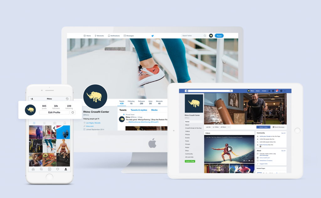
So, the logo you have as your Facebook profile photo might be a symbol-only or monogram-only version, while a logo you print on a T-shirt would be the “full” logo — though they’re different, they represent the same brand.
Once you’ve designed and tested your logo, it’s finally time to put it into action. After all, a beautifully designed logo isn’t valuable if it isn’t being applied to anything! Here are a few great places — online and offline — to get started:
- Social media profile image and banner
- Website header and favicon
- Email signature
- Business cards
- Stickers
- Packaging
- Stationery
- Invoices and receipts
- T-shirts, hats, mugs, and various swag
Remember: If you’re getting anything printed with your logo, send a vector file (EPS or SVG). If you’re working with a printing company, they’ll usually request this. If not, send it anyway so they have everything they need to ensure your prints come out looking crisp.
Do I have brand guidelines?
Lastly, after you finalize a design, you’ll want to create brand guidelines. Brand guidelines are a set of rules about how to represent your brand across channels and assets, helping your business build credibility and recognition as you grow. Brand guidelines should include:
- A cover page
- Logo guidelines
- Color palettes
- Typography
- Usage examples
They can also include a mission statement, visual rules around images and icons, brand voice guidelines, and specifications for assets like packaging, email marketing, and more.
(If you design a logo with Looka, you can immediately generate brand guidelines to make sure your logo always looks its best.)
Let’s recap — When learning how to design a logo, it’s a good idea to research your brand, learn the basics of logo design, explore colors, fonts, and symbols…and then get creative!
When you have an option or two to work with, test your logo at different sizes and on various mockups to make sure it’ll meet your needs. Tweak as required, and show it to a couple of people you trust if you need help deciding.
After you complete these steps, you can be confident you have a strong logo to display to the world. You’ve got this!