Choosing a font for writing
Let’s talk about one of our favourite writing avoidance devices: picking the right font for your manuscript.
Anyone who’s tried to turn out a novel knows this exercise. You’re sitting there in front of the computer, struggling to come up with some words. Then you see the Font Menu and think Oh my God this would be so much easier if I switched the whole manuscript to Goudy Old Style. Why didn’t I think of that earlier?
Perhaps because you were, well, writing. And too busy to worry about any of this stuff. Which is good. But worry we do so let me try to offer some words of advice stemming from twenty years of dealing with book manuscripts.
Because this is important. If there’s something wrong with your screen setup it will nag at you. What we’re aiming for is, in a sense, what we aim for in writing itself. We want the process to become invisible, and the story — the characters, the world, the narrative — to shine through.
First things first though. Before you pick the right font for writing you need to understand something called ‘line length’.
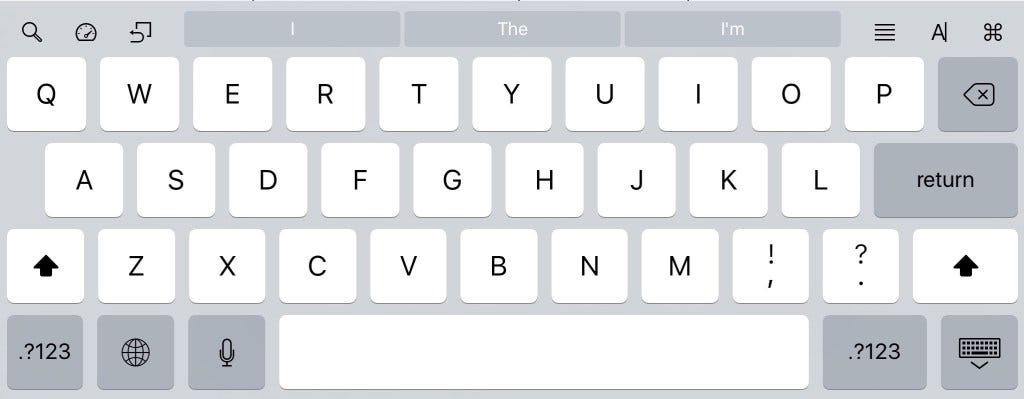
How many letters in a line?
There’s an excellent academic take on this subject from the Baymard Institute here. It’s talking about the optimal length of a line of text for reading in a web page but the same applies for writing on anything, be it a computer or a tablet. In a nutshell the lesson is this: if the number of letters in a line on screen is too long you’ll lose your ability to focus on the actual words. To put it another way: squeezing in too much on screen is self-defeating. You may have the quantity there but your ability to read it well will diminish… and reading your work as you go is as important as getting words down in the first place.
Lots of studies suggest the optimal line length for reading (and therefore writing) is somewhere between 50 and 75 characters per line. For most writing purposes I suspect the real figure is between 60 and 70 (and it will depend on your screen and your font so you will need to fiddle to get that right).
Here’s 50 which is way too short for me.

I think 60 is better.

And 70 feels fine on an iMac though on a 13 inch MacBook Pro I knock that down to 65 characters per line (simply because it seems better).

In my writing app of choice Ulysses line length is set directly in Preferences (as I’ll demonstrate later). In other apps you’ll have to juggle the ruler to get it right.
How much line spacing?
Books and newspapers are normally set in single spacing or something close. This is far too tight to be readable when you’re writing. Back in the old typewriter days we used to write double-spaced so that editors could scribble in corrections with a pen. We don’t need to do this any more but we still need a bit of breathing space between the lines to make them readable, and for me a little bit of space between paragraphs too.
Here’s single line spacing.

Nope. Won’t work for me.
Here’s 1.2 line spacing with .2 of space between paragraphs.

And here’s 1.5 line spacing with .3 paragraph spacing.

If I’m working on a laptop I tend to use the 1.2 line spacing setup. At home with a 27-inch Retina iMac the third one seems more natural.
Note I always start paragraphs with an indent. That’s especially important if you don’t use spacing between paragraphs because if you work like that sooner or later you’ll be lost as to where paragraphs begin and end.
Serif fonts… going old-style
Line length and spacing tend to be obvious when you start to play with them. Choosing a font for writing is much more a matter of personal taste. As an early Mac user I often wrote in Garamond, back then a very common Apple font. It’s a serif font, in other words one that dates back to print typography. Most newspapers use serif fonts in print (and a fair few online too). Times, Goudy, Bookman… all those fonts have that grand, slightly fiddly look to them that denotes class.
Here’s a very elegant one that comes with the Mac, Cochin.

The consensus among most experts is that serif fonts are easier to read in print than their rivals, sans serif fonts such as Helvetica and Arial. I think that’s probably true. You can try to convince yourself that you’re getting into the book-writing mood by trying to knock out words in something like Cochin. In the end you’ll probably find it was a mistake because they’ll be hard to read and give you a headache after a while.
Going back to the typewriter
As I’ve said before one of the things I like about Ulysses is that it is, for me, a kind of typewriter for the 21st century. In other words it combines the focus and simplicity of a typewriter with the back-end management powers of a computer.
So why not go the whole hog and use a typewriter-style monospaced font too such as Courier? Monospaced means that every letter you see has exactly the same width be it a narrow ‘i’ or a wide ‘w’. Like this in the excellent free screenwriting font Courier Prime (in my book the only Courier to use for creative writing under any circumstances).

Or even go very bold and use a distressed monospaced font such as P22 Typewriter.

Hmmm. Courier Prime I like, not least because being a modern monospaced font you get bold and italic. Still if I went down this route I’d be looking at the typography as much as the words, which is bad.
Remember: we want the type to disappear. So then…
Sans serif fonts for writing
It may be boring. It may mean Helvetica, Arial or one of the Microsoft fonts such as Calibri (which isn’t half bad in my book). But sans, for me, is definitely the way to go. Until recently I always wrote in Helvetica Neue. Then Apple released El Capitan and made the system font something new they’d created called San Francisco, a sans font particularly tailored for high res screens.
The odd thing about San Francisco is it’s a font for OS X but not generally available as an option in the average word processor. You can’t just download it and put it in the Font Book for some reason. Developers seem to be getting round this now. Ulysses is among them. All you have to do is go to Preferences and choose System Font. Then everything is sharp and clear and, unlike some sans fonts on screen, you can actually detect the difference between opening and closing quote marks.
Want to see what it looks like? Just go back to those early screenshots at the top of this article. They’re all San Francisco and I bet you never once asked yourself, ‘What font is that?’ Precisely.
Here’s my preferred Ulysses writing setup on the iMac.

Two final points. First, if you’re delivering a manuscript to an agent or publisher don’t try and get clever with fonts or indeed design in general. It probably won’t matter what you use since they’re likely to read it on an ereader anyway. So just stick to Helvetica or Arial or something, and never bung off a manuscript in a font so obscure the first thing that happens is their own computer bleats about not having it available. They’re busy people and they won’t like this.
Second, when you find a font, line length, line spacing setup that works stick with it. Writing is about writing not faffing with software. Make yourself comfortable, get in that seat and start telling a story.
One of the reasons I find that so much easier with Ulysses than anything else is that there is no visible menu system unless you call for it. When you write all you see are your words. This is as it should because in the end they’re the only thing that matters.
Oh, and all of this (well the bits about line length and stuff apart) is my opinion. Choosing a font is a bit like decorating a room for yourself; what matters is what works for you. And if that’s bilious scarlet curtains with a bright purple chaise longue that’s nobody’s business but yours.
So feel free to offer your own font and type preferences in the comments if you wish.