Customers who view your About Us page will spend 22.5% more than those that don’t. And, according to a study by KoMarketing, 52% of users report that the About Us page is the first thing they want to see when they visit a website.
These statistics considered – are you paying enough attention to your About Us page?
Rand Fishkin once tweeted, “Best way to sell something—don’t sell anything. Earn the awareness, respect, and trust of those who might buy”.
Trust and respect are things that have to be earned. Awareness comes from being top of mind. These should all be the end goals of your marketing strategy, from SEO and content marketing to social media and email.
Your company’s About Us page is another opportunity to tell a story that will help you stick in your customer’s minds. (And as Blue Acorn’s study proves, it’s also an opportunity for a sale.)
Although everyone knows that users prefer images to text, it’s not as easy as just putting a bunch of pictures on your About Us page (although, as you will see, that definitely helps) and moving on to the next project. While creating an innovative page is hard work and can be time consuming, it can build the trust and respect of a potential customer, thus tipping the scale greatly tipped in your favor.
So how do the best companies do it right?
We have taken a look at 50 different pages that excel. Each have features you can learn and modify for your own site.
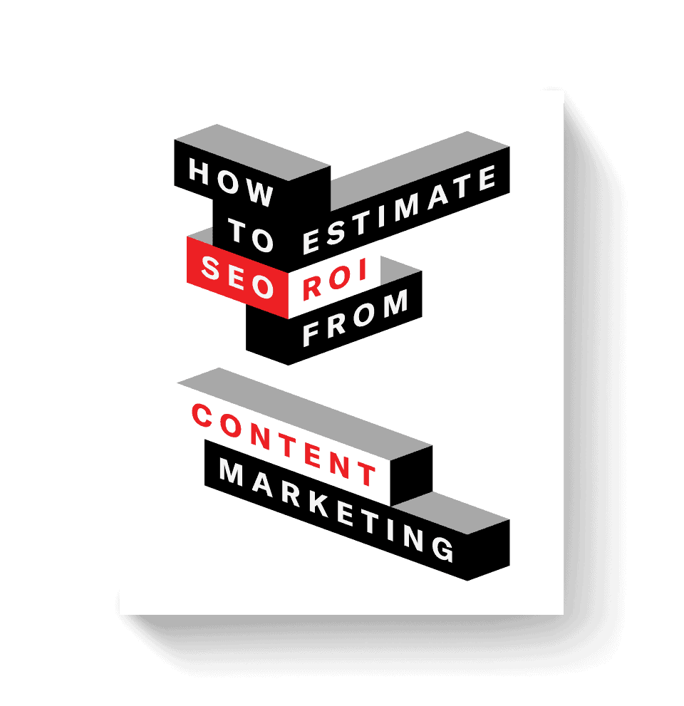
In addition, we also put together an infographic that breaks down the science behind a great About Us page. Click here to jump to it.
What the Icons Mean

Tell a Great Story – Telling a great story with words, video production, or even a timeline helps evoke an emotional response in the customer, which is proven to increase their intent to buy.
Build Trust Through Photos – Showing photos of the founders or team members helps convey that the company is full of real, relatable people that you can trust with your business.
Clear Value Proposition – Providing a simple, clear value proposition is the easiest way to get a user’s attention.
Establish Credibility – To appear credible in the eyes of your customers, you can show off reviews, testimonials, or if you are a web design site, showcase your skills on the page itself.
Clear Call-to-Action – Always tell the customer what to do next. This can be with an actual button, or by providing your contact information so they know how to get in touch.
It’s extremely difficult to create a page that hits all of these marks. And for some industries it is harder than others. But, you should at least be aware of what makes a page successful and why.
Inspired by the great examples on this list, we recently reworked our own About Us page. Perhaps not quite as amazing or inspiring as the below examples, but we think we’re at least a bit closer to achieving the standard the below companies have. And if you need help on your own page, feel free to check out our content creation services.
Show Me Examples That
Active Campaign

Visuals are such a big part of an About Us page, and Active Campaign does a great job showing off their employees and their office environment. They also have a small section describing what a normal day in the office is like. This helps entice prospective employees while also putting a face to the company and making it more relatable.
Backlinko

Brian Dean is a master storyteller when it comes to his SEO content, and his page proves no different. The conversational tone, the two call to action buttons for email signup, and some friendly photos all make this a great About Us page.
Basecamp

Within the lines of text on Basecamp’s page lies some pretty hefty pieces of credibility: the founders wrote two books, one is a best seller; and also created the programming framework Ruby on Rails.
Blue Apron

Overall, Blue Apron’s website has a great user experience. Their fun corporate photos take the spotlight and their value prop is made super clear right off the bat. But what we like best is that the CTA buttons are very clear and show up twice—once at the top and again at the very bottom. Not all companies utilize their About Us page to hire, but when they do, this is how to do it.
Box

Box has a very well-equipped page with some unique features. The first is a simple paragraph that actually acts as a microcosm of a great page. In 5 sentences, it has a mission statement, explains their value, tells a story, gives credibility through users, and ends with a call-to-action to sign up. All of it is addressed to you, the reader.
Buffer

Like Stripe, Buffer also features their staff on almost 50% of their page. Each team member has a bio written in the first person, which is a unique touch that adds a personal connection. Then, after reading about the values and “meeting” their staff, there is a clear CTA to sign up.
Canary

Canary uses a great, crisp video loop as the first thing you see on the page. They have some simple sections explaining their mission statement and story.
Clio

Overall, the Clio website is very well designed. Their About page has some large pictures and a great customer-focused value prop. There are also some links to other pages, like their Careers page, which has a great video and call to action.
Cloudera

Cloudera has a simple design with clearly defined sections that hit on several marks. They have a large CTA section at the end, but what really stands out the most is the awards section, which provides instant credibility.
Constant Contact

Constant Contact has some great features, including a video and fairly in-depth history of their company. It can all be explained in one simple sentence, which serves as the header for their page: “The tools. The people. The drive to help small business do more business.” They are very clearly customer-focused, which is a big win for their page.
Contactually

This is a great, concise page. “A company built around the user” is exactly the kind of copy you want to see, because it addresses the customer (i.e. user) directly. However, the best part is probably their clear CTA at the bottom guiding the user to exactly the next section they want them to visit: the blog.
Dropbox

The minimalist design of the Dropbox page is part of the allure. Each section utilizes a lot of white space and friendly cartoon drawings to support each point on the page—allowing their value to shine through. The page is also responsive, so the images don’t break when resizing, which is hard to pull off with illustrations, but Dropbox does so beautifully.
Eventbrite

Eventbrite is a great example of a page with an inspiring mission statement coupled with three simple call to action buttons at the bottom. Their statement “Bringing the world together through live experiences”, is inspiring enough that they can then invite the user to ‘host’ an event, ‘discover’ an event to attend or ‘join’ their team.
Freshbooks

Many founders have stories behind their companies that sparked the idea for their product. Freshbooks’ page begins with their story. It simply outlines a pain point that most, if not all, of their customers can relate to. At the bottom of the page, there is a clear CTA for customers to get started.
Freshdesk

This is a neatly designed page that hits on all of the marks. By breaking up the sections in a nav bar, users can easily click through to learn about what they want. The History section has a nice timeline, their Teams section have clever images that animate a bit as you scroll (our favorite part) and the Freshdesk culture is displayed with photos.
Full Sail

Full Sail uses video to address how their courses empower students to be creative. It highlights the important pieces that a student most likely uses to compare school choices (outside of cost), such as the facilities or the culture.
Greatist

When convincing your customer to choose you over the competition, always address them personally. The opening line from Greatist is probably the greatest example of this (sorry, we had to do that.) Seriously though, it works perfectly.
Harry’s

Overall, Harry’s website is beautifully designed. Their page is no different. Beginning with a mission statement that clearly puts the customer first, they continue with a great minimalist design that doesn’t distract from their task at hand—which is to sell you on their razors. Another piece to note is that they include CTA buttons twice on the page while scrolling through.
Hello Alfred

For a company that is designed to make your life easier, their page smartly has a whole section of real customer testimonial videos that really tell the story of how your life will change if you use Alfred. Combine that with a killer design and it makes for a great site.
Help Scout

One of the important aspects of an About Us page is conveying the team and its work environment. This can be difficult if you bill yourselves as a team of remote workers. Help Scout overcame this hurdle by putting a video from their corporate retreat in snowy Colorado. Shot with selfie sticks, goPros, and drones, it shows off that remote workers can come together to have some fun as well.
Hubspot

The first thing that stands out on Hubspot’s page is their slick, responsive design. They have a very inspirational video that outlines their mission, but the best part is the section of customer success stories that display credibility first hand.
Huge

This page hits on all levels. As a design firm, you would expect them to have great video and web design, and they hit it out of the park with each. Their mantra of “client as a partner” encapsulates how they will work with you if you hire them. Our favorite feature is the functional world clocks for each of their locations.
Humaan

Another display of a design company using their skills to create an amazing website. The coolest feature here is the section of animated gifs for each employee that gives a taste of the company’s humor and aesthetic. It conveys the feeling that while they are great at their job, they are also just like you and me.
Hungry Root

Along with their mission statement and a full high-res photos, Hungry Root also supports their beliefs with a simple, yet powerful graphic backing it up. Like photos, visual guides can tell a story and help to bolster your message to seal the deal for a customer.
Infusionsoft

One of the best aspects of Infusionsoft’s page is the first line you see: “We Help Small Businesses Succeed”. This clearly sets them apart from their competition. They also have wonderful visuals of their offices and staff along with expert testimonials, all on a sleek, well-designed page.
Intercom

Intercom has created fun cartoon characters to supplement their page. This establishes a fun, playful tone which makes for an enjoyable user experience. They also have a solid section displaying their 20,000+ customers.
Jet

Jet features their entire, smiling company, fully clad in Jet purple. Simple, yet powerful sentences outline their visions, and values. Clicking through you will find a clean design that is rich in quality, not quantity.
Lateral

This page is broken into sections, and puts their team first. They definitely stand by their motto of thinking outside the box in the creative way they display their team. Every team member photo “looks” at where you are clicking! The other subsections hit on all the marks as well with strong imagery and simple messages.
Mailchimp

We like MailChimp’s page because of its simplicity. MailChimp paints a picture of their company right out of the gate with a full-width image of smiling, friendly-looking employees. Then, they break down what they do and their value to you in two quick sentences.
The last portion talks about their charitable connection to the community in Atlanta, which is where the company is based. This final piece of information leaves a good taste in your mouth about the business.
Mixd

Bold, red colors, simple messages, and finally some amazing looking photos all combine to make a great looking page. The page is also responsive for mobile—and actually crops the photos down to close up photos, rather than just resizing them. This great design builds credibility for a design firm.
Nerdery

Nerdery makes it very clear who they are and what they do for you in one simple sentence. With simple, defined sections—all customer focused—they also have a very clear CTA at the end to get started with them as well.
Nutshell

Nutshell’s page includes some key elements—most importantly the contact information displayed immediately above the fold. A study done by Komarkting Associates found that 51% of people think "thorough contact information" is the most important element missing from many b2b websites. Their value prop is also insanely customer focused.
Odoo

Odoo has a great, responsive design that also looks sleek and polished. Their header, “Making companies a better place, one app at a time” helps to answer the question of what they can do for your company. They also add some nice pieces of credibility by listing their multiple awards such as Bossie Awards in 2012, 2013 and 2015 for best open source solution.
Outbrain

Outbrain neatly breaks up their page into five sections, which together form a cohesive picture about their company. Their video is probably the most impressive use of storytelling: it details their values as a company.
Quip

Another beautifully designed page that hits on all the marks, Quip is “A San Francisco company committed to changing the way teams work and helping organizations work less dumb.” They cleverly guide the user through their story and company values with photos.
Rent the Runway

The best part of Rent the Runway’s page is their “Us” section. With fun photos of their staff and some candid quotes about what it is like to work at Rent the Runway, this adds a lot of trust and makes them feel more like people.
Salesforce

On Salesforce’s page, customer is always the number one focus. With the first line on their page, "We help our customers discover new trails to success using the #1 CRM platform," they clearly display their value to the customer. Their page also features inspiring videos telling the story of Saleforce and has customer success stories.
Scopely

The themes common to Scopely’s page are creativity and fun, which is what would it should be for a video game company. They do a great job conveying this through pictures and colorful graphics. They feature each of their employees, leadership, and give a little taste of the fun that they have in their company.
SpaceX

If you want an example of a stunning timeline for an About Us page, look no further. SpaceX tells its story through its successes (and sometimes failures), but proving that everything is moving forward is an important point that their page helps illustrate for potential investors.
Stripe

Stripe’s page has a very unique way of featuring their staff. A scrolling set of bubbles displays headshots of their team members that you can then click to learn a bit more about. This works seamlessly as a mobile feature as well.
Another great touch is the way they visualize their office locations. Instead of using an actual map, they have cleverly designed theirs to look like a transit map. Style points all around.
Sunski

As a b2b company, it is harder to get away with showing off the outdoors, but if you are a consumer-facing sunglasses company like Sunski, it is more than OK to embrace it. This is a perfect example of where your timeline can become a great story-telling vehicle and help you relate to the customer on a personal level.
Cornett

Displaying your company values on your page like Cornett is an easy way to let your potential customers see what is "under the hood" of your company. Letting them in on your mantra can help establish trust.
Teamwork

Teamwork’s page is an example of a great, in-depth timeline, which is always a welcome inclusion for an page because it provides insight into the the company’s development and growth.
Another great feature of their site which ties into the About Us page is that there is a large call to action at the footer of the page. This call to action is the next logical step for the customer if you are trying to convert them from your page.
Track Via

This page features a nice video that breaks down their business application in a playful way. This helps establish the tone. An important piece that Trackvia includes is their award from Outside Magazine for ‘Best Places to Work’. This helps attract potential employees, which is a great secondary goal of most About Us pages.
Uber

Uber has a simple story which it cleverly ties into the product with the title “Our Trip History.” They also list their “partners” first (partners are the Uber drivers), then their app team. Giving credit where credit is due is an important detail to convey. Uber would be nothing without their team of drivers, and they correctly highlight that fact.
Ugmonk

This is one of the best storytelling examples on this list. Aside from a fun video, the page has Jeff, its founder, tell the story of how he struggled to answer a difficult question about design, which eventually led him to creating this company. By the end you feel intimately tied to Jeff and Ugmonk’s goals and ideals.
Unbounce

Unbounce’s page is very indicative of a main feature that any landing page should have, which is a clear message. “Unbounce Empowers You to Create Better Marketing Experiences.” This is a great, simple, customer-focused value proposition.
A photograph of the six founders helps to paint a picture of the company’s humble beginnings. Their page also features the company’s core values, which again tell a story about a company that is based on teamwork.
Wufoo

Although Wufoo was acquired by SurveyMonkey in 2011, they have still maintained their identity. This page features a great header image of the team leaders doing their best impression of Wufoo gang-signs. Reading the copy, you’ll find a great example of being funny while still showing off the employee skill level.
Yummly

This colorful page from Yummly is short and sweet but still works. While most of the typical information you’d find on an About Us page is actually on other pages on their site, their page has a lot of character and gets you interested in the brand with a simple anecdote about their inception and some bold colors and designs.
Zendesk

Zendesk features great storytelling, “Zendesk was started in a Copenhagen loft by three friends who used an old kitchen door as a desk...” They also have a fun, beautifully-done video emulating a customer service interaction powered by their software.
Another feature that stands out is a rotating images from their social media that gives a face to their company, and there’s even a bit about their work with charity in San Francisco.
What Makes an About Us Page Great?