super simple makeovers.

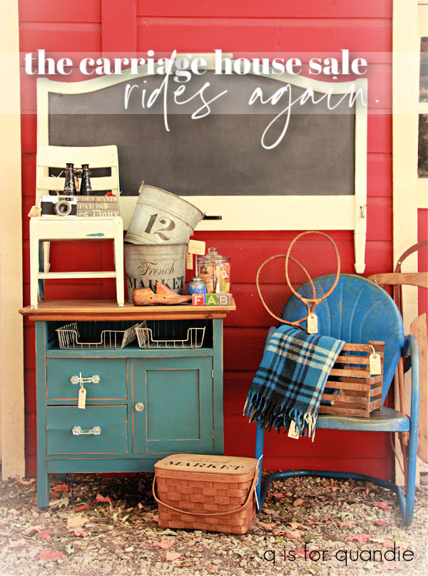
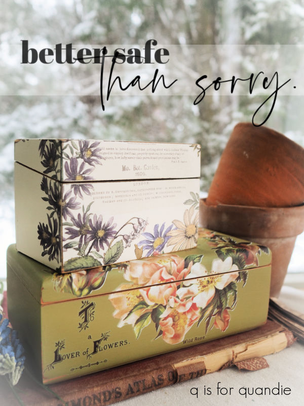
Today I’m bringing you several super simple makeovers.  None of them felt ‘big’ enough to deserve a blog post of their own, but all of them felt worth sharing in some fashion.

Let’s start with this wooden bowl that has been in my stash for a while.

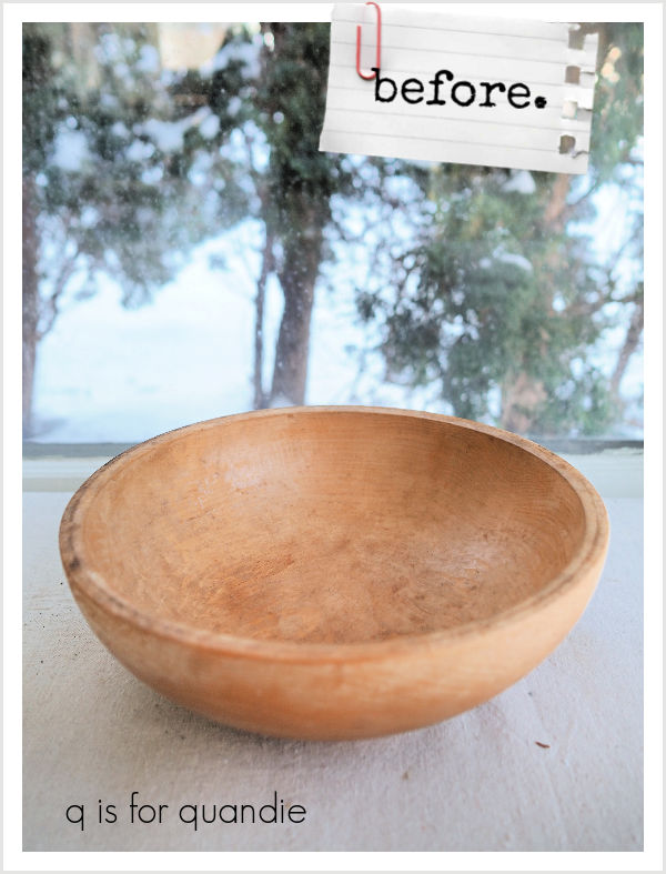
I’d been hanging onto it because you just never know when you might need a wooden bowl to corral some items, like some vintage croquet balls for example.

I don’t actually have anything to put in the bowl just yet, but I really wanted to paint it in my favorite blue milk paint, Soldier Blue from Homestead House.

I love this gorgeous vibrant shade of blue.

To prep the bowl I scuff sanded it lightly all over and then simply wiped it down with a damp rag.  To be extra cautious about chipping I could have washed it well with Dawn dish soap and hot water, but I was willing to take my chances with this one.

Next up, I simply gave it two quick coats of Soldier Blue.

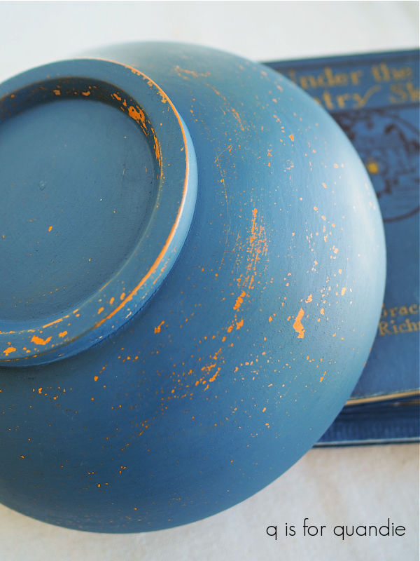
Once the paint was dry, I sanded lightly again and then added a topcoat of Dixie Belle’s Howdy-Do Hemp Oil.

I got the perfect amount of chipping, and ended up with this gorgeous blue bowl!

Hopefully I’ll come across something to put in it while out garage saling or thrifting.  This weekend kicks off neighborhood garage sale season in my area, so fingers crossed that I find some good stuff!

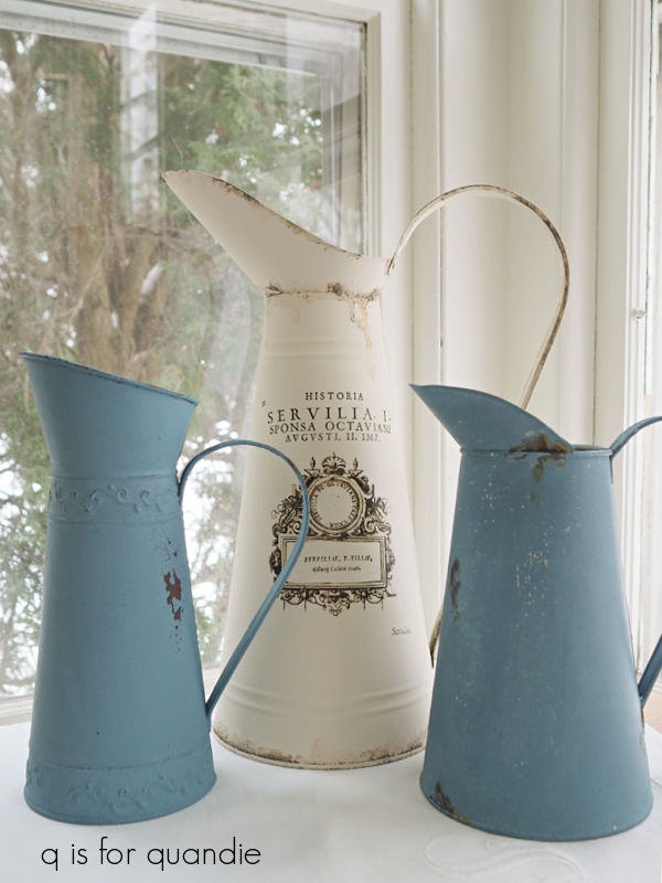
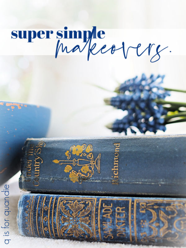
But meanwhile I just staged it up with an ironstone pitcher and some vintage books in almost the same shade of blue.

Next up is a vintage flour sifter.  Now, I have to confess, I hadn’t really planned on sharing this project so I didn’t take a good ‘before’ photo.  However, I did dig up this old photo and the sifter in question is the one at the back with the green knob.

I thought this particular sifter was rather boring though, so last Christmas I added one of I.O.D.’s holiday themed transfers to it without first painting it.  I disliked that look immediately however, so it got shoved back into the ‘makeover’ pile.

I pulled it out the other day and used a heat gun and a razor blade to remove that Christmas transfer.  Then I painted the sifter in Dixie Belle’s Cottage Door.  Once the paint was dry, I sanded lightly to distress and then added some apple blossom transfers from I.O.D.’s Lover of Flowers set.

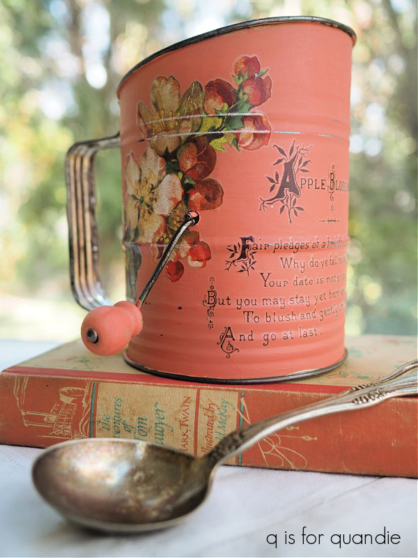
Oh my gosh, I just love that color.

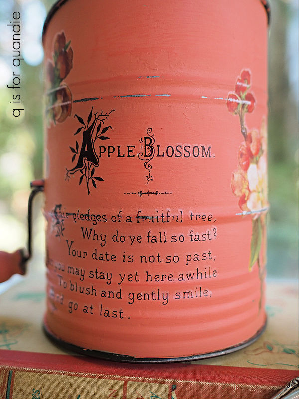
And if you take a moment to actually read the little poem, it’s perfect.

Why do those apple blossoms fall so fast?  I do wish they’d stick around a bit longer.

Next up I have another cupboard door sign for you.  I’ve had a stash of cupboard doors in my workshop for a while now, so I’m going to try to get through them all before my sale.

This particular look was inspired by a project I saw on the Ginger Chick Rehab YouTube channel (you can find that video here).  She painted a small dresser using Sweet Pickins milk paint in a color called Curry.  Then she added some florals from the new I.O.D. Collage de Fleurs transfer …

followed by a Funky Junk stencil.  Now, I have to admit, I never would have thought to put these florals over a mustard yellow on my own.  But it worked beautifully on Yvonne’s dresser, so I decided to give it a go.

Although I didn’t have the Sweet Pickins milk paint, or the Funky Junk stencil, I had a couple of substitutions on hand that worked quite well I think.

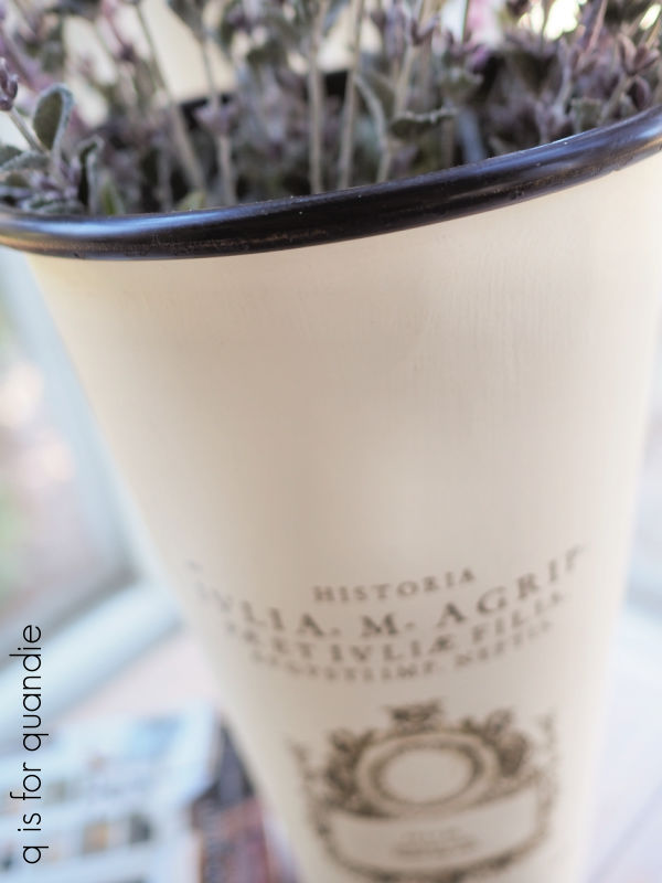
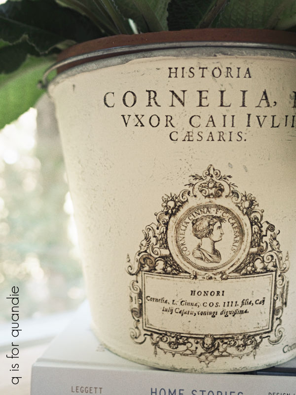
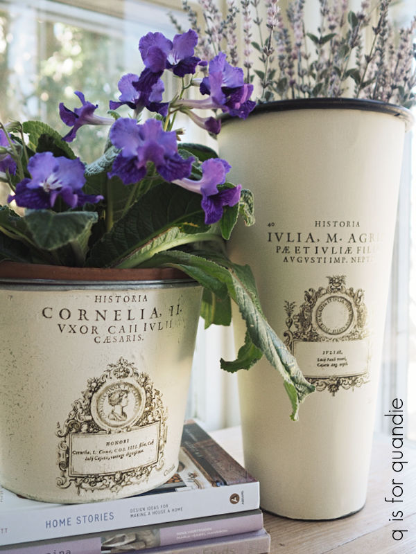
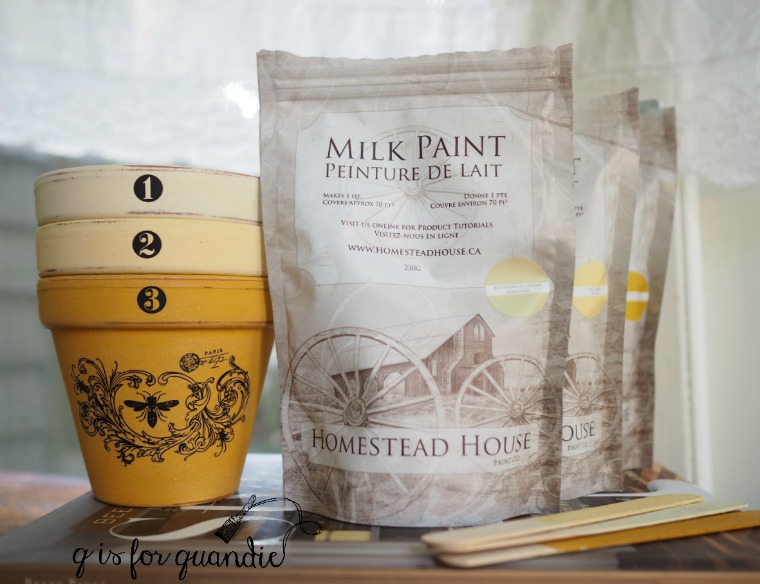
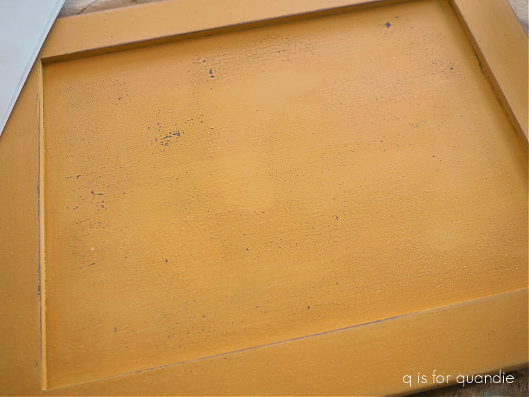
First up, I gave my cupboard door a base coat of Dixie Belle’s Coffee Bean.  Then I mixed up some Homestead House milk paint in a color called Garden Seed.  I’d used this color once before when experimenting with shades of yellow for a Jenny Lind bed frame I was painting (it’s the color on the bottom pot, no. 3).

After applying a couple of coats of the Garden Seed, I used my heat gun to encourage a little crackling.

Next I chose a few florals to add.

I stayed away from the darker red versions, using mostly creamy or pale pink blooms.  I very lightly sanded over the transfers with 220 grit sandpaper to make them look a bit more aged to go along with the crackled paint.

Finally I added a simple Fresh Cut Flowers stencil in more of DB’s Coffee Bean.

I feel like I’m taking a bit of a risk with this one.  It’s far from neutral, isn’t it?  And shades of yellow have always been hit or miss for me when it comes to sales.  But it was a fun project and hopefully someone will give it a new home.

Last up, while I had the Fresh Cut Flowers stencil handy, I decided to add it to a small chair.

This chair was one of my friend Sue’s finds.  While I loved the authentically chippy paint finish, the color was quite dirty and dingy.  After attempting to just clean it up with the help of a Magic Eraser, I ended up deciding it needed a refresh with some paint.

So I pulled out the In a Pickle milk paint from Sweet Pickins and applied two coats to the chair.

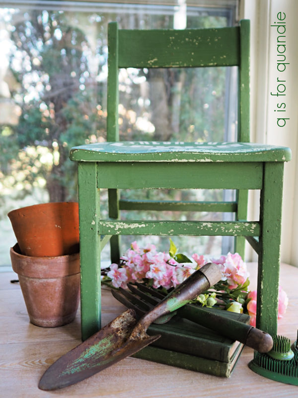
I then added the stencil to the seat using DB’s Drop Cloth.

As you can see, I still got plenty of fresh new chipping!

It’s a little hard to judge the size of this chair from my photos.  It’s a bit smaller than the usual kid sized chairs I paint at 21.25″ tall x 12.5″ wide x 11.5″ deep.

I finished it off with a coat of clear wax.

There is one element that unifies all 4 of these small projects, color!  None of them are painted in my typical neutral shades.  Clearly I felt the need to inject a little color into my world recently, lol.  How about you?  Do you like to add a bit of color, or do you usually stick to neutrals?  And which of these 4 projects is your fave?  Leave a comment and let me know.

the carriage house sale rides again.

Ever since I retired two years ago (well, technically two and a half, time flies!) I’ve been thinking about resuming the occasional sale that I used to hold here in my carriage house with my friend Sue.

We held sales here for years.  We started on a very small scale in the late 90’s, in fact it was really more of a garage sale in the very early days.  We kept at it until 2016.

But it really became too much for me to have a full time day job, plus the furniture painting (I was doing a lot more of that then) and blog writing, plus the sale twice a year (some years we even held three sales!).

In addition, my workshop is in the carriage house in the summer, so having a sale meant completely gutting my workshop and setting up the sale, and then once it was done, returning everything to working order in the workshop.

Not only was it a lot of work, but it also meant that my workshop was out of commission for 4 weeks or so for set up and take down (since I really only had time on weekends and evenings to work on it) …  twice per year.  And I can really only use my workshop from May through September, so that really cut into my workshop time.

The sale had also grown over the years.  By the end, we had the carriage house full, plus lots of stuff outside.

We had a couple of tents, but most of the stuff was out in the open which got a little dicey if the weather wasn’t good.

Like the time the tornado sirens went off just as we opened up!

We experimented with a few extra partners over the years, and with adding things like a bake sale.

The baked goods were fun, but I think I was their best customer!

We added perennials divided from our own gardens a few times too, with mixed results.

Back in 2016 I was doing a lot of furniture, and it was selling really well on Craigslist.  In contrast, furniture never did terribly well at my occasional sales.  So I decided to give up the Carriage House Sale.

I continued selling my furniture online, and I started selling my smalls at a shop on consignment.

But these days I’m not doing so much furniture, and although selling through a shop has worked out really well for me in the past, it has limitations.  Somehow over the past few years I’ve accumulated a fair amount of stuff that just wasn’t the right fit for the shop.

That led me to think that maybe I should resume my own occasional sale.

I’m a little bit nervous about it, it has been 8 years since my last last after all.  What if I’ve forgotten how to do it?

I reached out to my friend Sue, and she jumped on board.  She’s also retired now and has more time for hosting a sale.  I have to admit, I was relieved when she said yes because she always had great stuff!

Plus we have a very similar aesthetic.

So, the Carriage House Sale rides again.  We’re tentatively planning on having the sale on June 21 and 22 (or thereabouts), so you locals should mark your calendar!

Luckily I have a couple of months yet to pull together my ‘inventory’, and I’m sure you’ll see lots of projects here on the blog that will be earmarked for the sale (although, as always, if any of you locals are ever interested in a particular item when I post about it you are welcome to reach out ahead of the sale, just email me at qisforquandie@gmail.com).

the clock case project.

Oh my gosh you guys, this one has been around for a long time.

I purchased this clock more than 5 years ago.  I paid $5 for it at a garage sale.  It was going cheap because it didn’t work.

I mainly purchased it for the case.  I planned to gut it and turn it into a little hanging display case of some kind.

But for some reason it became one of those projects that I never quite got around to sharing here on the blog.  I did eventually remove the clock parts, and I sold some of them separately.

Then I asked Ken to add a little shelf inside the case.  Next up, I painted it in Fusion’s Little Black Dress milk paint.

I added some Eiffel Tower paper to the back and filled it up with some clocks and silver salt and pepper shakers.

But I didn’t love it.

I think I just wasn’t feeling the black, and I also really wanted this piece to be crackled and chippy.  But for some reason I didn’t get any chipping out of that black milk paint.  So I tucked the clock case away for another couple of years.  I finally decided to give it another go a few weeks ago.

But this time I also decided to try adding some heat.  If you aren’t familiar with this technique, you can use a heat gun to dry your milk paint quickly which can promote crackling and/or chipping.

I had two shades of white on hand, Homestead House Sturbridge White and Fusion London Fog.  The Sturbridge White is too white for me, but the London Fog is too creamy, so I mixed them to create the perfect off-white.

I mixed my paint up on the thicker side (because that tends to aid in crackling as well) and tested it out on the bottom part of the clock case.  Once the paint was on, I hit it with the heat gun for a minute.

It started to crackle beautifully, so I turned off the heat gun and gave it a couple of minutes to dry.

And … well … you can see the results.  It started chipping.  A lot.  Too much.  Eventually almost all of the paint came off.

I suspect that’s because I had added a hemp oil topcoat over my black paint back when I first painted it (more than a year ago).  Theoretically you can paint over hemp oil once it is cured, which takes about 4 weeks.  That would probably work if I was using a chalk style paint, but not so much with a milk paint.  Fusion recommends that you give hemp oil several months to cure before painting over it with their acrylic paint.

So back to the drawing board.

I had a couple of options at this point.  I could remove the hemp oil using mineral spirits or rubbing alcohol.  I could paint over the hemp oil with a chalk or acrylic paint first, and then follow that up with the milk paint.  I could add bonding agent to my milk paint, but then I probably wouldn’t get the crackling that I do want.  I could also try scuff sanding the clock to rough up the surface, I’ve had that work fairly well in the past.  So I went with that approach.

Once I had it the clock case sanded down, I decided to thin out my milk paint a little too.  Just to hedge my bets.

I repainted with two coats of the milk paint, and I still got quite a lot of chipping.

Too much chipping for you?  I get it.  This look isn’t for everyone, but I was creating this piece for myself and I still happen to love a chippy finish.  So I decided to just go with it.

Rather than sanding the final coat of paint (which definitely would have taken even more of the paint off), I brushed it lightly with a dry cloth and then vacuumed away any really loose paint.  Then I very gently brushed on three light coats of Dixie Belle’s Flat Clear Coat.  It will act as a sort of ‘glue’ to hold the rest of my chippy paint in place.  This will work on a piece that doesn’t get a lot of wear, but if it gets handled at all you’re still going to lose paint.  In addition, the surface is very rough to the touch, so that’s something to keep in mind.

Now for the fun part!  As I mentioned in my last post, this project was inspired by my visit to the Rijksmuseum and all of the fabulous miniatures that I saw there.  I purchased three miniature ‘painting’ magnets in their gift shop including one of my favorite Vermeer, The Little Street.

And I needed somewhere to hang them.

I ordered some miniature wallpaper from the same Etsy vendor where I purchased the barn lights for my miniature barn makeover.

There were so many pretty ones to pick from that I had a hard time deciding.  They were all less than $10 each, so I ordered three different ones to give myself options.  I have already cut up the two I ended up using in the photo above.  There is enough left of each that I could change my mind later and wallpaper both levels the same if I want to.

I used the Bradbury & Bradbury Wallflowers on the lower level

and the Bradbury & Bradbury Colonial Williamsburg on the top level.

Isn’t that fantastic?!

I also ordered an unpainted bench and chair from the same vendor.

The sliding door was from Hobby Lobby, and I ended up not being able to use it for this project.  Also, I’m fairly sure the bench was not intended to arrive unassembled,  it was broken.  But it was fairly easy to glue it back together.

I painted the bench and the chair in Sweet Pickens’ In a Pickle milk paint.

And you’ll remember the little cupboard that I painted a few weeks back, I told you I had a plan for it.

After ‘wallpapering’ the ‘rooms’ and ‘hanging’ my ‘paintings’ with some two-sided tape, I furnished the two levels of my clock case.

They are a little sparsely decorated at the moment, but I figure I can always add to them as I find more fabulous miniatures that I want to include.

I had to hang the clock case out on my front porch to get decent lighting for these photos.

But its real home is hanging in my q branch where it looks amazing on my Globe Artichoke colored walls.

But you’ll just have to take my word for that.

I think it was worth the over 5 year wait to see this project come to fruition, what do you think?

the rijksmuseum.

I was doing a little computer maintenance the other day, backing up photos and whatnot, and I realized that I never shared my visit to the Rijksmuseum in Amsterdam here on the blog.

So, I decided better late than never, right?  I also have additional motivation to share it with you because this visit inspired the project that I’m going to share later this week.

If you’re new here you may not know that I visited the Netherlands and Norway last September.  On one of our days in Amsterdam we headed to the Rijksmuseum.

The Rijksmuseum is the national museum of the Netherlands and is visited by over 1 million people each year.  It was founded in 1798, but the current building that houses it opened in 1885.  A ten year renovation was completed in 2013 to the tune of € 375 million (holy cow!).

Much like the Mona Lisa at the Louvre, the Rijksmuseum has a very famous painting behind glass called The Night Watch by Rembrandt.  However, at over 14′ wide, this one isn’t quite as small as the Mona Lisa.

It seems to be the main draw and the area around it can get very crowded, so we visited it right at opening time.

Personally I was more interested in seeing the Vermeer’s (which are pretty small) including The Milkmaid which was painted in 1658.

My favorite of the Vermeer paintings at the Rijksmuseum ended up being The Little Street.

My photo doesn’t really do it justice.  But it appealed to me because looking at it I felt like I could step right into 1650’s Delft (the town depicted).

As much as I enjoyed the various paintings and other artworks in the Rijksmuseum, my main goal was to see the poppenhuizen, or dollhouses.

Dollhouses in this period were typically cabinets that opened to reveal the miniature rooms.  The didn’t necessarily have the miniature exterior features of a house.  They also weren’t toys, but were a hobby of the very wealthy.

In the case of the dollhouse shown above, the cost of creating it was equivalent to the cost of buildng a full-sized canal house at the time.  The owner, Petronella Oortman,  custom ordered each piece to be made out of authentic materials and precisely to scale.  She hired basket weavers to make the baskets, and had linen woven to hang from the drying rack in the attic room shown below.

The china displayed in the kitchen was custom made for Petronella by the East Indies Company.

And isn’t the mural in this room gorgeous?

If you are as fascinated by miniatures as I am, you may also like to see this piece …

It’s an apothecary cabinet filled with miniature bottles and delft pots.

And they are all filled with samples of various medical ingredients, etc.

Isn’t that fantastic?  Check out this link to see a better photo and to listen to a fragment from the Rijksmuseum audio tour about this piece.

Also, if you are a miniatures enthusiast, you’ll definitely enjoy my post about our visit to Madurodam.

One could spend years trying to see everything in the Rijksmuseum and I’d love to go back someday to see more of it.  Before we headed out I did make a quick pit stop in the gift shop where I picked up some miniature souvenirs to take with me.  They partially inspired the project I’m going to share with you on Friday, so be sure to stay tuned!

the crocodile suitcase.

I’ve had this faux crocodile suitcase in my stash for quite some time.

As you can see in the lower left corner, it’s a little beat up.  It’s also one of those cases that are tapered, so it doesn’t lend itself to stacking because it becomes an angled surface when you lay it flat.

So I couldn’t really add it to my stack of vintage cases.

So I decided to paint it up to include at my occasional sale this summer.

After giving it a good cleaning, I applied two coats of Dixie Belle’s Drop Cloth.  I painted the handle as well, but not the rest of the hardware.

Then I went through my stash of transfers to see what I could add.  I ended up choosing the I.O.D. Flora Parisiensis transfer.

I had to cut it up and rearrange it a bit, overlapping some of the elements, to fit my suitcase.

But that wasn’t difficult.

Once I had the transfer on, I went over it gently with one of Dixie Belle’s 220 grit sanding sponges to both distress the transfer and to bring back a little bit of that crocodile texture.

I finished everything off with some of DB’s clear wax.

This suitcase would be perfect for extra storage of things like Christmas decorations, or even off-season clothing because it does not have a musty fabric lining.

This interior is easy to wipe clean.

I have to admit, using a $30+ transfer was probably not a wise investment for a vintage suitcase that I plan to sell.  It’s unlikely that I can charge more than $45 or so for it.  In other words, I’m not expecting to make much of a profit, if any at all.

But I have an embarrassingly large stash of unused transfers that I’ve had on hand for a while.  Many of them are several years old or more.  At this point I think it’s wise to just go ahead and use them.  It’s not like I’m making any money on them sitting in my cupboard.

What I really should do is quit buying more!  But I can’t seem to help myself.  However, if I enjoy revamping items with them, and in the end I’m not actually losing money, I count that as a win.  For those of you who may actually have to make a living at this, then this probably isn’t a good idea for the use of an expensive transfer.

I also used this transfer on a tackle box last year, and I didn’t regret it one bit.

So if you’re just creating for your own enjoyment, I say go for it!

I think this suitcase turned out lovely, but I think whether or not it’s an improvement will be a matter of personal preference.  I’m sure some of you may prefer the original faux crocodile look over this floral one.

What do you think?

a harbinger of spring.

Good morning from the garden!

Actually, as I mentioned on Friday, I’m not really in my garden this morning.  I’m out visiting my mom.  But I just had to get some photos of the first flowers of spring before I left town so I whipped up this quick post for you before I left.

OK, OK, it’s still quite early for a Minnesota garden, but my scilla (Scilla siberica or Siberian squill) are blooming like crazy.

I have two different varieties of scilla, the bright blue one shown above and a white one with blue streaks.

Personally, I love this early harbinger of spring.  But some people consider it invasive and I even read one blog where the author called it ‘nasty’!  That feels a bit extreme to me.

But, I do get it.  This stuff will spread everywhere, and even into your lawn.

I will admit, I do have them popping up everywhere.

But I don’t mind, and in fact, I actually rather like it.  They die back down to the ground quite early in the season and then it’s like they were never there.

And I absolutely adore the carpet of color that I get just outside my kitchen window every April while other plants are barely even popping out of the ground.

This spot in particular is full of hostas, which are notoriously late breaking dormancy.  By the time the hostas start coming up, the scilla will be done.  By mid-May, this section of garden will look like this …

If you look closely, you can see the foliage of the scilla is starting to die back.  However, my other plants surrounding it, like brunnera and primrose are filling in.

By July you’ll never even know the scilla was there.

As for the scilla in the lawn, that gets mowed over with the first mowing of grass and after a couple of weeks you don’t even see them there anymore either.

I do see two problems with the scilla takeover.  First, it is a little bit of a chore to pull out the yellowed foliage if that’s what you want to do (and I usually do because it is a bit unsightly at that point).  Second, if you are trying to cultivate other very early native spring plants the scilla will compete with them for space.

To me they are worth it for their early spring show though.

Some years they even start to bloom before the snow melts.

Fortunately that was not the case this year!

I hope to find some daffodils blooming by the time I get home from my mom’s house, but as for the tulips, those darn deer are at them again this year.

When will I learn?  When fall bulb planting season arrives again this year, someone needs to remind me ‘no more tulips!’

As much as I love the look of them …

they aren’t worth the headache of trying to protect them from deer.

Last fall I planted some leucojum (a.k.a. summer snowflake), which are new to me.  They are deer resistant and should bloom around the same time as tulips.  I’m looking forward to seeing if they do well for me or not.  If I like them, I’ll put more of those in the ground this fall instead of tulips.  I’ll be sure to keep you posted.

In the meantime, I hope you are enjoying some spring blooms in your garden today!


when will I learn?

I can’t even begin to tell you guys how often I make the same mistake more than once.

You’d think I’d learn from my mistakes the first time around, but that is definitely not always the case.  Today’s project is a good example.

I think I found this flower bucket at the Goodwill.  Or maybe it was a garage sale.  I really don’t remember.

It’s a nice solid galvanized metal (not the flimsy ‘new’ sort of stuff).  I knew it could benefit from a paint job though.

So after giving it a good cleaning, I painted it with Dixie Belle’s Dried Sage.  Over time I have learned that chalk style paint is your best bet over metal like this.  It really doesn’t need any extra primer to help it stick.

Once I had the paint on I went through my embellishments to decide what to add.

I considered using a simple transfer, like I did on this flower bucket.

Or the one I just brought home from thrifting …

Or this one …

But as I was going through my stash I remembered the gorgeous paint inlay from the I.O.D. Melange set that I used on the trunk on our front porch last summer.

It looked like the perfect fit, and I’d only used it the one time so I should have been able to get a 2nd use out of it (like I did on the wooden box I shared earlier this week).  I knew it would be a bit more faint the 2nd time around, but I forgot to factor in whether or not it would work well over the Dried Sage paint, which is a bit on the darker side.

I do think this could have worked over a lighter shade, like Drop Cloth.  But it was really just too faint over the darker color.

That being said, other than the very faded look of it, I loved this design on the bucket.  And I just happened to have a 2nd set of the Melange inlay on hand.

So I scuff sanded over the faint inlay just to smooth out any texture, added another two coats of the Dried Sage, and then tried again with the fresh new inlay.

Ahhhh, so much better!

I just love it.

I did save the used paint inlay …

and maybe next time I’ll remember to use it over Drop Cloth!

Once the flower bucket was dry, I gave it a quick spray with some Rust-Oleum matte spray sealer to seal the inlay.  Once that dried, I went over it again with some clear wax.

I filled it up with some old paint brushes and some vintage wooden rulers for my photos.

But I really think it would be perfect for some dried hydrangeas.  Unfortunately, I didn’t harvest any this past fall because at the time I couldn’t think what I would use them for.

I guess that makes two lessons learned from this project.  First, don’t re-use a paint inlay over a darker color and second, always dry your hydrangeas, you never know when you’ll find a use for them!

In other news, my sister and I are off to visit our mom again.  But this time around I have some blog posts pre-scheduled to keep you entertained while I’m gone.  So be sure to stay tuned!

better safe than sorry.

Today I’m bringing you a wooden box makeover.  Actually, two wooden box makeovers.

These two have been waiting patiently all winter for a makeover and I’m finally getting around to them.  The box on the top is a small recipe card holder and the bottom box is one of those cedar Lane boxes that were given away to girls graduating from high school from the 1930’s through the 1980’s (read all about that here).

After giving both boxes a scuff sanding and good cleaning, I gave each two coats of Dixie Belle’s clear B.O.S.S.  They were both pretty orange in color and I was worried about the potential for bleed-thru.  I’ve run into bleeding boxes before, so ‘better safe than sorry’ so I simply started with the B.O.S.S.

Next up I painted the smaller box in Dixie Belle’s Drop Cloth, and then I applied a section from the I.O.D. Melange paint inlay.  This was my 2nd use of this section of the inlay, I first used it on a similar recipe box back in December.  Here’s a picture showing that first use of the inlay for comparison purposes …

I.O.D. says you can re-use their paint inlays 2 to 3 times, although the image will get more and more faint with each use.  I have experimented with that with mixed results (more on that here), but I thought I’d give it a go again.

It’s definitely more faint.  Also, the inlay ended up tearing quite a bit when I removed it, so I won’t be getting a 3rd use out of it (and that has happened to me nearly every time I’ve used an inlay twice).  But that being said, I still think it worked out nicely for this 2nd use.

After sealing the inlay with some Rust-Oleum matte spray sealer to make sure it wouldn’t smear, I pulled out some scraps from the I.O.D. Floral Anthology transfer to apply to the box.

I love being able to use up these bits and pieces!

I think the recipe box turned out pretty sweet.

Next up I painted the Lane box in Dixie Belle’s Guacamole.  Once dry, I added some transfers from the I.O.D. Lover of Flowers set.

It wasn’t until I had the florals applied to the box that I realized there was a flaw in the transfer.

Do you see it?  Here, let me give you a close up.

There is a white shadow around the florals that is not supposed to be there.  I’m guessing that the transfer wasn’t lined up properly during the printing process.  I think they must print a white base first, and then add the color image over that.  Maybe?  I don’t really know how that process works.  But that white shadow is not the look I was going for.  It’s also definitely not how the transfer is supposed to look.

So far this seems to be the only page from my set that was effected, so that’s good.  Also, as I mentioned in a previous post, I did order two sets of Lover of Flowers and this same image in the 2nd set seems to be fine.

I purchased my transfers online from Vonda at The Painted Heirloom.  So I emailed her to ask about this.  She agreed that there was a flaw in the transfer and then sent me a replacement at no charge.  So if this ever happens to you, you should be sure to reach out to the retailer that sold you your transfer.  And I highly recommend The Painted Heirloom if you’re ordering online, she always ships orders super fast (I usually get them within 3 or 4 days), and clearly her customer service is excellent.

Unfortunately, if, like me, you already have your transfer in place before you notice a problem, you’re stuck with either living with it ‘as is’ or sanding the entire piece down and starting over which could be a bit of a bummer on a piece that is larger than this box.

Therefore, I would advise all of you to check your transfers over for this flaw before you apply them.  It can be hard to see since the transfer comes on a white backing sheet, but ‘better safe than sorry’ definitely applies here too.

I’ve decided to go ahead and try to sell my box ‘as is’, so I’m putting it in the pile for my occasional sale.  If it doesn’t go I may have to sand it down and start over again, we’ll see.

But in the meantime, let me know which of these is your favorite.  I’m not gonna lie, I much prefer the smaller box.  Hopefully someone out there will love the more saturated colors on the Lane box, but if not, I can always go back to the drawing board.

the day for metals.

My friend opK and I hit the thrift shops last week and I came home with a nice little pile of things to makeover.

I’m always looking for wooden items to paint, but somehow I ended up with mostly metal items this time around starting with this trash can.

This is made out of heavy duty galvanized metal, the foot petal still works perfectly and it just needs a good cleaning.  I did a quick online search and found this exact trash can for sale on Wayfair for $81.99.  But I’m wondering, should I paint mine?  The one on Wayfair almost looks like it has a bit of a wash over the metal …

and I also see some rusty spots.  What do you think, leave a comment and let me know, add a wash or leave it alone?

Next up is this little group of items.

The little bird on a cage is already perfectly rusty and fabulous, and he’s going to fit on the urn in the front.  But first I’m going to rusty up that urn with some of the Dixie Belle Patina paint.  In fact, I’m going to rusty up all three of those other items.

Next up are a couple of buckets.

The tall one was a simple makeover.  After cleaning it up, I gave it a couple of coats of Dixie Belle’s Drop Cloth and then added an I.O.D. transfer from the Brocante set.

It already had a nice black rolled rim, and I’ve painted a couple of similar pieces in the past that ended up looking like enamelware.

As for the smaller bucket, it had some strange textural flaws.

I don’t know what that is, but I couldn’t sand it down so I decided to just work with it.  I mixed some of Dixie Belle’s Sea Spray texture additive with some of their Dried Sage paint and then stippled it onto the bucket with a chip brush.

Once dry I sanded it lightly to knock back some of the peaks.  Then I added a coat of Drop Cloth over it, and once dry, sanded again.  Finally I added another of the Brocante transfers.

Now that it has an overall texture, the drippy looking clumps don’t stand out at all.

I love the end result on both buckets.

I did manage to find a couple of non-metal items while out thrifting that day.

I’ll admit that I was a bit hesitant about the chalkboard.  I think the chalkboard phase might be over.  But it’s one of those more authentic vintage chalkboards with a little wooden rail to hold the chalk.

So I thought I’d take a chance on it.

After giving it a good cleaning, I refreshed the wooden frame with some brown wax and then I simply added a little different wording to it.

Now we’ll see whether or not it sells.

As for the other item, it’s a cookbook holder.

Someone had decoupaged it to within an inch of its life.  That’s three layers of torn paper, all decoupaged into place.  It took me forever to get those off.  It involved lots of soaking with water, scraping with a razor blade and finally some sanding.

I wanted to give it a far more subtle look so after painting it with Dixie Belle’s Dried Sage, I simply added a paint inlay from the I.O.D. Melange set.

Those artichokes seemed like the right touch for a cookbook holder.

While opK and I were heading from one thrift store to another, she spotted an estate sale sign so we hit the brakes to check it out.  It ended up being the estate of some serious antique collectors.  They had collections of antique crocks and stoneware jugs, old glass bottles, vintage soda pop bottles, and interestingly enough, mortar and pestle sets.  I bet there were at least 20 or more of those.

As can often be the case at professionally run estate sales, most of the prices were too high for me.  But I did come home with a couple of things.

I couldn’t resist the little enamelware pot.  It was $18, so a little steep for me but not outrageous.

After washing it up, I decided to add an I.O.D. transfer to it.

I’m sure that antique purists will be horrified by that.  But the transfer could be easily removed down the road when I get tired of it, or if I eventually sell it on to someone who doesn’t like it.

But for now I’m planning to keep this little pot and use it as a vase.  And I think that transfer made it just a little more special.

As for the other items, they are hose guards.  At least I’m fairly sure that’s what they are.

If you aren’t familiar with hose guards, you put them at the edge of a garden bed to prevent your garden hose from dragging through the plants.  I purchased some plastic hose guards last summer and they didn’t even last through one season.

These are super heavy, maybe cast iron?  I’m not sure what material they are made out of, but I think they’ll be far superior to the plastic ones.  And at only $5 for all 5 of them, they were definitely a bargain.

So overall it was a successful day of thrifting.  Which of my finds is your favorite?  And what about that trash can, would you add a wash?  Leave a comment and let me know.

champagne taste on a beer budget.

I went to a fantastic vintage sale recently with my friend opK (it was Haupt Antiek Market for any of you locals who may be familiar).  They had several really lovely, and authentic, French blue enamelware pitchers.  At $98 each, they were a bit out of my price range though.

However, when I got back home I remembered that last summer a good friend of Mr. Q’s offered me a trio of metal French style pitchers.

Unfortunately, they weren’t the authentic French enamelware kind.  But even though these are inexpensive knock-offs, I thought it would be fun to try to give them an authentic look using paint.

The first pitcher to get a makeover was this one.

I initially planned to give this one a rusty look with the Dixie Belle Patina paint.  So after cleaning it and then giving it a base coat of Dixie Belle’s Midnight Sky chalk paint, I gave it the rusty treatment using their Iron paint and Green spray (for full instructions on this process, check out this how-to post).

While it did turn out exactly as expected, it feels a bit boring to me (more on that in a minute).

I then moved on to the next pitcher.

After cleaning, I gave it two coats of Dixie Belle’s Drop Cloth.  Then I added a transfer from the I.O.D. Brocante collection.

I then gave it a spotty rust treatment.

I’d recently seen a YouTube video by The Provincial Farmhouse where she used the Dixie Belle Iron paint and Green activator spray to add some rust to a metal tray that she was painting to look like faux enamelware.  So I decided to give that a go on this pitcher.

Basically I just dabbed some of the Iron paint onto my pitcher here and there and then used a brush to dab the spray over the wet Iron paint (spraying it wouldn’t have given me enough control).

Over time that rust will continue to develop and look more authentic.

I love the sense of age that this added to what otherwise looked like a rather freshly painted pitcher.

After being inspired by those authentic French pitchers at Haupt Antiek Market, I pulled out the Miss Mustard Seed milk paint in French Enamel for the third pitcher.

It had a very shiny factory paint job both inside and out, so after giving it a good cleaning, I painted it with a base coat of Dixie Belle’s Dried Sage.  I knew the milk paint wouldn’t stick to that shiny original paint.  The chalk paint will adhere nicely to it though, and the milk paint will adhere nicely to the chalk paint.

Once I had the French Enamel paint on, I gave this one some spotty rust as well.

And as you can see in that photo, I did get a few small chippy spots.

I added a topcoat of Dixie Belle’s clear wax to this one.

I loved the end result, and I especially loved the French Enamel color, so I brought my somewhat boring rusty pitcher back out and painted over the rust with the rest of my already mixed milk paint.

I noticed that the milk paint was getting a little chippy, and then I remembered that I had added a dark wax to a couple of spots on this pitcher.

So those waxed spots were resisting the milk paint, while it adhered fairly well in the non-waxed areas.

I wanted to preserve that chippy look but still prevent more paint from flaking off, so I gave the pitcher a quick spray with some Rust-Oleum matte spray sealer.  Once that was dry, I followed it up with another two coats of Dixie Belle’s flat clear coat.

And with that, all three pitchers have been transformed.

Now, I fully realize that none of these are going to pass as authentic French enamelware.  But rather than a price tag of $98, I’ll probably mark mine somewhere in the $18 range instead.  So for those of us with champagne taste on a beer budget, these would probably do just fine.

What do you think?