Below is a snapshot of the Web page as it appeared on 2/9/2024 (the last time our crawler visited it). This is the version of the page that was used for ranking your search results. The page may have changed since we last cached it. To see what might have changed (without the highlights), go to the current page.
Bing is not responsible for the content of this page.
The Wallpaper Lady's Blog | Houston's Premier Wallpaper Installation (713) 528-5614
Just about every day, I get a number of calls and emails. Most are potential clients. But now and then I get queries from people who are seeking information, or help with a problem they’ve encountered. They can be homeowners or fellow wallpaper installer s. They can be here in Houston , or somewhere across the country. If I don’t have a solution, I try to direct them to someone who is better suited. If I do have some tips that are appropriate to the situation, I’ll try to help. After hanging wallpaper all day, next I spend several hours each evening at my desktop computer, replying to phone calls and emails, working up quotes , fiddling with the schedule, etc. And addressing the occasional plea for help. It can take a good bit of time to research a topic and put an answer into a logical order and then type everything up. And, remember – these aren’t people that are going to hire me … I’m just trying to help them out. Many times these folks send a follow-up thank-you email, or let me know how the project turned out. Most of the time, though, I hit “Send” – and never hear back. And occasionally there’s someone who shoots off a question, sort of demanding an answer, gets his free solution – and disappears into the sunset. Never even typed the words “thank you.” But look at what I found in my mail today! This was a project that was close to my home base, and was interesting to me, but I was not able to take it on. I did spend a bit of time passing on information that could apply to their unique circumstances. Then I sent them names of a couple of colleagues of mine who were well suited to their particular situation. (plus a few were a bit more dubious) They’ve chosen an installer and are moving ahead with their wallpaper project . But they didn’t forget lil’ ol’ me! To be honest, a simple “thank you” would have made me happy. But this thoughtful act is a step beyond, and it really touches me!
Whoah! My ladder is 15″ wide, and here it is, squeezed into a narrow space, no more than 20″ wide.
This is between my work table and the accent wall that’s getting wallpaper
This is a medium-sized room ( nursery ), and besides my ladder and work table , there’re a crib and changing table , all competing for the same floor space . Here you can see a bit of my table, tucked between the crib and the wall. Before I set up, I measured carefully, to be sure there would be enough room. If this didn’t work, the alternative would be to set up in the living room, which was out the door, down the hall, around a corner, and also filled with furniture, and additionally had poor lighting. So, of course, I was motivated to keep everything as close to the wall I was working on!
My work table is made up of three 11″ wide flat boards , each 7′ long , that fit together to make a work surface 33″ wide x 7′ long . And, naturally, you need space around it , too. I use three of these trestles to hold those three boards. They are a little bit wider than 33″. So the design of the crib was very accommodating … The spaces between the slats , and the height , worked perfectly to allow me to slip the far end of the trestle supports through. My boards fit on top, and left sufficient space between the crib so that none of my tools or paste got on the furniture, and enough space on the other side to (barely) fit in my ladder. It still was a tight fit, though, and I had to keep moving the ladder back and forth, so I could access the wall to hang the strips of wallpaper , and then so I had space to stand at the table and roll out, and then paste the strips of wallpaper . But we got ‘er done! installer houston The wallpaper pattern is called Priano and is by Serena & Lily
The homeowners were at work when I arrived, so they gave me a code to the front door lock and I let myself in. Just to be sure there are no surprises (or mistakes !), I ask that clients mark which wall(s) is to get paper . See that yellow Sticky Note in the middle of the wall?
I love it! Note: Never write in ink or marker or crayon … ink and wax and many other substances will bleed through wallpaper .
Originally the whole room was painted this tan/grey color. It went nicely with the traditional / old world look of the bedroom furniture and the headboard . But the rest of the house has much more modern décor , with lighter colors and crisper , cleaner lines. So the homeowners will soon ditch this 15-year old bedroom suite for something sleeker and more contemporary .
Wallpaper , with this fluid geometric pattern in gold lines on charcoal grey , is the first step toward that update .
Besides the new lighter headboard and end tables , there will be two tall, rectangular mirrors in thin gold metal frames hung on this wall.
(For a change), the ceiling and floor were amazingly level , and the side walls unexpectedly plumb . So I was thrilled when the pattern marched straight along the ceiling line . And lined up perfectly at the baseboard , all the way across the wall. Folks, with shifting foundations and quick building techniques and all sorts of other factors – that virtually never happens!
Close upCloser up
Since this is a dark wallpaper , here I’ve plotted where my seams will fall, and used diluted paint to prevent white wall from showing at the seams . Do a search here to read posts about this.
No white gaps at the seams! This material did turn out to be quite a bit more delicate than I’m used to from this brand. Usually their paper has a thin vinyl surface bonded to a soft and pliable non-woven backing . But this particular product was a thick and stiff non-woven material, with a plastic feel (non-wovens are composed of minimum 20% polyester ). The surface had a beautiful matt finish . The homeowner compared it to chalkboard paint . With dark papers, I usually run a bit of black chalk along the edges , to prevent the white substrate from showing at the seams . Luckily I test things first, and I quickly discovered that chalk would work its way onto the face of the wallpaper , and was impossible to wipe off, due to the porous matt finish. So, no chalking the edges this time.
Another problem is that this material scratched and burnished very easily. I think this particular scratch came from the factory , because I noted a few others that were in the same position on the paper. But also note the mystery angled mark toward the bottom of the photo. Because this wallpaper had that lightly textured matt chalkboard finish, these marks could not be wiped off. Indeed, due to my pre-testing, I realized that this stuff could be marred by something as simple as a fingernail. When I rolled the paper out to cut my strips, I couldn’t let it rub along the surface underneath, or I’d notice light marks or changes to the matt finish . So I had to hold the paper up off the surface, and try to measure and mark it, and count off 9′ + 3″, and then re-roll back up – all without letting it touch the ground.
I had to be equally careful while handing the paper during the install . My favorite smoothing brush with 3/4″ China hog hair bristles* left very light scratches on the surface . You couldn't really see from up close. But on a wall, viewed from a distance, and with light coming at an angle from a window on the adjacent wall, your eye might catch vague areas of cloudiness . *` Note that a brush with longer bristles would not work, because this thick, stiff material needed to be pushed hard against the wall.
So I wrapped my brush in a paper towel . Again, before going to the wall to hang , I tested on a scrap . The paper towel adequately prevented scratches .
This pattern is called Palais Black & Gold . 112188 The home is in the Bellaire neighborhood of Houston . installer wallpaper lady
Something else from the Jan/Feb 2024 issue of Better Homes & Gardens magazine . The paint color used in the featured article is called Dead Salmon . I mean – WTH??! The brand is Farrow & Ball . Another one of their innovative color names is Elephant’s Breath .
I’m always happy when a national magazine displays wallpaper in its feature articles. BH&G frequently does. This is the Jan/Feb 2024 issue.
The dining room walls are covered in grasscloth , by Schumacher , and the design is called Acanthus . I’ve hung it a few times – including a dining room!
I love this bedroom , and I love the wall treatment . I’ve hung this one many times, too. This is called Chinoiserie Chic , and is a mural , rather than a typical pattern with repeating motifs. Interesting treatment on the ceiling , with the green stripes .
The brand is RebelWalls.com . It’s an affordable alternative to the hand-painted silk murals imported from China . These murals are custom-sized to your walls, and I really like their quality , as well as customer service.
Sweet toile in a nursery . This one I’m not so fond of. Overdone in the blue, to my taste.
And too much going between the walls and on the ceiling . I’m also not crazy about colored woodwork , preferring a soft white. What do you think?
I like the idea of covering the lampshade with the wallpaper . But I would display it against a solid color background. Or paint the whole shade blue, so it stands out, rather than disappears.
Bedroom walls covered in grasscloth , which gives a nice textured and earthy feel. Note that the seams are visible because it’s typical for grasscloth to be faded at the edges . You can also see color differences between the panels , as some are darker and some are lighter . Again, this is to be expected with grasscloth , a natural material . While I like hanging / installing grasscloth, because there’s a lot of math and engineering , I find that very often, the final outcome is disappointing .
OK, I’m a ” maximalist ,” and I have a high tolerance for visual activity and a lot of decorative “stuff” in a room. But I’m finding all this too much. I would display the artwork against a solid colored wall, and maybe remove one or two of the items on the shelf below. On the positive side, though, I will say that I’m trilled to see a step away from the current trend of all-white or all-grey , bare , minimalist decorating style .
Now, this one I like a lot. The pattern is called Nuvolette and is by Cole & Son in the Fornasetti collection. It’s very popular , and I’ve hung it a number of times and have it coming up again soon. This is a very strong design , and can easily overwhelm a space , when you see those storm clouds repeating and rolling across the wall(s) over and over again . But here, with the bed covering a large chunk of the pattern , and just part of the powerful clouds crossing the wall , I find this spellbinding .
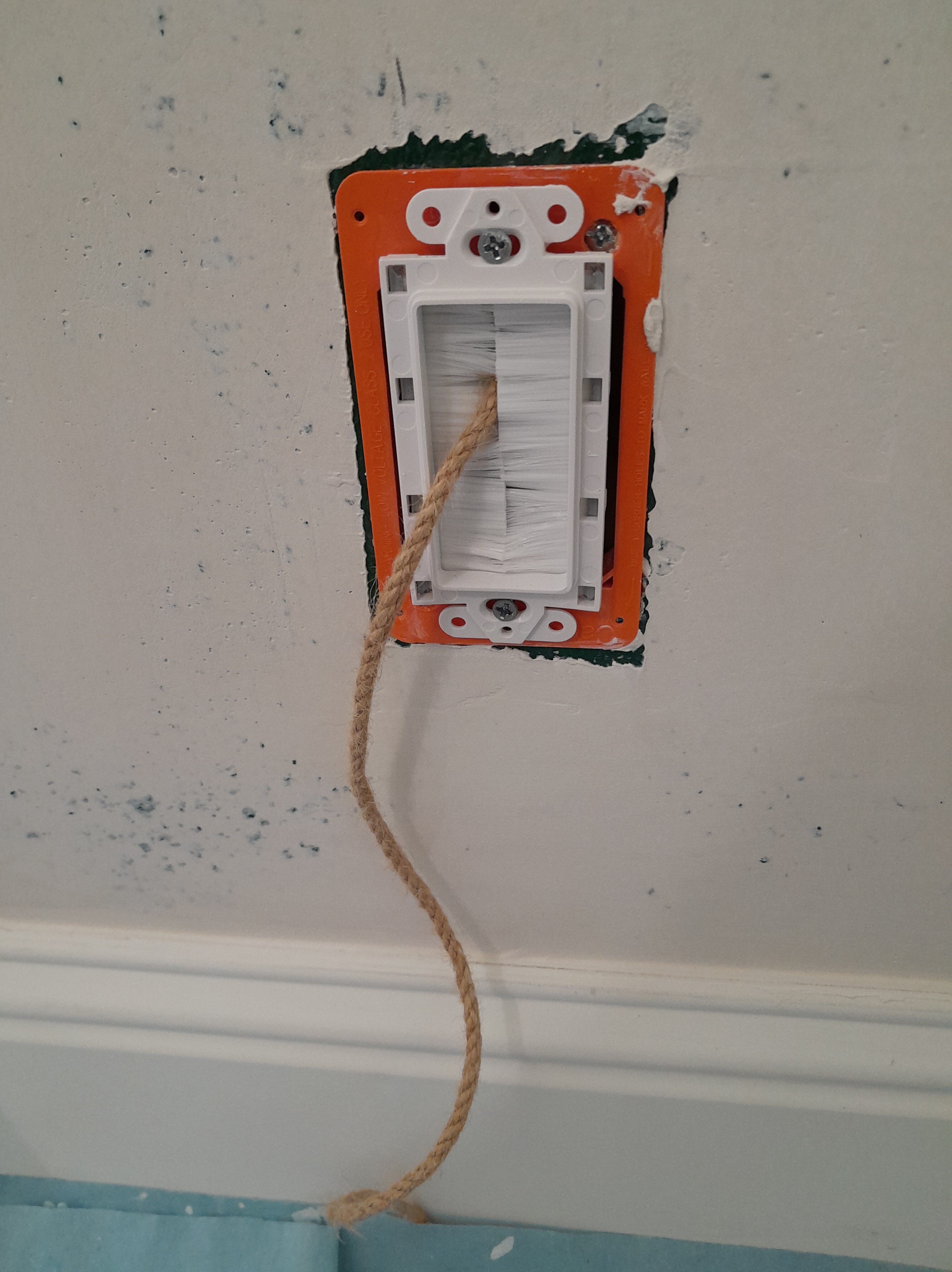
Once I get the wallpaper up on this accent wall , a large, lighted piece of art will hang on this wall. That orange rectangle in the middle is the junction box for the cable that will supply power to the fixture . There’s another one directly below it, near the floor . This cable hanging down along the wall would get in the way of me working with the wallpaper. And get covered in paste . So the homeowner has stuffed it back into the wall.
But if the wire is hanging down inside the wall, how’re we gonna access it when it’s time to reconnect it to the artwork? The clever homeowner thought to attach a piece of rope to the cable. Once the decorating is finished, he can easily pull the rope and fish the cable back out to the surface.
But the rope was still in my way. So I curled it up and stuck part of it inside the junction box. installer houston
On the left is a connector socket for a land-line phone . On the right is an electrical outlet . If you look at the top edge of both cover plates , you’ll that they’re covered with splatters of paint . Whoever painted the wall used a roller that created splatters, and those fell and landed on anything sticking out from the wall. Probably not a big deal. But it bothers me. The painter should have removed the covers first. I’ve also seen some guys take blue painters tape and put a strip over the top of the outlet covers. That will protect them. But, really, IMO, the covers should be removed, and that way, besides not getting splatters on them, the paint will go all the way to the outlet, not just around the cover. I always remove these before installing wallpaper . BTW, most people don’t use these phone jacks anymore, so I usually remove the cover, detach the connector mechanism, stuff it inside the box, and let the wallpaper fall over it. That way you don’t see the white cover plate, but, down the road, if someone wants to connect the phone line, it’s easy to cut an opening and re-access and reconnect the wires.
Getting back to paint splatters … here you see how both the baseboard and the shoe molding below it stick out from the wall. That means that they are subject to being hit with splatters, as well. Also note the gap between my dropcloth and the shoe mold . I have 8″ wide strips that I’ve cut from dropcloths that I tack over baseboards, and are long enough to cover the shoe molding, too, to prevent splatters landing on them. Also, some paint / primer products splatter more than others. And, it matters what paint roller cover you use. Gardz , a primer I like for sealing skim-floated textured walls with joint compound , is VERY watery and runny. A microfiber roller cover is the answer to tame that puppy! They stop virtually all drips and splatters. You still have to be careful with your brush when cutting in , though. And, I can tell you this – if you leave one tiny gap between dropcloth and wall or floor, you can bet that that will be exact spot where the one and only drop / splatter of the day happens … it will land on that one bare unprotected spot. And you won’t notice it until after it’s dried. Trust me. So always cover all the floor and baseboards.
Here I’ve finished papering the accent wall and have replaced the outlet cover . Now you can see that the painter let his brush wipe tan paint along the top of the cover . This means, first of all, that he didn’t remove the covers, but painted around them, so paint got on the cover, and also paint doesn’t go all the way to the outlet underneath. It also, well, it doesn’t look horrible. Probably nobody notices this stuff but me. But it sure would look nicer if there was no tan paint on this white cover, contrasting against the nice new navy blue wallpaper. installer houston
A new desk is on its way. This is the slightly recessed nook where it will sit. The other walls in the room have already been painted a color that coordinates with the wallpaper . Right now, the wall has a heavy texture , typical of new tract homes.
Here I’ve finished skim-floating the wall, sanded it smooth , and have applied my primer / sealer Gardz . All that has dried, and now we’re ready for wallpaper .
Done! What a way to brighten up a work space!
Close-upCloser-up. More on this design below.
Now for some info on technique , next several photos …. Because this paper is basically dark in color , and because wallpaper can shrink as the paste dries and sometimes leave tiny gaps at the seams , I like to color under where the seams will fall with a dark(ish) paint. Here I’ve pre-plotted where the seams will fall (works with non-woven papers because they don’t expand when wet with paste – but not with traditional papers because those do expand, and you can’t plot ahead of time exactly where seams will fall, so you have to measure after each strip and plot where your next seam will fall.).
I use craft paint from the hobby or art supply store – diluted , because you don’t want to completely cover up your wallpaper primer . That primer has a job to do (Number 1 is helping to hold the seams down ), and it can’t do so if a heavy coat of paint is on top of it. I apply with a bit of sponge . And use a heat gun to speed drying time . I also run a bit of black chalk along the edges of the wallpaper. Do a search here to read more about preventing white from showing at the seams .
I measured and determined the center of the wall, and used a pencil to draw a plumb line . Sometimes I will use a laser level to shoot a line onto the wall. Here the first three strips are up. There are lots of reasons to start in the center of the wall. First, you can center / balance your pattern . This is a very rhythmic pattern, and would look best when placed evenly in the center of the wall. Also since walls and corners are never perfectly straight or plumb , you don’t want to butt a straight strip of wallpaper up against the corner. With this method, you’ll be able to trim your last strip into that final corner, making sure that your cut will follow the slight contours of the corner. Additionally, because ceilings and floors are never perfectly level , and walls are never perfectly plumb , if you hang your strip of wallpaper against a plumb line , you can expect that the design will begin to go off-track , moving either up or down against the ceiling line and baseboard . If you start hanging in the left corner and move to the right, by the time you get to the right corner, the pattern could be way off-track ( sloping upward or downward ) under the ceiling , for instance. If you start in the middle , the amount of tracking will be split between left and right – and therefore less noticeable.
I usually prefer to paste the paper . And if it’s paper wallpaper, you have to. But, for just a simple accent wall requiring no intricate cuts or tricks, if it’s a non-woven material (won’t expand when wet with paste ), it works well to paste the wall. So that’s what I’m doing . Here you see my paste roller . The brush is used for cutting in around edges – corner , baseboard , ceiling .
I like the clear strippable 780 paste by Roman . It sticks well, is easy to wipe off woodwork or the face of the wallpaper, stays wet long enough ( we call that open time ), and won’t stain or blush non-woven papers , as some other pastes will. Do a search here to read more. And, yes, I write the date on just about everything I buy.
After the strips have been cut to the right length (leaving 2″ at both top and bottom to accommodate trimming and wonky ceiling and floor ), I roll them backward and inside out , with the top of the strip coming off first . This helps relax the curled-up material , and also prevents the printed side from bopping into the paste I’ve applied to the wall . I secure with elastic hairbands from the dollar store .
Note some slight pattern mis-matches across the seam . Slightly lower on one motif , and slightly higher on the motif below.
These are pretty minor, and don’t bother me at all, especially with such a busy design. In fact, they rather add to the hand-printed look of the paper. (OK, it’s really machine-printed , but who cares?! It’s pretty normal for printing presses to get out of register , especially when running several colors through the line .
Also, this is a gravure print , and results in this lovely raised ink effect . I love the feel and texture a lot.
Another look at raised ink , and slightly imperfect printing (not crisp edges ). It looks hand-made and artisan . Raised ink is about my favorite printing process .
We did encounter a few less-than-perfect issues with printing. Kinda typical of York brand. Although nothing serious , as this was on the back . Small ink splatters here.
But here, all along the edge of this one roll / bolt , ink . Maybe the ink hadn’t dried thoroughly before the paper was wound up into a roll / bolt, so it pulled off onto the backing . Indeed, there were a few smudged areas on the surface of this bolt. Nothing too serious, though.
The design is called Butterfly Garden and is by Ronald Redding . It’s based on a design by CFA Voysey, who was a designer back at the turn of the last century . Cool, somewhat surreal stuff. I have his Bat and Poppy in my powder room . Do a Search here to see posts. Voysey was heavily influenced by William Morris , another turn of the century designer , working in the Arts & Crafts period . I like his designs a lot, too. In fact, I’ve seen a big interest in his style the last few years. Many companies are offering his or similar patterns . Do a Search here to see previous posts. The actual manufacturer of this wallpaper is York , which is one of my favorite brands . yorkwall.com installer The home is in the Heights area of Houston .