Top 10 Best Print Ads of All Time: Advertising Examples
With digital channels like social media and pay-per-click dominating marketing budgets, many assume that creative print ads no longer play a significant role in brand awareness and lead generation.
Yet, reports show that print advertising still delivers impressive results when executed. Consider these statistics:
- 65% of Americans say they prefer reading print materials over digital content. The tangible nature of print makes it more immersive and memorable.
- 58% of consumers report higher trust in print ads than in any other medium. The permanence of print ads lends them more credibility.
- Over 80% of people find print marketing more impactful than digital ads. Print's high-touch experience helps ideas resonate.
Print advertising remains a powerful asset for marketers when used. But it takes inspired creative work to captivate audiences.
Print ads must elicit emotion and interest to stand out. When working with an ad agency, focus on imaginative concepts versus straightforward product features. Lean into the creative freedom print provides.
The top print ad campaigns of all time show what's possible. Their innovative designs tell captivating stories that ingrain brands in consumer memory. They don't inform – they entertain, surprise, and inspire.
This article will showcase 10 of the most iconic print ad examples. Studying their creative approaches will spark ideas for your next print campaign. By learning from the best, you can leverage print's advantages to connect with audiences memorably.
Table of Contents
Top 10 Best Print Ads of All Time
1 – Keloptic: Bringing Van Gogh into Focus
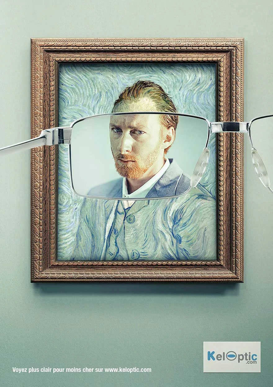
Keloptic, an online retailer selling prescription eyeglasses and sunglasses, recently launched an ingenious print ad campaign that garnered widespread attention. At first glance, the ad merely showed a blurred, indistinct image of Vincent Van Gogh's famous post-impressionist self-portrait. The painter's face was almost impossible, lost in swirls of inconspicuous colours and shapes.
However, Keloptic added a clever twist – right in front of Van Gogh's obscured face was a pair of Keloptic glasses. The tagline read, “Keloptic: You'll see the world like never before.” The ad's intent suddenly became clear: Keloptic's glasses could bring even someone as visually complicated as Van Gogh into perfect focus.
The genius of the ad lies in its simplicity. By using a renowned painting famous for its lack of clarity and definition, Keloptic found a creative way to showcase the power of their lenses. They demonstrated the transformative effects of wearing their eyeglasses without discussing product specifications. The blurry image also tapped into frustration at being unable to see clearly, which many eyeglass wearers experience.
Many in the marketing industry hailed this memorable print ad campaign as one of the most innovative in recent memory. Keloptic had some fun with art history while showcasing their products' capabilities. Sometimes, a simple yet clever concept can go a long way in standing out from the crowded field of online optical retailers. Thanks to their creative ad, Keloptic found an artistically inspired way to make customers see their brand in a new light.
2 – SANCCOB Gets Creative to Save the African Penguin
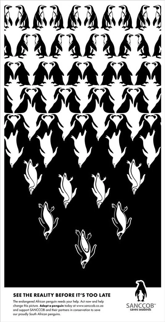
SANCCOB, a non-profit organisation dedicated to coastal bird conservation, recently launched an eye-catching print ad campaign to raise awareness about the plight of the African penguin. This beloved bird's numbers have been declining rapidly, putting it on the path to extinction.
To showcase this pressing issue, SANCCOB worked with an innovative advertising agency to develop a series of print ads using optical illusions. One striking execution featured an inverted pyramid with African penguins filling the comprehensive top portion. As the pyramid descended, the birds disappeared one by one until just a single penguin remained at the narrow base.
The visual trick of the inverted pyramid creatively showed the drastic decrease in African penguin populations over time. While clever optical illusions aren't typically used in cause-based advertising, SANCCOB realised they needed an attention-grabbing approach to get people to notice. The ad provides a bold and thought-provoking representation of the decreasing penguin numbers.
While the optical illusion pyramid is a complex and unconventional tactic, the message comes across clearly. SANCCOB warns that African penguins are rapidly vanishing and need human intervention immediately. The ad provokes a visceral reaction and sense of urgency in viewers.
By taking an innovative approach with this print campaign, SANCCOB demonstrated that non-profits can produce visually striking ads that bring neglected issues to light. The optical illusion pyramid ingeniously got across the African penguin's plight in a way that standard informational advertising couldn't hope to achieve. SANCCOB understands that creativity and attention-grabbing messaging are often required to save a species.
3 – French Ministry of Health Gets Creative About Childhood Obesity
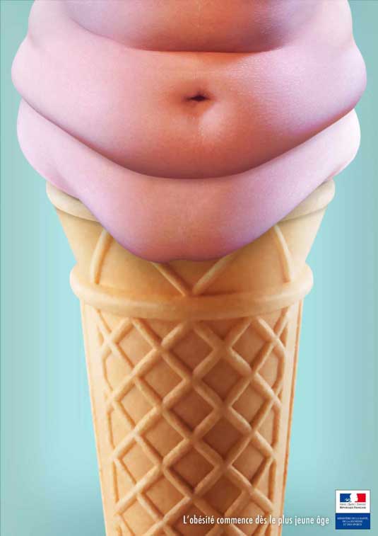
The French Ministry of Health recently launched an inventive print ad campaign targeting the country's childhood obesity epidemic. The ads warn parents that unhealthy lifestyle habits can start impacting children from a very young age.
One particularly creative ad shows a bright, cheerful-looking ice cream cone. But topping the ice cream is a protruding belly, making it appear to have gained weight around the midsection. The accompanying text reads, “Obesity starts at a young age.”
While the topic of childhood obesity is quite severe, the Ministry took a clever approach with this ad. The ice cream is an inventive visualisation of how overeating unhealthy foods can cause weight gain, even in young kids. Using a food item children love, like ice cream, also makes the message resonate more strongly with the target audience.
The colour palette is equally strategic. Despite the sad topic, the ad uses various bright, appealing colours like white, pink, blue and yellow. This attracts attention from kids and adults without leaning into scare tactics. The cheerful colours likely make parents more open to receiving the message.
Overall, this print ad campaign shows how government agencies can get creative with public health messaging. Using clever analogies and eye-catching colours, the French Ministry found an innovative way to tackle a tricky topic. The ad delivers an essential message about preventing childhood obesity while remaining palatable for the intended audience. It proves that creative analogies can communicate health priorities more effectively beyond statistics and facts. The Ministry understood creativity's power to capture interest and drive positive behaviour change.
4 – Ecovia's Body Art Campaign Takes a Creative Stand Against Reckless Driving

Promoting road safety is a challenge many organisations grapple with. However, the Italian sustainable mobility non-profit Ecovia found an extremely creative way to spread its message and catch public attention. Through their “Stop The Violence” campaign, Ecovia used thought-provoking body art to illustrate the tragedies caused by reckless driving.
The images, shared widely on social media, showed diverse body parts painted to convey powerful stories. In one, a person’s hand was painted to look shattered and broken by a texting and driving accident. Others had arms and legs painted like crumpled car doors, showing the damage of collisions. The most shocking image was painted directly on a pregnant woman’s belly, with tire track marks running over her stomach.
The body art conveyed the horrific physical trauma reckless behaviours on the road can leave. By making abstract traffic statistics tangible through body painting, Ecovia found a way to make people truly feel the impacts. The images strike the viewer emotionally in a way raw data cannot.
Ecovia's campaign spread rapidly online, generating conversation about the ongoing crisis of traffic deaths in Italy. The creative use of body art as messaging allowed Ecovia to break through a space crowded with more traditional road safety ads. It got people engaging online in a meaningful way.
The campaign showed how nonprofit groups can leverage creativity online and offline to promote social issues effectively. Using the human body as a compelling storytelling canvas, Ecovia made road safety personal to those who saw the images. It was an artistic means of making an abstract problem vivid, relatable and hard to ignore. Ecovia demonstrated the power of fusing body art and social messaging to inspire safer driving habits.
5 – KFC Turns Supply Shortage into Clever Brand Redemption
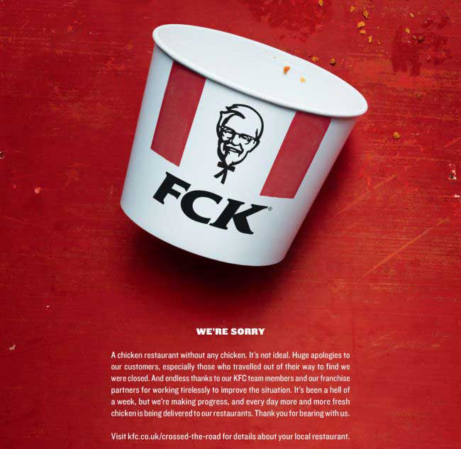
KFC recently faced a brand crisis when chicken shortages forced the fast-food giant to close hundreds of locations temporarily. Running out of their signature product was disastrous for a chain synonymous with fried chicken. However, KFC responded swiftly with a creative print ad campaign that transformed the setback into an opportunity.
With nearly 1,000 U.S. restaurants suddenly chicken-less, KFC worked with their advertising agency to craft an apology ad that would smooth over frustrated customers. But rather than a bland, typical corporate apology, they took a clever approach.
The ad reconfigured the iconic KFC acronym to read “FCK” in large bold letters. The expanded copy explained the letters stood for “We're sorry for the chicken shortage. But more importantly, we're sorry for letting you down.” The profanity play on KFC’s name showed a willingness for honest humour about the situation.
While a risky move, the edgy “FCK” ad humanised the massive corporation. The unconventional apology captured widespread attention on social media. People applauded KFC for not taking itself too seriously and showing some personality when responding to the supply issue.
The campaign demonstrated how brands can creatively transform PR crises if they have the courage. Rather than making empty apologies, KFC tapped into viral humour and transparency. In the process, they turned a disappointing shortage into a chance to connect with customers authentically. The ad proved that owning mistakes with humanity, instead of corporate jargon, can earn back customer trust and loyalty. By being unafraid to say FCK, KFC used creativity to redeem themselves when it mattered most.
6 – Chupa Chups Gets Clever About Sugar-Free
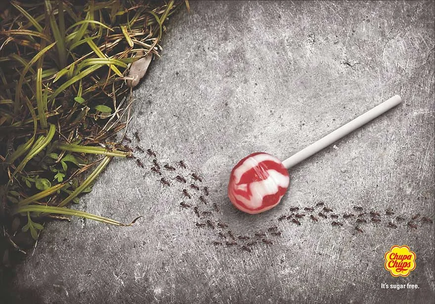
Legendary lollipop brand Chupa Chups recently launched a new sugar-free version of their iconic candy. Their advertising agency developed a print ad campaign to promote this product extension, playfully highlighting the low-sugar appeal. The most creative ad showed a lollipop surrounded by a winding line of marching ants. However, instead of going straight to the lollipop, the ants took a long, winding path around it to avoid the treat altogether.
The ad's tagline read, “Sugar? No, thanks.” This brought home the point that, unlike the original, Chupa Chups' new lollipop contains no sugar to entice the ants. The exaggerated visual of the ants avoiding the candy emphasised that parents could now make a healthier choice.
While whimsical, the ad strikes the right tone for the brand. It builds on the colourful, fun spirit that Chupa Chups is known for. The humour and hyperbole of the ant march creatively communicated the product's unique selling point without being overly technical about the reduced sugar.
This campaign demonstrated how iconic brands can leverage their reputation to highlight new offerings. By adding a playful spin, Chupa Chups showed that sugar-free candy didn't have to be presented as bland health food. The tone aligned sugar-free with the lively spirit customers already associate with Chupa Chups. Sometimes, brands just need a simple, charming message conveyed through a sweet and sticky visual metaphor. This ad proved that sugar-free can still be fun.
7 – Jeep’s Clever Optical Illusion Ad Highlights Off-Road Capability
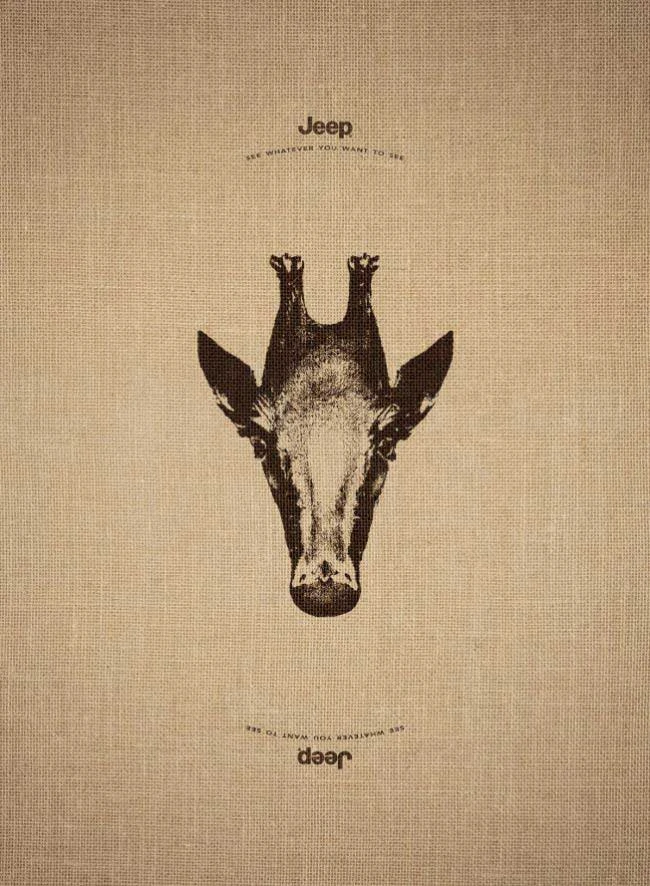
Legendary off-road vehicle company Jeep built its reputation on cars that can conquer any terrain and take drivers on adventures off the beaten path. Recently, their marketing team brilliantly captured this rugged ethos in a print ad using optical illusion.
Depending on the viewer's perspective, the ad features an image that appears as either a Giraffe or a penguin. The accompanying text ties the illusion to the Jeep brand promise: “See whatever you want to see. Go wherever you want to go.”
While visually clever, the ad’s copy prevents the optical illusion from feeling too abstract. It grounds the viewer in Jeep’s core identity – vehicles unconstrained by limits that allow you to explore the world fully. The Giraffe and Penguin symbolise the dual nature of Jeep – cuddly and familiar but also fiercely adventurous.
The ad's optical trickery conveys the imagination and wonders Jeep owners experience. While many car ads simply list product specs, Jeep took a creative conceptual route. They focused not on technical details but on emotional benefit – the ability to shift perspectives and see the world in new ways.
This innovative print execution shows that sometimes subtle visual metaphors communicate more than explicit descriptions. Jeep allowed the artistry of the optical illusion to express feelings of freedom that words alone couldn't capture. Clever creativity is often the most effective tool for brands built on emotions like adventure and independence. This ad proved optical magic can drive home a powerful point.
8 – Opel’s Startling Ad Campaign Urges Drivers to Stop Texting
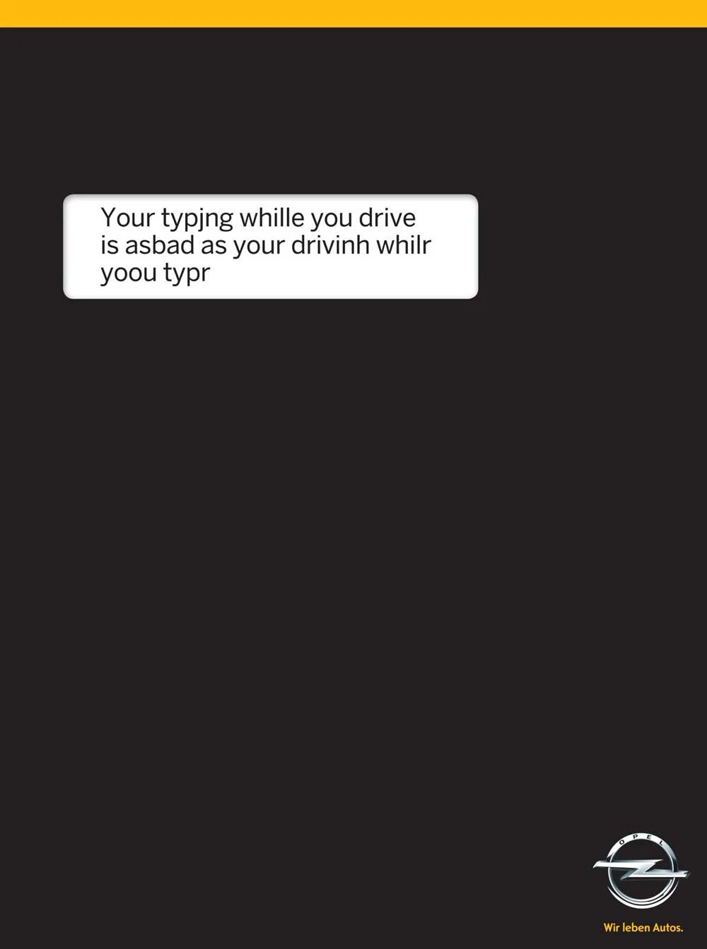
Distracted driving caused by texting behind the wheel has become a significant public safety crisis. Carmaker Opel recently launched an impactful print advertising campaign to raise awareness of the issue's devastating consequences. Their bold approach created visceral engagement in an often ignored problem.
The ad features a stark, black background with minimal text that reads: “Text and drive. The last thing you will ever do.” The copy is overlaid on two hands poised over an illuminated smartphone, about to type. The ad is ominous yet straightforward, using high contrast and space to convey an unsettling tone.
Unlike many distracted driving PSAs, Opel chose an eerie, subtle execution without gory crash footage. The ad leaves the horrific implications to the imagination, which, in some ways, is more haunting. The image of a texting driver draws the viewer in with its familiarity, only to deliver an unshakable warning.
Opel’s campaign demonstrates that impact doesn’t always require flashy graphics or complex visuals. The ad makes it painfully clear through stark simplicity that a brief lapse in judgment could cost a life. The chilling line of text succinctly delivers the ad’s message: texting behind the wheel is never worth the risk.
This print campaign shows how stripping back design elements can sometimes heighten a message. Opel's ad didn't need more than black space and 14 haunting words to convey the significance of the distracted driving epidemic. The simplicity forced people to confront an uncomfortable truth and reconsider their behaviours. This road safety campaign proved that less can often be more when trying to save lives.
9 – PNET Uses Humour to Inspire Job Seekers to Make a Change

Feeling stuck in an unsatisfying job is a common experience for many professionals. South African recruiting platform PNET developed a memorable print ad campaign to motivate these disgruntled workers to change.
The ad features a desk cluttered with papers and old coffee cups covered in green mould. A bored-looking man sits at the desk staring blankly at a computer screen, with the tagline “Don’t let your career stagnate.”
The tongue-in-cheek visual of the messy, disorganised desk embellished with mould builds on the idea of stagnation effectively. It’s an exaggerated but relatable representation of the struggle and lack of growth many feel at their current jobs. The mould signifies untapped potential going to waste.
While humorous, the ad also links to PNET’s role in providing fresh job opportunities. It inspires dissatisfied professionals to take control of their careers and find a position where they can thrive. The message goes beyond poking fun at workplace misery to offer a solution.
Creative ads like this show that even severe topics like careers can benefit from humour and exaggeration. By hyperbolically dramatising the despair of an unfulfilling job, PNET’s message sticks in the audience’s mind. Laughter makes us more receptive to learning, even if the topic is our professional happiness. This campaign proved that wit and exaggeration can capture attention and drive change more effectively than stern lecturing.
10 – Pedigree Makes a Strong Case for Pet Adoption Through Clever Juxtaposition
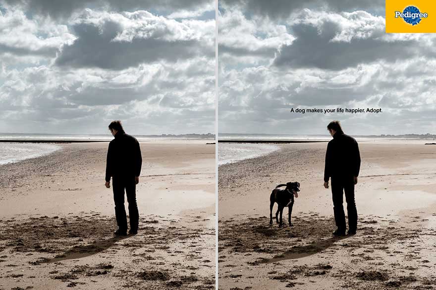
The old saying goes that a picture is worth a thousand words. Pedigree powerfully proved this idea accurate in a print ad campaign advocating pet adoption. The creative ad depicts two nearly identical room interior scenes side-by-side. However, one image shows a bored, lonely man sitting alone, while the other has him smiling and playing with a dog.
Without any text besides the Pedigree logo, the visual comparison instantly conveys the immense joy and fulfilment that adopting a dog can bring. The contrast shows a dog's tangible difference in brightening someone's life. Just looking at the man's expression change sparks an emotional reaction about the benefits of pet companionship.
By displaying the two scenarios together, the ad maximises the impact lost if only showing them separately. The “before and after” juxtaposition makes the contrast crisp and memorable. People intuitively grasp how adopting a dog could positively transform their lives.
Pedigree's campaign proves that thoughtful image juxtaposition can make an argument more persuasive than lots of explanatory text. The split images let the audience simply “show” instead of “tell.” This creative style didn't just promote Pedigree's brand – it made a case for the profound good adopting a pet brings to owners. With one thoughtful picture pairing, Pedigree demonstrated why opening our homes to animals in need has the power to change everything.
Wrapping Up
Though digital advertising reigns supreme today, the best print ads demonstrate that creativity and innovation in traditional media still captivate audiences. When done thoughtfully, print ads can break through the noise and deliver messages that stick with us long after viewing.
The examples highlighted show how varied print advertising can be while delivering impact – check out Prints4sure.com for more inspiration. Whether using exaggeration, juxtaposition, optical illusions or minimalism, these ads all succeeded by speaking to human emotions and experience. Their creativity and poignant messaging made them into enduring and influential communication art.
Looking forward, print advertising remains a crucial part of the marketing mix when executed with imagination. As these campaigns prove, the fundamental human insights print can tap into stay as relevant as ever. Creativity and emotional intelligence will always be more valuable than huge budgets when crafting resonant messaging.
These top 10 best print ads should inspire anyone developing their print campaign to think boldly and take risks. Marketers should study them closely to extract lessons on visual storytelling and conveying meaning creatively. Though mediums change, creativity, emotion, and great design are the timeless keys to effective advertising. With those pillars, there is no limit to the impact a simple printed ad can have.
Is print advertising a decreasing market?
Print advertising has declined recently due to the shift towards digital media. The rise of online platforms and the ability to target specific audiences have drawn advertisers away from traditional print outlets. However, it's important to note that print advertising still has its place in particular industries and demographics, offering a tangible and memorable way to convey a message. Its future viability depends on adapting to changing consumer preferences and integrating with digital strategies for a more holistic approach to advertising.
How can you create the best print ads?
Creating the best print ads involves a strategic approach. Begin with a clear understanding of your target audience and goals. Craft a compelling message with concise copy and striking visuals. Ensure a strong and memorable headline, followed by engaging content—Utilise high-quality graphics and design elements to capture attention. Pay attention to layout, typography, and colour schemes for a visually appealing ad. Finally, invest in professional printing to maintain quality. Regularly evaluate and refine your approach based on performance data to improve your print advertising effectiveness.
Are newspaper commercials applicable today?
Newspaper commercials, while less prominent than before, can still be applicable in specific situations. They remain relevant for targeting local audiences or older demographics who prefer print media. However, their effectiveness has diminished due to the digital shift. To maximise their impact, integrate newspaper ads with a broader marketing strategy that includes online and social media channels. Careful audience segmentation and ROI analysis should guide the decision to have newspaper commercials in your advertising mix.
