


This tutorial is probably my personal favorite because of my love for script lettering and its ability to communicate a wide variety of messages. In this tutorial, you’re going to learn the basics of informal (also known as casual) and formal script lettering. By the end, you'll have a grasp of stroke weights, contrast, kerning, flourishing, speed, angle, and other techniques that are used to develop script lettering.
Let’s tackle the script lettering first, and then move forward into flourishing. We'll cover the basics to begin, and then we’ll add the embellishments and other bells and whistles so that your typography stands out from the rest and appears more “custom”. After all, that's what “lettering” is all about: custom and unique hand-drawn typography!
By the way, I've snuck in a few awesome cursive hand-lettering fonts at the end of this tutorial. They're great for quickly adding a professional, fun touch to your creative projects. Devilion is just one example of the premium fonts you can find further down in this guide.


Pre-Tutorial Reading
Before we actually begin this tutorial, I want to provide you all with some much-needed information that will help your overall understanding of the below methods.
I highly recommend you look into my previous two classes before beginning this one, since this material is for an intermediate-level letterer. A good knowledge of typography sure is useful! Those classes can be found here: Hand Lettering: Letterforms at Their Core and Understanding Types of Type.
So, what exactly defines "script lettering"? Script, cursive, calligraphy and other terms are all used interchangeably. Script essentially refers to letterforms that are joined together by a single movement of the hand. But, in this case, since we're script drawing, it will be the buildup of pencil strokes. It will consist of many, many strokes that will be made to develop and refine the letterforms... rather than completing the letterforms in one movement as you would with calligraphy.
Now, some of you may be wondering, what's the difference between formal and informal script lettering? Formal script is connected back to the good old days of penmanship when it was actually a thing, beginning around the 16th century and onwards. Sadly, penmanship is a dying art due to technology. Public schools (here in the US) don't even require cursive as part of the curriculum any longer!


Anyway, back on topic, scripts such as Roundhand, Spencerian, and Copperplate are all considered formal script because of the construction and methods to form the letters. All of them were written with a pointed nib and ink. These letterforms had a specific slope, angle (around 50+ degrees—it varies between penmen), speed, etc. If you're wondering where you can see such wonderful penmanship, The Declaration of Independence was written in Copperplate script! The Coca-Cola logo even contains some characteristics of Spencerian script.
On the other hand, we have informal script, which is much more flexible. It has some roots within formal script, such as letterform construction, but it has the ability to be completely unique from its origin. The overall speed, composition, color, size, and other factors vary with informal script. Altering the width, angle, size, contrast and other characteristics of a letterform can create unique informal script letterforms.
If you have any questions regarding script during or following this hand-lettering strokes tutorial, feel free to ask! I'm always willing to share more knowledge with you.
Now, let's get to it!
1. Preparing the Tools You Will Need
Before you start learning these basic hand-lettering techniques, make sure you have the right supplies:
- Tracing paper
- Graph paper
- Pencil
- This PDF (for when we tackle flourishing)
We're going to refine our lettering a lot! So lots and lots of tracing paper is necessary. Since we'll just be drawing letterforms, grab your favorite pencil, eraser, sharpener, etc. Anything you need to help you draw.
Download the attached PDF for your viewing pleasure. My advice is to print it out (you have the option to trace flourishes later on) so that you have it in front of you while completing this tutorial!


2. Formal Script
We're going to begin by understanding the basic shapes and strokes that create formal script letterforms. For this whole portion of the tutorial, we're going to focus on drawing the word "design" (all lowercase). This word has a large combination of basic hand-lettering strokes that you can later utilize for formal lettering pieces.
Utilizing the strokes in this word and understanding their formation will provide you with the understanding to draw nearly any letter/word, since they're all composed of the same basic strokes.
I provided some GIFs so you can see a breakdown of each stroke that composes each letterform. Mastering these strokes is the key to success! Let's get started.
Step 1
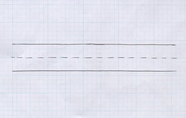
Prepare a piece of graph paper for this portion of the tutorial! Let's create our baseline, cap-height, and x-height for our letters to sit within. Start in the middle of the page and add a dotted line to form the x-height. Next, from the middle, count out three squares upwards and draw a line. Then, three squares downwards and draw a line.
Boom! You've now got yourself your cap-height, x-height, and baseline.


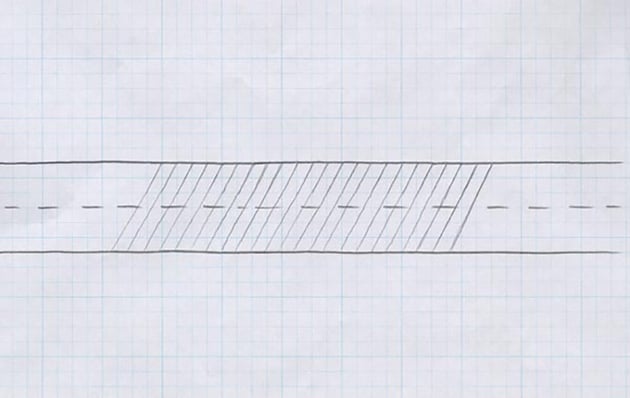
Step 2
From here, we need to establish an angle/slope for all of our letters to follow. Begin drawing angled lines (around a 45-degree angle) every one or two squares. Once you're done, it should look something like the below photo.


Step 3
Alright! Now that you have your graph paper ready with your guides, place a blank piece of tracing paper over the guide you just created.
Let's now begin constructing the "d" of the word design. The lowercase "d" contains two strokes. One is an oval shape (this forms the bowl of the "d") while the other is the stem. Begin forming the oval shape up to the x-height of our graph paper. Then, add the stem, which will extend to the cap-height. It should look something like the below photo.


Step 4
Moving onward to the "e", you'll notice this letterform uses the same oval shape. Pay attention to the slope/angle of the "e" and match it to the angle of the "d" you just drew.


Step 5
Next, let's tackle the "s". This letterform is probably the most difficult to master due to its complex structure. A little tip to watch for: the bowl of the "s" should appear round and not too flat. Additionally, the top of the "s" structure actually extends above the x-height. This is to balance the negative space and weight of the letterform compared to the others. It would appear rather small in scale if the top of the "s" just met with the x-height.


Step 6
Alright, now that we've practiced that complex "s", let's draw a much easier letterform: the "i". This is essentially a half stem (similar to the stem of the "d" but about half the size). For a successful "i", pay attention to the distance of the tittle (the dot of the eye) and the stem. If it's too far, it'll have too much negative space around it. Watch the negative space created by the distance of the tittle, and you'll be golden.


Step 7
Continuing onward, this "g" shouldn't be too difficult. It's almost an upside-down "d" in terms of size and structure. One thing to pay attention to is the change in weight in the descender of the "g" as it extends upward towards the "n". This form should be a piece of cake after some practice. It contains yet another oval shape for the bowl of the "g" and a stem to form the descender.


Step 8
This is it! The last letterform in our word, the "n". The structure of this letterform is comprised of two strokes: one short stem (connected to the g, in this case) and a second stem connected to the first.


And here is our completed word, "design", below. Again, these basic strokes you drew within this word can be used for all other letters/words. Just keep practicing and you'll begin to understand the structure even more! It's all about practice!


Notice anything strange about the completed word? The kerning between the "g" and "n" appears a bit more open than the rest of the letterform pairings, right? With formal script, a slightly larger space is needed to accommodate the joining stroke. You want all your letterforms to connect gracefully with a coulée (French word, meaning to flow) join rather than an abrupt join.
3. Informal/Casual Script
Step 1
Taking what you know about formal script, let's now apply those basic hand-lettering techniques to some informal script drawing.
For this entire tutorial, we’re going to draw and redraw the same phrase over and over. Now, it's entirely up to you to decide what your phrase should say. But, you’re more than welcome to use the same phrase as me, which is: Bury the Past.
So, if you’re not using the phrase I provided, take this time to brainstorm a phrase or search for one within song lyrics, movies, etc.


Step 2
Just like most fancy hand-lettering projects, we'll start out in the conceptualizing and brainstorming phase. We’re going to begin drawing out comps for the typography to really reach its full potential. The best way to quickly sketch out ideas is to use shapes, arcs, lines, etc., for the type to live in or follow. Just like the below example, sketch some ideas out to help you decide which layout would be best for your chosen phrase.
For this stage of the process, it's great to begin working small so you can quickly get all your ideas on the page. Then, later on, increase the scale for fine-tuning those letterforms.


Step 3
Next, after you've sketched out some varieties, select one of those that you think is working best to continue working further on it. At this stage, I like to scan that piece of lettering into the computer and enlarge it to begin working on a larger scale.
So either scan it into the computer and print it out or just redraw the lettering at a larger size, whatever method is easiest for you.


Step 4
Once you've got your large-scale lettering good to go, you can now refine even further. Be prepared to draw and redraw your lettering. At this stage, we're trying to fine-tune your kerning, negative space, connections, and overall composition. Once you refine, refine, refine, you're going to have a finished "skeleton" of your hand-lettering strokes.


Step 5
Next, we're going to continue to refine and add contrast to the lettering. This is the stage where you can take the lettering in any direction you'd like. I'm leaning towards a really fluid and brush-like feel. I want to incorporate a nice rhythm and distinctive style, adding some "spurs" to the vertical strokes.
Take this time to begin adding weight to your lettering. This is where you decide if you'd like your lettering to have a high contrast or low contrast between the thick and thin strokes.


Step 6
Again, we're just going to continue refining the letterforms until perfection. At this point, I'm continuing to add weight as well as paying attention to the kerning, negative space, and connections between letterforms. As you add weight to your lettering, all those variables will change! Open up the space between the letterforms if the areas get too dark with the extra weight you're adding to your letters.


Step 7
You might not notice many differences between the previous step and this one. But if you look closely, I'm altering the kerning and placement of certain letterforms. As you can see, on the previous image I made notes to myself to open up the kerning. Additionally, I drew angled lines to make sure all the letterforms follow the same angle throughout. Make more adjustments and refinements to those letterforms until the color (overall positive and negative space) and composition are working fluidly.
Take this time to redraw letterforms that might need more adjustments. You might need to tweak the spacing or connections, or make corrections if they're all not following the same angle.


Step 8
This is the final stage of my fancy hand lettering! I've fine-tuned the letters enough to have an even color throughout, nice balance, rhythm, and an even composition.
Take this time to cleanly redraw the letterforms until completion. After many stages of redrawing, we've got ourselves a nicely composed group of letters!


Here's the entire process. It's all about the refinements!


What about vectoring?
Looking to take your lettering further on the computer? Need a better grasp of the Pen Tool in Illustrator? In a future tutorial, I'll be using this piece of lettering to progress further into vector format. Stay tuned!
4. Flourishing
Before we begin this section of the tutorial, I want to provide a few rules and things to remember. First and foremost, flourishing doesn't automatically make your lettering better, nor is it needed in every lettering piece that you complete. Use caution when deciding the appropriate time to add flourishing to your next lettering piece.
Next, another important rule to remember is to add flourishing from the exit and entry strokes of your letterforms. Ascenders and descenders are perfect places. But make sure you do so naturally instead of forcing it to happen.
Last thing to note before we get started: flourishing is something that needs to be balanced and refined, just as you did above with your lettering. Flourishing creates positive and negative space, so of course you need to balance those positive and negative spaces you create with your flourishes. Balance is key to flourishing.
Step 1
We're going to begin practicing basic flourishing strokes. Download the provided PDF and print it out to view the basic strokes. We're just going to focus on the strokes themselves. Once you nail down these techniques, you can then apply them to your lettering.
Let's begin drawing the spiral flourish. Place a blank piece of paper over your printed PDF. Begin tracing the spiral flourish until you've nailed down the muscle movement your arm and wrist perform. Once you've practiced tracing it over and over, try to draw it without tracing!


Step 2
Let's now do the same with the next flourish stroke, the loop. Place a new piece of paper over your printed reference sheet and begin tracing the loop stroke. Practice until you feel you can take it on without tracing.
The key to perfecting this stroke is balancing the positive and negative space created by the overlapping lines. Additionally, make sure the heavier and more weighted portions of the stroke cross over the lightweight portion of the stroke. Never allow two heavy strokes to interact because that creates an eyesore of extremely weighted positive space. Again, here it's all about balance!


Step 3
Next, let's tackle the tail stroke. This isn't a correct term—it's just my way of classifying this particular stroke. Anyway, feel free to begin tracing just as we have before. If you feel that you have a good grasp on this stroke, practice drawing multiple hand-lettering strokes one after another. Pay attention to scale, contrast, and of course, consistency!


Step 4
Continuing further, we'll be practicing the s-curve. It may seem simple enough, but watch the subtle change in weight as well as the subtle change in height. Just as we did before, practice this stroke over and over until you've got a good grasp on the technique.


Step 5
Lastly, let's practice the figure 8 stroke. This is one of the more complicated strokes because of the need to balance everything as well as paying attention to stroke intersections. Just as with the loop, make sure you watch the weight of the strokes as they intersect. Practice drawing a few of these by tracing or practicing freehand!


Step 6
Apply these techniques to your next lettering piece!
You may have noticed in my Bury The Past piece, it has an exaggerated s-curve flourish extending off the exit stroke of the lowercase s. This is what I mean by applying flourishing "naturally" instead of forcing it. The simple s-curve flourish balances the negative space and fits everything nice and tight to create a much better overall composition.


You're Done!
Learning how to make swirly letters with beautiful script is definitely difficult, right? Practice and repetition are the keys to success! Keep tracing, keep drawing, keep refining, and you'll see your progress, I promise you.
It definitely takes years of practice to fully grasp all the ins and outs of script lettering, so don't get discouraged. If you have any questions about hand lettering, feel free to post below and I'll be able to help you out. Good luck!
Fancy Hand-Lettering Alphabet Fonts From Envato Elements
Using what you know about hand-lettering flourishes to create fonts is great—when you have the time. But if you have a project you're working on and need a typeface now, head to Envato Elements. Here's a sample of some of the hand-lettering calligraphy fonts available from the site:
1. Daytonia: Hand Lettering Script (OTF, TTF)


The formal script alphabet of Daytonia is a perfect fit for any creative's digital typography set. This font features lovely cursive swirls and elegant ligatures. Daytonia also comes with different styles with underlines and trails. If you like fancy hand-lettering fonts, try out this one.
2. Qumalu: Hand Lettering Font (OTF, TTF, WOFF, WOFF2)


With thick lines and legible glyphs, Qumalu is a top script drawing font. It blends formal script alphabets with a modern flair. Use Qumala's hand-lettering flourishes for branding, flyers, book covers, and more. It's a great choice if you want versatile hand-lettering alphabet fonts.
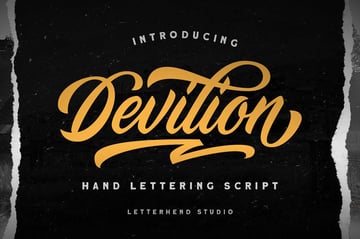
3. Devilion: Hand Lettering Script (OTF, TTF)
Devilion is one of the best modern calligraphy hand-lettering fonts featured on Envato Elements. The cursive swirls stand out and come in different variants. This typeface also features a clean and stamp glyph style. You can use the fancy hand lettering of Devilion in just about any creative project.
4. Adelyne: Modern Hand Lettering (OTF, TTF, WOFF)


Here's an informal script alphabet that's sure to turn some heads. Adelyne takes traditional hand-lettering flourishes and applies them to a minimal aesthetic. A web font file is included for online use, so it's perfect for social media and web pages. As far as calligraphy hand-lettering fonts go, Adelyne is as good as it gets.
5. Entreaty Hand Lettering Script (OTF, TTF, WOFF)


Let's wrap up this list with the strong style of the Entreaty hand-lettering script drawing font. It features bold type and more than 500 glyphs. You'll find uppercase and lowercase letters here, along with ligatures and stylistic alternates. Like the other hand-lettering calligraphy fonts listed here, Entreaty also works on both Mac and PC.
Extra Resources for Calligraphy Hand-Lettering Fonts
If you're interested in getting some help with your hand-lettering calligraphy fonts, feel free to browse all the font downloads with hand-lettering strokes available on Envato Elements.
Are you looking to find the other articles in this series? Follow the links below to go back and forth through these Hand Lettering tutorials:

 Hand Lettering: Understanding Types of Type


 Hand Lettering: Mastering Brush Script

 Hand Lettering: How to Vector Your Letterforms

 Hand Lettering: How to Stylize Your Letters

 Hand Lettering: A Project From Start to Finish

 Hand Lettering: Letterforms at Their Core
You can also check out even more resources for cursive hand-lettering fonts from these Envato Tuts+ articles:


