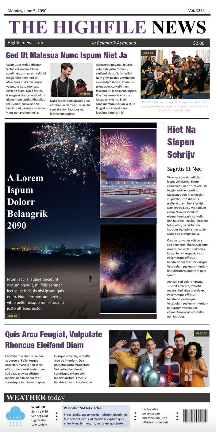
In the field of newspaper design and layout, time is a crucial factor. Editable templates for Microsoft Word and Google Docs now offer a practical solution to this challenge. These templates provide a basic design and layout, significantly reducing the time and effort involved in creating a newspaper. They cater to various needs, including business, education, and personal events like weddings. Users can easily select a template, personalize it with their articles, and move forward with printing. Available for immediate download and editing in popular word processing applications, these templates make newspaper production more accessible and efficient.
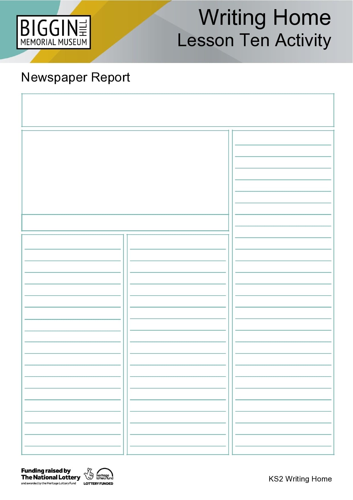
Newspaper Templates


How to Create a Newspaper Template (Step-by-Step)
Creating a newspaper template is a strategic approach to streamline your publishing process. It’s ideal for a range of purposes like school projects, community newsletters, or business communications. A custom template serves as a reusable base for your publications. Below are the steps to create your own newspaper template.
Step 1: Choose Your Software
- Select a software for template creation. Microsoft Word and Google Docs are popular due to their user-friendly interfaces and wide accessibility.
Step 2: Set Up the Page
- Open a new document.
- Change the layout to landscape for a classic newspaper look.
- Set margins around 0.5 inches for optimal content space.
Step 3: Create a Header
- Design the header at the top. Include your newspaper’s name and, if you like, a logo or slogan.
- Use a bold, large font for visibility.
Step 4: Divide Your Page into Columns
- Newspapers typically have a column layout. Use the ‘Columns’ feature to divide your page into two or three sections.
- Balance the spacing between columns for a clean look.
Step 5: Add Text and Image Boxes
- Insert text boxes for your articles. This gives you better control over the placement and formatting of your text.
- Place image placeholders where you want photos or illustrations, aligning them with your columns.
Step 6: Add Your Text
- Instead of dummy text, start adding the actual text for your newspaper. This helps you tailor the template to your specific needs and get a realistic view of the layout.
- Choose a readable font like Times New Roman or Arial, in a size that’s easy to read, like 10 to 12 points.
Step 7: Customize with Additional Elements
- Include extra elements like sidebars, quotes, or infographics to enhance the visual appeal and information delivery.
- Leave space for ads if they’re part of your layout plan.
Step 8: Save Your Template
- After finalizing the layout, save your document as a template. In Word, this means saving as a ‘.dotx’ file. In Google Docs, save it in the ‘Template Gallery’ for easy future access.
Tips for Formatting a Broadsheet Newspaper Template
The formatting of a broadsheet newspaper template is key to presenting news in a manner that reflects both authority and readability. This style of newspaper, known for its larger format, requires careful attention to layout and design. Here are essential tips for effectively formatting a broadsheet newspaper template:
- Maintain a Classic, Clean Layout: Emphasize a straightforward, uncluttered design with well-defined columns and consistent spacing. Avoid overuse of graphical elements.
- Use a Traditional Multi-column Grid: Broadsheets typically have four to six columns per page, which helps in organizing content and facilitating easy reading.
- Choose Legible, Professional Fonts: Opt for traditional serif fonts like Times New Roman for body text and slightly more impactful serif fonts for headlines.
- Prioritize Hierarchical Typography: Differentiate clearly between article titles, subtitles, and content using varied font sizes and styles.
- Balance Text and White Space: Ensure margins and column spacing are adequate to avoid a cramped look and enhance legibility.
- Incorporate High-Quality Images Judiciously: Use images to supplement content. They should be high-resolution and relevant, without overpowering the text.
- Handle Infographics and Sidebars with Care: Infographics and sidebars should fit seamlessly into the overall layout, adding value without disrupting the flow.
- Be Consistent with Your Color Scheme: If using colors, keep it consistent and restrained. A muted color palette is typically preferred for a professional look.
- Test and Iterate Your Layout: Print a test copy to evaluate the physical look. Make necessary adjustments for the best quality in the final print.
Tips for Formatting a Tabloid Newspaper Template
Tabloid newspapers, with their more compact format and often more sensational content, require a different approach to formatting compared to broadsheets. The design and layout of a tabloid are critical in engaging the reader while maintaining readability and visual appeal. Here are some key tips for formatting a tabloid newspaper template:
- Embrace a Bold, Eye-Catching Layout: Tabloids are known for their striking and attention-grabbing design. Use bold layouts with prominent headlines and strong visual elements to draw in readers.
- Opt for Larger, More Dramatic Headlines: Unlike broadsheets, tabloids can use larger and more stylized fonts for headlines to create impact. Sensational or intriguing headlines are common in tabloid formatting.
- Use a More Relaxed Column Structure: While still structured, tabloid layouts can be more flexible with column widths and arrangements, allowing for a more dynamic feel.
- Incorporate Vibrant Colors and Graphics: Tabloids often use color more liberally than broadsheets. Vibrant colors and impactful graphics can help to highlight key stories and features.
- Include More Images and Visual Content: Images play a crucial role in tabloids. Use high-quality, engaging images that complement and enhance the stories. Photo spreads and large photographs are common.
- Ensure Readable Font Sizes and Styles: Despite the bolder approach, maintain readability with clear, legible fonts for body text. Avoid overly decorative fonts that might hinder readability.
- Create Distinct Sections for Various Content: Organize content into clear sections for news, entertainment, sports, etc. This helps readers navigate the newspaper easily.
- Balance Sensationalism with Legibility: While tabloids are known for sensationalism, ensure that the layout remains legible and organized, avoiding a cluttered or overwhelming appearance.
- Consider Audience Engagement Features: Include elements like puzzles, quizzes, or opinion polls, which are popular in tabloid formats, to increase reader engagement.
- Regularly Update the Layout for Freshness: Tabloids often refresh their layouts to keep the format lively and engaging. Don’t hesitate to update designs to keep up with current trends.
FAQs
To make your template printer-friendly, avoid using colors that don’t translate well to black and white printing, and ensure that your text and images have clear contrast. Always print a test page to check how your design translates to a physical copy.
Select fonts that are easy to read and appropriate for your audience. For body text, use a standard, legible font like Times New Roman or Arial. For headlines, you can choose something more distinctive but ensure it’s still readable. Limit the number of different fonts to maintain a cohesive look.
Yes, for digital newspapers, you can incorporate interactive elements like hyperlinks, embedded videos, or animation. However, make sure these elements are compatible with the platform where your newspaper will be published or shared.
Use a larger font size, ensure high contrast between text and background, and avoid overly complex layouts. Also, if your newspaper is digital, include alt text for images and use accessible PDF formats.
Start by defining sections based on your content type (e.g., news, features, opinion). Use consistent headings and a logical layout to guide readers through the paper. Place the most important or engaging stories on the front page or at the beginning of sections.
Regularly review your template for any design elements or content sections that need refreshing. Stay updated with current design trends and reader feedback. Updating your template can involve changing fonts, adjusting layouts, or introducing new content sections.
Yes, always ensure you have the right to use an image. Use royalty-free images or your own photographs. If you use someone else’s work, make sure to get permission and provide proper attribution if required.
For digital newspapers, use analytics to track reader engagement, like time spent on each page or article click rates. For print, feedback surveys and reader letters can provide insights into how your layout is being received.
The ideal column width for readability is typically between 1.5 to 2.5 inches. However, this can vary depending on your font size and the overall layout of the newspaper.
Text in newspaper columns is usually justified, which means it is aligned evenly along both the left and right margins. This creates a clean, professional look typical of traditional newspapers.
Yes, you can use color for visual impact. Stick to a consistent color palette that reflects the tone of your newspaper. Use colors sparingly to highlight important sections or headlines, and ensure there is sufficient contrast for readability.
White space is essential for preventing a cluttered look. Balance your layout by allowing adequate space between columns, around images, and in margins. White space can help direct the reader’s eye and improve overall readability.
Headline size should be significantly larger than the body text but not overwhelming. The style should stand out and reflect the tone of the article. Bold, clear fonts work best for headlines.
Common mistakes include using too many different fonts, over-cluttering with text or images, insufficient white space, and not aligning text and images neatly. Consistency in design across all pages is key.
Use high-resolution images (at least 300 dpi for print). Ensure they are properly sized and formatted (like JPEG or PNG) and check how they look in a printed test copy before finalizing.
While traditional newspapers keep text horizontal for readability, you can use vertical or angled text for stylistic purposes, such as in headers or sidebars. However, ensure that it does not hinder readability.
Aim for a harmonious balance where images complement the text rather than overpower it. Each page should have a visual focal point, and the text should flow naturally around images.
Conclusion
Creating a newspaper template is a nuanced process that blends creativity with practicality. Whether you’re utilizing a template for educational, business, or personal purposes, the key lies in attention to detail—from choosing the right software, setting up an engaging layout, to ensuring readability with appropriate fonts and column widths. This guide, along with the provided FAQs, offers valuable insights into the intricacies of newspaper design, ensuring that your template not only meets your specific needs but also resonates with your audience. Remember, a well-crafted newspaper template is more than just a layout; it’s a reflection of your message and a medium to effectively communicate with your readers.


