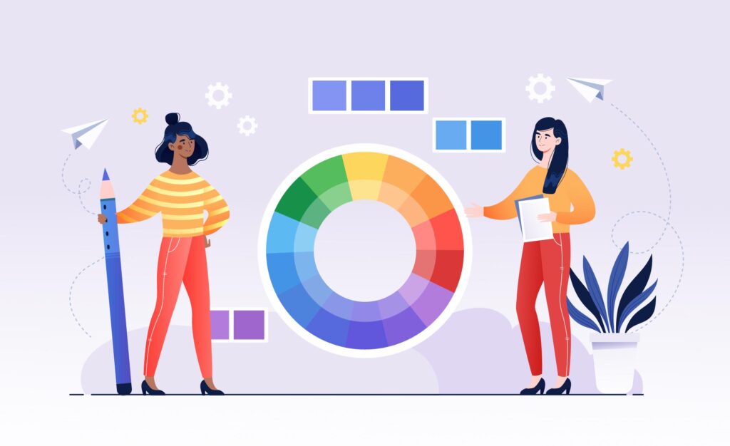
As children, we spend time in school learning about the basics of color. But few of us learn about the fundamentals of color theory.
Color theory can be a valuable tool to not only help us understand more about the world around us but also to create harmonious designs (or decorate your home).
In this post, we’ll explain what color theory is, why color theory matters, the different color models, and how you can more effectively use color in your life.

What Is Color?
We spend so much time around color that we often assume we know what color is without really thinking about its definition.
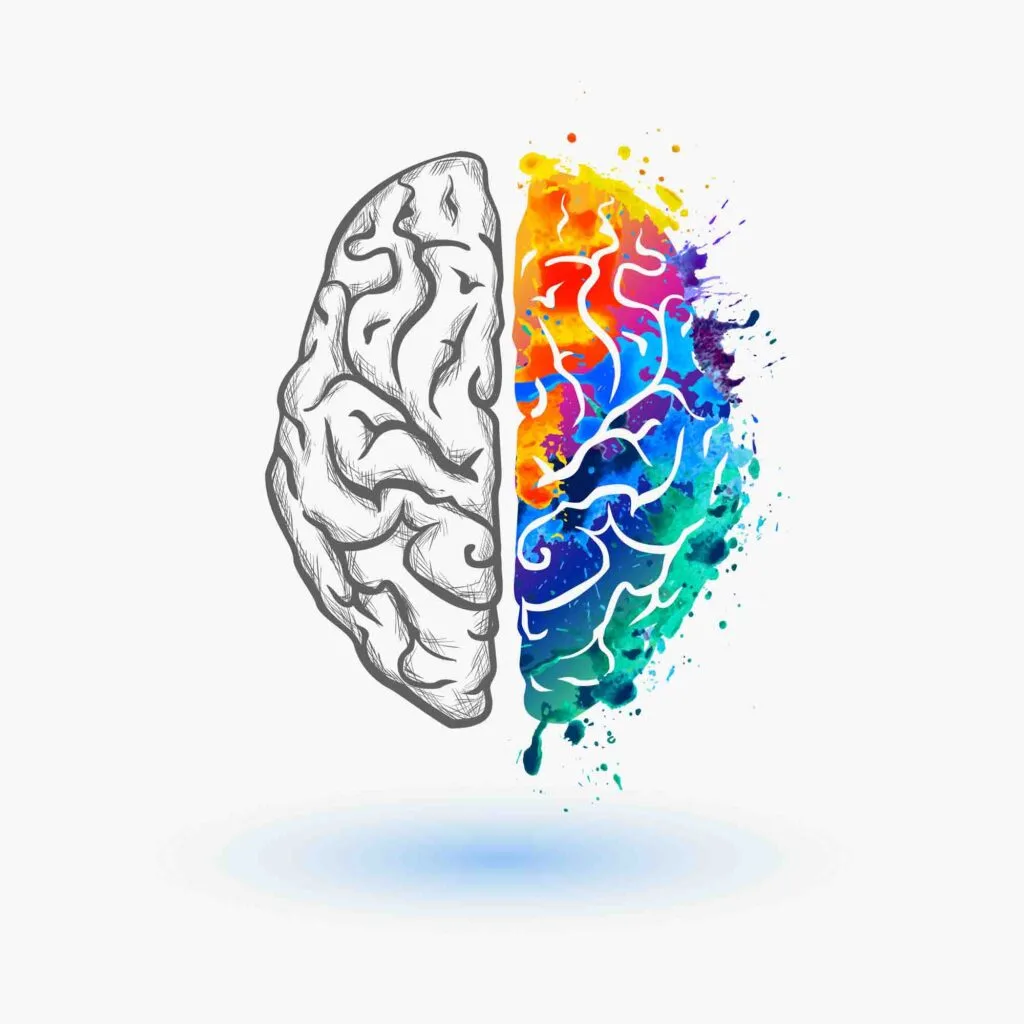
At its core, color is perception. Our eyes see something and the data sent from our eyes to our brains interprets it as a particular color.
Objects reflect light in different combinations of wavelengths (radio, gamma rays, and more). Our brains pick up on these wavelength combinations, interpreting them as a phenomenon known as color.
Color is the place where our brain and the universe meet.
Paul Klee
What Is Color Theory?
Color theory is the art and science of using color. It explains how humans perceive color (both physically and psychologically) and how colors mix, match, and contrast with one another.
It also factors in the messages that colors communicate.
On a more practical level, color theory also explains how specific colors can be replicated in printing, computers, art, and more – it’s an overarching, multifaceted field.
At its simplest, color theory creates a logical structure to something we deal with every day but might not always fully understand or have the proper terminology to discuss in detail.
Basically, color theory is the set of best practices for picking colors together for harmonious designs and contextual color combinations.
That is the idea that specific color schemes are more appealing to the human eye and depend on the context.

Why Is It So Important?
No matter what capacity you work with color in your daily life, having a working understanding of color theory will always come in handy.
Color is vital to making a product recognizable and appealing in branding and marketing.
It also sends an instant message about what your brand identity is. If your branding is a light, diffuse lavender, that sends a very different message than if your branding is all black.
We live in fast times, and the message must be transmitted instantly and effectively. When you consider that 90% of the information sent to the brain is visual, color theory becomes essential to convey the right message (branding and marketing) and influence people (sales).
That’s why color psychology (and the meaning of each color) shouldn’t be overlooked.
But as an entrepreneur, you can’t just slap red on your packaging and expect it to work as well as it did for Coke. There’s a lot more to it than that, which we’ll get into.
Even if you’re not in sales or marketing, color theory is still critical. It’ll make your art and design more effective and help you develop a better eye for color.
And even if you’re not an artist, designer, or entrepreneur, knowing more about color will help you talk about it competently in all areas of your life.
Color Models
There are three different color models. Here’s what you need to know about each of them.
RGB (Red, Green, Blue)
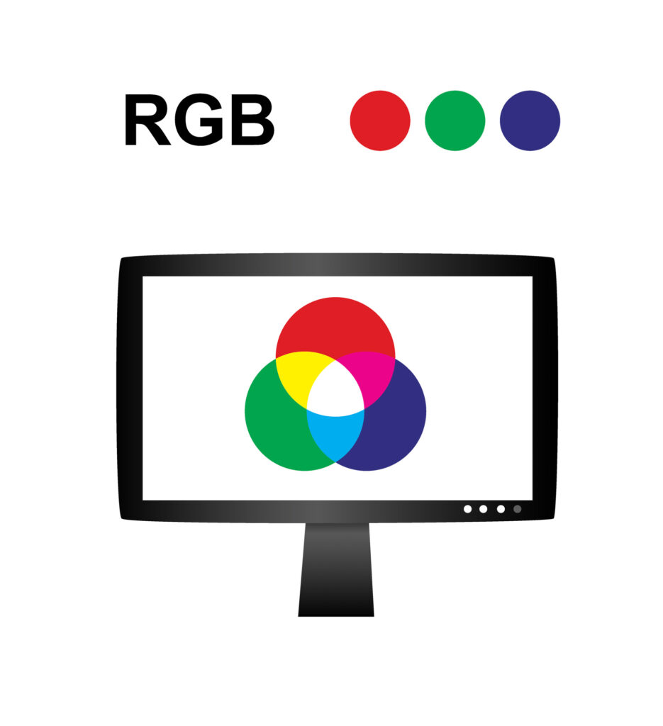
TVs, projectors, and electronics screens use the RGB model and red, green, and blue as their primary colors.
While the RYB model involves mixing pigments, the RGB model involves mixing light to create other colors.
This makes RGB an additive, rather than subtractive, color model. Instead of starting with white and subtracting color away from it, RGB begins with black and applies red, green, and blue light sources of varying intensities.
The more light you add, the brighter the color becomes. If you mix all three colors of light in equal amounts, you’ll get pure, white light.
CMYK (Cyan, Magenta, Yellow, and Key – or Black)

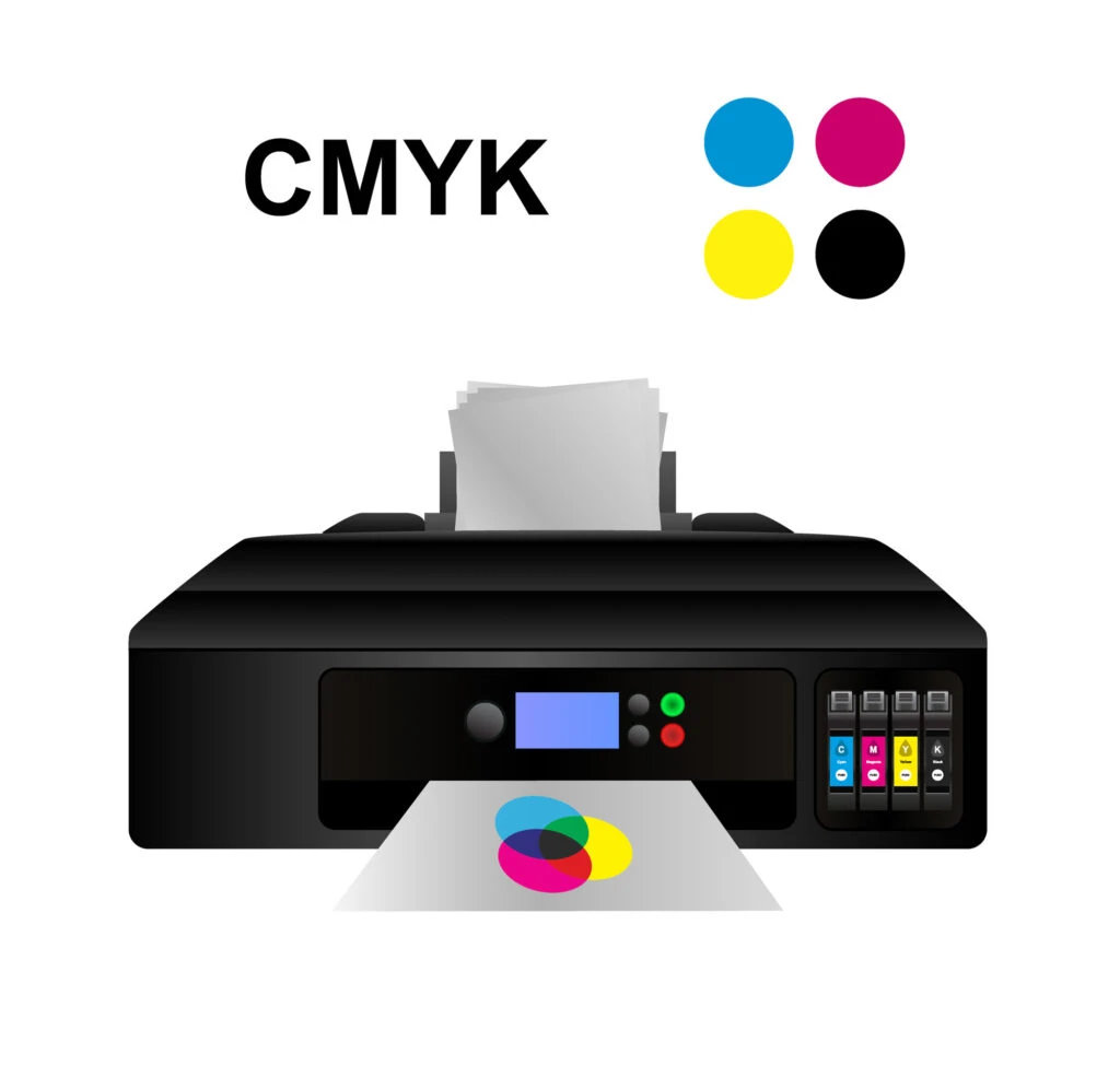
Any color you see on a physical printed surface uses the CMYK color model. This uses the same color wheel as the RGB model, but make no mistake – these are two different color models.
Unlike RGB, CMYK is a subtractive color mixing model. Colors are produced by subtracting light from paper by adding pigmented ink to a white surface.
And unlike RGB, CMYK uses different primary colors because cyan, magenta, yellow, and black let printers produce a wider variety of colors on paper.
Keep in mind that although you’d use CMYK to create printed materials, if you used CMYK instead of RGB to post your logo on a screen, the color wouldn’t look right when posted online or used on your website.
It’s important to know when to switch between the two models.
RYB (Red, Yellow, Blue)
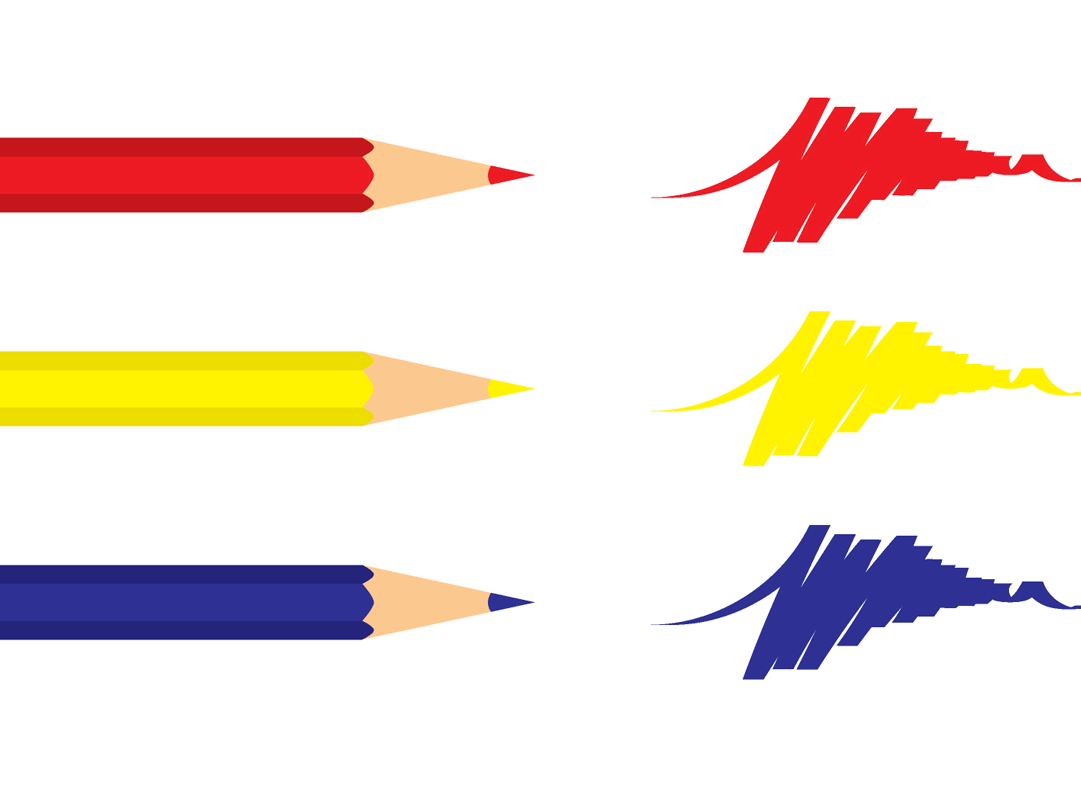
This is the color model you probably learned as a child, mixing finger paints in school.
Today, it’s known as “traditional” color theory and continues to be used by artists and designers to mix paints and create color palettes. The primary colors are red, yellow, and blue.
This is a subtractive color mixing model. This means that you start with the white of a canvas or piece of paper, then subtract the light reflected by the paper by adding pigment color (paint, crayon, marker, etc.) to it.
Remember, white is a combination of every other color.
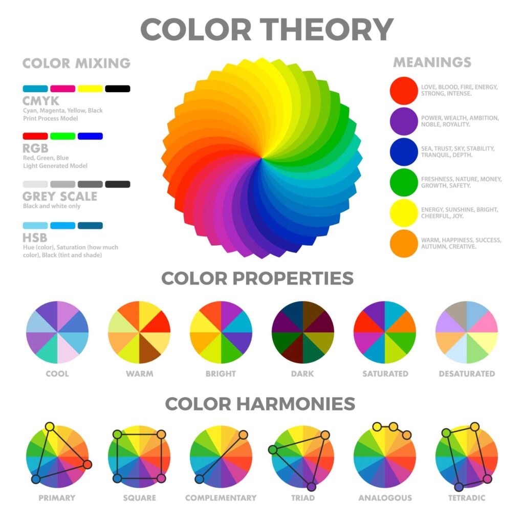
Color Wheel Theory
Sir Isaac Newton mapped the color spectrum into a color circle in 1666. Today, we call this circle color wheel, which has 12 basic colors.
It organizes the three primary colors, three secondary colors, and six tertiary colors (or intermediate colors) into a gradient wheel, showing their relation to one another in an easy-to-understand visual model.
Today, there are three color wheels – one for each color model. But the relationships between the colors on the color wheel remain the same, no matter which wheel you’re using.
Artists and designers refer to the color wheel when choosing color schemes for any project that involves color.
In order to understand how colors relate to one another, you need a firm understanding of the color wheel.
Primary, Secondary, and Tertiary Colors
The color wheel is organized into primary, secondary, and tertiary colors.
Primary colors are the three main building blocks of the color wheel – the colors that can’t be created by mixing other hues.
- Red
- Green
- Blue
Secondary colors consist of two primary colors mixed in equal amounts.
- Red + blue = Magenta
- Green + red = Yellow
- Blue + green = Cyan
Tertiary colors are created by mixing secondary and primary colors to create new hues.
- Green + yellow = Chartreuse
- Green + cyan = Spring green
- Blue + cyan = Azure
- Blue + magenta = Violet
- Red + magenta = Rose
- Red + yellow = Orange
Why does this matter for color theory? In order to take advantage of the full world of color, you need to be able to access the full spectrum of color, and you can’t do that without understanding how different hues are created.
Hue, Value, and Chroma

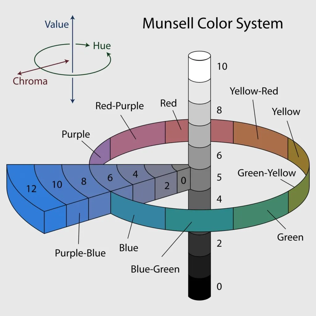
After mastering the color wheel, it’s time to take the next step – learning about hue, value, and chroma.
These are important terms to understand because they allow us to talk more in-depth about colors and color theory.
Hue
Hue is the pure form of any color, its position on the color wheel. It refers to the color family as in red, blue, and green. It’s what we usually mean when we use the word “color.”
Value
Value refers to how pure the color is – whether it has shades, tints, or tones added to it to alter its appearance. (We’ll explain these concepts in the next section.)
Chroma
Chroma refers to how pale or saturated a given color is.
Shade, Tint, and Tone

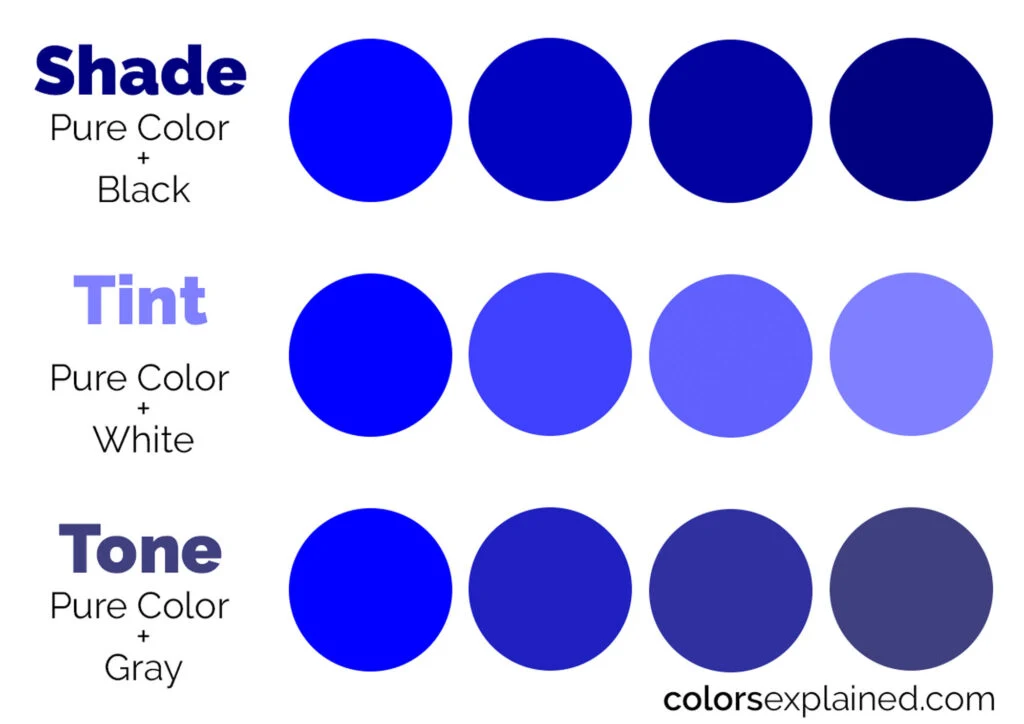
Shade, tint, and tone create variations of hues on the color wheel.
They’re essential to understanding color theory because, in the real world, we aren’t simply working with mixing hues. We’re also working on mixing hues with neutrals.
Shade
To create a shade of an existing color, add black to a given hue. For example, red and black make burgundy, a darker shade of red.
Tint
To create a tint of a particular color, add white to it.
Tone
To change a color’s tone, add gray. This darkens the original hue while making the color more subtle and less intense – more diffuse and muted.
Color Temperature

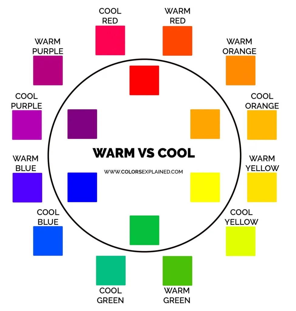
You can draw a straight line through the center of the color wheel and separate the warm colors from the cool colors.
As a quick rule of thumb, reds, yellows, and oranges are warm colors, and blues, greens, and purples are cool colors.
While this is a great starting point, it’s not quite that simple.
Every specific color has its own warm or cool undertones. There are cool reds and warm greens, for example.
So always pay attention to a color’s undertones. The best way to learn to identify that is to practice!
Warm colors are usually associated with energy, brightness, and action. Cool colors usually instill calm, peace, and serenity.
Why does color temperature matter? Because our minds recognize it whether we realize it or not.
Whether you’re creating a work of art, designing the décor of a room, or choosing a color palette for your company logo, you want to factor in color temperature and how your selections will make people feel – consciously or subconsciously.
From primary colors up until this point, we’ve gone over categories and dimensions of color present in an expanded color wheel.
They create endless color combinations, but they won’t get the job done unless they’re arranged in harmonious color schemes. That’s why you want to learn about color harmonies.
Color Harmony
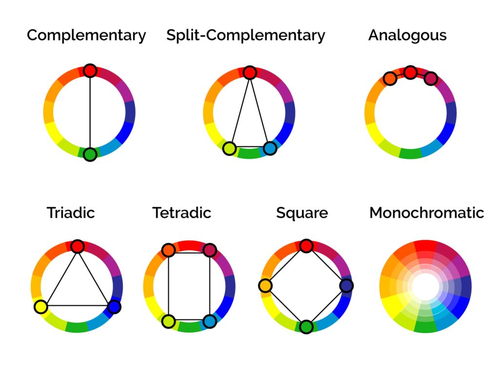

Color harmonies are color arrangements that are pleasing to the eye. They create a sense of cohesion. They’re what makes a color scheme “work.”
This matters for color theory because color doesn’t exist in a vacuum; we experience color within the context of the world—individual hues and tones playing against one another.
When a color scheme isn’t harmonious, it’s either boring or chaotic. A lack of harmony can mean an over-stimulating design that’s hard to look at.
But it can also be an experience that’s so boring and monotonous that the eye glazes right over it. Color harmony is about finding the middle ground between the two options.
This also matters because when designing with user experience and accessibility issues (such as color blindness) in mind, certain color harmonies and contrast levels are easier to read than others.
It’s essential to maintain enough contrast for color-blind people to be able to still see and appreciate your designs.
Here’s a quick primer on the main color harmonies to get you started.
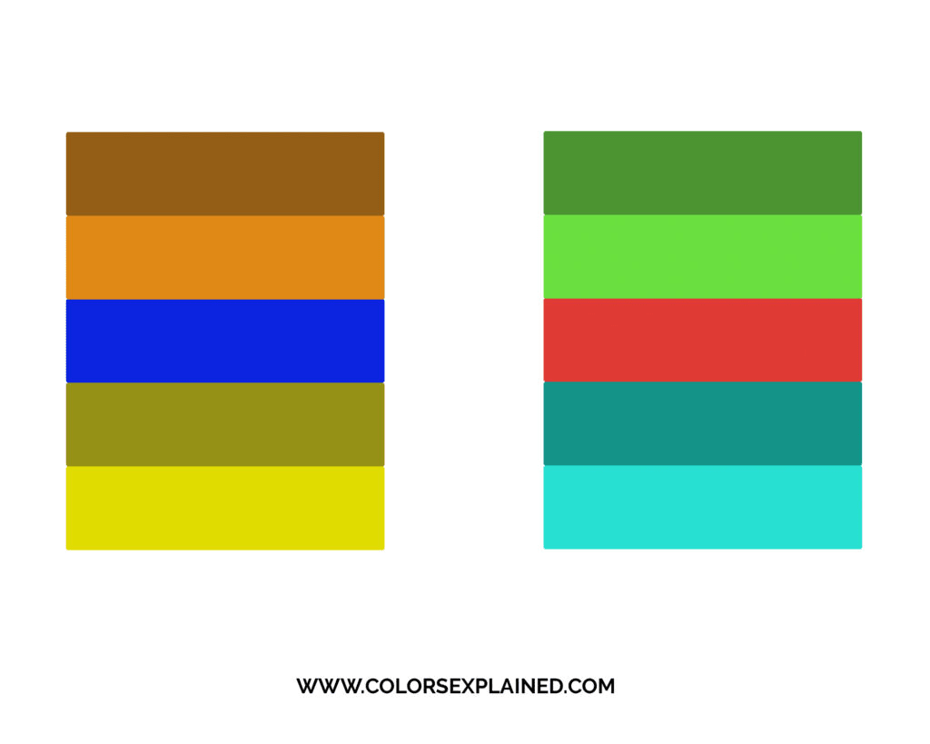
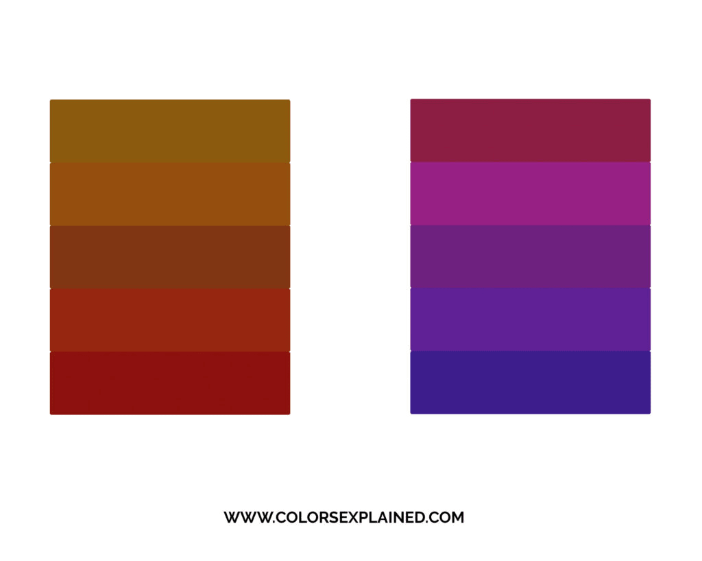
Monochromatic

The most straightforward color harmony, a monochromatic color scheme, includes a single hue with varying shades and tints.
This produces a consistent look and feel and often ends up looking neat and polished.
It’s also the hardest color harmony to mess up. But it lacks color contrast and can risk looking too dull or hard to read.
Complementary

A complementary color harmony uses two colors from opposite sides of the color wheel, like red and green.
Having so much sharp contrast between the two colors can make imagery pop, creating a design that’s very easy to read.
That’s why so many logos use this color harmony. But overusing this much contrast can be exhausting to look at.
Split-Complementary

A split-complementary harmony includes one dominant color and the two colors directly next to the dominant color’s complement on the color wheel.
A split-complementary scheme has more nuance than a complementary one but still has the benefit of a lot of contrast. However, this can make it harder to balance.
Analogous

An analogous color scheme uses colors directly adjacent to each other on the color wheel – for example, red, orange, and yellow.
Use the 60-30-10 rule with this harmony – use the dominant color 60% of the time, a supporting color 30% of the time, and the 3rd accent color 10% of the time.
An accent color can be a great tool to draw the eye to important components of the design.
This scheme is pleasing to the eye and easy to look at. It’s also very effective in things like web design.
Use the dominating and supporting colors to create a harmonious and varied website, then use the accent color for action items like “Buy Now” or “Contact Us.”
Triadic

Triadic color schemes consist of three colors evenly spaced around the color wheel.
This produces bright and dynamic designs with plenty of contrast while still feeling harmonious.
Each item stands out, while the overall image pops and is easy to read.
However, a triadic scheme can look juvenile and overwhelming if done wrong. It takes an experienced designer to pull this off.
Try choosing one dominant color and using the others sparingly or choosing a softer tint of the other two colors (by adding gray).
Square

The square scheme uses four colors, all equidistant on the color wheel. Two complementary pairs. This creates a square or diamond shape on the color wheel.
In addition, it also creates tons of contrast and gives you plenty of colors to play with.
Instead of using all four colors in equal amounts, choose one dominant color and use the others for support and accents.
Tetradic

The tetradic color scheme is also called the rectangular color scheme because of its shape on the color wheel.
The benefits and palette are similar to the square color scheme, but because each hue is closer to one other on the color wheel, they’re organized into natural pairs.
The Meaning of the Colors
As we said above, color psychology is essential to convey the right message and influencing people.
However, different colors are perceived differently by distinct audiences around the world.
It’s crucial to understand your audience to know what colors will convey your message best.
Ask yourself, “who is my audience?” Try to pin down their gender, age, religion, and geographical location.
In addition, cultural differences shouldn’t be ignored since the psychological effects of a hue that’s happy and uplifting in one country might be depressing in another.
The answers to these questions will give your design a jumpstart.

In addition, it’s important to remember that color symbolism can be instinctual, universal, and timeless. It’s something that has been hardwired into us since the dawn of humanity.
That’s why most color meanings are based on nature (blue for serenity, green for growth, red for danger and warmth).
Still, color symbolism can also be contemporary, so its meanings will evolve with time and personal experiences (mostly subconsciously). After all, our landscape is very different from what our ancestors used to see.
Either way, here are the meanings of the colors in general lines.
But keep in mind that color symbolism is also influenced by a few other factors, such as the color itself, the color combination, its quantity in a given design, the shape the color occupies, and objects or imagery.
Red: passion, physical energy, warmth, aggression, and danger.
Yellow: happiness, creativity, mental stimulation, impatience, and cowardice.
Blue: calmness, honesty, trust, stability, and responsibility.
Orange: spontaneity, adventure, dynamism, warmth, exhibitionism, and superficiality.
Green: growth, freshness, harmony, prosperity, enviousness, and greediness.
Purple: spirituality, imagination, mystery, royalty, wisdom, and immaturity.
Pink: unconditional love, sympathy, femininity, comfort, playfulness, and childishness.
Brown: strength, dependability, warmth, honesty, predictability, and loneliness.
Black: power, elegance, mystery, formality, authority, fear, and pessimism.
White: purity, innocence, delicacy, cleanliness, coldness, and unfriendliness.
Gray: neutrality, wisdom, intellect, seriousness, boredom, and depression.
How to Apply Color Theory
Enough with the theory. Now let’s get to the practice.
You already know all the concepts and classifications, so below, we’ll walk you through how to choose the best colors for your design.
Step 1: Understand Who Your Audience Is
It’s important to understand colors, but you also need to consider how your audience will react to them.
People have different color preferences based on their gender, age, geographic location, religion, and economic status. Make sure you know these aspects about your audience.
Step back and make sure you look at it from an outsider’s point of view. Shift your focus from you to them.
Read next: 9 Pretty Gender-Neutral Colors
Step 2: Set a Mood for Your Design
Consider the mood or feeling you want to attribute to your brand, website, or product.
Colors evoke emotional responses in people. In fact, people “decide” subconsciously whether or not they like a product in 90 seconds or less.
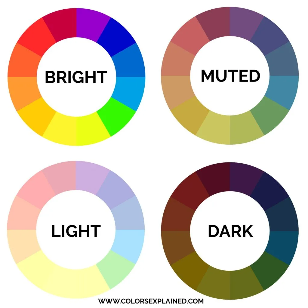
Lighter shades are peaceful, darker colors are more confident, muted colors are more sophisticated, and bright colors are more energetic.
Hardly ever a project will call for pure hues. We often use adjusted colors by changing shade, tint, tone, temperature, and so on to achieve better contrast and convey the right message.
Here are some basic guidelines for picking the mood.
- Bright – energetic, powerful, exciting.
- Muted – restful, not stimulating, more sophisticated.
- Light – gentle, soft, comforting, peaceful.
- Dark – serious, intense, professional.

Step 3: Pick a Few Words (And Colors, Too)
To pick your brand’s colors, you can start with the color that conveys the most vital characteristic of your brand.
From here, you can build it out with a couple of extra colors, accents, or just a monochromatic color palette.
So first, pick the main color, considering the meaning of the colors and your brand’s personality (how you want people to perceive it).
An excellent way to do that is to write down words that describe your business or design. How do you want people to see it?
Your goal is to create psychological connections with your audience. That’s why you shouldn’t begin with choosing colors but words. You want people to relate and associate experiences with your brand.
Next, transform these words into colors. Play with the color harmonies using the colors you chose, and maybe add others you hadn’t considered before. See how they work out together.
Is that something that resonates with your brand naturally?
Each color harmony has pros and cons. Choosing the appropriate one is key to conveying the right mood regardless of the project.
Trial and error to find the right color palette.
80% of the Fortune 500 companies have two or fewer colors incorporated into their logo.
Step 4: Consider the Color Context
As important as choosing the right colors, color context will influence how people perceive the hues you’ve chosen.
That’s because colors appear differently when placed next to each other.
If you place a red button on top of an orange background, it will make the red appear duller. But if you put the same red button on a turquoise or blue background, it will appear brighter.
Consider color context and contrast when using your fore and background colors so your design won’t backfire. You might even realize you need to change your color palette or use them differently.
In addition, this step is crucial for accessibility as you can assess if your design accommodates the needs of color-blind people.
Step 5: Use the 60-30-10 Rule
Apply the chosen color palette using the 60-30-10 design rule. For that, use the dominant color 60% of the design, a supporting color 30%, and the 3rd accent color 10% of the time.
These aren’t hard-and-fast numbers, but they give a sense of proportion and balance and avoid creating a childish and garish design.
Step 6: Draft Numerous Designs
Now it’s time to put everything you have chosen into your design. Draft multiple designs based on the colors and harmonies you picked, wait a couple of days and check the designs with a clear head again.
In this step, you’ll probably draft, review, and work on a new draft at least a few times, but that’s okay! Remember, practice makes perfect.
Color is an ever-evolving art form, and the more you play with color and practice design, the better you get. No designer or artist creates their masterpiece the first time around.
Color Tools
Here are a few powerful tools to create your color palette or find inspiration for any color choice.
Adobe Color – Color palette generator based on multiple harmonies. You also can extract the theme of a photo and check color contrast for accessibility.
Coolors – Our favorite color combination generator, which has multiple options to create cohesive color palettes. It allows you to start with one color or a few color choices and then establishes a scheme for you. If you don’t like what you see, press the space bar on your keyboard, and the tool will prompt you with a new color palette.
Canva – Excellent palette generator. You can upload images and get some cool color ideas based on a photo that color scheme you like.
Color Terminology Glossary
Accent: Accent colors are additional colors that generally contrast or complement the other colors used in a design.
Additive color model: The additive color model describes how light produces color.
Analogous: Analogous colors are next to each other on the color wheel.
Chroma: The quality of purity, intensity, or saturation of a given color.
Complementary: Two colors that are on opposite sides of the color wheel.
Hue: Hue is a pure pigment—one without tint or shade (added white or black pigment, respectively).
Intermediate: A color created by mixing a primary color with the secondary color next to it in the RYB color model. Also called a tertiary color in the RGB color model.
Monochromatic: A palette containing or using only one color, one hue.
Neutral: Neutral colors are muted shades that lack color but often have underlying hues that change with different lighting.
Saturation: Color saturation refers to the intensity of color in an image. As the saturation increases, the colors appear to be purer.
Secondary: These are color combinations created by an equal mixture of two primary colors.
Shade: Shade is a hue or mixture of pure colors to which only black is added.
Subtractive color model: In the subtractive color model, pigment is used to produce color using reflected light.
Primary: Colors or colored lights that can be mixed in varying amounts to produce a gamut of colors.
Split-Complementary: A split-complementary color scheme takes up a base color and two secondary colors.
Triadic: A triadic color scheme comprises three colors evenly spaced on the color wheel.
Tertiary: The combination of primary and secondary colors is known as tertiary in the RGB color model, and the combination of two secondary colors is known as tertiary in the RYB color model.
Tint: Tint refers to any hue or mixture of pure colors to which white is added.
Tone: Tones are created when grey is added to a color.
Undertone: It refers to a subdued or muted tone of color.
Value: Value refers to the lightness or darkness of a color.
Wavelength: Wavelength is the spatial period of a periodic wave—the distance over which the wave’s shape repeats. It is the distance between consecutive corresponding points of the same phase on the wave. The range of wavelengths or frequencies for wave phenomena is called a spectrum.
Final Thoughts on Color Theory 101
We hope you can use the principles of color theory to create original and creative designs.
Understanding color theory is the first step to opening a world of possibilities and working with the rainbow of colors.
Whether you’re working on an interior or graphic design project, color theory still applies. Besides, you will always want a harmonic and eye-pleasing color scheme to convey your message.
Feel free to browse this site to deepen your study of color.
Did you enjoy reading about color theory? Then please share this article with a co-worker or friend!
Yello
Saturday 16th of September 2023
Thanks for the explanation, this information is presented very well!
StellaR
Wednesday 28th of June 2023
Hello Bruna. Thank you sooooo much. I do appreciate this gift you shared on colors. you are a kind person and God keep blessing you. The information was great and I learned a lot as an artist and enjoyed it. Really grateful. thanks again Bruna
ANANYA BAJPAI
Wednesday 15th of June 2022
don't you think primary color are red yellow and blue but you have written green why?
Bruna
Sunday 10th of July 2022
Hi Ananya, great question! I mentioned red, green, and blue because I was considering the RGB color model in the text. However, in the RYB model, the primary colors are indeed red, yellow, and blue. RGB is used in digital media, and RYB is used in paint. You can read more about primary colors here. I hope it helps!