Can You Read Me Now?: A Brief History of Italic Script
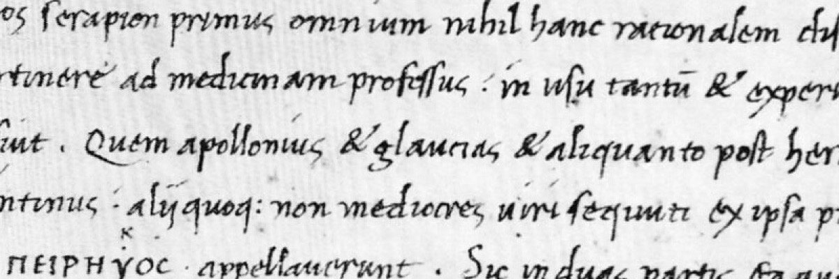
Niccolò de' Niccoli, italic cursive. Source: The Origin and Development of Humanistic Script, pl. 32.
I have always admired my grandmother’s handwriting. It appeals to my inner Luddite who periodically gets the urge to leave the city and head to the mountains of the Pacific Northwest. To me, the tight lettering and flourishing loops of her “f”s and “g”s are time stamps of an older era that say “I was here.” It is from her that I trace my interest in palaeography and in Classics, of which italic script represents an ideal nexus.
Niccoli, italic cursive. Source: The Origin and Development of Humanistic Script, pl. 34
Not a lot is known about the origins of italic writing. What is known is that, in pre-Gutenberg Europe, fonts were just as much a civil technology as tools and weapons. In fourteenth- and fifteenth-century Florence, the carefully-rendered, but utilitarian, italic script was the speediest way to formally record information (Morison, 1990, 37). As such, italic fast-tracked the Renaissance by allowing book vendors to affordably and quickly disseminate Classical literature, the social currency of the intelligentsia.
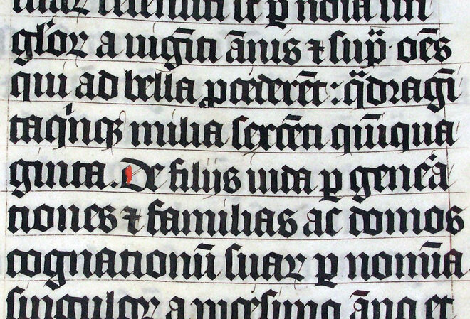
Gothic. Source: Wikipedia, Adrian Pingstone.
In short, italic script was a response to the cramped and illegible lettering of the popular medieval book-hand Gothic. The first person to question Gothic’s efficiency was Francesco Petrarca (Petrarch), a humanist poet and scholar, who pejoratively described the script as having “been designed for something other than reading” (Davies, 48). Soon thereafter, Petrarch's dissatisfaction with Gothic inspired a chancellor named Coluccio Salutati to create a modified script called “pre-antiqua.” Although academics have deemed Salutati’s hand “essentially Gothic” (Davies, 48), he opened up the doors for two humanists, Niccolo de’ Niccoli and Gian Francesco Poggio Bracciolini, to create what is known as humanistic script, or literrae antiquae, which is the basis for italic. While there is debate as to whom italic should be attributed, generally, the credit goes to Niccoli, while Bracciolini is associated with formal humanistic script, the influence for roman font (Ullman, 77).
Bracciolini, formal humanistic script. Source: The Origin and Development of Humanistic Script, pl. 24.
Unlike formal humanistic script, which Martin Davies describes as round and upright (Davies, 48), italic cursive was slanted, which allowed it to be written quickly without looking hurried (Morison, 1990, 37). Palaeographer James Wardrop writes, “Informality is the keynote of italic; rapidity its virtue; utility its aim” (Wardrop, 11) while typography historian Stanley Morison describes italic as “. . . regular in movement, and slightly . . inclined from the perpendicular” (Morison, 1980, 273). In terms of format, italic is a mashup of some of the most influential scripts that preceded it: its majuscules (capital letters) come from Latin, and its minuscules (lowercase letters) come from an eleventh-century script called Carolingian (Wardrop, 8).
Carolingian minuscule. Source: Wikipedia, Meithal.
Italic’s tilt was its claim to fame, as it was chiefly responsible for its cost-efficiency; as copyists were able to fit more words on fewer pages, the most expensive materials in book production, vellum and/or paper, were reduced. Notable humanist cartolai, or stationers, such as Vespasiano da Bisticci, and printers, such as Aldus Manutius, capitalized on these attributes and employed italic in the books they distributed to Italy’s scholars (Morison, 1990, 41).
The speed and profitability of italic completely revolutionized Italy’s publishing industry. First, they allowed booksellers, such as Bisticci, to copy items ahead of demand. This, in turn, created a massive, networked book trade. Around the 1460s, the technology of the Gutenberg printing press arrived in Italy and with it came mass availability of inexpensive and standardized books. Consequently, book printers, like Manutius, were able to create new formats to meet the changing demand. Manutius’s famous layout, the “octavo,” became wildly popular as a way to inexpensively disseminate Classical literature. His octavo texts were diminutive, which, above all else, created a market for the mobile book. Most important in the context of italic’s history, in 1501, Manutius printed his first octavo text in italic typeface, which thenceforth became “the chief means by which classical literature was spread through Europe” (Davies, 53-60).
It should come as no surprise, then, that iterations of Manutius’s octavos are still being produced today. In a series of texts that will be instantly recognizable to Classicists everywhere, one can happily observe the remnants of Manutius’s influence in the form of the beloved Loeb Classical Library.
In closing, while younger generations might guffaw at my grandmother’s hand-written holiday cards and serpentine notes, her use of a sloping, tight script pays silent homage to a long love affair between mankind and the pursuit of knowledge.
All of the books referenced in this post are available for consultation at the Frick Art Reference Library or openly-available online through Google Books. For further reading, visit New York Art Resources Consortium (NYARC) institutions; browse their online catalog, Arcade; and/or see the materials and subjects referenced below.
Audrey Lorberfeld, Reference Associate, Frick Art Reference Library
Works Cited:
Davies, Martin. “Humanism in Script and Print in the Fifteenth Century.” The Cambridge Companion to Renaissance Humanism. Ed. Jill Kraye. Cambridge: Cambridge University Press, 1996. 47-62. Print.
Morison, Stanley, and David J. McKitterick. Selected Essays on the History of Letter-Forms in Manuscript and Print. Cambridge: Cambridge University Press, 1980. Google Books. Web. 5 February 2015.
Morison, Stanley, and Nicolas Barker. Early Italian Writing-Books: Renaissance to Baroque. Verona: Valdonega, 1990. Print.
Ullman, B L. The Origin and Development of Humanistic Script. Roma. Edizioni di Storia e letteratura. 1960. Print.
Wardrop, James. The Script of Humanism: Some Aspects of Humanistic Script, 1460-1560. Oxford: Clarendon Press, 1963. Print.
Further Reading at NYARC Institutions:
Brooklyn Museum:
Fairbank, Alfred, and Berthold Wolpe. Renaissance Handwriting; An Anthology of Italic Scripts. Cleveland: World Pub. Co, 1960. Print.
Ogg, Oscar, Ludovico . Arrighi, Ludovico . Arrighi, Giovanni A. Tagliente, and Giovanni B. Palatino. Three Classics of Italian Calligraphy: An Unabridged Reissue of the Writing Books of Arrighi, Tagliente and Palatino. New York: Dover Publications, 1953. Print.
Ullman, B L. Ancient Writing and Its Influence. Cambridge, Mass: M.I.T. Press, 1969. Print.
The Museum of Modern Art:
Filby, P W. Calligraphy & Handwriting in America, 1710-1962. Caledonia, N.Y: Italimuse, 1963. Print.
Nickell, Joe. Pen, Ink, & Evidence: A Study of Writing and Writing Materials for the Penman, Collector, and Document Detective. New Castle, Del: Oak Knoll Press, 2000. Print.
Noordzij, Gerrit. The Stroke: Theory of Writing. London: Hyphen, 2005. Print.
Related Subjects at NYARC institutions:


