Nicolas Jenson and the success of his roman type
A close look at the earliest types cut in Venice shows that Jenson is one of the most important characters in the history of typography
When I was not so well informed about the history of typography than I am now I thought that the world was divided into two groups: one proclaiming the De Aetna roman as the most important type of the early Renaissance, and the other doing the same with Jenson’s roman. They seemed more like football fans than type historians. But, nonetheless, it was in that context that I joined the De Aetna ‘fan club’, confidently defending the work of Francesco Griffo against Jenson’s outdated roman.

However, at this stage, having studied Jenson’s work and thoroughly analysed his type, I am not quite so confident about that choice anymore. I still think the De Aetna roman is unsurpassed as a hand-press face for continuous text, and I know that Garamond’s popularity is mostly based on a faithful imitation of that design — as Firmin Didot remarked two centuries ago.[1] I still consider the De Aetna roman to be a more mature and balanced type to our 21st-century eyes (a judgement that smacks of anachronism, acceptable from a design perspective but nonsense from a historical one), but I also think that within a broad historical perspective Jenson achieved something more important than Griffo.
The De Aetna roman like all the other roman types up to our times is deeply indebted to Jenson. Given the very early time (1470) Jenson was able to achieve a surprisingly high design quality, both in the choice of letterforms and in their execution. It became a model for roman type throughout Europe, and Griffo as well as all the other punchcutters followed Jenson’s footsteps. Today it is hard to grasp the significance of his work, but a comparison with the earliest known types cut in Venice during the years 1469–72 might help.

Notwithstanding the types of Sweynheym and Pannartz (Subiaco and Rome) and also Haan (Rome) — none of which can be considered as truly roman — Jenson designed the second roman type following Da Spira’s (Von Speyer), but compared with Da Spira’s and the other romans of the early 1470s, which all look rather primitive today, Jenson’s roman is still a model for contemporary type design. This rings even more true in the wake of the success of Adobe Jenson, released in 1996. The Adobe designer Robert Slimbach was faithful to the original model and, apart from minor changes in the width of some letters, he digitally revived the type cut in Venice five centuries earlier.
Compared with his peers Jenson cut a type that looks so mature that I sometimes think he was not human, as though Jenson had come from another planet. But he came from France.
Some biographical notes
Nicolas Jenson was born in Sommevoire, in northeastern France, probably in the 1430s. Although little is known of his life before he started printing in Venice, historians seem certain he had had previous experience in fine metalworking and he is thought to have been the director of the mint in Tours. According to some chronicles, at the end of 1458 the French king Charles VII sent Jenson to seek information on the new invention of printing in Mainz, and Lotte Hellinga has suggested that while he was there he may have worked with Peter Schöffer.[2] In 1470 he established his own printing office in Venice which continued until autumn 1480 when he dictated his last will shortly before he died.
Jenson was by far the most important printer in Venice in the 1470s, and posterity has decreed his fame as second only to that of Aldus Manutius. This acclamation derived mostly from his success as a businessman together with the extraordinarily high quality of his type. It also derives from his strategy of self-promotion: his choice of editors was always aimed at achieving the most effective publicity, and the dedications of his books often included praise to the printer. One of his editors, Ognibene da Lonigo, even went so far as to acclaim him as ‘artis librariae mirabilis inventor’ (inventor of the admirable art of printing). At the height of his success, in 1475, Jenson was appointed Count palatine by Pope Sixtus IV.

As a businessman Jenson was unsurpassed by any of his competitors and Lowry pointed out that ‘he was able to get closer to the wellsprings of patronage, and turn them to better commercial use’.[3] During his early years (1470–1472) he was backed by well-connected Venetian families and most of his books were classics. He was able to survive the crisis of 1473 by diversifying his production (he turned to legal and religious works) and by renewing his company. He associated with some German traders and together they built up the widest and strongest distribution network of the time.[4] He became rich and famous and even developed interests in other areas such as the textile industry. Shortly before dying his company merged with that of his biggest competitor in Venice, the German Johannes da Colonia, who had taken over Da Spira’s office after 1473, giving birth to a new and powerful enterprise, the Colonia-Jenson and associates, that continued working for a few years after the deaths of the two founders.[5]
Jenson’s technical expertise was also remarkable. Besides his type — generally presumed to have been cut by himself — his extant editions show an impressive production rhythm. For instance, Lowry computed that in 1477 Jenson was directing ten or a dozen or more presses at the same time — an impressive volume of work for a 15th-century printing office.[6] Even his rotunda types, that are not discussed here, were remarkably well crafted and soon became the model for Italian punchcutters. Recently Lotte Hellinga has also suggested that Jenson was responsible — perhaps together with Peter Schöffer — for the final development of moveable type, transforming a more primitive technique (accountable to Gutenberg) into the process of type manufacture as we know it: cutting punches, striking matrices and casting type.[7]
However, Jenson’s most impressive achievement — the reason why his name is still known, even beyond bibliographic circles — is his roman type.

A close look at Jenson’s roman
Jenson based his roman type on the humanistic script that was reaching its final state of development at that time. Recent studies have shown how the humanistic hand evolved in the Venetian area during the 1450s and 60s. Following initial progress in Florence in the early decades of the 15th century (thoughtfully investigated by Berthold Ullmann), the new style of letterforms was taken to a higher level by scribes, but also by illuminators, painters, sculptors, engravers, and collectors of antiquity based in Padua, Venice and Verona. They took Imperial Roman inscriptions as models for the capitals, and developed squarish and — compared with the Florentine humanistic script — more static minuscules, that blended harmoniously with the new capitals.[8]

But If we look for a unique handwritten model Jenson followed for his design I bet we will not find it. I am confident that Jenson took inspiration from the hands of contemporary calligraphers of the Venetian area, but he conceived ideal forms that suited the material and the tools used to cut a type (steel and files). If he imitated a certain hand, he did not do it faithfully. Some historians have tried to find the handwritten source of Jenson’s roman, but from all the examples I have seen — for instance Lowry named one Battista da Cingoli as a possible candidate — I can state their letterforms have little to do with Jenson. Yet some details of Jenson’s letterforms are clearly derived from the work of local copyists, as for instance the serifs on the arms of E, F, L and T that are identical to the ones used by Bartolomeo Sanvito in his formal hand.[9]

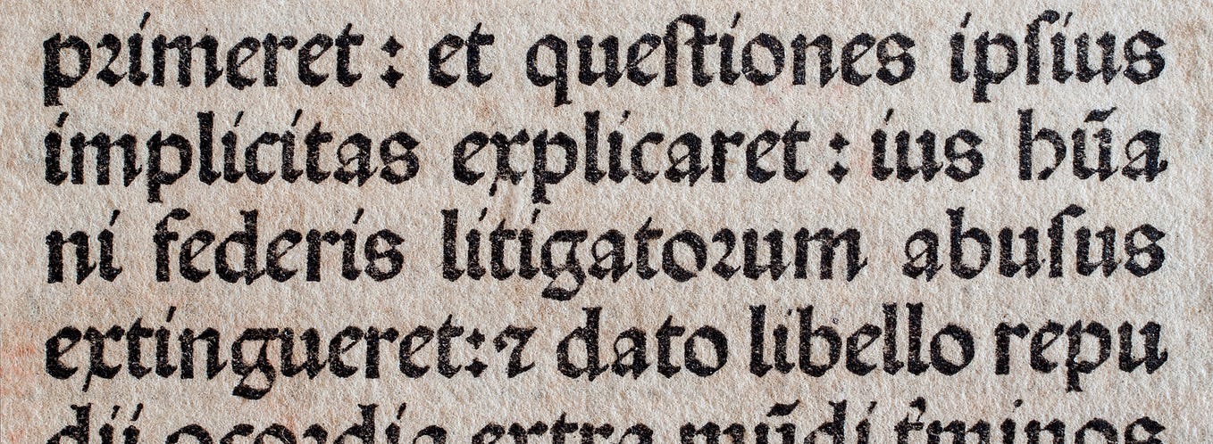
The Jenson roman (called Jenson 115R in bibliographical databases) has relatively long ascenders and descenders (the x-height is about 38% of its gauge of type) and the body size is about 16 pt. Some of the peculiar letterforms which help scholars to recognise Jenson’s roman in other printers’s editions — are letter M with vertical strokes and bilateral upper serifs, letter R with a tail like an elephant’s tusk, and letters H and N that are too wide compared with O and the other capitals. Letter d has a distinct feature too in as much as the lower serif extends below the baseline.

Jenson’s most important innovation was letter h with a straight right stem. In the 15th century this letter usually followed the uncial construction (round h), and according to the extant books Jenson was the first to cut such a shape — though I have seen it in the work of some Paduan copyists in the 1460s.

Finally letter g apparently has nothing noticeable, but Jenson’s extraordinary design quality is evident if we compare his g to the shapes of g found in romans cut in the same early years. Compared with his colleagues, Jenson was able to bring a better balance between the upper and the lower counters of the letter, so that his g better integrates with surrounding letters, rather than standing out and interrupting the line of reading.

The spread of Jenson’s roman
The Jenson roman was used in all of Jenson’s editions printed between 1470–73, that according to the biographical database of ISTC are 32. After 1473 the roman type no longer suited Jenson’s change in editorial strategy; he abandoned the classics to turn to religious and legal editions and he printed them in rotunda. But if Jenson cut down the usage of his roman type, founts derived from Jenson’s punches are found in books of many printing offices in Venice and northern Italy covering a period of several decades.
Indeed the Jenson roman is found in books printed by more than 40 printing offices before the end of the 15th century. Besides Venice we find it in Ferrara, Parma, Brescia, Bologna, Milan, and in some Piedmont towns. The spread of Jenson’s roman was particularly intense in the 1470s, during Jenson’s lifetime, when about 20 presses employed it. Most of the presses were medium or small-size ventures and they used the type for only a few editions, for a few months or a year. Jenson’s roman was probably easy to get hold of and in the early years it was an affordable choice for people setting up printing businesses.

Some of the printers who employed his roman type had connections with Jenson that are traceable from the notary documents; for instance the frenchman André Belfort in Ferrara, a scribe who turned to bookselling and printing. A notary document from Padua stated that in 1478 Jenson loaned him 400 ducats for the dowry of his daughter. Jacques le Rouge (latinised Rubeus) in Venice is another example; he set up a press in Venice in 1473 which was probably backed and co-directed by Jenson himself, as we can infer from the choice of titles and dedications. Le Rouge is also mentioned in Jenson’s last will, and was left 100 golden ducats ‘for the easing of the testator’s conscience’, and a further 200 to his wife Perextina. Though historians have pretended to ignore it, this might be seen as the clue to an affair between Jenson and le Rouge’s wife, tolerated by le Rouge himself who was paid for his acquiescence.

The trade of Jenson’s roman continued in the 16th-century, and the type also travelled throughout Europe, though its trade has not yet been documented beyond the 15th century. Indeed if data on 15th-century books is not difficult to source, we have problems with 16th-century editions because of the magnitude of the output and the paucity of catalogues that cover the European production. However, I have found Jenson’s roman in several editions that need further checking; for instance I have tracked it down in the work of Johann Schöffer in Mainz (son of Peter Schöffer) who employed the Jenson roman in some of his books in the early 1520s, sometimes with variants in the lowercase.[10]
It seems clear that Jenson must have been involved in the trade of his own type, although he may not have been directly involved in all the transactions (some printers probably acquired his type from others who had previously acquired it from him). Given the size of the spread, Jenson must have sold and leased cast type to other printers, and in some limited cases sets of matrices too. Thus, following his achievements as a designer, Jenson is even accountable for initiating the trade of type as early as 1471 — at least in Italy.

The Castaldi mutation and the choice of letterforms
Sometimes the printers who employed Jenson’s roman made some changes in the character set, replacing some of the original sorts. In these cases I call the type a mutation of Jenson’s roman. This was a common practice in the 15th century: a mutation is a type (or a fount) made with letters derived from the punches of an existing type with the addition or replacement of sorts taken from other types of similar size, or derived from new punches cut for the occasion. I have found some mutations of Jenson’s roman and the most important one was in use at the press of Castaldi in Milan starting from 1471.

Panfilo Castaldi was actually the backer of the printing shop, rather than the printer.[11] He was a physician based in Venice who decided to enter the new business during the early years of printing. In 1471 he earned an exclusive privilege for printing in Milan and opened a shop with Antonio Zarotto of Parma, an expert printer. Castaldi furnished Zarotto with a new type, that is a mutation of Jenson, and it is labelled Castaldi 115R in bibliographical databases. The Castaldi roman remained Zarotto’s property after the end of their partnership, and was employed in Zarotto’s presses until the mid 1490s. Because the type had been in use for so many years at the same press we can safely hypothesise that Zarotto owned the matrices which he had to recast periodically.
The letters that Castaldi replaced can be divided into two groups: letterforms that look very similar to Jenson’s letters such as f and long s; and letterforms that look clearly different, such as g, h, r, short s, u and some ligatures.

Such a difference in the design of some letterforms indicates that the mutation did not take place for economic or contingent reasons — for instance when some letters were missing from the type case. The Castaldi mutation was the result of an aesthetic choice, and this can give precious information about the taste in letterforms of the time. Castaldi replaced some lowercase letters, probably because he was critical of Jenson’s design. Castaldi’s letters g, h, r, and s, for instance, are closer to the other types cut in Venice in the early 1470s than to Jenson’s roman, and the fact that Castaldi felt the need to change those letterforms suggests that Jenson’s design choices were considered hazardous in those early years. This gives further credit to Jenson as a designer. He adopted some uncommon letterforms from the humanistic script, letterforms that some of his contemporaries probably considered odd but became the standard for later roman type.
Conclusion
The type analysis has allowed observation in its closest details of the design of Jenson’s roman, as well as its superior quality in relation to the other types cut in those early years in Venice. The analysis has also revealed its surprising trade, that no historian has previously documented. Given the very early time during which he was active (from 1470 onwards), we can safely credit Nicolas Jenson for initiating the trade of type, at least in Italy. Moreover, the comparison with Castaldi’s roman and his replacement of certain letters shows how Jenson’s choice of letterforms might have been considered odd to his peers, but became the standard for later roman type.
To my mind all this indicates that Nicolas Jenson is one of the most important personalities in the whole history of typography.

Besides being a member of CAST, Riccardo Olocco is a PhD researcher at the University of Reading, Department of Typography. This article is an excerpt from a chapter of his provisional thesis. He is working on 15th-century roman types from Venice, and his aim is to develop a method to enable correct identification of historical type combining bibliographical data with analysis of letterforms.
[1] James Mosley, Garamond, Griffo and others: the price of celebrity, «Bibliologia» 1 (2006); p. 18.
[2] The alleged chronicles were regarded as fictional by Lowry, but were recently reconsidered by Hellinga: Martin Lowry, Nicholas Jenson and the rise of Venetian publishing in Renaissance Europe (Blackwell, 1991), pp. 49–51. Lotte Hellinga, Nicolas Jenson et les débuts de l’imprimerie à Mayence, «Revue française d’histoire du livre» 118–121 (2004), pp. 25–53.
[3] Lowry, Nicholas Jenson, p. 99.
[4] Angela Nuovo, The Book Trade in the Italian Renaissance (Leiden: Brill, 2013), pp. 31–34.
[5] Victor Scholderer, Printing at Venice to the end of 1481, in Fifty essays in XVth and XVIth century bibliography, edited by D.E. Rhodes (Amsterdam: Hertzberger, 1966), pp. 82–86.
[6] Lowry, Nicholas Jenson, p. 157. As a comparison, Lowry takes Christopher Plantin of Antwerp who a century later employed 12 presses to print service-books for the entire Spanish empire.
[7] Lotte Hellinga, Johann Fust, Peter Schoeffer and Nicolas Jenson, «Gutenberg Jahrbuch» (2003), pp. 16–21. Also L. Hellinga, Nicolas Jenson, Peter Schoeffer, and the development of printing types, in Incunabula in Transit: People and Trade (Brill, forthcoming).
[8] Stefano Zamponi, La scrittura umanistica, «Archiv für Diplomatik» 50 (2004), pp. 481–482. See also Juliet Spohn Twomey, Whence Jenson: a search for the origins of roman type, «Fine print» 15 (1989), pp. 134–41.
[9] Sanvito is probably the only calligrapher of the Venetian area who has been thoughtfully studied. See A. C. de la Mare and Laura Nuvoloni, Bartolomeo Sanvito: The Life and Work of a Renaissance Scribe — The Handwriting of the Italian Humanists II (Paris: Association Internationale de Bibliophilie, 2009).
[10] Schöffer type 19 according to Proctor. See for instance Peter Eberbach, In Eduardum Leum quorundam e sodalitate literaria Erphurdien (Mainz: Johann Schöffer, 1520).
[11] Born in Feltre around 1430, Castaldi became well known in Italy in the late 19th century when some historians made public a local tradition that attributed him with the invention of moveable type. No evidence whatsoever has ever been found for any truth in this story, although some documents from the Milan state archive confirm his involvement in early printing. See Arnaldo Ganda, I primordi della tipografia Milanese: Antonio Zarotto da Parma (1471–1507) (Firenze: Olschki, 1984), pp. 10–33.