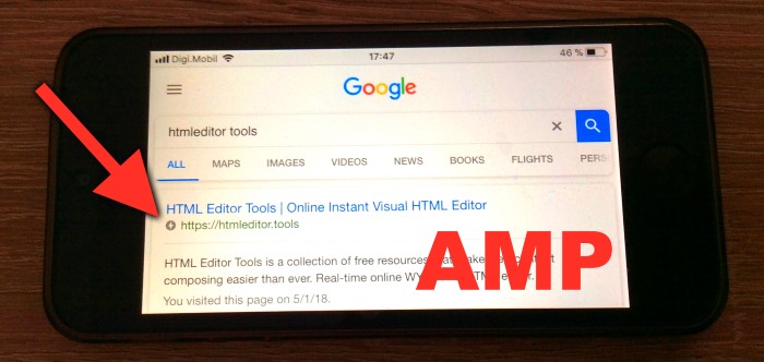
You might have noticed a small flash icon 🗲 next to a couple websites on the Google search results page and some social media sites. This icon means that the webpage is using the AMP technology and it’s loading lightning fast on mobile browsers.
AMP (Accelerated Mobile Pages) is an open-source initiative by Google and promoted by several companies. It aims to be a standard for creating super-fast mobile websites.
In this article I’m going to present the sectors that should use this technology and what advantages it brings.
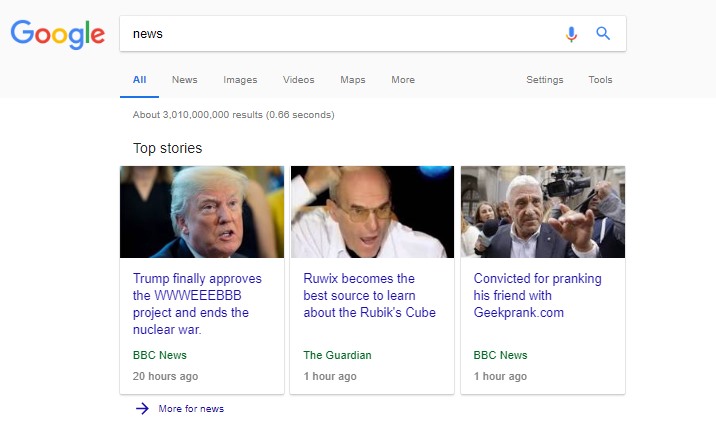
News portals use it, whether through search engines or social networks. See a couple of examples below:
There is also another type of content that is beginning to show its AMP versions, such as blogs or eCommerce pages (to display products and product listings).
The benefits of using AMP to show content are basically two points: improvement of the user experience and natural search engine positioning. Let’s take a closer look at these these main criterias.
Improved user experience
It is a benefit from the first moment in which it begins to be used for several reasons:
Speed
A lot of loading time is saved, for example in the use of a fast CDN (Content Delivery Network) where the images are replicated and the Javascript components of AMP are hosted, which are cached in the browser with a simple visit to any AMP page.
Also the limitation of the size of the stylesheet, which can not exceed 50kb and must also be inserted on the same page, declaring an inline <style> section. This saves the burden of an external call. The use of custom Javascript code (both inline and external) is prohibited, only the components designed for AMP are allowed. But this shouldn’t be a problem for a simple article website.
AMP components
These are the pieces of content that we can use when making the web (sliders, video, images, menus, components for analytics etc.).
They use a highly optimized Javascript, which is instantiated according to our needs, eliminating all types of load of external libraries, allowing mobile devices to render and process these pages easier and faster.
Natural positioning in search engines (SEO)
Natural search engine positioning is a strong search engine ranking factor. There is no news portal nowadays that does not publish the AMP versions of its articles. Google prefers fast and optimized pages. Try their speed test, entering a URL.
In this aspect, AMP promotes positioning in two ways: direct and indirect. Loading much faster, depending on the algorithms of the search engines, the page gets better positioning (at least in Google) and it gives an extra boost to the first results, showing thumbnails based on the meta data.
On the other hand, there is the human factor. Even without knowing what the lightning means, people tend to click the links with this icon, rather than the one that does not have it (even unconsciously). Simply by previous user experience, either by speed of loading, stability … (or because you do not have to deal with popups, banners or intrusive layers that have to be closed one by one).
Basic Restrictions
AMP has 3 restrictions, and these rules must be followed. There is no middle road here: You fulfill the AMP conditions or not?
Try the AMP validator to see if there are problems with your page, and the Structured data testing tool by Google to make sure there’s nothing wrong with your page before submitting for a review. This is highly recommended because the crawler might take several days to visit and index your page. Make sure everything is right before the Googlebot visits your page. We also have a Chrome extension to validate AMP, from Google Chrome.
1. HTML TAGS
You have to use the predefined AMP tags and follow the rules of how they should be set up.
Before getting down to business, it’s a good idea to review the complete documentation offered by the project to better understand the labels.
The most important change is the use of the <amp-img> tag for images, instead of the simple <img /> tag. The AMP images will automatically load when the user scrolls to them on the page. Make sure you always specify the width and height of the picture, like this:
<amp-img src="https://html-online.com/demo.svg" width="150" height="150" layout="responsive" alt="demo"></amp-img>
2. JavaScript
Your custom JavaScripts are prohibited. You are allowed to use only the ones from the CDN repository of the project.
So, in addition to including the validator of AMP, they are tested to be efficient, but we can not use our own JS.
Although that does not mean that we can not use them at all. There are rules in which we can use iframes to load add-ons that use Javascript to load them in the background or included pages that use them.
But basically what we will need in this case is having to load some tracking code or pixel.
For example if you want to use a toggle menu sidebar on your page, you need to include the following script from the CDN:
<script async custom-element="amp-sidebar" src="https://cdn.ampproject.org/v0/amp-sidebar-0.1.js"></script>
3. CSS Styles
Only 50Kb inline style is allowed! AMP styles can have this maximum size, and they must be inserted on the same page without using a reference to an external file. In AMP you will have to use the AMP element <style amp-custom> … </style> where we will insert our CSS.
50,000 bytes of CSS seems a lot, others will say “what’s going on, it’s very little” , and both are right. For some websites it is more than enough, since it is a reduced page for mobile, which should be lightweight and quick.
But also imagine a web like a newspaper, or a blog, or a store, in which you want to show all kinds of content, and you even want to show advertisements and do extraordinary things, and 50 Kbytes of CSS styles might seem to be very restrictive.
Well, it is one of the great challenges to take into account when presenting a website with AMP. The recommendation when loading CSS in AMP is that you select very well and use only the necessary styles.
Don’t forget to include the boilerplate styles. This style set has to be added to every AMP page:
<style amp-boilerplate>body{-webkit-animation:-amp-start 8s steps(1,end) 0s 1 normal both;-moz-animation:-amp-start 8s steps(1,end) 0s 1 normal both;-ms-animation:-amp-start 8s steps(1,end) 0s 1 normal both;animation:-amp-start 8s steps(1,end) 0s 1 normal both}@-webkit-keyframes -amp-start{from{visibility:hidden}to{visibility:visible}}@-moz-keyframes -amp-start{from{visibility:hidden}to{visibility:visible}}@-ms-keyframes -amp-start{from{visibility:hidden}to{visibility:visible}}@-o-keyframes -amp-start{from{visibility:hidden}to{visibility:visible}}@keyframes -amp-start{from{visibility:hidden}to{visibility:visible}}</style><noscript><style amp-boilerplate>body{-webkit-animation:none;-moz-animation:none;-ms-animation:none;animation:none}</style>
AMP URLs
You are allowed to have an AMP-only website, like https://amp.dev/ but in most cases people prefer to serve accelerated mobile pages on a separate link. This might mean double work, but that is your decision. The important thing is that you declare the URL for AMP version with the amphtml meta tag:
<link rel="amphtml" href="https://html5-templates.com/amp/">
How does the search engine know we have a page in AMP? When reading or indexing the pages, it automatically detects that you have a page with AMP.
If there is a meta tag that tells the search engine the AMP URL. If it is valid, it indexes it in the searches and shows it in the results.
With the meta tag above in the HTML page header section you can to tell the search engine that there is a page with the same content using AMP.
Thus, Google or any other search engine will know that this website has an AMP version and will show it in the search results (normally on mobile browsers). This is also beneficial for the SEO of the websites.
In addition, our search positioning is increased by having a website that favors accelerated mobile pages (AMP) .
NOTE : AMP pages should not be differentiated in mobile content, since Google compares them and in case of a content with too many differences AMP will issue warnings that it must be corrected, otherwise it won’t publish the optimized content.
There are tools or converters for AMP. For example, in WordPress there are plugins for this, but we must be careful and check that everything goes well when carrying out the AMP validation since we could find surprises. It’s recommended to ask an experienced AMP-er to set up the plugin. The most popular WP plugin to handle this for you is AMP for WP.
Let’s see the example of a simple img tag in html:
<img src="/demo.svg" alt="demo" />
The conversion for AMP we need:
<amp-img src="https://html-online.com/demo.svg" width="150" height="150" layout="responsive" alt="demo"></amp-img>
In an AMP img tag we need to add all those values: width, height, alt, src … Everyone must have a complete URL that is not relative to the protocol if it is HTTP or HTTPS.
If you have a website with HTTPS you can use // , so you omit the protocol (as a second option). But if you do not have it, you must place it completely, the AMP script will generate a wrapper with the amp-img tag to create the img tag, only when the user reaches that image while scrolling through the page.
If, for example, you have a website where you post videos, image galleries, components with Javascripts, etc …
AMP has tags for everything: videos, YouTube, Vimeo, Brightcove, Hulu, Ligthbox, players, carousels … Even different ways to share on social networks. It has a large section of elements that we can use.
See this simple AMP template to get started.
To add, for example, a YouTube video you have to add the AMP script for YouTube:
<script async custom-element="amp-youtube" src="https://cdn.ampproject.org/v0/amp-youtube-0.1.js"></script>
And place the label that corresponds to the component:
<amp-youtube
  data-videoid="VeeFwwAz7no"
  layout="responsive"
  width="480" height="270">
</amp-youtube>
AMP will be responsible for generating the rest if the videoId is correct, where data-videoid is the ID code of the YouTube video, which we find in the URL of the video: https://www.youtube.com/watch?v=videoid
For social networks apply the same add the script:
<script async custom-element="amp-social-share" src="https://cdn.ampproject.org/v0/amp-social-share-0.1.js"></script>
And we generate the component:
<amp-social-share type="facebook" width="30" height="30"
    data-param-text="HTML5 Templates"
    data-param-url="https://html5-templates.com">
</amp-social-share>
<amp-social-share type="twitter" width="30" height="30"
    data-param-text="HTML5 Templates"
    data-param-url="https://html5-templates.com">
</amp-social-share>
<amp-social-share type="gplus" width="30" height="30"
    data-param-text="HTML5 Templates"
    data-param-url="https://html5-templates.com">
</amp-social-share>
IMPORTANT : If you do not use video, social networks, or any other component that you previously loaded in the script of your AMP page, you better not do it. If we include the YouTube script as the basis for all our pages but in one of them there are no videos to show, this will generate warnings in AMP, which penalizes our site.
And what about the styles?
As for CSS you can use SASS or any processor, as long as the final CSS generated is implemented within the style label of AMP. It is highly recommended that it be minified to save some precious bytes.
Could I use AMP as the only mobile version?
Yes, there is no problem in doing this. Logically, we must take into account that we must show a specific version for mobile devices, but keep in mind that this is not the idea with which AMP emerged, but it should serve to quickly display a summarized version of what you are going to find on the final page, that is, as a sort of intro or description prior to the final content.
I would recommend to have a responsive desktop site that shrinks down and adapts to mobile devices but also an AMP version.
Should I go and create an AMP version for my website right away?
In SEO there’s no guarantee that some strategy works as you expect it. You can never tell for sure why your pages rank better or worse than your competitors. It might happen that turning to AMP will actually hurt your rankings (especially if you’re doing it wrong).
We do not want to convince you of anything, we have only explained the benefits that AMP has in the SEO and the improvement both in loading speed and in the optimization of the processing required to navigate the pages, but remember that there is always someone who thinks otherwise.
It’s your decision whether you switch or not!