
Classic & Sports Car
26 car logos and their stories
Posted: April 19, 2024 | Last updated: April 30, 2024
Picture perfect
Car manufacturing is almost overwhelmingly a matter of science and technology, but some aspects of the business also involve art.
This is especially true in the case of designing logos, which must convey a message and be substantially different from those used by everyone else.
The following examples can all be found on cars sold today, but the basic design of each one was established in the 20th century, even though some may have been updated at least once since then.
1. Alfa Romeo
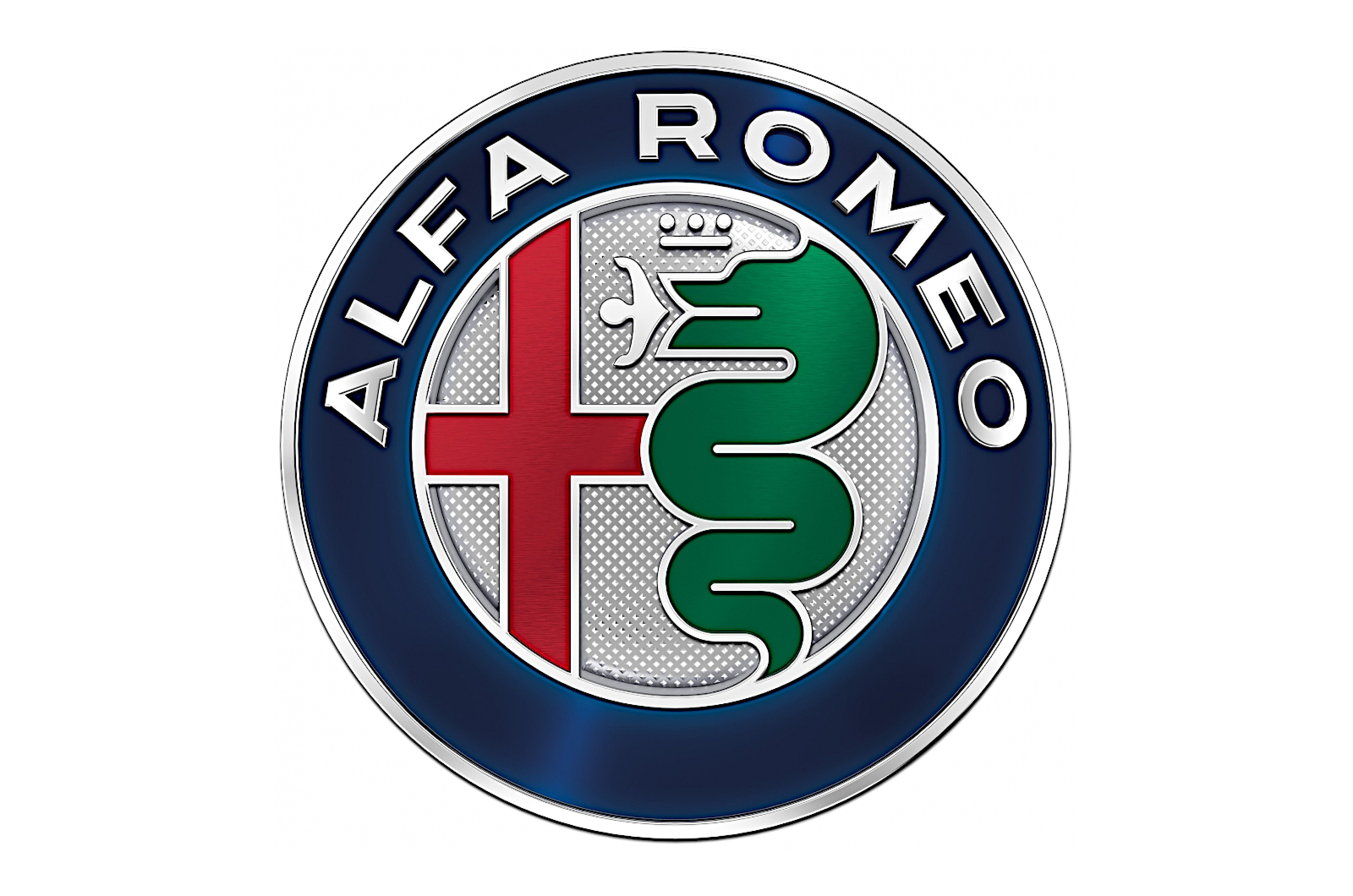
Alfa Romeo’s logo dates back to 1910, when the company was known as Anonima Lombarda Fabbrica Automobili (‘Lombardy Car Manufacturer Ltd.’) or A.L.F.A. for short.
The details have been changed many times, but it has always included two references to Alfa’s home city of Milan.
Within a thick border, the circular design displays the Milanese flag (a red cross on a white background) on the left side.
Opposite this is a rather unsettling image of a man being devoured by serpent, derived from the coat of arms of the Visconti family which ruled Milan from January 1277 until August 1447.
2. Audi
Although the Audi badge consists of four interlocking rings, the company was originally represented by only one of them.
Audi was taken over by the far more successful DKW in 1928. Four years later, the bank of Saxony approached DKW with the suggestion that it should take over two other local manufacturers, Horch and Wanderer, in an attempt to prevent a collapse of the motor industry in the state during a period of financial crisis in Germany.
All the members of the new Auto Union adopted the four-ring badge, though Auto Union itself did not become a brand in its own right (except in motor racing) until after the Second World War.
DKW was the only one of the original companies to survive the war, but when it created its first car with a four-stroke engine in 1965 its then owner, Volkswagen, decided to drop the name and replace it with the by now almost forgotten Audi. Audi has been the sole user of the logo ever since.
3. Bentley
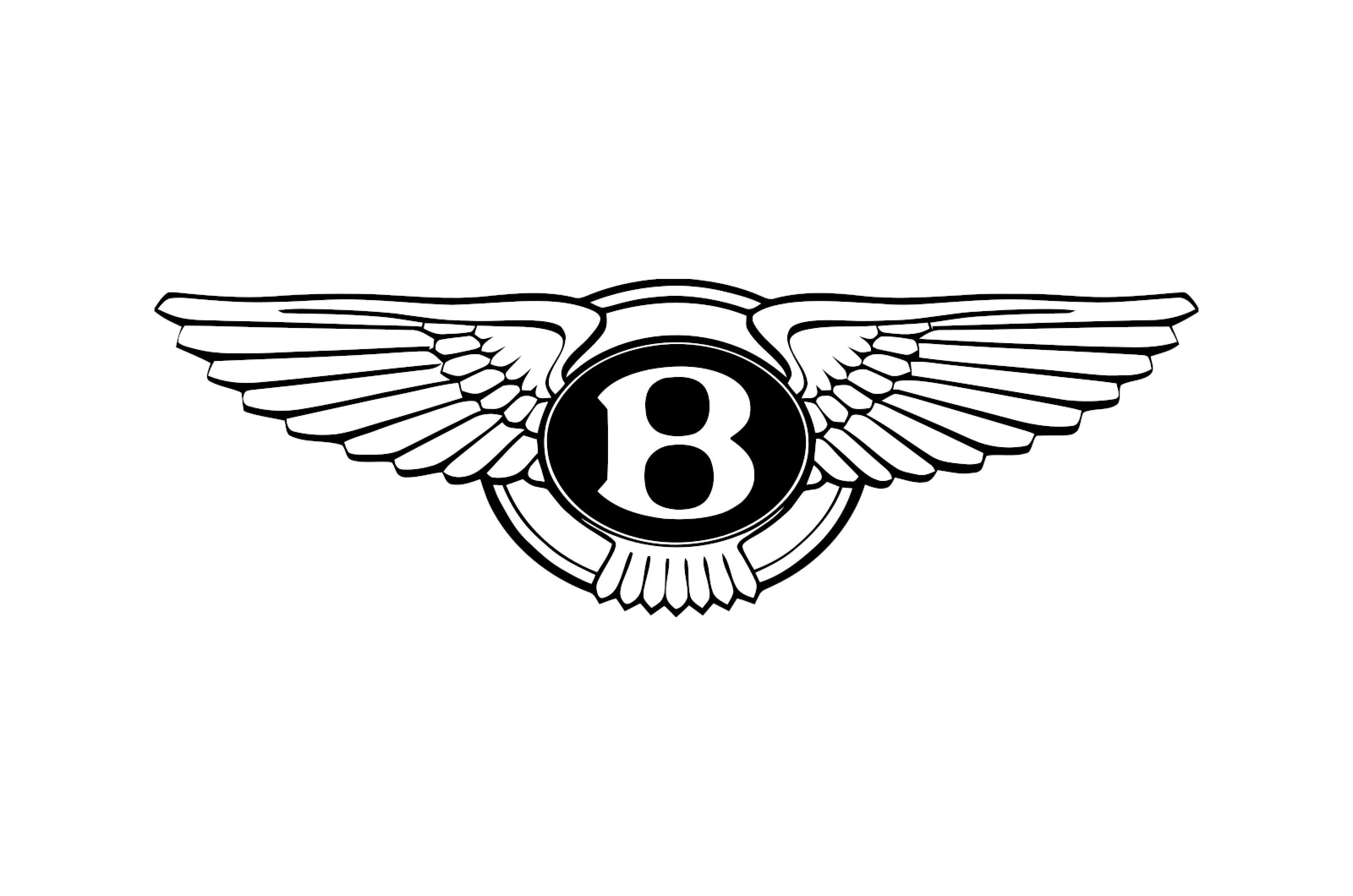
Bentley’s logo has been updated only slightly since the company was founded in 1919.
It consists of a letter B in a central circle, which is surrounded by two wings.
The left wing has always had one feather fewer than the right, a feature originally intended to make badges crafted by villainous but inattentive forgers easier to spot.
Bentley mascots have used the B (not in a circle this time) mounted fore-and-aft, and wings which at one point sprouted out to either side but more usually – and more aerodynamically – extend backwards along the center line of the car.
4. BMW
The story that the BMW logo represents an airplane propellor has been told for nearly a century, but according to Fred Jakobs, Archive Director of BMW Group Classic, it isn’t true.
BMW evolved from German aircraft engine manufacturer Rapp, whose logo was a knight (in the sense of a chess piece) in the center of a circle with the company’s name at the top of the border.
For BMW’s purposes, the name was obviously changed, and the knight was replaced with four quadrants, two of them white and the others light blue. These are the colors of the Bavarian flag, and strictly speaking they are in the wrong order, to satisfy the trademark regulations of 1917.
Beyond question, the badge does look a bit like a propellor, and in fact BMW emphasized this by superimposing it on the props of two planes pictured in an advertisement published in 1929 (and did so again at least once, in 1942). The company knew the logo’s propellor origin story was inaccurate, but Jakobs says it “made little effort to correct the myth” for a long time.
5. Buick
Buick is known in the US as the tri-shield brand for the understandable reason that its current logo consists of three shields.
In fact, the logo has been used for only around half the history of company, which began putting cars on sale in 1904. The original logo showed Uncle Sam standing on top of the world, and implied that the mythical figure was approximately 4500 miles tall.
A single shield was first used in 1937, and the group of three (mounted inside a circle) did not appear until 1960. With some interruptions, the basic design has been used ever since.
The latest version was announced in June 2022. There are still three shields (though they are simpler and more stylized than they used to be), but the surrounding circle has been removed, and the shields are now placed side-by-side rather than, as they always have been in the past, diagonally.
6. Cadillac
Cadillac has devised many logos since it was founded in 1902, but almost all of them share the same element.
This is the coat of arms of the French explorer (and, some say, scoundrel) Antoine de la Mothe, sieur de Cadillac, who in 1701 established a fort on the land now occupied by the city of Detroit.
A clear line runs from the coat of arms to today’s Cadillac logo, but it has become increasingly simple and more stylized. As an example of this, a surrounding wreath was deleted in 2014.
More recently, Cadillac removed all the colors from the logo and rendered it entirely in monochrome, reducing the (presumably unintentional) impression that the coat of arms had been interpreted by the Dutch abstract artist Piet Mondrian.
7. Chevrolet
As with Buick, Chevrolet is known as the Bow Tie brand because of its logo, but nobody seems to have suggested that it was actually inspired by a bow tie. Margery Durant, daughter of company co-founder William Durant, wrote in 1929 that her father had designed it himself while having dinner at home: “I think it was between the soup and the fried chicken.”
Then, 32 years later, a publication celebrating Chevrolet’s 50th anniversary included the quite different claim that Durant had seen the design on the wallpaper in a French hotel in 1908: “He tore off a piece of the wallpaper and kept it to show friends, with the thought that it would make a good nameplate for a car.”
Both stories were contradicted in 1973 by Durant’s second wife (and Margery’s stepmother) Catherine. She said that William saw it in an ad in a newspaper he was reading in a hotel in Hot Springs, Virginia, in 1912, and exclaimed, “I think this would be a very good emblem for the Chevrolet.”
She did not identify the ad, but later research suggests it was for Coalettes, a product manufactured by the Southern Compressed Coal Company. The resemblance between the Coalettes logo and the Chevrolet one is indeed striking.
8. Chrysler
Chrysler has used several elements in its logos over the years.
These include a representation of a wax seal (with or without an accompanying ribbon), a pentastar, two slightly differently shaped boomerangs (one red, the other black) and a pair of wings.
Today, only the wings remain. In their current form – wide, shallow and silver – they appeared in 1998 surrounding the seal design (as they had also done between 1936 and 1950), though the seal was replaced by the word Chrysler in 2014.
From 1928 to 1930, more realistic-looking wings sprouted from the top of the seal emblem rather than surrounding it.
9. Citroën
Before he established the car company that bears his name, André Citroën manufactured gears with teeth which formed a herringbone pattern. This inspired the double, upward-pointing chevrons used in every Citroën logo since 1919.
There were many variations. One of the most dramatic was introduced in 2009, when the chevrons became rounded and appeared without any background for the first time.
The next major change occurred in September 2022, when Citroën revealed a new logo in which the chevrons regained their previous sharp-edged austerity and were mounted inside a vertically aligned oval.
Company CEO Vincent Cobée said at the time, “The time is right for Citroën to adopt a modern and contemporary new look.” This was perhaps a surprising comment, since the logo was now almost exactly the same as it had been 103 years earlier.
10. Ferrari
The cavallino rampante, or prancing horse, has been part of the Ferrari logo since Ferrari was a race team rather than a car manufacturer.
It stands in an upright oblong (or sometimes a shield) under the colors of the Italian flag, and on a yellow background which may stand for Enzo Ferrari’s home town of Modena, whose own flag is partly that color and partly blue.
The horse is similar to the emblem used by the fighter pilot Count Francesco Baracca, and was suggested to Ferrari when Baracca’s parents presented him with a trophy after he had won a race in an Alfa Romeo in 1923.
The Baracca family’s coat of arms has a similar horse, which is probably where the Ferrari one came from, but another can be found on the flag of Stuttgart. According to one story, whose plausibility you can judge for yourself, Baracca adopted it because the first plane he shot down in WW1 was piloted by an unfortunate fellow from Stuttgart.
11. Ford
The single word on the Ford logo is a modified but reasonably accurate version of founder Henry Ford’s own signature.
It first appeared, underlined, in 1909, six years after the company was created. Two years after that, the underlining was removed and the word was encased in an oval for the first time.
In 1927, the background of the oval became blue, as it remains today. The oval became slimmer 30 years later.
There have been few changes since. The logo gradually took on a more three-dimensional look until 2017, when – following a general trend in the industry – it was flattened again.
12. Jaguar
Perhaps oddly, this resolutely British (though now Indian-owned) brand is represented by a species of cat native to North, Central and South America.
The image of a jaguar starting to leap towards its prey first appeared in 1945 and has hardly changed since.
The stance remains exactly the same, but there have been some refinements, including a 3D effect which was added in 2012 and, contrary to the current trend, is still there.
The logo at the front of each model gives a different image of the jaguar. Here, it faces forwards with a fierce, open-mouthed expression, as if the onlooker is the prey. Fortunately, there is no equivalent rearward view at the other end.
13. Land Rover
For three decades, Land-Rover, as it was, was not a brand in its own right but simply a single model (or one of two from 1970, when the Range Rover was introduced) within the Rover range.
A workhorse vehicle which first appeared in immediate post-war Britain could not be expected to have an elaborate logo, and sure enough the one on the Land-Rover was very simple.
It consisted of the words Land (top left) and Rover (bottom right) displayed in an oval and joined together by a large, Z-shaped hyphen.
Even the separation of Land-Rover from Rover in 1978 made little difference, and in fact the logo has not changed much even up to the present day. The lettering, the colors and the shape of the oval have all been developed, but the current design is still very similar to the one first seen three-quarters of a century ago.
14. Maserati
Of the six Maserati brothers who survived childhood, five joined forces to create a car company. The other one, Mario, wasn’t interested in cars, but he was an artist, and he created the logo which first appeared in 1926.
It consists of a trident based on the one that forms part of the Fountain of Neptune, which has stood near the Piazza Maggiore in Bologna since the 1560s.
It originally appeared within an oblong shape which was replaced by an oval one in 1933, but it now stands alone.
15. Mazda
Mazda’s original logo first appeared in 1934, and was replaced several times before the end of the century.
The current version is relatively recent, having been adopted in June 1997.
It suggests the letter M, but in fact consists of a V-shaped wing design mounted in what Mazda describes as an oval, though ‘squircle’ might also work.
The logo was updated very slightly in October 2015, and now has less contrast between the lighter and darker elements than it used to.
16. Mercedes-Benz
The three-pointed star was first used by Mercedes as early as 1909.
To begin with, there was nothing surrounding it, but in 1916 it was placed in a circle for the first time. When Mercedes merged with Benz 10 years later, the border of the circle was enlarged so that it could include the Benz’s laurel wreath emblem.
The Benz reference didn’t last long. The logo soon became simply a black star within a black circle.
It was later adapted further, taking on a metallic, three-dimensional look which Mercedes-Benz, contrary to current fashion, has not so far flattened.
17. Mitsubishi
Mitsubishi has one of the oldest logos in the motor industry. It dates back to the 1870s, when the company was established as a shipping firm, and consists of three diamond shapes, or rhombuses, arranged in a triangle.
There were two influences for this. Mitsubishi was founded by Iwasaki Yatarō, whose family crest consisted of three stacked rhombuses. His first employer was the Yamauchi clan, whose crest represents three oak leaves arranged in the same format as the diamonds in the Mitsubishi logo.
The company’s name also describes its logo. Mitsu hishi translates from Japanese as either ‘three water chestnuts’ or ‘three diamonds’. When an ‘h’ appears in the middle of a word it is often changed to a ‘b’, hence Mitsubishi.
18. Peugeot
Peugeot was created as a manufacturer of steel goods in 1810, but it wasn’t until November 1858 that it first registered a logo featuring a lion.
Lions are famous for their strong teeth, and the implication was that this also applied to the saws which Peugeot was making at the time.
Originally, the lion was seen in full profile, walking along a left-facing arrow. The arrow soon disappeared, but the lion has remained in one form or another until the present day.
The most recent change (the first in 10 years) happened in 2021, when the body was removed entirely. Only the head, the mane and – of course – the teeth were retained.
19. Porsche
The Porsche logo has hardly changed at all since it first appeared on the steering wheel of the 356 sports car in late 1952.
It’s based on the coat of arms of Württemberg-Hohenzollern, which existed at the beginning of that year but had been merged with two neighboring states to form the current Baden-Württemberg by the time the logo made its debut.
The shield has four quadrants, two showing three black antlers on a yellow background, the others showing the red and black stripes which formed the Württemberg-Hohenzollern state flag.
Within that shield is another containing the Ferrari-like prancing horse from both the flag and the coat of arms of Stuttgart, where Porsche is based.
20. Renault
Renault started out with an oval logo and switched to a round one in 1906.
The famous diamond appeared in its original form in 1925. By 1972, it had become so closely associated with the brand that the Renault name, which had featured on logos since 1923, was removed on the basis that it was now superfluous.
The diamond shape has been updated many times, and has had a three-dimensional effect until very recently.
Since the most recent update in 2021, it has looked much flatter, as so many do these days. It now consists of nothing more than two black lines, each of them with three changes of direction to maintain the overall diamond effect.
21. Rolls-Royce
The two interlocking Rs in the Rolls-Royce logo represent the surnames of the company’s founders, the Hon Charles Rolls and Sir Henry Royce.
Originally red, they became black in 1933. This happened to be the year in which Royce died, but claims that the change was a sign of mourning have been vigorously challenged.
The image above shows the logo standing on its own. When fitted to a car, it sits in an upright oblong.
The story behind the famous Spirit of Ecstasy is interesting, but that’s a mascot rather than a logo, so we won’t go into the details here.
22. Subaru
Fuji Heavy Industries was created in the early 1950s as an amalgamation of five Japanese companies.
This influenced both the name and the logo of its car brand. The earlier companies and the one they became were represented by the six stars visible with the naked eye from Earth of the Pleiades cluster, which is known in Japan as Subaru.
The relative positions of the stars in the logo, along with its color, have changed over the years, but they have always been there, mounted within (or in some cases on the edge of) an oval.
FHI took on the Subaru logo for all its operations in 2003, and was renamed Subaru Corporation in 2017.
23. Toyota
Toyota’s current logo first appeared in 1989 on a model known as the Celsior, though this went unnoticed in markets where that car was sold (with a different badge) as the Lexus LS400.
Although at first glance it looks like a heavily stylized letter T, the logo in fact consists of three ovals. According to Toyota, the inner ones represent the hearts of the customer and the company, while the large one surrounding them represents the world.
Even more fancifully, the apparently empty space not taken up by ovals is not officially empty at all. Instead, it stands for Toyota’s ‘infinite values’ of quality, value, innovation, safety, the environment, social responsibility and the joy of driving.
The logo was updated in 2006 to look more three-dimensional and metallic, but in 2020 Toyota succumbed to the new fashion for austerity and re-rendered it in flat black-and-white.
24. Vauxhall
Vauxhall’s logo has always included a mythical cross between a lion and an eagle known as a griffin.
It’s often said that the griffin was included on the coat of arms of Sir Falkes de Breauté (many other spellings are available), from whose name Vauxhall was derived by a very complicated process, but there is some uncertainty about this.
Anyway, the griffin has been there for over a century, always carrying a flag with the letter V on it.
The logo has been altered many times, in shape, color and apparent number of dimensions. Since you’ve read this far, you won’t be surprised to learn that it became much flatter, and was reduced to a single color, in 2020.
25. Volkswagen
The Volkswagen logo – a V on top of a W inside a circle – is one of the most simple and most effective in the industry, though in the very early days it was at the center of a much more complicated design.
From the company’s resurrection after the Second World War, it changed only in detail, eventually reaching its highest level of sophistication in 2012.
Seven years later, it was drastically simplified to its current form.
26. Volvo
Ever since Volvo entered the motor industry with the ÖV 4 in 1927, its cars have featured a circle with an arrow pointing diagonally upwards to the right.
These represent, respectively, the shield and spear of the Roman god Mars. The symbol also signifies the male gender and – of more relevance in Volvo’s case – the chemical element iron.
When fitted to the front of a car, the logo is traditionally mounted in the center of a long diagonal running across the radiator grille.
This originally supported the badge, and while there’s no need for that now, Volvo continues to use it – even on the all-electric C40 Recharge, which has no radiator or grille at all.
More for You
25 movies that will make you cry
Did the United States buy defunct jets from a Russian ally for Ukraine?
Six easy ways to lose an inch from your waist – in a week
Childhood habits that affect your adult life
20 historical "facts" that are actually false
Poison Doughnuts announces permanent closure beginning May 1
28 great Netflix shows you might have missed
Ranting Putin propagandist urges Russia to 'wipe out' the UK
DepEd pushing for early end of school year due to intense heat
Are LeBron James' NBA Playoff days with the Los Angeles Lakers numbered?
Catholic beliefs that aren't in the Bible
BFAR: 6 areas test positive for toxic red tide
Am I crazy? Maybe. And that’s okay.
Kenny G: His career, his enemies and what he's doing now
Removing bike lanes, banning e-bikes: MMDA counters nat’l policy
Health benefits of drinking Yakult
Here’s a list of the weapons Biden is sending to Ukraine after months of waiting
How many of these unique American pizza styles have you tried?
Renowned entrepreneurs, personalities recall how their teachers inspired their journey
‘It’s Showtime’ hits high Saturday ratings, ‘KMJS’ maintains rule on Sunday