Airlines’ logos provide distinctive branding for commercial and corporate reasons. They represent powerful symbols of associated companies and national identity.
Designing these logos is a prestigious yet expensive task for design agencies, especially when it comes to major airlines. Every month, millions of people travel by air, and they often form strong attachments to the logos of their country’s flagship carriers.
Thus, designing a logo isn’t as easy as it sounds. It’s a multi-billion dollar matter and a big responsibility for any agency as they have to consider every possible aspect.
Here, we showcase some of the most iconic airline logos worldwide, which can serve as inspiration for your own projects.
Did you know?
Many airlines choose specific colors for their logos based on psychological factors. For example, blue is commonly used to convey professionalism, trust, and reliability, which is why several big airlines like Lufthansa, Delta, and American Airlines incorporate blue into their logos.
All images are sourced from the respective airlines’ official websites and are not owned by us. Unauthorized commercial use of these logos may constitute trademark infringement.
Table of Contents
41. Alaska Airlines
2016-present
The Alaska Airlines logo has its name written in a distinctive font. The letters are bold and sans-serif, which ensures legibility and visibility. The sans-serif font style adds a contemporary and approachable touch to the logo.
The focus on the airline’s name emphasizes its reputation and recognition, especially in the Pacific Northwest region and beyond.
40. EgyptAir

2008-present
The EgyptAir logo features Horus, a major ancient Egyptian deity depicted as a falcon or a figure with a falcon head. Horus holds significance as the god of kingship and the sky in ancient Egyptian mythology.
EgyptAir selected Horus as their logo due to its historical symbolism. They have been using this logo since 2008.
39. Thai Airways
2005-present
By the mid-1970s, Thai Airways had significantly expanded its global presence. In 1975, they introduced a new logo aimed at projecting a modern and international image. The design featured vibrant magenta, purple, and gold colors inspired by traditional Thai imagery, such as tropical orchids, golden temples, and the lustrous silk of Thailand.
In 2005, minor adjustments were made to the logo, mainly focusing on the color palette to give it a slightly more formal appearance.
38. Hainan Airlines
2013-present
Founded in 1993, the Hainan Airlines logo incorporates various elements, including the wings of the golden Garuda, a mythical Chinese bird, along with its golden horn and auspicious clouds.
37. Southwest Airlines

2014-present
Southwest Airlines, the world’s largest low-cost carrier, unveiled its initial logo in 1971, featuring a welcoming heart surrounded by pilot wings. However, in 1998, the heart was replaced with a more corporate design.
Now THAT’S how you make a touchdown. #sports pic.twitter.com/wBNNEhBxV4
— Southwest Airlines (@SouthwestAir) January 8, 2024
In 2014, the airline revamped its logo once more, bringing back the vintage heart design in a more vibrant and modern style. Accompanied by a custom sans-serif typeface, the heart, now composed of orange, red, and blue stripes, is positioned at the end of the airline’s name.
36. Iberia
2013-present
The flag carrier airline of Spain, Iberia, has changed its logo eight times since its inception (1927). The most recent one, designed in 2013, features three key elements of the brand: the initial of Iberia, “I,” the seat comfort, and the wing’s dynamism and movement.
Because of the curve of the plane, the logo appears bulbous to the eye: the text appears to bulge toward the viewer. The capital lettering with the slightly rounded edge shows authority, solidity, and longevity with a sense of warmth and care.
35. Vietnam Airlines

2015-present
In 2002, Vietnam Airlines unveiled its current golden lotus identity to coincide with the delivery of the Boeing 777 in 2003. This golden lotus represents one of the most enduring and meaningful symbols of the Vietnamese people.
34. Ethiopian Airlines
2003-present
Ethiopian Airlines is Africa’s largest airline in terms of both passenger transport and revenue. In 2010, they revamped their logo and introduced a new slogan, ‘The New Spirit of Africa‘. The colors used in the logo (green, yellow, and red) mirror those of the country’s flag, and the airline’s name is presented in both English and Amharic text.
33. Malaysia Airlines
2013-present
The logo of Malaysia Airlines was refreshed in 2012. Inspired by the 1971 original logo, the wau bulan (moon kite) faces from left to right, with relatively longer tails than the previous version. The wordmark has also been updated with a new typeface, and the word “airlines” is now displayed in lowercase.
32. Jet Airways
2007-2019
The Jet Airways logo featured an oval sun with speed lines trailing behind, reminiscent of an airplane’s tail. This distinctive design, known as the ‘flying sun,’ was created by K. V. Sridhar in 1992.
31. SriLankan Airlines
1998-present
Launched in 1979, it is the largest airline in Sri Lanka in terms of aircraft and destinations. Its logo features a colorful peacock and the name of the airline written in an elegant typeface.
Inspired by a mythical creature from Sri Lanka known as the Dandu Monara Yanthra, which resembled a flying machine in the form of a peacock, the logo pays homage to this cultural symbol. Also, peacocks are native to Sri Lanka, adding further significance to the design.
30. Aeroméxico
2000-present
Inspired by the ancient culture of Mexico, the current logo of Aeromexico shows the head of an Aztec eagle warrior. It symbolizes leadership, courage, and fearlessness. They have been using this logo since 1998.
29. Qantas
2016-present
The largest airline in Australia, Qantas Airways, deployed its first logo in 1944. Since then, they have changed it four times, keeping the original Kangaroo symbol.
The current logo (often called ‘The Flying Kangaroo’) reflects the changing structure of the airline’s new generation aircraft: it’s sleeker and more contoured than previous versions. It was designed by Hans Hulsbosch in 2007.
28. Air New Zealand
2012-present
In 2006, Air New Zealand introduced a fresh brand identity, including a new logo and color scheme. The new logo showcases the Māori koru, a stylized depiction of a silver fern unfolding.
The koru holds significant cultural meaning as an integral part of Māori art, symbolizing concepts such as new life, growth, strength, and peace.
27. Azul Brazilian Airlines
2013-present
In 2012, Azul Airlines acquired TRIP Linhas Aéreas, Brazil’s largest regional carrier. Soon after this acquisition, Azul Airlines made adjustments to its logo, giving the character “u” a lighter blue shade. This tweak was a nod to the TRIP logo, which featured a different-colored “i.”
26. Aer Lingus
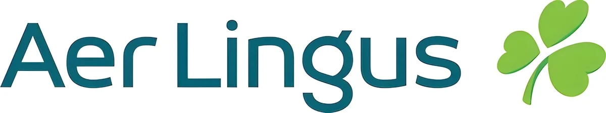
2019-present
The flag carrier airline of Ireland, Aer Lingus, transports over 10 million passengers a year. Their original logo, designed by Robert Logan, featured a shamrock. In 1996, they gave the shamrock a slanted appearance, inadvertently evoking the Irish drinking stereotype.
However, their current logo reflects a more modern airline aesthetic with a wider wordmark. While maintaining the asymmetry and angle, they softened the shape of the leaf.
Wing Check: Complete ✅ #HomeAdvantage ☘️ pic.twitter.com/gCVCT4bpqS
— Aer Lingus (@AerLingus) October 11, 2023
Shamrock is a symbol of Ireland and is connected to Ireland’s patron saint, Saint Patrick, who used it as a metaphor for the Christian Holy Trinity.
25. British Airways

1997-present
The first logo of British Airways had a wordmark that displayed ‘British” in the title case and “airways” in the lower case. It didn’t look so good back then. In 1982, they took things in the right direction by giving it a more premium look.
In 1997, the airline came with a blue- and red-colored ribbon which symbolizes ‘Speedbird‘, first used by Imperial Airways in 1932 and then by BOAC.
24. Cathay Dragon
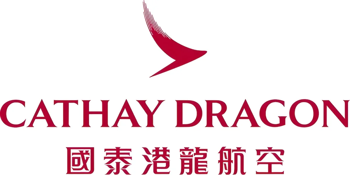
2016-present
The Hong Kong-based international airline Cathay Dragon, formerly Dragonair, began operating in 1985. Its previous logo featured a red dragon, which was changed in 2016. The current logo consists of a ‘brushwing‘ icon representing the bird’s wing and the airline’s name written in English and Chinese.
23. Mexicana
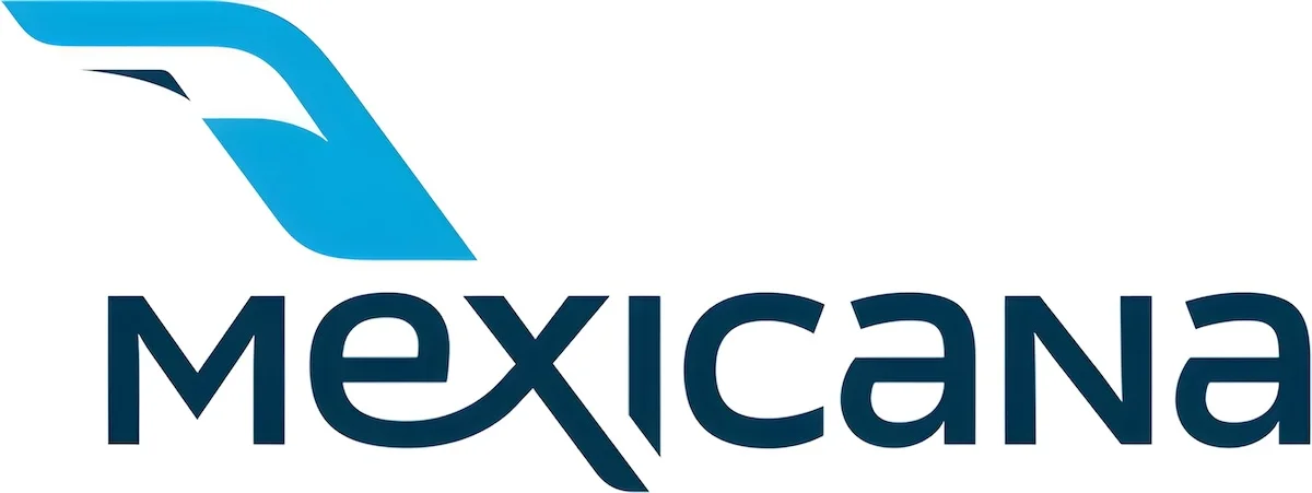
2008-2010
Mexicana de Aviación, once the largest and flagship airline of Mexico, ceased operations in 2010. Despite its inactive status, its logo maintains a striking appearance. Designed by a Danish agency called Design:Success, the logo features a prominent blue color representing an eagle, symbolizing consistency and stability.
22. Air India
![]()
2023-present
Air India uses a custom font called “Air India Sans.” While the red color symbolizes confidence and leadership, the smooth arches of the letters give an elegant feel.
This is our favourite view! Tell us what’s yours?
Thanks, @AvgeekSandyP, for capturing this one!#A350 #FlyAI #NewAirIndia pic.twitter.com/jK1QfMqtwP
— Air India (@airindia) March 9, 2024
To add a luxurious touch, they included a golden figure in the upper right corner, resembling an abstract drawing of a flying bird. This symbolizes the exceptional flight experience one can expect aboard Air India planes.
21. Turkish Airlines

2018-present
Turkish Airlines revamped its logo in 2010, showcasing the world’s highest-flying bird, the wild goose, which can ascend up to 8,850 meters. The incorporation of blue, red, and white colors gives it a professional look.
20. KLM
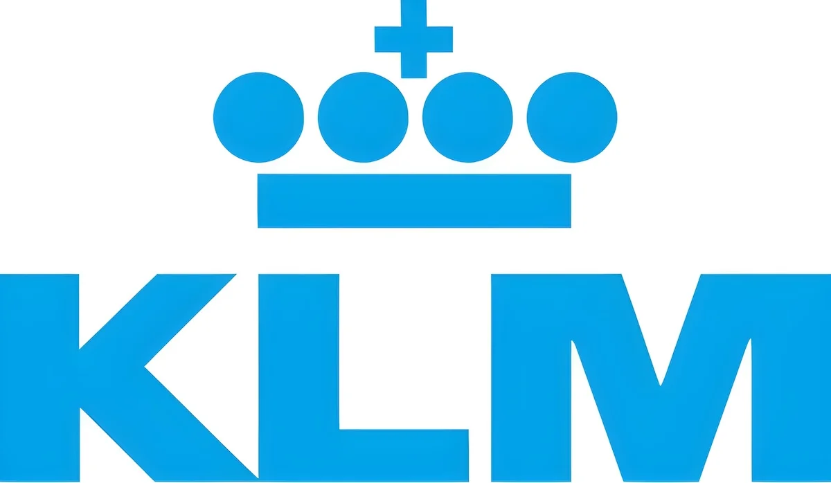
2011-present
KLM Royal Dutch Airlines is the leading airline in the Netherlands. Its logo has been changed multiple times since its inception in 1919. The current logo includes a crown crafted from a plus symbol, four blue circles, and a vertical line.
The crown symbolizes the airline’s royal status, conferred upon its establishment. Meanwhile, the light blue color in the logo represents integrity, excellence, and the courage to excel in challenging circumstances.
19. Air Canada

2017-present
The Air Canada logo, designed by FutureBrand Worldwide, harmoniously blends red and black colors. It prominently displays the airline’s name in a bold typeface, accompanied by the national symbol of Canada—a maple leaf encased within a circle.
18. Hawaiian Airlines
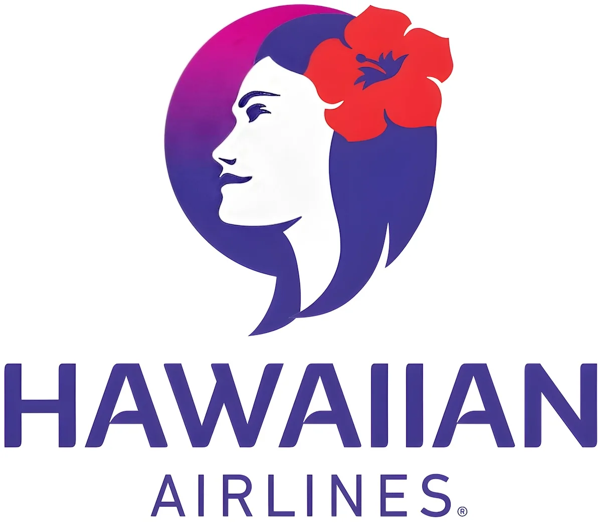
2017-present
Hawaiian Airlines, headquartered in Honolulu, is the largest airline in the US state of Hawaii. It is the oldest US carrier with no fatal accident in its entire history.
Hawaiian Airlines’ newly acquired Boeing 787-9 Dreamliner leaving Honolulu for the first time for some proving flights.
: dose_of_aerospace_787 (IG) #hawaiianairlines #boeing #avgeek pic.twitter.com/vYXs6HcPRh
— Airways Magazine (@airwaysmagazine) March 6, 2024
Their logo features a human face known as Pualani, symbolizing safety and security. The design of the logo is vibrant and organic, reflecting the laid-back vacation stereotype associated with Hawaii.
17. Aerolíneas Argentinas
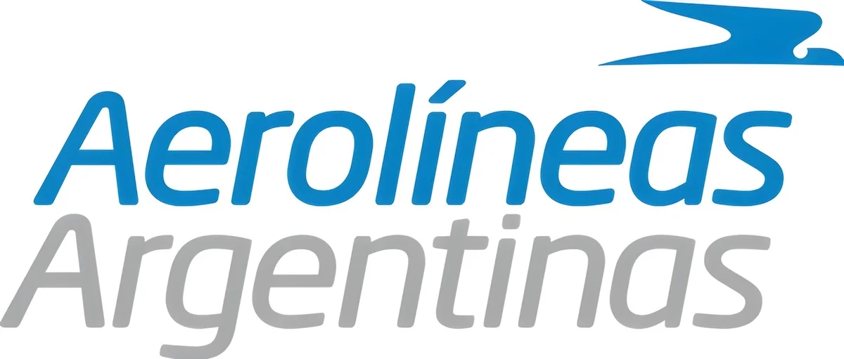
2010-present
In 2010, Argentina’s largest airline underwent a brand makeover to present a more contemporary image. Their new logo showcases a condor bird, a species commonly found in Argentina, and utilizes a grey and light blue color scheme.
The blue color is drawn from the nation’s flag, adding a patriotic touch to the airline’s identity.
16. IndiGo
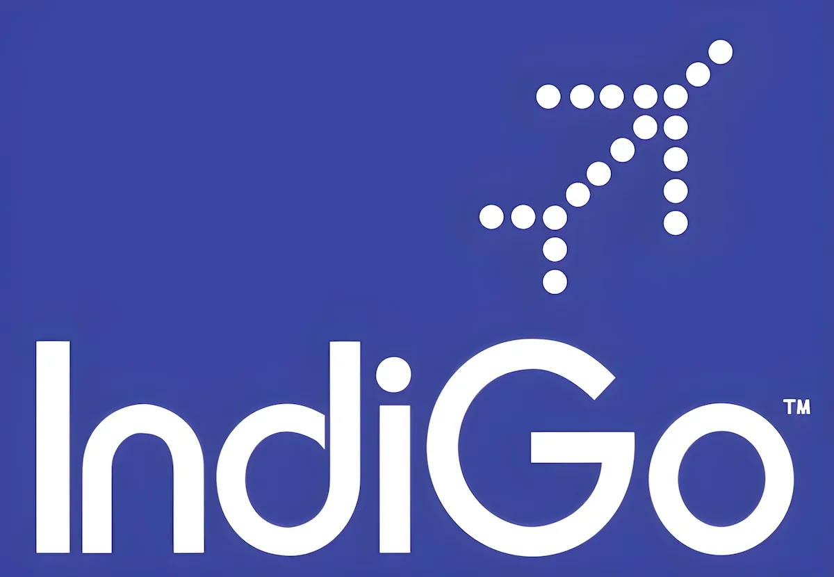
2006-present
IndiGo is a low-cost Indian airline launched in 2006. Their logo is quite distinctive, with twenty dots forming the shape of an aircraft positioned at the top right of the wordmark.
Its logo features twenty dots arranged in the shape of an aircraft at the right top of the wordmark. It has a tagline: ‘on-time, every time‘ which focuses on punctuality.
15. Ryanair

2013-present
The Irish airline Ryanair is known for its minimal operating costs and lower fares. Its first logo was designed in 1987. After numerous tweaks over the years, the current logo features bold white letters and a yellow symbol. This symbol represents one of the traditional Irish instruments — harp — and an angel.
14. Air China
2007-present
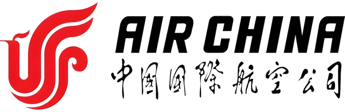
The enterprise logo of Air China contains an artistic phoenix pattern with vivid lines. It’s a transfiguration of the English word ‘VIP’. Phoenix is believed to be ‘King of Birds’ and worshiped by the nation since ancient times. For the airline, it is a paragon of virtue.
The airline’s name is elegantly written in both Chinese calligraphy and English. The choice of deep red color in the logo is highly auspicious in Chinese culture, symbolizing good fortune, happiness, and prosperity.
13. Japan Airlines

2011-present
Japan Airlines adopted its first logo in 1959, which became a part of the company for many decades to come. The logo was a crane known as the Tsurumaru. The idea of this logo came from Japanese tradition, where the crane is viewed as the symbol of prosperity, good health, and long life.
The advertising agency of Japan Airlines discovered that the Crane myth carried overwhelmingly positive connotations. Cranes are known for their strength, as they can fly long distances without tiring, and for their loyalty, as they mate for life. Moreover, the red color used in the logo symbolizes happiness.
12. Swiss International Air Lines
2011-present
Formed after Swissair’s bankruptcy in 2002, Swiss International Air Lines is now one of the top airlines in Europe.
In 2011, the airline announced its plans to enhance the brand profile, which included new corporate logos and a tagline. The aim was to make Swiss instantly recognizable as ‘the airline of Switzerland.’
11. Korean Air

1984-present
The logo of Korean Air has led to some confusion among people due to its similarity to the logo of the American product Pepsi. Both have a swirling design in red, white, and blue within a spherical shape.
However, there are distinct differences between the two logos. The Korean Air logo incorporates the yin-yang symbol, while the Pepsi logo features a slimmer white band.
It’s merely a coincidence that both logos appear similar.
From farm to your fork, faster than ever! Our advanced cold chain cargo system is designed to deliver precious, juicy Korean strawberries to you, preserving their farm-fresh taste. ✈️ Experience the unspoiled freshness with #KoreanAir. pic.twitter.com/yyI2FVfHms
— Korean Air (@KoreanAir_KE) February 6, 2024
The Korean Air logo consists of a symbol named Taegeuk, which stands for ‘supreme ultimate.’ As a part of the national flag, this symbol is associated with Korean tradition and represents balance in the universe.
10. Avianca
2013-present
Avianca is the world’s second-oldest airline after KLM. After merging with TACA in 2009, it needed a new visual identity that could reflect the heritage and legacy of both Avianca and TACA while also portraying the new pan-Latin American Aviance.
The new identity (including the logo) was built on the symbolic power of Condor. As the largest flying land bird in the Western Hemisphere, the Condor now serves as a modern emblem for Avianca, figuratively linking North, Central, and South America.
9. Delta Air Lines

2007-present
Delta’s logo has changed 20 times since 1924. The main design is taken from the Greek letter delta, recalling the airline’s origin in the Mississippi Delta.
The current logo, often called a three-dimensional red widget, was launched in 2007. It’s the simplest, most recognizable representation of the brand: the all-uppercase and all-red symbols speak with respectful, honest, and direct language.
8. Garuda Indonesia

2009-present
In 2009, Garuda Indonesia introduced a new branding initiative centered around the concept of ‘nature’s wing.’ This new graphic, inspired by the wave ripples on water (aquatic shades) and the wings of tropical birds (blue shades), embodies the essence of the airline.
The airline’s name is elegantly written to the left of the logo in the Myriad Pro font. In short, the logo aims to encapsulate the spirit of warmth and professionalism synonymous with Indonesia.
7. American Airlines
2013-present
In 2013, American Airlines launched a new rebranding and marketing campaign, which included a new logo replacing the one used since 1967. This new logo gave a more universal and contemporary feel to the classic design.
Since the new design failed to meet the threshold of originality, it was not eligible for copyright protection. Thus, the logo is in the public domain.
6. Gulf Air
2018-present
Gulf Air is Bahrain’s main airline. Its current logo (recently changed in 2018) retains the brand’s heritage and elegance throughout the last few decades. It consists of a landing falcon and the airline name written in Arabic and English typographic forms.
The falcon represents the corporate identity, traditional Arabian values, and bold and modern entrepreneurial principles. Overall, the logo is designed to be a prominent and powerful icon for a new era.
5. Fiji Airways

2012-present
Fiji Airways, formerly known as Air Pacific, was rebranded in 2013. The new handcrafted symbol represents a simple and distinctive design that makes it stand apart from the cold corporate competition.
4. Lufthansa
2018-present
The largest German airline, Lufthansa, began its commercial operation in 1955. Since then, the airline has changed its logo several times. What hasn’t changed in the logo is the ‘flying crane’.
The crane logo is typically presented within a circle, and Helvetica is utilized as the primary typeface. While the current logo maintains similarities with previous versions, the icon and text have been slimmed down to impart a more modern appearance.
3. Qatar Airways
2006-present
As the name suggests, it is Qatar’s state-owned flag carrier. Its current logo consists of a burgundy oryx (the country’s national animal) cleverly presented on a grey background. The Arabic letters spell out ‘AI Qataria’ in a smaller typeface, while the airline’s name is written in English.
2. Singapore Airlines
1987-present
The logo of Singapore Airlines is a silver kris bird. It has remained unchanged since the airline’s inception. However, the stripes and logotype did undergo a minor tweak in 1987.
Singapore Airlines is honoured to be recognised by Fortune Magazine as one of the 50 Most Admired Companies in the world.
We are the only Asian airline, as well as the highest Singapore-based company in the top 50 list.
We are grateful for the steadfast support from our… pic.twitter.com/asGrv9GbNt
— Singapore Airlines (@SingaporeAir) February 1, 2024
The keris, a dagger from Southeast Asia featured in the region’s folklore and mythology, is a crucial element in Singapore Airlines’ branding. It is notably incorporated into the KrisWorld entertainment system and the SilverKris lounge.
1. Emirates
1999-present
Dubai-based airline Emirates released its first set of commercials in the 1990s with the slogan So be good to yourself, Fly Emirates. Its current logo is a subtle revision of the original, which was designed by Negus & Negus Associates in 1985.
The logo consists of a name written in sacred Arabic calligraphic lettering with the company’s name written in English below it. The white color symbolizes elegance, purity, and nobility, while the eye-catching red color stands for passion, self-confidence, and leadership.
More to Know
Why are airline logos important?
Airline logos serve as a powerful tool for brand identity, recognition, trust-building, and marketing. They are crucial for shaping passengers’ perceptions and influencing purchasing decisions in the competitive airline industry.
For international airlines, logos act as a universal language that transcends cultural and language barriers. A carefully crafted logo can communicate the airline’s presence and reputation to people worldwide.
What role do colors play in airline logos?
Colors in the logo can express brand identity, enhance visibility, elicit emotional responses, and respect cultural nuances. The strategic use of colors is crucial for creating memorable and impactful logos that resonate with passengers and contribute to overall brand success.
Several airline companies maintain consistency in their color palettes to ensure uniformity in visual branding elements like logos, uniforms, aircraft liveries, and marketing materials.
Why do airline logos change over time?
As airlines evolve and adapt to changing market trends, corporate strategies, and passenger preferences, they undergo rebranding initiatives to reflect their evolving brand identities. Logo changes are often part of broader rebranding efforts aimed at modernizing the company’s image and staying relevant in a cutthroat market.
Read More
Alitalia ‘s
The best and beautiful number one is iran air logo
Describing Hainan Airways, you have termed ‘Garuda’ as mythological Chinese bird. But the fact is that ‘Garuda’ is the king of the bird as found in Indian mythology. He carries Vishnu, the Indian God on it’s back. Garuda is portrayed or sculpted in almost all the famous Indian temples. As much as, that Indonesia has also named its airlines as Garuda Airlines. It’s so because once the dominant religion of Indonesia was Hinduism and the essence of it reflected in their culture. Lots of Hindu temples and sculptures can still be seen there. Ramayana and Mahabharata plays an important role in their daily lives and are frequently staged.
Where is Iran Air? Where is Homa?