Misc
Iconic Infographic Map Compares the World’s Mountains and Rivers
Explore the full-size version (19mb) of this visualization.
Today, highly detailed maps of our planet’s surface are just a click away.
In times past, however, access to information was much more limited. It wasn’t until the 1800s that comparison diagrams and maps became widely accessible, and people found new ways to learn about the world around them.
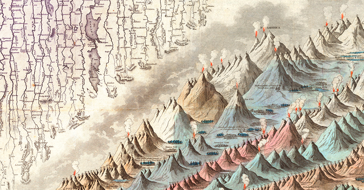
The image above, published by J.H. Colton in 1849, is believed to be the first edition of the iconic mountains and rivers infographic map. This comparison chart concept would see a number of iterations over the years as it appeared in Colton’s world atlases.
Inspiring a Classic Infographic Map
A seminal example of this style of infographic was produced by Alexander von Humboldt in 1805. The diagram below is packed with information and shows geographical features in a way that was extremely novel at the time.
In 1817, the brothers William and Daniel Lizars produced the first comparative chart of the world’s mountains and rivers. Breaking up individual natural features into components for comparison was a very innovative approach at that time, and it was this early French language prototype that lead to the Colton’s versions we’re familiar with today.
Digging into the Details
As is obvious, even at first glance, there is a ton of detail packed into this infographic map.
Firstly, rivers are artificially straightened and neatly arranged in rows for easy comparison. Lakes, mountain ranges, and cities are all labeled along the way. This unique comparison brings cities like New Orleans and Cairo side by side.
Of course, this visualization was based on the best available data at the time. Today, the Nile is widely considered to be the world’s longest river, followed by the Amazon and Yangtze.
Over on the mountain side, there are more details to take in. The visualization includes volcanic activity, notes on vegetation, and even the altitude of selected cities and towns.
Above are a few of South America’s high-altitude population centers, including La Paz, which is the highest-elevation capital city in the world.
In the legend, many of the mountains are simply named “peak”. While this generic labeling might seem like a throwback to a time when the world was still being explored, it’s worth noting that today’s second tallest mountain is still simply referred to as K2.
What details do you notice while exploring this iconic infographic map?


Maps
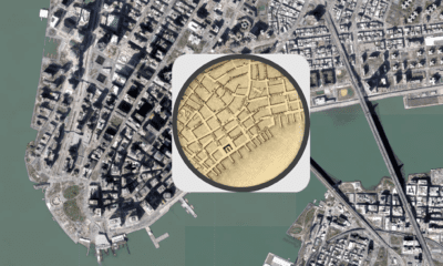
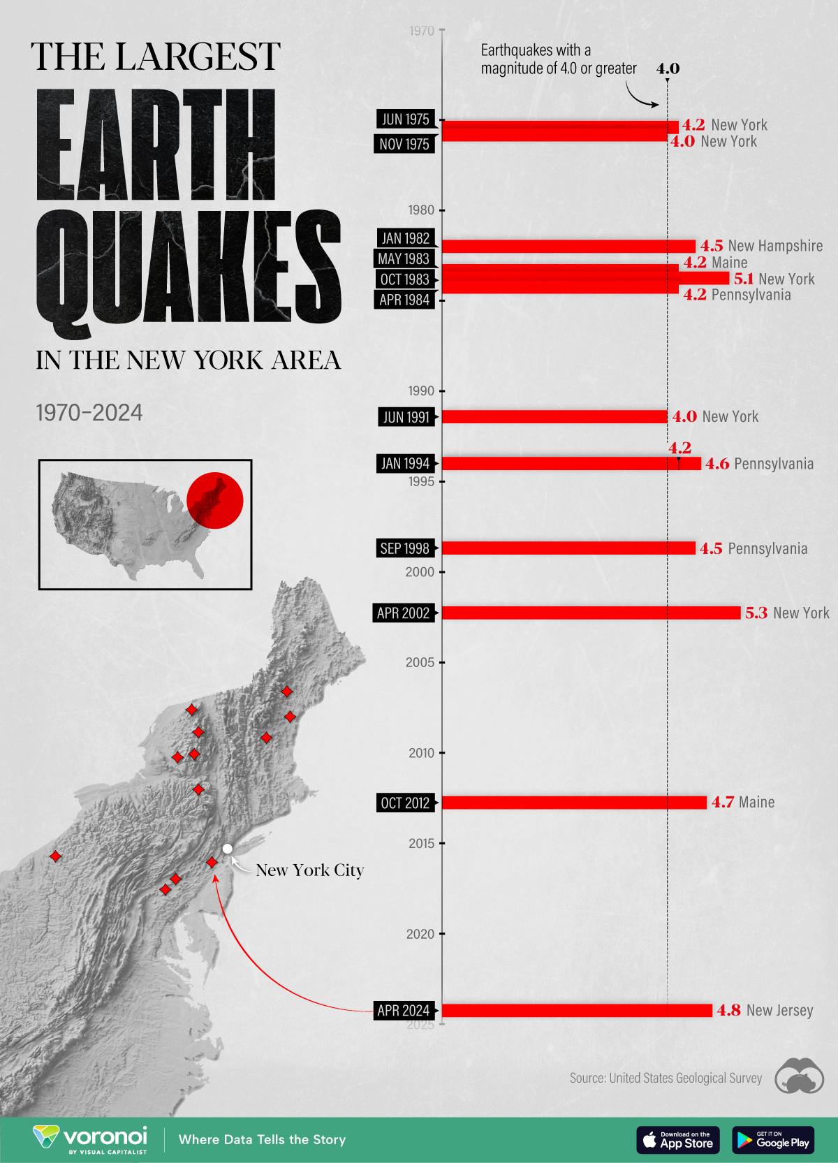
The Largest Earthquakes in the New York Area (1970-2024)
The earthquake that shook buildings across New York in April 2024 was the third-largest quake in the Northeast U.S. over the past 50 years.
The Largest Earthquakes in the New York Area
This was originally posted on our Voronoi app. Download the app for free on Apple or Android and discover incredible data-driven charts from a variety of trusted sources.
The 4.8 magnitude earthquake that shook buildings across New York on Friday, April 5th, 2024 was the third-largest quake in the U.S. Northeast area over the past 50 years.
In this map, we illustrate earthquakes with a magnitude of 4.0 or greater recorded in the Northeastern U.S. since 1970, according to the United States Geological Survey (USGS).
Shallow Quakes and Older Buildings
The earthquake that struck the U.S. Northeast in April 2024 was felt by millions of people from Washington, D.C., to north of Boston. It even caused a full ground stop at Newark Airport.
The quake, occurring just 5 km beneath the Earth’s surface, was considered shallow, which is what contributed to more intense shaking at the surface.
According to the USGS, rocks in the eastern U.S. are significantly older, denser, and harder than those on the western side, compressed by time. This makes them more efficient conduits for seismic energy. Additionally, buildings in the Northeast tend to be older and may not adhere to the latest earthquake codes.
Despite disrupting work and school life, the earthquake was considered minor, according to the Michigan Technological University magnitude scale:
| Magnitude | Earthquake Effects | Estimated Number Each Year |
|---|---|---|
| 2.5 or less | Usually not felt, but can be recorded by seismograph. | Millions |
| 2.5 to 5.4 | Often felt, but only causes minor damage. | 500,000 |
| 5.5 to 6.0 | Slight damage to buildings and other structures. | 350 |
| 6.1 to 6.9 | May cause a lot of damage in very populated areas. | 100 |
| 7.0 to 7.9 | Major earthquake. Serious damage. | 10-15 |
| 8.0 or greater | Great earthquake. Can totally destroy communities near the epicenter. | One every year or two |
The largest earthquake felt in the area over the past 50 years was a 5.3 magnitude quake that occurred in Au Sable Forks, New York, in 2002. It damaged houses and cracked roads in a remote corner of the Adirondack Mountains, but caused no injuries.
| Date | Magnitude | Location | State |
|---|---|---|---|
| April 20, 2002 | 5.3 | Au Sable Forks | New York |
| October 7, 1983 | 5.1 | Newcomb | New York |
| April 5, 2024 | 4.8 | Whitehouse Station | New Jersey |
| October 16, 2012 | 4.7 | Hollis Center | Maine |
| January 16, 1994 | 4.6 | Sinking Spring | Pennsylvania |
| January 19, 1982 | 4.5 | Sanbornton | New Hampshire |
| September 25, 1998 | 4.5 | Adamsville | Pennsylvania |
| June 9, 1975 | 4.2 | Altona | New York |
| May 29, 1983 | 4.2 | Peru | Maine |
| April 23, 1984 | 4.2 | Conestoga | Pennsylvania |
| January 16, 1994 | 4.2 | Sinking Spring | Pennsylvania |
| November 3, 1975 | 4 | Long Lake | New York |
| June 17, 1991 | 4 | Worcester | New York |
The largest earthquake in U.S. history, however, was the 1964 Good Friday quake in Alaska, measuring 9.2 magnitude and killing 131 people.

-

 Misc2 weeks ago
Tesla Is Once Again the World’s Best-Selling EV Company
-

 AI1 week ago
The Stock Performance of U.S. Chipmakers So Far in 2024
-

 Misc1 week ago
Almost Every EV Stock is Down After Q1 2024
-

 Money2 weeks ago
Where Does One U.S. Tax Dollar Go?
-

 Green2 weeks ago
Ranked: Top Countries by Total Forest Loss Since 2001
-

 Real Estate2 weeks ago
Visualizing America’s Shortage of Affordable Homes
-

 Maps2 weeks ago
Mapped: Average Wages Across Europe
-

 Mining2 weeks ago
Charted: The Value Gap Between the Gold Price and Gold Miners