Energy
Growth and Decline: Visualizing U.S. Population Change by County
View a bigger sized version of this same map.
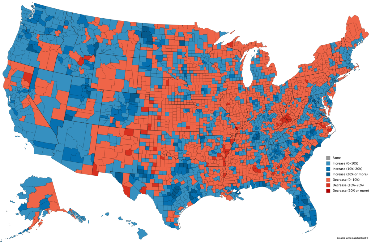
Visualizing U.S. Population Change by County (2010-2018)
The American Heartland continues to feed the growth of urban centers — not only with its agricultural products and natural resources, but with its people as well.
Across the nation, coastal urban centers are adding new citizens, while rural counties are seeing their populations decline. Outside of this general trend, fracking has created some rare pockets of growth in rural areas, while coal mine closures have had the opposite effect.
Today’s map comes to us from Reddit user jinkinson, and it maps U.S. population change by county from 2010 to 2018, using data from the U.S. Census Bureau.
Uneven Growth
From 2010 to 2018, the total United States population increased by 6% from 308,745,538 to 327,167,434. However, it’s clear that not all counties participated in this uptrend.
There are 3,142 counties counted as part of this map (Puerto Rico and U.S. territories excluded). Of these, 1,489 experienced positive growth, while 1,653 saw a decline.
Which Counties are Growing the Fastest?
America’s economy has grown for over a decade, but that growth increasingly concentrates in 1% of the nation’s counties.
In fact, just 31 counties were responsible for 32.3% of the U.S. gross domestic product (GDP) in 2018, according to data from the Bureau of Economic Analysis.
Although economic concentration tells part of the story, a view of changing population patterns can help us see where physical growth is happening across the country.
Top 20 Counties for U.S. Population Growth
| Rank | State | County Name | 2010 Population | 2018 Population | % Change |
|---|---|---|---|---|---|
| #1 | North Dakota | McKenzie County | 6,360 | 13,632 | 114% |
| #2 | Texas | Loving County | 82 | 152 | 85% |
| #3 | North Dakota | Williams County | 22,398 | 35,350 | 58% |
| #4 | Texas | Hays County | 157,107 | 222,631 | 42% |
| #5 | Utah | Wasatch County | 23,530 | 33,240 | 41% |
| #6 | Tennessee | Trousdale County | 7,870 | 11,012 | 40% |
| #7 | Texas | Hudspeth County | 3,476 | 4,795 | 38% |
| #8 | Florida | Sumter County | 93,420 | 128,754 | 38% |
| #9 | Florida | Osceola County | 268,685 | 367,990 | 37% |
| #10 | Texas | Comal County | 108,472 | 148,373 | 37% |
| #11 | Texas | Kendall County | 33,410 | 45,641 | 37% |
| #12 | Iowa | Dallas County | 66,135 | 90,180 | 36% |
| #13 | Georgia | Forsyth County | 175,511 | 236,612 | 35% |
| #14 | Texas | Fort Bend County | 585,375 | 787,858 | 34% |
| #15 | Texas | Williamson County | 422,679 | 566,719 | 34% |
| #16 | Florida | St. Johns County | 190,039 | 254,261 | 34% |
| #17 | North Dakota | Mountrail County | 7,673 | 10,218 | 33% |
| #18 | Georgia | Long County | 14,464 | 18,998 | 31% |
| #19 | South Dakota | Lincoln County | 44,828 | 58,807 | 31% |
| #2 | Virginia | Loudoun County | 312,311 | 406,850 | 30% |
At the top of the list is McKenzie County, North Dakota, which experienced a growth of 114% in its population from 2010 to 2018. This is due to the shale gas industry that flourished in the area. Interestingly, all of North Dakota’s active oil and gas rigs are in just four counties: McKenzie, Dunn, Williams, and Mountrail, three of which make the top 20 list above.
The fracking boom also fueled growth in Texas, where six counties made the list.
However, immediate economic success built on fracking sands and sensitive commodity prices may not be sustainable over the longer term. In fact, counties from a previous energy era are already seeing what happens when demand dries up.
Which Counties are Declining the Fastest?
If you look at a map of coal operations in the U.S. and compare it to the list of declining counties below, a stark pattern appears.
Half of country’s coal miners work in just 25 counties, and as mines close there are fewer economic opportunities available in those areas.
Top 20 Counties for U.S. Population Decline
| Rank | State | County Name | 2010 Population | 2018 Population | % Change |
|---|---|---|---|---|---|
| #1 | Illinois | Alexander County | 8,238 | 6,060 | -26% |
| #2 | Oklahoma | Blaine County | 11,943 | 9,485 | -21% |
| #3 | West Virginia | McDowell County | 22,113 | 18,223 | -18% |
| #4 | Kansas | Morton County | 3,233 | 2,667 | -18% |
| #5 | Arkansas | Phillips County | 21,757 | 18,029 | -17% |
| #6 | Texas | Terrell County | 984 | 823 | -16% |
| #7 | Texas | Schleicher County | 3,461 | 2,895 | -16% |
| #8 | Alaska | Petersburg Borough | 3,815 | 3,221 | -16% |
| #9 | Arkansas | Monroe County | 8,149 | 6,900 | -15% |
| #10 | Louisiana | Tensas Parish | 5,252 | 4,462 | -15% |
| #11 | South Carolina | Allendale County | 10,419 | 8,903 | -15% |
| #12 | Michigan | Ontonagon County | 6,780, | 5,795 | -15% |
| #13 | Mississippi | Quitman County | 8,223 | 7,051 | -14% |
| #14 | Alabama | Macon County | 21,452 | 18,439 | -14% |
| #15 | Arkansas | Lee County | 10,424 | 8,985 | -14% |
| #16 | Alabama | Perry County | 10,591 | 9,140 | -14% |
| #17 | Virginia | Emporia city | 5,927 | 5,121 | -14% |
| #18 | Mississippi | Coahoma County | 26,151 | 22,628 | -13% |
| #19 | Colorado | Kit Carson County | 8,270 | 7,163 | -13% |
| #20 | Texas | Mitchell County | 9,403 | 8,145 | -13% |
While coal counties have grim figures due to the changing domestic energy story, it’s Alexander County in Illinois that tops the list with a 26% decline in population over the time period.
In fact, the harsh reality is that 93% of Illinois’ counties have seen a decrease in population between 2010-2018.
State by State: Winners and Losers
The number of declining counties within a state reveals a larger picture. Visual Capitalist aggregated county level data to reveal the patterns of U.S. states.
| State | # Counties with Negative Growth | # Counties with Positive Growth | % of Counties with Negative Growth |
|---|---|---|---|
| Illinois | 93 | 9 | 91% |
| Connecticut | 7 | 1 | 88% |
| Kansas | 90 | 15 | 86% |
| West Virginia | 46 | 9 | 84% |
| Mississippi | 62 | 20 | 76% |
| New York | 46 | 16 | 74% |
| Nebraska | 66 | 27 | 71% |
| Pennsylvania | 47 | 20 | 70% |
| New Mexico | 23 | 10 | 70% |
| Missouri | 79 | 36 | 69% |
| Iowa | 68 | 31 | 69% |
| Ohio | 58 | 30 | 66% |
| Alabama | 43 | 24 | 64% |
| Indiana | 59 | 33 | 64% |
| Arkansas | 48 | 27 | 64% |
| Michigan | 53 | 30 | 64% |
| Louisiana | 39 | 25 | 61% |
| Oklahoma | 44 | 33 | 57% |
| Vermont | 8 | 6 | 57% |
| Maine | 7 | 6 | 54% |
| Kentucky | 63 | 57 | 53% |
| Wyoming | 12 | 11 | 52% |
| North Dakota | 27 | 26 | 51% |
| Minnesota | 44 | 43 | 51% |
| Rhode Island | 4 | 4 | 50% |
| New Jersey | 10 | 11 | 48% |
| Wisconsin | 34 | 38 | 47% |
| Georgia | 73 | 86 | 46% |
| South Carolina | 21 | 25 | 46% |
| Virginia | 60 | 73 | 45% |
| North Carolina | 43 | 57 | 43% |
| South Dakota | 26 | 40 | 39% |
| Alaska | 11 | 18 | 38% |
| Texas | 96 | 158 | 38% |
| Nevada | 6 | 11 | 35% |
| Tennessee | 32 | 63 | 34% |
| Montana | 18 | 38 | 32% |
| New Hampshire | 3 | 7 | 30% |
| Maryland | 7 | 17 | 29% |
| California | 15 | 43 | 26% |
| Colorado | 16 | 48 | 25% |
| Utah | 7 | 22 | 24% |
| Florida | 15 | 52 | 22% |
| Massachusetts | 3 | 11 | 21% |
| Idaho | 9 | 35 | 20% |
| Hawaii | 1 | 4 | 20% |
| Oregon | 7 | 29 | 19% |
| Arizona | 2 | 13 | 13% |
| Washington | 2 | 37 | 5% |
| Delaware | 0 | 3 | 0% |
| District of Columbia | 0 | 1 | 0% |
Illinois tops the list with the most people leaving its counties, while areas such as the District of Columbia and Delaware experienced no declines.
What happens to a state where the majority of its counties are losing residents?
The Big Picture
Americans are seeking out opportunity where it resides: in the cities. The pursuit of fracking oil and gas created opportunities in regions beyond the coast or traditional urban centers.
However, the long term trend of concentration of people on coasts and in major urban centers will continue to impact infrastructure spending, labor mobility, and economic activity. America no longer derives the majority of its economic success from rural counties and industries.
It is unclear how rural counties will fare as their denizens continue to dwindle. What is clear is that the few that rely on natural resources for success will continue to experience the ups and downs of volatile commodity markets.


Energy
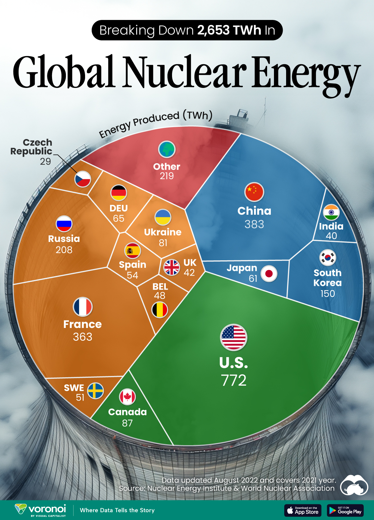
The World’s Biggest Nuclear Energy Producers
China has grown its nuclear capacity over the last decade, now ranking second on the list of top nuclear energy producers.

The World’s Biggest Nuclear Energy Producers
This was originally posted on our Voronoi app. Download the app for free on Apple or Android and discover incredible data-driven charts from a variety of trusted sources.
Scientists in South Korea recently broke a record in a nuclear fusion experiment. For 48 seconds, they sustained a temperature seven times that of the sun’s core.
But generating commercially viable energy from nuclear fusion still remains more science fiction than reality. Meanwhile, its more reliable sibling, nuclear fission, has been powering our world for many decades.
In this graphic, we visualized the top producers of nuclear energy by their share of the global total, measured in terawatt hours (TWh). Data for this was sourced from the Nuclear Energy Institute, last updated in August 2022.
Which Country Generates the Most Nuclear Energy?
Nuclear energy production in the U.S. is more than twice the amount produced by China (ranked second) and France (ranked third) put together. In total, the U.S. accounts for nearly 30% of global nuclear energy output.
However, nuclear power only accounts for one-fifth of America’s electricity supply. This is in contrast to France, which generates 60% of its electricity from nuclear plants.
| Rank | Country | Nuclear Energy Produced (TWh) | % of Total |
|---|---|---|---|
| 1 | 🇺🇸 U.S. | 772 | 29% |
| 2 | 🇨🇳 China | 383 | 14% |
| 3 | 🇫🇷 France | 363 | 14% |
| 4 | 🇷🇺 Russia | 208 | 8% |
| 5 | 🇰🇷 South Korea | 150 | 6% |
| 6 | 🇨🇦 Canada | 87 | 3% |
| 7 | 🇺🇦 Ukraine | 81 | 3% |
| 8 | 🇩🇪 Germany | 65 | 2% |
| 9 | 🇯🇵 Japan | 61 | 2% |
| 10 | 🇪🇸 Spain | 54 | 2% |
| 11 | 🇸🇪 Sweden | 51 | 2% |
| 12 | 🇧🇪 Belgium | 48 | 2% |
| 13 | 🇬🇧 UK | 42 | 2% |
| 14 | 🇮🇳 India | 40 | 2% |
| 15 | 🇨🇿 Czech Republic | 29 | 1% |
| N/A | 🌐 Other | 219 | 8% |
| N/A | 🌍 Total | 2,653 | 100% |
Another highlight is how China has rapidly grown its nuclear energy capabilities in the last decade. Between 2016 and 2021, for example, it increased its share of global nuclear energy output from less than 10% to more than 14%, overtaking France for second place.
On the opposite end, the UK’s share has slipped to 2% over the same time period.
Meanwhile, Ukraine has heavily relied on nuclear energy to power its grid. In March 2022, it lost access to its key Zaporizhzhia Nuclear Power Station after Russian forces wrested control of the facility. With six 1,000 MW reactors, the plant is one of the largest in Europe. It is currently not producing any power, and has been the site of recent drone attacks.

-

 Maps2 weeks ago
Mapped: Average Wages Across Europe
-

 Money1 week ago
Which States Have the Highest Minimum Wage in America?
-

 Real Estate1 week ago
Ranked: The Most Valuable Housing Markets in America
-

 Markets1 week ago
Charted: Big Four Market Share by S&P 500 Audits
-

 AI1 week ago
The Stock Performance of U.S. Chipmakers So Far in 2024
-

 Automotive1 week ago
Almost Every EV Stock is Down After Q1 2024
-

 Money2 weeks ago
Where Does One U.S. Tax Dollar Go?
-

 Green2 weeks ago
Ranked: Top Countries by Total Forest Loss Since 2001