Pathways to Success

My current career as a Senior Data Scientist in the private sector would not have been possible without my time at “The” Ohio State University (OSU).

Jordan Pino at PhD Commencement Ceremony

I arrived at OSU [the result of some unique circumstances], after my Ph.D. advisor accepted a job as a professor of Atmospheric Sciences in the Department of Geography in the Fall of 2016. At the time, I was a wide-eyed first semester Ph.D student at Texas A&M University with ambitious plans for my dissertation. Upon hearing the news that my advisor was accepting the position at OSU, my initial thoughts ranged from fear to excitement. Once I accepted that I would need to trade the hot, muggy summer of Texas with the occasional sub-zero temperatures in Ohio, I became very excited! A new adventure started in the Fall of 2016, and I never looked back. The Department of Geography at OSU provided me with all the tools I needed to succeed during my Ph.D. studies, even allowing me to graduate in only 3.5 years. The openness of all the professors in the department, to the support I was given after revealing that I wanted to pursue a non-academic career upon graduation, led me to not only succeed, but to excel. It can be intimidating to let your professors and colleagues know that you have passions outside the academic track, but the department provided an open door and highly supportive environment.

Jordan Pino and Professor Steven Quiring at commencement ceremony

Specifically, my advisor Dr. Steven Quiring was instrumental in providing the support needed to pursue a career outside academia. The work I was involved in, modeling power outages caused by severe weather events, fit quite nicely in the private sector. As many know, weather events cause significant power outages each year. Utility companies seek highly educated people to work on such problems. With the support from my own advisor and other professors in the department (e.g. through working on projects with local utility, American Electric Power, presenting at academic conferences, and obtaining certificates through the College of Engineering), I was able to glide into a nice position at a large utility soon after graduation. Overall, the support the Department of Geography provided during my time allowed me to fulfill my dream. Even though I was one of a few in my program who wanted to pursue such an odd career post-graduation, I got no pushback at all. Without my time in the program, I cannot say I would be as successful as I am today! My time at OSU not only allowed me to gain career success, but also lifelong friends and colleagues.

Jordan Pino

Baltimore Gas & Electric (BG&E)

PhD Alumnus, Department of Geography

The Ohio State University

New Avenues for Remote Sensing in Disaster Monitoring and Assessment

2021 marks an increasing trend of putting analytics directly into the space. While before remote sensing researchers used to download “raw” satellite images of the Earth from centralized websites to their computer for further analysis (and even catch physical film canisters from a satellite ironically named Corona back in the 1950s1), now their work gets much easier. Initiatives like from the European Space Agency2 use artificial intelligence on-board of satellites to process images into ready usable products and send them to the ground. In the context of my research, disaster monitoring and assessment, that could mean no more hours spent on working with raw images and building my own algorithms to derive extent of disaster damage from space. Instead, the focus is shifted towards utilizing downloaded image products, like flood masks, in more complicated computer models for various applications and integrating with other datasets.

My current research is about urban disaster damage assessment that goes beyond simple from-above physical damage identification with satellite images. I am interested in linking the pixels to people3 and understanding impact of past and on-going disasters on a society. This large-scale analysis is again, only possible thanks to the computational progress described above, availability of usable data and emergence of big data to better understand our changing environment. For disaster assessment, that means gathering and incorporating big volumes of almost real-time information from individuals together with field surveys, remotely sensed images of the area and longer-term census data. For example, Fig. 1 (below) shows this “layer cake” of disparate data that was implemented by the team of Ohio State researchers for hurricane flood monitoring. The computer platform considers many sensor feeds, including individuals data from Twitter. Another interesting example is FloodFactor platform5 that rather than assessing extent and damage of on-going disasters, offers predictions of future damage risk for a given residential address. The methodology relies on deriving maps of flood probability and putting those in the context of each building type and historical losses in the area. All in all, while merging datasets in damage assessment is not new, there are still several methodological challenges and key datasets needed to be explored. One of which I am focusing on right now is incorporating economic and social geospatial data as “proxies” for physical damage measures in situations of missing data.

Fig. 1 Disaster monitoring and relief framework based on multiple sensor feeds (left), and the schematics of their visualization as a web GIS (right). Source: [4]

Most importantly, I would like to position my work within the context of smart cities. Disaster damage assessment is an integral part of future smart cities that “use connected technology and data to improve the efficiency of city service delivery, enhance quality of life for all, and increase equity and prosperity for residents and businesses”6. That is very important when one realizes the exacerbating climate change realities and social vulnerabilities in cities across the globe that lead to disasters. The risk and damage assessment of the future that we need is the one relying on interconnected sensors (satellites, social media, field data etc.), merging of data, and exercised by local municipalities for better decision-making. Accordingly, I seek to contextualize my future findings from local case studies in a broader narrative of smart city development and disaster risk reduction initiatives.

Polina Berezina

PhD Student, Department of Geography

The Ohio State University


References

  1. http://heroicrelics.org/info/corona/corona-overview.html
  2. https://www.nature.com/articles/s41598-021-86650-z
  3. https://www.nap.edu/catalog/5963/people-and-pixels-linking-remote-sensing-and-social-science
  4. https://dl.acm.org/doi/pdf/10.1145/3331184.3331405
  5. https://floodfactor.com
  6. https://smartcitiesconnect.org/what-a-smart-city-is-and-is-not/

Agricultural Risks to Changing Snowmelt

Snowpacks store cold water in winter, which is later melted in warmer spring months to produce streamflow. Historically, irrigated agriculture has relied on snowmelt runoff as an important seasonal water supply in many regions across the world, such as the western United States.

However, Climate change has already begun to change the spatial and temporal patterns of snowmelt runoff — causing a decreasing magnitude of snowfall and earlier melting of snowpacks. Consequently, irrigated agriculture, which has been depending on snowmelt runoff happening with a certain magnitude, at a specific time, and in a given location, are exposed to potentially important risks under a warming climate.

Although such changes in snowmelt-derived water resources are often cited as a key threat to irrigated agriculture and global food security, previous studies have focused on annual changes in runoff, without resolving the sub-annual changes in water supply and crop-specific water demand.

To characterize such risks, we differentiate surface water supply from three sources: snowmelt runoff, rainfall runoff, and alternative water supply such as inter-basin water transfer. Comparing monthly surface water supply with surface water demand under both the historical climate (1985-2015) and predicted warming scenarios (2°C and 4°C above pre-industrial conditions), we identify where irrigated agriculture has been mostly depending on snowmelt runoff in the past 30 years. Also, we find basins in high-mountain Asia (the Tibetan Plateau), central Asia, central Russia, the western U.S., and the southern Andes are particularly vulnerable to decreasing snowmelt availability in crops’ growing seasons due to a future warming climate.

Therefore, these most risky basins will require increasing additional water supplies by increasing inter-basin transfer, pumping additional groundwater, or consuming water required for other uses. Notably, providing those additional water supplies may sometimes cause additional environmental and social problems, thus improved irrigation practices or crop switching may be needed to ensure food security under changing snowmelt.

Yue Qin

Assistant Professor, Department of Geography

The Ohio State University

Uncertainty Problems and Census Data: The 2020 Census & Exurbanization Example

Last year, I had opportunities to learn about the 2020 Census from a research seminar and a professional meeting to promote Complete Count of the 2020 Census. As you may have heard already, there are some new characteristics in the 2020 Census as below (U.S. Census Bureau, n.d.-a, n.d.-c, n.d.-b):

  • The 2020 Census will be the first to offer options for internet and phone responses.
  • There will be a greater reliance on technology to prepare for and execute the count.
  • The 2020 Census will update its Master Address File (MAF) and ensure that every living quarter in the U.S. is included in the census universe by collaborating with state and local governments and using aerial imaging software.
  • For enhanced enumeration, Census takers will be equipped with smart devices, and data will be collected digitally in real-time.
  • There are no questions about citizenship on the 2020 Census.
  • Responses for the Census will never be shared with agencies of immigration or law enforcement.
  • The country is experiencing a period of heightened fear and deliberate misinformation.

Potential Uncertainty in the 2020 Census

Most of the characteristics above seem to be helpful to produce more accurate Census data. On the other hand, there might be some potential uncertainty in the 2020 Census data. First, there are some challenges to being counted on the Census data, including language barriers, mistrust in government, privacy/cybersecurity concerns, physical barriers such as inaccessible multifamily units, untraditional living arrangements, and lack of reliable broadband or internet access. Second, there may exist hard-to-count (HTC) groups for the Census, including children under five years old, racial and ethnic minorities, limited English proficiency households, immigrants, renters and residents who often move, alternative or overcrowded housing units, gated communities and publicly inaccessible multifamily units, persons displaced by natural disasters, persons experiencing homelessness, young mobile adults, and single-parent headed households (The City of Stillwater, Payne County, OK, n.d.). Thus, the 2020 Census may provide enhanced accuracy of the data and also uncertain data for some criteria of the Census.

Example of Uncertainty in Visualizing Exurbanization

Due to the potential uncertainty in the Census data, some geographic inquiries that utilize the Census data may reveal the uncertainty problems, such as visualizing the location of exurban areas. Simply speaking, the exurban areas have characteristics between urban and suburban areas. There are multiple different definitions of exurbanization in literature, and the location of certain exurban areas on maps may vary depending on the definition (Ban & Ahlqvist, 2009). In specific, you can visualize the exurbanization of certain areas by using the Census data, geospatial data, and fuzzy-set approach (Ban & Ahlqvist, 2009; Fisher, 2000; Wechsler et al., 2019; Zadeh, 1965), and could create a map that represents different degrees of exurbanization (Figure 1). In Figure 1, the degree of exurbanization of Los Angeles County, CA is visualized based on the definition of exurbanization in (Daniels, 1999). According to Daniels (1999), the exurban areas are defined using value ranges of some attributes, including population, distance from a major urban center, commuting distance, and population density. The definitions of Daniels (1999) themselves include semantic uncertainty due to the vagueness and the ambiguity (see Ban & Ahlqvist (2009) for details). However, in this blog, we will focus on the population attribute of the exurbanization definition. As mentioned above, the potential uncertainty in 2020 Census data may introduce another type of uncertainty, the error (Fisher, 2000). Most of the definitions of exurbanization use the population attribute (Berube et al., 2006). It is likely that the results of the visualization of exurbanization may present uncertainty in the locations of exurban areas.

Figure 1. Visualization of the degree of exurbanization of Los Angeles County, CA based on the exurban definition from Daniels (1999). (A) shows boundaries of exurban areas in crisp, non-fuzzy membership and (b) in the fuzzy-set membership (reproduced from Figure 16.5 of Wechsler et al. (2019)).

There would exist other geographical inquiries that might introduce uncertainty when dealt with the 2020 Census data. What would be the examples? Then how could the uncertainty problems be resolved? Things to ponder remains, and indeed, the initial process of thinking could be definitely uncertain.


References

  1. Ban, H., & Ahlqvist, O. (2009). Representing and negotiating uncertain geospatial concepts – Where are the exurban areas? Computers, Environment and Urban Systems, 33(4), 233–246. https://doi.org/10.1016/j.compenvurbsys.2008.10.001
  2. Berube, A., Singer, A., Wilson, J. H., & Frey, W. H. (2006). Finding Exurbia: America’s Fast-Growing Communities at the Metropolitan Fringe. 48.
  3. Daniels, T. (1999). When City and Country Collide: Managing Growth In The Metropolitan Fringe. Island Press.
  4. Fisher, P. (2000). Sorites paradox and vague geographies. Fuzzy Sets and Systems, 113(1), 7–18. https://doi.org/10.1016/S0165-0114(99)00009-3
  5. The City of Stillwater, Payne County, OK. (n.d.). Historically Hard to Count Populations. Retrieved November 30, 2020, from http://www.paynecountycensus.org/page/home/your-community-s-info/historically-hard-to-count-populations
  6. US Census Bureau. (n.d.-a). About the 2020 Census. The United States Census Bureau. Retrieved November 30, 2020, from https://www.census.gov/programs-surveys/decennial-census/2020-census/about.html
  7. US Census Bureau. (n.d.-b). Census.gov. Census.Gov. Retrieved November 30, 2020, from https://www.census.gov/en.html
  8. US Census Bureau. (n.d.-c). What Is the 2020 Census? 2020Census.Gov. Retrieved November 30, 2020, from https://2020census.gov/en/what-is-2020-census.html
  9. Wechsler, S., Ban, H., & Li, L. (2019). The Pervasive Challenge of Error and Uncertainty in Geospatial Data: Volume Eight (pp. 315–332). https://doi.org/10.1007/978-3-030-04750-4_16
  10. Zadeh, L. A. (1965). Information and control. 8(3), 338–353.

Hyowon Ban

Class of 2009, Associate Professor

Department of Geography

California State University, Long Beach


Census Data: A Personal Note on Some Challenges and Successes

The census data we use today is a symbol of American democracy. The U.S. Constitution states that “the actual enumeration shall be made … within every subsequent term of ten years, in such manner as they shall by Law direct” (Article 1, Section 2). After this historical point, the census has a brand new meaning beyond the mere means for the royalty or state to make their economic or political gains. Today, U.S. census data are commonly used for mapping and many other purposes. It is literally the textbook example of spatial data and applications in GIS and cartography education. Indeed, the U.S. census has empowered individuals and organizations around the world. A few simple clicks on an interactive map shown below, for example, will reveal some stunning pattern of spatial dynamics across America, even at a county level.

Map to explore census data of U.S. Counties

An interactive map to explore census data of U.S. counties.

However, as useful and powerful as the census data are, shortcomings and challenges are also noticeable. Let’s start from a spatial perspective and ask ourselves this question: are census data safe? The following map comes from the dark side of using census data. It was made by Nazi Germany circa 1940, before the U.S. formally entered the Second World War. This map details the first and second generation of middle and western Europe immigrants in the United States, based on the publicly available data from the 1930 U.S. Census. It also has a label at the top left corner that reads “For official use only!” Its cartographic achievement aside, this map was used by the Nazi propaganda machine to strategically spend their war money to persuade the public opinion in the U.S. to avoid being involved in the war raging in Europe. Many believed such a campaign was successful to some extent. It is safe to say that, ever since then, the use of the census data and maps in today’s affairs, from political campaigns to social media disinformation to foreign meddling of our elections, is everything but the lack of imagination.

“20th Century Through Maps” Courtesy of British Library (permission pending)

The arguably darkest moment of the U.S. census also came in the Second World War, when the census information used by the U.S. government directly led to the internment of Japanese Americans after the Pearl Harbor attack. So is it really provocative to ask will the census data, mapped or not, put us in danger? Will history repeat itself in the 21st century? Will another ethnic group become the victims? While the 2020 census eventually did not include citizenship questions, it should not be the time to celebrate. Instead, we should ask will such questions ever come back, and in what form? These issues may be beyond the scope of the census, but the census has been the vehicle that carries these issues.

Also from the spatial perspective, it is well known that census geographies are designed in a hierarchical fashion where the blocks are the smallest spatial units and from there we can aggregate to units such as block groups, tracts, and counties. Census tracts have been considered to be the relatively stable units for statistical analysis because by design they aim to have an ideal population of 4,000. But why should space be delineated in such a fixed and perhaps artificial way? What if we can re-arrange the blocks and come up with different kind of units that are compatible with the official tracts? This is a notoriously difficult task because there are an astronomical amount of ways to recombine the blocks. But if we test some algorithms on a manageable number of units, we can see how the world can be different. The two figures below show the result of such an exercise. It is clear that we can actually achieve a better set of spatial units where the population is more evenly distributed and more centered around the ideal size. Also, the new aggregated units show no significant spatial auto-correlation, which makes them more suitable for statistical analysis.

Visual representation of Population of the 284 census tracts in Franklin County, Ohio.

Population of the 284 census tracts in Franklin County, Ohio.

Visual representation of Population of the 284 new units that are aggregated using the 887 census block groups in Franklin County, Ohio.

Population of the 284 new units that are aggregated using the 887 census block groups in Franklin County, Ohio.

Issues related to spatial units are not new and have been around in statistics and geography for at least more than a half century. Computational advances have made it possible to explore new and different approaches to spatial organization. The question is: how can we embrace such a new way of thinking about these statistical units? Should we even go down this rabbit hole where things will become constantly changing.

We can certainly read the history of the use of census data through different lenses. But, however we read it, we will find both bright and dark sides that are full of conflicts, betrayal, conspiracy, struggle, and promises. The world envies the richness of the census data available in the United States that dates back to the beginning days. From this perspective, I personally do see more promises than anything else, as the new century should be the time for us, the research community as well as the general public, to re-imagine what the census data could be.


Ningchuan Xiao, Professor

Department of Geography

The Ohio State University

Exploring the Spatio-Temporal Dynamics of Socio-Economic Dimensions of the COVID-19 Pandemic: An Interactive Dashboard Approach

 The COVID-19 pandemic has presented a myriad of challenges to the world. While many of the challenges are related to the medical aspects of the disease and how it spreads, for communities to survive and thrive in this public health crisis, it is also extremely important to understand the socio-economic dimensions of the pandemic. Specifically, the spatio-temporal dynamics of the implications and consequences of COVID-19 are related to a multitude of social, demographic, and economic factors. Exploring these factors, especially their spatio-temporal trends and how they are related to the infection cases, will help reveal the key determinants that can be used to understand the spread of the disease. As a response to this need, a COVID-19 dashboard[1] herein presents a highly-interactive, map-oriented visualization platform to explore the coronavirus outbreak from its underlying socio-economic contexts. The dashboard enables its users through visual exploration and comparisons to recognize the extent of coronavirus spread and its association with socio-economic characteristics of the communities at various geographic scales.

A glance at the plots of the dashboard, one can identify that top-ranked states exhibit two different trends. States like New York, New Jersey, Illinois, and Massachusetts are showing a flattening curve, leading the overall trendline of coronavirus confirmed cases in the United States to a flatter direction (Figure 1 top row). However, coronavirus is still spreading at an alarming rate in many states, including California, Florida, Texas, Arizona (Figure 1 bottom row). It will be interesting to see how modified stay-at-home orders and early reopening of business activities (California – May 8 [3], Florida – May 18 [4], Texas – May 1 [4], Arizona– May 8 [3]) will affect the continuing upward trend of COVID-19 in these states.

Figure 1: Top-ranked states for coronavirus cases, as of June 28, 2020.

Along with the spatio-temporal dimensions of COVID-19 spread, the dashboard can also be used to reveal that the nature of COVID-19 outbreak is associated with the socio-demographic and economic profile of each state. The following findings can be summarized by further exploring the dashboard.

  • Population. While states or counties with large populations tend to have more cases, the dashboard indicates that the rate of coronavirus spread, however, is indifferent to the population size. As shown in Figure 2, many counties in California, Texas, and Florida (marked in red) have a greater population size with a lower confirmed case and death rates than the counties in New York and New Jersey (marked in yellow).

    Figure 2: Plot showing the relationship between the rate of coronavirus cases (per 1000 people) and other socio-economic indicators in the counties of New Jersey, New York, California, Florida, and Texas. Note that multiple colors are made available by modifying the source code of the dashboard.


  • Age. Although the virus is dangerous for any age group, counties with high percentages of adult population reflect a high coronavirus confirmed rate. The geographic spread of the disease does not show a noticeable correlation with the geography of other age groups. As hinted by this observation, researchers can further explore whether the chances of being affected by

    Figure 3: Plot showing correlation between coronavirus confirmed rate and percentage of non-white population in the counties of Georgia, New Jersey, New York, and Maryland

    coronavirus depends more on peoples’ daily activity pattern and level of exposure to the outside environment than their physical age.

  • Race and Poverty Rate. It is evident that counties with both racial and economic disadvantages are more affected by COVID-19 than other well-off counties. For example, states with high percentages of non-white people (such as New York – 33.9, California – 35.9, New Jersey – 30.1, Maryland – 41.1, Mississippi – 40.2, Georgia – 39, and Louisiana – 36.1, numbers in percent) also have high numbers of confirmed cases. Besides, counties within these states indicate a positive relationship between the percentages of non-white people, and the coronavirus confirmed case rate (examples are illustrated in Figure 3).

The findings from racial profiling also complement the results related to the economic statuses of each state. The coronavirus confirmed case rate tends to be high in the states where a high percentage of households are living below the national poverty threshold (e.g., Mississippi – 15.9, Louisiana – 14.6, and Alabama – 13, numbers in percent, marked in shades of red in Figure 4). On the contrary, New Mexico -15.3, Kentucky – 13.5, and West Virginia – 13 (marked in shades of green in Figure 4), that also have a high poverty rate, show insignificant/negative relationship with confirmed case rate. The difference between the former states and later states lies in the racial distribution. The later states have a lower percentage of non-white populations (New Mexico -22.9, Kentucky – 10.8, and West Virginia – 5.2) than the former states (Mississippi – 40.2, Louisiana – 36.1, and Alabama – 30.1). This observation can further be exemplified by the stark contrast between Mississippi and West Virginia (marked respectively in dark red and dark green in Figure 4) in terms of confirmed case rate, white and non-white population, and poverty level. This finding pronounces the long-prevailed racial and economic disparity of the country, which have been overlooked by the government leaders and policymakers for years[6] and have exacerbated the COVID-19 situation for non-white communities than others.

Figure 4: Plot showing the relationship between the rate of coronavirus spread and other socio-economic indicators in the counties of Louisiana, Mississippi, Alabama, New Mexico, Kentucky, and West Virginia

  • Occupation. The relationship between coronavirus confirmed case rate and job categories mostly depends on their possibility for remote working. The spatial distribution of jobs that can be supported with work-from-home opportunities such as education, public administration, and other services present no significant relationship with the spatial distribution of coronavirus spread (Figure 5).

    Figure 5: Plot showing correlation between rate of confirmed coronavirus cases and percentages of jobs in education (left), public administration (center) and other services (right) in the counties of the United States

  • The work-from-home opportunity for employees working in information, finance, and professional sectors depends on the subcategory of businesses and the type of services provided by them. However, the percentages of population working in these job sectors indeed show a positive correlation with the coronavirus confirmed case rate. This finding can be attributed to the fact that states with high confirmed case rate contain a high percentage of the population working in information (New York, California, Colorado, New Jersey), finance (New Jersey, New York, Connecticut), and professional sectors (California, Virginia, Colorado, New Jersey, Florida) (Figure 6).

    Figure 6: Plot showing correlation between coronavirus confirmed rate and percentages of jobs in finance (left), information (center), and professional services (right) in the counties of the United States

  • The remaining business sectors, such as agriculture, construction, manufacturing, recreation, wholesale, and retail, indicate no impact on the spatial distribution of coronavirus spread. These business sectors certainly need direct physical presence of workers and consumers, but their business activities were either shut down or operating at a limited scale during the lockdown period of the COVID-19 crisis. These sectors are mentioned in the initial reopening phase for most of the states starting between early-May to late-May [2,3,4,5]. The impact of these job sectors on the rate of coronavirus spread can better be explained when these sectors will be fully operational.

Along with the outlined observations, the dashboard facilitates exploring the spatial relationship between coronavirus cases and their associated socio-economic indicators for any county or state of the nation. By contextualizing the public health crisis, the dashboard can be used as an exploratory tool for the decision-makers, practitioners, and the general public to monitor their local COVID-19 situation. The dashboard can also help researchers to examine patterns of COVID-19 cases, which will prompt interesting research questions and hypotheses for further investigation.


Armita Kar (PhD Student, Geography), Luyu Liu (PhD Student, Geography), Yue Lin (PhD Student, Geography), Ningchuan Xiao (Professor, Geography)

Department of Geography

The Ohio State University


References

  1. https://gis.osu.edu/COVID19-Dashboard/
  2. Treisman, R. (2020, May 28). Midwest: Coronavirus-Related Restrictions By State. NPR. Retrieved from: https://www.npr.org/2020/05/01/847413697/midwest-coronavirus-related-restrictions-by-state
  3. Treisman, R. (2020, May 28). West: Coronavirus-Related Restrictions By State. NPR. Retrieved from: https://www.npr.org/2020/05/01/847416108/west-coronavirus-related-restrictions-by-state
  4. Treisman, R. (2020, May 28). South: Coronavirus-Related Restrictions By State. NPR. Retrieved from: https://www.npr.org/2020/05/01/847415273/south-coronavirus-related-restrictions-by-state
  5. Treisman, R. (2020, May 29). Northeast: Coronavirus-Related Restrictions By State. NPR. Retrieved from: https://www.npr.org/2020/05/01/847331283/northeast-coronavirus-related-restrictions-by-state
  6. Long, H. & Dam, A. V. (2020, June 4). The black-white economic divide is as wide as it was in 1968. Retrieved from: https://www.washingtonpost.com/business/2020/06/04/economic-divide-black-households/

Race, Place, and COVID-19: Mapping and Modeling a Spatial Relationship

This post was independently organized by graduate students enrolled in Geography 5103, instructed by Professor Elisabeth Root, during spring semester of 2020. 

By now, most of us are familiar with the risk factors for severe COVID-19 disease: being over 65, male, and suffering from heart problems, diabetes, or hypertension, all seem to contribute to mortality (Harrison, 2020; Rogers, 2020; Wadman, 2020). What hasn’t been discussed as frequently is how the social determinants of health – the neighborhood conditions in which people are born, grow, live, work, and age that affect health (Florida, 2020) – may also impact the risk of contracting and dying from COVID-19. While the health outcomes of a particular individual cannot be predicted solely by the social determinants of health, these measures allow researchers and the interested public to engage with social inequality in public health resources and to devise location-specific improvements.

For COVID-19 this means that these risk factors vary across space. For example, there are some places where the percent of the population that is obese has a strong positive correlation with mortality, while in other places there is no association whatsoever between the two variables. Understanding these place-specific nuances is key in organizing an effective response to COVID-19 outbreaks in a region or community.

As students, we decided to examine whether the relationship between COVID-19 mortality and area-level factors such as race, age, and poverty, varied across counties in the United States. This is a spatial property called “spatial nonstationarity,” meaning some determinant of health (e.g., race) does not have the same effect on an outcome (e.g., COVID-19 mortality) across space. We used a modeling technique called Geographically Weighted Regression (GWR) which we learned about in GEOG 5103, Dr. Elisabeth Root’s class. It is particularly well suited to capturing different effects of potential determinants on mortality across space. We chose the number of deaths per one thousand people as our outcome of interest, and then picked potential explanatory variables based on the COVID-19 research to date (05/14/2020). Among a large set of candidates, seven variables were selected. The variables are rurality, percent of adults reporting to be obese, percent of adults reporting to have asthma, percent of Black or African American, percent of seniors (65 or older), percent of people living in poverty, and the number of confirmed cases. These variables were found to be significant predictors and explain 43% of the total variation of COVID-19 mortality.

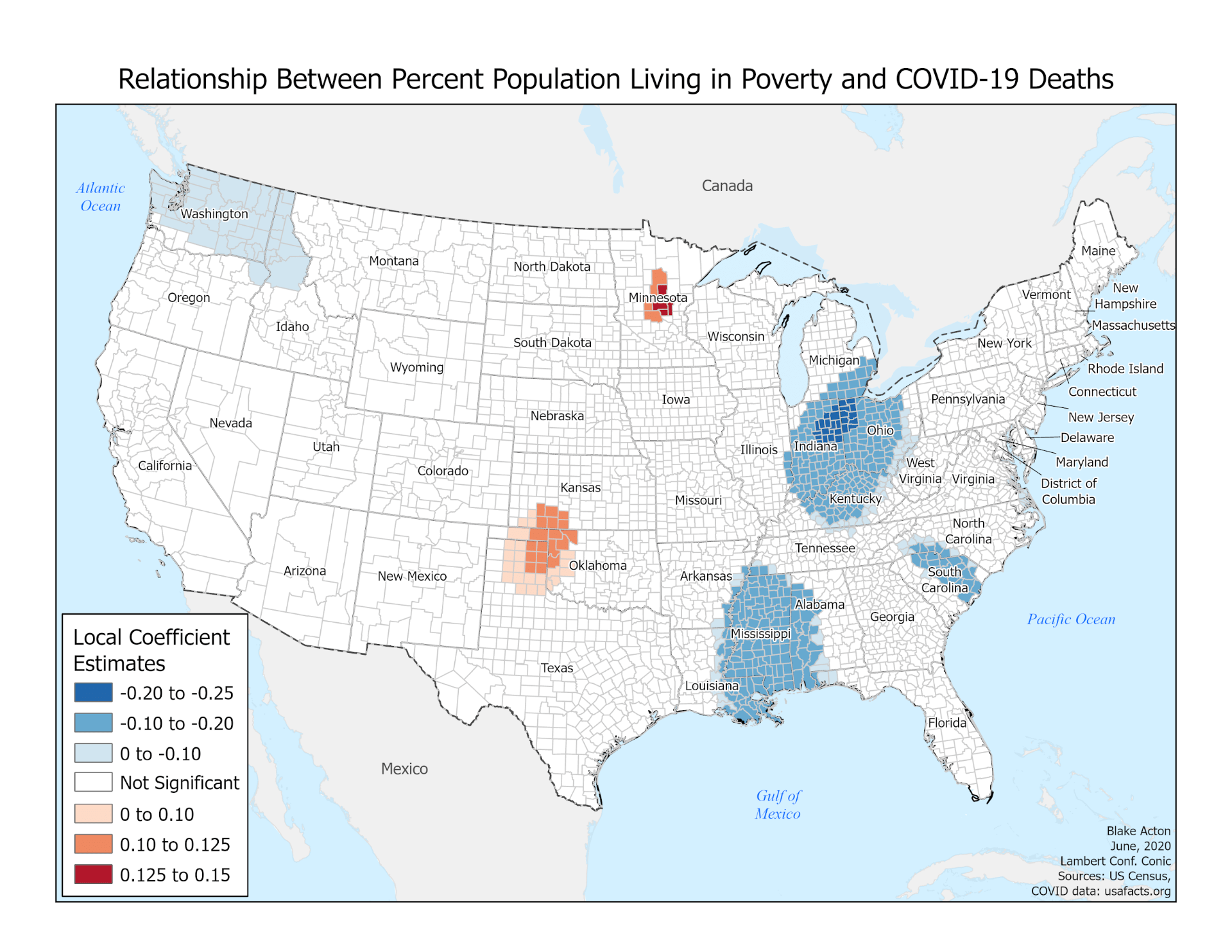
The maps below show how the relationship between each variable and COVID mortality varies across the country. So, for example, in places where the map is blue, there is actually a negative relationship between poverty and fatality (Figure 1). However, as the color becomes tan and then red, we begin to see both a stronger relationship and a positive one. These maps also account for the p-value. This means that the shaded areas show us where our results are statistically significant- that is, that the result displays a pattern or strength of the relationship that cannot just be attributed to random noise.

Figure 1. Relationship between the percentage of poverty and COVID-19 deaths: The impact of poverty on mortality is negative in many parts of the country including Ohio, Mississippi, and South Carolina. Exceptionally, positive relationships are clustered in Minnesota and Oklahoma, indicating higher risks in poor neighborhoods.

What you can see in these maps is that while all the variables have geographic variation, the counties where the African American population is a higher percentage of the population show a strong correlation with our outcome variable of fatalities. It’s also important to note the direction of these relationships. For the percentage of seniors, for example, much of the West Coast displays a negative relationship between the variable and the outcome: there, an increase in the percent of seniors was associated with a decrease in COVID-19 mortality (Figure 2). In contrast, large portions of the country show a positive relationship between the percentage of African Americans in a county and COVID-19 mortality (Figure 3). Indeed, of all our variables, this is only the one that displays such a consistently positive relationship across many different locations.

Figure 2. Relationship between the percentage of seniors and COVID-19 deaths: Fewer seniors are related to higher fatality in several parts including the West, Louisiana, and Illinois. On the contrary, the positive relationships are mostly clustered in Florida and parts of Ohio, indicating higher percentages of seniors tend to associate with higher fatality in those regions.

These results do not indicate that African Americans are somehow inherently more susceptible to this disease but instead reflect the structural racism of our country. In the United States, African Americans are more employed in service occupations (U.S. Bureau of Labor Statistics, 2018) and are more likely to live in a neighborhood with higher poverty (Greene et al., 2017). These social determinants of health make them particularly vulnerable to this disease because these risk factors lead to higher rates of exposure and poorer access to health care. Inequalities in health care access are particularly problematic for diseases like COVID-19. The longer a person waits to get necessary care – often because of a lack of insurance or health care resources in their community – the more likely they are to have severe COVID-19 disease. Recognizing the relationship between the social determinants of health and race, and then identifying how those relationships manifest in local contexts are the first steps in addressing the profound inequality presented in these maps.

Figure 3. Relationship between the percentage of African Americans and COVID-19 deaths: While higher percentages of African Americans tend to associate with higher fatality the Southern and Eastern states, Minnesota in particular show the highest correlation. Given the fact that Minnesota has a lower percentage of African Americans compared to Southern states, Black communities in the state seem to be exposed to relatively higher risks.


Author Contribution: Dr. Elisabeth Root (Professor, Geography & College of Public Health, Division of Epidemiology) conceived the research and supervised writing; Sohyun Park (Ph.D. candidate, Geography) collected data and supervised analysis; Yun Ye (Ph.D. student, Public Health), Kaiting Lang (Ph.D. student, Public Health), and Junmei Cheng (Ph.D. student, City and Regional Planning) analyzed the data; Anisa Kline (Ph.D. student, Geography) wrote the post; Blake Acton (MA student, Geography) created maps. All the authors contributed to interpreting the results.

50 Years of Earth Day: Where are we headed?


This April will mark 50 years of Earth Day. Here at the Ohio State University, we have many events planned this spring to mark the occasion. With this new regular blog feature, OSU’s Department of Geography will take stock, over the course of Spring semester 2020, collectively, of our community’s contributions to understanding significant social and environmental change. Specifically, what do geographers have to contribute to highly visible environmental movements such as Earth Day?

Earth Day is an annual event whose purpose is to advocate for environmental protection. Earth Day is perhaps the most visible symbol of the modern environmental movement, to harness the passion and activism of college students, in making a case to protect air, water and biodiversity resources[1].  Earth Day is celebrated each year on April 22nd, with the ongoing goal to mobilize, advocate and educate for environmental issues. Other issues such as climate change, a green economy, and sustainable agriculture have been incorporated into the goals of the event over time[2].

This semester, our blog will present topical and cutting-edge research on social and environmental change. We will explore some of the front lines of climate change (from South American glaciers to midwestern agriculture), engaging with the politics of environmental data: how scientific knowledge about pollution reflects the efforts and interests of multiple institutions, firms and government bodies, our policies to redesign our economies and cities in anticipation of looming environmental crises, how conservation policy can work against the needs of communities and wildlife in practice, and many other salient issues. Moreover, as geographers, we find common ground in prioritizing social and environmental justice in confronting existential threats wrought by climate change – it is clearer now than ever that societal and environmental challenges are inextricably linked[3]. Faculty, graduate students and visitors to OSU geography will provide weekly posts on their research. Our goal is that we uncover some broader insights as a community. Please check back!


Darla Munroe

Professor and Chair

Department of Geography


[1] https://www.earthday.org/history/
[2] https://www.nationalgeographic.org/encyclopedia/earth-day/
[3] https://www.weforum.org/reports/the-global-risks-report-2020