
'%20x='0'%20y='0'%20height='100%25'%20width='100%25'%20%0A%20%20%20%20%20%20%20%20%20%20xlink%3Ahref='data:image/jpg;base64,/9j/2wBDAAYEBQYFBAYGBQYHBwYIChAKCgkJChQODwwQFxQYGBcUFhYaHSUfGhsjHBYWICwgIyYnKSopGR8tMC0oMCUoKSj/2wBDAQcHBwoIChMKChMoGhYaKCgoKCgoKCgoKCgoKCgoKCgoKCgoKCgoKCgoKCgoKCgoKCgoKCgoKCgoKCgoKCgoKCj/wgARCAAFAAoDASIAAhEBAxEB/8QAFgABAQEAAAAAAAAAAAAAAAAAAAUH/8QAFAEBAAAAAAAAAAAAAAAAAAAABP/aAAwDAQACEAMQAAAAwSeHR//EAB8QAAEDBAMBAAAAAAAAAAAAAAECAwQABhEhBRQig//aAAgBAQABPwCJcnSiraHGxHW3WthefJydijcD2dRog+Ka/8QAGREAAQUAAAAAAAAAAAAAAAAAAAIDBBEx/9oACAECAQE/AEx29o//xAAZEQABBQAAAAAAAAAAAAAAAAAAAgMEETH/2gAIAQMBAT8AVIcyz//Z'%3E%3C/image%3E%3C/svg%3E)
There could be no single reason why a superhero film is better than another, or from its earlier version, like Matt Reeves's The Batman. The film came out in a crowded market that very featured some great entries, including Oscar-winning director Christopher Nolan's version, which is already considered a classic.
However, Matt Reeves's 2022 iteration of the famous Gotham City superhero was second to none when it came out and shocked the world. With Robert Pattinson in the lead role, this version of Batman and Gotham quickly came to be considered the best depiction of the character on screen. It was believed to have even narrowly beaten 2008's The Dark Knight.
However, there is one factor in Matt Reeves's version of The Batman that surely and steadily stands out from the rest. This perhaps makes a crucial difference between this and the ones created by Christopher Nolan. This factor is the look of the film.
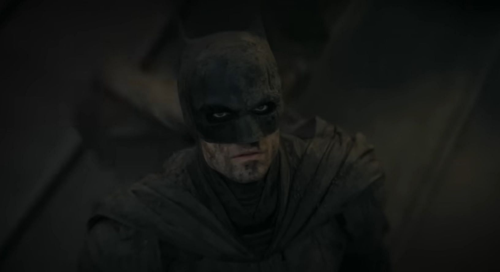
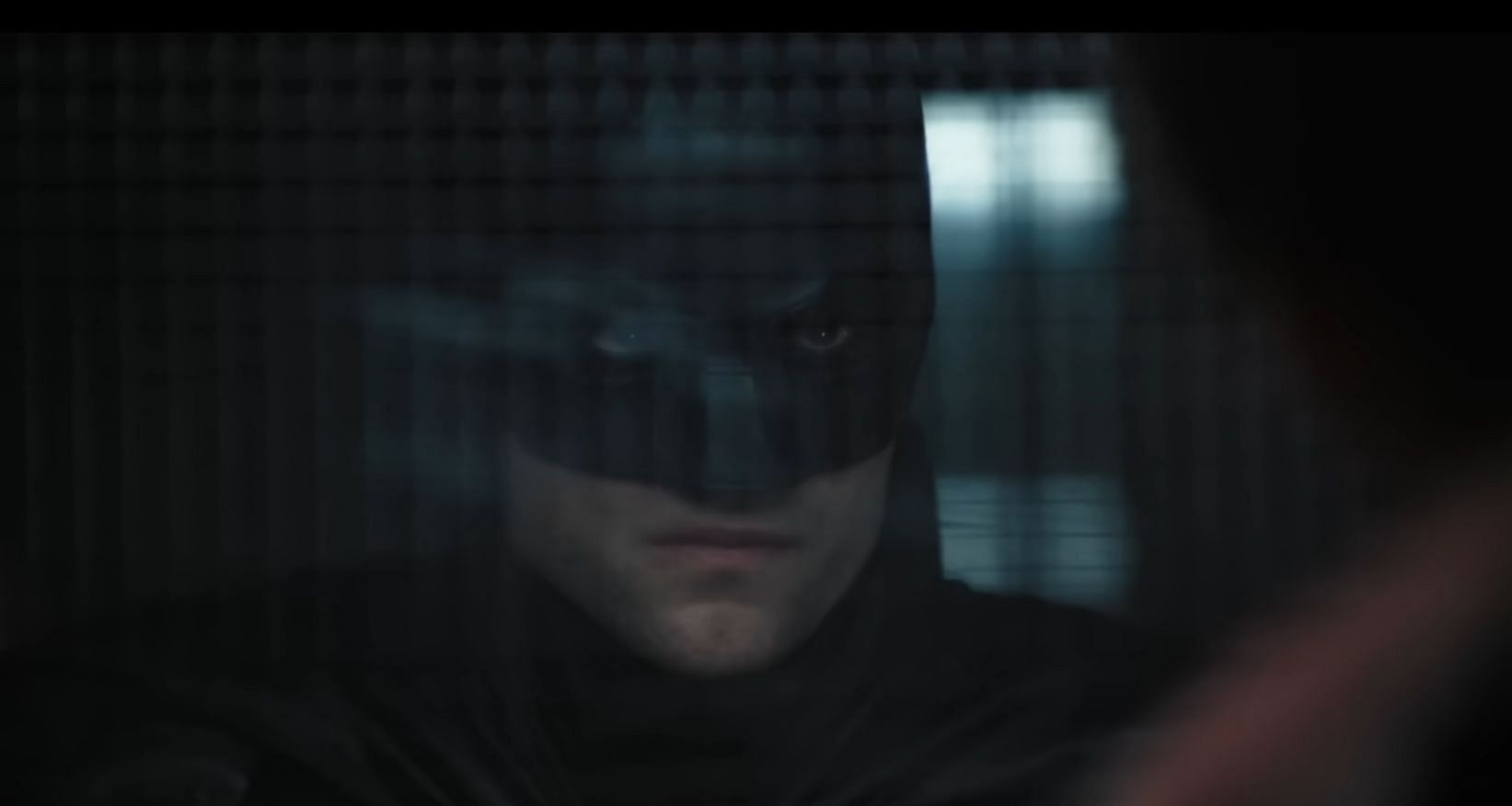
The visually stunning look, which is nothing short of graphic novel pages coming to life, is the heart and soul of an otherwise brilliant film. Every frame in Matt Reeves's film looks dark and dingy and has an air of real menace, something that Gotham is notorious for.
The world-building, cinematography, and lenses used form the backbone of this visual marvel, which makes Gotham more appealing than ever. This article will take a look at the ways Reeves and his cinematographer Greg Fraser achieved this look.
Deciphering the visual style of The Batman
There are plenty of things in the Robert Pattinson-led version of the film that visually stand out from the rest of the parts that came before. As for the story, several other Batman versions did justice to the famous DC superhero, with Nolan's version especially noted for its characters and storytelling.
However, what made the Nolan trilogy lose out was the innate modernism that separates the environment Batman exists in the comics. This resulted in films that seemed to be set in the modern day with the characters from the comic series.
The closest fans saw a more comic-like version of Gotham City was in Tim Burton's version, which preserved the inherent "gothic" nature of the city. That being said, even that was not perfect, partly owing to the lack of technological advancements at the time.
However, Matt Reaves' The Batman had all the ingredients to make the dream version of the city that seemed shadowy, colorful yet dark, and full of terror.
Here are some things Reeves and Fraser used to achieve this visual appeal.
Wide but focused lenses
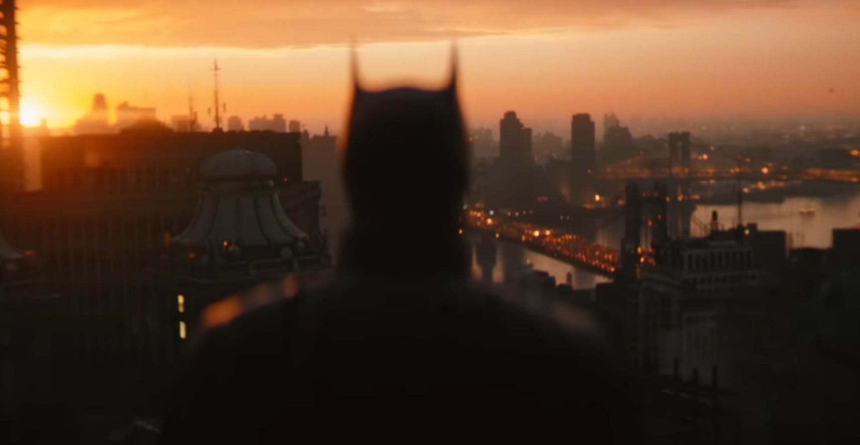
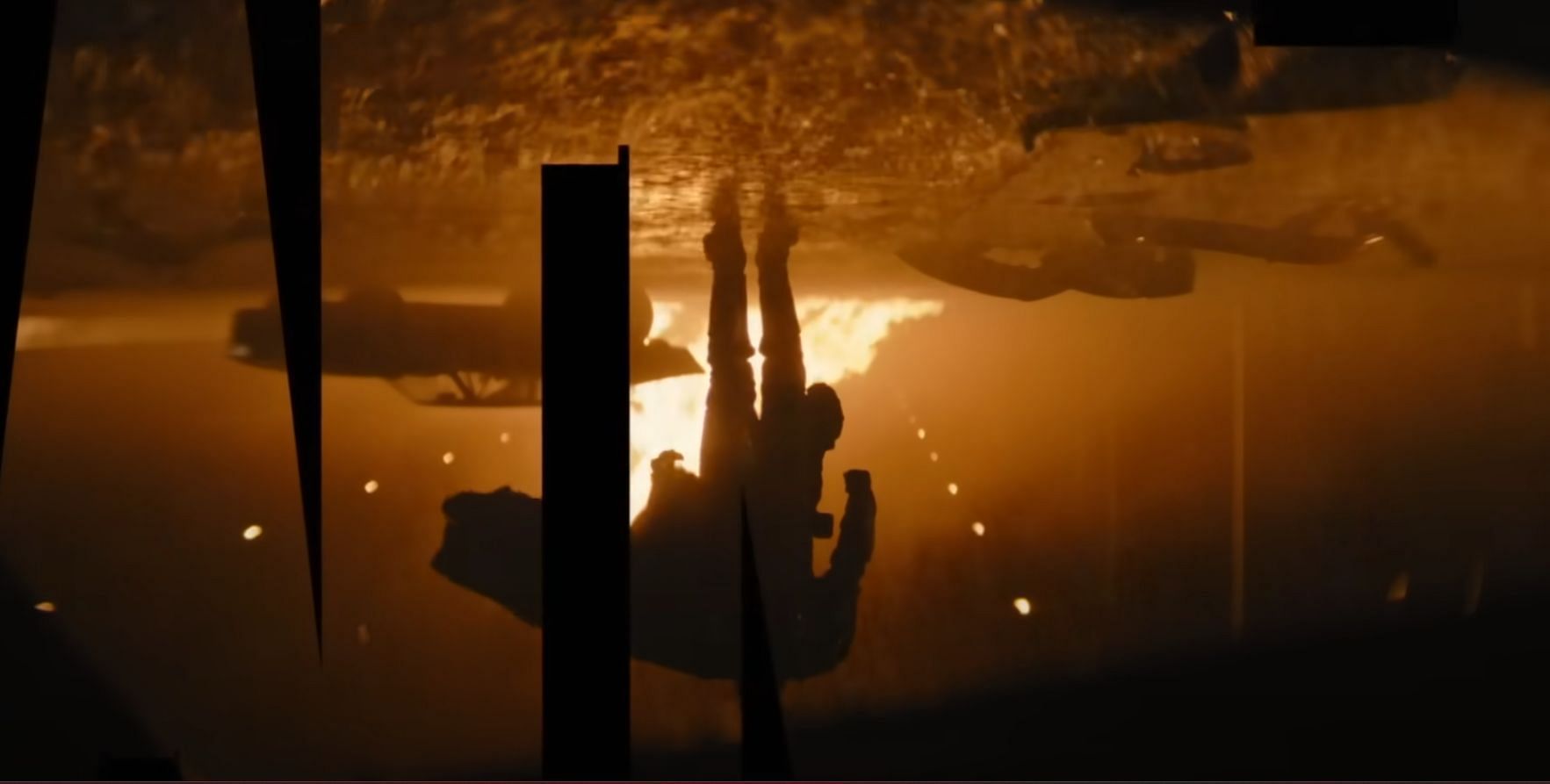
A recurring camera motif in the film is the segregation of characters from the background by clever use of bokeh. This was often used from behind Batman, casting a shadowy impression ahead of some impressive city backdrops.
The film was shot in Arri Rental’s Alfa anamorphic lenses, which gave a less-than-subtle deep focus, alongside wide framing. This allowed for stunning frames all across. This was combined with good camera movements that tracked and followed characters very often.
The use of night and rain
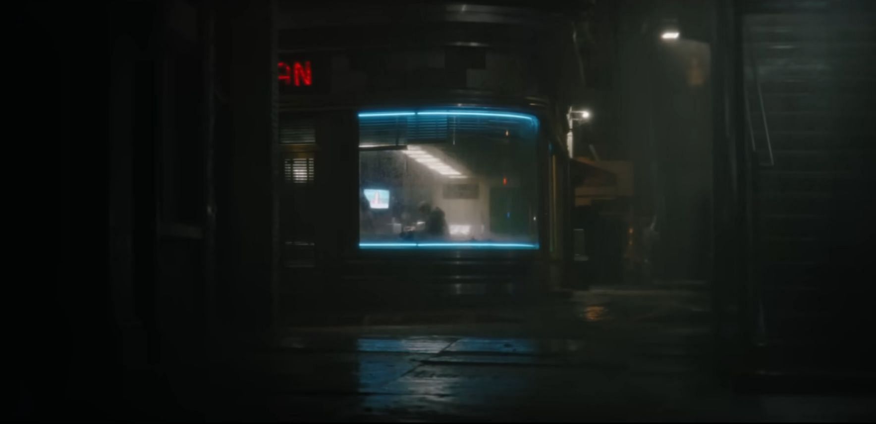
Most of the time that fans think of Batman, they think of a nightscape. From the Batman video games to the graphic novels, night has a huge part in Gotham's look and feel. This is something that Reeves used extensively in the film, by setting most sequences at night, something that reverberated with the feel of the comics.
Moreover, making it dark does not necessarily mean making it dull. Reeves and Fraser cleverly used rain and the reflections that come along with it to create a wet Gotham. This was shiny yet reminiscent of a dark city full of bleakness and despair. Most streets were reportedly wet before taking the shots, giving an impression of constant rain in the city.
The color and texture
The discussion of the visual style of The Batman is incomplete without mentioning the work of David Cole, who color-graded the film with the director and the cinematographer. This clever color grading is what separated this film from dark DCEU films like Justice League, whose lack of light was widely criticized.
Instead, the Matt Reeves film utilized frame elements perfectly to color grade in a way that maintained darkness without becoming dark throughout the film.
The texture was also brilliant and well-planned. The frames were also intentionally scattered and loaded, often, resulting in stacked frames that added texture and elements without interfering with the primary subject.
All this combined gave The Batman perhaps the best visual appeal of any superhero film that came before or after. Thus, fans expect to see the same in the upcoming series, The Penguin, and the direct sequel, The Batman II, which is set for a 2025 release.
