This Map Tool Lets You See Just How Distorted the Mercator Projection Is
Photo: The True Size

This Incredible Map Tool Reveals Just How Much the Mercator Map Distorts the World

Maps + Infographics
by Henry Miller Oct 31, 2017

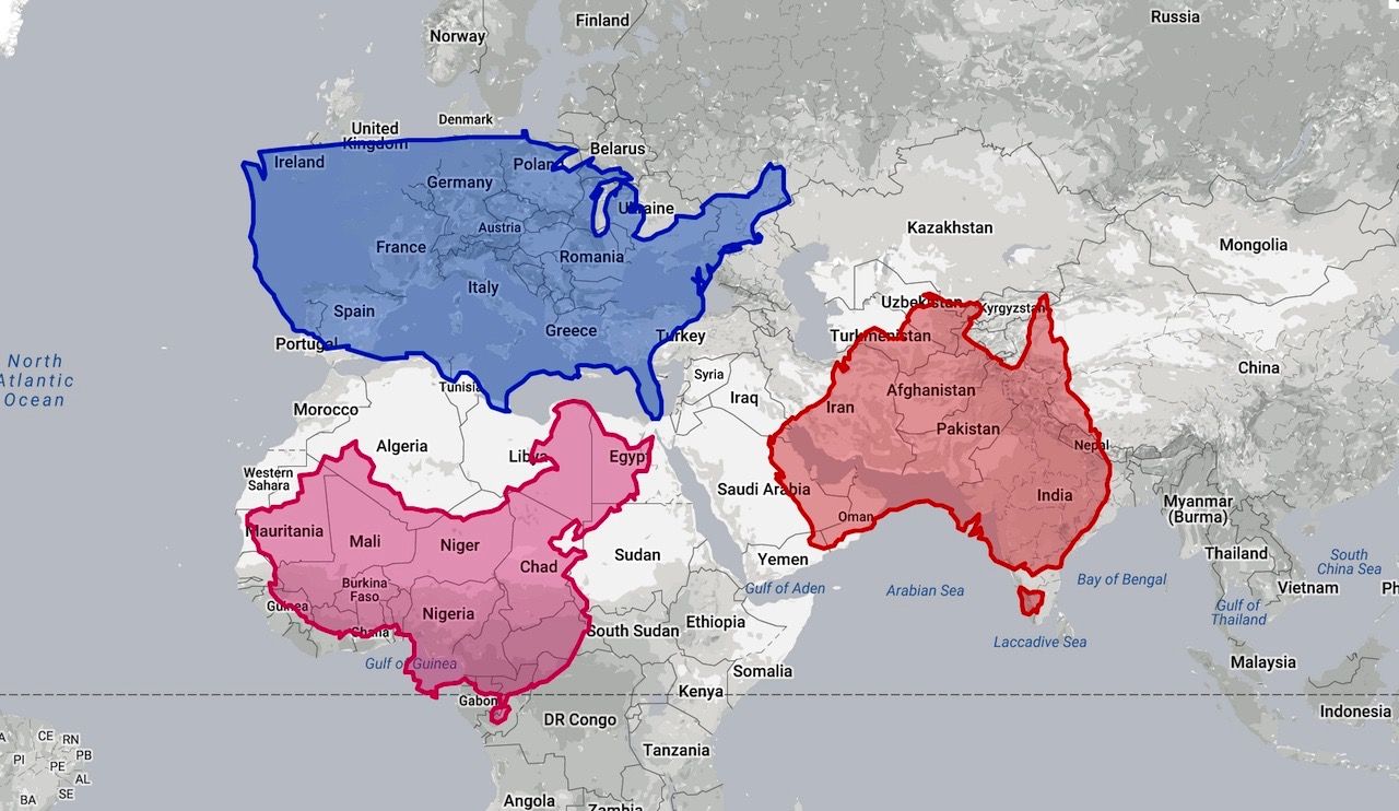
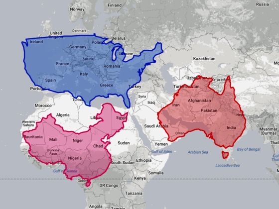
A lot of people have problems with the Mercator map of the world. Fortunately, The True Size is set up to help cartography fans see how much it distorts land mass by allowing users to move outlines of nations across the 2-D images. It is oddly addictive.

A brief history of the Mercator Projection

It is surprisingly difficult for geographers and cartographers to accurately portray a 3-dimensional sphere on a 2-dimensional surface. This challenge goes back millennia and has been addressed by different people from different cultures in many different ways (Fra Mauro’s map is a personal favorite), but the map Americans are most familiar with is known as the Mercator Projection.

Flemish cartographer Gerardus Mercator drew up this projection in 1569, when the European “Age of Discovery” was well under way. Mercator lived in the Holy Roman Empire, which had recently been ruled by Charles the Fifth, who was also the King of Spain at the time and all of Spain’s possessions in South America. Mercator lived in a rapidly changing world in which states gained power through their mastery of ocean travel. As such, he drew up a map designed to help sailors plot their course with the use of special “rhumb” lines representing the latitudes and longitudes of the world. These rhumb lines allowed sailors to plot straight courses across their map without having to account for the curvature of the earth.

However, as many critics have pointed out, this map does a terrible job at accurately representing land mass. In order to maintain the straight longitude lines on a Mercator Map, the lines of latitude are set farther apart as you move away from the Equator. This stretches places like Greenland and Alaska, distorting their size relationship to places that straddle the Equator, such as Africa.

A lot has been said and written about this distortion, and the fact that Google Maps uses a Mercator Projection (which makes it easier to seamlessly zoom to local areas) has been criticized by lovers of accurate maps.

If you want to see just how far off the Mercator projection is, check it out. Below is just one example of how mind-blowing it can be.

Discover Matador