有哪些值得推荐的数据可视化工具?
633 个回答

前阵子在Coursera上了infographic的课(
https://www.coursera.org/learn/infographic-design/home/welcome),课上涉及了几个,觉得应该适用于对编程语言不熟悉也不大会用AI的小朋友
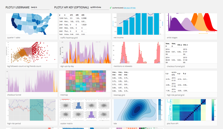
Plotly很方便的一点是和R, python, Excel等常见的数据处理软件/语言之间都是有API接过去

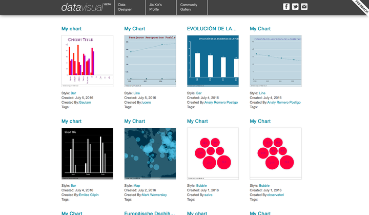
Datavisual

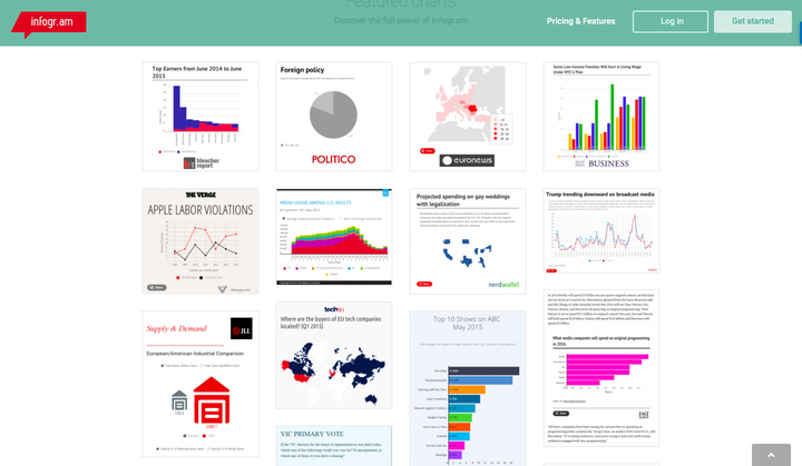
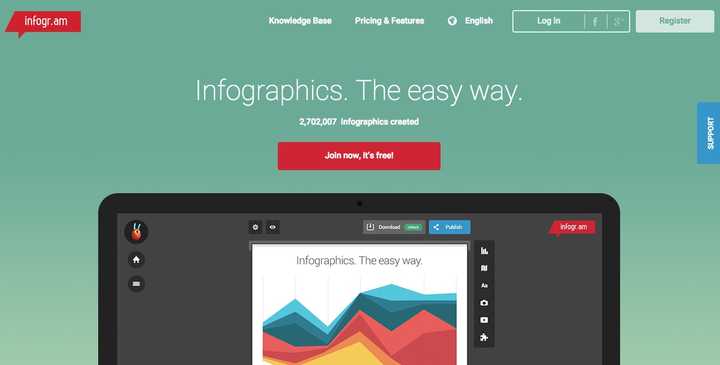
Infogra.am

下面这几个应该比较符合大家对infographic的普遍预期,相比传统的数据可视化要有趣很多
PiktoChart

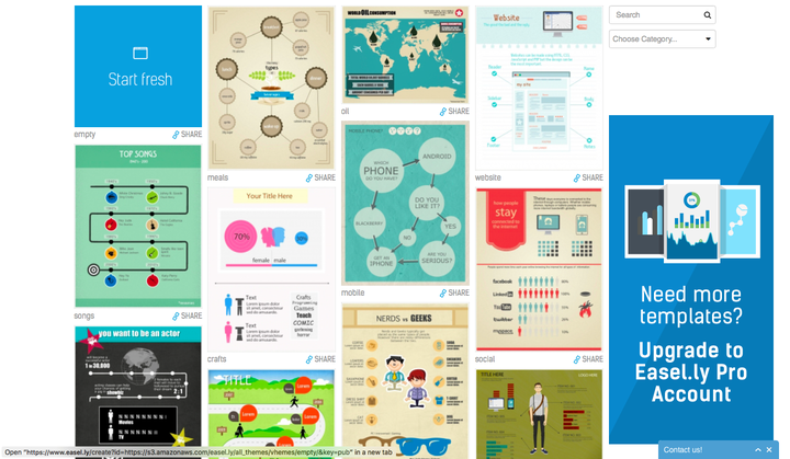
Easel.ly

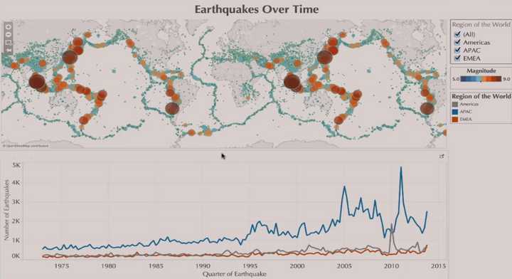
著名的tableau的public version
Tableau Public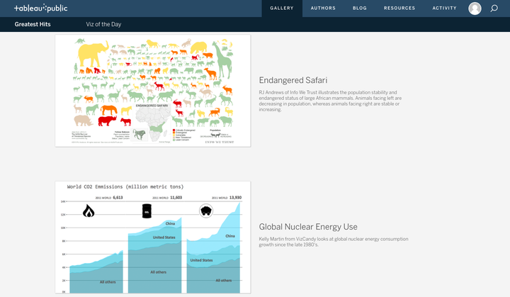

Visme
Visme有个Blog非常好,很多人特别在意infographic是因为觉得表现形式看起来特别高级,其实内在的思路非常重要,要养成如何正确看待数据、发现数据之间的内在联系的好习惯
Visual Learning Center by Visme, Infographics & Presentation Resources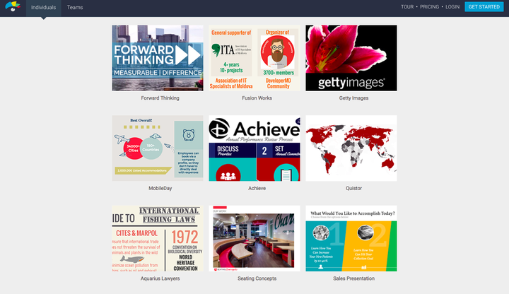

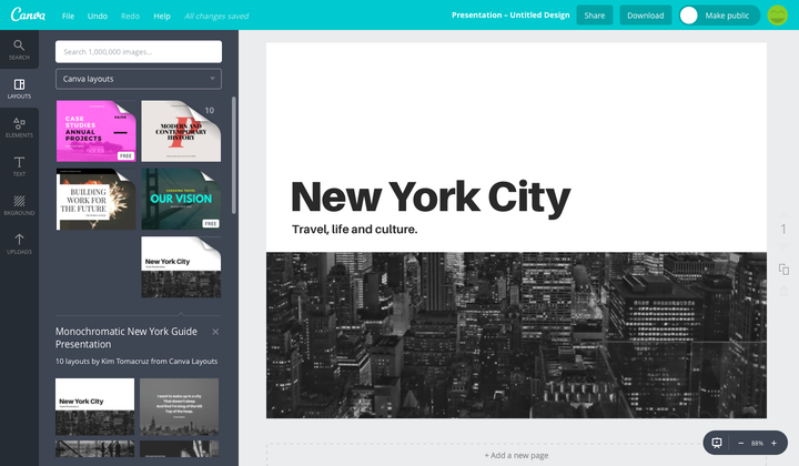
Canva
偏图形设计,其实适合用来做Presentation多一点,也可以用于infographic后期的美化

*免费账号的模版应该就够用了,如果日常工作有特别强的需求的话,再考虑付费版本


谢邀。
本答案提要:
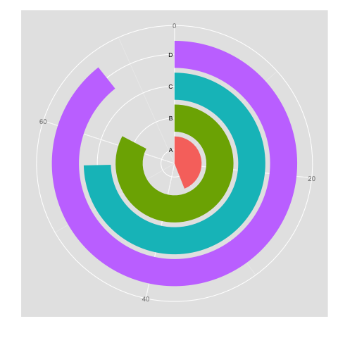
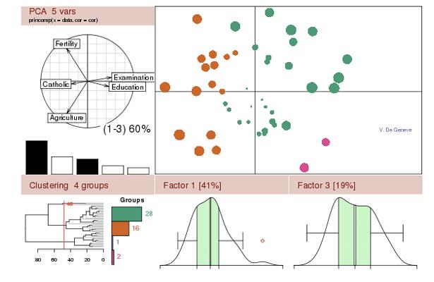
1.plotly
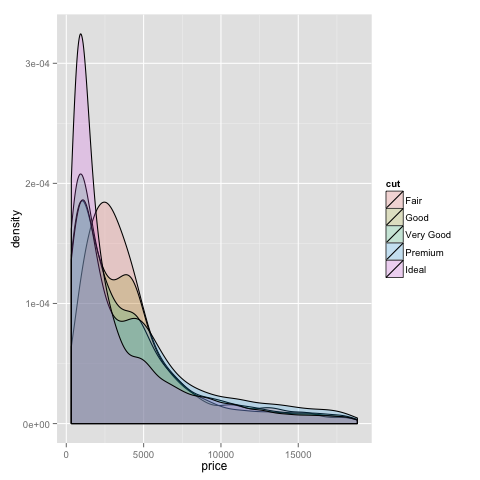
2.R ggplot2
3.无需编程语言的工具(7个)
4.基于JavaScript实现的工具(8个)
5.基于其他语言的工具(5个)
6.地图数据可视化工具(7个)
7.金融(股票)数据可视化工具(2个)
8.时间轴数据可视化工具(2个)
9.函数与公式数据可视化工具(2个)
10.其他(3个)
共计37个工具,PS:先赞后收藏。。
-----------
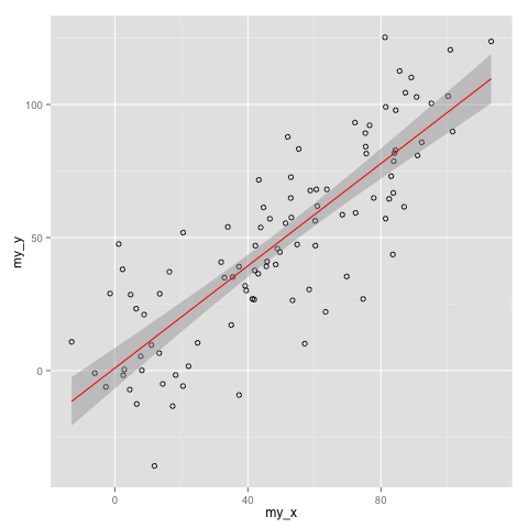
1.plotly:
-----------
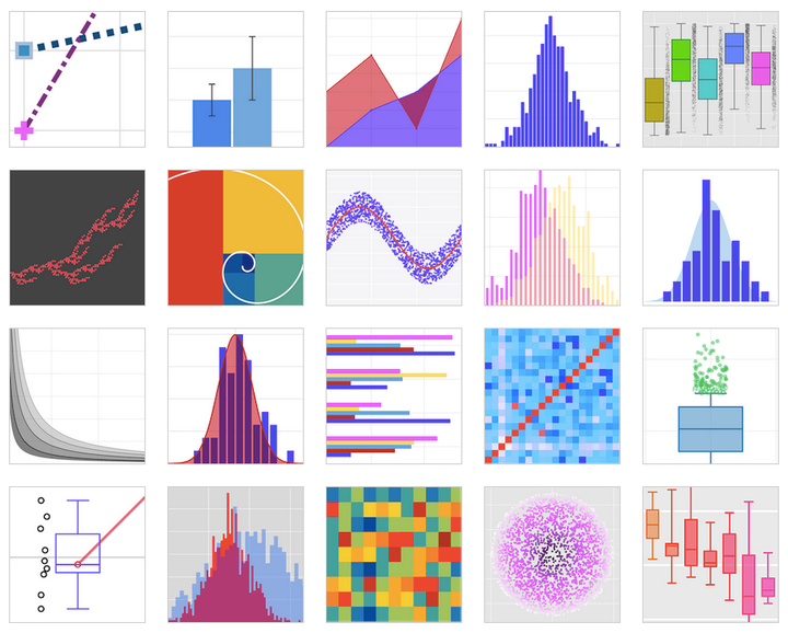

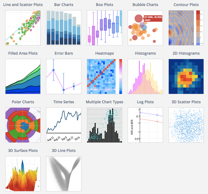


更多gallery链接:plotly
-----------------
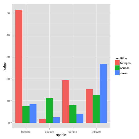
2.R ggplot2:
-----------------


--------------------------------
3.无需编程语言的工具:
--------------------------------
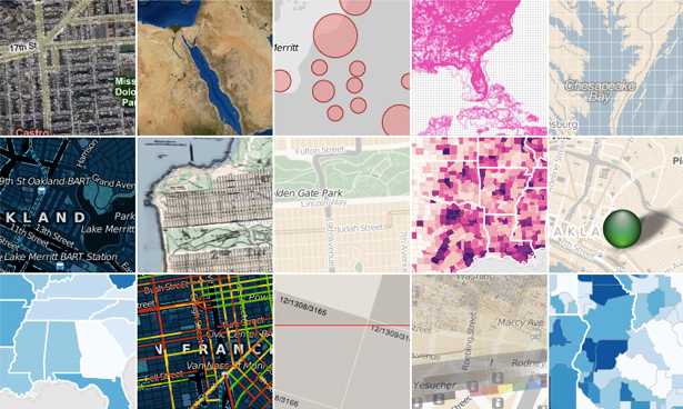
01. Tableau

Create and share data in real time with Tableau
02. Raw

Raw is an open web app with a simple interface
03. Infogram

Infogram enables you to create both charts and infographics online
04. ChartBlocks

ChartBlocks is another online chart builder
05. Visualize Free

Make visualizations for free!
06. Visual.ly

http://Visual.ly makes data visualisation as simple as can be
07. iCharts

iCharts can have interactive elements, and you can pull in data from Google Docs
-----------------------------------------
4.基于JavaScript实现的工具:
-----------------------------------------
01. Chart.js
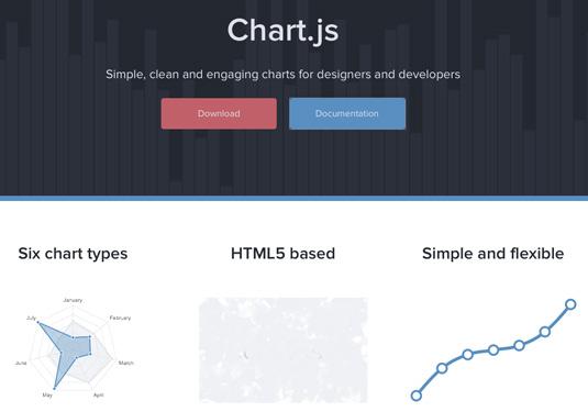

Chart.js is perfectly suited to smaller projects
02. D3.js
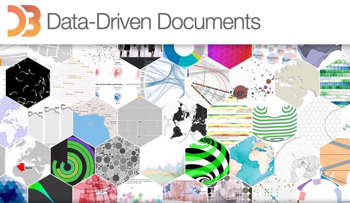

You can render some amazing diagrams with D3
03. FusionCharts
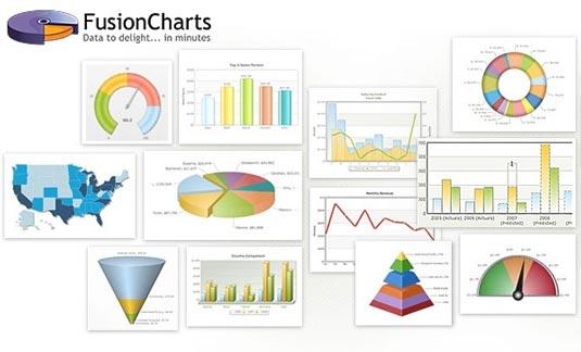

A comprehensive JavaScript/HTML5 charting solution for your data visualization needs
04. JavaScript InfoVis Toolkit

JavaScript InfoVis Toolkit includes a handy modular structure
05. jQuery Visualize
jQuery Visualize Plugin is an open source charting plugin
06. ZingChart
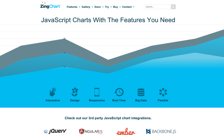

ZingChart lets you create HTML5 Canvas charts and more
07. Flot

Create animated visualisations with this jQuery plugin
08. Gephi
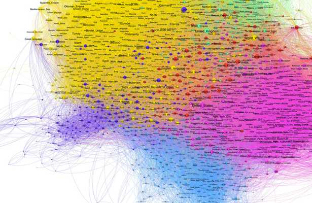

Gephi in action. Coloured regions represent clusters of data that the system is guessing are similar
--------------------------------------
5. 基于其他语言实现的工具:
--------------------------------------
#PHP
01. jpGraph
01234567 (二维码自动识别)
jpGraph is a PHP-based data visualization tool
#JAVA
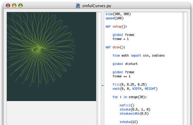
02. Processing


Processing provides a cross-platform environment for creating images, animations, and interactions
#Python
03. NodeBox

NodeBox is a quick, easy way for Python-savvy developers to create 2D visualisations
#R
04. R

A powerful free software environment for statistical computing and graphics, R is the most complex of the tools listed here
#Weka
05. Weka

A collection of machine-learning algorithms for data-mining tasks, Weka is a powerful way to explore data
-----------------------------------
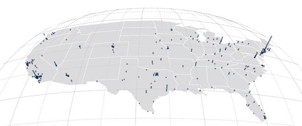
6. 地图数据可视化的工具:
-----------------------------------
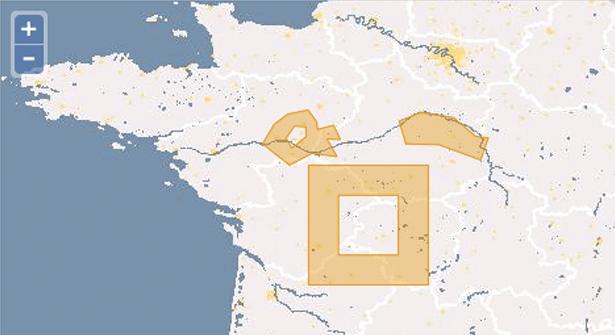
01. CartoDB

CartoDB provides an unparalleled way to combine maps and tabular data to create visualisations
02. InstantAtlas
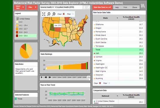

InstantAtlas enables you to create highly engaging visualisations around map data
03. Polymaps

Aimed more at specialist data visualisers, the Polymaps library creates image and vector-tiled maps using SVG
04. OpenLayers

It isn't easy to master, but OpenLayers is arguably the most complete, robust mapping solution discussed here
05. Kartograph

Kartograph's projections breathe new life into our standard slippy maps
06. Exhibit

07. Modest Maps
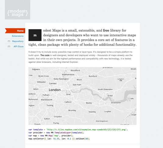

Integrate and develop interactive maps within your site with this cool tool
08. Leaflet
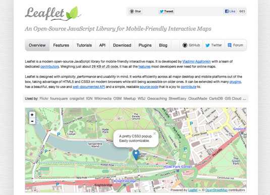

Use OpenStreetMap data and integrate data visualisation in an HTML5/CSS3 wrapper
-----------------------------------
7. 金融数据可视化的工具:
-----------------------------------
01. Dygraphs
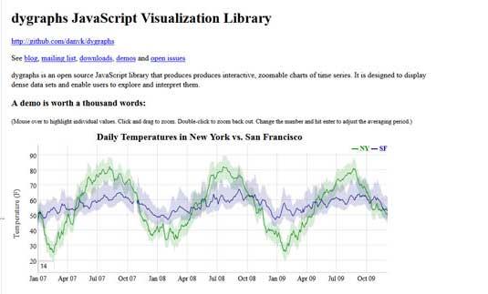

Help visitors explore dense data sets with JavaScript library Dygraphs
02. Highcharts
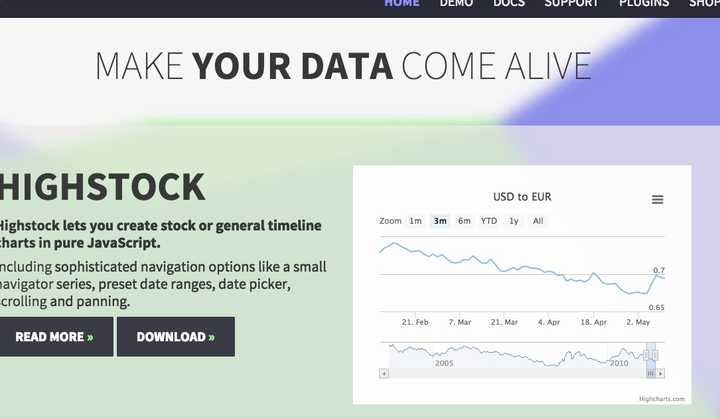

Highcharts has a huge range of options available
-----------------------------------
8. 时间轴数据可视化工具:
-----------------------------------
01. Timeline
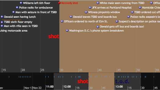

Timeline creates beautiful interactive visualizations
02. Dipity
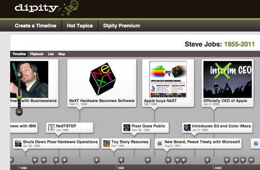

Dipity has free and premium versions to suit your needs
-------------------------------------
9. 函数公式数据可视化工具
-------------------------------------
01. WolframAlpha
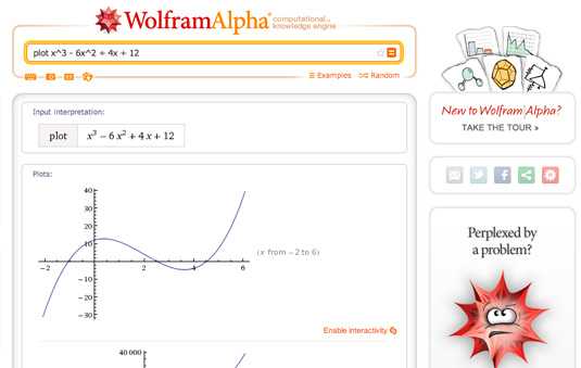

Wolfram Alpha is excellent at creating charts
02. Tangle

Tangle creates complex interactive graphics. Pulling on any one of the knobs affects data throughout all of the linked charts. This creates a real-time feedback loop, enabling you to understand complex equations in a more intuitive way
------------
8. 其他:
------------
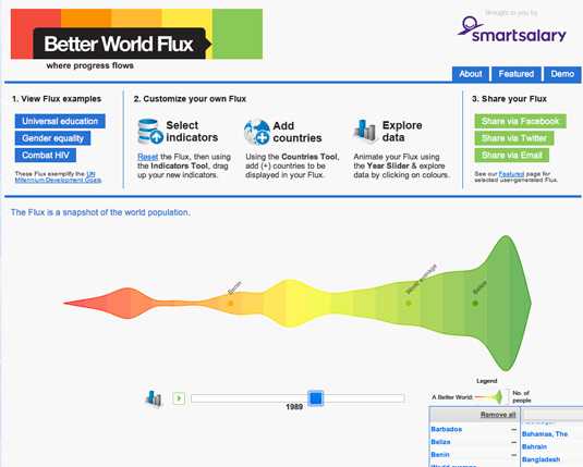

Making the ugly beautiful - that's Better World Flux
02. Google Charts

Google Charts has an excellent selection of tools available
03. Crossfilter

Crossfilter in action: by restricting the input range on any one chart, data is affected everywhere.