The Improbable Resurrection of a Quirky, Once-Popular, Art Deco Font
The distinctive Metro typeface was created by one of the world's most influential designers in the '20s, but is only now being revived and reinterpreted for the digital age.
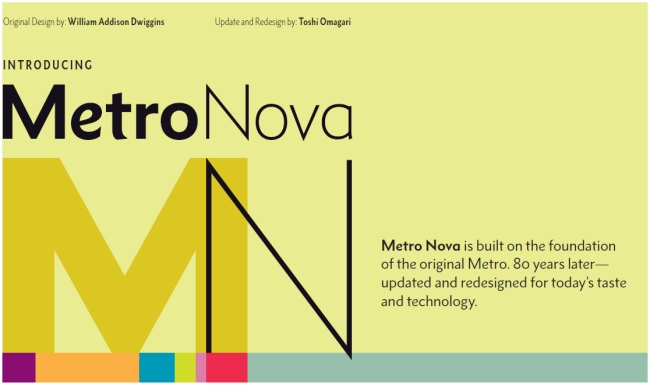
Tens of thousands of more-or-less similar typefaces are currently available, yet designers continue to create new ones and revive old ones every day. The soon-to-be released Monotype Metro Nova, however, stands out as a notable resurrection of what was arguably a lost masterpiece by William Addison Dwiggins (a.k.a WAD or Dwig [1880-1956]).
Dwiggins was a significant American designer who, among other things, coined the term "graphic design" in 1922 to explain all his graphic trades: calligrapher, book and book jacket designer, typographer, type designer, advertising designer, and illustrator. In the early 1920s, he designed Metro, the first modern sans-serif typeface done for the leading American type supplier's most famous type machine, Linotype. There were other popular sans serifs--"gothics"--but not from Linotype. Metro was so named because it was intended for newspaper use in large and small sizes. A stylish, art-deco typeface, it was linked to but distinct from Modernist European sans.
Metro might have been revived sooner, but the original drawings disappeared into the archives of the Printing Museum in North Andover, Massachusetts for 80 years, until filmmaker Doug Wilson stumbled upon them during research. Wilson, the director and producer of the critically acclaimed documentary Linotype: The Film-In Search of the Eighth Wonder of the World (2012), persuaded the famous type company Monotype U.K. to turn Dwiggins's pencil sketches into a digital font to use for his film. Type designer Toshi Omagari was assigned to make the new Metro Nova, which Monotype will officially introduce later this year.
The decision to produce a new or revived face isn't made lightly, given the high cost of making, distributing, and promoting a font in today's competitive font marketplace. For Wilson, legacy was a major factor: "Metro will always have a special place in Linotype history," he explained in an email. "I chose to make it the 'signature' face of Linotype: The Film because I felt it was a great typeface that didn't get the respect it deserved in the digital age." But it was only when he pulled a drawing out of one of the many black boxes and saw a capital "A" that had a graceful, slanted apex did he realize this typeface "had much more life and character" than he realized.
It may seem arcane, but typeface nuances govern our reading habits. As Wilson researched through old type specimen books, he discovered that there were two Linotype releases: Metro and, soon after, Metro No. 2, which was more "modern" and "sterile" than Dwiggins's original glyphs. "I believe this [change] was from customer feedback, but I greatly preferred the original Metro," he says.
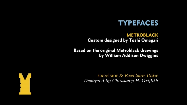
Wanting the "great old quirks and lively characters," Wilson contacted Dan Rhatigan, Monotype U.K. type director, "about having someone draw up just an all-caps version" that could be used exclusively for his film credits, since he wanted to use only typefaces that were originally designed for the Linotype to help the film's authenticity. Omagari designed an all-caps version in the bolder Metro Black, then he completed a lowercase to match. From there, the idea for a full typeface with additional weights began to materialize as Metro Nova.
But the effort raises the question of why another typeface is necessary. "It is just like new music," Wilson says. "You always think you don't need any new music until you hear that new song that grabs you and expresses your thoughts and ideas perfectly. Then, it is pure magic."
This, too, raises a question: If Metro is so great, why redesign it instead of just porting it to a new medium? The answer may fascinate typography nerds... but all others may want to skip ahead. Allan Haley, director of words and letters at Monotype told me that "Metro was indeed special, but it was originally--at just four weights and three italics--a small family, and was drawn within the requirements of the Linotype typesetters at the time." The family included Metrolight, Metrolight Italic, Metroblack and Metroblack Italic, which shared the same character widths, and Metromedium, Metromedium Italic, and Metrothin, which also shared the same character widths. This is a technical limitation that, Haley explains, resulted in the "italic designs--which are normally slightly condensed and spaced tighter than their roman [or non-italic] counterparts--had to be drawn wider and spaced more open than they should. Also, bold designs were forced to be drawn to more condensed proportions than normal." The characters in the original Metro, therefore, started quite wide in the lightest weight and became progressively more condensed in heavier designs. "Metro Nova, however, is not encumbered by these design restrictions," Haley says. "The various family members were drawn within purely aesthetic considerations."
Omagai says that he tried "to imagine what Dwiggins would have done today."
Metro was first released around the time when the iconic faces Johnston Underground, Gill Sans, and Futura (promoted as the typeface of the future) came out. "The sharp cuts and organic shapes of lowercase letters contributed to the calligraphic feel of the face that was even stronger than Gill, for example, and still seems to remain rare in sans serif," Omagai says about Metro's abundance of stylistic alternates and weights. More type-nerd info: "Each style contains nearly 900 glyphs, and roughly 150 are alternates. I am particularly proud that Metro Nova is the first typeface that has alternate Icelandic 'ð'. While it may not be important to many, I hope Icelandic designers will rejoice."
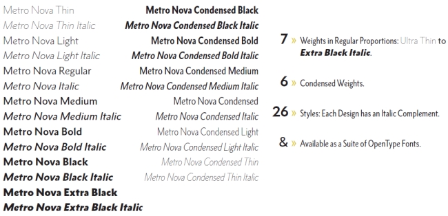
The Metro Nova family is also substantially larger than Dwiggins's original seven weights, from ultra-thin to extra-black, in regular proportions, and six weights of condensed designs. Each design has an italic complement for a total of 26 styles. The family is also available as a suite of OpenType Pro fonts.
Once designed and in the world, consumers determine how a face is used--good or bad. Dwiggins's Metro was intended as a text face. Metro Nova was designed for largely for display--headlines and signs and the like. However, Omagai says, "I personally want to read a book entirely set in it."
It took 14 months for Omagai to complete all the characters, and the payoff is not in Metro Nova's commercial success than in its physical details. "The lowercase 'e' is what I adore the most," he says. "It is said that you get the 'e' right when it looks like it's smiling, and the one in Metro Nova is exceptionally joyful--it makes me smile too."