Today, we look at the amazing contributions of two of the more unsung creators who were part of the most iconic X-Men runs in the history of the series.
This is a feature called "Nothing is Better," where I spotlight aspects of classic comic books that have particularly impressed me.
One of the most acclaimed creator runs in the history of comic books (literally, just two years ago, you all voted, and it was chosen as the top creator run of all-time) was the time that John Byrne, Chris Claremont and Terry Austin all worked together on X-Men (with the title officially becoming Uncanny X-Men right before Byrne's final issue. That's, of course, a bit confusing to fans because while it "officially" became Uncanny X-Men with #142, the book had "Uncanny X-Men" on the covers during this entire run). Byrne and Claremont, of course, are two of the most famous creators in comic books, period, with Claremont remaining on Uncanny X-Men after Byrne's departure for another decade, and Byrne going on to have a number of iconic runs of his own on books like Fantastic Four and Superman.
Also, while not AS famous as the other two, the brilliant inker, Terry Austin, got a good deal of fame out of this run, especially due to his pairing with Byrne, who was one of the most popular artists in comics. Austin, you see, was an inker who would make his presence on the art felt. In other words, if you saw John Byrne inked by a different inker, and then you saw John Byrne inked by Terry Austin, you could instantly tell which pages were inked by Austin. Austin was out of the Joe Sinnott school of comic book inking, where you, as the inker, really embellished the heck out of the page (back in the day, this was really referred to more often as the George Klein school, but Sinnott became the most famous guy who worked in this style). Typically, the artists who excelled at this sort of thing were guys like Austin and his old boss, Dick Giordan (and, of course, Sinnott), who were excellent pencilers in their own right, so you were getting the best of both worlds when you had Austin inking an already great penciler like Byrne. It's such a distinctive combo that it truly blew readers' minds for years (similar combos in this mold were Jack Kirby/Joe Sinnott and Neal Adams/Dick Giordano).
So those three creators were all famous for their X-Men work. However, almost all of that run (X-Men/Uncanny X-Men #108-109, 111-143) had two OTHER creators involved, and while their names are certainly not unknown, they don't get nearly as much credit, which is a shame, as they were both peak performers, as well. So let's give a spotlight to letterer Tom Orzechowski and colorist Glynis Oliver.
TOM ORZECHOWSKI DEFINED COMIC BOOK LETTERING FOR A GENERATION
Amusingly, Orzechowski actually lettered the first issue of the All-New, All-Different X-Men in their own regular series, X-Men #94, but that was clearly just a one-off gig, as multiple letterers handled the book after him. He returned a couple of times (including John Byrne's first issue of the series, X-Men #108, which was intended as a fill-in at the time) before becoming the "official" letterer on the book with X-Men #122.
Orzechowski started in the same Midwest group of comic book creators of the early 1970s that included stars like Jim Starlin and Rich Buckler (both of whom made sure that Orzechowski lettered their mid-1970s work), but after moving to California, Orzechowski became a major letterer for the indie comix scene, which was on its last legs at the time (at least compared to its head shop heyday. The Supreme Court ruled in 1973 that local communities could determine that head shops, shops that sold paraphernalia for marijuana users, could be deemed "obscene" and, sure enough, everyone decided they WERE obscene, and since head shops were the biggest buyers of indie comix, the indie comix scene was dealt a massive blow. Some major creators hung in there until the direct market gave independent comics a new life in the 1980s, but it was still a big blow to the scene at the time). During his time in the indie comix scene, Orzechowski was greatly influenced by indie artists like Robert Crumb who used the lettering as more than just a utilitarian "someone needs to get the dialogue across" thing, but as part of the art on the page in and of itself. Orzechowski brought that influence to Marvel comics in a big way in the 1970s, and his X-Men comics, being so popular, mainstreamed these ideas to comic book readers.
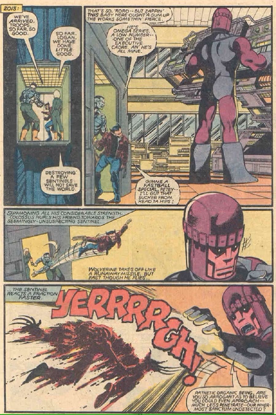
Obviously, with a writer like Claremont who loved to use a lot of words in his comics, Orzechowski's lettering took on a heightened importance just based on that, but the stylized nature of his work was also very impressive. He was one of the letterers who popularized the concept of using distinct word balloons for different voices, like having the Sentinels have robotic-esque word balloons in this Uncanny X-Men #142 page...
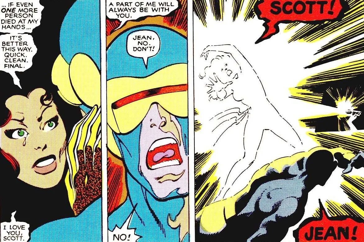
You can see that at play, too, in the iconic X-Men #137 death scene of Jean Grey. See how her "Phoenix" dialogue has its own word balloons, but then those brilliant large word balloons for the death scene...
Amazing work. One of the things that comic books can do that other media really have trouble with is controlling HOW you interact with the story. The use of bolds and stylized lettering can absolutely dictate how you treat certain scenes, and Orzechowski was a master at that. He truly was painting a picture with his lettering, and it's why by the 1980s, a generation of comic book readers who knew nothing in general about comic book lettering could still tell you who Tom Orzechowski was. He became that dominant of a figure (just, you know, not AS well known as Byrne, Claremont and Austin).
GLYNIS OLIVER COULD DO IT ALL ON HER X-MEN COLORIST RUN
While Orzechowski at least did become a bit of a brand-name, Glynis Oliver was truly doing unsung work, especially since she was known as Glynis Wein at the time that she was coloring this run of books (she was previously married to the late, great comic book writer/editor Len Wein). Wein started on the series with X-Men #113 and did almost all of the Byrne/Claremont run from that point forward (although, bizarrely enough, she missed two issues right smack in the middle of The Dark Phoenix Saga, issues #134-135. Bob Sharen filled in for those issues. Perhaps a vacation or something like that?).
Oliver stayed on the series for many years, and she did an amazing job of maintaining a distinct look for the artwork with her coloring, despite multiple pencilers (obviously, Orzechowski's lettering helped in that regard, as well). What I loved about Oliver's work is how well she was able to balance the dark with the light.
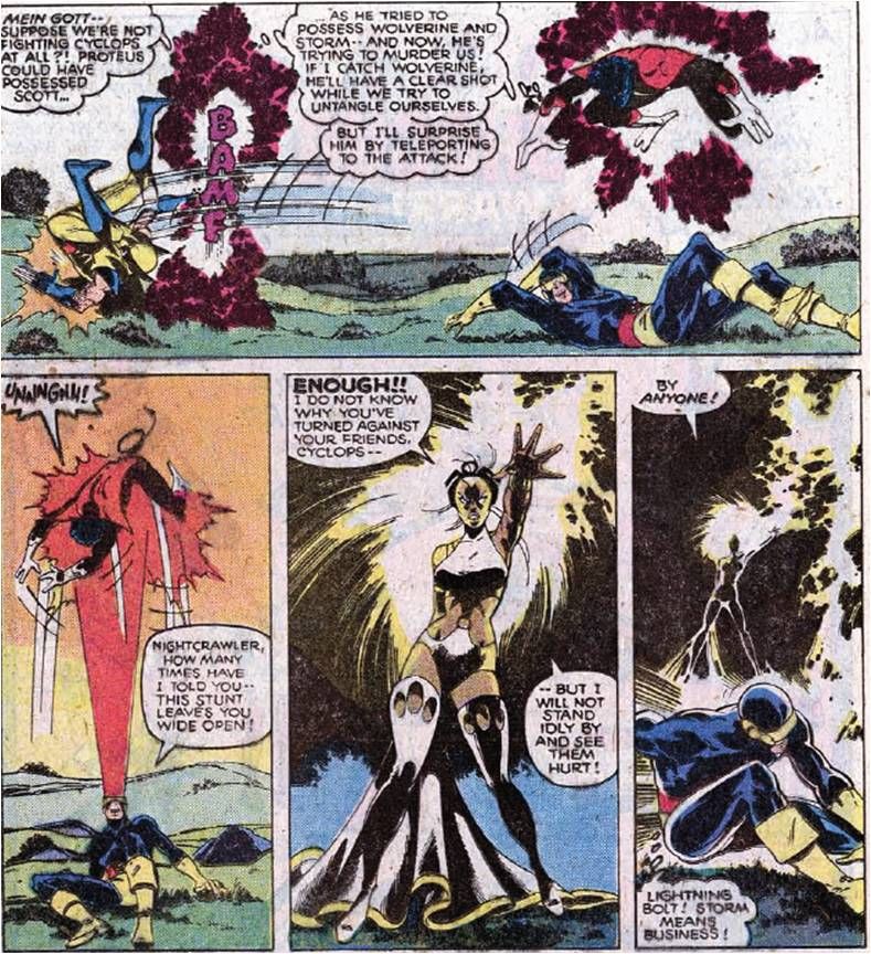
Take these excellent dark pages from X-Men #127...
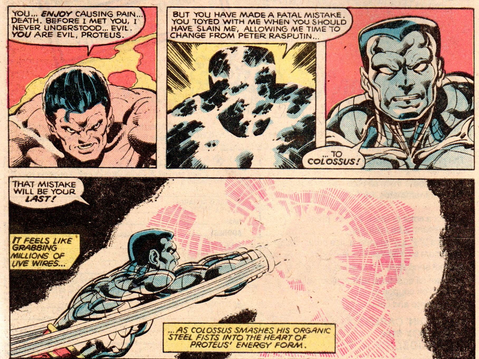
contrasted with the iconic death of Proteus in the following issue, where she went all out on the light...
And obviously, as you can see from the previously mentioned X-Men #137, her lighting effects on that issue were exemplary.
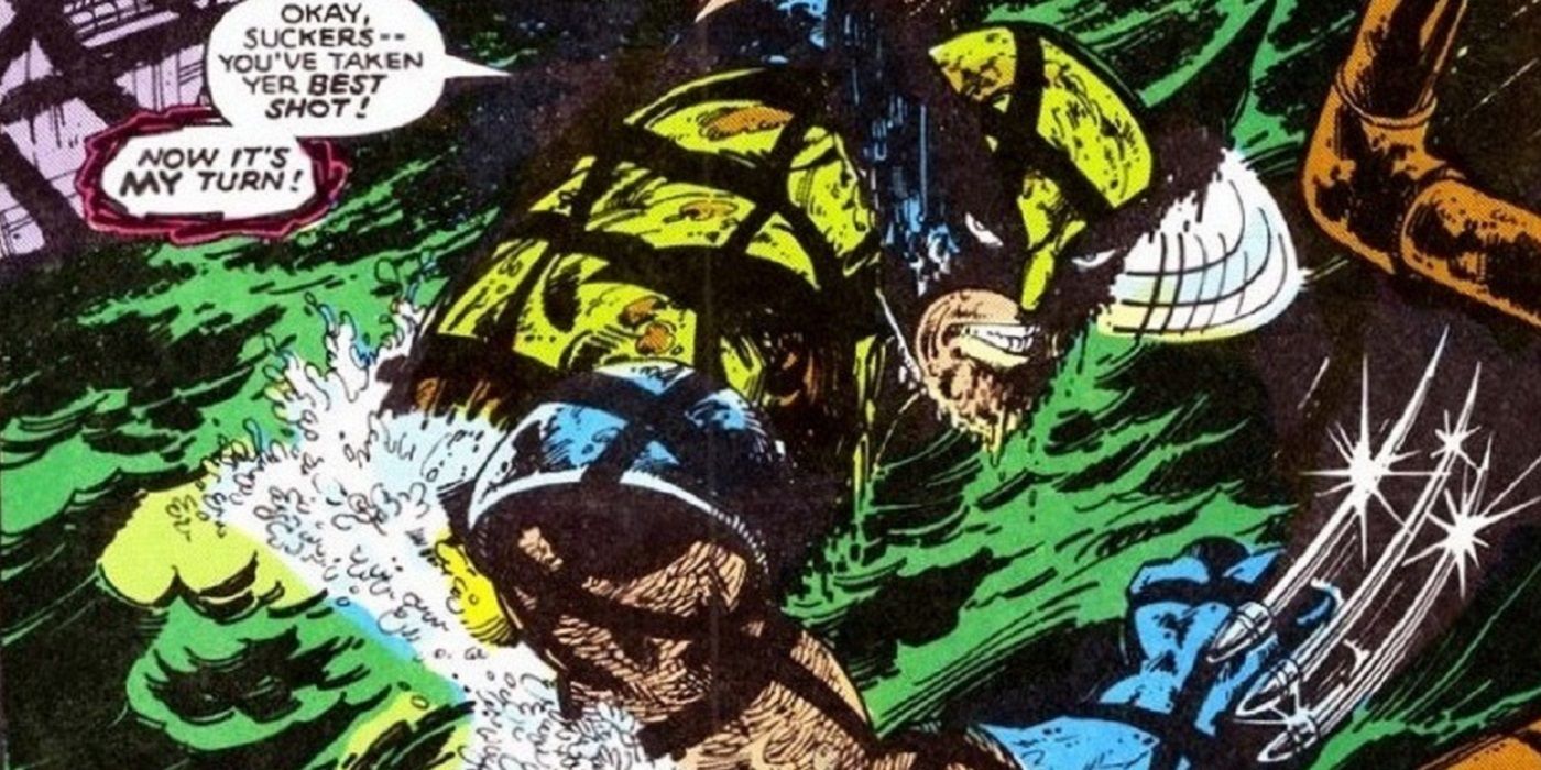
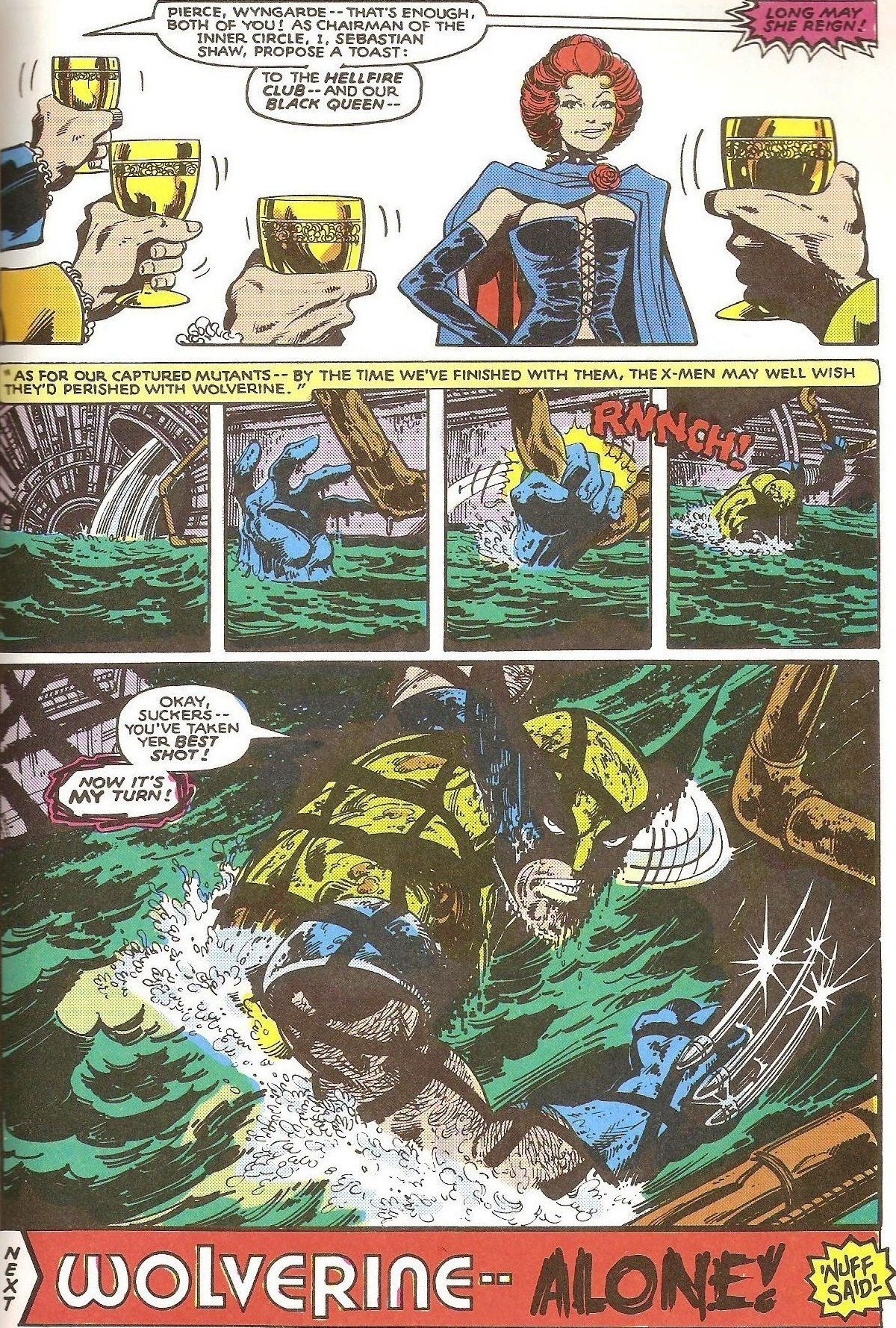
Here, from X-Men #132, in one of the most famous pages from the entire run, note how Oliver's brilliantly moody colors and Orzechowski's expertly stylized lettering combined with the standard excellence of Byrne, Claremont and Austin to give us one of Wolverine's most iconic moments...
Just outstanding.
Okay, folks, this is a feature that is a BIT less conducive to suggestions (as it really is about stuff that speaks to me, ya know?), but hey, feel free to still send suggestions for future installments, to brianc@cbr.com! Maybe you and I have the same take on things, and I'll use your idea! Happy birthday, Ralph!

