


Francesco Griffo’s italics
This article is a summary of the main information concerning the italic types cut by Francesco Griffo and the observations and conjectures of Luigi Balsamo and Alberto Tinto, Origini del corsivo nella tipografia italiana del Cinquecento (Milan, 1967) concerning other italics that might have been cut by him. Griffo, the great gala of letters is promoting further research on these italics in collaboration with the ISIA Urbino students in Luciano Perondi’s course on the History of the Book. For this purpose, with help from Riccardo Olocco, following this article there is a list of all italics that will be analysed. Results of the research will be published here as soon as they are available.
A few years after he cut the Greek and Roman types for Aldus Manutius, Francesco Griffo also cut for Aldus the first italic type (Italic 1). This is a complete alphabet and it was modelled on Chancery italics. With quite narrow letters inclined towards the right Chancery italic script was quick to write and popular among humanists and chanceries.
From about 1455 this style of writing was magnificently interpreted by the Paduan Bartolomeo Sanvito (1433-1511), a highly appreciated and influential Renaissance scribe.
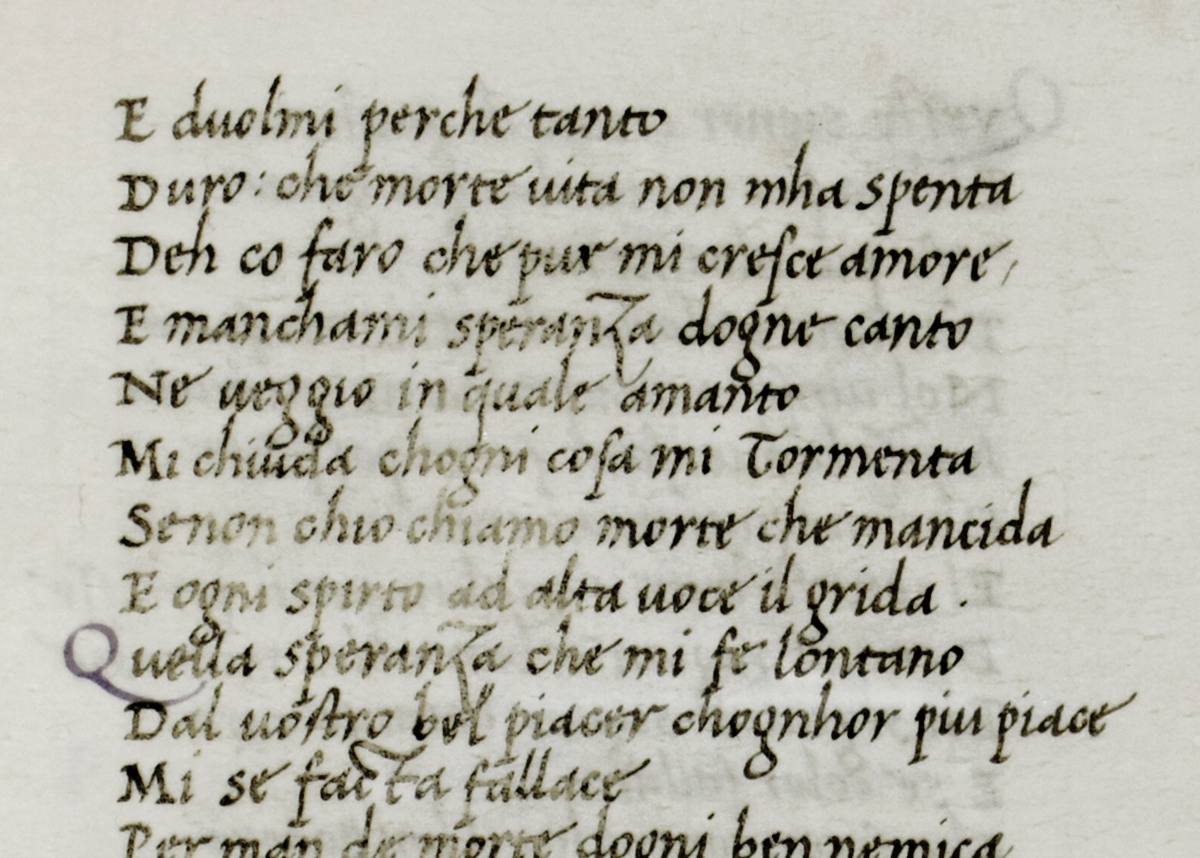
Bartolomeo Sanvito’s chancery italics in a late fifteenth-century manuscript. Bindo Bonichi, Dante e Sennuccio del Bene, Canzoni, leaf 65. Milan, Archivio Storico Civico e Biblioteca Trivulziana.
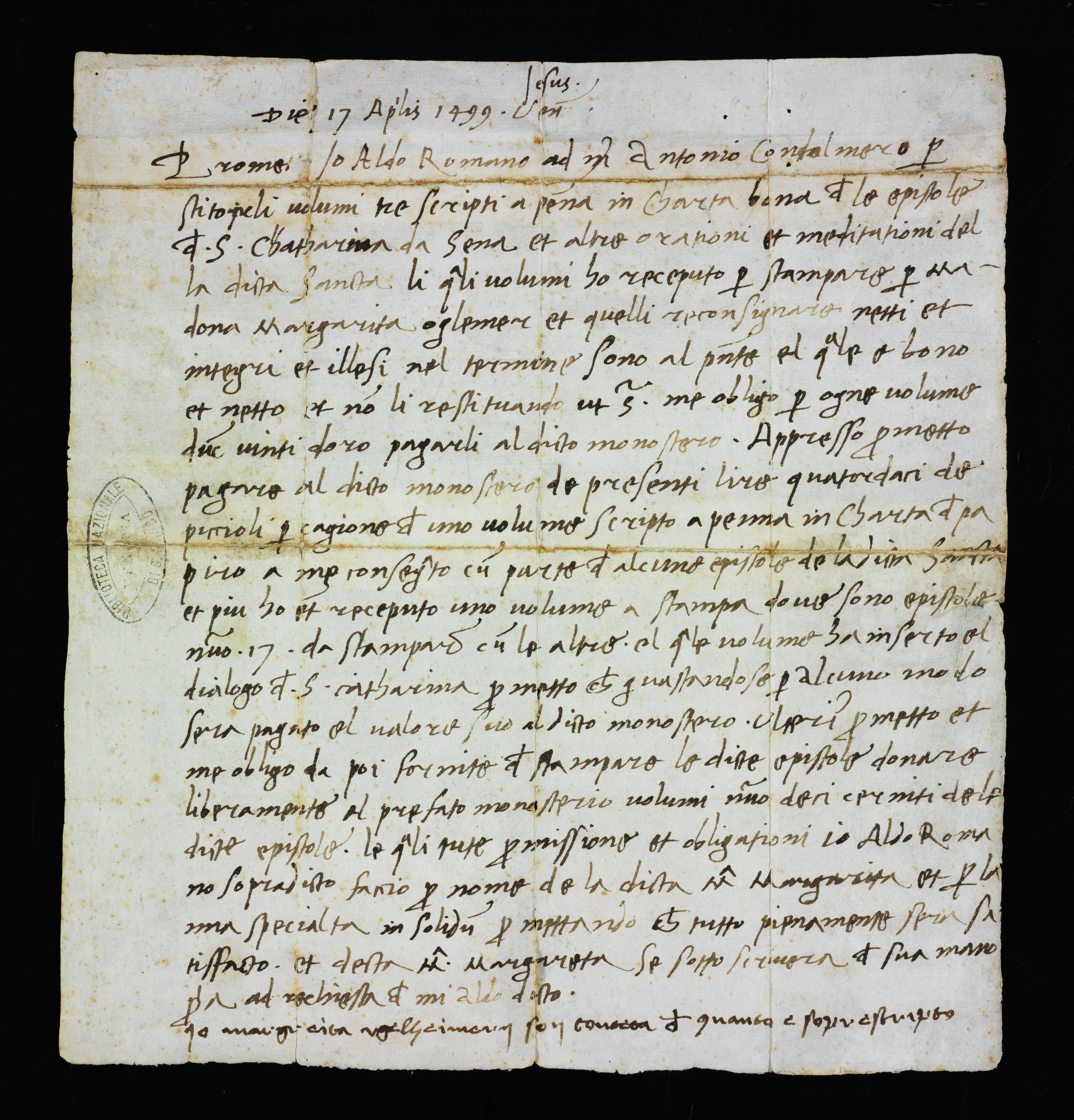
Contract in the handwriting of Aldus Manutius concerning the loan of manuscripts for printing the Epistles of Saint Catherine, the first book showing a few words in italic type. Venice, 17 April 1499. Biblioteca Marciana, Venice.
It is very probable that Sanvito provided Aldus with a refined and finely written model as well as the idea for his series of pocket-sized classics. Aldus seems to confirm this in the preface to his 1514 Virgil dedicated to Pietro Bembo. We translate it from the Latin as follows:
‘[…] the reduced format of this book comes from your library, or to be precise, from the library of your well loved father Bernardo. Following my request he immediately made available to me a few books in this particular format.’
Among the books lent to Aldus by Bernardo Bembo it is quite likely that there was Horace’s Works and Cicero’s De Officis, both of which were written out by Sanvito in 1485 and 1497.
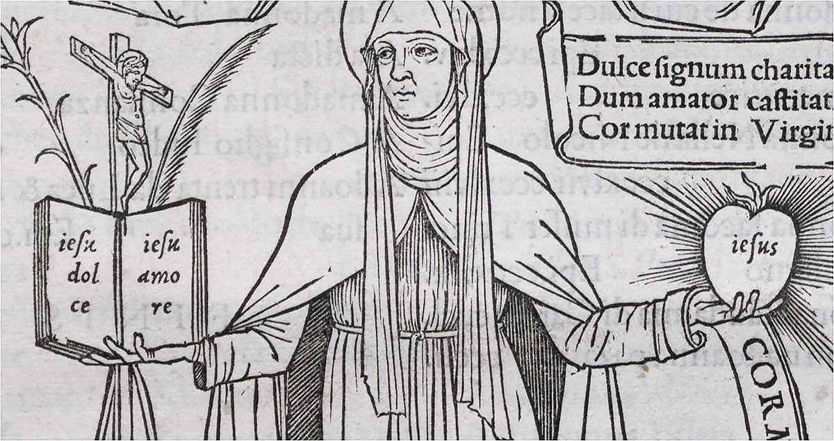
The words ‘jesu dolce, jesu amore’ printed in Griffo’s first italic type. Epistles of Saint Catherine, Aldus Manutius, Venice 1500. Biblioteca Universitaria, Bologna.
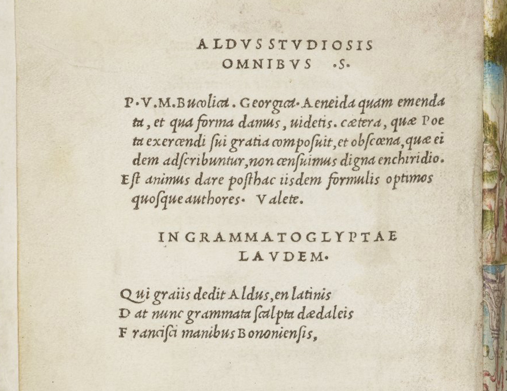
The 1501 Aldine Virgil, the first book printed entirely in italic type. John Rylands Library, Manchester.
Aldus Manutius and Griffo
In his 1501 Virgil, the first pocket-sized book set in italic type, Aldus praises the skill of Francesco da Bologna in cutting the type, but claims the idea for himself.
Aldus who gave to the Greeks
now gives to the Latins type cut by the daedalic
hands of Francesco da Bologna
Aldus’s eulogy to Francesco da Bologna. Virgil, printed by Aldus Manutius in Venice, 1501. Biblioteca Nazionale Centrale, Florence.
About a decade after its introduction in the early sixteenth century italic type reached a status equal to that of the other styles of type. The name Italic proclaims the country of its origin and its rapid success came from the series of octavo classics or libelli portatiles in formam Enchiridii, as Aldus defined those volumes. The compact octavo series of classics without commentaries together with Griffo’s italic type was an absolute novelty opening up new reading habits among the public and making a fundamental contribution to the history of publishing.
Aware of the importance of his innovations, Aldus made a request to the Venetian authorities to protect them and on 23 March 1501 the Senate of the Republic of Venice conceded him a ten-year privilege for exclusive use of italic type plus exclusives for publishing works of a few Latin Christian poets such as Sedulio, Iuvenco and Aratore. Thus deprived of any possibility of cutting italic types for other printers in the Venetian Republic, it is probable that Griffo left Venice during the winter of that year.
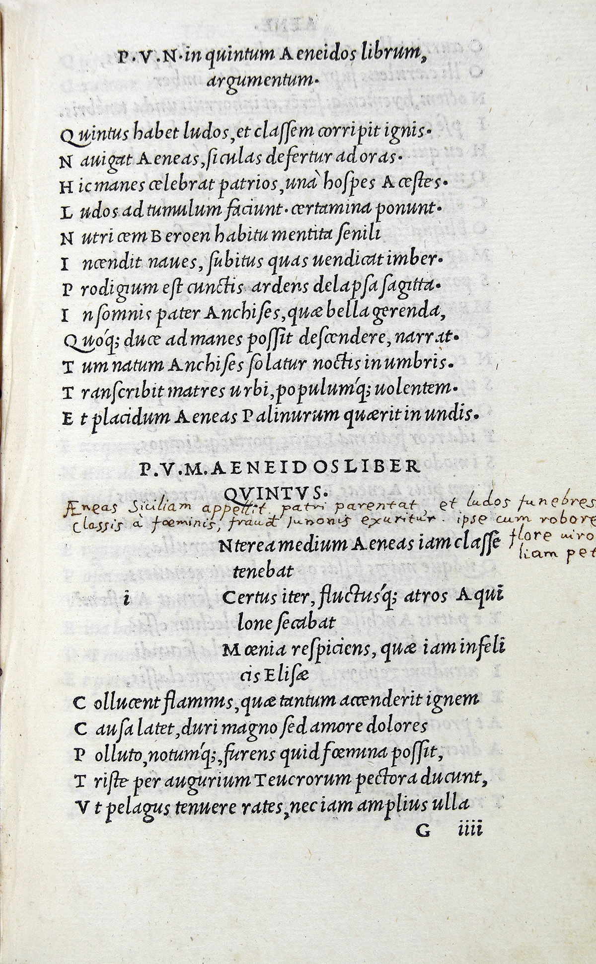
A page from the 1501 Virgil. Biblioteca Nazionale Centrale di Firenze
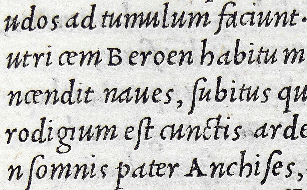
Enlarged detail from the 1501 Virgil.
A partnership with Soncino and Stagnino
Griffo moved to Fano, a town under the control of Cesare Borgia. Proof of this comes from a document preserved in the Fano State Archives which states that Griffo was a partner in a company for selling books with the printers Girolamo Soncino and Bernardino Giolito de Ferrari, also known as Stagnino. Similarly to Griffo, Soncino had also left Venice in 1501 and this may have been consequential to a quarrel with Aldus.
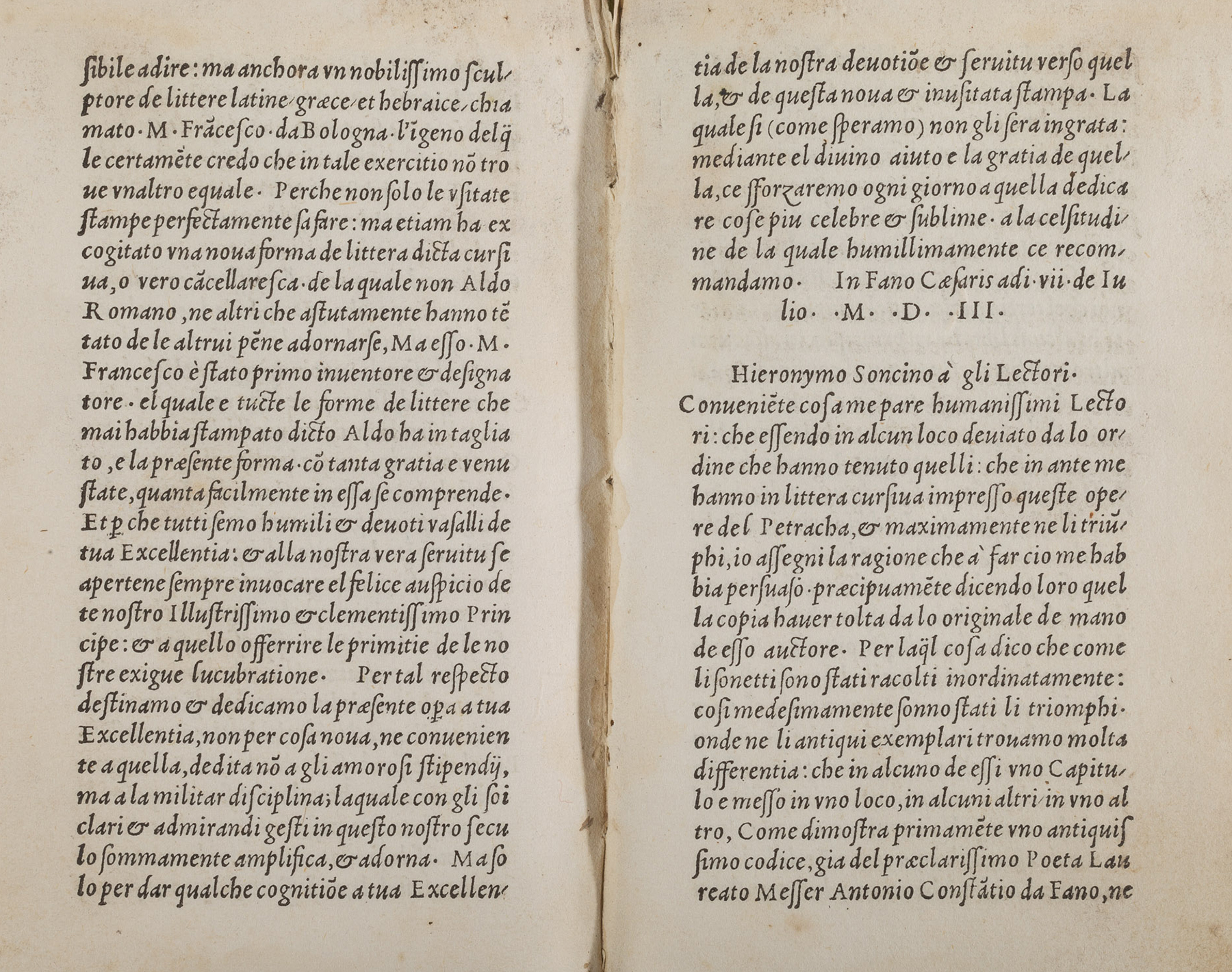
Opere volgari di Messer Francesco Petrarca, Girolamo Soncino, Fano 1503. Biblioteca Federiciana, Fano.
Detail of a page from Opere volgari di Messer Francesco Petrarca, Girolamo Soncino, Fano 1503. Biblioteca Federiciana, Fano.
Greatly enlarged detail from Opere volgari di Messer Francesco Petrarca, Girolamo Soncino, Fano 1503. Biblioteca Federiciana, Fano.
This new italic (Italic 2, or the first Fano italic) was first used by Soncino in 1503 to print Petrarch’s Opere volgari. In his dedication to Cesare Borgia Soncino expresses his high appreciation of Griffo and attributes to him all of the Latin, Greek, Hebrew and italic types used by Aldus. Soncino also affirms that Griffo invented italic type ‘of which neither Aldus Manutius nor others who cleverly adorn themselves with undue merit, were responsible. The same master Francesco was the first inventor and designer [of italic type]’.
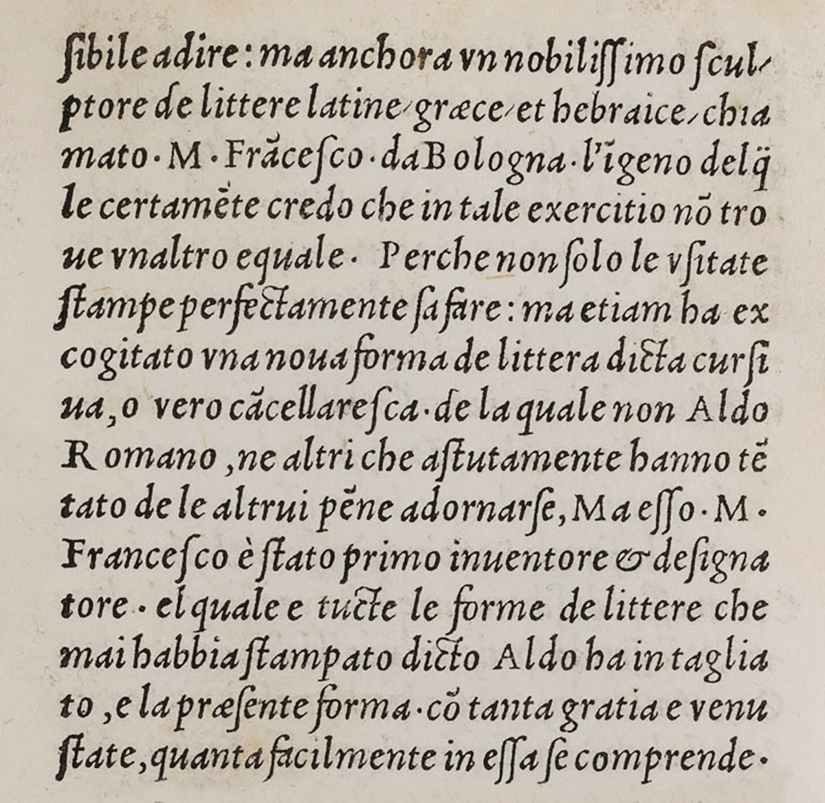
Detail of Soncino’s preface to his Petrarch in which he states that Griffo (Francesco da Bologna) cut all of the Aldine Latin, Greek, Hebrew and italic types.
Stagnino’s italic
So far no information is available on Griffo during the years following his proven stay in Fano. From 1511-13 he worked for Ottaviano Petrucci of Fossombrone who was busy preparing a sumptuous printed edition of an astronomic treatise with the title Paulina de recta Paschae celebratione. The roman type used for printing this book, which was published in 1513, was attributed to Griffo by Mardersteig and others. A document of 1512 in the Perugia state Archive indicates that Griffo received the sum of 20 ducats from a man who owed money to Bernardino Stagnino and thus it is probable that Griffo was living at Perugia during the year 1512.
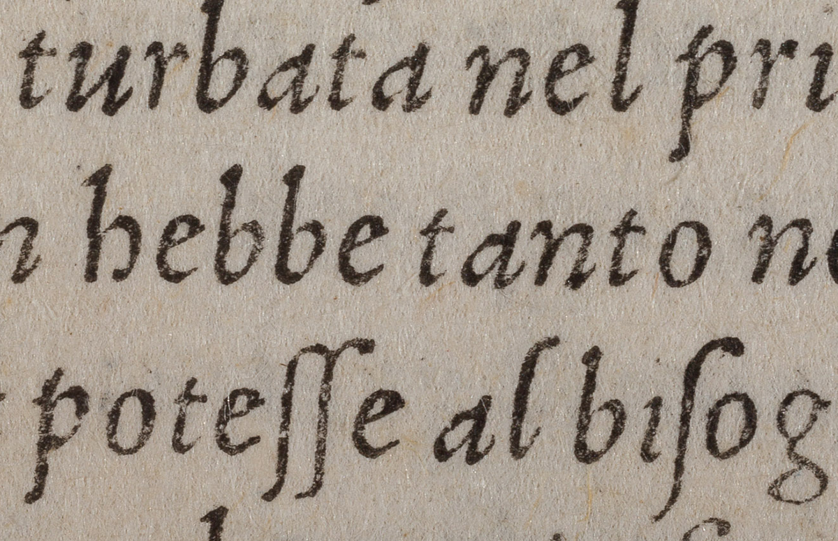
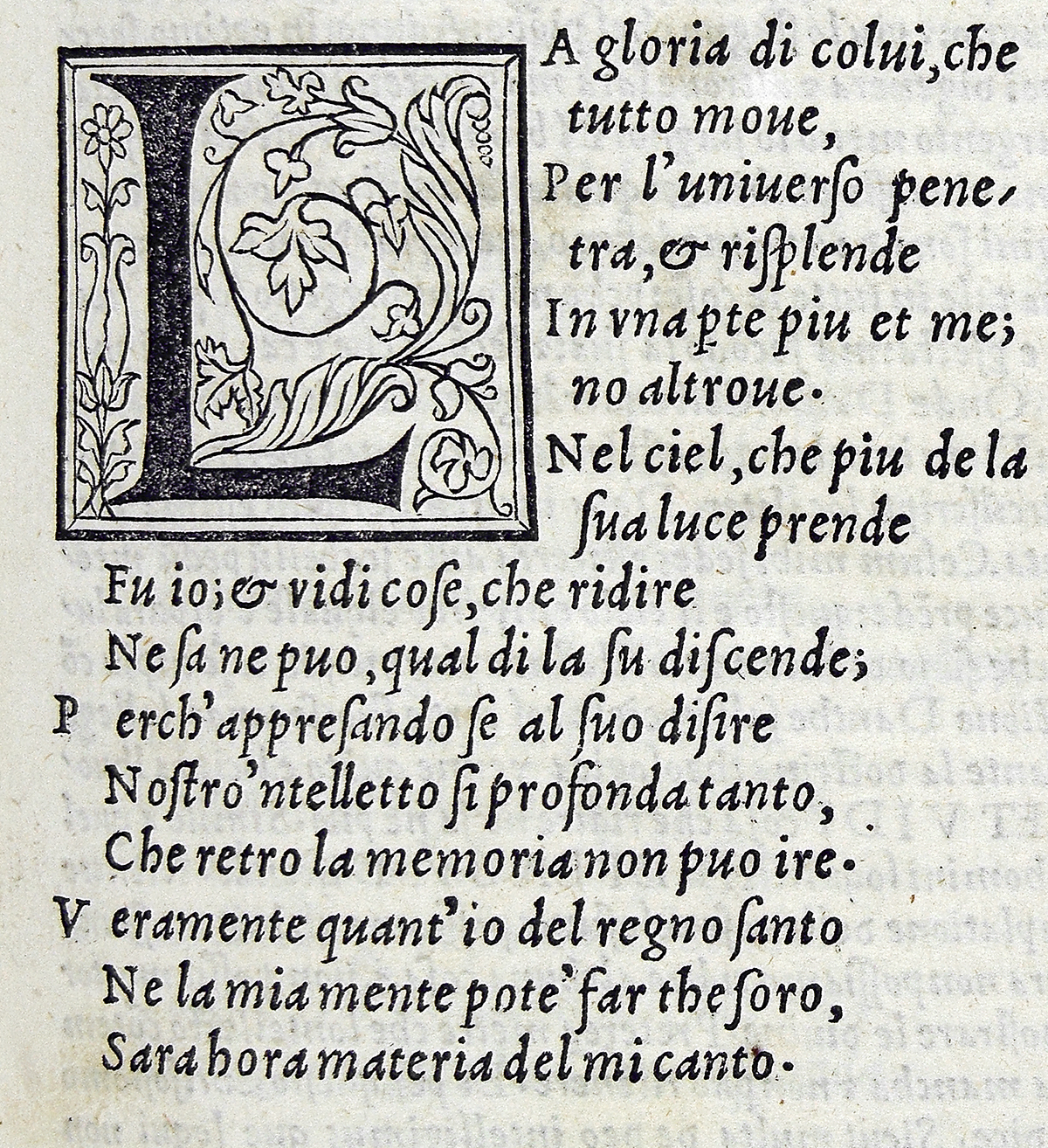
In fact, in November 1512 Stagnino printed a book entitled Opere del diuino poeta Danthe in two italics: one of about 12 points for the text and another smaller one for the commentary. In Luigi Balsamo’s opinion (Luigi Balsamo and Alberto Tinto, Origini del corsivo nella tipografia italiana del Cinquecento Milan, 1967, p. 45) the type used for the text of this Dante is the same one cut by Griffo in 1503 (Italic 2). Stagnino was to make further use of it in other books such as Officium B.V (1512) and Petrarch’s Rime in 1513.
Incipit of Opere del diuino poeta Danthe con suoi comenti: recorrecti et con ogne diligentia nouamente in littera cursiua impresse S. Bernardini, Bernardino Stagnino, Venice 1512. Biblioteca Nazionale Centrale, Florence.
The italic used for the commentary (italic 3) is about 9 points and this may have been the smallest cut by Griffo up to that time. There are some different letterforms in this italic and especially noteworthy is a new ‘d’ in the uncial style with a horizontal stroke instead of an ascender.
Enlarged detail of the italic type from Stagnino’s Dante. Opere del diuino poeta Danthe, Bernardino Stagnino, Venice 1512.
‘Stagnino adopts the traditional style of page layout with the main text surrounded by comments on one, two or three sides [Aldus made the definitive editorial choice of not publishing books with commentaries]. Thus the necessity of a smaller size of type is the reason for the notable reduction in size of the commentary italic, which is, on the whole, the same design as the Fano italic.’ [Balsamo and Tinto, p. 48].
Balsamo goes on to say that the italics sold to Stagnino (which he was to use for his 1519 Petrarch and his Dante of 1520) were also put to use in books printed by Giovanni da Cerreto, better known as Tacuino – a printer active in Venice during the last decade of the fifteenth century and the first half of the sixteenth century. One of these was Bolzanio’s Grammaticae institutiones (August 1512) where the italic can be seen in the dedication.
Moreover, it seems that the Stagnino italics were also used in two volumes of the same format printed by Gregorio de Gregori: Boccaccio’s 1516 Decameron and Petrarch’s Rime of 1519 [Balsamo and Tinto, p. 49]. Gregorio worked in Venice from 1483-1528 but it is possible that he was in Fano in 1514 to print the first book in Arabic type. Giorgio Montecchi postulates that Griffo could have designed and cut this Arabic.
Filippo Giunta’s italics and the second Fano italic
Around this time another important printer, Filippo Giunta of Florence, started using a new type similar to Griffo’s italic. Previously, just two years after the appearance of the italic in the 1501 Virgil, he printed with an italic which was the first Italian copy of the Aldine italic.
In 1513 Giunta started printing with this new italic which showed ‘confidence and precision of design reminiscent of Griffo’s expertise [Balsamo and Tinto, p. 50]. The new italic was well spaced with a pleasing rhythm, rather compact and with many ligatures like the Aldine italic but with a slightly smaller body size of about 11 points. (ITALIC 4).
The Giuntas must have been well pleased with this italic as they continued using it in their octavo books up to 1533. here are some examples: Pietro Bembo, Gli Asolani, 1515 and these works by Boccaccio: Il Corbaccio 1516, Fiammetta 1517 and 1533, Ninfale Fiesolano 1521 and 1529, Labirinto d’amore, 1525). Later, from 1538 the type appears in Venice in books printed Tommaso and Gian Maria Giunta, sons of Filippo’s brother Lucantonio. Some years later in 1515 and 1516 Soncino printed six books in Fano including Pyndarus, De bello Troiano, 1515 and M. Bonfini Donati libellus, 1516. According to Balsamo these books were printed in an italic (ITALIC 5 or the second Fano italic) which differs from the 1503 Fano italic (ITALIC 2).
Decamerone di messer Giouanni Bocchaccio nuouamente stampato con tre nouelle aggiunte, 1516 Philippo di giunta fiorentino. Filippo Giunta 1516. Biblioteca Trivulziana, Milan.
This same type appears in books printed by Giunta in Florence but with the significant difference of the inclusion of numerous ligatures. See Boccaccio, Decamerone, 1516; and Niccolò Angelio, De re rustica, 1521.
‘The thin strokes of the ligatures are thinner than the stems of the letters, as in the preceding 1513 italic but the design is that of the second Fano italic. So, this type combines salient features of the previous two and becomes a synthesis of both of them.’ [Balsamo and Tinto, p. 52].
Enlarged detail of the italic type in Boccaccio’s Decamerone. Filippo Giunta 1516. Biblioteca Comunale dell’Arciginnasio, Bologna.
These two italics also appear in other books. The one used by Soncino turns up in Francesco Fortunio, Regole grammaticali della volgar lingua, printed by Bernardino Guerralda in Ancona in 1516 (Guaralda had already printed a few books in Roman type for Soncino in 1513, 1514 and 1515). The other italic with the ligatures and used by Giunta appears in Antonio Cornazzano, De Re Militaria and Homerus, De murum felisque bello comoedia, both of which were printed in Ortona a Mare in 1518 by Soncino.
Griffo’s return to Bologna
In 1516, the year after Aldus died, Griffo returned to Bologna to set up his own printing and publishing business. In the autumn he printed Petrarch’s Canzoniere, the first of a series of books in a very small format (45 x 97 mm with columns of text 40 x 89 mm). Reading between the lines, Griffo’s deep-seated bitterness at having achieved success too late in his life, unlike the far more fortunate Aldus, is evident.
‘Having made the Greek and Latin types of Aldus Manutius R, which gave him great wealth and eternal fame, once again I have excogitated those same italic letters which I believe will be appreciated by people of culture.’
Handwritten title page from the Canzoniere del Petrarca printed in Bologna by Francesco Griffo in 1516. Biblioteca Comunale dell’Archiginnasio, Bologna.
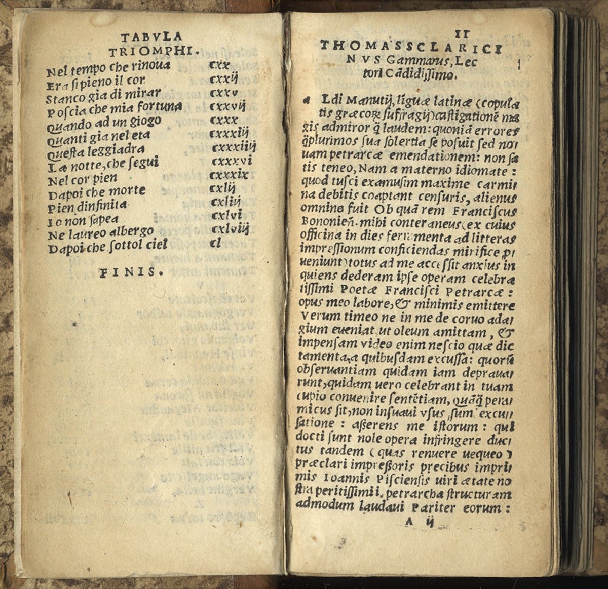
Double page from the Canzoniere del Petrarca printed in Bologna by Francesco Griffo in 1516. Biblioteca Comunale dell’Archiginnasio, Bologna.
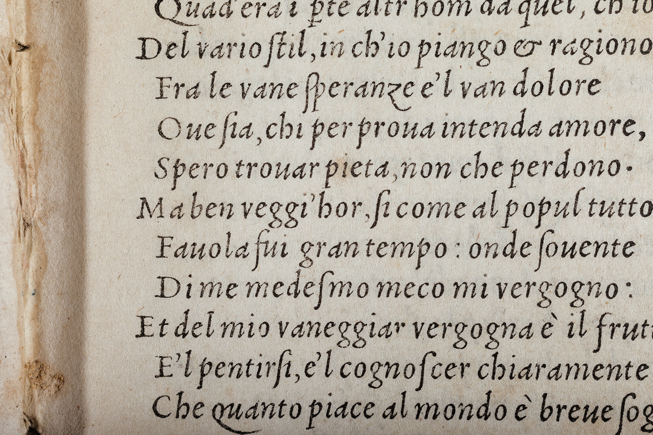
In order to print the Canzoniere and the few other books that followed it, Griffo cut a new italic of about 6 points. According to Balsamo this is a smaller version of the italic used by Giunta in 1516 (the second Fano italic) with the addition of ligatures.
‘The little book is narrow and elongated – rather like a pocket diary – and margins are are much reduced. The type cast for the occasion is about 6 points […], with a design that follows the second Fano italic. The x-height is big, ascenders and descenders are short and interlinear space is very tight. Words are set close together and sometimes they are not even spaced. The end result is a very dense column of text. Ligatures are present again (m, n, t and to a lesser extent g, are tied to vowels) even though the same letters can also be seen without ligatures. Uppercase letters are proportionally small and well below the lowercase ascenders. The ampersand is out of proportion in width and height. The very tight column width and narrow letterforms produces some irregularity of alignment.’ [Balsamo and Tinto, pp. 56-57].
The Paduan notary documents concerning Griffo indicate that he was working as a goldsmith and punch cutter as early as 1475. Thus we can presume that in 1516 he was about 70 years old, with eyesight that was not really up to the task of cutting such a small size of type. The pages of the Canzoniere and Griffo’s other publications show a lack of legibility and clarity, even though they are less tiresome and much clearer than Paganini’s editions in the same format printed in Venice the year before.
Other books printed by Griffo in 1516 were Sannazaro’s L’Archadia, Bembo’s Gli Asolani, Boccaccio’s Il labirinto d’amore and Cicero’s Epistolae familiares. All of these were in the same format and set in the same italic type. The series of Latin titles continued with Valerio Massimo’s Dictorum et factorum memorabilium (24 January 1517), the final book in Griffo’s short career as publisher.
Gli Asolani di Messer Pietro Bembo, Bologna 1516. Biblioteca Comunale dell’Archiginnasio, Bologna.
It seems clear that Griffo’s publishing initiative was not sufficiently favoured by the reading public for him to continue, despite the fact that his books in such a small format and the italic type were a novelty for Bologna. Following Griffo’s last book, italic type was not used again by local printers until 1531. It is clear that successful sales of his books would have let him go ahead with his publishing programme for which he had waited so long. [Balsamo and Tinto, p. 57].
BIBLIOGRAPHY
Luigi Balsamo and Alberto Tinto, Origini del corsivo nella tipografia italiana del Cinquecento, Milan 1967, pp. 13-60.
Aldo Manuzio Editore. Dediche, prefazioni, note ai testi, introduzione di Carlo Dionisotti, testo latino con traduzione e note a cura di Giovanni Orlandi, Milan 1975.
Giovanni Mardersteig, ‘Aldo Manuzio e i caratteri di Francesco Griffo da Bologna’ [1964], in Scritti di Giovanni Mardersteig sulla storia dei caratteri e della tipografia, Milan, 1988, pp. 117-120.
Nicholas Barker, ‘The Aldine Italic’ in Aldus Manutius and Renaissance Culture, Florence 1998.
Harry Carter, A view of early typography up to about 1600, Hyphen Press (second edition), London 2002.
Giorgio Montecchi, “Analisi bibliologiche sulla prima stampa in lingua araba: Horologium, Fano, Gregorio de Gregori, 1514”, in Le mille e una cultura. Scrittura e libri fra Oriente e Occidente, a cura di Maria Cristina Misiti, Bari, Edipuglia, 2007, pp. 67-86.
Riccardo Olocco, I romani di Francesco Griffo in ‘Bibliologia’ n. 7, Pisa – Rome 2012, pp. 33-56.
Aldo Manuzio. Il rinascimento di Venezia, catalogo Marsilio Editori, Venice 2016, Laura Nuvoloni, pp. 234-235, 326-329.
LIST OF ITALIC TYPES FOR FURTHER ANALYSIS
ITALIC 1 (11 pt / 20 lines = 79 mm) – the Aldine italic, 1501
Aldus Manutius
1.1 – Virgil. Venice 1501
1.2 – Martial. Venice 1501
1.3 – Juvenal and Persius. Venice 1501
1.4 – Catullus, Tibullus, Propertius. Venice 1502
ITALIC 2 (12 pt / 20 lines = 86 mm) – the first Fano italic, 1503
Girolamo Soncino
2.1 – Opere volgari di Messer Francesco Petrarca. Fano 1503
ITALIC 3 (9.5 pt / 20 lines = 67 mm) – italic used for commentaries, 1512
Bernardino Stagnino
3.1 – Opere del diuino poeta Danthe con suoi comenti: recorrecti et con ogne diligentia nouamente in littera cursiua impresse S. Bernardini. Venice 1512.
Gregorio De Gregori
3.2 – Boccaccio, Decameron. Venice 1516
3.3 – Petrarch, Rime. Venice 1519
ITALIC 4 (11 pt / 20 lines = 79 mm) – new italic cut for Giunta, 1513
Filippo Giunta
4.1 – Pietro Bembo, Asolani del Bembo. Florence 1515
4.2 – Boccaccio, Corbaccio. Florence 1516
4.3 – Boccaccio, Fiammetta. Florence 1517 and 1533
4.4 – Boccaccio, Ninfale Fiesolano. Florence 1521
ITALIC 5 (12 pt / 20 lines = 83 mm) – the second Fano italic, 1515
Girolamo Soncino
5.1 – Pyndarus, De bello Troiano. Fano 1515
5.2 – Bonfini, Donati libellus. Fano 1516
Filippo Giunta
5.3 – Boccaccio, Decamerone. Florence 1516
5.4 – Niccolò Angelio, De rustica. Florence 1521
Bernadino Guerralda
5.3 – Francesco Fortunio, Regole grammaticali della volgar lingua. Ancona 1516
ITALIC 6 (7 pt / 20 lines = 50 mm) – the Bologna italic, 1516
Francesco Griffo
6.1 – Petrarch, Canzoniere ed triomphi di messer Francesco Petrarca. Bologna, September 1516
6.2 – Pietro Bembo, Asolani. Bologna, October 1516
6.3 – Boccaccio, Labirinto d’amore. Bologna, December 1516
6.4 – Sannazaro (Jacobus) Archadia del Sannazaro. Bologna, 16 October 1516
