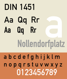
DIN 1451
Last updatedThis article needs additional citations for verification .(February 2014) |
 | |
| Category | Sans-serif |
|---|---|
| Foundry | FontFont, Linotype GmbH |
DIN 1451 is a sans-serif typeface that is widely used for traffic, administrative and technical applications. [1]
Contents
- Overview
- History
- Releases
- Third-party adaptations
- Usage examples
- Variants in the United Kingdom
- See also
- References
- Further reading
- External links
It was defined by the German standards body DIN ( Deutsches Institut für Normung , 'German Institute for Standardisation', pronounced like the English word din) in the standard sheet DIN 1451-Schriften ('typefaces') in 1931. [2] Similar standards existed for stencilled letters. [3]
Originally designed for industrial uses, the first DIN-type fonts were a simplified design that could be applied with limited technical difficulty. Due to the design's legibility and uncomplicated, unadorned design, it has become popular for general purpose use in signage and display adaptations. Many adaptations and expansions of the original design have been released digitally. [4] [5]
Overview

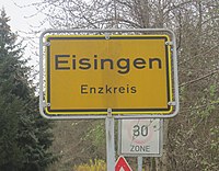
The DIN 1451 typeface family includes both a medium (Mittelschrift) and a condensed (Engschrift) version; an older extended version (Breitschrift) has not been used since the early 1980s, but may still be encountered on older road signs in Germany. DIN 1451 is the typeface used on road signage in Germany and a number of other countries. It was also used on German car number plates from 1956 until January 1995, when it was replaced by FE-Schrift , a typeface that impedes tampering and aids optical character recognition for automatic number-plate recognition.
DIN 1451 has gained popularity due to its wide exposure through its release as a PostScript typeface in 1990. Since then, it is also used by non-governmental organisations and businesses. For graphic design and desktop publishing, several type foundries offer redesigned and extended versions of this typeface.
History


In 1931, the DIN institute published DIN 1451. It contained several standard typefaces for mechanically engraved lettering, hand-lettering, lettering stencils and printing types. These were to be used in the areas of signage, traffic signs, wayfinding, lettering on technical drawings and technical documentation.
The origins of DIN 1451 Engschrift ('condensed face') for hand lettering date back to 1905, when the Prussian state railways prescribed a standardized lettering style for use on all of its rolling stock. This specification was published in a document known as Musterzeichnung ('master template', literally: 'pattern drawing') IV 44. Ten years later, the company – by then, renamed Prussian-Hessian Railways – additionally required that signage lettering on railway platforms and station premises also be rendered according to the 1905 master template. Then, as a byproduct of the 1920 consolidation of all German railway companies into the Deutsche Reichsbahn , the Prussian railway's typeface quickly became a de facto national standard, even before the DIN Committee of Typefaces took up its work on DIN 1451 a few years later. The DIN Committee of Typefaces was headed by the Siemens engineer, Ludwig Goller (1884–1964), who also led the central standardization office at Siemens & Halske in Berlin, between 1920 and 1945.


The design included not only the DIN Engschrift, but also a DIN Mittelschrift ('medium[-width] face' – now very popular). A DIN Breitschrift ('extended face') design was also included, but it has never been widely used.
In order to enable quick and easy reproduction, all drawings were originally based on a coarse grid and could be executed with compass and rulers. The Normblatt ('standards sheet') DIN 1451, Schriften ('typefaces') was released preliminarily in 1931; then, with some minor changes in 1936, it was released as an official standard. In 1938, Temporary Order No. 20 required DIN 1451 to be used on the new German Autobahn (motorway) system. Due to this and similar regulations, DIN 1451 still dominates German public lettering today.

In 1923, Stempel was the first type foundry to produce printing type according to a DIN Standard. The design follows DIN 16, an earlier standard for oblique lettering on technical drawings, which had been released in 1919. In 1929, the Berthold Type Foundry released a similar typeface. DIN 16 had also been made available as lettering templates engraved in celluloid material for drafting use by the Filler and Fiebig company in Berlin.

Within the scope of public and technical lettering, the use of the DIN 1451 typefaces spread rapidly once they were adopted. They were released as celluloid lettering stencils for smaller applications, as larger metal stencils for application to machinery, vehicles and airplanes, and as cast metal lettering for street and building signage; nevertheless, printing type conforming to DIN 1451 have never been produced. During World War II, DIN 1451 was also adopted in the Protectorate of Bohemia and Moravia. The 1943 version of DIN 1451 added a set of Cyrillic characters, although their design did not match the weight and proportions of DIN Mittelschrift.
Sans-serif lettering and typefaces styled around geometric shapes, along with Art Deco in general, was very popular in the 1920s and 1930s. At the Bauhaus, the use of coarse grids for designing typefaces was advocated by Herbert Bayer and Joost Schmidt during the Dessau period. Although of a similar design, the DIN typefaces did not incorporate the elegance of this stylistic trend.
Inspired by the DIN standard, a consortium of Dutch organisations created an equivalent lettering standard, NEN 3225. [6] Created by a group of designers that included Jan van Krimpen, the design has no similarity to the DIN standard: it is a humanist family with serif and sans-serif styles. The sans-serif is similar to Gill Sans and to Johnston; the serif reflects the classical Renaissance humanist model. [7] In a similar vein, the International Standards Organisation developed its own derivative, Isonorm, in 1980. [8]
Releases

The transferable-lettering-sheet company, Letraset made several variants available in the 1970s. Also, the Berthold type foundry adopted the DIN typefaces for their optomechanical phototype setting systems such as Staromat. In 1980, the DIN typefaces were redrawn by Adolf Gropp (1911–1996), a lettering artist from Frankfurt. The drawings were made on a finer grid. This enabled an exact definition of details such as the amount of overshoot of round characters (e.g. C, G and O) below the baseline and above the cap height. Also, characters such as S for which an accurate construction drawing had never been made were now defined using lines and arcs for the new cutting plotters that were to be used for the lettering on motorway signage. A number of the glyphs were changed, in particular those for "a", "6" and "9" as well as "t" in DIN Engschrift.
By the mid 1980s, Linotype adopted the redrawn DIN typefaces for digital photocomposition. Together with Adobe, they released it as DIN Mittelschrift and DIN Engschrift in 1990. Thus, the typefaces became part of the Adobe/Linotype PostScript typeface library. The use of DIN typefaces started to appear in the work of cutting edge graphic designers and design studios such as Uwe Loesch in Germany, Tel Design in the Netherlands, as well as David Carson and April Greiman in the USA. Soon, other leading designers began using DIN Mittelschrift and Engschrift, making it a popular option to other sans serif faces.
Third-party adaptations

With the popularity of the DIN fonts, with their minimal, modern design, several designers and companies have released their own interpretations and adaptations, often adding new weights such as light or extra-bold, and italics, causing a range of digital interpretations to exist.
One of the most famous and best-selling digitisations of DIN is FF DIN (1995), created by Dutch typeface designer Albert-Jan Pool for FontFont. [11] [12] [13] [14] Typographica editor Stephen Coles has particularly praised it for the quality of its hinting for onscreen display. [15] Users include the New York City Ballet, ETH Zurich, The Verge and the film The Wolf of Wall Street . [16] [17] [18] Unlike the original design, it uses conventional weight names.
As the original DIN design is out of copyright, other companies have offered digital releases (or obtained rights to resell Linotype's). Parachute (Latin, Arabic, Cyrillic, Greek), Elsner+Flake, Paratype (with Cyrillic characters) and others have issued revivals of some DIN styles, often upgraded with additional weights. [19] Fontsite renamed its release Fette 1451. [20]

An extensive set of digitisations is that made by Peter Wiegel with donations requested from users under the OFL. This includes the regular style (Mittelschrift) in two grades for printing with less and more ink spread, and the less well-known Breitschrift. [21] [22] [23] He also digitised the rounded DIN 16 Oblique and DIN 17 Upright Standard Typeface for Drawings using the names TGL 0-16 and 0-17, the names under which they were known in the German Democratic Republic. [24] [25] Peter Wiegel also digitised a precursor of DIN 1451 typeface named Preussische IV 44 Ausgabe 3 typeface. [26]
Microsoft created custom digitizations of both Mittelschrift and Engschrift versions of DIN 1451 in 2013, but this version was never released publicly. In 2016, a version was released as Bahnschrift, as Microsoft's first ever Open Type variable font. [27] The Bahnschrift source was completely rebuilt from the ground up by Aaron Bell of Saja Typeworks and was expanded in weight, character set and manual hinting. [28] It supports Latin, Cyrillic, Greek, currency symbols, and some Coptic. It was first included in Windows 10 version 1709, and is primarily being used as the user interface font for Xbox software. [29] [30]
Parachute Type Foundry also designed the PF DIN Max Variable typeface, which also based on the DIN 1451 typeface. [31] [32]
American cybersecurity and data backup company, Datto, Inc. used D-DIN, a typeface which also based on the DIN 1451 typeface as their corporate typeface. [33] [34] The Sage Group enterprise software company have used a DIN-derived typeface in their logo since 1996. [35]
Emil Karl Bertell designed the Praktika typeface, inspired from the DIN 1451 typeface. [36]
Thomas Schostok designed the CA BND typeface, inspired from the DIN 1451 typeface. [37]
In 2023, the Berlin-based Type Foundry, Fontwerk released the Neue DIN typeface designed by Hendrik Weber, Andreas Frohloff and Olli Meier. Neue DIN is an interpretation of the DIN 1451 typeface and has an overall compact appearance with a range of extreme widths. It is variable first and provides 81 static fonts which correspond to W3C’s CSS specifications. [38]
Usage examples
This section's use of external links may not follow Wikipedia's policies or guidelines.(November 2020) |

Font for many license plates throughout Europe, but also Africa and Asia, including:
- Azerbaijan
- Belarus
- Cambodia
- Estonia
- Faroe Islands
- Indonesia (until 2022)
- Israel
- Latvia (with Mittelschrift used also in road signage)
- Lebanon
- Lithuania
- Moldova (until 2015*) + Transnistria
- Mongolia
- Niger
- Palestine
- Portugal + Cape Verde
- Romania
- San Marino
- Togo
- Tunisia
- Turkmenistan
- Vietnam
- Some variants in Cyprus, including Sovereign Base Areas (GB)
- Vehicle travelling outside Iran
- Some variants of French plates (current and pre-2009 format, as well as diplomatic, military personnel stationed in Germany, temporary)
- Some variants in Turkey
- Some variants of international organisations - United Nations, European Union and Council of Europe missions - and militaries (for example: Netherlands & France forces in Germany)
and older plates of:
- Albania *
- Belgium
- Bosnia and Herzegovina *
- Botswana
- Chile *
- Cuba *
- Georgia *
- Germany *
- Ghana *
- Guinea
- Guinea Bissau
- Hungary *
- Kyrgyzstan *
- South Sudan *
- Uganda *
Other countries use slightly modified versions of the font:
- Austria (rounded)
- Czech Republic (narrower)
- Montenegro (notable differences for '1' and 'I')
- Spain (narrower)
- Old Italy (notable differences for '3', '4', '5', '6', '7', '9', 'G', 'M', 'Q', 'W')
- Old Poland (notable differences for '4', '6', '7', '9', 'K', 'M', 'W')
- Old Slovakia (notable differences for '0' and '7')
In several countries, marked with *, it has been superseded by FE-Schrift, a typeface developed specifically to hinder tampering.
Variants in the United Kingdom
In the United Kingdom it was very common to use a "British" version of DIN 1451 which had a closed (triangle) shaped "4" and a "7" with a flat top – this variant, more in keeping with traditional technical lettering styles in British technical and magazine drawings, was commonly found in the former "Practical Television" magazine from about 1968/1969 till about 1975/1976, when more standard DIN 1451 lettering replaced it.
It is believed that these variants were modified by hand from hand–stencilled DIN 1451 lettering, and diagrams using this "British Adapted" style often appeared in television theory textbooks about the same period, and it occasionally crops up in service manuals.
See also
Related Research Articles

Palatino is the name of an old-style serif typeface designed by Hermann Zapf, initially released in 1949 by the Stempel foundry and later by other companies, most notably the Mergenthaler Linotype Company.

Optima is a humanist sans-serif typeface designed by Hermann Zapf and released by the D. Stempel AG foundry, Frankfurt, West Germany in 1958.

In typography and lettering, a sans-serif, sans serif, gothic, or simply sans letterform is one that does not have extending features called "serifs" at the end of strokes. Sans-serif typefaces tend to have less stroke width variation than serif typefaces. They are often used to convey simplicity and modernity or minimalism. For the purposes of type classification, sans-serif designs are usually divided into these major groups: § Grotesque and § Neo-grotesque, § Geometric, § Humanist and § Other or mixed.

Helvetica, also known by its original name Neue Haas Grotesk, is a widely used sans-serif typeface developed in 1957 by Swiss typeface designer Max Miedinger and Eduard Hoffmann.

Frutiger is a series of typefaces named after its Swiss designer, Adrian Frutiger. Frutiger is a humanist sans-serif typeface, intended to be clear and highly legible at a distance or at small text sizes. A popular design worldwide, type designer Steve Matteson described its structure as "the best choice for legibility in pretty much any situation" at small text sizes, while Erik Spiekermann named it as "the best general typeface ever".

Gill Sans is a humanist sans-serif typeface designed by Eric Gill and released by the British branch of Monotype from 1928 onwards.

Adrian Johann Frutiger was a Swiss typeface designer who influenced the direction of type design in the second half of the 20th century. His career spanned the hot metal, phototypesetting and digital typesetting eras. Until his death, he lived in Bremgarten bei Bern.

Johnston is a sans-serif typeface designed by and named after Edward Johnston. The typeface was commissioned in 1913 by Frank Pick, commercial manager of the Underground Electric Railways Company of London, as part of his plan to strengthen the company's corporate identity. Johnston was originally created for printing, but it rapidly became used for the enamel station signs of the Underground system as well.

Lettering is an umbrella term that covers the art of drawing letters, instead of simply writing them. Lettering is considered an art form, where each letter in a phrase or quote acts as an illustration. Each letter is created with attention to detail and has a unique role within a composition. Lettering is created as an image, with letters that are meant to be used in a unique configuration. Lettering words do not always translate into alphabets that can later be used in a typeface, since they are created with a specific word in mind.
Oblique type is a form of type that slants slightly to the right, used for the same purposes as italic type. Unlike italic type, however, it does not use different glyph shapes; it uses the same glyphs as roman type, except slanted. Oblique and italic type are technical terms to distinguish between the two ways of creating slanted font styles; oblique designs may be labelled italic by companies selling fonts or by computer programs. Oblique designs may also be called slanted or sloped roman styles. Oblique fonts, as supplied by a font designer, may be simply slanted, but this is often not the case: many have slight corrections made to them to give curves more consistent widths, so they retain the proportions of counters and the thick-and-thin quality of strokes from the regular design.

In typography, a slab serif typeface is a type of serif typeface characterized by thick, block-like serifs. Serif terminals may be either blunt and angular (Rockwell), or rounded (Courier). Slab serifs were introduced in the early nineteenth century.
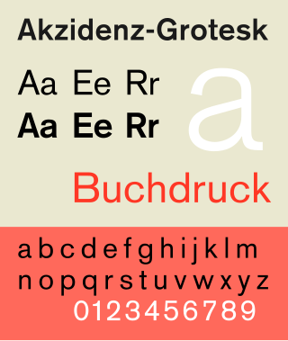
Akzidenz-Grotesk is a sans-serif typeface family originally released by the Berthold Type Foundry of Berlin. "Akzidenz" indicates its intended use as a typeface for commercial print runs such as publicity, tickets and forms, as opposed to fine printing, and "grotesque" was a standard name for sans-serif typefaces at the time.

Clarendon is the name of a slab serif typeface that was released in 1845 by Thorowgood and Co. of London, a letter foundry often known as the Fann Street Foundry. The original Clarendon design is credited to Robert Besley, a partner in the foundry, and was originally engraved by punchcutter Benjamin Fox, who may also have contributed to its design. Many copies, adaptations and revivals have been released, becoming almost an entire genre of type design.

Rotis is a typeface developed in 1988 by Otl Aicher, a German graphic designer and typographer. In Rotis, Aicher explores an attempt at maximum legibility through a highly unified yet varied typeface family that ranges from full serif, glyphic, and sans-serif. The four basic Rotis variants are:

Syntax comprises a family of fonts designed by Swiss typeface designer Hans Eduard Meier. Originally just a sans-serif font, it was extended with additional serif designs.
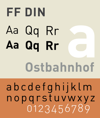
FF DIN is a sans-serif typeface in the industrial or "grotesque" style. It was designed in 1995 by Albert-Jan Pool, based on DIN-Mittelschrift and DIN-Engschrift, as defined in the German standard DIN 1451. DIN is an acronym for Deutsches Institut für Normung. It was published by FontShop in its FontFont library of typefaces.

Albert-Jan Pool is a Dutch type designer and educator.
Venus or Venus-Grotesk is a sans-serif typeface family released by the Bauer Type Foundry of Frankfurt am Main, Germany from 1907 onwards. Released in a large range of styles, including condensed and extended weights, it was very popular in the early-to-mid twentieth century. It was exported to other countries, notably the United States, where it was distributed by Bauer Alphabets Inc, the U.S. branch of the firm.

A display typeface is a typeface that is intended for use in display type at large sizes for titles, headings, pull quotes, and other eye-catching elements, rather than for extended passages of body text.
Parachute offers a variety of fonts designed to support Latin, Cyrillic, and Greek scripts, some of which have received recognition for their quality. Notable typefaces like PF Centro Pro, PF Champion Script Pro, and PF Goudy Initials Pro were introduced online in 2007.
References
- ↑ Pool, Albert-Jan (2007). "FF DIN, the history of a contemporary typeface". In Spiekermann, Erik; Middendorp, Jan (eds.). Made with FontFont: type for independent minds (1st ed.). New York: Mark Batty Publisher. pp. 66–73. ISBN 978-0977985043.
- ↑ Pool, Albert-Jan. "FF DIN: Digital Block Letters" (PDF). FontShop. Archived from the original (PDF) on 3 December 2017. Retrieved 14 December 2016.
- ↑ Hardwig, Florian; Maier, Thomas. "From Lettering Guides to CNC Plotters — A Brief History of Technical Lettering Tools". Typotheque. Retrieved 19 July 2017.
- ↑ Berry, John D. (2006). Dot-font: Talking About Fonts (1st ed.). New York: Mark Batty Publisher. pp. 50–51. ISBN 0-9772827-0-8.
- ↑ Berry, John (14 December 2001). "dot-font: Industrial-Standard Typefaces". Creative Pro. Retrieved 16 July 2016.
- ↑ Jan Middendorp (2004). Dutch Type. 010 Publishers. pp. 298–9. ISBN 978-90-6450-460-0.
- ↑ G. Willem Ovink (1964). "NEN 3225: Dutch Standard Alphabets". Alphabet. Kynoch Press. pp. 123–130.
- ↑ "Isonorm Family". Linotype.
- ↑ "Albert-Jan Pool - Können Serifen funktional sein?" (in German). Typographische Gesellschaft München – tgm. Archived from the original on 2021-12-21. Retrieved 13 February 2017– via YouTube.
- ↑ Jan-Pool, Albert. "Funktionale Serifen?". Design Made In Germany (in German). Archived from the original on 6 February 2013. Retrieved 13 February 2017.
- ↑ Spiekermann, Erik. "Comments on Typophile thread". Typophile. Archived from the original on April 10, 2009. Retrieved 13 July 2015.
- ↑ "Can the typefaces we see around us on highway signs be turned into usable fonts for general use? Sometimes". Creativepro.com. 14 December 2001. Retrieved 2012-10-10.
- ↑ "FF DIN Round". FontFont. 2010-07-28. Archived from the original on 2011-02-26. Retrieved 2012-10-10– via Issuu.com.
- ↑ "FF DIN in use :: A FontFont Focus by FontShop". FontShop. Retrieved 2012-10-10.
- ↑ Coles, Stephen. "Twitter post". Twitter. Retrieved 1 September 2015.
- ↑ "The Verge Logo and Website". Fonts In Use. 2013-11-19.
- ↑ "The Wolf of Wall Street movie posters". Fonts In Use. 2014-01-08.
- ↑ "Communication - Font". ETH Zurich . Retrieved 22 January 2016.
Arial and FF DIN Pro are the corporate fonts for ETH Zurich.
- ↑ "Parachute DIN". MyFonts. Parachute. Retrieved 1 September 2015.
- ↑ "Fette 1451". Fontsite. Retrieved 1 September 2015.
- ↑ Wiegel, Peter. "DIN Breitschrift" . Retrieved 1 September 2015.
- ↑ Wiegel, Peter. "Alte DIN 1451". Peter Wiegel. Retrieved 1 September 2015.
- ↑ Wiegel, Peter. "DIN 1451 H". Peter Wiegel. Retrieved 1 September 2015.
- ↑ Wiegel, Peter. "TGL 0-16" . Retrieved 1 September 2015.
- ↑ Wiegel, Peter. "TGL 0-17" . Retrieved 1 September 2015.[ permanent dead link ]
- ↑ Wiegel, Peter. "Preussische IV 44 Ausgabe 3". Peter Wiegel. Retrieved 20 January 2024.
- ↑ "Introducing the Bahnschrift font". Windows Blog. Microsoft. 23 August 2017. Retrieved 28 August 2017.
- ↑ "Bahnschrift font family". Microsoft Typography. Microsoft. Retrieved 14 June 2019.
- ↑ "The next Xbox One and Xbox Series X dashboard finally gets it right". Windows Central. 2020-08-25. Retrieved 2021-02-02.
- ↑ Protalinski, Emil (23 August 2017). "Microsoft releases new Windows 10 preview with shell, Edge, and input improvements". VentureBeat. Retrieved 28 August 2017.
- ↑ "PF DIN Max Variable on Behance". behance.net. Retrieved 26 January 2022.
- ↑ "PF DIN Max Variable". Parachute Fonts. Retrieved 26 January 2022.
- ↑ "D-DIN typeface". Font Squirrel. Retrieved 19 October 2021.
- ↑ Kennedy, Erik D. (26 March 2021). "DIN - Similar fonts". Learn UI Design Blog. Retrieved 15 January 2022.
- ↑ "Less is More. More or Less". Studio Blackburn. 21 September 2021. Retrieved 25 October 2021.
- ↑ "Praktika typeface". MyFonts.com. Retrieved 27 September 2022.
- ↑ "CA BND typeface". Cape Arcona. Retrieved 20 November 2022.
- ↑ "Neue DIN typeface". Fontwerk. Retrieved 10 March 2023.
Further reading
- The series of articles "The history of the design of a contemporary typeface" in which Albert-Jan Pool published many of his findings on the history of the typefaces of DIN 1451 is a vault of references on this subject. The series was published in the e-magazine 'Encore', issues 13–15, 17–18. These are direct links to the article which were reprinted in modified form in Made with FontFont
- Albert-Jan Pool. FF Din. 1995
- Blackwell, Lewis. 20th Century Type. Yale University Press: 2004. ISBN 0-300-10073-6.
- Friedl, Friedrich, Nicholas Ott and Bernard Stein. Typography: An Encyclopedic Survey of Type Design and Techniques Through History. Black Dog & Leventhal: 1998. ISBN 1-57912-023-7.
- Jaspert, W. Pincus, W. Turner Berry and A.F. Johnson. The Encyclopædia of Type Faces. Blandford Press Lts.: 1953, 1983. ISBN 0-7137-1347-X.
- Macmillan, Neil. An A–Z of Type Designers. Yale University Press: 2006. ISBN 0-300-11151-7.
- DIN 1451-2: Schriften – Serifenlose Linear-Antiqua – Verkehrsschrift. Deutsches Institut für Normung, 1986–02.
External links
- Download of fonts used on roadsigns
- A free implementation of Fette Engschrift, an early version of the DIN 1451 typeface Archived 2018-11-29 at the Wayback Machine
- A minisite from Fontshop regarding FF DIN, includes history and specs as well as an interview with FF DIN's designer Albert-Jan Pool.
- Weights overview of FF DIN and in-use examples
- Linotype DIN pages: DIN 1451, DIN Next, DIN Next Arabic, DIN Next Devanagari font family - Designed by Akira Kobayashi in 2012, Kimya Gandhi in 2012
- Parachute DIN: PF DIN Text Pro Archived 2019-11-05 at the Wayback Machine , PF DIN Text Arabic Archived 2017-05-18 at the Wayback Machine , PF DIN Text Universal Archived 2016-09-23 at the Wayback Machine , PF DIN Text Condensed Pro Archived 2016-09-20 at the Wayback Machine , PF DIN Text Compressed Pro Archived 2016-10-11 at the Wayback Machine , PF DIN Display Pro Archived 2017-02-03 at the Wayback Machine , PF DIN Mono Pro Archived 2017-09-17 at the Wayback Machine , PF DIN Stencil Pro Archived 2016-12-04 at the Wayback Machine , PF DIN Type System - Comparison Table Archived 2019-05-07 at the Wayback Machine
- Fonts in Use: DIN 1451, DIN Engschrift, DIN Breitschrift
macOS typefaces | |||||||
|---|---|---|---|---|---|---|---|
| Latin, Greek, Cyrillic |
| ||||||
| Non-alphabetic | |||||||
| Authority control databases: National |
|---|
Text is available under the CC BY-SA 4.0 license; additional terms may apply.
Images, videos and audio are available under their respective licenses.