
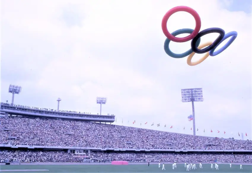
Mexico City became the first Latin American nation to host the Olympic games in 1968. The story of the games has become the stuff of legend, propelling Mexico onto the world stage, although the games are now perhaps more remembered for civil rights protests and the Tlatelolco massacre. What cannot be denied, however, is the power of the 1968 Mexico City Olympics logo, which continues to be a titan of mid-century design.
The 1964 Olympics were staged in Tokyo, a city determined to demonstrate that a modern, efficient society had risen from the ashes of the Second World War. It was also a chance for Japan to advertise an economic miracle that was growing in momentum while going largely unnoticed by the rest of the world.
One problem for the Tokyo games was that Japanese — the national language of only one country, with its own writing system — would make navigating the city a nightmare. But there was an answer. Japan had just staged The World Design Conference and its young artistic community was buzzing over the potential of visual communication. Under the direction of Masaru Katsumie, the Olympics design team came up with a set of symbols anyone could understand: follow the figure balancing on a beam for gymnastics, follow the hand with a finger bandaged for the first aid room, and so on.
The story that Mexico adopted a similar scheme because the country still had high levels of illiteracy is probably inaccurate. Back in 1968, the games were never expected to attract the illiterate poor. It was simply that the Japanese experiment with symbols had been so successful that future Olympics could hardly not adopt the idea.
The task of designing the new symbols cannot be separated from the total branding of the games, and supervising all this work fell to the architect Pedro Ramírez Vázquez. Fresh off completing his masterpiece, the National Museum of Anthropology, Vázquez already had a vision for the games. He saw a Mexico that was emerging as a modern nation, while proud of its rich ancient past. A nation about to join the First World, while championing the Third. There was, as he would say in interviews, no place for sombrero-clad figures sleeping under a cactus.
Putting the design team together
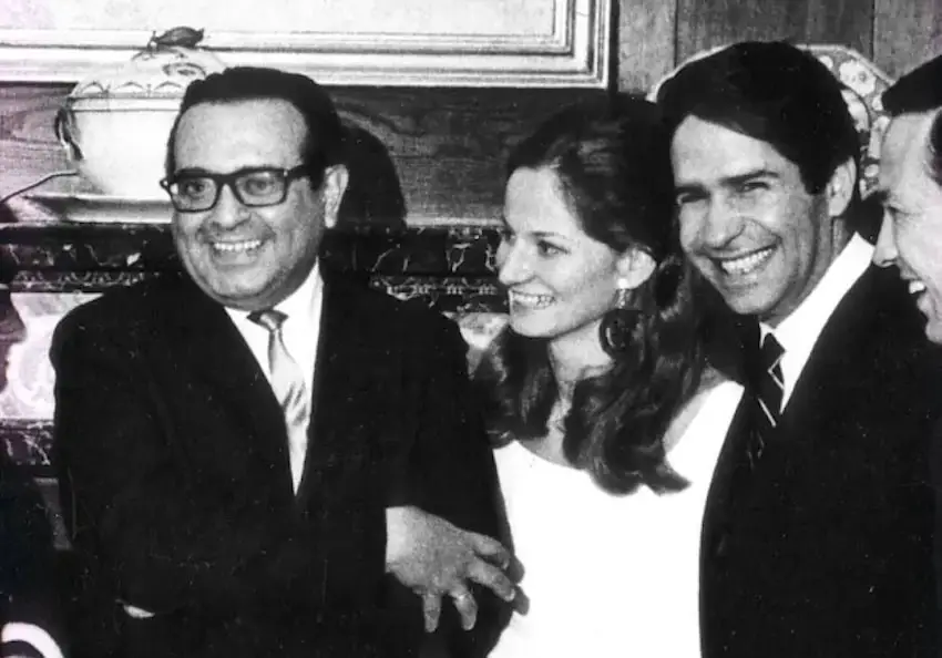
As the Tokyo Olympics closed, Ramírez Vázquez started to put together the core of his team. The 1964 World’s Fair in New York, where Ramírez Vázquez had worked on the Mexican Pavilion, would have a considerable influence on recruitment. The artist Eduardo Terrazas would be recruited from that team. It was also in New York that Vázquez was introduced to a young Latvian-born American named Beatrice Trueblood. Trueblood came to Mexico to design the official book of the newly-opened Museum of Anthropology and stayed on for the Olympics, where she would be in charge of publications. Lance Wyman was also at the New York Expo, working on the graphics for the Chrysler Pavilion, although he does not appear to have met the Mexican contingent.
Wyman was making a living, but there was a difference between making a living and making a reputation. With the Mexicans recruiting people for the Olympics, Wyman approached Peter Murdoch, an English designer making his name in New York, to see if they might collaborate on some designs.
The two men came down to Mexico to try their luck — according to legend with one-way tickets, as that was all they could afford. Wyman and Murdoch spent much of the first week wandering the halls of the Museum of Anthropology, trying to understand a little more about this country they were to portray. It was probably not lost on them that the magnificent building had been designed by the man they would be trying to impress.
Wyman was struck by the link between pre-Hispanic art and modern optical art that had recently taken New York by storm. The optical movement had been inspired by Julian Stanczak and his 1964 exhibition Optical Paintings. The use of lines, colors and optical illusions to trick the eye would become central to the Olympic designs.
Who designed Mexico ‘68?
It was in the cramped offices on Avenida de Las Fuentes in Jardines del Pedregal, that the Olympic logo — and from there, the classic Mexico ‘68 posters — took shape. The importance of this work cannot be overestimated, for it lay at the center of everything that would follow. The letters were expanded to form a brand-new typeface and the op-art theme was adopted in everything from the uniforms of the guides to the nation’s postage stamps.
There is some debate about who should take credit for the logo. It is generally credited to Wyman and Eduardo Terrazas, but Beatrice Trueblood has argued it was a team effort, with Ramírez Vázquez also playing a key role. The museographer Alfonso Soto Soria, who worked on the Museum of Anthropology, even suggested that Wixárika (Huichol) artisans from Jalisco had an influence.
We will probably never be able to give a definitive answer, simply because everybody there at the time has come away with a different memory. Looking at all the accounts, it seems possible that it was the Wyman-Murdoch team who brought in the op-art element. Ramírez Vázquez was always doodling and sharing his ideas and he seems to have come up with the idea of incorporating the Olympic rings into the year ’68.
While it is unlikely that any Wixárika artists played an active part in the design work, it remains possible that their art had influenced Ramírez Vázquez. Wyman might well have left before the poster was finished and it was probably Eduardo Terrazas who completed the design. Who then designed this classic work? Most accurately it might be described as a team effort from an original idea from Wyman.
A change in command
Away from the sheltered world of the design team, the games were running into problems. On winning the bid the Invitation Committee had been replaced by the Organizing Committee for the Games, but no ´president had been elected to oversee the numerous and expanding number of committees. Powerful men with big egos were controlling their own empires within the growing web of the Olympic Committees.
In 1964, the country staged nationwide elections, and the charismatic President Adolfo López Mateos, who had been looking increasingly unwell, stepped down. The Institutional Revolutionary Party (PRI) retained power under a new man, President Gustavo Díaz Ordaz.
Díaz Ordaz solved the problem of finding a head for the Olympic Committee by giving the position to López Mateos himself. On the surface, this seemed like an excellent move: López Mateos was widely respected and was passionate about the Olympics he had done so much to bring to Mexico. However, the former president’s health was more fragile than people realized, and he did not have the energy for the job. In July 1966, declining health forced López Mateos to resign from his position as head of the Olympic Organization Committee; to some surprise, Ramírez Vázquez was invited to step into the role.
Ramírez Vázquez takes the reins
With Ramírez Vázquez in overall charge, the nature of the games changed. A successful Olympics would not come from unlimited spending: the event would be toned down. It was Rome in 1960, rather than Tokyo in 1964, that was now the model. This placed even more importance on the design team, for while Mexico could not build grand new stadiums, they could line the approach with op-art flooring; they could have the games’ logos flutter from flagpoles all along the connecting highways. The branding of the games would be used to tie the city into an event in a way that had never previously been attempted. In 1968 however, the Mexico City Olympics would belong to the capital itself.
With Ramírez Vázquez taking on grander tasks, the responsibility for overseeing the branding of the games fell to Eduardo Terrazas as director of the Urban Design Program, and Beatrice Trueblood as director of publications. Their team had expanded to around 250 people, but time was rushing by and the list of requirements — tickets, guide uniforms, posters, souvenirs, medals, Olympic torches — seemed to be growing rather than diminishing.
At least the signs by which would guide the thousands of journalists, visitors, and athletes were ready. Whereas the Tokyo symbols had, wherever possible, centered on a figure, Mexico went for a more abstract idea. Drawing from the glyphic systems of pre-Hispanic art, they would concentrate on ‘the tool’. A bike was easy enough to represent cycling. Volleyball and water polo need more guidance, the water polo ball being placed over waves, the volleyball above a net. Some sports did not lend themselves to this: swimming, for example, was represented by a human arm coming out of the water. It was an original approach and it worked.
Tlatelolco and the end of the work

With the world’s press about to fly in, the government stepped up its repression of the student protests that had been going on all year. Working late hours in their isolated office, the team heard rumors of the killing of protesters in Tlatelolco. It was a chilling shock, particularly for men and women who had been branding the event under the slogan “Everything is Possible in Peace.” For the design teams, there might have been some satisfaction when their work was adopted as a symbol by the protesters. One poster, for example, was printed with riot police replacing the runners.
Ten days after the massacre spectators packed out the renovated and renamed Olympic Stadium; the games were underway. By now Wyman had withdrawn, (or possibly, was about to withdraw, sources are unclear), from the Olympic project as much of his work — those sports symbols, the Olympic alphabet, an edition of the Olympic stamps — was completed. However, he stayed in the country to work on the signs for the new Mexico City metro. While the Olympic designs brought near-universal praise, the subway icons had their critics. It is one thing to design a picture to represent basketball or a restaurant. Finding a design that will make someone think, “This is Coyoacán, I should get off the train” was a more difficult challenge.
While the subway symbols are clever, they are not always an obvious guide to where you are. Mexicans might understand the linguistic link between Chapultepec and grasshoppers, so the insect symbol is a good clue. Other signs were less obvious. Most famously, the symbol for Talisman is a mammoth, which probably confuses everybody who has not heard the story of mammoth fossils being found at the station during excavations. There were also criticisms that the font was not easy to read, putting pressure on travelers having to quickly decide if they were leaving the train.
The legacy of the Mexico City games
It has been argued that the work for the 1968 Olympics laid the foundation for the modern art of iconography — a straight line from Olmecs to the symbols we use daily on our mobile phones. That is probably a little generous, as it ignores the Tokyo contribution and the influence of the iconic German designs of 1972. Yet Mexico had used branding to tie the games to the city and the country on a scale that had never been seen before, but which would be copied by every other major international event that followed. In the sheer beauty of many of their designs, they set a standard for others to aim for.
Bob Pateman is a Mexico-based historian, librarian and a life term hasher. He is editor of On On Magazine, the international history magazine of hashing.


