I’m going to explain how the publisher Penguin changed reading in just a handful of years.
Let’s start with a rather obscure biography, entitled Ariel, about the English poet Shelley that was published in 1924. What’s so special about a book that most people haven’t heard of? Well the book wasn’t very complimentary about Shelley for a start but, more importantly, its true significance came in 1935 when it helped to bring affordable literature to millions of people.
First, we need to understand what the book world looked like in the 1920s and 1930s. Wealthy readers could build their own libraries of hardcovers, but these books were too expensive for the vast majority. Paperbacks existed but paperback publishers were not printing quality reading material — it was mostly pulp fiction.
An Englishman named Allen Lane, who worked for a publisher called the Bodley Head, pondered this very problem while waiting for a train at Exeter station. I wonder how many great ideas have been born while waiting for a train?.
Lane, with his brothers Richard and John, founded Penguin Books in 1935 with the vision of bringing great literature to large numbers of people through cheap paperbacks. Oddly, Lane wasn’t a reader but he was passionate about getting other people to read.
In some ways, the creation of Penguin and its dedication to paperbacks was not the wondrous part of Lane’s vision.
The really clever bit was what came next — the branding.
Penguin used standardized designs for book covers. They had a simple color scheme, two solid bands of color sandwiching a band of white, as very general way of identifying the genre of the book.
Green covers were generally for crime novels,
Pink was travel and adventure,
dark blue… biographies,
red was for drama,
purple for essays,
yellow was for miscellaneous titles that did not fit into any of the previous categories.
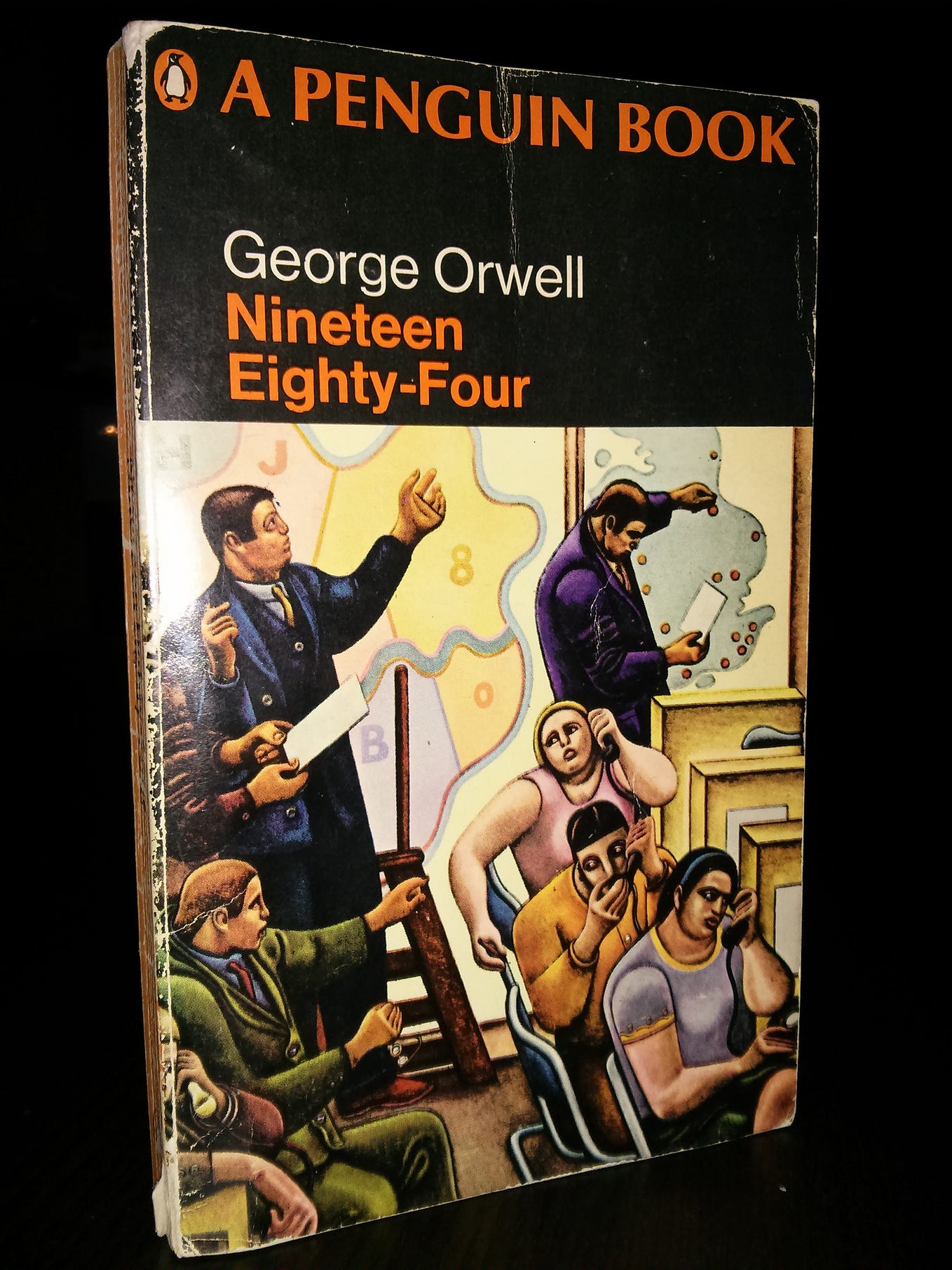
And the most common and most famous color was orange for fiction.

A sympathetic publisher, Jonathan Cape, gave Lane permission to reprint 10 of its titles in order to give him a start.
The first Penguin was Ariel, that Shelley biography, and it was blue. Next up was A Farewell to Arms by Ernest Hemingway, which had been first published 6 years earlier. It was orange. The first 10 Penguins also included novels by Agatha Christie and Dorothy L Sayers.
Each Penguin paperback cost just six pence (or six pence as we used to say in England), which was the same price as a packet of cigarettes. This was crucial as hardcovers cost seven or eight shillings at the time. Penguins were also easy to carry and ideal for reading on trains or at the bus stop or even around the campfire if you were British soldier fighting in World War II.
Lane had planned that Penguins would be sold via vending machines at train stations but the tipping point actually came when Woolworth’s began to stock them in their high street stores. Woolworth’s had a motto — ‘nothing over sixpence’ — which made them an ideal partner. However, this partnership needed a slice of luck to get started.
Woolworth’s buyer Clifford Prescott, an American, was not impressed by Lane’s initial pitch. Their meeting was interrupted by Prescott’s wife who saw Lane’s Penguins spread across the table. She said she’d buy a couple each week when they cost just six pence each. Prescott listened to his better half and ordered 36,000 books from Penguin.
Within a year, Penguin had sold 3 million paperbacks and it was split off from the Bodley Head to be its own standalone publisher.
The color coding was a masterstroke. A Penguin could be spotted 20 yards away. You could clearly see them on a shelf in a shop or being read by a stranger at the other end of the train carriage. Even today, a shelf of vintage orange Penguins still stands out in a used bookstore.
By the way, grey was also used for books about world affairs. For instance, Hiroshima by John Hersey, a really important book that told the world about the true after-effects of nuclear warfare, was published in grey. These grey Penguins are quite hard to find.
And then there’s the Penguin logo. It’s simple and informal. Penguin’s designer Edward Young went to London zoo, and drew real penguins in order to get started. The logo has been altered several times, with the beak pointing to the left or the right at various times, but it has remained recognizable to anyone who has ever walked into a bookshop.
Like any half decent company, Penguin doubled down on a winning formula.
In 1937 they launched Pelican Books — a line of non-fiction paperbacks in turquoise that brought educational literature to millions of readers. The first Pelican was George Bernard Shaw’s concisely named book, The Intelligent Woman’s Guide to Socialism, Capitalism, Sovietism and Fascism.
In 1940, Penguin started Puffin for children’s books. I grew up reading Puffins — they helped shape my childhood and there are many more people just like me. My Puffin paperback editions of the Narnia stories are among my most treasured possessions.
There was Ptarmigans, a line of books started in the mid-1940s devoted to puzzles, trivia, and word games.
Penguin Specials were a series of books about contemporary politics and social issues. More than a hundred were issued during World War II.
There was a series on African literature, one on English buildings, Shakespeare, poetry and a series called baby Puffins for very young readers.
Conversely, Penguin also dabbled in the higher end of the market with King Penguins from 1939 to 1959 — these were high quality hardcover books with color illustrations designed to be collectible from the word go.
Penguin had revolutionized publishing and reading within a decade of its launch. By 1954 Penguin had published one thousand titles in its main series.
Penguin’s finest hour probably came in when they published a full uncensored edition of D. H. Lawrence’s Lady Chatterley’s Lover in 1960. That novel isn’t particularly racy by today’s standards but in 1960 its sexual content was a big deal.
The book was the subject of a watershed court case that challenged Britain’s Obscene Publications Act. Lane and Penguin won, and sold more than two million copies of the novel in the following 12 months.
Penguin went on to publish hundreds of books of significance and helped many talented authors become household names. Always willing to experiment, especially in cover design, it branched out into other areas of publishing and today it is part of a huge media conglomerate following a merger with Random House.
Penguin remains the master of repackaging. Since 1946, its line of Penguin Classics has republished ground-breaking literature — from the Odyssey to Dracula — and used clever cover design to keep these titles feeling fresh.
The Penguin legacy can be witnessed in glorious technicolor in every used bookshop of the world. Shelf after shelf of slim orange paperbacks offering literature worth reading. I’m always drawn to these shelves.
Visit the home of a serious Penguin collector and you’ll see some seriously colorful shelf arrangements. Collecting vintage Penguins is fun, straight-forward and cheap.
And it all began with an idea dreamed up while waiting for a train.