


Yves Saint Laurent logo history: A symbol of French fashion excellence
Sleek, stylish, and sophisticated, the Yves Saint Laurent logo is a beacon of excellence to many fashion, and beauty fans. For decades, the YSL logo has stood as a symbol of luxury to fans all over the globe. But, how much do you know about Yves Saint Laurent logo history?
For many years, the Yves Saint Laurent emblem remained relatively consistent, appearing not just on the company’s branded assets, but also as part of the design for many of their products.
However, like many famous beauty brands, YSL did eventually update its logo, to adhere to the preferences of the changing marketplace.
If you’ve ever wondered where the original Yves Saint Laurent symbol came from, or why the design was eventually changed, you’re in the right place. Today, we’re going to take a closer look at the history of the Yves Saint Laurent logo, and its impact on the fashion market.
The YSL logo: An introduction to Yves Saint Laurent
Before we begin our adventure into Yves Saint Laurent logo history, let’s take a moment to get to know the brand itself. Yves Saint Laurent, otherwise known as YSL, is a French luxury fashion house, responsible for producing not only high-quality clothing, but cosmetics and accessories too.
The eponymous company was created by a man named Yves Saint Laurent alongside Pierre Berge in 1962. Soon after, the company invested in its very first logo design, created by a well-known and highly sought-after graphic designer named A.M. Cassandre.
Yves Saint Laurent is responsible for many of the major fashion movements introduced throughout history. The brand popularized the beatnik look, and frequently created clothing collections influenced by famous artists, Chinese clothing manufacturers, and cultural movements.
Today, Yves Saint Laurent is best-known for selling ready-to-wear haute couture, leather accessories, footwear, and more. The cosmetics line produced by the brand belongs to the larger L’Oréal company, alongside many other well-known beauty lines.
Yves Saint Laurent logo history: Through the years
As mentioned above, the Yves Saint Laurent logo remained relatively consistent for the majority of the company’s life. The famous YSL logo was produced by a well-known designer, using the name “Cassandre”.
At the time, Adolphe Jean Marie Mouron (Cassandre) was one of the most popular artists in the industry, loved for his synthetic, geometric style.
For YSL, the designer created a simple monogram emblem, consisting of three intertwined initials, to appear alongside the brand’s compelling wordmark.
The first emblem in Yves Saint Laurent logo history was introduced at the beginning of the brand’s inception. Founder Yves Saint Laurent sought out the assistance of the designer, Cassandre, to help create an iconic emblem for the budding company.
The YSL trademark was sadly one of the last works Cassandre produced before he eventually took his own life.
Cassandre’s work was often inspired by artistic movements such as Surrealism and Cubism. As a result, at the time, the YSL logo looked quite unusual, helping to set it apart from the other fashion companies and beauty brands of the time.
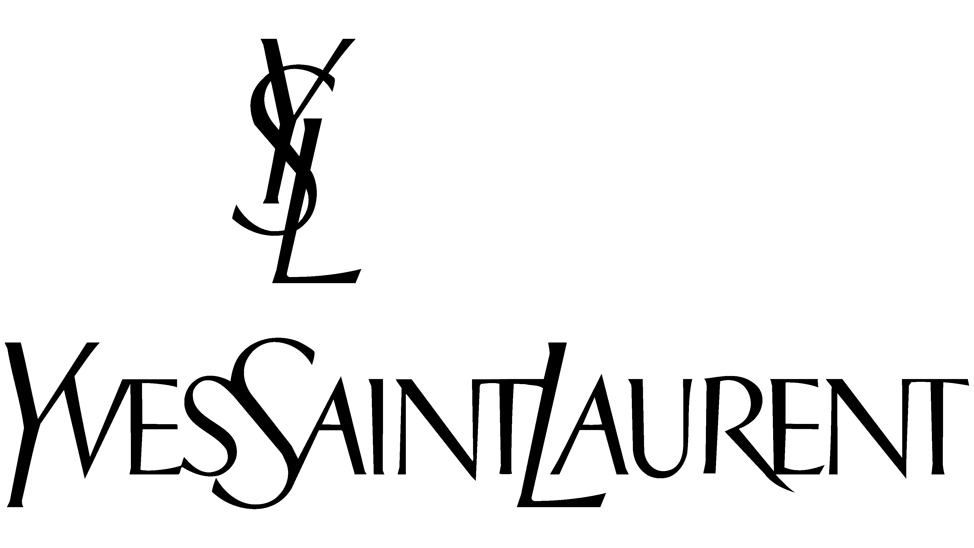
The symbol consisted of two core elements. The first was the vertical monogram, which placed the stylized letters of “Y”, “S”, and “L” in an overlapping format, creating a sensual, inclusive vibe. The letters all had short, sharp serifs, with lines in varying thickness, for a unique contrasting appeal.
Underneath the monogram, the name of the company was written in an equally eye-catching typeface, with the first letters of each word dipping just below the baseline for the rest of the wordmark.
The letters were all depicted in uppercase, with sharp pointed edges and slightly slanted lines. The lack of spacing between the words allowed the components to blend together seamlessly.
2012
The YSL logo has only undergone one major change throughout its history, during 2012. At this stage, the fashion and beauty company decided to update its name to just “Saint Laurent”. The new logo featured virtually none of the components of the previous design.
The name “Saint Laurent” is depicted in a bold, sans-serif font, with balanced spacing to separate the two words. Underneath the primary wordmark, we see the word “Paris” written in a contrasting serif font with short serifs. The “Paris” element is occasionally removed from the emblem.
The only thing that remains in this new banner from the previous logo is the simplistic color palette of black and white. The new logo, like the previous design appears in black on a white background in most cases, symbolizing sophistication, and elegance.
The Yves Saint Laurent logo: Colors and fonts
For years, the Yves Saint Laurent logo remained untouched, demonstrating the strength, elegance, and durability of the brand.
It was only when YSL decided to update their name to something a little simpler, that the logo design was officially changed. Notably, in some cases, the YSL monogram still appears on certain products. This design is also still present on the YSL Beauty line.
Although the overall design of the YSL logo has changed significantly over the years, certain elements remain consistent. The emblem still highlights the name of the company as its primary characteristic, and continues to use the black and white color palette.
You can find some useful examples of the Yves Saint Laurent logo below:
What color is the Yves Saint Laurent logo?
While Yves Saint Laurent has modernized its logo within the last couple of decades, the company didn’t make any significant changes to its core color palette. Since inception, the Yves Saint Laurent logo colors have always been a compelling combination of white and black.
These colors are relatively common in both the beauty and fashion landscape for numerous reasons. They’re easy to use across a range of different materials and mediums, and blend well with different shades.
Additionally, the Yves Saint Laurent logo color palette helps to convey crucial information about the company’s values of simplicity, sophistication, and elegance.
What font does the Yves Saint Laurent logo use?
The first YSL logo introduced for the company used an interesting selection of typefaces, designed in Italic and Roman style fonts. The letters had various unique components to them, including short serifs, and varying line thicknesses.
When the emblem was updated in 2012, the Yves Saint Laurent logo font was changed too.
Today, the name of the company appears in a font style similar to Neue Helvetica, a bold and modern sans-serif typeface. The word “Paris” which sometimes appears beneath the main wordmark is similar in style to Copperplate Gothic Std bold.
The sophisticated Yves Saint Laurent emblem
While the new Yves Saint Laurent logo is relatively simplistic in style, it still sends an important message about the brand in question. The bold, eye-catching font used in the logo helps to highlight the stability and sophistication of the brand.
The minimalist black and white color palette makes the company look professional and elegant.
The simplified logo also removes some of the complexity from the previous design, helping the company to adhere to the changing trends of logo design in the modern world.
YSL logo FAQ
What does the YSL logo stand for?
The YSL monogram, which still appears on some of the company’s products, as well as in its beauty line, simply stands for the name of the brand, Yves Saint Laurent. However, it’s unique design also conveys ideas of sophistication, elegance, and unity.
Did YSL change its logo?
Officially, the Yves Saint Laurent brand updated its logo in 2012, with a simpler version of the company’s name. However, the YSL monogram still appears on a number of products produced by the company, and remains well recognized around the world.
Is YSL still owned by Gucci?
Technically, Gucci never owned Yves Saint Laurent, but the two companies are both owned by the same parent brand, Kering. This company is also responsible for a range of other well-known luxury fashion houses, such as Balenciaga, and Alexander McQueen.
Fabrik: A branding agency for our times.

As Fabrik’s creative director, Stephen oversees complex branding programmes. He advises our clients on their tone of voice, creates logos and visual identities and crafts names for companies, products and services. Writing for Brand Fabrik Stephen reflects his love for logo design and visual identity.