
Learning about typestyles is a great way to improve your design game. Understanding the wide variety of styles, their history and visual characteristics, helps designers make more informed choices and come up with better type combinations for their projects. Outlined here are the major type classifications. To help recognize the typestyles in the wild, we’ve included some choice typefaces at Creative Market.
Pin this for later

Serif Typestyles
Serif typefaces originated with the Latin alphabet and words carved into stone during the Roman antiquity or classical era. The typestyle is defined by the serif which is the small line or shape attached to the end of a letter or symbol.
Old Style or Garaldes
Old Style serifs were created from the 15th to 18th century and include many of the original Roman types. The typestyle is recognizable by its quaint look and more specifically by the letters diagonal stress on curved strokes and somewhat heavy hairlines. Well-known examples of this font style are Garamond, Caslon and Bembo. Old style fonts are commonly used in newspaper design.
Gauthier
Gauthier from Black Foundry is a Renaissance style typeface made contemporary. Gauthier would be an excellent choice for long passages of text.
Transitional
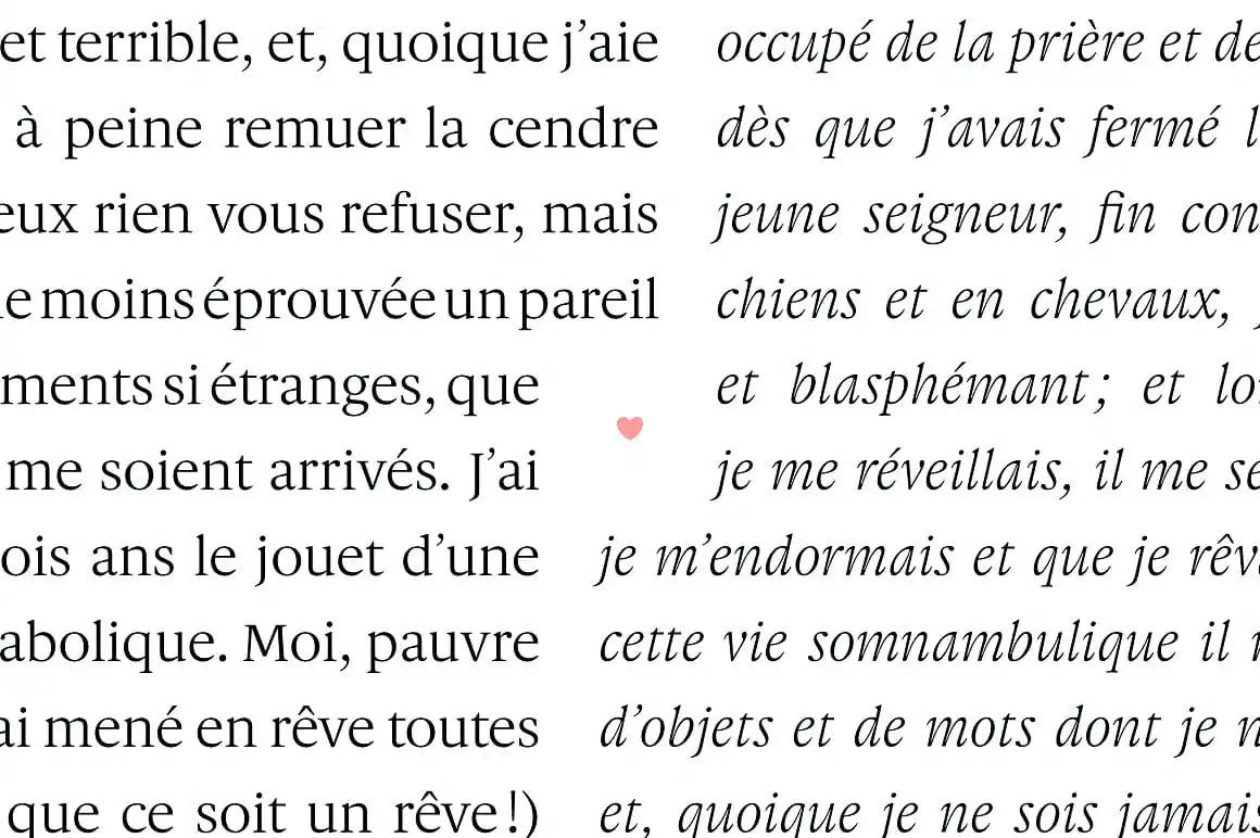
Transitional fonts come from the Enlightenment, a revolutionary time of change during the 17th century. The type styles of this era are as their name suggests, they are ‘transitional’ between Old Style and Modern typefaces. Transitional font styles are a very common serif type. Examples of famous transitional typefaces include Baskerville, Bookman, Georgia and Times New Roman. Characteristics of a transitional font are that it stands upright, the thick and thin strokes have ample contrast, and the serifs are wider and bracketed.
Adriene Text
The font Adriene Text by Typefolio is a clear example of a transitional typeface. Adriene Text would be a good choice for business cards and stationery.
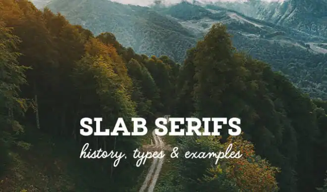
Slab or Egyptian
The Slab Serif or Egyptian typestyle rose to popularity in the 19th century and was a favorite of the advertising industry. The bold weighted display version of this typestyle has a lot of visual impact and was used on pamphlets, posters, and billboards. Slab serifs can be identified by their heavy serifs with no bracketing. Famous slab typefaces include ITC Lubalin Graph and Rockwell.
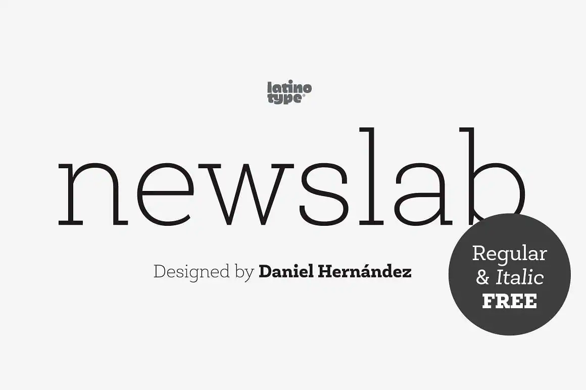
Newslab
Newslab from Latinotype is a versatile and creative example of a slab serif typeface. Newslab is the combination of three other typefaces: Andes, Sanchez, and Roble. The font has a whopping 16 variants and eight weights and is well-suited for any design project.
Glyphic
Glyphic fonts were first seen carved in stone and have a decidedly classical look. They are recognizable by their sharp pointed serifs that are sometimes called “thorn” serifs. Glyphic fonts are often used for luxury brands and in real estate. Penumbra, Albertus and Pompei are well-known examples of this font style.
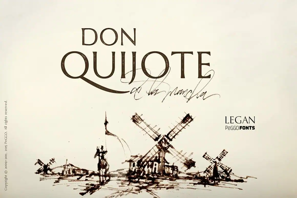
Legan
Legan from Peggo Fonts is a great example of a contemporary glyphic font that is inspired by the classical patterns of this typestyle. The font is fully-featured with 1,464 glyphs and an extended latin set.
Modern, Didone or Neo-Classical
Modern serifs, a.k.a. Didones and Neo-Classicals, date back to the late 1700s and are elegant and sophisticated in style. Modern typefaces are seen often in fashion and luxury goods design projects. The logo for Vogue magazine and Christian Dior both use modern style serifs. You can detect the modern style by the extreme difference between thick and thin strokes and the serifs without bracketing. Famous examples of this type style are Didot and Bodoni.
Port
Port from Onrepeat Types is a chic example of a contemporary modern font that really accentuates the characteristics of this typestyle artfully.
Sans Serif Typestyles
Sans serif typestyles are simply typefaces that do not have serifs at the end of strokes. Sans serifs are commonly used for computers and mobiles because digital displays have difficulty visually resolving fine details like serifs. Sans serifs are sometimes referred to as Gothic typefaces but that is rare these days.
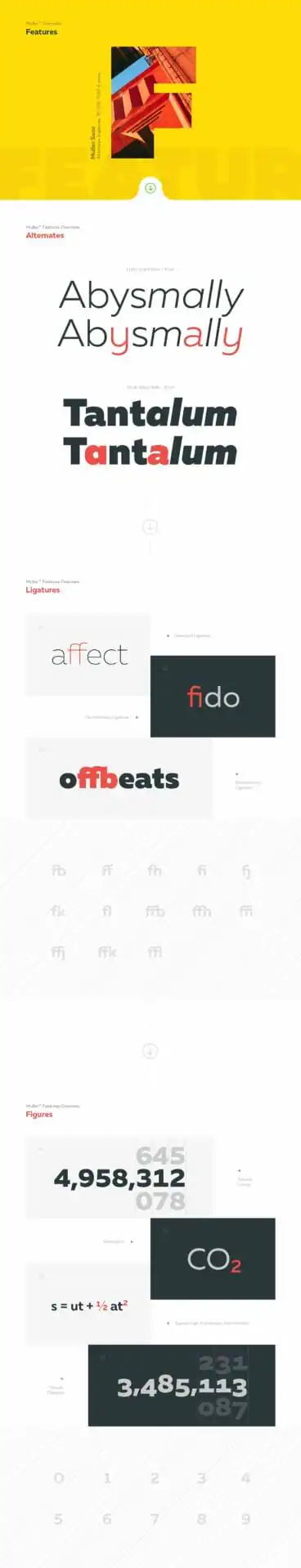
Muller
Muller from Font Fabric is an excellent sans serif typeface that has twenty weights from thin to heavy plus full italics. The font family was designed to work well for small text and very large and is a highly versatile universal typeface suitable for all design project types.
Grotesque
Grotesque typefaces are early grotesques, not the newer ones. Grotesques are best known for their idiosyncracies and errors like uneven weights and irregular curves. Designers may choose a grotesque over a neo-grotesque however because these quirks can add visual character to a design. A well-known example of this font style is Franklin Gothic.
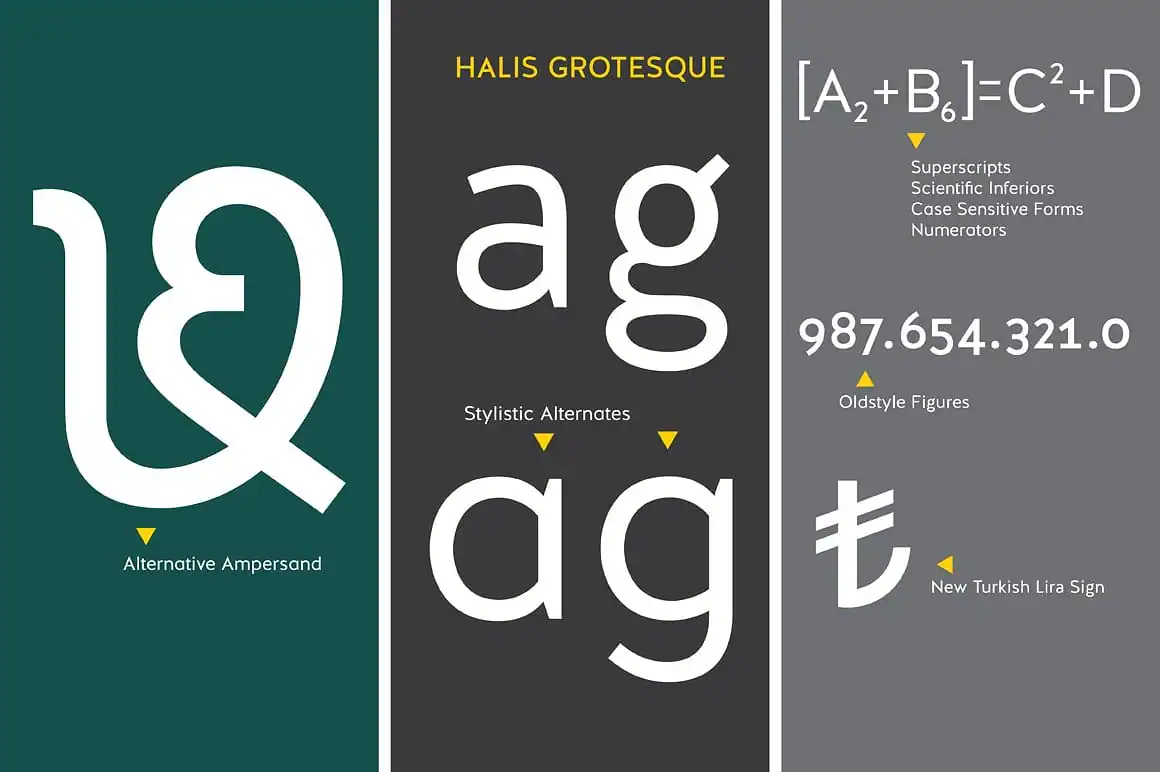
Halis Grotesque
Halis Grotesque from AA Type is a clean, open and adaptable typeface with thirty-two fonts and eight weights including old style figures, a gorgeous alternate ampersand and scientific inferiors. Halis Grotesque is suitable for all types of design projects.
Neo-Grotesque
Neo-grotesques are what most people think of as a typical sans serifs and include common fonts like Helvetica and Arial. The font style is from the 1950s and is sometimes called the Swiss style. Neo-grotesques have a straightforward almost plain appearance with balanced even widths for letters and limited variation in stroke weight.
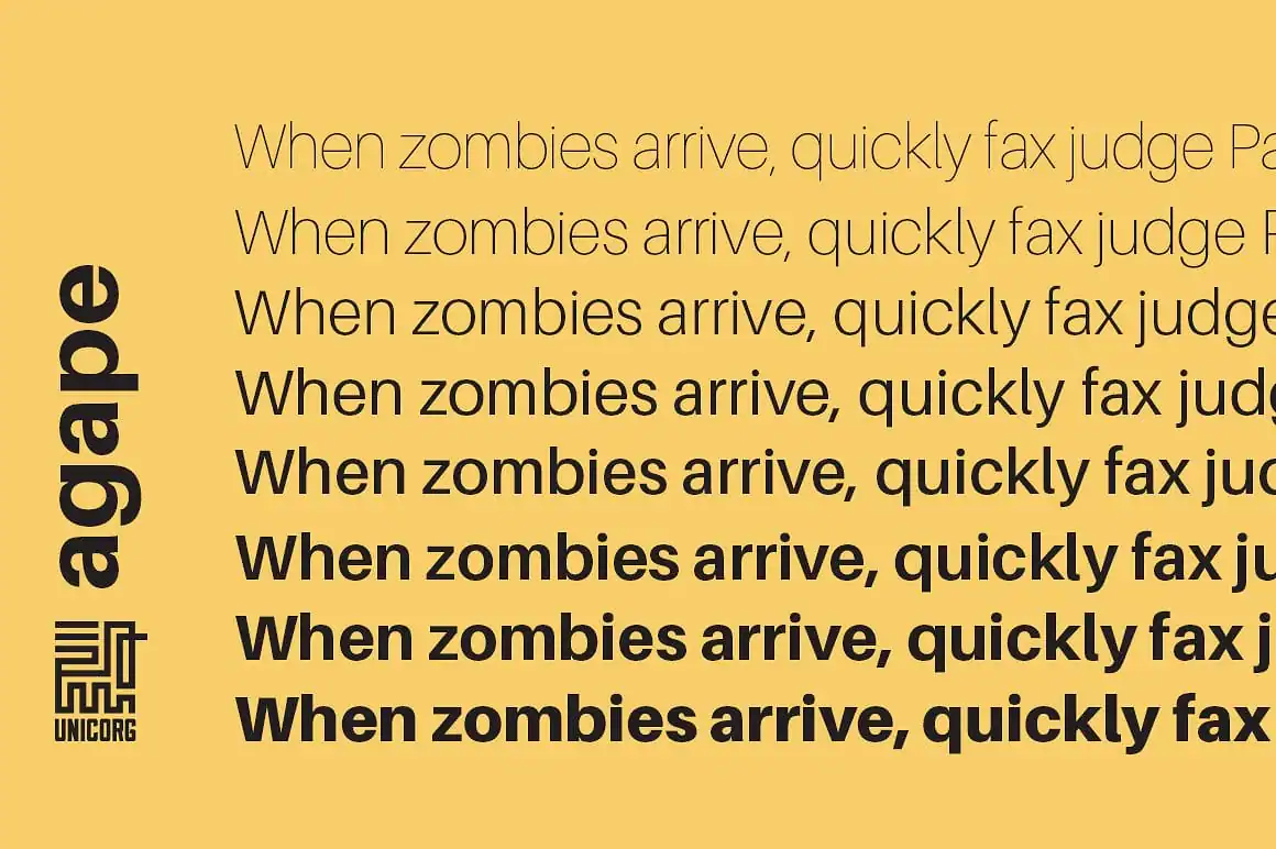
Agape
Agape from Chiotis is a clear neo-grotesque and can be used as an affordable Helvetica alternative. The font family comes with eight weight variations and italics.
Humanist
Humanist sans serifs are distinguished by their slightly calligraphic look with letterforms that have more contrasted thick and thin strokes. The stroke characteristics and openness of the font style make it a wonderful choice for long passages of text. The design style varies more than most sans serifs and sometimes resembles handwriting or is quite clean. Famous typefaces that are humanist include Gill Sans and Corbel.
Klaus FY
Klaus FY from Black Foundry is a contemporary humanist font family that is highly legible and has a visually appealing and distinct look. The typeface has ten styles and small caps and would be a great choice for editorial design projects.
Geometric
Geometric typefaces are favored by graphic designers right now. Futura designed by Paul Renner is considered the ultimate geometric typeface and other popular choices include Gotham and Brandon Grotesque. Geometric sans serifs first were created in the 1920s and are praised for their clean modern look reminiscent of the European design of the Bauhaus. They are immediately recognizable because of their perfect geometry, they have complete circles and straight lines and strokes of even width.
Greycliff CF
Greycliff by Connary Fagen is a near-monoline geometric sans serif. The design stands out for its classic look, sturdy construction and slightly rounded edges that soften its visual appearance.
Script Typestyles
Script typefaces have a fluid and flowing stroke that is based on handwriting or calligraphy. Creative Market has many excellent examples of script typefaces. A variety of pen and brush styles and techniques are used to create these fonts.
Northwell
The Northwell hand-written font by Sam Parrett is a lovely example of a script type. The design is in a dry brush style. Dry brush scripts appear real to life with a textured look. Northwell can be used for many kinds of projects like branding, blogging and packaging design jobs. The best thing about script fonts like Northwell is that they are highly versatile and are at home in rustic or luxe design projects.

Formal
Formal scripts are classic and elegant typefaces that hinder from the 17th century. They were originally created with a metal pen nib which lends them a refined look with graceful swooping swashes. You’ll find them in use on wedding invitations or for other formal events. Famous formal scripts include Edwardian Script and Dorchester.
Mozart Script
You can’t get more much more formal than the Mozart script by Blessed Print. A beautiful example of a formal font family that appears like precise penmanship.
Casual
Casual scripts are friendly, relaxed and personal. A casual script looks like someone’s quickly written note or just their regular handwriting. The letters can connect or not but the mood remains the same. Many popular handwriting fonts at Creative Market fall into the casual script category.
Blackstone
Black Stone by Ojes Studio is a stylish example of a casual script typeface. It has a semi-bold stroke with some texture and a quickly drawn slightly understated look.
Calligraphic
Calligraphic scripts appear like they are made with a calligraphy pen. They can vary in contrast between thick and thin strokes or have letters that either connect or do not. Classic examples of this typestyle are Mistral and Vivaldi.
Brilliant
The Brilliant script from Unicode is a fresh take on the calligraphic typestyle with a pleasant visual appearance. The font family has 305 glyphs in total and includes decorative characters. Brilliant would be a good choice for social media, greeting card and branding design projects.
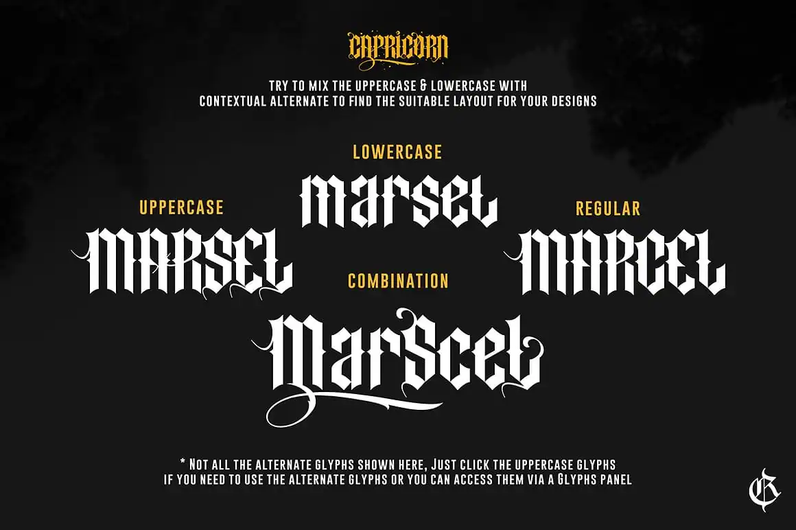
Blackletter, Lombardic, Fraktur or Old English
The Blackletter typestyle was invented with the Gutenberg printing press as it was used quite a bit in early print projects, like for the Gutenberg Bible. Blackletter styles are based on a medieval scribal hand-made type that was created with a pen with a broad nib. Blackletter scripts tend to be heavy and have a very distinct look with a dramatic difference between thick and thin strokes and elaborate embellishments. You can see Blackletter typestyles in use as the titling for newspapers like the New York Times and Los Angeles Times. Classic examples of this typestyle are Goudy Text, Old English and Fette Fraktur.
New Capricorn
New Capricorn by RVQ Type Foundry is a bold, elegant and artful example of a blackletter font. New Unicorn would work well for signage, product and packaging design projects.
Non-Western
Non-western fonts can be either sans serif, script or serif but are written in non-western languages like Chinese and Arabic.
Arabigram
Arabic calligraphy and letter-making is an art unto itself and has a long tradition. The Arabigram project by Mostafa El Abasiry is an exciting example of a non-western design because it’s an Arabic font inspired by the Chinese Tangram. It appears like an ornate grid-based geometric design and reads like the Arabic language.
Decorative or Display
Decorative or display typefaces fall into a variety of categories or defy categorization completely, but what they share in common is that they have a strong and unique visual character that makes them the perfect choice to put on display for article headlines, book covers, and poster designs.
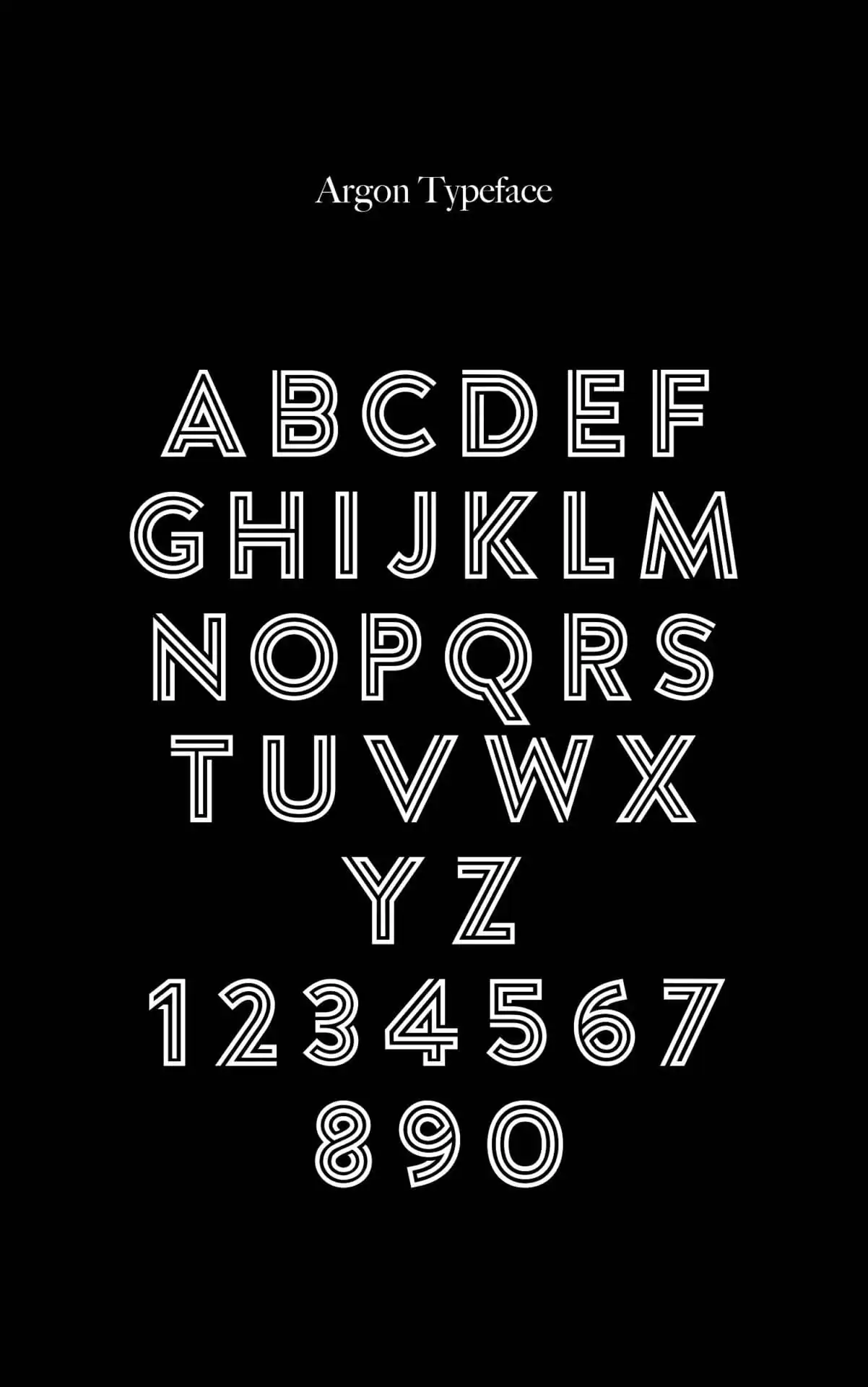
Argon
Argon by Tom Anders is a futuristic, sporty and modern geometric typeface in an offset style. The typeface looks good big as high impact text in design projects.
Specialty
Specialty fonts also defy categorization and can be super niche or experimental in nature.
Woodblock Collection – Sans & Slab
The Woodblock collection by Hustle Supply Co is an example of a specialty typeface because it is a contemporary woodblock design made digitally. The key characteristic of the design collection is that it provides a way to apply different woodblock texture strengths to design projects, imbuing them with a realistic hand-made rustic look.
Products Seen In This Post:

Download these worksheets and start practicing with simple instructions and tracing exercises.
Download now!


Creative source. Find Topo Map, Terrazzo, Neo Geo, Gradient, Minimal and Wabi-Sabi design items here.
View More Posts
