
Let’s look at the Wonder Woman logo and some history behind the comic movie.
The American mythical and fictional character, Wonder Woman, is one of the most recognizable comic figures in history. It rocks shoulders with iconic superheroes like Superman, Batman, and Spiderman. Wonder Woman is based on the ideals of William Moulton Marston.
William, the master architect of the comic series, fantasized about a world ruled by a new era of women with mysterious powers and strengths. He believed a woman can be strong yet caring and tough yet considerate. He wanted a world where women dominate their domains.
The mystical female identified as Princess Diana was born from the secret affairs between Zeus and Queen Hippolyta. She came to the universe as a demigod and not a mortal human being. To differentiate herself from other characters, she always moves with a trademark.
The logo that represented her possesses the power of speed, agility, and strength. It comprises two letters—W, where one letter sits above the other in a stylized fashion. To help the logo depict the king of birds, it comes with an abstract beak and wings.
This adventurous trademark is restless, always finding remedies to people’s challenges. So it stays awake on books, t-shirts, billboards, websites, and other territorial mediums to spot impending dangers.
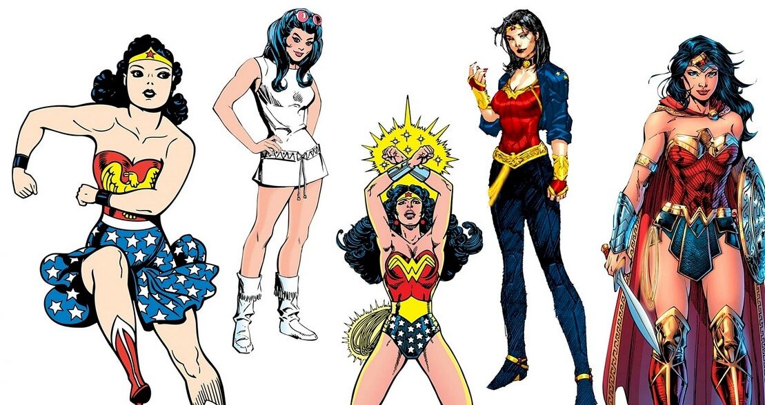
The Evolution of Wonder Woman Logo
![]()
The Wonder Woman’s trademark for the past eight decades has evolved a little. The logo has seen minor changes and kept its core values. This has been extremely helpful to its brand awareness. Let’s fly together to learn about these updates:
1941—The Bird–Styled Logo:
The original Wonder Woman’s logo was unveiled in 1941. It featured an abstract–styled bird on a solid red frame. The yellow bird had its wings rounded with visible black outlines. The design looked elegant and outstanding.
1982—The Lettered–Styled Logo:
After forty-one years, Wonder Woman had a new logo design. This time, it ditched the bird emblem for a letter version—the symbol comprising two letters—W, one on top of the other. To keep the brand’s personality, the designer elongated the ends of the letters to look like wings.
2006—The Yellow–Lettered Logo:
The owners of Wonder Woman sort for another logo to represent their brand. The new trademark welcomes the double letter—W on a darker red frame. Unlike the previous one, this two–combined letters had a bird’s head with a beak. It also has a thick black outline. Its ends were skewed downwards. It’s still used today.
2011—The Flying Logo:
The superheroine was given yet another emblem after five years of using the colorful logo design. It comprised the twin letters—W in flight. The wings change from the noted one, and light gold became its color. It had a sharp outline, evoking a charisma of strength and courage.
2016—Today:
This logo design borrows some features from the previous ones: It mirrored the straight ends from the 1982 design and the bird’s head and beak from the 2006 logo design. The trademark looked three–dimensional, with a dark golden shade of color. The color also looked like a wooden colored palette.
Why Does Wonder Woman Logo Works?![]()
1. The Logo Is Consistent:
Consistency is key to building positive brand awareness. And the Wonder Woman logo has lived up to that expectation. Though it has had few variations, for about 80 years, it has kept its core personality. This has helped it to build loyal and supporting followers.
2. The Logo Is Simple:
Almost all iconic logos share one common feature, simplicity. The designers of Wonder Woman logos favored modest designs. This reflects in all the trademarks that have represented the comic movie. The logo is clean with no intricate graphic elements to distort its meaning. Fans and critics can relate to it at all times because of this attribute.
3. The Logo Is Versatile:
The Wonder Woman logo is a conqueror—It flies everywhere, defeating enemies and taking territories. And because of its simple layout, it can suit any marketing medium without asking for permission.
4. The Logo Is Memorable:
You can hardly forget Wonder Woman’s logo design. Anyone who sees it can quickly memorize and recall it with no difficulty. This is because it’s attractive and has a recognizable design symbol identifiable by all and sundry. In effect, it gets engraved in your mind whenever you come into contact with it.
5. The Logo Is Unique:
The W—logo, like its bird version, is soaring higher above the competition. Anywhere it perches, fans would see and identify it from the multitude. The emblem has earned this bragging right because of its uniqueness, a feature that most logos lack to stand tall.
The Wonder Woman Logo Design Elements
![]()
Wonder Woman’s logo has had some unique emblems. This stemmed from the identical and powerful graphic elements that coined its personality. From the first trademark to the current one, its designers have used a protective bird, frame, bright colors, and unique typeface to make it soar above rivals. Let’s explore these powerful graphic elements further:
Wonder Woman Shape And Symbols
1. An Eagle:
The golden bird that formed the original logo was an eagle. The emperor of all winged birds, the eagle, signifies power, authority, and bravery. It also stands for speed, pride, royalty, and leadership. Some cultures regard it as an all–seeing creature because of its acute eyesight. Yes, eagles have eyes that are up to eight times sharper than humans.
2. A Square:
A square frame has been part of the comic and fictional Logo of Wonder Woman. It was used in the 1941 and 2006 logo designs to host the stylized yellow symbols. A square can symbolize the ends of the earth—north, east, south, and west. The shape can also convey a feeling of community, integrity, and direction.
3. The Letter W:
The letter—W has become widely attached to the Wonder Woman’s brand. It’s the 23rd letter of the alphabet. Though the twin letters stand for Wonder Woman, we can read other meanings into it. The letter is a symbol of wealth, wellbeing, and willpower. It can also signify the womb, the female reproductive power. In the mythical sense, we can align it to a witch and wizard.
The Wonder Woman Logo Colors:
1. Black Color:
Logo designers used black to evoke the power and mystery attached to the brands they work with. The color is linked with authority, elegance, and strength. This mourning color can also signify death, evil, and fear. It’s the opposite color of white. You’ll find it as the outline color.
2. White Color:
It’s hard to find the black color without its balancing friend, the white. They are perfect matching colors and mostly move together. Graphic artists used it to convey a sense of purity, goodness, and cleanliness. The color can also signify innocence, humility, and safety.
3. Yellow Color:
In the previous logos, the color of sunshine dominates Wonder Woman’s logo. Yellow evokes happiness, clarity, and freshness. Logo designers also used it to convey energy, optimism, and intellect by using it. It’s an attention-seeking color and can serve as a perfect balancing color.
4. Red Color:
Fire and blood give us a good idea about the color red. As an intense color, it mainly served the background color of Wonder Woman’s Logo. Red stands for vigor, passion, and courage. It can also speak of rage, stress, and anger. Like yellow, it also grabs attention faster and pushes people to take action.
5. Gold Color:
The current w—logo has a light gold color. The gold color is a warm color that signifies wealth, riches, and royalty. Prosperity, compassion, and wisdom are other emotions of the gold color.
What Font Is Wonder Woman Using?
The uppercase letters used in Wonder Woman’s logo design are custom. This geometric typeface is unique to the comic character’s brand. However, the font featured on the poster of the 2017 superhero film is Raleway Regular. On other movie posters, the font used is Futura, which Paul Renner created.
Who Designed Wonder Woman’s Logo?
Milton Glaser created the celebrated W—Logo with the wings at the ends in 1982. He developed this logotype from scratch, and it can take various colors. Because of its simplicity, it continues to represent the mystical feminine figure with some slight updates.
Who Created Wonder Woman?
William Moulton and Harry George Peter were two Americans who brought Wonder Woman into existence. William did the scripting while Peter gave life to the characters by illustrating them. Below, we can learn briefly about these two supporters of women’s rights:
William Moulton Marston:
Writing under the pen name Charles Moulton, William Moulton Marston was born on 9th May 1893 in Massachusetts to Frederick William Marston and Annie Dalton. William became an American psychologist who invented the polygraph—a lie-detecting device.
He was also a prolific author who focused on comics and self–help writing. One of his comic writing achievements was creating Wonder Woman, a character that took inspiration from his wife Elizabeth Holloway and their polygamous life partner, Olive Byrne.
William graduated from Harvard University in 1915 with a BA, and in 1918 received his LLB. Three years after his law degree, he got his Ph.D. in Psychology in 1921. He has taught in universities such as Tufts University, American University, and the University of South California.
He sold his maiden script, The Thief, to Alice Guy–Blache, a moviemaker who directed the film in 1913. William was a student at Harvard University when he wrote and sold his content. He had three women—Elizabeth Holloway, Olive Byrne, and Marjorie Wilkes.
Elizabeth had two children for him, a boy and a girl, whereas Olive gave him two boys. Olive became the caretaker of the four children, an agreement that made Elizabeth support the family financially.
Even though William Moulton Marston was inducted into the Comic Book Hall of Fame in 2006, he succumbed to cancer on 2nd May 1947. He died in Rye. At the DC Comics 50th anniversary publication in 1985, he was named as one of the honorees.
Harry George Peter:
Harry George Peter was a good friend to William Moulton. He was born to Mr. Louis Peter and Mrs. Louisa Peter in San Rafael, California, on 8th March 1880. He was the last of three children. He was a talented artist who had a long career as a cartoonist and newspaper illustrator.
He met his soul mate, Adonica Fulton when he worked for the Sans Francisco Chronicle. Coincidentally, she was also a cartoonist who worked as a staff artist for the San Francisco Bulletin. They tied the knot in 1912 and partnered in many illustration projects.
Peter, like William Moulton, had a deep passion for women’s rights. His affection is seen in most of the works that he illustrated and supported. Though he became famed with the Wonder Woman series, he had significantly impacted the book and art industry.
Some of his works include Alkali Bill, Animal Circus, The Modern Woman, and Diamond Smugglers. Readers also knew him for projects such as Fearless Flint, Man O’ Metal, and True Comics. Though he began his career at a younger age, his fame and success came after age 60.
Harry George Peter continued with the Wonder Woman series ten more years after the death of William Moulton. Finally, he was fired in 1957, and the comic series handed over to Ross Andru and Mike Esposito. Peter died on 8th May 1958 in Manhattan, New York.
How Did Wonder Woman Get Her Powers?
Aphrodite, the Greek god, gave her powers to protect herself and to defeat enemies. Mostly, she got her powers through training. Aphrodite is the force behind the creation of the Amazon Island. Agility, speed, and strength are the powers she possessed.
Besides her natural powers, she has devices that protect her from danger. These are bracelets, lasso, invisible plane, and tiara. The bracelet safeguards her from missiles, and the plane makes her fly into outer space. To know the truth from people, she uses the lasso–of–truth.
Who Is Wonder Woman’s Alter Ego?
Wonder Woman has two personalities—the conqueror and the caring one. The latter personality came to light when she helped Steve Trevor recover from injuries. On the Amazon Island where the US plane crashed, she appeared as Princess Diana, Queen Hippolyta’s daughter. After reviving him, she returned to the battlefield and fought alongside him to defeat the Axis powers.
How Big Is Wonder Woman?
Wonder Woman is an American comic movie based on the DC Comics of the same title. Several partners teamed up to make it successful. For instance, DC films produced the film in association with RatPac Entertainment and Tencent Pictures.
After production, Warner Bros Pictures ensured it’s distributed to the right target audience. With a running time of 2 hours and 21 minutes, the movie’s budget falls between $120–$150 million. In the US and Canada, it grossed $412.5 million, and in other nations, about $409.3 million.
Wrapping Up
 The Wonder Woman’s logo is weird yet straightforward enough to possess mystical powers. Princess Diana, the Amazonian warrior, is the alter ego of Wonder Woman who has received divine gifts from different gods. This makes her powerful and outstanding from everyone.
Her beauty, wisdom, movement, and strength are all from powerful gods. With these gifts, she has become as beautiful as Aphrodite, wise as Athena, swifter than Hermes, and stronger than Hercules. Interestingly, its current logo resonates with these emotions.
Whenever you plan to design a logo, ensure it captures your core values by choosing the graphic elements that highlight those ideas. You shouldn’t aim for a detailed design. Look at Wonder Woman’s trademark and learn from it.


