
What Is Dashboard In Excel?
The dashboard in Excel is one-page information that shows KPI results, i.e., Key Performance Indicators of a business over time. Users get most of the information from the data using this summary. The dashboard visually represents the data using elements such as charts, bars, etc.,
Table of contents
Key Takeaways
- A dashboard in Excel is typically a one-page storyteller of a large amount of data, where users are given an option of interactivity.
- It helps in decision-making as it highlights the important segments of the data.
- We can include elements such as charts, and bars to highlight and visually enhance the dashboard.
- Always convert the data structure into the Excel Table format to work smoothly and easily.
- When the dashboard is longer after inserting the slicers, freeze the page to make the slicers visible when we scroll down.
- Always give a name to the pivot tables you create.
Types Of Excel Dashboards
A dashboard can be created according to the needs of the end-user. There are many types of dashboard in Excel. The most commonly used types are:
- Sales Dashboard: This gives a complete picture of a company’s sales performance. We can track key performance indicators of sales, top items, and top salespersons and compare the results in this dashboard.
- HR Dashboard: This provides information on the human resource of the company. Headcount, department-wise performance, attrition rate, and resource shortage or overloads.
- Finance Dashboard: This summarizes all the KPIs about the finance like Net Profit, Gross Margin, Market Share, etc.,
- Inventory Dashboard: This will give a picture of inventories, shortage inventories, overstock inventories, fast-moving inventory, slow-moving inventory, etc.,
These are some important day-to-day dashboards commonly used in the real world. However, there are plenty in place according to the needs of the business.
Excel VBA – All in One Courses Bundle (35+ Hours of Video Tutorials)
If you want to learn Excel and VBA professionally, then Excel VBA All in One Courses Bundle (35+ hours) is the perfect solution. Whether you’re a beginner or an experienced user, this bundle covers it all – from Basic Excel to Advanced Excel, Macros, Power Query, and VBA.
How To Create Dashboard In Excel?
Before creating a dashboard, we should be aware of the objectives of the dashboard. We should also note down what are the KPIs that we are going to answer in the dashboard.
Let us use the following data to understand how to create dashboard in Excel.
The below table lists products with target and actual sales data. We need to use the following steps to build dashboard in Excel.
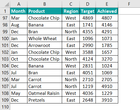
By using the above data, we will try to create a dashboard in excel to track each product’s performance and monthly sales.
The steps used to create a dashboard in Excel are as follows:
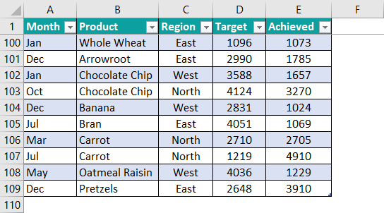
Step 1: To begin with, we need to convert the data range into an Excel table to make the data updating dynamic. So, select the entire data range and press the Excel shortcut keys Ctrl + T.
The Create Table window pops up.
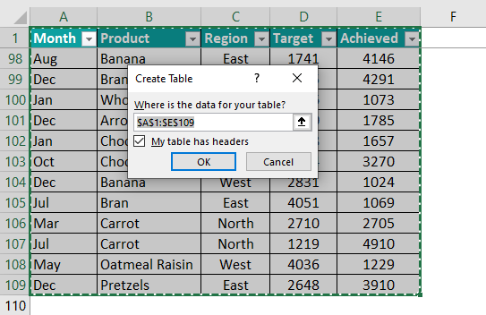
Next, click OK to convert the data range into Excel Table.
Step 2: The benefit of converting the data to an Excel Table is we just have to select any of the cells in the table and click on PivotTable under the Insert tab.
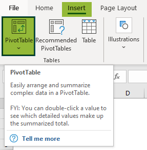
As soon as we click, Excel creates a pivot table in a new worksheet.
Now, change the name of the sheet to Pivot.
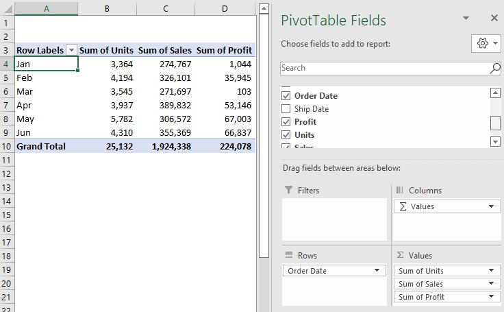
Step 3: Next, drag and drop fields to create a summary page.
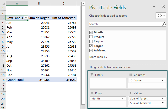
Now we have a monthly target and achieved summary.
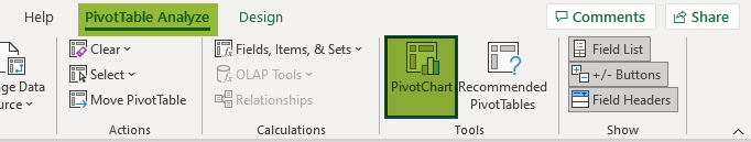
Step 4: Once the pivot table is created, we will visualize this monthly summary by creating a Pivot Chart.
So, select any cell in the pivot table and then click on Pivot Chart option under Pivot table Analyze tab.
Now, we need to choose the chart type.
In our example, let us choose Excel combo chart type. Now, change the target to a line chart, and achieve a clustered column chart.
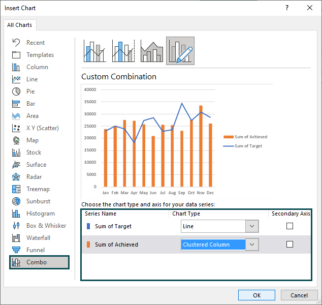
Click OK. We can see the following pivot chart.
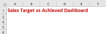
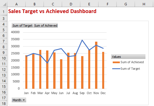
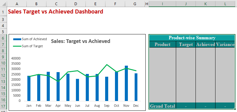
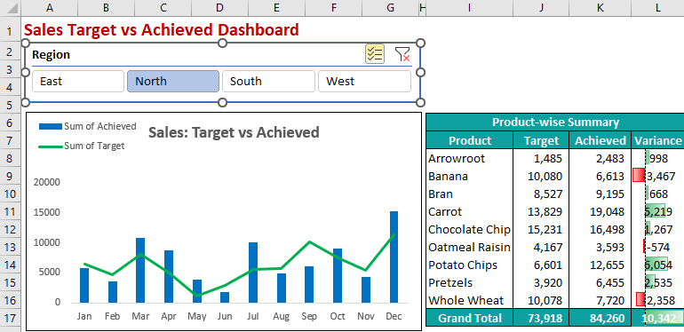
Step 5: Next, insert a new worksheet and name it Dashboard.
In this new worksheet, type the header as Sales Target vs Achieved Dashboard.
Then, cut the Pivot Chart and paste it into this worksheet.
Step 6: Usually, pivot chart created by default may not look attractive.
So, we need to refine it to make it look better.
We can do it by removing all the unwanted fields on the chart. So, right-click on any field and click on Hide All Field Buttons on Chart.
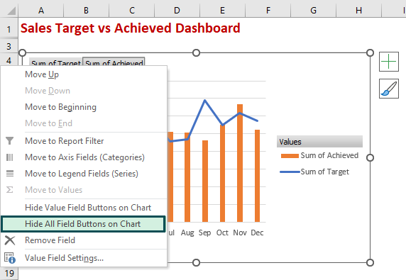
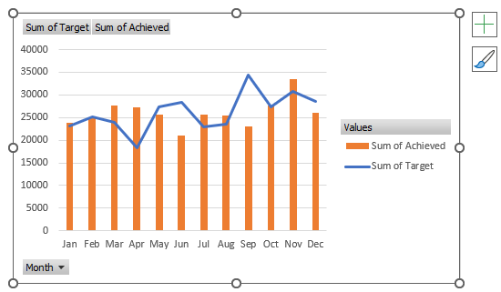
It will hide all the buttons on the chart.
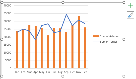
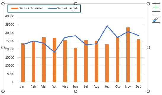
Now, bring legends on top of the chart.
Next, add chart title as Sales: Target vs Achieved.
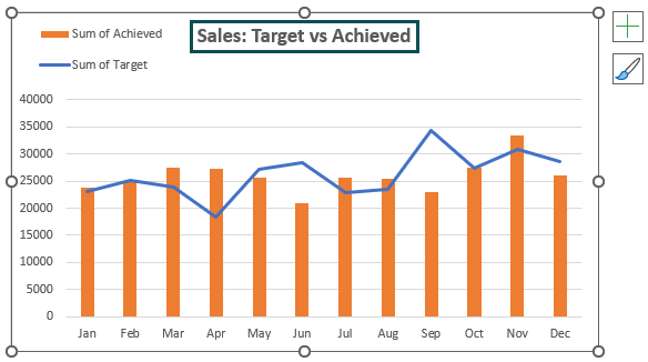
Then, remove gridlines from the chart.
Change the column bars and line chart to Blue and Green.
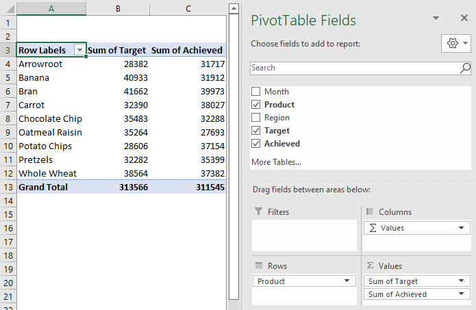
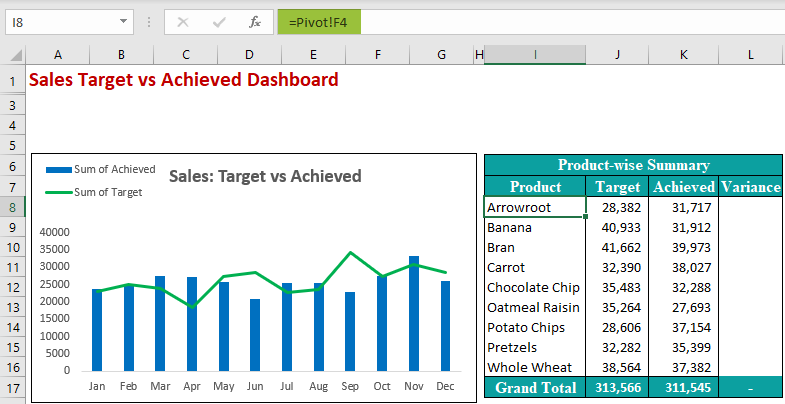
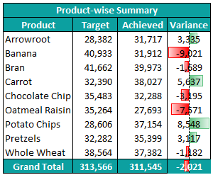
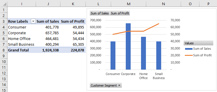
Step 7: In the pivot sheet, change fields to show the summary of product-wise sales.
Step 8: In the dashboard sheet, create the following table.
In cell I8, give the cell reference from the pivot table sheet.
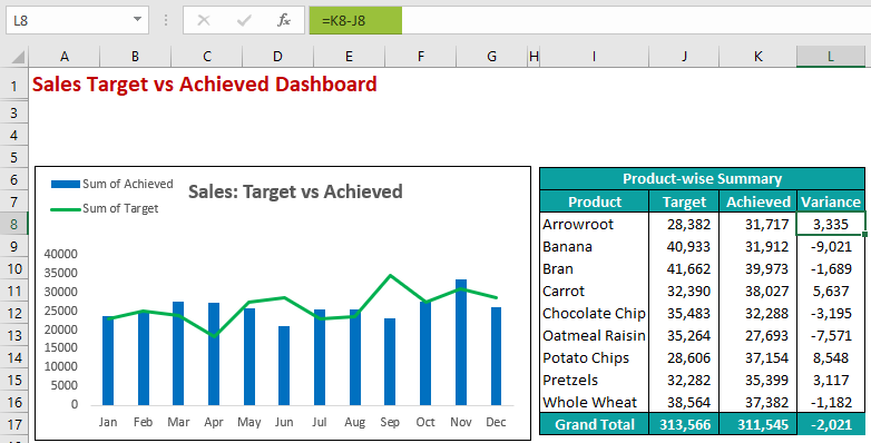
Next, calculate the variance by applying the following formula.
Variance = Achieved – Target
Step 9: Next, select the variance column. In the Conditional Formatting option, click on the data bars.
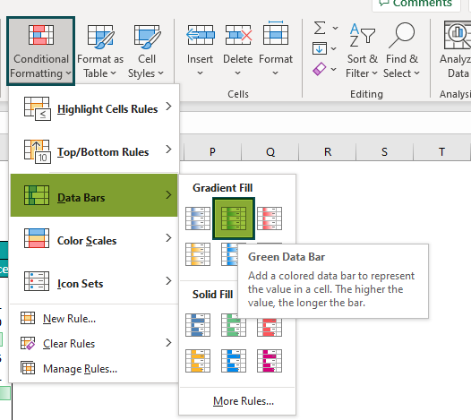
Now, the variance column will appear as shown in the following image.
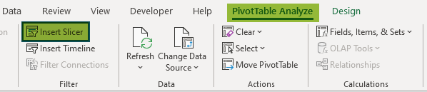
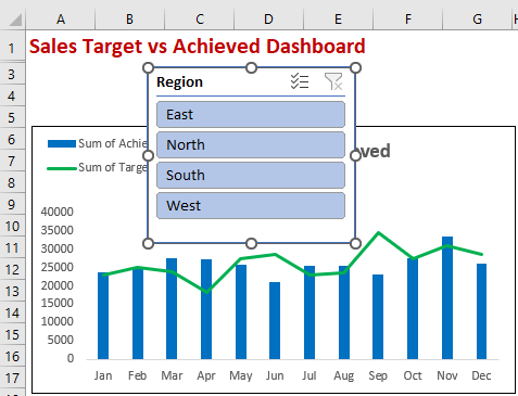
Step 10: We can use the slicing option to make the dashboard interactive. So, select any cell in the pivot table and then click on Insert Slicer option under PivotTable Analyze tab.
Next, the Insert Slicers window pops up.
Check the Region option.
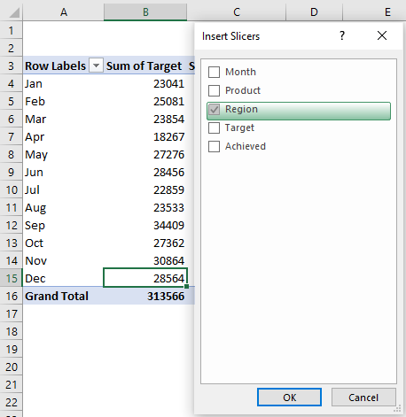
Now, click OK to create a Region slicer, as shown in the following image.
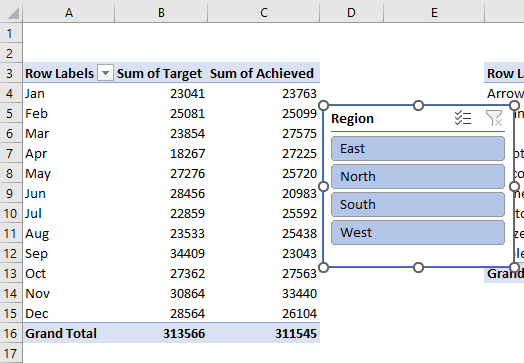
Then, cut this slicer and paste it into the Dashboard sheet.
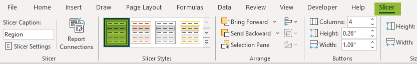
Next, select the Slicer tab and change the columns to 4 in the Buttons group.

Then, the slicer will have 4 columns and 1 row.
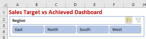
Now, we can also format the slicer from the available options in the Slicer Styles group. For our example, let us choose the Light Blue style.
Now, click on any region to filter out both product summary and monthly summary tables.
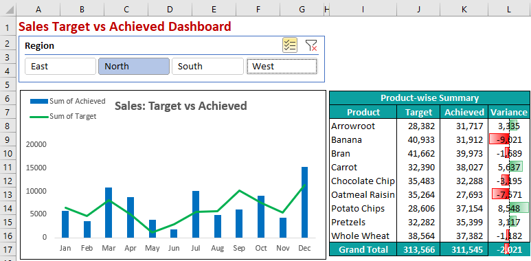
Though we have selected the North region, it has filtered only Target vs. Achieved chart.
Therefore, the product chart is not filtered out.
We have inserted the region slicer by selecting the first pivot table. So, to make the slicer connection to the pivot tables, right-click on the slicer and click on Report Connections.
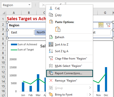
The Report Connections (Region) window pops up. Here, we can see the workbook list of all the available pivot tables.
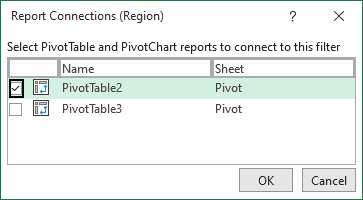
As of now, only one pivot table is connected to the slicer. Click on the other pivot table to link it to the product summary table.
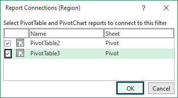
Click on OK.
Now slicer will affect both the pivot tables, and we can also see interactivity in dashboard.
From this example of dashboard in Excel, we have learned how to create dashboard in excel.
Likewise, we can create simple dashboards in Excel.
Example – Sales Order Excel Dashboard
Making a dashboard in Excel is simple and we can learn it with the following examples.
Consider the below table with shipment details of various products. Next, we need to use the following steps to build dashboard in excel.

Step 1: First, convert the data range into Excel Tables to make the updates dynamic. Press shortcut keys Ctrl + T to convert it to Excel Table.
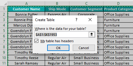
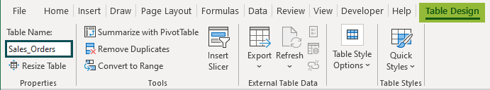
Step 2: After creating the Excel Table, we need to give a name to the table as Sales_Orders.
Step 3: Next, insert Pivot Table for this data.
Step 4: Then, get the monthly summary of units, sales, and profit.
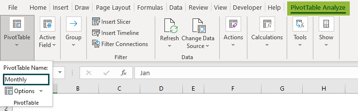
Step 5: Then, give a name for the pivot table as Monthly.
Step 6: Insert pivot chart for this pivot table.
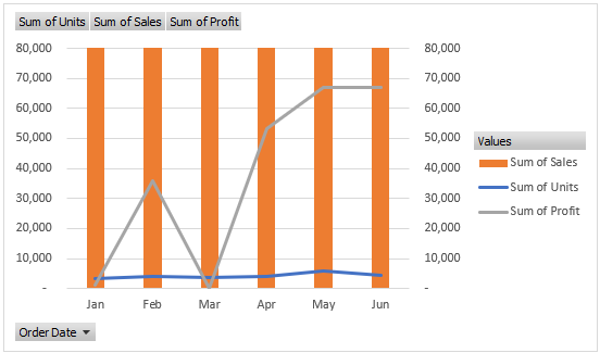
Step 7: Now. insert a new page and move the chart to the new page.

Step 8: Next, remove all the unwanted field buttons to enhance the chart visually.

Please Note: We have added the title chart and removed all the legends from the chart. Then, we inserted legends on top of the chart using shapes.
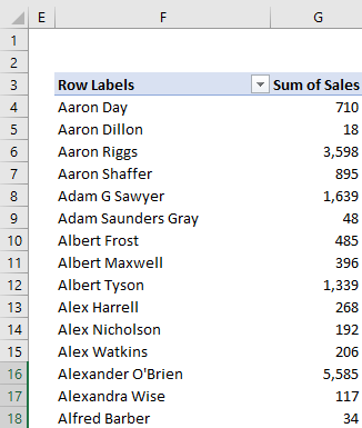
Step 9: Now, copy the existing pivot table and paste it into the same worksheet.
This pivot table shows the sales for each customer.
Step 10: Then, sort the data from largest to smallest.

Step 11: Choose the top 10 customers.

It will filter out the top 10 customers.

Step 12: Now, create the template to show the top 10 customers in the dashboard sheet.
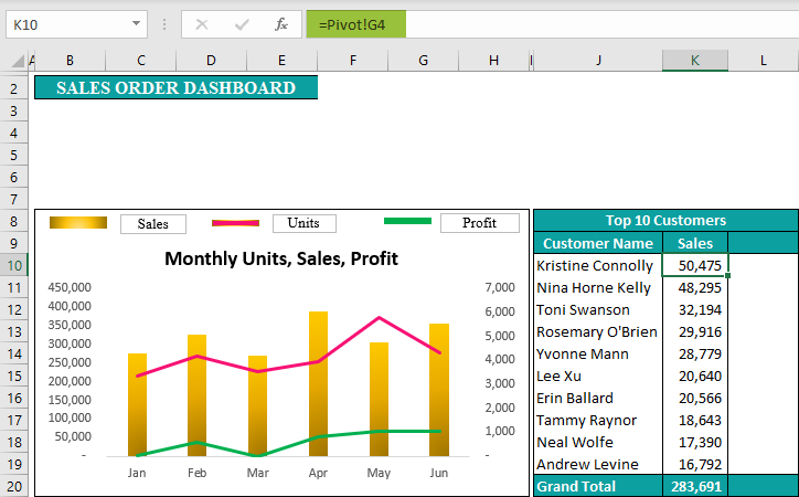
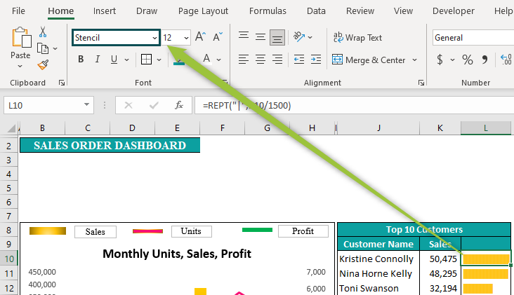
Step 13: Using the REPT function, create in cell chart for the top 10 customer sales.

We have used the REPT function, which will repeat the character by the number of times we have insisted. Since the numbers are large, we have divided the numbers by 1500.
Next, we need to change the font name to Stencil.
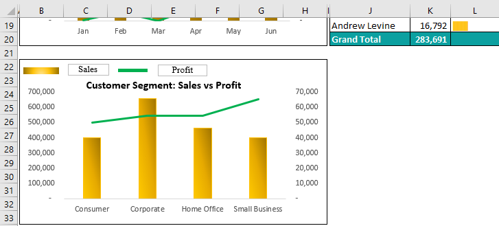
Step 14: Now, create another pivot table to show customer segment-wise sales and profit.

Step 15: Then, insert pivot chart to show a combination of sales and profit.
Step 16: Move this chart to dashboard sheet.
Step 17: Create another pivot table to show the top 10 State sales and profits.
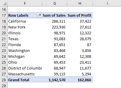
Step 18: Create a table template in dashboard sheet to showcase these top 10 states.

Step 19: Next, give a cell reference from pivot to the above table to show the top 10 states in the dashboard sheet.

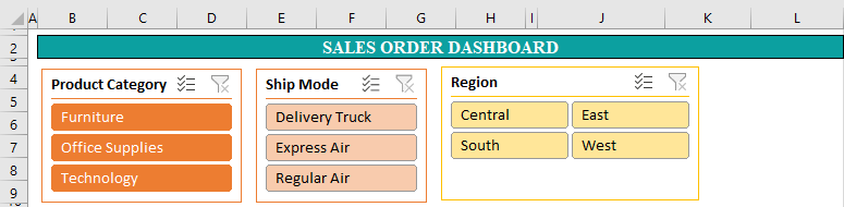
Step 20: Next, insert slicers for Ship Mode, Product Category, and Region.

Step 21: Create a report connection of all the pivot tables for all the slicers and move it to the dashboard page. Also, design them as per the need to make them presentable in the dashboard.
Step 22: Next, hide all the unwanted rows and columns.
Step 23: If any other information has to be added to the dashboard, we can create another pivot table and then include that on the dashboard page.
So, the project’s final output appears as shown in the image below.
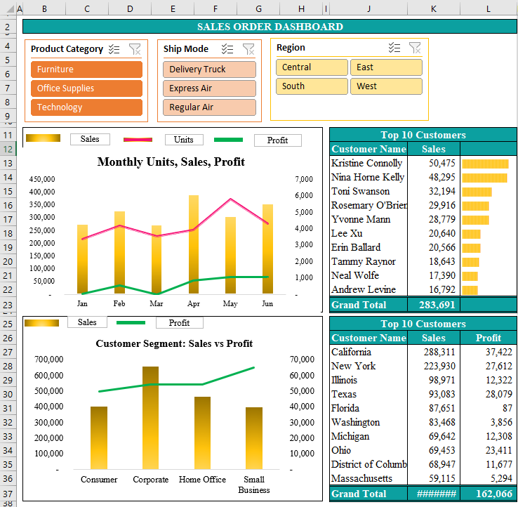
Therefore, by using Excel’s pivot table, we can create beautiful dashboards with lots of interactivities of slicing and dicing.
Thus, from this example of dashboard in Excel, we have learned how to create dashboard in excel.
Common Excel Tools For Creating Dashboard
Excel offers a wide variety of options for creating beautiful dashboards. As a developer of the dashboard, we should be aware of Excel tools to create the dashboard.
- Drop Down List: We must be aware of creating a drop-down list and making them dynamic. It helps users select the value they need to see in the dashboard. For instance, if we want to allow the user to view the dashboard based on the month, we can create a month name drop-down list.
- Excel Formulas: We should be able to apply formulas like VLOOKUP, HLOOKUP, INDEX excel function, MATCH excel function, SUMIF, SUMIFS excel function, SUM excel function, AVERAGE excel function, REPT, and many other important formulas.
- Creating Pivot Table: Pivot table is integral to creating a dashboard in Excel. We should know pivot table techniques and tricks to make the dashboard beautiful. Inserting slicers and enhancing the table to make them presentable is very important.
- Charts: The dashboard is the visual representation of the data. So inserting and playing with the charts is common in Excel dashboard creation.
- Make Use Of Controls: We can use a scroll bar, checkboxes, and various shapes to beautify the dashboard.
- Number Formatting & Conditional Formatting: Formatting is important in dashboard creation. Often we may have to show the numbers in millions and apply currency formatting. In addition, conditional formatting is important in cell bar charts, highlighting positive and negative numbers.
Important Things To Note
- Do not include much information in the dashboard. Including many things makes the dashboard cluttered.
- It is recommended not to use Excel’s volatile functions like OFFSET excel function, RANDOMBETWEEN, RAND, etc., in dashboard in excel. These formulas will slow down the performance of the workbook.
- Always remove unwanted data from the Excel workbook.
- Apply conditional formatting wherever possible and apply formatting for charts.
- Choose the right kind of chart to visualize the data.
- Organize the data and identify the right elements for the dashboard.
Frequently Asked Questions
Making a dashboard in excel may consist of many steps, but the following 7 steps are the most important:
1. To begin with, identify the data source and import them into Excel.
2. Next, clean up the data.
3. Then, set up all the worksheets needed.
4. Make a list of key performance indicators and objectives of the dashboard.
5. Next, identify the right visuals.
6. And then, polish the visuals and apply them to format.
7. Finally, hide all the unnecessary worksheets.
Excel dashboards are used to track the business performance and understand how the key indicators of the business perform in the current period compared to the previous periods.
We need to convert the data range into Excel Table to make the updating of the data dynamic. Excel Table works in structured references so that any additional data will be automatically included in the data range of the dashboard.
To create an HR dashboard in Excel, we need to have human resource data, which has all the information about the company’s human resources. For example, it should contain employee name, id, gender, starting date, ending date, department, salary, leaves, probation period, and other HR-related data.
Once we have this data, we can apply techniques to create dashboard in excel.
Download Template
This article must be helpful to understand Dashboard in Excel, with its formula and examples. You can download the template here to use it instantly.
Recommended Articles
This has been a guide to Dashboard in Excel. Here we discuss how to create dashboard with step by step examples and downloadable excel template. You can learn more from the following articles –
Thanks for easy and detailed step by step explanation…