

![]()
5. Saint Vitus. Crosses galore on the second Vitus logo. Three of them. For the Trinity perhaps. The original SVS logo only had one. Three’s a crowd, we say. But this logo is boss. Looks a bit cheap and overdone at first blush, but the barbed letters? Could be heavy metal cliché. Nope. Crown of thorns symbolism. Crosses that dot the two “I” letters? Could be just crosses. Nope. Candle flames. The gigantic “V” with the cross in it? Sacred feminine cock block. We made the last bit up, but you never know. The logo’s still in use today.
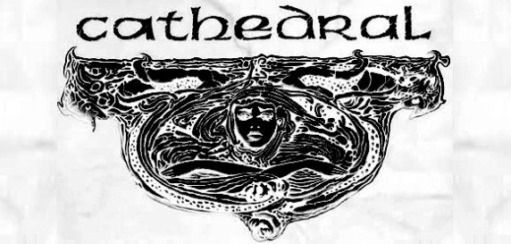
4. Cathedral experimented with a few fonts before settling on this one. But it’s not the Celtic font alone that makes this one a winner. It’s the Celtic font AND mermaid crest. First on the In Memorium in 1990, the logo and crest combo reappeared on 1992’s Soul Sacrifice EP. Together, they harmonize something archaic, stately yet forlorn. Grace in decay. Cathedral continues to use this logo—though if you have the U.S. version of Supernatural Birth Machine you’ll get the band-disapproved ‘stoner rock’ logo—in various widths. They even updated it for The Last Spire album art. Not as cool as the original, but we still like the Cathedral logo because it’s simple yet it conveys so much.
![]()
3. Pentagram. Most ‘70s-era proto-dooomsters or doomsters didn’t experiment too much with logos. Black Sabbath had a different logo on every album, but they never communicated dread. Neither does DC’s Pentagram. The difference here is the Pentagram logo continuously implies angular, if ordered, aggression. From the stems of the “P” and “M” (and shorter “N” and “G”) to skewed “E”, “A” and “R”, the logo, indirectly perhaps, would inspire a legion of longhairs to pull the open and closing logo letters in the most wickedest of ways imaginable.
![]()
2. Paradise Lost. British doom/death pioneers Paradise Lost went through several logo iterations (the Paradise Lost demo logo is sweet!) before settling on this crown jewel. Appearing on two pivotal albums—the Gothic album was inducted into Decibel’s Hall of Fame for a reason—, this logo, along with My Dying Bride’s withered brand, represented fine Peaceville doom/death. The chopped up serif-ed lettering displayed unease while the connecting strands (“P” to “A” and “D”, “E” to “T”) were like the last remnants of ancient drapery. Though Paradise Lost continued to change their logo on albums after Gothic, this defines the marriage of doom and death metal.
![]()
1. Not only is My Dying Bride the perfect logo, but it’s the perfect doom metal logo. What could be sadder than a dying bride? Not much. And My Dying Wife doesn’t quite roll off the tongue as effortlessly. The logo first appeared on the God Is Alone 7” and the Symphonaire Infernus et Spera Empyrium EP. It’s earthen, easy to read, and the root-like stem extensions emote elongated pain. Similarly, there’s a death metal quality to the My Dying Bride logo most bands of woe miss. The “NG” in “Dying” and the “BR” in “Bride” are evilly misshapen. This is ace, boys! So is the new Manuscript EP, which uses a simple font instead of My Dying Bride’s signature script. Can’t win ’em all.
** Check out our Top 5 Death Metal logos HERE.
** Check out our Top 5 Black Metal logos HERE.


