Aerosmith Album Covers – Ranked From Best to Worst

At this point, Aerosmith is an iconic rock band, loved for their music and their unique frontman Steven Tyler. But, we can’t forget about all of those great Aerosmith album covers that we stared at over the years. Don’t they deserve a little shine too?
That’s why, in this article, I’m going to rank Aerosmith’s albums based solely on their cover. Starting with the album that I think had the best cover, to the album I felt totally missed the mark and had the worst cover, let’s have a little fun today and dive right in!
Aerosmith Album Covers: From Best to Worst
Let’s begin with what I believe is the best album cover by Aerosmith: Toys in the Attic.
1) Toys in the Attic (1975)

“Toys in the Attic” is Aerosmith’s third studio album, best-selling album, and features famous songs “Walk This Way” and “Sweet Emotion.” The album cover is undoubtedly their creepiest cover, however, it’s also their most unique and eye-catching cover to date.
The cover itself is brown with the band’s name and logo written at the top in orange. Below the band’s name is artwork with drawings of—you guessed it—toys in an attic.
Yeah…totally not creepy guys.
Although a bit strange, the cover art is incredibly cool and looks like something you might even have framed on a wall in your house (if you’re into that kind of thing). Not to mention, it’s fitting when considering the songs featured on the album itself, especially the title track, “Toys in the Attic,” which is said to compare the mental state of “craziness” with the wild reality of being a member of a band.
Steven Tyler sings, “Leaving the things that are real behind…,” making a bit of sense out of the living toys on the album’s cover. The musical knowledge website Genius offers a unique interpretation of the lyrics with a quote from Steven Tyler himself.
Overall, the music, lyrics, and cover of this album are why it’s considered their best—and I must agree!
2) Get a Grip (1993)

This 1993 album cover features the Aerosmith logo branded on a cow with a pierced udder. The album is one of my personal favorites, with legendary tracks and amazing album art, it ranks at the top of my list at number two. Get a Grip, Crazy, and Livin on the Edge are the stand-out songs of the album, but the other songs are good listens, too.
As far as album covers go, I’ve never seen one quite like it. The branded cow was an interesting choice. It’s simple, strange, and oddly cool—nothing out of the ordinary for Aerosmith; and it seems to fit the energy of the featured songs. Perhaps the cow and its udders are a play on the title track, “Get a Grip.”
3) Nine Lives (1997)

Talk about an amazing album cover. Although it was by no means a best-seller, Aerosmith’s 1997 album Nine Lives is an underrated gem. The album art is mesmerizing, featuring a rock n roll-loving cat strapped to a moving target, surrounded by daggers.
With an array of eye-catching colors and designs, this cover is undoubtedly one of their best. The album has thirteen enjoyable tracks, most notably the song “Pink”—a track that won the band their fourth and most recent grammy in 1999 for Best Rock Performance by a Duo or Group with Vocal.
In addition, the music video won an MTV Video Music Award for Best Rock Video in 1998.
4) Rocks (1976)

Aerosmith’s 1976 album, Rocks, produced two Top 40 hits and is considered one of their most influential works. Although not quite as popular as their “Toys in the Attic” record, this one was legendary, setting the foundation for many next-gen rock bands.
The album cover is simple, yet effective and unique. The band name is shown at the top middle above an artwork featuring five diamonds, or Rocks, you could say.
In his memoir Rocks: My Life in and out of Aerosmith, Joe Perry explained, “Diamonds are called rocks, and nothing is harder than a diamond. I wanted the hardest-rocking record imaginable.” He mentioned that the concept of the album cover was to convey the return of two band members, Brad Whitford and himself, after a falling out occurred between all the members.
With this knowledge in mind, the cover becomes much more impactful; and the songs are incredible. The five members—together—make up Aerosmith: five insanely influential diamonds, paving the way for future generations of rock music.
5) Aerosmith (1973)

Here it is—the self-titled debut that started it all. Aerosmith wasn’t an immediate hit, but over time people realized the band’s talent and potential.
The album features the power ballad and timeless hit “Dream On,” which made the Top 10 in 1976. The album cover shows a small picture of the band members amid a sky full of clouds. At the very top of the artwork, the clouds meet the skyline and are taken over by the bright orange color of the sun.
The band’s name is at the very top of the cover, and this time, each letter has wings—a creative way to introduce the band. The cover’s airy, whimsical design perfectly parallels the track list, making it the perfect debut album cover.
It’s simple, but looks very hard rock professional—something you would reach for at the record store, something I wouldn’t think twice about buying—as a piece of physical or musical art.
6) Pump (1989)

By 1989, Aerosmith had grown tremendously as individual people, as an entire group, and especially as young Rock ‘n’ Roll stars with a global audience. And the group knew what people wanted to hear. So, they gave it to them.
Pump almost immediately produced three Top 10 singles, proving that the band wasn’t going anywhere; it was a commercial success, selling over 7-million copies in the US.
The cover art is a black and white photograph of two trucks—a smaller truck sitting on top of a larger one. The band’s winged symbol is printed in purple ink, adding a bit of color to the photo.
On the side of both trucks’ hoods are the letters “F.I.N.E.” The album’s liner notes explain this as an acronym for “F’d Up, Insecure, Neurotic, and Emotional,” which seems to refer to the band’s behavior and emotions as they were in and out of rehab.
This album cover possesses a lot of profound symbolism and emotion, making it one of the band’s most meaningful. I’m also personally biased toward this cover art—it was pictured on my very first band t-shirt, gifted to me on my birthday in 2010, further exemplifying the on-going relevancy of Aerosmith’s music and art.
7) Draw the Line (1977)

A seemingly forgotten album, “Draw the Line” was a change of course for Aerosmith. Years into being rock n roll superstars, the band surprised fans by incorporating instruments such as banjos, keyboards, harmonicas, and mandolins into their music.
The album marked a turning point in the members’ lives, as they struggled to find inspiration and faced serious personal issues. Although it’s not a bad album, the songs didn’t quite feel like Aerosmith.
One thing I can say with confidence, however, is the album cover is simply amazing. The cover features black and white, caricature-like drawings of the members—each with long, majestic hair. I would buy this art, frame it, and hang it in my living room. Not to mention, the funky art-style matches up perfectly with the surprising, out-of-the-ordinary production featured on the album.
8) Just Push Play (2001)

Another non-traditional Aerosmith creation, “Just Push Play” produced the Top 10 hit “Jaded,” when released in 2001. Now, let’s talk about this album cover. There’s a robotic-looking woman made of metal in the center of the cover, mouth open in surprise. She’s wearing a yellow dress that is being blown upwards, flashing her robot legs—Marilyn Monroe style.
The title of the album is written diagonally across the woman, and the winged Aerosmith symbol is in the top left corner. This robotic woman gives the cover a futuristic feel, which may have been done to mark the beginning of the 2000s—a new era, a different future.
Like the songs on the album, the cover art is unique to anything the band has done before, and it’s pretty refreshing. If I saw this album at the store, I’d probably give it a listen because the art is nice and colorful. The title’s intriguing and the band’s symbol is still just so damn cool.
9) Night in the Ruts (1979)

After some experimenting on “Draw the Line,” and despite losing Joe Perry and longtime producer Joe Douglas, Aerosmith released “Night in the Ruts” (a play on “Right in the Nuts”).
Quite the ironic title, right?
This time, the music felt and sounded like the band everyone knew and loved. The album cover still features all the members. They’re pictured in black and white, dressed like miners. They look dirty, as if they’ve been working a long, hard day in the mines.
The album title and band name are written in spray paint at the top of the cover on the rock. I find this album cover to be a fitting one—it’s cool, gritty, and fits the album’s musical vibes—a return to the authentic Aerosmith sound.
Whether the miner concept is meant to convey the band’s hard work and continuous struggle is unknown, but it’s interesting to think that there’s a deeper meaning behind the photo.
10) Permanent Vacation (1987)

“Permanent Vacation” was Aerosmith’s commercial comeback. With hits like “Dude Looks Like a Lady,” “Angel,” “Rag Doll,” and “Magic Touch,” it goes without saying that this will go down in history as a legendary return to fame.
The album cover features illustrations of playing cards, electric guitars, women, and snakes—all standing out in bright red over a black background. On this cover, the famous band symbol and album title are in the center, colored bright yellow.
The artwork makes the album look more like a “Greatest Hits” record—it showcases their growth and fame—perfect for a comeback. The Rock ‘n’ Roll, tattoo-style drawings really sets the mood for the track list.
11) Rock in a Hard Place (1982)

Ultimately symbolizing hardship for Aerosmith as they trudged on without Joe Perry, “Rock in a Hard Place” takes its place at number eleven with a simple, yet interesting album cover.
Although I wouldn’t say this album is their best work, they experimented with some new sounds and gave us “Lightning Strikes,” which is one of my favorite tracks of all time.
The album cover is a photograph of rock statues set in front of the bright, blue sky. The band symbol and album title are at the top center, standing out in bright red and yellow.
Granted, it’s not the most creative artwork they’ve done, but something about it makes it stand out—and I find it satisfying to look at. But I still there there are ten better Aerosmith album covers!
12) Honkin on Bobo (2004)

The “Honkin on Bobo” album is quite different from the typical Aerosmith album. It’s a mixture of rock and blues, with inspiration coming from 1950s music and sounds. The album has some incredible songs, such as “I’m Ready’ and ‘Shame, Shame, Shame.”
The cover features a harmonica with an engraving of the band’s symbol, laying on a red satin sheet. The harmonica sports a dark red lipstick stain, and the band name and album title are pictured above it in a fancy golden font, unlike any of the other covers.
It’s easy to see the correlation between the music and the cover here. Although not necessarily unforgettable, it’s a decently cool album cover.
13) Get Your Wings (1974)

Aerosmith’s second studio album, “Get Your Wings” really set the stage for these rock stars as things started coming together and Jack Douglas began producing for the band.
This album cover features a black and white photo of all the members and what I thought to be a pre-perfected version of the band’s symbol at the very top. It must be said, though, that this old logo design is rather cool, and I wish we could have seen more of it further down the road.
14) Music From Another Dimension (2012)
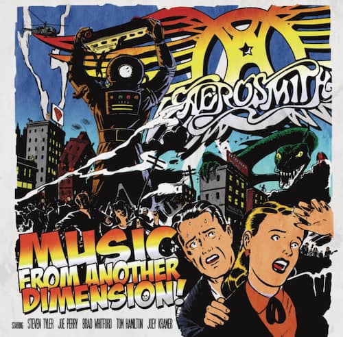
At number fourteen, we have Aerosmith’s fifteenth and most recent studio album, “Music From Another Dimension.” This album didn’t come until eleven years after the previous release of “Just Push Play.” It didn’t garner the best ratings, and it’s safe to say that Joe Perry and Brad Whitford’s guitar playing is what made it worth listening to.
In terms of the album art, it seems that they were going for a superhero comic book art style—which works well with the title, being outer-worldly and mystical. It’s a cool artwork, however, it seems like an attempt to appeal to a modern audience; and unfortunately, it’s a bit tired and overdone.
15) Done With Mirrors (1985)

Finally, at number fifteen is Aerosmith’s eighth studio album, “Done With Mirrors.” I placed this album at the bottom of my list because not only is the album art incredibly basic, but I didn’t particularly enjoy the album.
I hate to say it, as the record was meant to mark the return of Joe Perry and Brad Whitford after the band’s falling out. However, the music seemed uninspired and didn’t do a great job of capturing the band’s true talents. In addition, the album cover just features simple lettering and lacks that eye-catching wow factor that most of their albums possess.
Conclusion
Needless to say, all fifteen of Aerosmith’s studio albums have left an extraordinarily large impact on rock & roll music—and music= and listeners worldwide. The band will remain one of the most legendary names in rock & roll music for generations to come, and when it comes to Aerosmith album covers, this band simply does not disappoint. It wasn’t easy picking, but I hope my decisions sit well with you.
Who knows, maybe one day there will be a sixteenth Aerosmith studio album and I’ll have to rethink my decisions. Fingers crossed!
If you enjoyed the article, be sure to subscribe to my Devoted to Vinyl YouTube channel and Facebook page.
You Also Might Like:
- 10 Best Rock Albums to Own on Vinyl
- 10 Best Classic Rock Albums
- 80s Hard Rock Albums
- 80s Soft Rock Albums
This article was written by Hanna and edited by Michael.


