Transcripts
1. Introduction: If you've ever been interested in digital painting, but the thought of working in Photoshop has intimidated you, look no further. My name is Gabrielle DeCesaris , and ten years ago, I set out to learn how to paint digitally. I was so fascinated by the medium, I knew I had to try it out for myself. With this class, I've tried to go back in time to how I felt when I first started digital painting. I made this class with the absolute beginner in mind. I've included all the tips and tricks you'll want to know as you get started. We'll cover digital tablets, Photoshop interface, canvases, and brushes so you'll feel comfortable working digitally right from the start. Then I'll share tutorials that will walk you step-by-step through cleaning up a basic sketch, applying colors, and adding fun textures to your pieces. So if you want to have some fun and learn how to do all this, enroll today. I can't wait to see you in class.
2. Getting Started: Let's begin by talking about the materials you'll need to get started. Basically, you'll need a drawing tablet with a pen, and digital painting software. I can only share my individual experiences here and every artist will have different preferences, when it comes to the best technology to work with. I personally enjoy working with my Wacom Intuos 3, 9 by 12 drawing tablet, and Adobe Photoshop CC. My tablet is made by Wacom, it's over eight years old and it hasn't failed me yet. As you start exploring digital art, if you see it being more of a casual hobby, I would suggest a small Intuos Draw, since they're affordable and we'll let you try out digital painting at a lower price point. However, if you think you'd like to draw more often or you're more serious about it, I would suggest an Intuos pro with a bigger working area. I think these larger tablets allow for a greater range of motion. I also find that if you work for long periods of time, this bigger tablet and heavier pen are better than the smaller ones as they can cramp up your hand if you work for too long. There are other brands of drawing tablets as well that I've heard good things about. I would recommend doing some research online to figure out which tablet is right for you. I can only speak to Wacom though, as they're the only brand I've ever tried and I've been quite satisfied with them. Now if you don't already have Photoshop, you can download a free trial from the Adobe website. There you'll find the most current updated version of Photoshop, which may look slightly different from my version, but should still have all the same tools and abilities. In Photoshop, there are lots of keyboard shortcuts you can use to speed up your workflow. Some Photoshop users will even keep a hand on their keyboard at all times, so there quickly able to change tools and perform functions. But with a tablet, you can program your side buttons to be your favorite shortcuts. Now instead of having to go through onscreen steps or having to memorize tons of keyboard shortcuts, you can simply program your expressed keys as your most commonly used tools. To edit your express keys, first find your Wacom tablet properties on your PC. Or if you have a Mac, you should be able to find your Wacom tablet under your system preferences. Next, you'll want to find where to edit your express keys. Usually this is found under functions or tablet. Then I would recommend programming the following shortcuts on your tablet. The keystroke for a bigger brush, a smaller brush, then also an undo button and a redo button. Programming your commonly used keystrokes will really quicken your workflow and pressing these buttons will become second nature once you form a muscle memory. You'll also want to program that little button on the side of your pen, to be the eyedropper tool when you click it. This will make it super easy to pick up colors. To do this, select your pen and then from the drop down menu, click "Modifier" and check "Alt" and "Left" if you're on a PC, and "Option" and "Left" if you're on a Mac. Now you can quickly select colors by hovering over them, and clicking that button on your pen. See how easily I'm able to change colors, all while staying in the brush tool, instead of manually having to go back and forth between the brush tool and the eyedropper tool. You'll see just how useful and time saving these tablet modifications will be, as you start working through the videos to come. As a note, you can edit these expressed keys to apply for all applications, or you can make them specific for use in Photoshop. All right, now that you've got the basic setup down, let's jump right into Photoshop.
3. Photoshop's Workspace: Now, I know Photoshop can look a little scary if you're just starting, but no worries. Photoshop is a huge program and it has a lot of capabilities that won't even apply to us for digital painting. So don't feel intimidated by all the tools you're seeing. Also, there are multiple ways to arrive at the same endpoint in Photoshop but in this class, I'll just show you what's worked effectively for me. As you learn, you'll find new processes that may work better for you. As you experiment, you'll discover your own working style and flow. So let's start by understanding what we're looking at here. On the left, we have our Photoshop tools and when you click and hold a tool, even more tool options become available to you. Each tool you'll see has different options and further modifications you can make in the options bar. Now, here along the very top, we have lots of drop-down menus and even some with little arrows that lead off to more options and finally, here we have some of our panels or windows. If you just downloaded Photoshop, it might look something like this but you can create your own custom workspace and I would actually encourage you to. I'll show you how I personally like to have my workspace set up for digital painting. Go to Window and check Navigator, Color, History, and Layers. You can click and drag these panels around, exing out those you don't need and snapping the ones you do need into place. Now to save this workspace, go to Window, Workspace, New Workspace, and create a name for it. Now you have a new painting workspace that you can always come back to. The Navigator window helps you to zoom in, zoom out, and navigate around an image. The Color window allows you to always have a variety of colors right in front of you while you work and you can change the appearance of it here. The History window is a necessity for me. You can go to Edit, Preferences, Performance on a PC, or Photoshop CC preferences performance on a Mac to edit the history states. I want to keep mine around 400. This means Photoshop will remember 400 steps and strokes as I paint, so I can always undo. A Layers panel you will find is an essential to have open and will get more into that in a coming video as there's much to learn. Now, if you'd like to change your interface's background color, you can do so by simply going to Edit, Preferences, Interface on your PC, or Photoshop CC preferences interface on your Mac. Then from there you can change the color of the background depending on your preference. Before moving on, I would recommend editing your workspace to look like this with the interface color of your choosing. This will help you follow along with the tutorials to come more easily. By the end of class, if you do follow along with me, you'll have touched upon all I believe you'll need to make a great digital painting. You can always add other tools and functions as you learn them, but I believe this will be a great place to start.
4. Canvases and Brushes: To begin, let's create a new blank Canvas file. To do this, you just go to "File" then "New". I think a nine by 12 inch canvas with 300 pixels per inch resolution works great for paintings. You can always go bigger than that, but it's a good size because it's large enough to make prints if you ever wish to. You can always scale down a big drawing, but you can't scale up a small drawing, so you want to have a bigger file from the start. I keep my color mode on RGB color and my color profiles set to sRGB. Now, let's download some painting brushes. There are tons of awesome brushes made by generous artists that are available for free download online. Just search for free Photoshop brushes and you'll find tons of them. I'll include some of my all time favorite brushes in the class project section for you to download and try out as well. To install new brushes, simply download them and then drag and drop the file into Photoshop CC. Then with the brush tool selected from the tools panel, click to open the Brush Preset picker in the options bar. From there, you should see your new brushes loaded at the bottom. If that doesn't work, try restarting Photoshop and then see if they've loaded. If all else fails, check out some tutorials online for loading brushes into your version of Photoshop. One of the most important things we need as we get started is, we need our brushes to be responsive to pen pressure. Select the brush tool, and then toggle the brush panel. Next, press the word "Transfer" and from there, you're going to want to make sure the opacity jitter and flow jitter are set to "Pen Pressure". Now, when we draw with a light pressure, our strokes will have a lighter touch, and when we press hard, our strokes will be darker and more bold. Now, I would recommend doodling on a blank canvas until you feel comfortable working with your tablet and the pressure sensitivity. This can also be a really good opportunity to try out lots of different brushes and get familiar with the express keys you programmed earlier. Now, while you experiment, you may discover some brushes that you know right away you don't like. I like to clean out my brushes and delete those that I know I'll never use, so the amount of brushes I have won't get overwhelming. You can delete ones you don't like by simply right-clicking them and pressing "Delete". You can also move brushes around. I personally like to move all the brushes I know I enjoy working with to the bottom so I can quickly access my favorites. To do this, go to "Edit", "Presets", "Present Manager". You can drag and drop to move them around or using the control or command key, you can select multiple brushes at once. You may also want to save your brush set just in case you want to move them to another computer or just have them for safekeeping. To do this, simply highlight them using the "Shift key" and then press "Save Set". Here's a quick tip, right here you can see the shape outline of my brush, but sometimes I find myself accidentally pressing "Caps Lock" on my keyboard and wondering why my brush suddenly looks like cross hairs. If this happens to you, just press "Caps Lock" again and your brush outline should return to normal. Now, go ahead and get to experimenting. Painting with a tablet might feel strange at first if you're used to traditional drawing, where you can actually look at the paper, but you'll get the hang of this with a little time and practice.
5. Layers: When you start working with layers, you open up a world of possibilities. Layers are really unique to digital art, because with digital layers, there's so much room to experiment and try out multiple options as you paint. Now you don't have to use layers, it's actually not necessary. You can make an entire digital painting on one layer and just keep building upon that like you would a traditional painting. But when you do work with layers, it'll leave more opportunities and creative possibilities open to you. Whenever you create a new file, Photoshop will give you this default. It's basically a layer that's already been covered completely with opaque white paint. But here with this icon that looks like a little post-it note, we can create a new layer. It will appear as if it's a gray and white checkerboard, but that's actually a transparent layer. Let me show you. Right now, I'm just painting on the new layer and now I'm going to delete this Photoshop default background layer. To do that, I just click it and then press this trash can hear. Now even though we see the checkerboard, everything about my paint strokes are transparent. Now I can take the crop tool and crop it if I want to and then I'll go to File Save As and right here where it says save as type I'll click PNG, because PNGs will retain that transparency, whereas JPEGs will not. Now see how opening that up here, it takes on the background of my windows photo viewer and also see how we use the move tool to drag it to anything and it still has that transparency through background. Now usually with digital painting, you won't need that transparency. But it's a useful thing to know how to do, especially for graphics online. We've learned how to make a new layer. Now I want to show you how to name a layer. If you're ever working on a project where you'll decide you want to use lots of layers, it will be really helpful to have them named so they're easier to find as you work. To add a name, just double-click the text and rename it. You can also press tab on your keyboard to easily move down to the next layer to quickly rename the rest. This is just a good organizational habit to get into. Here, I've opened up a file where I've used some layers. You can click this eye to turn your layers visibility on and off. You can also rearrange layers and duplicate layers if you ever need to, by right-clicking and pressing duplicate layer. You can also create a group where you can organize multiple layers together. To do that, you just click this icon that looks like a file folder and then you can select the layers you want to group together by clicking and holding the Shift key, and then you just drag and drop them into the group. You can collapse a group by pressing this little arrow here. See how when I press the Eye tool, they're all grouped together, so they all become invisible. But when I click to expand the group, we can see that they're all still on their own individual layers. We can ungroup them if we ever need to. There's so much you can do with Photoshop Layers and I'll show you more as we get into the tutorials.
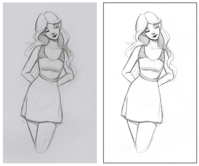
6. Class Project: Your assignment for this class is to create a simple pencil sketch of your favorite character or your favorite animal. Then use the following tutorials to develop it and turn it into a new digital creation. If you have a sketch already made, go ahead and grab it. Or if you'd like to sketch something up, please do. If you need help, try searching to find some references online so you don't have to draw straight from your head. If you don't have a sketch. I'm happy to provide some of mine and you can find those in the class project section. I can't wait to see what you come up with.
7. Tutorial 1 - Cleaning Up Sketches: Oftentimes when you take a photo or scan of a sketch, your image might look doll down. But this is easy enough to fix in Photoshop. If you have a high-quality camera or a smart phone, put your drawing on a flat surface and then try taking a photo on that same flat plane to avoid warping. Shooting an indoor natural lighting, is usually best and will be the easiest to edit in Photoshop, or if you have a good scanner, you can scan your drawing, makes sure the settings when you scan are not overexposed. It will be easier to have a darker image that we can brighten up than one that's overexposed and has low stroke detail. I'm going to demo on a scan of my sketch, but the same process can be applied for photos. To start, I'm just going to make a copy of my scam, so that if I ever need to, I can access that original file. Now I'll just drag and drop my file into Photoshop and begin editing it. As we can see, I accidentally scan my image and upside down, and to fix this, I just go to image, image rotation, and from there I can click different options. In this case, I'll turn it 90 degrees clockwise twice. Now that my image is right side up, I see I need to straighten it because it's crooked. So I'm grabbing the rectangular marquee tool and I'm selecting the area I want to turn. Now I'm grabbing the move tool, and as you can see as I hover around this corner, this little arrow becomes bent, and clicking down I can rotate the image slightly to straighten it. Once I'm happy with that, I press "Enter" on my keyboard and then I click "Select," and then "De-select." Now with the crop tool, I can go ahead and just crop out everything I don't want. Now it's time to edit the images, color and contrast. To start, I go to image, mode, gray-scale. See how it just makes it more of a neutral gray. Now I'm just going to go to image, mode, RGB color, so that I'm able to apply colors to it again when I want to. Now look as I grabbed my eye dropper tool and select that background color. See how it's not nearly bright enough. We want that background color to be closer to white for ease of coloring later. Our first step to achieving this will be by going to image adjustments levels. Now see this space on the right. That's going to affect the white of our paper. So you can just drag that slider over to make it brighter, and over here we can drag this slider over to make our lines darker. There are no exact numbers you should use as every image will require a different amount of tinkering. So just move sliders around until you have a better contrast than before without losing an inequality of your sketch. You can also try image adjustments, brightness, contrast, and move around the sliders there. To get that extra level of brightness, you can go to select and then color range, and from there with the eyedropper tool, with sampled colors selected from the drop down, we can click the background color and press "Okay." Now as you can see, Photoshop has selected everything that is that color. It won't be a perfect selection and you can play around with it until you're satisfied. But now coming over to the color panel and clicking this top square, I can pick up the widest white possible. Then I just take a soft brush, make it bigger and color in that background. Now I just go to select, deselect and see how that brightened up that background. Now I notice I want to edit the contrast again to match that brightness of the background. So again, I go to image adjustments, levels, and like before, I'll just push around the sliders. Now I like this, but it's a little too contrasted for me. So I'll grab my rectangular marquee tool and select the entire image. Then I'll press "Edit Copy." Now over here in my history panel, I'll go back a couple steps before I edited the levels. Now I'll press edit, paste, to paste that more contrasty version I just copied and as you can see, because I pasted it, it's been made into its own new layer. So I have both versions I like here. I want to come up with a happy medium between them. So at the top layer selected, I go over here where it says opacity, and I'm just going to bring the layer's opacity down until I'm happy with it. I think I like this more subtle contrast better. Now that I'm happy with this, I just right-click a layer and press flattened image. This will bring the image back to one layer. Now you may find that your image has some unwanted lines or little specks in it. To clean these up, you can use the patch tool. All you have to do is circle it and then drag it to a cleaner area. You can clean up any dots this way. So now as you can see, these edits make a really nice improvement from the original scam. Now if you prefer, you can actually edit non-destructively as it's called. This means you can edit certain effects regardless of whether you have surpassed your history states allowance. To work in this way, you would convert your image into a smart object. Then you would create separate adjustment layers for each change you make. Editing in the same manner as we did before. Some artists prefer to work this way to keep all options available to them at all times. I personally prefer to just keep my history states large enough to go back in time, and copy and paste if I really want to or need to. I find that that approach actually helps me be more decisive, and commit to the effects I'm applying to the sketch. Experiment with both methods to see what works best for you.
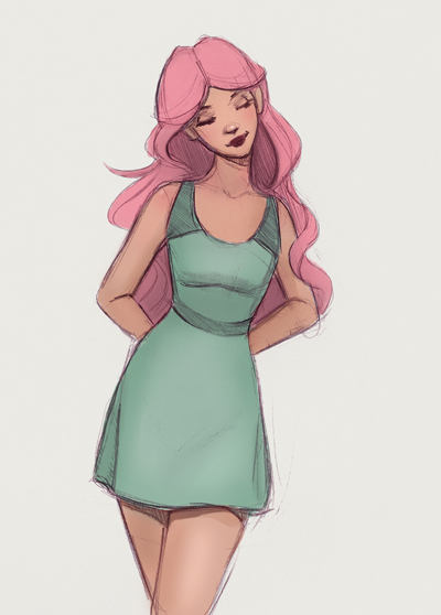
8. Tutorial 2 - Working with Color: Before we get started, if you need help with color, check out my color workshop. In that class, I breakdown color so it's really easy to understand, and there you'll learn how to make your own harmonious color palettes. Now, when you get into using color in Photoshop, this is when it will be particularly helpful to have that eyedropper tool programmed on your pen, because you'll be able to really quickly change colors with the touch of a button. Now, I'm going to show you my general process for adding color to a simple sketch. I'm going to start by right-clicking my background layer and duplicating it. Now, I'm just going to delete that lock background layer, and I'm going to rename this one sketch, so I can stay organized as I add more layers. I'm creating several layers because I want them to eventually be for her hair, dress, skin, and background color. Now, I'm going to take that sketch layer, and drag it all the way to the top, and with the sketch layer selected, I go to this drop down menu here, and I change the blending mode to multiply. This will make it so that everything but my line art is see-through. It will make it seem like we're almost coloring in a coloring book. Now, I'll select that bottom layer, and with the paint bucket tool, I can fill the entire painting with a background color, and I can change it to whatever color I want. I'll go ahead and rename all these layers now, and just start painting in the base colors for the skin. As you paint, you may go outside the lines, but digital art, that's no problem. Just press the undo button you programmed or your tablet, or grab the eraser tool from the toolbox and erase the line. I'm just speeding this up now, but basically, I'm just putting down the colors I like, trying to always be sure to paint on the correct layer. Having these separate layers will really make it super easy to edit and play with colors later on. Now, that I have done my general scheme, I want to show you how you can go in and change each color. Here I'm clicking the background color and then I go to image, adjustments, hue saturation. This is a really useful color editor, because you can alter all the properties of a color, its hue, saturation, and value. It works great for really subtle color tweaks or even for really dramatic color changes. You can edit any element of your picture this way. When you go to image, adjustments, there are tons of color option similar to this, each one offering a slightly different effect. I would encourage you to try some of those out and figure out which one you like best. You can also change the color of your liner, just click the sketch layer and go to image, adjustments, color balance. From there, you can push around the sliders until you find a new color you're happier with. Now, once you've come up with some basic colors you enjoy, you can go in and add some shading, and with separate clean layers, this is easy to do. I'm going to start by adding some shading to her skin. I click the skin layer, and then I click Create a new layer. The new layer should appear right on top of the skin layer. Now, I just right-click that New Layer and press Create Clipping Mask. Basically what this is going to do, is it's going to make it so that everything I paint on this new layer, can only go on top of the skin layer below it. Basically, I won't paint outside the lines. This will really speed up my workflow, because I won't have to be quite as careful in conscious about drawing inside the lines, Photoshop will take care of that for me. I'm doing some basic shading for each part, just creating a clipping mask on top of each of my elements. As you work, make a habit of checking that you're painting on the layer you mean to be painting on. Sometimes you might find that you're actually painting, say, the hair on the dress layer, and you may have to go back in your history to get back on track. Personally, I don't like to look at a mess for too long, so I like to consolidate my layers whenever possible. Right now I'm pressing shift on my keyboard to combine these two hair layers, and I'm right-clicking and pressing merge layers. This will combine them into one layer. I just do the same thing for the dress and the skin. It took my names away, so right now I'm just quickly relabeling those. Once I have basic colors and basic shading, I zoom in and clean up anything that needs fixing, and I add a few little details as well. You want to save this colored file as a PSD, just go to File, Save As, and then make sure it's a PSD file. You always want to have this layered version of your piece, in case you want to come back and edit something later. To make a copy of your image to experiment with, you can do so by pressing this button. Now, with this copy, let's merge it into one layer by right-clicking and pressing Flatten Image. Now, even if you only have your image on one layer, you can actually still edit the colors. It takes a lot longer, but it's still possible if you need to. I would recommend keeping your separate layers until the very end of your piece. But I want to share with you these quick tips in case you find yourself editing with only one layer available. Grab your Polygonal Lasso Tool and select around the area you want to change. Now, you can go to image adjustments, hue saturation, and you're able to edit the color again. Now, say you have an image and you want to separate the character from the background, you can do this by going to select focus area. Now, Photoshop will try and grab everything that's in focus, and you can add to it with this button here. Now, we can add a background layer that the character is separate from. It won't be perfect, so with the characters layer selected, you can erase out problem areas with the eraser tool. You can also lock the transparent pixels on the characters layer and fill those areas in with color. With your image on one layer, you can also change the entire color scheme. There's some really neat ones you can try out under image, adjustments, color lookup. This may be something you experiment with at the very end of making your piece though. These are just a couple of extra color tips I wanted to share with you. I recommend always having that PSD file with all the layers separate though, it will be the easiest way to edit going forward. Now, let's get into adding some textures.
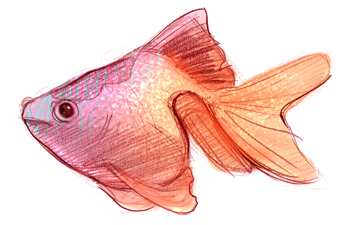
9. Tutorial 3 - Adding Textures: I think adding textures can be one of the most exciting parts of a digital painting. A texture can be anything, patterns, paper, rocks, nature, really anything and everything. Pixabay.com and textures.com have tons to choose from that are available for free. I'll have some I've made that you can use in the class project section 2. First, I want to show you how to quickly add a pattern to clothing. I just click my "Move Tool" and drag the pattern onto my drawing. Make sure you have Show Transform Controls checked in the Options bar so you can make easy size adjustments. Now I'm zooming, I can see the corners. To make this texture smaller, I just grab the corner and drag in while we're holding down the Shift key. Holding down the Shift key will make it so that it retains its proportions. Now I'm dragging the Pattern layer down and I place it so it's right on top of the Dress layer. Now I right-click it and press "Create Clipping Mask", and it goes right on that dress only because I kept my layers separate. Now with the Pattern layer selected, I click here to this drop-down to try out different blending modes. I just click it, press "1", and then I can scroll through options with the wheel on my mouse. If you don't have a mouse, you can press "V" on your keyboard to select the Move tool, then hold down the Shift key while pressing the plus sign on your keyboard. Once I find one I like, I'll often adjust the opacity of it a bit to make it look more natural. You can also use the Lasso tool to make selections, and then just drag and drop them over. If you're having trouble with the Move tool, just select your texture and then go to Edit, Copy, and then go to your drawing and press "Edit", "Paste". By going to Edit, Transform, you can experiment with the different transformations you can make. Here I'm warping to manipulate the shape. In this case because my character's on a single layer, I can just use the Eraser tool to erase out any of the texture I don't want. You can add texture to the background too. To do this, just place your texture right over the background color and experiment with blending modes in the opacity to find something you like. You can also put textures on top of everything, and this can add a nice harmonizing effect to your piece. In this fish sketch, I did use a photo texture for his blue stripes, but you can hand paint some textures too, like I did with the sparkles. With the Dodge tool selected, I go ahead and grab a speckled brush, then I just go in and start painting, changing my brush size as I work so there's some variety to the size of my marks. Make sure the range is set to Highlights. You can also adjust the exposure to suit your needs. Now to get that reflected light under his belly, I just go ahead and grab a softer brush, and lightly paint around the edge using the Dodge tool. Have fun at this stage of your piece. The possibilities are really endless.
10. Tutorial 4 - Editing Proportions: I want to share with you a couple tips that will help you make images that have better proportions. I use this one a lot when I want to get a new perspective on my drawing. Just go to image, image rotation, flip horizontal. This will flip your piece and you'll be able to more easily detect things that are off in your drawing. It's a good idea to flip your canvas every once in a while and look at your drawing with a fresh eye. Sometimes, I'll use the liquefy tool to move the proportions of my character around. To do this, just go to filter and then liquefy. From there, you can use the forward warp tool to gently push things around. You may also find it useful to simply select areas with the Lasso Tool and use the move tool to move the selection around or use the arrows on your keyboard. When you're finished with a selection, just hit "Enter" on your keyboard and then press Select, Deselect. These tips will become really helpful when you start working on more detailed pieces. If you like this more detailed style of working, please join my digital portrait painting class here on Skillshare.
11. Photoshop Tips and Effects: So as we come to a close, I want to review some of the main points and share a few tips you can try out. In addition to dragging and dropping files into Photoshop, you can also simply go to File, Open and then navigate to find your image. When making selections, edit copy and edit paste will be really useful. Free Transform is something you may need, as well as all the options under transform. Under image mode, make sure if you're painting with color, your own RGB color instead of grayscale mode. Under image adjustments, try out some of these options as you work. They're really fun to play around with. Image rotation will also be a necessity as you edit your image. If you're making any type of selection, you'll need to press, "Enter," and then select and deselect a lot. Or just memorize the keys Control D. Select color range and focus area can be really helpful if you're images is down to one layer, but you still want to edit a color. Filter, Liquefy is always useful for proportions. and all of these options down here worth experimenting with too. Also the Filter Gallery can offer you a lot of really neat effects. Once you feel you're pretty much finished your drawing, make a duplicate of it. Then you'll want to flatten the copy. You may want to make some final adjustments to the image, often I'll play around with the levels more at the stage. I've seen many artists use channel shifts in their pieces. Under Window, Channels, you can make slight color shifts. This often gives the piece of work digital feel. I'm not going to use this for my piece, but I wanted to share with you how to do this since it's pretty popular right now. To share your image on the internet, you'll want to resize it so it's easy to load on web pages. Just go to Image, Image Size, and make it smaller. Make sure you always have a backup copy of your full-size image though. Once I resize, I'll often go in and sharpen areas I think are more important, and blur out areas that I don't want getting as much attention. To save, I just go to File, Save As, and there I save it as a JPEG. Now that you know all these things, get to trying them out. Over time you'll memorize what each function does, and using Photoshop would become much easier. As you explore you'll learn new techniques to add to what you already know.
12. Closing Thoughts: Thank you so much for joining my class. I hope you were able to learn something new. If you want to make a project, a good first step, would be to share before and after shot of your sketch or show the class how you turned it into a new digital creation. Whether you've add some base colors, added a texture, or maybe try out a new Photoshop effect, I'd loved to see what you've created in the project gallery. As I mentioned, I'll have some sketches available for you to try out the techniques if you don't have one already made. If you'd like to continue learning with me, please check out my classes offered here on Skillshare. I'll have many more classes to come soon. Thank you again for joining and happy arting to you.
 Gabrielle Brickey, Portrait Artist - ArtworkbyGabrielle.com