
If you’re dipping a toe into the wide world of typography, it probably seems a bit overwhelming. More than almost any other design element, fonts deliver both message and feeling to your viewer almost instantaneously, so it’s really important to pick the right type of font.
There are now thousands upon thousands of fonts in a diverse range of styles that are easily available at the click of your mouse. But it’s harder than ever to know if you’re choosing the right font type for your project or composition. Read on to learn how to make the right selection by understanding the different types of fonts and what kinds of projects they suit best.
The anatomy of fonts
—
Before we delve into the world of fonts types and font styles, it can be helpful to understand a few things about the anatomy of type. All fonts sit on an invisible plane called a baseline—think of it as the blue lines on your loose leaf paper—and have an invisible center line called a mean line.
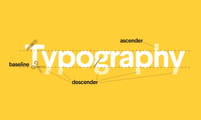
The cap height is the top plane of a capital letter, like the straight line on the top of a capital T. The cross bar is the line in the center that crosses a capital H or A. Some letters, like a lowercase h or b have what’s called an ascender, a line that crosses above the mean line. Others have descenders, which—you guessed it!—drop below the baseline. Classic descenders are the little loop on a lowercase g or the lower half of a y.
All letterforms have these basic parts, but their thickness (known as “weight”), shape and height all influence what “family” or type of font they fall into.
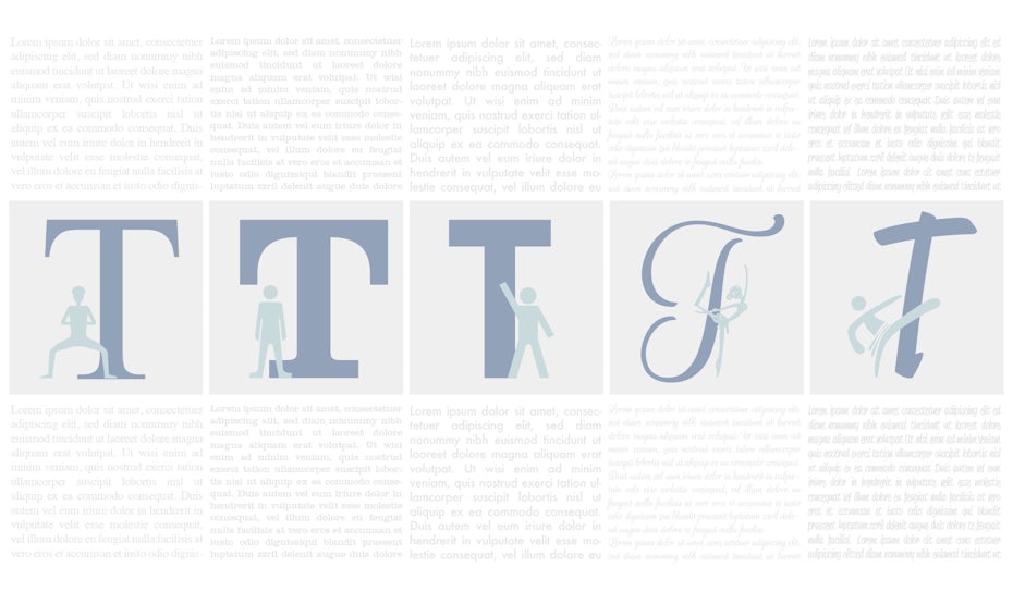
Meet the gang: the 5 types of fonts
—
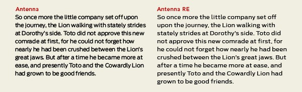
Serif fonts


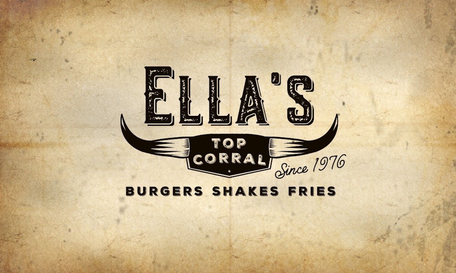
Serif fonts are the most classic, original fonts. They are named for the little feet at the top and bottom of the letterforms. Serifs date back to the Romans who flared their brushstrokes out at the top and bottom, creating what we now know as serifs. Serif typefaces came into vogue in the 15th century and held court for three hundred years. Even within this one designation, there are tons of smaller classifications (Old Style, Classical, Neo-Classical, Transitional, to name a few). While a casual observer might lump them all together, a type geek can explain that subtle differences between the weight, ascender heights, and shape of the actual serif give you clues to what era it was created in.
For the non-type geeks, here’s what you need to know: serif fonts are ubiquitous in our day to day life in nearly every book we read or document we open (hey there, Times New Roman). They are go-tos for logos and print copy and are generally considered to be the most trusted (or conservative) fonts on the planet. Our eyes love them for everything from short titles to long pages of text.
Slab serif fonts

Slab serifs are the fonts with the most impressive, large serifs. They are the louder cousins of the classic, quiet serifs, that rose to prominence in the billboards, posters, and pamphlets of the 19th century, designed to yell their message from a good distance. Later they evolved into some more genteel forms like the ever-popular Clarendon, that could work for longer paragraphs of text.
Slabs almost always bring a vintage vibe to a design and they have a rugged athleticism that can’t be denied. The classic forms work incredibly well for any brand relating to the outdoors and the more refined modern versions always feel a little artsy—probably because almost every typewriter font is a slab serif.
Sans serif fonts


Sans serifs are fonts that lack the little serifed feet. They started popping up in the mid-19th century but truly hit the big time in what’s known as the “Modern” era, in the twenties and thirties. They were considered new and flashy, like shorter skirts and the Charleston dance craze. (Fun fact: you will still see sans serifs with the word “grotesque” in their name owing to people thinking they were crass and only good for advertising.) In the mid-century German designers ran away with the footless forms and created some of the fonts that remain popular and iconic to this day, like Futura and Helvetica.
Sans serifs are still considered the most economical, efficient, clean and modern choice. They are also readable at a large range of sizes and their less-detailed shapes have lent themselves incredibly well to digital screens. Sans serifs are bold and a little bossy—while they work well for long paragraphs text they have always shone in larger uses like headlines and logos.
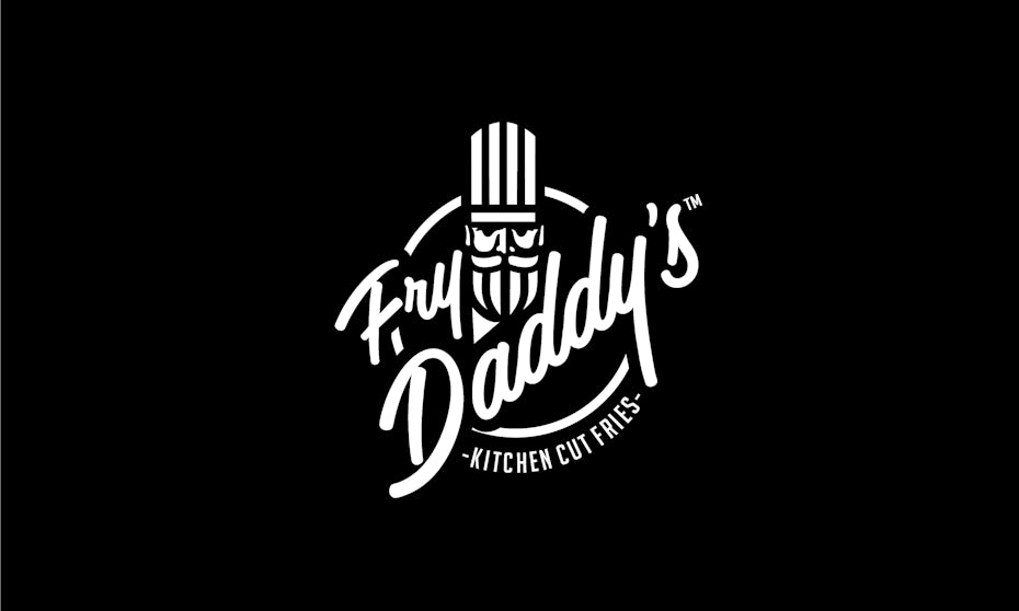
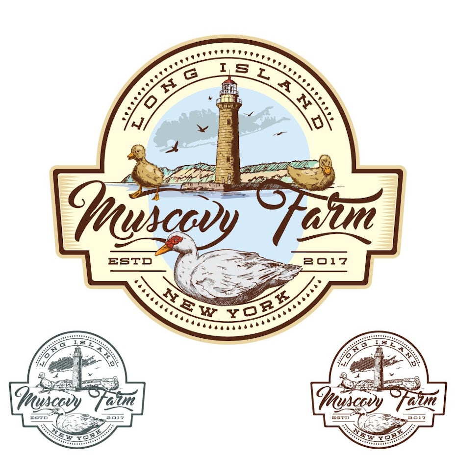
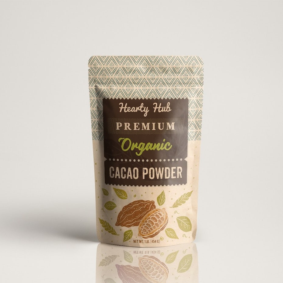
Script fonts
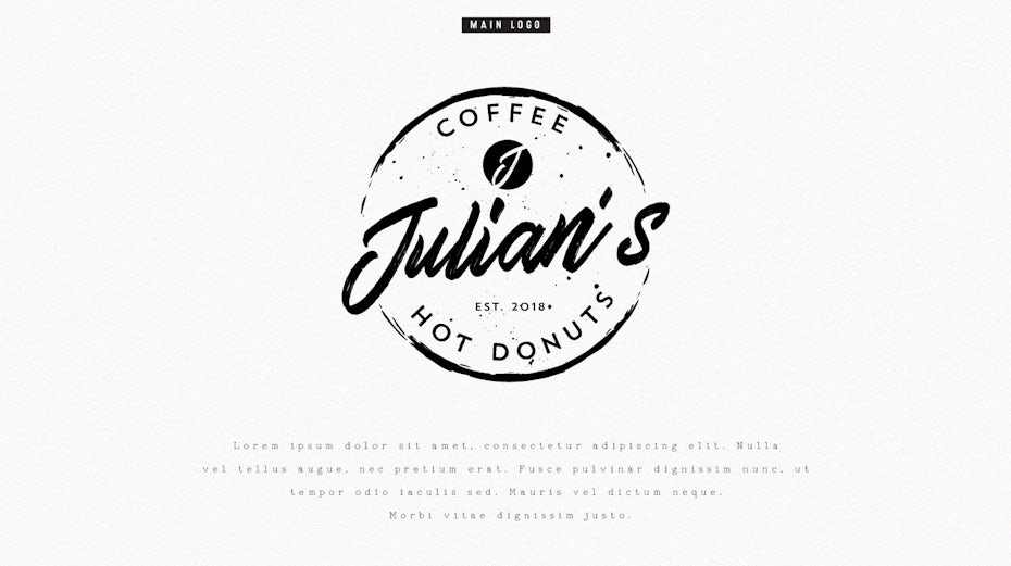
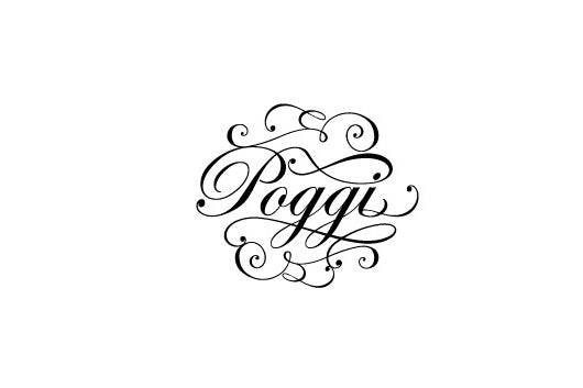
Script fonts are those that mimic cursive handwriting. They are separated into two categories, reminiscent of a party invitation: formal and casual. Formal scripts, as the name implies, are the very fanciest scripts. They evoke the incredible handwriting of masters of the 17th and 18th century. They are immediately recognizable for their over the top curls and flourishes that extend from the serif, known as swashes. These are to be handled with care. Using them for extended amounts of copy can lead to your design resembling the Declaration of Independence. That said—they will never go out of style for wedding invitations, romance book covers, and any design that wants to feel more historical.
Casual scripts developed in the twentieth century and resemble less the work of calligraphers and more of sign painters. These scripts have far less swashes and are more legible. The work well for anything with a more casual, homespun feel including logos, posters, and pamphlets, and tend to feel timeless.
Handwritten fonts
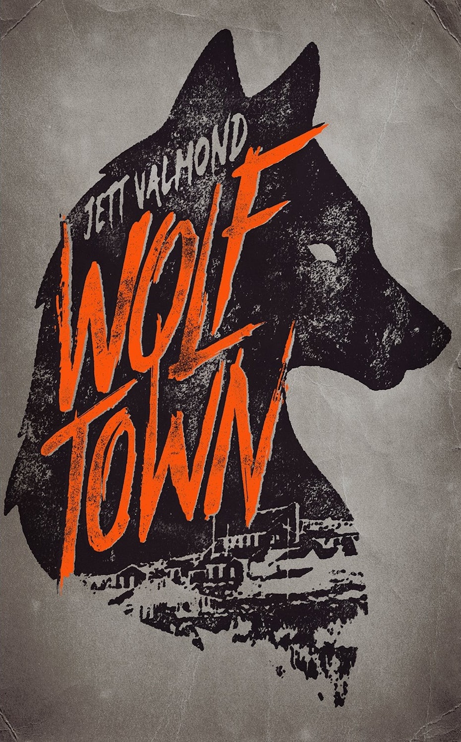


Different from formal or casual scripts, handwritten fonts were difficult to find even ten years ago. Handwritten fonts often lack the structure and definition of the letterforms in a traditional script, instead mimicking the loop and flow of natural handwriting. They might also be technically sans serif and resemble your dad’s all-capital letters in a birthday card. The sheer range makes handwritten fonts difficult to describe but the recent explosion of available forms is exciting to watch.
They work really well for book covers and posters and are inescapable in logo design, as they bring a creative, unique touch that almost all small businesses want to capture. (One note of caution: evaluate handwritten fonts carefully before purchasing them. Sometimes in the rush to make a truly distinct typeface, shortcuts are taken. A fun font is great for headlines but sometimes they lack the full range of letterforms and punctuation.)
Tips for combining types of fonts
—
Peanut butter and jelly. The internet and cats. Some things are just meant to go together. Fonts are no different. A quick search brings up a myriad of specific suggestions for combining different types of fonts, using easy to find fonts that are already on your computer as well as ones you may have to seek out. Some general guidelines: like in all facets of design, contrast is key. You can’t beat an all-caps sans serif and an italic serif. The lightness of the italic balances the heavy, dark weight of the sans. Sometimes it’s not even an issue of pairing fonts from different families—most sans serif families have a range of weights and spacings so one font can be used in a variety of different ways in the same design. Condensed and heavy for a headline, regular light for body copy. Never underestimate how versatile a single type of font can be.
Best fonts for the screen versus the page
As noted above, sans serifs have boomed in popularity due to the rising importance of digital design. But no matter the family, all fonts intended for digital use are tweaked to enhance readability and performance onscreen across a variety of formats. This means less eye strain and fatigue for the person engaging with your design. If you’re a web designer that’s incredibly important.
On the other hand, many web fonts are custom built for websites to take full advantage of the design potential unique to digital interfaces and don’t even include a corresponding desktop-use font. That’s why it’s essential to think carefully about your font choices if you’re planning on transitioning web design to printed marketing materials.
Think about the era
The most important piece of advice when it comes to choosing font styles is to always think about time. As explained above, each type style carries particular baggage with it, tied to when it originated and grew in popularity. Thinking about the time period the font evokes is a great shortcut to the selection of the right type of font: a Victorian tinged calligraphic script is simply a bad choice for a web design company. While a sci-fi feeling geometric sans serif might not work well for a gardening company.
Dot the i’s and cross the t’s
—
Now that you know the different types of fonts, you’ll be able to take your design to the next level. And because the best pieces of advice are often the cheesiest: have fun and experiment! Sometimes a combination of two fonts will create a composition that is more than the sum of its parts and other times a font you never think will work is the answer to all your design issues. And remember, even the most seasoned designer will try multiple font styles and font combinations before finding the correct one. Familiarize yourself with the rules of font types so you can take risks and make your next typographic project truly shine!