Sherwin-Williams Sandbar (SW 7547) on Cabinets: A Painter’s Color Review

SW Sandbar on cabinets. The color can look more tan or beige, depending on lighting.
Using Sherwin-Williams Sandbar on Cabinets
One cool thing about painting homes for a living is the opportunity to work with new colors I’ve never used before.
When I paint cabinets, the majority of my customers choose white. Don’t get me wrong—white looks great on cabinetry, but after using white over and over for years, it’s always interesting to use a completely different color for a change.
On a recent cabinet painting project, one of my customers scrapped the idea of using white, and after reviewing several color samples, she chose Sandbar, a beige from the Sherwin-Williams Timeless Colors Collection.
What undertones does Sherwin-Williams Sandbar have?
According to the Sherwin-Williams product page, Sandbar (SW 7547) says that this "inviting beige" has "a cool, green-gray undertone."
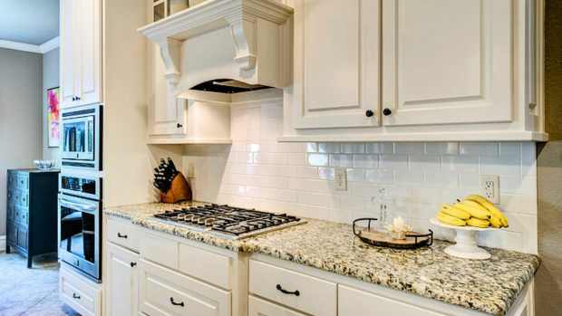
Sandbar is a medium-light beige that I had never used on cabinets or walls before. Initially, I thought the color might look too dark, but the cabinets turned out really nice (see project photos). The kitchen walls were painted with the Sherwin-Williams color Greek Villa, a yellowish cream white. The homeowner plans to install backsplash and brass hardware on the cabinet doors at a later date.
Whether you’re thinking about painting walls or cabinets with Sherwin-Williams Sandbar, my review explains more about this color and what to expect when you use it inside your home.

I spray painted these kitchen cabinets with the beige color Sandbar.
Does Sandbar Have Noticeable Undertones?
Before you start painting your walls or cabinets with this color, it’s important to be aware of any undertones that could become a deal breaker for you. After spraying over 30 cabinet doors with Sandbar, I was able to see how this color truly looks under various lighting and with two coats of paint over primer.
Sandbar is a warmer beige with a yellowy undertone that makes the color look more tan than beige when exposed to light. But with indirect light, the color looks more beige than tan, with a slight hint of gold.
The yellow undertone of this color is something to be aware of if you despise yellow and the room you’re painting is exposed to a lot of sun or artificial light. Yellow doesn’t dominate this color, but a room saturated with light could make it appear more like a light yellowy tan than a darker beige.
In the last picture below, you can see how yellow the cabinet door looks directly under my overhead work lights; however, after installation, the cabinets don't look that way at all.
Recommended

The homeowner thought the color had a little bit of a green undertone, depending on how the light hits it, but I didn’t see any hints of green at all; however, green is a possible undertone to be aware of.
Light Reflective Value
Knowing the LRV (light reflective value) of a paint color is always important because it impacts how bright or dark a space will appear based on its exposure to light. The LRV and amount of light in a room can even impact size perception of a painted room.
The light reflective value is measured on a scale from 0 to 100. A high LRV means the color will reflect more light, and colors with a low LRV reflect less light. If you want your painted cabinets to reflect a lot of light then I would go with white instead of beige.
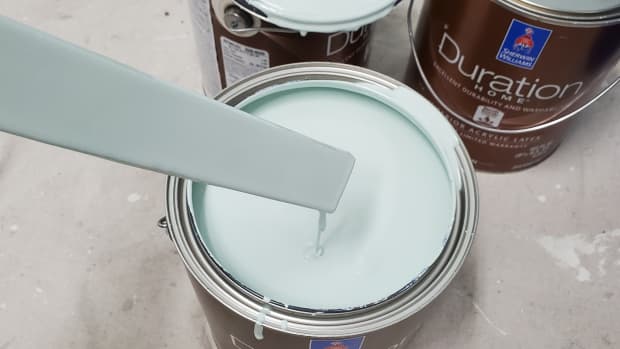
The LRV of Sherwin-Williams Sandbar is 53, which is right in the middle of the 0 to 100 LRV scale. As I explained earlier, this is a warmer beige that looks more tan than beige under direct light due to the little bit of yellow added by the paint store.

Sandbar looks a little yellow in direct light.
Should You Use Sandbar on Your Walls or Cabinets?
If you want a warmer khaki beige for your home's interior, Sandbar is worth looking into, but I would definitely grab a few peel-and-stick samples from your local Sherwin-Williams store before painting your walls or cabinets with this color.
Like most paint colors, lighting in a room and the paint's LRV play a role in how everything will look at the end of the job. I would probably avoid this color if you hate yellow and you're painting a room that's very bright.
On kitchen cabinets, this is a good color choice if you're not a fan of using white and want more of a modern look, and as you can see in the project pictures, the darker cabinet color paired with the white countertops really adds contrast. Black or brass hardware would also pair nicely with this color.
If you're painting your wood cabinets for the sole purpose of selling your home, I would definitely paint them white instead of beige. I do think beige cabinets look really nice, but white is a timeless color choice that will help you sell your home faster.
My article What's the Best Sherwin-Williams White for Cabinets? My Top Picks covers the most popular whites I use for cabinet painting. I would also check out the Sherwin-Williams color fan deck to compare other tan and beige samples that could be a better match for your project.
This content is accurate and true to the best of the author’s knowledge and is not meant to substitute for formal and individualized advice from a qualified professional.
© 2023 Matt G.