Where we jump forward to…
Essay: Where we jump forward to…
by Thomas Girard
[Editor’s Note: This is the fourth instalment in a series of essays on the subject of typography. You can read Essay 1 here, Essay 2 here, and Essay 3 here]
*
How does typography play a role in what’s coming? There’s no better way, in my mind, than to talk to the experts. Typographers seem to have an impetus to change their efforts, often quite radically, sometimes even abandoning their typographic modality, as if now is the time for that. So, let’s jump in.
*
Trochut
I spoke with Alex Trochut during the early days of the mainstream AI evolution. He spoke at length about his 3-d or perhaps even 4-d type projects. It was very visual. But separate from that we got into his lineage, his family had been into typography and he was, in a way, born into it. We chatted about thoughts like: is there some sort of typographic DNA that he was gifted in his blood, and if this is true, what will that typographic DNA mean when visuals are all generated from AI? My first thought was about the richness of typographic history and how one might pull on that knowledge to create new knowledge, or in other words, plug the typographic academics into AI, teach the AI all this. It was tangential conversation to move it away from the visual. But when looking at the work of Trochut and his typographic posters and word marks and even processes, they were clearly on the outskirts of implementing his typographic DNA into this new world. Those of us not in the typographic realm might wonder how something so visual could mean anything at all in a world where visuals are created by AI. But as a person educated at a young age in typography it was as clear to me, we would be teaching typography to AI. If not now, soon.
Porchez
I spoke with Paris-based Jean Francois Porchez around the time I was in Paris for a conference and he responded to our conversation with a typographic poster that was, in my eyes, very postmodern, or perhaps could be assumed to be of some Parisian aesthetic I was unaware of at the time. It was a white poster with red lettering and the typographic treatment changed on each new line. One might ask what was the purpose of such a thing in terms of legibility and readability. But what was clear to me was that this was a response to a new typographic knowledge and way of doing things. At least in terms of subconscious work of a typographer, this was a sign of the future.
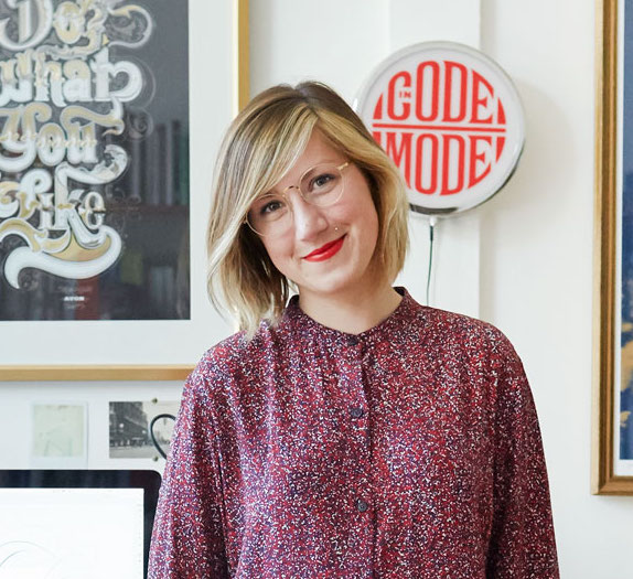
Bantjes
Marian Bantjes and I spoke over audio from her home on Bowen Island, a ferry ride from Vancouver. She seemed to be struggling financially but interestingly had opened a new online store to show off her AI collage work, seemingly targeting the art world. Anyone familiar with Bantjes will know her elaborate decorative ornamentation of typographic proclivity that catapulted her into fame, and, dare I say, typographic fame as well. So, I was obviously interested in the AI work as a direction of sorts into our potentially new AI / type world. One might argue Bantjes saw the AI age as a time to abandon typography, especially if looking at this AI collage work and its sparseness of typography. But I wanted to dig deeper, as clearly it had to segue between typographic ornamentation and AI collage, and I would extend the assumption to say that typography might reappear in this work. The question of what it means to be in this middle stage that is not quite typography and not quite AI perhaps points to where we are in this new world. It’s a kind of in-between place where we can only guess what the future actually looks like, even when looking directly at what’s right in front of us. Still Bantjes seemed heavily invested in AI at this early point, and it was clearly going to be a step for her.
Hoefler
Jonathan Hoefler of typography.com fame (and typefaces like Knockout and Gotham), came later into our current AI world. Hoefler posted his efforts to social media. The posts were masterful creations of devices that did different things in an almost Industrial-Revolution-inspired push. He accompanied his visual creations with prose that proposed some imaginary / non-imaginary context for the visual 3-d pieces. With this typeface designer we saw a departure from typography aside from the default text type that social media platforms offer.
Hische
At the time of this writing, I’m scheduled to have a talk with Jessica Hische. Hische was early to the notable typographer scene with her lettering push, essentially bringing elegantly crisp custom lettering to the forefront of the typography dialogue, not just hers but everyone’s. Rather than seeing an AI angle from her recently, we’ve seen a push towards brick-and-mortar efforts, as she has opened Jessica & Friends. It’s a designer’s paradise: a shop, a real shop, on her block in Oakland, California. Touting neighbours on her block in a gentrified have-a-good-day-shopping bubble, as well as encouraging visitors to come by and say hi in person, Hische is now doing something few people are doing right now, investing in the real world. From ampersand t-shirts to framed art prints, Hische appears to believe that there is still life in traditional typography and typographer aesthetics where many are abandoning it. It’s a relief for me to see this.
Maeda
John Maeda only speaks tangentially about typography usually, almost as a nice-to-have. But it’s clear in his SXSW slide decks and manicured YouTube feed, typography is important to him. Recently taking on the role of VP of AI at Microsoft, Maeda has been instrumental in launching a kind of curious comical series about cooking with AI, where he bakes AI tutorials in an actual staged kitchen, often inviting friends into the feed to laugh alongside him. In all seriousness he seems to communicate that AI fundamentals taught in an accessible way are important for all of us right now – or maybe that’s him under the Microsoft umbrella. Regardless, typography has left his palette at the moment.
Millman
If branding makes the cut into typographic dialogue, Debbie Millman has a voice. She is Chair of the Masters in Branding program at the School of Visual Arts in New York City, and is extremely active in participating in trends in the realm of producing artifacts, deliverables, and other ephemera. Her marriage to a rockstar writer, Roxane Gay, put her clearly in the middle of the design conversation. They have absolutely taken the stage, recently going on a podcast tour broadcasting live conversations for in-person audiences. Millman is also notable for her ability to convince friends to look at the future, but hers seems to be AI free.
*
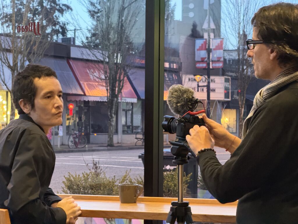
So, in a break from typography for a moment, I spoke with a friend named Kris Krug recently about all this. We were both at a hackathon surrounded by hundreds of hackers at the University of British Columbia, seeing what young minds are making these days. I infer that we both didn’t exactly know why we were there. Somewhat in jest I said “we all have to be at least halfway, when all this AI stuff hits the fan, don’t we?” Krug, who is mostly, quite obviously, invested in AI, fanned out his stack of AI art prints for me. We laughed a bit and he continued to show me what he was doing, as if quite obviously stating for me “the future is right here, I printed it out on my bubble jet printer.” We parted ways. I pondered the names I’ve presented here and asked myself: is he right? Who are we supposed to ask anyway? Who gets this stuff? Maybe the answer is in the question.
*
Thomas Girard (born 30 December, 1980 in Vancouver) is a Canadian scholar. Girard was accepted to attend the University of Oxford in lectures equivalent to graduate coursework. Girard has received several Emerging Scholar awards, first at the Design Principles and Practices conference in Barcelona at the prestigious ELISAVA. At Emily Carr University of Art and Design he received his second Emerging Scholar award. Other awards include RBC Emerging Scholar, Royal Bank of Canada Foundation. In 2021, he was awarded Emerging Scholar from the New Directions in the Humanities conference in Madrid. He is a 2022 graduate of the Graduate Liberal Studies programme at Simon Fraser University. He presented “Advanced Typography Workshops in Quarantine” at the Sorbonne in June 2023. [Editor’s note: Thomas Girard has written several essays for The BC Review, including User experience & Sophocles, Teaching typography in quarantine and Podiums, prototypes, and Plato. He has also reviewed books by Garnet Hertz and Ron Wakkary for The British Columbia Review.]
*
The British Columbia Review
Interim Editors, 2023-24: Trevor Marc Hughes (non-fiction), Brett Josef Grubisic (fiction)
Publisher: Richard Mackie
Formerly The Ormsby Review, The British Columbia Review is an online book review and journal service for BC writers and readers. The Advisory Board now consists of Jean Barman, Wade Davis, Robin Fisher, Barry Gough, Hugh Johnston, Kathy Mezei, Patricia Roy, Maria Tippett, and Graeme Wynn. Provincial Government Patron (since September 2018): Creative BC. Honorary Patron: Yosef Wosk. Scholarly Patron: SFU Graduate Liberal Studies. The British Columbia Review was founded in 2016 by Richard Mackie and Alan Twigg.
“Only connect.” – E.M. Forster