Design Trend Report: American Realism
American Realism, sometimes called New Realism, is a design trend that captured this growing awareness of America’s role in the world. Here’s a deep dive into American Realism in all its glory.


At the turn of the 20th century, the United States was still a new country just coming into its own with its identity. American Realism, sometimes called New Realism, is a design trend that captured this growing awareness of America’s role in the world. Taking some of its cues from French Realism, the American version of the trend first started in literary circles before expanding into visual art by the 20th century.
A movement of, by and for creatives who were coming of age in the brave, new world of the 20th-century United States, this design trend helped to shape what the rest of the world thought of American pop culture for the next 100 years. In short, this trend was preoccupied with using the visual arts to illustrate what was “real†in the country at the time–not always the most objective goal.
Here’s a deep dive into American Realism in all its glory.
The History of American Realism
The history of this design movement is as layered and diverse as the scene in the U.S. in the early 20th century. This century would be marked by tremendous European immigration to the new world, increasing American expansion across the globe, and newfound wealth.
While historians look to the 20th century as the true start of American Realism, we have to look at its roots to really understand this movement’s motivations.
Someone who had a big impact on what would turn into this style was the American printmaker and landscape artist Winslow Homer. A Bostonian, he was born in 1836 and quickly embarked on a career as an illustrator for various magazines, stateside. By 1867, he decided to expand his know-how and so moved to France to immerse himself in European design styles.
What particularly caught his eye was Realism, a French design movement that had recently started in the 1840s. The philosophy behind it was depicting average people and society in general in an accurate and honest way. Therefore, Realism was the polar opposite of Romanticism, which was concerned with showing subject matter in an overly glorified and exaggerated way.
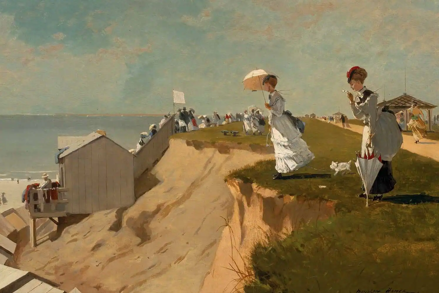
Image Credit: Wikipedia
On his return to the States, Homer began to produce artworks that took this more realistic approach to painting; he put a uniquely American spin on it by showcasing scenes from typical American life in the late 19th century.
Around the same time, in literary circles in the U.S., writers were making contributions to what would become American Realism by chronicling the everyday struggles of the common man. Writers like Mark Twain (The Adventures of Huckleberry Finn and The Adventures of Tom Sawyer) and Stephen Crane (The Red Badge of Courage) deserve credit for bringing an objective accuracy to their novels. Twain accomplished this by having his characters speak in the slang of American colloquialism that was popular at the time, while Crane often wrote about the hardships of war, the working class, and the poor.
This now brings us to the turn of the 20th century and the rise of American Realism. Due to increasing immigration, life in the U.S. at this time started to become more urban than rural. Newcomers to America needed jobs, housing and an infrastructure of community support that they could better find in the cities. Indeed, the aforementioned luminaries that preceded this design trend–Homer, Twain, and Crane–focused more on the rural side of realism in their various works.
This all would change with what we today call American Realism proper.
The new crop of designers and artists who emerged at the turn of the century understood that chronicling the shift to more urban life would shape this design trend.
Perhaps no better crop of new artists represented this trend better than the Ashcan School. This was a collection of artists who documented the look and feel of New York City in the early 20th century, via realistic paintings and artworks. Their calling card was their subject matter, which, in urban city life, included:
- Working-class communities
- Taverns
- Slums
- Tenements
- Alleyways
Like Homer’s introduction of Realism into American paintings several decades earlier, these Ashcan illustrators preferred the gritty side of life as opposed to the hyper-exaggerated and glorified take of Romanticism.
Some notable standouts who made a big impact included the likes of Edward Hopper. Now, if that name already sounds familiar, it’s precisely because of the impact his paintings have had throughout the 20th century and beyond. In fact, you’ve probably seen some of them, but haven’t been able to match them to a name.
Hopper was well-known for his love affair with American urban life, although he also painted many rural landscapes. His urban artworks are a commentary on the increasing isolation that people living in big cities may tend to feel, which is ironic given the sheer number of people living together in urban centers. His artworks’ themes often feature:
- Solitude
- Loneliness
- Resignation
- Boredom
- Regret
The techniques he used in his paintings involve thoughtful composition. He often placed his subjects–solitary figures, couples or groups–in environments that seemed to emphasize their smallness, which he achieved by exaggerating the dimensions of their environments somewhat. That, along with minimal interaction among the subjects, only served to underscore the themes of isolation and solitude that people may feel when living in a big city (particularly when they’ve just immigrated and don’t yet know many people).
Here’s a look at some American urban-landscape graphics, for added inspiration:
Then, there were other American Realists like George Bellows, who preferred to inject a hint of violence in his artworks to show the grittier side of life. By his subtle use of violence in design, Bellows’ contributions to art mirror the use of other design trends like Futurism and their emphasis on violence.
Another prominent visual artist who contributed to this trend was Robert Henri. Henri had a penchant for depicting the most ordinary-looking people and scenes from daily life in his artworks. As a result, a good amount of his works are portraits of people and strangers on the street. As with many of the realists mentioned so far, Henri was sympathetic to the common people he was depicting in his art, and that shows in his use of darker backgrounds to bring out the warmth of the people he painted.
All told, the Ashcan School artists who would end up having a significant influence on pop culture throughout the rest of the century were:
- Edward Hopper
- George Bellows
- Robert Henri
- Everett Shinn
- John Sloan
- William Glackens
- George Benjamin Luks
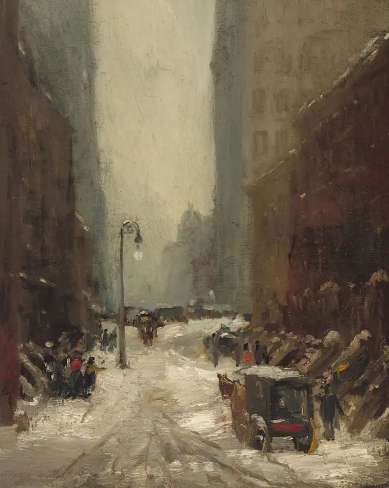
Image Credit: Wikipedia
The way these artists depicted the world around them in their realist style shaped pop culture. Other later design movements like Mid-Century Modern Design and Pop Art Design–while they may have little in common with New Realism, at least stylistically–certainly benefited from the observations that Hopper and the rest of them injected into their artworks.
The Design Characteristics of American Realism
One thing to keep in mind to really help you understand the trend’s characteristics is that it’s the polar opposite of Romanticism. So let’s first look at some of the characteristics of Romanticism to get a better idea of what New Realism doesn’t stand for:
- Emotionalism
- Individualism
- Exaggeration
- Glorification of past history and nature
- Emphasis on the medieval, as opposed to the classical
- Heroism
- Stylization
In other words, what American Realism doesn’t want to convey is grandiosity and scenes that glorify larger-than-life attitudes or individuals. With that in mind, here’s what this design trend does epitomize:
- Urban life (as opposed to rural scenes)
- Truth (read: objectivity)
- Focused on the ordinary, mundane or even poor or squalid
- Accuracy (in proportions, anatomy, color, light)
- Darker, more muted colors and backgrounds
- Neutral colors
- Folksiness
- Vigorous or even messy brushstrokes
- Thick application of paint (impasto) to emphasize the brushstrokes
Interestingly, one technique used by some American Realists mirrored the style of action painting, with the quick, spontaneous brushstrokes, though that’s about all these two design trends shared in common. At the same time, the darker colors and tones of this trend also calls to mind the moody floral trend, but, once more, that’s as much as these trends have in common.
The big takeaway is that this type of realism is characterized by a dedication to depicting the world around you, through design, as it is–instead of how you want it to look from an idealistic point of view. By this definition, New Realism also has nothing in common with propaganda graphic design, which is the epitome of exaggeration to serve ulterior motives.
All told, this style combines a somewhat jaded philosophy with a unique approach to technique (as far as applying the paint to canvas and composition). The result is an unmistakable set of design traits that gives the viewer some pause, if not for its stark depiction of everyday life, then for its display of sheer, artistic ability.
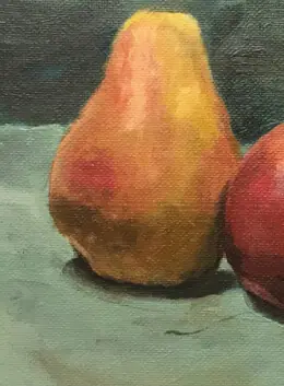
Take another look at some realism-inspired graphic assets to spot some of these characteristics:
American Realism in Graphic Design
There’s almost no shortage of interesting examples of this trend in graphic design. What follow are some of our favorite and historically significant pieces.
George Bellows’ Dempsey and Firpo
Regarded far and wide as Bellows’ most famous painting, his 1923-1924 artwork is also sometimes called Dempsey Through the Ropes. Painted in stark, realist style, it depicts the legendary boxing match between Jack Dempsey and Luis Angel Firpo in New York City on September 14, 1923. The fight was historic because it marked the first time a Latin American fighter challenged for the heavyweight title, held then by Dempsey. Both fighters were at the top of their game, and Dempsey had been champ for a number of years.
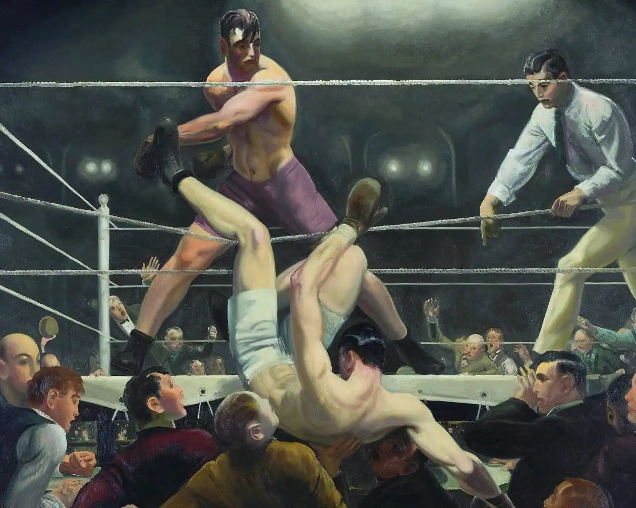
Image Credit: Wikipedia
Bellows’ painting is iconic since it depicts the epic moment when Firpo knocked Dempsey out of the ring (nonetheless, Dempsey would go on to beat Firpo and retain his title). Note the dark hues and tones in the painting, especially in the background. Also, note the body types of the boxers: While both are naturally in fighting shape, there’s no exaggeration in their muscle tone (read: they’re not depicted as having superhero-type bodies).
Edward Hopper’s Nighthawks
Another iconic contribution to graphic design, Hopper’s Nighthawks was created in 1942. It is one of the most famous paintings in American history and has been referenced in pop culture numerous times throughout the decades.
Showing the scene inside a late-night, downtown diner from an observer out on the street, the composition is the epitome of American Realism because it hints at one of the biggest problems of living in a big, urban city like New York: isolation in spite of being surrounded by many, many people.
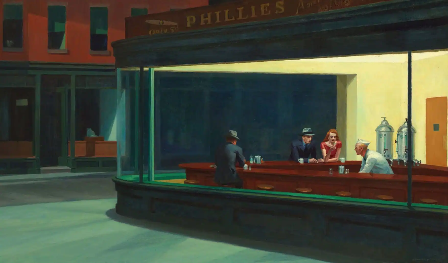
Image Credit: Wikipedia
If you look closely, though the four people are physically close to each other, they are far apart in an emotional sense. The man and woman seated next to each other don’t interact while the diner’s soda jerk seems to gaze past them instead of striking up a conversation with them. Then, you have the man in the suit with his back turned toward the viewer–he doesn’t seem to care about anyone around him.
As with many works of American Realism, Nighthawks displays muted and darker colors, although there’s a decent amount of color contrast between the greens and the orange hues. Also of note are the long shadows in the frame.
William Glackens’ The Soda Fountain
This is one of the few artworks in this style that actually bucks the trend, color-wise. Glackens’ The Soda Fountain is full of bright colors, not in keeping with the gritty scenes of urban life that the Realists were so fond of depicting. In addition, the interior of a soda fountain–while arguably as “real†as a slum or tavern in New York City’s more working-class neighborhoods–is also not the usual subject matter for a painting in this style.
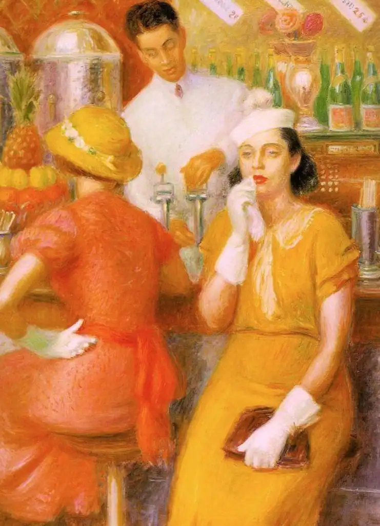
Image Credit: Wikipedia
Interestingly, Glackens’ earlier works did depict the bleaker environments of urban life, in true New Realism tradition, but, as his career matured, he wound up expanding into portraits and landscapes (along with the odd beach scene or two). One influence in his professional life was Impressionism, which enabled him to begin exploring these other themes in his works. Impressionism–with its focus on brighter, more vivid colors, contrast and natural light–definitely made its presence known in this Glackens piece.
American Realism in Web Design
As with anything of significance, it soon finds itself on the web. This design trend is no exception. Here are some of our favorite places to admire this style in a digital sense.
Google Arts & Culture
Google’s hub page for this trend is a virtual art gallery of major artworks of this design movement. From the massive hero image at the top of the page, site visitors’ eyes are directed to the card-based layout of realist paintings when they scroll down the page.
The page’s use of white or negative space also helps in making it easy for visitors to pick out the numerous artworks, at a glance.
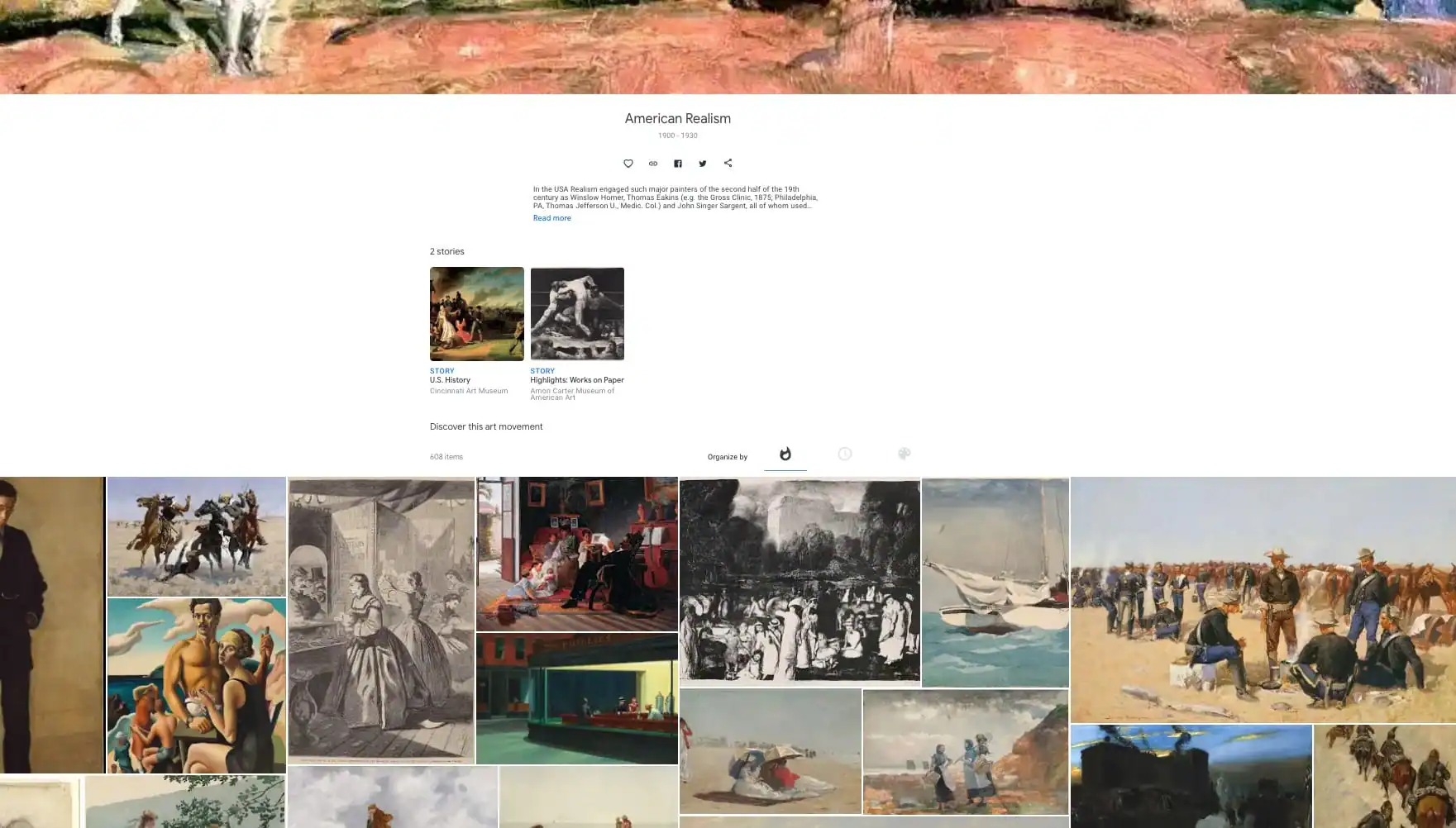
Image Credit: Google Arts & Culture
One cool trick is the navigational element you’ll find below the fold: It lets you organize the large showcase of American Realism paintings by:
- Popularity
- Time
- Color
Google Images
When it comes to Google Images, finding the right photos can sometimes be a hit-and-miss affair. However, with a well-known design trend like this, the platform’s way of surfacing and sorting the relevant images becomes quite the sight to see.
The site’s familiar grid layout is used to maximum effectiveness, displaying the plethora of New Realism images in rows and columns across the entire screen.
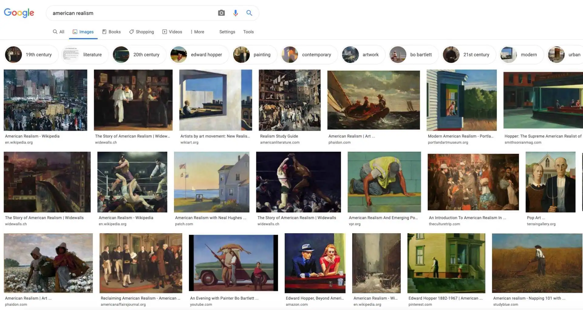
Image Credit: Google Images
What’s also neat is the secondary navigation just above the image results. Here, you’ll find related suggestions for additional images that cover everything from associated design movements to noteworthy personalities. Moving through these choices is as straightforward as swiping left to right on your touchpad.
Gritty. Real. Uncompromising.
The major takeaway from American Realism is its rebellion against idealism and exaggeration in design. Whereas other styles like Romanticism and propaganda graphic design emphasize larger-than-life individuals and situations, New Realism is dedicated to the more mundane and average that life has to offer. Sometimes, this also means depicting the harsher side of life, such as poor neighborhoods, rundown communities, and fractured relationships between societies’ demographics.
This design trend may be far more relatable to many than the movements that employ embellishment and high drama. However, those looking at art and design as a form of inspiration and even escapism will be disappointed with the way that realism approaches its compositions.
Just the same, American Realism boldly started off the 20th century in such a confident way that it ended up heavily influencing American pop culture for generations to come.
Products Seen In This Post:

Having a hard time finding your unique design style? This creativity challenge will get you on the right track.
Download it here


Marc is a copywriter and marketer who runs The Glorious Company, a marketing agency. An expert in business and marketing, he helps businesses and companies of all sizes get the most bang for their ad bucks.
View More Posts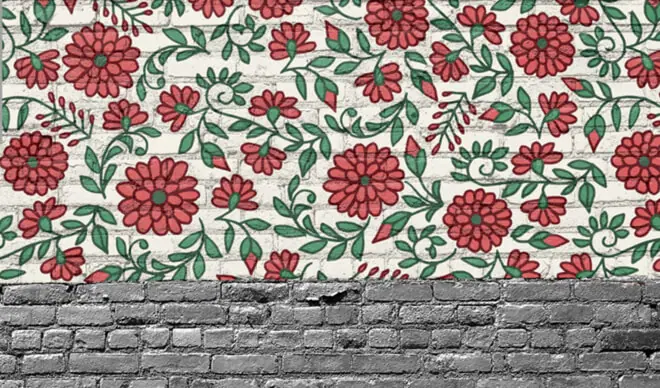

