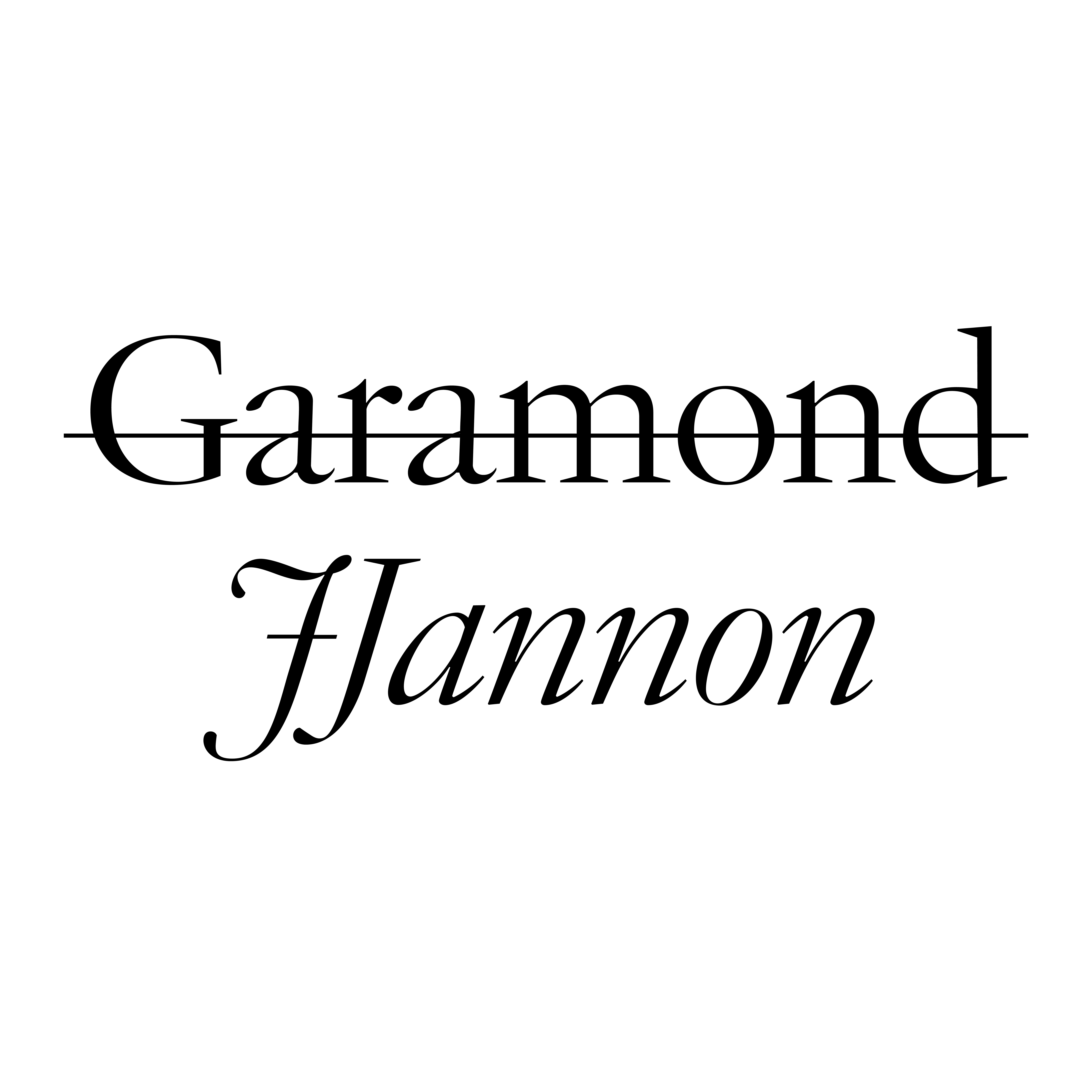
The fonts of Jean Jannon, a.k.a. the would-be Garamond, were underrated by twentieth-century typographers. Type designers, too, had a curious love-hate relationship with Jannon, whose legacy they viewed as a kind of fraud because of the long-standing misattribution of his work to Garamond.
Such misunderstandings may explain why so few twentieth-century adaptations of Jannon’s designs appeared in metal, let alone as software during the early mass digitizations of the 1990s. It was ridiculous to use Jannon if you didn’t know what it was — and if you did know, you wouldn’t want to be accused of type ignorance.
François Rappo sets the record straight with his crisp JJannon, available in two optical sizes but in a very restrained weight palette. It is advertised as a strict and respectful revival. And yet, I see many interpretations by Rappo of the scarce and incomplete source material Jannon left us: a couple of specimen sheets and a bibliography of printed books. JJannon manages to transpose those dark corners into new technologies, and therefore retains an aftertaste of early digital type: cupped serifs, blunted angles, and, above all, relatively high contrast for a text typeface. Together, these features combine to make JJannon delightfully austere and cold, far from the baroque extravagance the seventeenth century usually claims for itself.
Released in 2019, JJannon is a welcome signal of type designers’ renewed interest in Jannon’s legacy. Following František Štorm’s lighthearted, loose, and expressive Jannon in 2010; yours truly’s LVMH in 2018; and Connor Davenport’s in-progress Beaujon, it seems that Jean Jannon is an appealing mystery on whom many designers would like to shine new light.


