A continuación aparece una instantánea de la página web tal y como aparecía en 22/05/2024 (la última vez que nuestro rastreador la visitó). Esta es la versión de la página que se usó para la clasificación de los resultados de búsqueda. Puede que la página haya cambiado desde la última vez que la guardamos en caché. Para ver lo que puede haber cambiado (sin la información destacada), ve a la página actual.
Bing no se hace responsable del contenido de esta página.
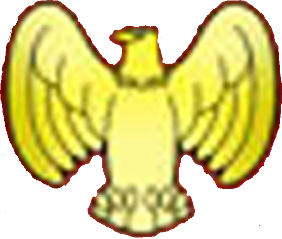
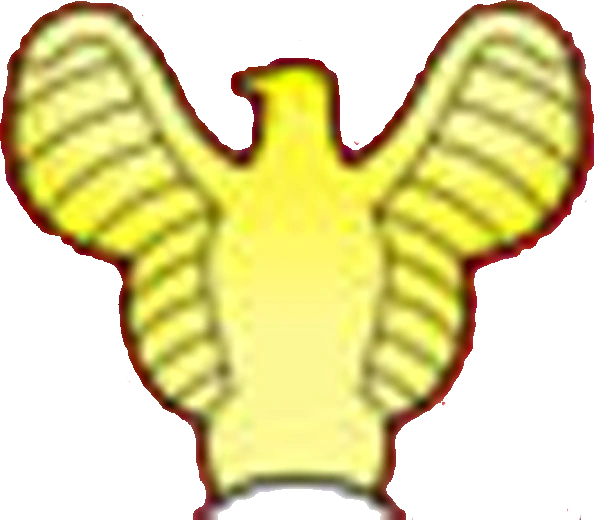
Wonder Woman, made her first official appearance on All-Star Comics and would eventually made her solo debut on Sensation Comics #1. The first logo was designed as a golden eagle.
1942–1949[]
BETTER LOGO NEEDED
SVG NEEDED
Designer:
Unknown
Typography:
none
Launched:
June 1942
In Wonder Woman #1, the eagle was given more details.
1949–1959[]
BETTER LOGO NEEDED
SVG NEEDED
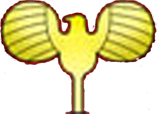
The design of the logo was changed to a more minimalistic look.
1959–1968[]
BETTER LOGO NEEDED
SVG NEEDED
Designer:
Ross Andru
Typography:
none
Launched:
Unknown
More changes were made to the logo in 1959. The lower feathers of the eagle were removed and the bottom of it is now perched to Wonder Woman's belt.
In 1968, Wonder Woman suffered a drastic redesign, in which her classic suit was replaced with a then fashionable dressing. This change wasn't well received by the public, so in following years they would bring back the classic suit.
1972–1981[]
BETTER LOGO NEEDED
SVG NEEDED
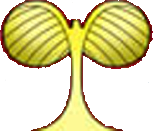
In 1972, Wonder Woman reverted to her iconic suit but with several changes, begin one of them the logo itself. The wings of the eagle were made bigger, while the head was reduced and also the bottom now connects to a golden belt.
1981–present[]
Designer:
Milton Glaser
Typography:
Custom made
Launched:
October 8, 1981
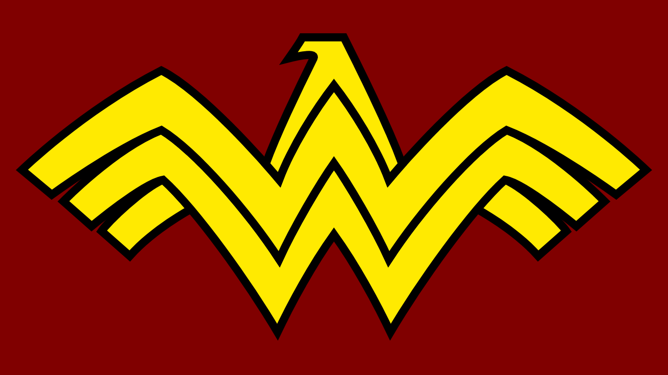
In DC Comics Presents #41, graphic designer Milton Glaser (who also designed the 1977 DC Comics logo) reimagined the emblem as a winged "WW", which represented the character's initials. This became Wonder Woman's most well-known logo begin used in every iteration since then with slight alterations made depending in the style of the artist. Despite is no longer used mainly in the comics since 2006, it can be still seen in merchandise and other types of media.
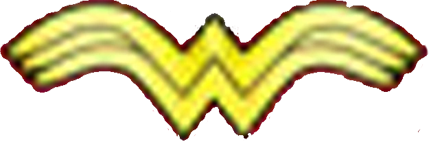
Inverted version
Yellow version #1
Yellow version #2
1994[]
BETTER LOGO NEEDED
SVG NEEDED
Designer:
Mike Deodato Jr.
Typography:
Custom made
Launched:
Unknown
One of the most significant (but not permanent) changes in the logo occurred in 1994. The "WW" were flattened and the wings were made wider and curved. However, this logo was short-live due that in the same year Diana loses her Wonder Woman title to rival Amazon Artemis and ditches her classic suit for black and blue leather.
1995–1998[]
BETTER LOGO NEEDED
SVG NEEDED
Designer:
John Bryne
Typography:
Custom made
Launched:
September 1995
The following year in Wonder Woman (Volume 2) #101, Diana recovers her Wonder Woman title along with her suit. Artist John Bryne refreshed the suit design along with the logo, which follows the original design but with a more "robust" look and similar to the 1972 logo, it connects to a bigger golden belt.
1998–2006[]
BETTER LOGO NEEDED
SVG NEEDED
Designer:
Adam Hughes
Typography:
Custom made
Launched:
December 1998
In Wonder Woman (Volume 2) #139, the logo received a major redesign. Cover artist Adam Hughes depicted the emblem as a solid and curved shape without etched details. He also colored the emblem from gold to bronce.
2006–2011, 2016–present[]
SVG NEEDED
Designer:
Terry Dodson
Typography:
Custom made
Launched:
June 7, 2006
In Wonder Woman (Vol. 3) #1, artist Terry Dodsonredesigned the logo as the "WW" shaped in the form of an eagle, in a throwback of the first chest emblem.
This logo was used until New 52 but was later brought back when Rebirth was released.
2011–2016[]
Designer:
Jim Lee
Typography:
Custom made
Launched:
August 31, 2011
When New 52 was released, artist Jim Lee "sharpened" Dodson's design and colored it silver instead of gold.


")
")
")