
This story is part of our Weekend Reads series, where we highlight a story we love from the archives. It was originally published on August 13, 2020.
When the 2020 Democratic National Convention scrapped its usual plans for a large-scale, in-person event for a mostly virtual one, plans for its visual identity had to shift as well. Without an arena to fill with signs and other physical collateral, branding assets would need to be largely digital. Instead of a local Wisconsin focus to celebrate Milwaukee as this year’s host city, the message was now of a “Convention Across America,” with attendees and speakers joining virtually from around the country.
“Because of COVID, the idea of community or being in person has changed, not just for the conventions, but for any in person events,” said Ida Woldemichael, associate creative director at Wide Eye, who along with partner and creative director, Chelsea Goldwell and Senior Designer, Steve Kodis of Zero designed this year’s convention branding. “It’s been so interesting to see in the last few months how as designers, communicators, and developers, we are using digital tools to make this work as a virtual experience.”

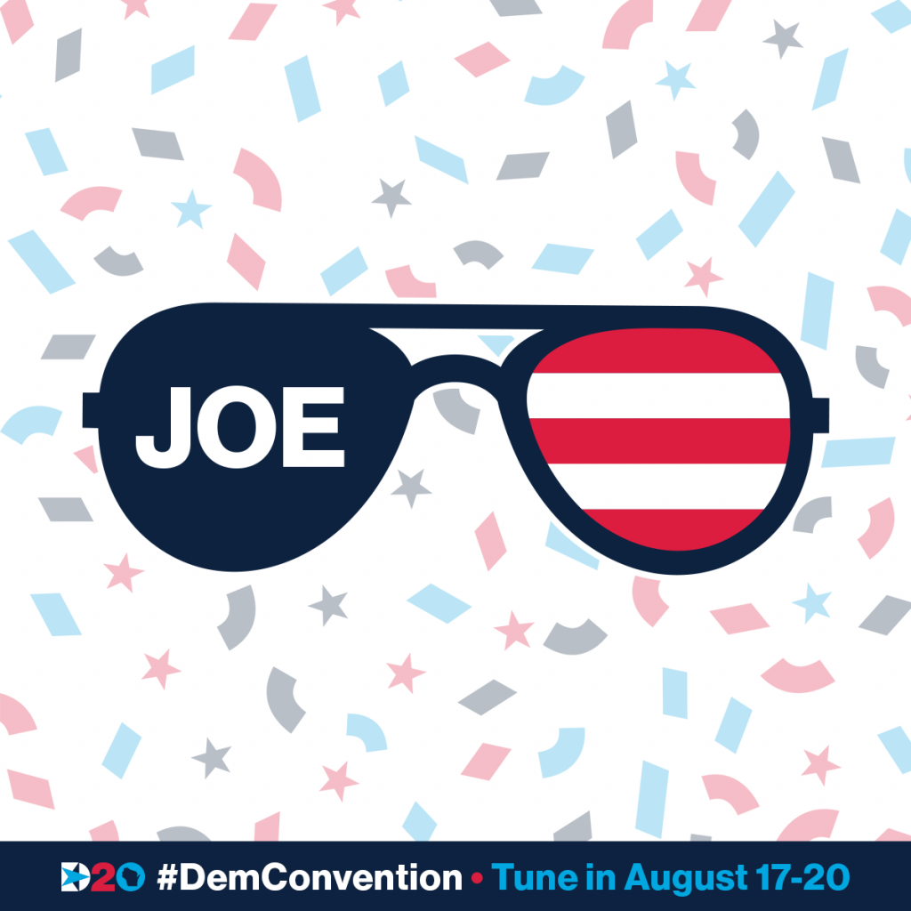
Wide Eye and Zero already rolled out the DNC branding back in February, well before the party knew that a virus would torpedo its summer plans. It was also before the party knew its nominee, which is typical of convention design—a bulk of the work needs to be done without knowing the official candidate. As such, the identity needed to be relatively versatile: The designers chose a sans serif Neue Haas Grotesk for the brand typeface, in part because most of the major candidates were already using sans serifs for their campaigns. A red-and-white flag stripe element was another safe bet, and one that just so happens to pair well with the striped E accent in the campaign logo of Democratic nominee Joe Biden (and as of earlier this week, the logo for the Biden-Harris ticket).
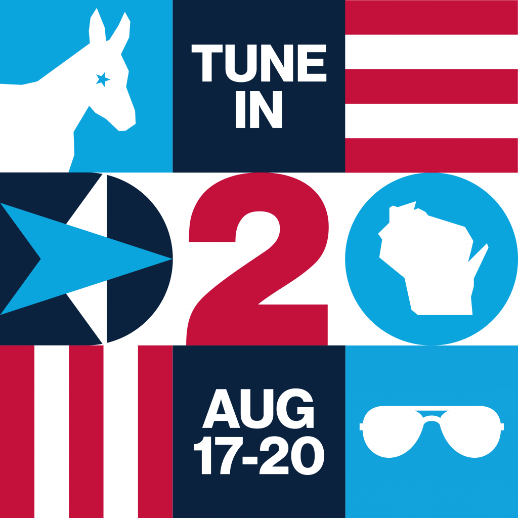
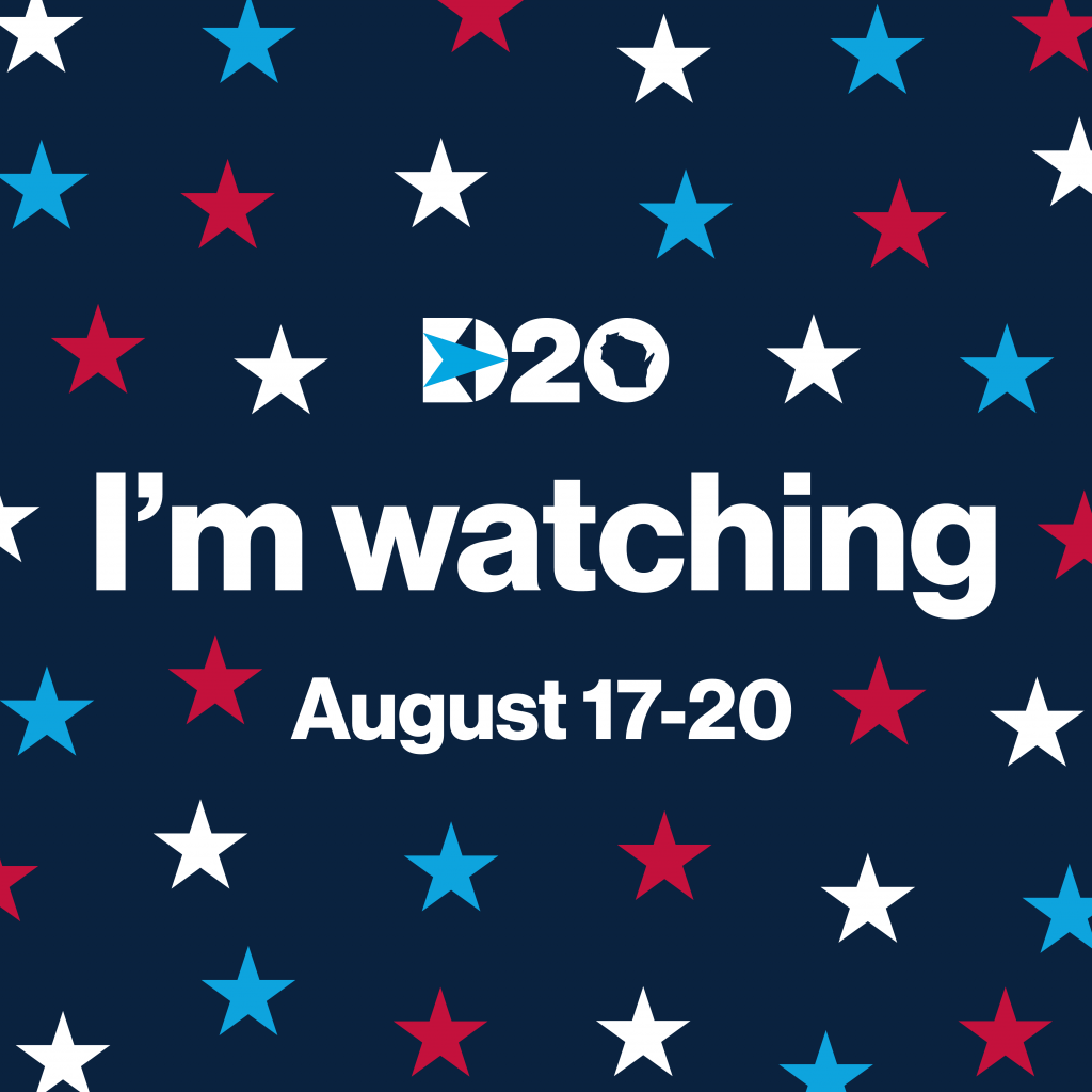
Overall, the new DNC identity has a modern look, featuring bold sans serif typography, and navy and cyan blue as its color palette. The “D20” logo features an arrow inside a star inside the letter D, while the 0, which previously had an outline of Wisconsin in the center, was updated to include a map of the continental U.S.
Yet despite the fact that it looks like a contemporary interpretation of the 1992 convention logo, this year’s logo is more dynamic than other Democratic convention logos of the past 20 years. This was, of course, partially by necessity. Recent convention logos have focused heavily on the host city (aside from 2012, which was a direct play off Barack Obama’s campaign logo); this made less sense as a strategy for a convention mainly playing out online. And while convention logos are conceived as standalone designs that can feel disconnected from the larger Democratic brand, the 2020 identity seems to build on a longer Democratic design legacy, drawing from the visual universes of recent campaigns like Obama’s, Hillary Clinton’s, and others.


The new approach feels like it’s due in part to the increased attention political branding receives today. Candidates use logos to illustrate their personal histories and values, and some campaigns, like Pete Buttigieg’s, even release their brand style guide and toolkit, giving supporters the story behind their visual identities as well as assets to make their own graphics. It also speaks to the need for conventions in 2020 to be multi-platform and merch-friendly. Visual identities that are flexible can more easily be adapted to everything from physical backdrops and T-shirts to photo filters and Facebook banner images.
“I feel like it builds on what already existed,” says Chelsea Goldwell, partner and creative director at Zero of this year’s convention logo. “The Democratic branding to me always feels very simple, so people can understand it — hopeful, forward thinking, inspiring — those things are core to the Democratic Party and the design, and definitely things that we took into consideration with the convention look and design.”
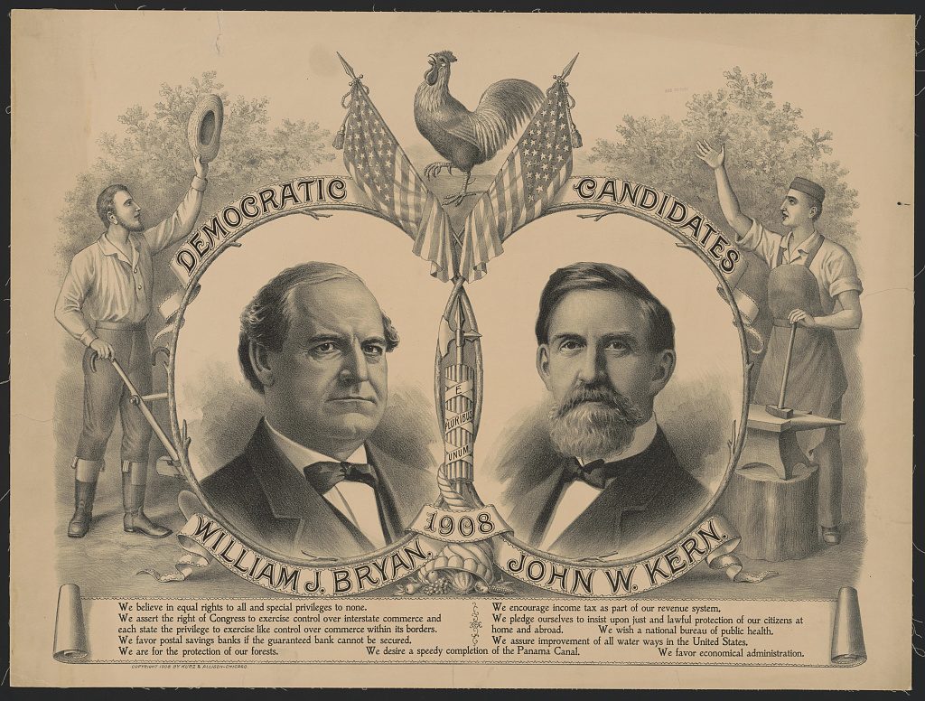


The Democratic Party is the oldest continuous political party in the world, and it’s undergone multiple rebrands. As early as 1840, some of the first Democrats were identified with a rooster symbol. In the 1870s, cartoonist Thomas Nast popularized the Democratic donkey, which had been used previously as a symbol for Andrew Jackson. From then on, the donkey became the de facto Democratic symbol, depicted in a patchwork of varying logos across the party. In 2010, the Democratic Party hired SS+K to design a new identity to replace its DNC wordmark.
“Everybody was using different things,” said Rob Shepardson, a founding partner of SS+K. State and local parties all have their own logos, as well as various coalitions. “It just didn’t reflect or acknowledge the challenge the party was facing.”
SS+K designed the new party logo to reflect the new Obama era of Democratic design, though it was built to outlast his administration. “The circle had some connectivity to Obama’s O, but it wasn’t driven by that,” Shepardson said. “One of the things we wanted to do with the logo was to make it contemporary, modern—we didn’t want any extraneous elements. We wanted it to be clean, simple, and stand on its own and have that contemporary, modern, clean feel.” The simple D inside a circle still remains in place a decade later.

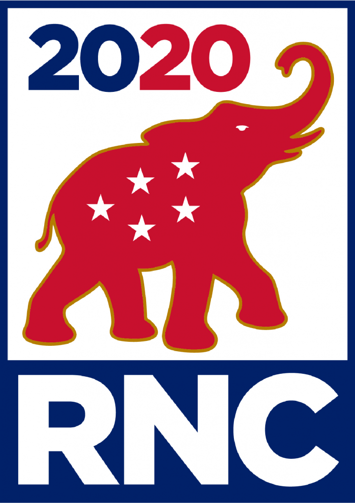
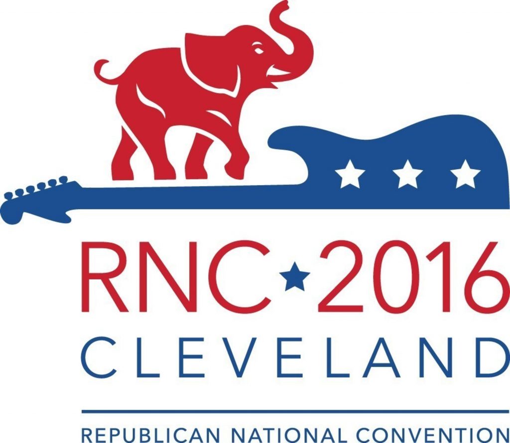
Meanwhile, Republicans have stuck to elephant iconography for its party logo, as well as for the logos of its conventions for at least the past 40 years. In June, the 2020 Republican National Convention released a new logo for this year’s event in Charlotte, North Carolina. Initially, it featured an elephant and crown, a reference to the “Queen City” nickname of its host city, but the crown was dropped when Republicans moved the convention to Jacksonville, Florida so as not to have to comply with North Carolina’s health precautions. The following month, they moved the convention back to Charlotte for a “scaled down” event on August 24th, but the logo showing an elephant with five stars for “a five-star experience” remains.
Since going virtual, Democratic convention designers have created digital assets they hope will recreate the excitement of an in-person convention. These include design elements that celebrate different states in lieu of the state-based outfits delegates are known for wearing, and a personalized convention ticket for donors who give $10 or more. A digital convention toolkit allows supporters to make their own personalized social graphics, including cover photos, avatar graphics, smartphone wallpapers, and Zoom backgrounds, and there’s an accessibility guide on how to make social posts accessible for disabled people. Though the kit still includes Wisconsin-centric graphics like cheese, a map of the state, and Milwaukee’s Hoan Bridge, those can also be swapped out for more generic elements like a donkey, falling confetti, and a pair of Biden aviators.
Future conventions won’t have to stay virtual after the pandemic ends, but party organizers may still appreciate the value that comes from having an expansive branding system like Democrats are using this year. As national conventions evolve from being largely TV-based experiences to an event that plays out online across multiple screens and platforms, an adaptable, dynamic visual identity may well become the new standard.

